More mail art

More Mail Art © Angela Porter | Artwyrd.com

After a very late night talking to a friend and not enough sleep, today is a self-care day. I’m going to go back to bed soon and try to sleep some more before driving for four hours tonight.

While waiting for sleep to catch up with me again, I thought I’d make some mail art. The photo isn’t the best; I’ve said it before, I’m not a brilliant photographer. However, I’m sure you get the idea. Also, I wanted to catch a glimpse of the metallic highlights I’ve added to this card, so the angle of the photography was just plain weird!

My brain seemed to have ticked over some ideas while I was asleep and I woke with some things I thought I could try out. This card is the result of some of them.

I started by using a 4″ x 4″ piece of watercolour paper and applying Distress inks to it to create a background.

I used a torn piece of paper to mask off the bottom of the panel so that could use an ink blending tool to apply Pine Needles and Crushed Olive Distress inks to create some land.

A sky was required, so I used Broken China Distress ink to create it so that it faded from top to the land.

I then sprayed the background with a mixture of gold Perfect Pearls and water to create a less perfect appearance.

While this was drying, I flipped through my Zibladone (visual dictionary) and found some motifs I liked. I used Pitt Artist pens from Faber-Castell to draw the motifs on the panel. I chose these pens because they’re waterproof when dry and I knew I wanted to add colour and sparkle to them later on.

To give a sense of dimension, I used black pens for the foreground motifs and a grey brush pen to create the foliage in the background.

To help the seed pods stand out, I used washes of Dusty Concorde and Seedless Preserves Distress inks. Then, I used some Cosmic Shimmer gold iridescent watercolour paint to add the gold highlights.

Once everything was dry, I used a piece of Cut’n’Dry foam to edge the panel with Dusty Concorde Distress Ink. The design was framed nicely by this edging; it also added a sense of dimensionality.

Next, I mounted the panel on a piece of black card and then adhered these layers to a 6″ x 6″ blank Kraft card, all done with Tombow Mono glue.

Finally, I carefully used a gold glitter Uniball Signo gel pen to add lines around the edge of the design panel and also the black mat.

I then turned my attention to the envelope. I drew some more of the seed pods before adding a light wash of Dusty Concorde and Seedless Preserves Distress Inks, being careful not to overwet the envelope. I added dots of gold watercolour paint to the seed pods and the space around them too, making sure I left enough space to write the name and address of the eventual recipient.

I’m quite pleased with the card. I’ve done this style of drawing digitally in the form of a mandala, but never like this. However, as I look at the card, it seems to need a focal motif in the space between the seedpods. I may be wrong; it may just be my constant need to fill up space with line and pattern and the difficulty I have in leaving white space in a design.

I shall let the card ‘sit’ for a while before making my mind up on that issue.

Arty goings on…

Non-dotty Flowers 15Aug12 © Angela Porter 2012

Non-dotty flowers – a reworking of the dotty flowers below.  3″ x 5″ approx.

Busy, busy, busy…

I’ve been kind of busy, but not busy-busy, since my last entry, busy with art.  Being engrossed in arty pursuits has kept me up until the wee-small hours as the dark outside has given me no idea about the passage of time.  Good thing I’m still on the long summer break from teaching.

I must admit that I’m not looking forward to going back to work.  I think I’ve said before I need a different environment to flourish in.  My only problems in changing career are that I need a certain income and I have no particular idea what I’d like to do instead of.  I’d love to do more things that are creative – arty/crafty would be good.  I’d also like to work in an environment where people actually get along, without the constant rumble of poor attitudes, disrespect for self and others and an unwillingness by the majority to want to learn or to see the point of having a good education and doing their best.

Anyway, before I drag myself down into a gloom, I still have two and a half weeks or so away (apart from a need to go in for a few days towards the end of the break to mark work, prepare work, and sort out displays for the walls) and so will be making the most of the time to be creative and explore my artsy-craftsy nature.

Torc – statement necklace – bib necklace – collar necklace.

I managed to complete this torc.  It took over 30 hours of work.  It is available for purchase at Etsy at the time of this blog entry.

Torc © Angela Porter 2012

As always, spirals, circles and curves feathre in my work, along with some of my ‘custom made’ sequins.  I enjoyed the work in this, and realised how many of the ‘tricks’ I had forgotten from previous endeavours like this.  My earlier torcs can still be seen on Artwyrd at deviantART.

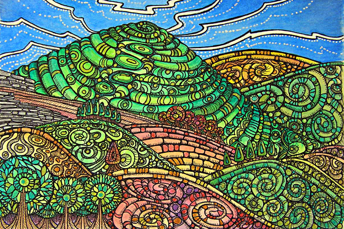
Experimental landscape number two.

I’ve also managed to complete another experimental landscape – this one from a photograph of a ‘real’ landscape in North Wales.

Landscape Experiment 2 © Angela Porter 2012

A dear friend of mine has made some interesting suggestions about how I can approach the ‘patterns’ for different land-uses. When I’m ready to do another landscape I will take his suggestions to heart.

There are glimmering, metallic, glittery highlights on the drawing/painting that don’t come out well when photographed/scanned.  I do think I’m beginning to find my ‘style’ when it comes to landscapes – and that style involves simplifying the shapes/lines of the land, trees and so on, and then working out how to fill those shapes in.  Spirals are, as always, a favourite motif of mine, along with circles and curves, influenced as I am by prehistoric rock art, early Celtic art, and anything with curves and curls in!  If I try to work with perfectly straight lines and sharp corners in my work, well it just doesn’t seem to work or scream out ‘Angela’ at me.

Abstract Floral.

This was an experiment in something a little different for me – pastel colours on a grey paper, with an open kind of design.  The usual spirals and swirls are there, but there’s a lot of ’empty space’ which also works.  The pastel colours are a definite change from me!

AbstractFloral1 10Aug12 © Angela Porter 2012

Flowers…

This started as a good idea and ended up a right ‘mare of an experience.  A dear friend of mine reckons it is lovely and very William Morris…

Flowers 14Aug12 © Angela Porter 2012

I realised the rising flowers were on the wrong side if I wanted to add words to it as I was inking it all in.

Then, as I blended the coloured pencils, the ink rubbed off to mix with the coloured pencils, so it all had to be inked in again, which is often the case with my kind of work, but the ink subdued the colours somewhat.

I then started to fill in the blank space to the left with tendrils, without putting pencil lines down first as a guide, and ended up making a right hash of it.  So, the shading under the leaves and so on was meant to disguise some of that, and cutting it all out and sticking it on blue paper … well it was a good idea, but not the blue!  I also rediscovered how useless I am with a pair of scissors or craft knife too.

However, some of the most important lessons we learn are when things go wrong…

Geometricity 1

So, after the pastel colours and the disaster, a return to bright colours, and flashes of metallic gold.

Geometricity1 14Aug2012 © Angela Porter 2012

A small piece of work – 7cm x 10.5cm, but jewel-bright watercolours used to fill in the pattern.  I’m pleased with the work (though not with the scanned image – photographing/scanning my work is a major problem with the shiny Sakura Glaze pens that I use and the highlights of metallic/iridescent/glitter paints/inks that I so love.  However, you get the idea.

I think that I’m going to play with geometric patterns and colour for a while, on a small scale, to see where it leads me.  Of course, I may just change my mind as time goes along!

More flowers…

I completed this one with Geometricity1, and there are too many ‘dots’ on the flowers – another lesson to learn!  I’ll be reworking this one in a little while.  It will keep me occupied during the torrential rain that is falling here in waves.  I love the sound of the rain…

Bright flowers 14 August 2012 © Angela Porter 2012

Greetings Cards

Greetings Cards 1 © Angela Porter 2012

Greetings Cards 2 © Angela Porter 2012

I’ve been doing teeny-tiny bits of art to turn into greetings cards.  Each card is 4″ x 3″ and the artwork is created using a variety of different media, including metallic pencils, coloured pencils, metallic and iridescent paints, metallic and glitter gel pens, Sakura glaze pens and fine-point technical drawing pens with black ink.

I’ve really enjoyed creating these; they’re relatively quick for me to create, though each one takes anywhere from 30 minutes to 90 minutes to create, believe it or not!  It’s also nice to create little bits of art that are more affordable.  Perfect for framing after receipt of them as a keepsake.

My swirly, curvy, spiralling style of abstract art is very much featured in these little creations, as is my love of colour.  The inner raven has been kept happy by the use of metallic, iridescent, shimmering colours and highlights.

All the cards are for sale on Etsy.

I’m going to be creating more this afternoon I think.