Template Thursday

Another week has gone by, so it’s time for a new template for members of the Angela Porter’s Coloring Book Fans facebook group.

This week, it’s another of my collections of little windows. Yesterday was a day where I needed to draw a template that wouldn’t overwhelm me, and a collection of tiny drawings and patterns is a way to break the task down into bite-size, cute, whimsical pieces. As I result, I enjoyed the process and found some contentment and peace too.

In fact, some of the colorists in the group have told me that the really like the way the page is broken down into pieces that can be finished quickly if they are limited for time. The different sizes allow them to choose something that can be coloured in the time they have available. That part can then be left finished, freeing them of the worry of leaving something unfinished.

Coloring, like any creative activity, can help calm, relax, soothe and give a break from negative self-talk, to name a few of the benefits. I know that scientific studies have shown this to be the case and that losing yourself in coloring has a similar effect on brain activity as mindfulness meditation.

I use art to help me with times when my emotional weather is stormy, dull, unsettled. As I said earlier, drawing a collection of small designs was far less overwhelming than drawing a full page illustration yesterday. Yet, I still end up with a full page of mini-templates to colour.

I feel I struggle with colours. I tend to try to put all colours available to me into one template. Every now and then I do work with a limited palette, which also has it’s own problems. My window templates take away any pressure I put on myself regarding colour. Each window is a unique image in it’s own right and I can use whatever colours I wish in it without worrying about the overall cohesiveness of the project.

These window templates are also great fun for trying out different colour combinations, for blending colours, and even for trying out new techniques. You could make notes on the template, or cut out the pictures you want to keep and start an art journal where you note down the media, colours and techniques used to get the effects/blends you like. No longer any need to remember what they are, just refer to the journal!

Talking of cutting the designs out, that is a perfect way to make use of a finished coloring page like this one. The individual images, or groups of them, can be used to make greeting cards, bookmarks or to embellish art journals, journals, scrapbooks, diaries, planners and bullet journals!

As always, I love to see what people create using my templates – share with and/or tag me on social media :
f: @artwyrd
t: @artwyrd
i: @artwyrd

Ephemera

Ephemera ©Angela Porter |Artwyrd.com

I woke this morning with the desire to make a little box to store ephemera in. So I did.

I used a video from PootlesPaperCraft to help me make the box, which is 4″ square with a depth of 2″, so sizeable enough for some of my smaller ephemera such as inchies and little shrink plastic charms (you can just see them peeking out from under the envelopes to the left of the photo).

I used plain, white card for the box base, which I coloured with Tea Dye, Rusty Hinge and Vintage Photo Distress Inks. For the top, I used a piece of Tim Holtz card from my stash that I’ve had for a number of years. This I grunged up with Vintage Photo and Rusty Hinge Distress Inks.

Once I made the box up, I used Aged Mahogany to distress the edges of the box.

I coloured a square piece of white card with Aged Mahogany and Rusty Hinge Distress Inks and then used a light brown pen to draw a zentangle design on it. This panel was layered on a piece of the same Tim Holtz card I used to make the lid, and then I adhered it to the box.

The box really needed a label to identify it’s contents. Now, I could’ve printed the label out, but I thought this would be an opportunity to practice my hand lettering, which I did.

Then, I aged the label with Aged Mahogany Distress Ink, applied lightly over the face and a bit darker around the edges. Next, I layered the label on another piece of the Tim Holtz paper. Before adhering the label to the box lid, I edged the panel with some Rich Gold Starlights paint from Imagination Crafts.

It’s been a long time since I made any boxes, but they really are easy enough to do. I need to make a longer, thinner box to store tags and other bits and bobs in, once I work out the size I need to make.

Making a simple sketchbook or journal pocket.

Making a Simple Pocket © Angela Porter | Artwyrd.com

Yesterday, I said I’d like to make simple pockets for my sketchbook-journal to hold my artwork rather than gluing it to the pages. So, this morning, I started my day looking on YouTube for some ideas and this video by joie de fi was the top of the list.

While I was watching it, I thought I’d make an instruction sheet to go in my sketchbook (or my virtual one I’m making in One Note).

I picked up some quadrille paper and wrote and drew as I watched the method for the first pocket. I worked in ink without pencil sketches and I made quite a few mistakes. A Tipp-Ex mini pocket mouse was my friend.

When I’d finished the instruction sheet, I scanned it in and used Autodesk Sketchbook Pro to remove the square grid from the paper, clean up some smudges, and correct minor errors.

Then, I added some colour to help bring out the drawings, but also to help with the instructions.

I’ve yet to make this kind of pocket, but I’m sure I’ll be able to do so quite easily now.

Reflecting on the artwork/illustration

This was a lot of fun for me to do. It’s something I’ve not done much since my days as a science teacher, or a learner in school and university myself. I’d forgotten how much I enjoy creating instruction sheets with my own drawings on them.

Back in those days, I would’ve used a ruler to draw straight lines, pencil for the diagrams, pen for the words, and little or no colour. Here, I free-handed the drawings, wobbly lines and all. The colour also adds life and dimension to the diagrams/drawings/illustrations.

The layout of the instructions may not be the best and easiest to follow through. That’s because I did this as I was watching the first part of the video. I think that for the next one, I need to sketch out the steps and notes first, and then work on organising them more clearly.

Yes, I’m going to do some more instruction sheets like this!

I also really need to do more hand lettering! I’ve lapsed in my writing practice, that’s for sure.

Zentangle ‘toppers’ for cards

©Angela Porter | Artwyrd.com

I’ve been awake way too long already today. I just couldn’t settle to get back to sleep when I woke around 4am. I gave up trying just before 6am and thought I’d do some drawing to see if it would settle me.

The soothing style of choice at the moment is zentangle, so I made use of some of the coloured ’tiles’ I made yesterday, and these are the result. I’ve yet to decide whether I will actually turn them into cards, or whether I’ll just keep them as references for the future.

I thought plain black line looked a bit ‘flat’. That may be a consequence of me working digitally so much and the way I achieve dimensionality in my art.

So, in the top design, I used brush, water and some colour from Zig Clean Colour Real Brush Pens by Kuretake. I enjoyed adding shading with colour, though it was hard work with the fine brush I’d chosen, especially when I turned my attention to the one on the bottom left. So, I used a Tombow Blender pen with the colour for the third card on the bottom right. I’m much happier with the smoothness of the gradients here, compared to the other two.

What I’m not happy with is the way the pigment from the black lines seems to move, particularly when I used the brush. I’m not sure whether this is a result of me drawing on top of the distress ink coloured paper, or whether it’s to do with the friction of brush on the lines. I did get a little bit of movement of the pigment with the Tombow blender pen, but not so much it seems.

As I’m digging into my stash of media from past times, I remembered I had some Nuvo Drops from Tonic. So, instead of using a metallic gel pen to add some embellishments, I added some of these drops.

I’m not entirely sure they work. I think I’ll have to look at these cards again after I’ve had a good sleep and a break from them

I am glad I tried adding more saturated colour to the designs to give that illusion of dimension, even though I had to rediscover the joys of using a blender pen. I do find pens so much easier to work with than brushes, that’s for sure. That may be a knock on effect of me using pen ‘brushes’ so much in digital art.

I’m exhausted now, but I won’t go back to bed until my grocery deliveries have arrived.

Butterfly WIP

I’ve been experiencing a tummy bug the last day or two and so have had to take time away to rest and take care of myself. It’s making me feel very tired, though I do have a little appetite back, which is good.

I started work on this butterfly yesterday morning, and have continued this morning. I think I’ve spent about 5 hours on it so far.

It’s giving me a chance to explore and familiarise myself with features of Autodesk Sketchbook Pro I’ve not used much. Tools such as the selection tool and different types of layers, for instance.

The butterfly is definitely not finished; I’m trying out ways to add pattern to the various sections on the wings. I’ll get there eventually I’m sure. At the moment I’m adding entangled/zentangle patterns to the sections using a ‘glow’ layer. Not sure if it’s working, yet. But I’ll keep trying things out until I’m happy.

But not today. I still need to take some time out for self-care. That means cwtching up, keeping warm, drinking plenty of fluids, and cross-stitching while binge-watching Criminal Minds! Maybe I’ll even see if I can do some reading too – I have a couple of books about Craftivism I want to read and digest.

Talking of craftivism, I do need to order some knitting/crochet yarn made of natural fibres to create some butterflies with for a yarn bombing project I’ve volunteered to help with. My yarn stash consists of yarn made of synthetic fibres.

Oh, back to the cross-stitch thing.

I used to cross-stitch years, and years ago, quite avidly. I always avowed that I’d never take it up again. However, as I searched for books on craftivism, a cross-stitch book popped up that was just way too intriguing! So, I ordered the book and some materials to cross stitch with.

The materials arrived yesterday, but the book won’t be here until tomorrow. So, I did a quick hunt around Etsy and found a cross-stitch project or two that were perfect! Both were quite simple, small, and had words and images and would work so well for craftivism as well. I do need quite small, fairly quickly finished projects in terms of needle felting, crochet, or cross stitch at least. When it comes to drawing, art, I can work happily on a piece for a long time quite happily. But not so with other crafts it seems.

Perhaps the satisfaction at finishing a craft project quickly gives me that little hit of achievement that helps me push through with projects, like this butterfly, that will take me a number of days to complete.

Even though I’ve left therapy, my healing continues bit by bit. I’m finding myself returning to crafts and activities that I once enjoyed, but as the CPTSD worsened and depression deepened I abandoned them

I am someone who needs variety in my artistic, crafty life, so I’m embracing this as much as I can. I need a change from time to time, and that change allows a freshening up of my other skills/talents. Doing different techniques adds new ideas for my artistic pursuits too.

So, I’m now going to sort myself out and settle down to finish the cross-stitch thingy I’m doing. And let my body recover from the tummy bug.

More mail art

More Mail Art © Angela Porter | Artwyrd.com

After a very late night talking to a friend and not enough sleep, today is a self-care day. I’m going to go back to bed soon and try to sleep some more before driving for four hours tonight.

While waiting for sleep to catch up with me again, I thought I’d make some mail art. The photo isn’t the best; I’ve said it before, I’m not a brilliant photographer. However, I’m sure you get the idea. Also, I wanted to catch a glimpse of the metallic highlights I’ve added to this card, so the angle of the photography was just plain weird!

My brain seemed to have ticked over some ideas while I was asleep and I woke with some things I thought I could try out. This card is the result of some of them.

I started by using a 4″ x 4″ piece of watercolour paper and applying Distress inks to it to create a background.

I used a torn piece of paper to mask off the bottom of the panel so that could use an ink blending tool to apply Pine Needles and Crushed Olive Distress inks to create some land.

A sky was required, so I used Broken China Distress ink to create it so that it faded from top to the land.

I then sprayed the background with a mixture of gold Perfect Pearls and water to create a less perfect appearance.

While this was drying, I flipped through my Zibladone (visual dictionary) and found some motifs I liked. I used Pitt Artist pens from Faber-Castell to draw the motifs on the panel. I chose these pens because they’re waterproof when dry and I knew I wanted to add colour and sparkle to them later on.

To give a sense of dimension, I used black pens for the foreground motifs and a grey brush pen to create the foliage in the background.

To help the seed pods stand out, I used washes of Dusty Concorde and Seedless Preserves Distress inks. Then, I used some Cosmic Shimmer gold iridescent watercolour paint to add the gold highlights.

Once everything was dry, I used a piece of Cut’n’Dry foam to edge the panel with Dusty Concorde Distress Ink. The design was framed nicely by this edging; it also added a sense of dimensionality.

Next, I mounted the panel on a piece of black card and then adhered these layers to a 6″ x 6″ blank Kraft card, all done with Tombow Mono glue.

Finally, I carefully used a gold glitter Uniball Signo gel pen to add lines around the edge of the design panel and also the black mat.

I then turned my attention to the envelope. I drew some more of the seed pods before adding a light wash of Dusty Concorde and Seedless Preserves Distress Inks, being careful not to overwet the envelope. I added dots of gold watercolour paint to the seed pods and the space around them too, making sure I left enough space to write the name and address of the eventual recipient.

I’m quite pleased with the card. I’ve done this style of drawing digitally in the form of a mandala, but never like this. However, as I look at the card, it seems to need a focal motif in the space between the seedpods. I may be wrong; it may just be my constant need to fill up space with line and pattern and the difficulty I have in leaving white space in a design.

I shall let the card ‘sit’ for a while before making my mind up on that issue.

More Foiling experiments

More foiling experiments ©Angela Porter 2019

The death of a laminator…

Another useless photograph, but I think you get some idea of how the foiling appears.

I’ve had a bit of a nightmare with the laminator. This morning it decided to terminally ‘eat’ a ‘foiling sandwich’ and there is no way I can get it out. I tried to put an A4 sheet through the laminator which meant that the folded ‘carrier’ paper had the fold to the side, not going through the laminator first. I think that’s what caused it all to get caught and stuck.

Lesson learned? Hopefully. I think I’m going to have to work on images that are A5 (UK) in size or less. Which is fine now I’m sure about that. However, I really was hoping to foil one of my A4 monogram images.

Ho hum. I shall purchase another laminator later today so I can continue working on it. The instructions with the foil say any home laminating machine will work with this particular foil.

About the foiled works…

Here’s what I’ve discovered so far.

Foiling works best on smooth paper, such as the heavyweight ‘premium’ paper I use in my printer. I do want to try Bristol Board as that is smooth and a bit more weighty again and stands up well to quite a few media.

Coloured cardstock, such as the dark blue example to the bottom left, doesn’t work quite so well as it’s not all that smooth. The foiling ends up a bit uneven and has a kind of ‘brushed’ look to it.

The copper foil I’ve used is amazing! It is like an interference ink or paint in that it’s colour changes from coppery-red to gold as it catches the light in different ways. I’m in love with this one for sure. It looks fab with turquoise blues and greens, a lot like the colours of verdigris.

I tried colouring the top left, top middle and bottom right images with Distress Inks after foiling. This worked brilliantly! It needs to be added after foiling; a little wipe with a dry paper towel removes any excess ink from the foil.

I’m not sure if you can see it, but the centre of the two mandalas at the top left and middle have some colour added to them. I used Staedtler Fineliners for the blue one and Zig Clean Colour Real Brush pens for the orange one.

The mandala at the top right I coloured using Chameleon markers and pencils after I’d foiled it. Not my best choice of colours, in my opinion, but it was an experiment. The alcohol inks stained the foil where I couldn’t keep the nib in the tiny spaces. The mandala was designed to be printed on A4 paper so the gaps weren’t quite so tiny, but I printed them at 4″ x 4″ just to try the foiling out.

I need to draw at sizes that it’s possible to foil successfully without killing a laminator off quickly in the future, and that means A5 or less in size. Unless I decide to ’tile’ the image in some way.

Future experiments in foiling…

There are some different papers I want to try. Bristol Board from either Frisk, Daler-Rowney or Winsor and Newton in particular. Strathmore is textured and I suspect it won’t work well, it’ll be more like the coloured card stock.

Coloured, heavyweight paper is a definite, particularly black I think. Just for the line art in foiling.

Hot-pressed, smooth watercolour paper may be worth a try, along with the smoother side of Claire-Fontaine or Daler-Rowney mixed media paper.

Different papers mean I can used different coloring media in different ways.

What else I have learned and what else I need to think about.

I really, really like digital colouring and I’m rather rusty with different traditional media.

I also need to think about what I can do with foiling and any market that I can create for myself with my art.

I’m really not at all good at promoting myself or my art and pricing work is so very difficult for me to do. It really is. I have a bit of a break in contracts at the moment (apart from editing some templates this week) and it’s something I really do need to turn my attention to. I create so much, but do so little with it.

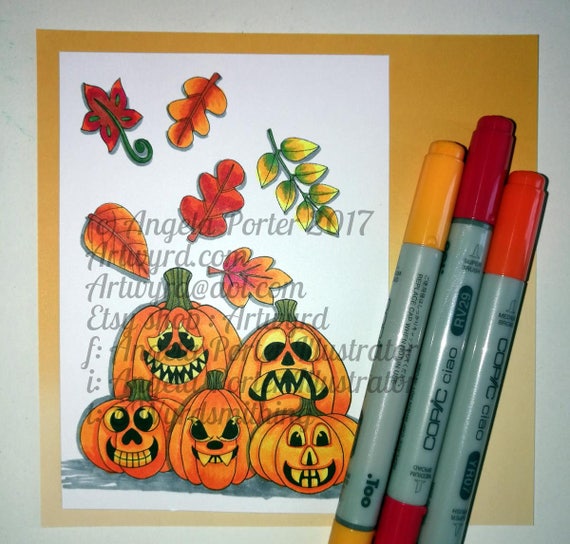
Digi Hallowe’en Pumpkin Stamp set

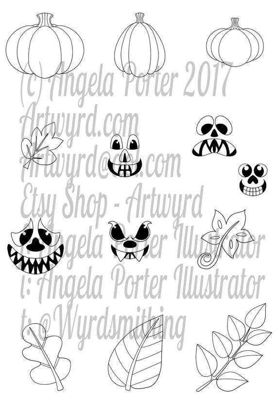
I have a set of 13 digi stamps with a whimsical Hallowe’en Pumpkin theme available in my Etsy shop, Artwyrd.

The set includes :

  • 3 pumkins without faces
  • 5 faces to add to the pumpkins or any other images you wish ( spooky eyes in the dark, on monsters, ghosts, aliens…your imagination is the only barrier!)
  • 5 leaves to use to create an autumn/fall scene with or without the pumpkins

Use them to create cards, or to fill a page with images for a custom colouring page, or any other craft you can think of.