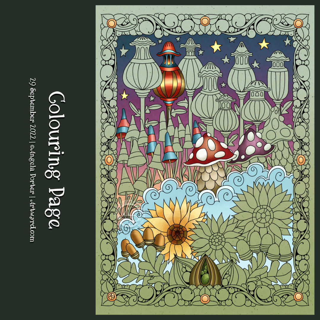
I drew this colouring page for Angela Porter’s Coloring Book Fans Facebook group this morning. It definitely has a fair few autumnal motifs; however, any kind of colours could be used!
I’ve partly added colour to the design, mainly to highlight some trickier areas with lots of detail.
Today was a day to draw some mushrooms! I do love them, especially the quirky, whimsical and cute ones. These fit the bill, I think, a little resplendent in their autumnal tones.
As far as I’m concerned, I don’t think there is such a thing as too much whimsy or cuteness. Ever. Though I may seemingly stray away from things cute and kawaii from time to time, it’s not long before I feel the pull to add some more whimsy to this worrisome world.
There’s such a huge variety of fungi on the Earth, so much inspiration to draw from. But today, I kept it fairly simple.
To add colour, I used Inktense pencils with a Kuretake Zig water-brush. Oh, and the ‘frame’ was coloured with iridescent gold watercolour paint. And that gave me the perfect excuse, not that I needed one, to scatter some gold dots around the background. Oh, the white dots on the ‘shrooms and foliage were applied with a Sakura white Soufflé pen. Its opaque white ink is perfect for this job, especially as it doesn’t seem to pick up any underlying colours. Must remember to get some more of them.
Here’s this week’s template, full of whimsy and smiles. I’ve combined some of my favourite things to draw – flowers, foliage, fish and fungi! This time, I have sky-fish swimming in a sky filled with happy bubbles above a garden. And why not? This is my world of whimsy after all.
Sky-fish. Who would’ve thought it? Well, apparently I did, and no doubt many, many others too.
Thursday is the day I gift a colouring template to the members of Angela Porter’s Coloring Book Fans Facebook group. I know that not everyone uses Facebook, so I am working up the oompf to sort out a mailing list, so please bear with me while I do that.
This week, it’s a right feast of funky fungi, with some flowers and foliage thrown in for good measure. As far as I’m concerned, in my inner whimsical universe, all fungi are funkily coloured! And I had a lot of fun working with colour in this one, as well as a new brush or two in Clip Studio Paint.
Today’s Pattern Exploration Video
In today’s drawing tutorial video on YouTube, I take a look at Ansu by Lori Manoogian CZT. It’s a rather versatile tangle pattern that makes lovely flowers and foliage for sure.
I spent some lovely time this morning starting to draw this week’s coloring template. I decided to edit some oopsies and add some colour to the part I drew in today’s video.
It was fun to use a different kind of digital brush than I usually do to add colour. There’s a lot more texture that is a little like watercolour. I definitely need to spend more time with these brushes, and others, to understand them though.
Still, after a late breakfast, actually lunch as it’s now midday, I’ll finish drawing the template.
Thursday comes around quite quickly, and with it comes a new coloring page, or coloring template if you prefer, for the members of the Angela Porter’s Coloring Book Fans facebook group to bring to life with colour.
This week is a fabulous fungi fantasia. I really enjoyed drawing this one, and adding colour really brings it to life. I’ve chosen rather bright, almost psychedelic colours, as is often the case! So, I’m intrigued to see how others will use colour magic to bring the drawing to life.
The design was drawn with a Tombow Fudenosuke pen on marker paper. This version is coloured digitally in Clip Studio Paint.
Here’s the link to a timelapse video showing the drawing of this template.
Mushrooms. Lots of mushrooms. A sketchbook page full of simple line drawings of mushrooms drawn from memory and/or imagination, some brightly coloured with Ecoline watercolour ink.
This page was a lot of fun to draw. I wasn’t aiming for realism or detail. It was all about drawing simple, stylised, imaginary mushrooms. I planned to add colour to bring volume to the drawings.
As I used imagination to draw these whimsically wonky mushrooms, it was easier to give myself permission to forgo the pressures I put on myself to be realistic in adding colour. I could use whatever colours I wanted to for each mushroom, I could be as stylised as I wished about the colour too.
Adding colour in this way is easy when I add colour to my coloring book pages/templates. As these pages are stylised, I can add colour in a simpler, more fun way. This is especially true for my Doodleworlds style of art.
Transferring that mindset to my drawings from nature, architecture and so on isn’t quite so easy for me. I still hear that critical voice of ‘It’s not good art if it doesn’t look like photograph or like the real thing’ in my head. This is a message that is repeated to us time and time again from our earliest days of starting to draw. It was these critical messages that led to me having a belief that I was no good at art, and those messages were seared deeply into my view of myself.
In fairness to myself, I have overcome some of these critical beliefs foisted upon me by others. However, some linger and rise up from time to time. I suspect their influence is most noticed in my lack of confidence in myself when it comes to colour.
Identifying these ‘inner critics’ is the first step to dispelling them. This is a multi-step process as the inner critic is armed with many weapons to destroy my self-confidence. I’ve disarmed this critic time and time again, but it always seems to find a new weapon. Eventually though, it will run out of weapons to use.
It’s a process, a long winded process, but it’s one that’s worth doing, step by step.
I finished the mushroom painting! I was so engrossed in the magic of watercolour and wanting to complete this work that I spent most of yesterday working on it!
I’m really quite happy with the outcome. It was very much inspired by Danielle Donaldson, but I think I may have given it some little twists of my own too.
I’m also beginning to think that I can make watercolour work for me, with a mix of ‘tight’ shapes, the magic textures achieved by wet into wet, and details with gel pens and drawing pencil.
I added the dots with a mixture of white Posca, Uniball Signo and Sakura Gelly Roll pens. I also tried adding dots of gold from a metallic Gelly Roll pen. I like the metallic dots, though they don’t photograph well.
There’s only one thing better than mushrooms, and that’s more mushrooms!
I enjoyed this so much that I thought I’d do a smaller version on some of the Canson Imagine mixed media paper. That’s the work on the top left. I used Zig Clean Colour brush pens and Caran D’Ache Supracolour watercolour pencils on this one to see how they could work. I’m happy with some of the effects I achieved, but in other ways I’m not at all happy.
Surprisingly, I rather like the softer colours of the Supracolour pencils on the mushrooms at the top. I found I could get a ‘painterly’ effect with them too.
The dye inks in the Zig brush pens will reactivate with the slightest touch of water, which meant I had some interesting colour bleeds.
I think what I like most about this experiment were the different colours, particularly those peachy pink colours! I have a lot to learn about colour mixing of my watercolour set for sure!
Insects!
Well, I thought I’d have a little play around with some cute insects, the start of which is at the bottom left.
I used a 0.3mm pencil to draw the design on Canson Imagine paper and then set to adding colour with Mijello Mission Gold watercolours. I’d forgotten that I wasn’t fussed about using them on the Imagine paper. However, I carried on working with them and worked with how they interacted with the paper. I definitely wasn’t working in the prescribed way of watercolour work. But, I ended up with some effects I rather like.
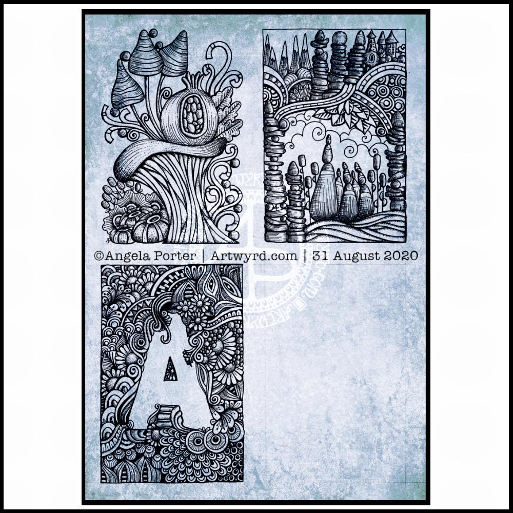
Small Art
I often revert to working on a small scale. It’s something I’ve done throughout my art journey. I’ve never really been happy with working on a huge scale, except when working with pastels and charcoal.
Even when I create A4 art, which is the biggest I do in traditional media nowadays, my artwork is full of tiny details – the size of those details varies depending on whether it is personal art or art for a colouring book.
I get a lot of pleasure from creating small, precious works of art. If I were to frame them, I’d be tempted to put the tiny art in the centre of a huge frame to give that feeling of preciousness. But that would be very pretentious of me, wouldn’t it?
I finished the top right design, and have completed the ‘A’ illustration on the bottom left. That leaves one space to be filled, no doubt later today.
I’ve used either Faber-Castell Pitt Artist pens or Uniball Unipin pens to complete the drawings on ClaireFontaine’s Paint-On mixed media paper. This paper is fairly weighty (250g/m²) and has a lovely velvety feel to it.
The only pencil lines I’ve used have been to delineate the ‘boxes’ to draw in, and for a couple of the design elements in the top left image as well as the A.
Reflecting on the designs
The white space in the top left design works really well I think, and is quite an accomplishment for me. The same is true, to a lesser extent for the top right design. In both cases, the white space brings attention to the design.
In contrast, the densely pattered area helps to bring out the monogram A, making the white space the focus of the design.
I think I’m going to work on some more monograms in this style. They are fun to do, and dense, entangled patterns are one of my signature artistic voices. It’s been a long time since I’ve completed art like this, with a lot of detail to bring out dimension/volume in the design.
In fact, I’ve enjoyed using line and stipple to add volume in all the designs, exploring how I like to do this as I go. All the work I do with colouring books means I have put this to one side. It’s interesting how I’ve circled back to this style. It’s even more interesting to look at how my drawing skills have developed and evolved over time as well.
I found some peace, contentment and joy while drawing these, and feel a sense of accomplishment, particularly with the two on the left.
Do I prefer digital or traditonal drawing?
A difficult question to answer. I think it depends on what I’m creating.
I really do enjoy using pen on paper. I get a better sense of the overall design. Paper and pen is very portable too – whether I’m sketching when out and about, or drawing in different places at home.
Drawing on the screen of my Surface Studio with a pen is a lot like drawing on paper. The smoothness of the screen makes it a very different tactile experience. It also is great for inking in sketches. It also makes correcting mistakes or re-working areas a lot easier, and there are techniques I can use that are near impossible or very time consuming when working traditionally.
Sometimes, the lines produced digitally are too perfect. I’m still working on developing the brush styles that will mimic the unevenness of an inked line. I do have to use some element of line-smoothing as I draw; without it the lines are really wobbly, but with it they can be too perfect and I lose, to a degree, that personal and unique way that my pen moves on paper.
I also find it difficult to have a sense of proportion or detail when working digitally, even though I can look at the design at the same size as it will be printed. The ability to zoom in and work on a small area means I lose all sense of relative size and complexity/detail of a design. So, if I’m going to work on a drawing digitally, I prefer to start with a sketch to give me that sense of scale.
I rarely sketch out my design when I work on paper, except if I need the outlines of a design element as I’m drawing. I do tend to work very intuitively.
So the answer is, I prefer each for different purposes, and also to suit my different moods and purposes.
Of course, once I’ve drawn a design, I then have to decide if I want to add colour, and then what media I will use – traditional or digital!