This morning I started to colour the reef illustrations I posted yesterday. I’m using a mixture of Chameleon marker pens and pencils to do this. My photograph of the work in progress isn’t brilliant, but you get the idea I’m sure.
In the larger motifs, I’m using the Chameleon Color Tones markers along with the Color Tops to achieve gradient colouring. Flat colour is added to smaller areas using the pen.
Then, I use Chameleon pencils to add depth and dimension. I’m also adding more depth and dimension by using a white gel pen and a fine Unipin pen to add highlights and texture.
I’m enjoying the process, but I must admit I’m finding it more ‘fussy’ to do than when I digitally colour! Continually swapping pens and pencils is a little frustrating for me.
Maybe that’s just today as I’m tired. I didn’t sleep at all well last night. Stomach cramps were plaguing me throughout the night, though they do seem better today. Painkillers have stopped the pain completely today; yesterday, they merely dulled it.
Also, when I woke, my mind was very active with flashbacks related to my EMDR therapy yesterday. It was a very emotional session, lots of tears and upset. However, my therapist tells me I’m making good progress. I believe her.
Today, everything seems like hard work as I’m so exhausted, not just from the lack of sleep, but emotionally too. These feelings will pass; they always do.
I don’t know how much more I’ll do today. I don’t think I’ll get a lot of colouring done. I do feel I need to draw though, so perhaps I’ll do that after I’ve done some errands today. Typical of ‘adulting’ to get in the way of self-soothing and self-care.
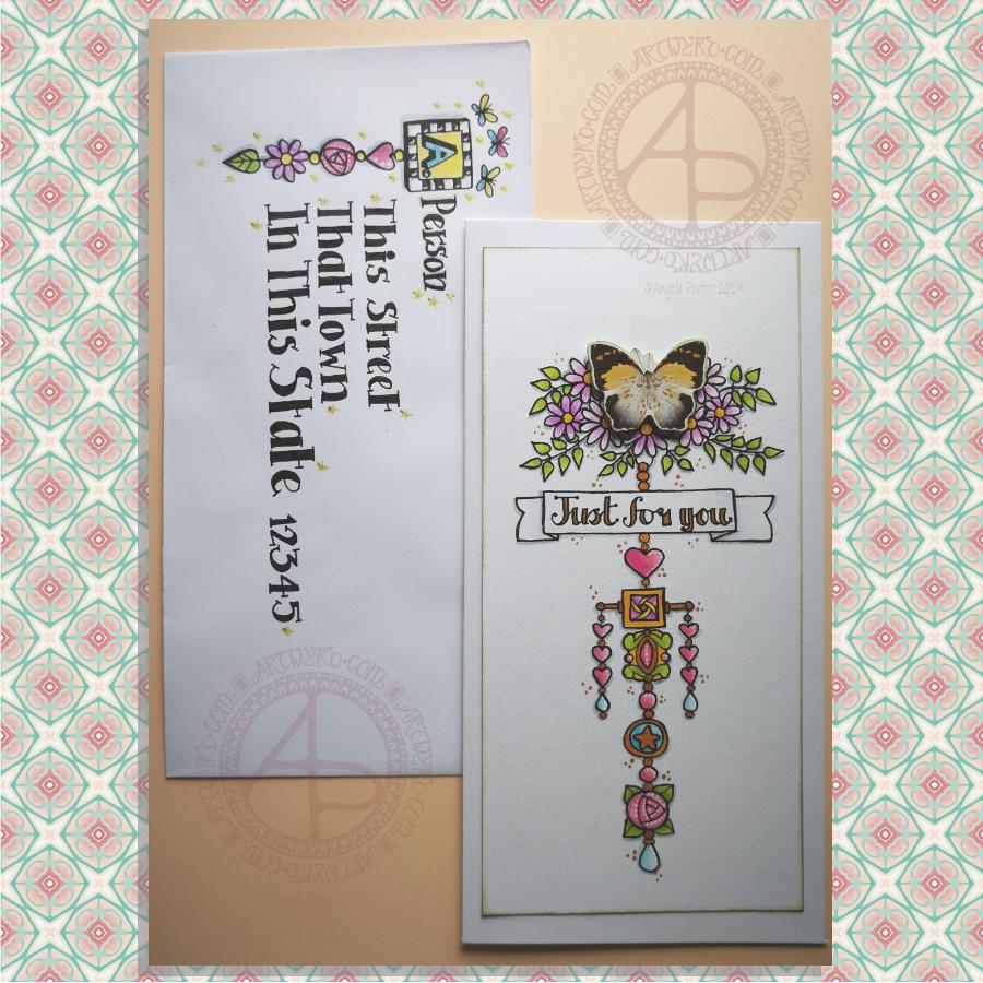
Here’s a pretty pair of whimsical and cute dangle designs card and envelope.
For the focal point of the card I used a butterfly from a pack of Ephemera from Tim Holtz called Botanical. I added some metallic gold ink highlights to the butterfly as I knew I’d be adding gold to the design. I also edged the butterfly with some Peeled Paint Distress Ink using a sponge ink applicator.
I then cut my paper to fit the card blank I wanted to use; I learned my lesson from the the last card I made! The card blank measured 8½” by 4¼”. So, I cut a piece of Claire Fontaine Mixed Media paper 7¾” by 3¾” to create the dangle design on.
I used the butterfly as a guide as to where I wanted to add some flowers upon which it could alight. I also drew pencil guidelines in for the centre of the design and the sentiment banner.
Then it was drawing the design. I used a 05 Unipin pen from Uniball.
I started by drawing the flowers at the top of the design.
Next, it was the hand lettering for the sentiment ‘Just for you’.
Flowers, hearts, stars and spherical and teardrop shaped beads are my goto choices for dangles. I did add a charm that was based on some jewellery, as well as a square charm with a geometric pattern inside it.
When I’d drawn the main dangle I realised I wanted to add a bit of width to it. So, I added two bars stretching out from the side of the square charm and used the ends to hang dangles made up of hearts and beads.
Colouring was the next task. I used Tombow Dual Brush pens to colour the design in. The colour gradients weren’t strong enough for me, so I used Chameleon Duotone Pencils to add depth to the colours.
Then, it was time to attach the butterfly using some foam squares.
I then used a dip ink pen to add some dots of gold FW Pearlescent ink around the design. I also used gold to fill in the lettering of the sentiment and various elements of the dangle design.
Next, I added white dots highlights to some of the design elements using a Sakura Souffle pen.
I also used a blue-grey Chameleon pencil to add shadows to the design at this point.
Before affixing the design to the card blank I used a sponge ink applicator and Peeled Paint Distress Ink to edge the design. That was the card done.
I then thought it would be fun to create an example of an addressed envelope using a dangle design as a monogram. I used some of the charms from the card for this design. I also drew some simple, whimsical butterflies above the monogram. I used Chameleon Duotone Pencils to colour the dangle design and to add a shadow to the dangle.
Pencil guidelines helped me to keep my lettering evenly spaced and of a consistent size. In this case I just guesstimated them, but in future I think I will need to measure the spacing of the lines!
Finally, I added some glittery golden stars with a gold glitter Uniball Gel pen as well as some white dot highlights using a white Sakura Gelly Roll pen.
One thing I realise I didn’t do was to make the colours in the dangle more harmonious with the butterfly. The color tones of the butterfly are quite antique and grungy and I used rather bright, clean colours to colour the design with. I also am not happy with the monogram on the envelope; it’s too small and the lettering style doesn’t seem sympathetic to the rest of the lettering.
I’m going to put these down to me still suffering the lingering effects of the stinking cold I’ve had for the past three days. It’s definitely broken now, but I’m still not 100%.
It’s also a learning experience. I’m not a wonderful card maker; I do dabble in it from time to time, however dangle cards are fun to make and with the decorated envelopes it’s double the fun! I think I need to start sending happy mail to people! I’d be happy to receive this card with a letter inside – how would you feel about it?
A couple of days ago I was musing about using a photograph instead of a monogram in a dangle design. That idea stuck with me and so I set out to make a card.
I had seen somewhere the Photobooth Ephemera by Tim Holtz and I was able to source a set at a sensible price. This pack contains thirty strips of three passport-sized, vintage, copyright free photos. Perfect for me as I have very few photos and none are a small enough size to be used in this way. Also, the photos are printed on fairly sturdy card.
I first started by trimming the photo and then tracing around it on a sheet of thick white printer paper. It was then easy to draw pencil lines to give a border or two around the photo as well as a pencil guide line for a central dangle.
My next job was to draw the flowers at the top of the design. I started with the big central blue flower and worked my way out, adding leaves and swirls as I went. The design here is symmetrical, but not perfectly so. I had to add some butterflies to finish this part of the design off.
My next steps involved drawing the borders. I wanted a black and white chequerboard pattern around the photo. I also added a thinner border around it.
My next step was to create a ribbon for the hand lettered sentiment ‘Hello friend’. I drew a pencil box, added some pencil guidelines for the height of the letters, then wrote the greeting in pencil so I could get the placement of the letters good enough.
My next step was to ink in the letters using a black Sakura Pigma PN pen, which I used for the rest of the drawing. I wasn’t concerned about perfection here. I wanted a kind of cutely whimsical feel to the lettering. For some reason, I always think adding wonky and uneven serifs to the letters helps a little with this. The final job was to draw the ribbon box with the cute ends.
I then needed to decide on the charms I’d use to build the dangle. Hearts are a foregone conclusion. When I think of time I spend with friends, tea and cake are often involved, so adding a coffee/tea cup along with a cupcake (or fairy cake as we used to call them here in the UK) was perfect. I joined the charms with small beads and a circular charm containing another heart.
To colour the dangle design I used copic markers. I did use two shades of pink for the greeting and the cupcake case. Everywhere else I used just one flat colour.
I used a fine brush and some black ink to fill in the square at the centre of the design. Next, I trimmed the paper around the design. I then used a foam ink applicator with Vintage Photo Distress Ink to edge the paper. I always feel that edging paper in this way not only gives a little bit of a vintage feel to it, which is in keeping with the photo, but it also gives a finished edge to the paper.
To mount the photo here I used some adhesive foam squares. These lift the photo above the paper, adding a little bit of dimension to the card. The photo was a little bit smaller than the square I’d drawn and so the black background gave black border around the photo. I then used a golden yellow copic marker to colour some clear adhesive gems and I attached three of them to the photo, just to add a bit more sparkle.
I used Chameleon duotone pencils to add shadow to the design elements. I also used a dip pen and gold FW ink to add some little dots here and there around the design as well as on the photo. Not sure that on the photo was such a great idea though. But once the dots were there, they had to stay there. The gold dots, however, did match the gold gems I’d added to the photo.
The final step was to affix the design to a blank card. I didn’t think to cut my paper to the size of blank cards I had in my stash before I started to work on the dangle design. I found that my design was too long. So, I just took a piece of A4 bristol board, folded it in half along the short edge. I burnished the fold and then attached the dangle design to the paper using strong double sided sticky tape.
To add a bit more dimension to the card, I could’ve used foam squares or a piece of fun foam cut to a little smaller than the paper the design is on. Fun foam would support the paper better, especially as I had a relatively weighty photo adhered to the paper already.
Instead of foam, I could’ve cut a piece of metallic card a little bigger than the design to give a metallic edge to it.
I decided, though, that there was enough dimension on the card with the photo.
I also could have used a Wink of Stella brush pen or a Spectrum Noir sparkle pen to add some shimmer to the design elements, but I decided that the gold dots were enough. However, I may go back and add some to the butterfly wings; butterflies should always shimmer and shine wherever possible as far as I’m concerned!
The only other thing I’d need to do is to make a custom envelope to fit the card.
I enjoyed making the card. My card making skills aren’t brilliant, but I kept it fairly simple, as I did for the dangle design itself and the colouring.
Oh, the patterned background for the photo is one I created from one of my mandala designs using Repper Pro, just in case you were curious! I thought it’s vintage feel would go nicely with the card.
On the whole, I’m quite happy with this card. I had serious doubts that it wouldn’t work out. It has, better than I thought it would. I think I need to make more of these in the future!
Another quote from Terry Pratchett. This one from one of my favourite characters – Death. Death tries so hard to understand humanity, yet he gets it both very wrong and quite right at the same time.
I like the way I’ve added colour to my black and white line art in this example, but one day I hope to get around to colouring in the black and white version.
Maybe I’ll print the art out and then colour it in using Chamelon Pen’s ColorTone Pencils, which arrived yesterday.
I have spent some time colouring with them and so far I quite like them.
They are softer than Polychromos and others, but not quite as soft as Prismacolours. They blend quite nicely, and a little help from a blending pencil results in really nice blends.
I like the colour palette; the colours are nice and bright and just the colours I love to use in my art, which is a huge, huge bonus! As I often struggle to choose and use colours in a sensible manner when I have a huge choice, the limited palette of 50 colours is really useful for me, as are the double ended pencils. Being able to flip to add shadow or light is a nice touch, though I would like a bit more contrast between some of the colours as some are a bit too similar.
The leads are a bit thicker than other pencils, such as Prismacolours. However, this makes the barrels of the pencils a bit too thick for a standard pencil sharpener. My Staedtler pencil sharpener – the ones with the handles that you turn around – should cope well with them though.
At a price point of £45 on Amazon.co.uk with free prime delivery I think they’re good value for money, even though you essentially have 50 half-sized pencils. However, the thicker colour leads make up for that to some degree.
I’ve not been able to find out if you can buy individual pencils when some wear down. However, I can’t see that being a big issue as I suspect that I’ll use most of the pencils fairly equally.