
Wishing each and every one of you the very best of the season’s blessings, not just for the seasonal holidays, but for each and every day ahead of you.
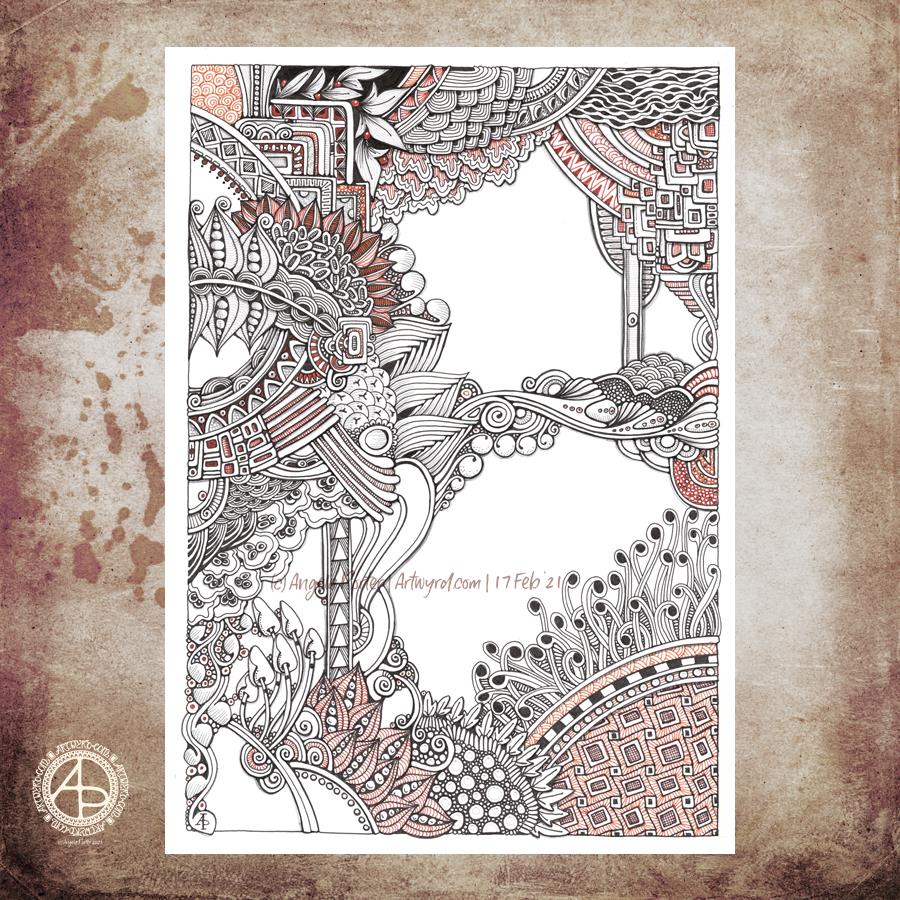
I’ve been working on this drawing for the past three or four days. I finally finished it this morning. Here’s a list of materials used:
A4 Daler-Rowney Bristol Board
Copic Multiliners (05, 025, 02)
Sakura Pigma Micron (01)
Various shades of brown Stabilo fineliners
Grey and sepia Uniball Unipin fineliners
I’m finally becoming comfortable with leaving open spaces in my art, though I still do like a clear border/edge. The spaces give a lighter, more airy feel to the design. I’m learning that I don’t have to fill every available space with pattern. I think that is a good thing.
I’m also really enjoying using shades of brown to add patterns to the design, and some grey too.
If you’d like to know where I started this drawing, it was with the small arrangement of boxes just above the blueberry-ish berries just above the left of centre. Everything else grew out from there.
I think this one is finished, though as I look at it now, I want to use a white Gelly Roll pen to add dots in places. Also, the shadows need to be tad intensified around the motifs to give the illusion of depth. I may use alcohol markers – Chameleons or Copics – to do this as the Copic Multiliners are alcohol ink safe.
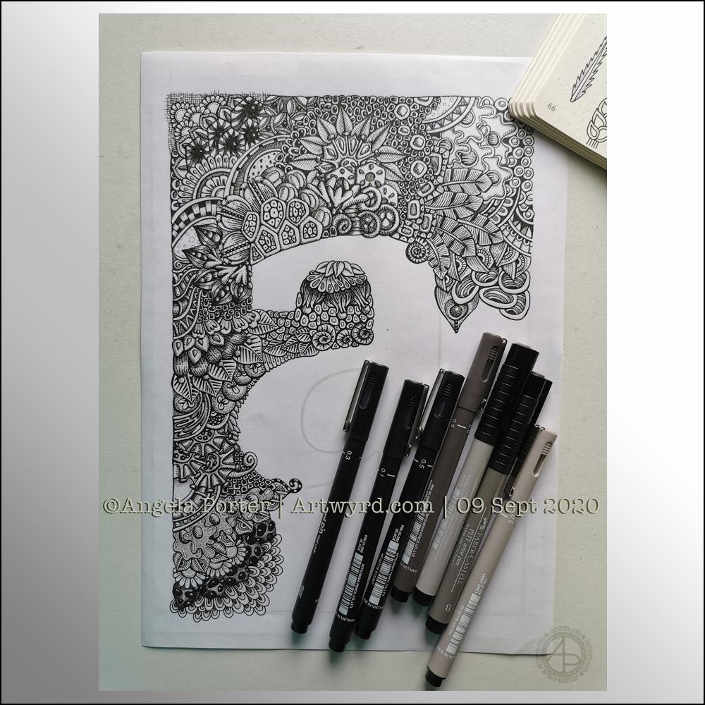
Wednesday is work in progress (WIP) day. So, I thought I’d share my monogram “a” and the progress I’m making on it.
There’s a clutch of pens there! I decided to see if I could add grey to heop areas of the design stand out more, as well as adding some depth and dimension. I figured I had nowt to lose if I tried as the the design was becoming all much of a muchness to my eye. Looking at the image above, it seems to be working well in some areas!
I started using some grey unipin pens to add shades of grey to the design. They worked kind of well enough, but they were picking up pigment from the black and moving it around.
So, I thought I’d see what greys in Pitt Artist Brush pens I had and found some warm greys. They worked better as the colour could be laid down more smoothly.
I do have some new motifs to add to my visual dictionary, a corner of which you can see at the top right of the photo.
I’m not sure if I like adding the greys more than if I don’t add them. I suspect I’ll like them more as I work with them as I love the sense of volume that has appeared in various areas thanks to the contrast they confer on the design.
Let me know what you think – drop me a comment.
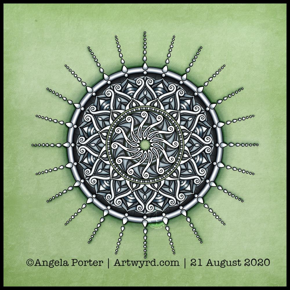
Today’s art is a simple mandala. A cool grey, black and white colour scheme on a soft, calming green background.
Drawn in Autodesk Sketchbook Pro using a Microsoft Surface Slim Pen and Microsoft Surface Studio.
I am emotionally drained, confused and overwhelmed again today. I don’t have much in the way of focus. I was surprised I could complete even this quick and simple mandala.
I don’t have the focus or energy to reflect on the choices of colours and symbols in the mandala and how they relate to messages bubbling up from my unconscious mind.
I feel trapped, caught between a rock and a hard place. I’m damned if I do, damned if I don’t. The stress of it all is giving me a migraine, upset digestive system and is dragging my mood downwards.
Heck, even the mandala looks like it is either sinking down, pulling itself up or hanging on by the chains of teardrops. That is how I feel, and I had no idea that was how the mandala would appear when finished.
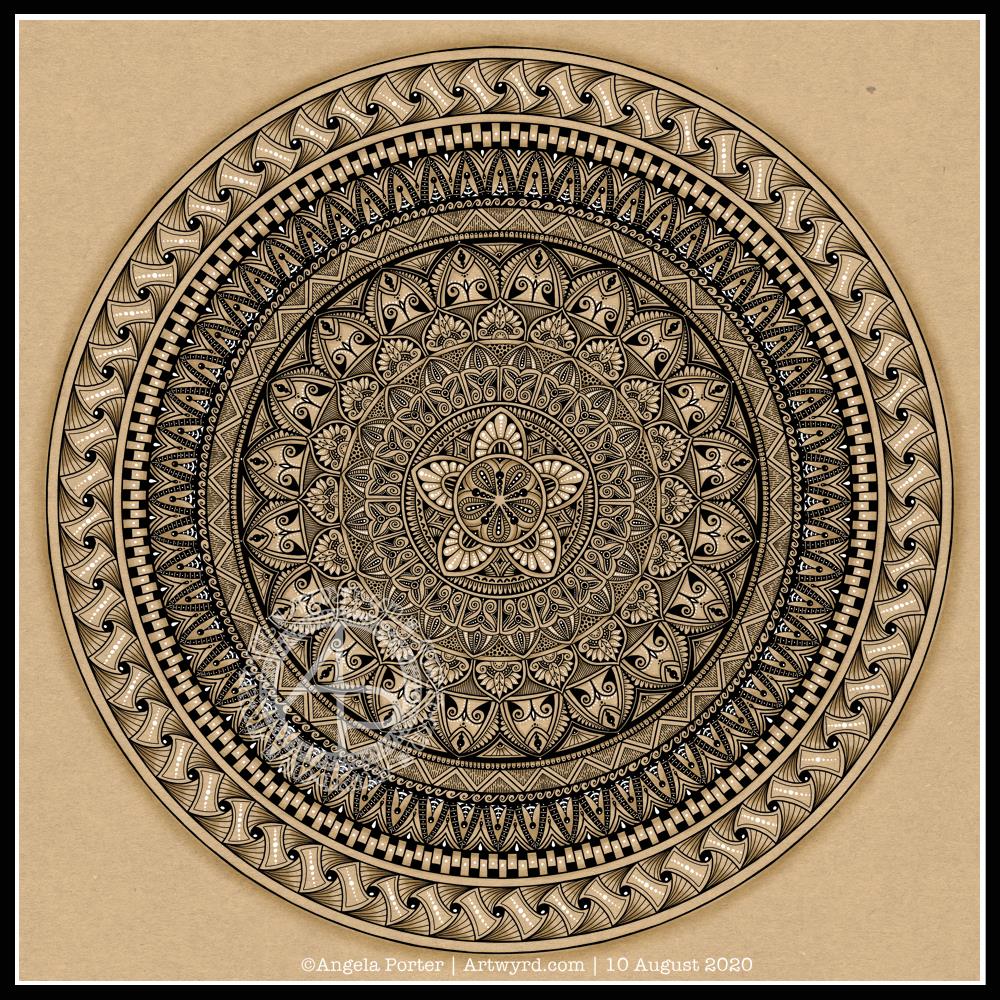
I actually started this mandala yesterday morning, but I did most of the work on it this morning.
Black, white and craft paper, with some warm grey shading to help to bring out a sense of volume to areas of pattern.
The number five.
I chose, to start with, five-fold symmetry.
The number five symbolises balance and harmony. It also can represent freedom, independence, adventure, curiosity, intelligence, individualism, courage, and important life lessons to be learned from your experiences.
Five can also be symbolic of a problem, but there are solutions to the problem. As five also symbolises inner wisdom, the solution comes from our own inner wisdom. Once a solution is identified, then a plan of action needs to be developed through passion, emotions, ideas or work. Then it needs to be followed through.
Star symbolism
The central motif of the mandala is reminiscent of a five-pointed star.
Stars are symbols of guidance and are often considered protective symbols. They are also associated with wishes, mysteries and magic. Most often, they represent something that is good, beautiful or positive. They are symbols of hope, truth and spirit.
The colour brown
Brown is a natural colour that evokes a sense of strength, approachabilityapproachability and reliability. It is often associated with resilience, dependability, security and safety.
Feelings of loneliness, sadness and isolation can also arise with brown, especially when used in large amounts, like a vast, expansive rocky landscape or desert. But it also can bring to mind feelings of warmth, comfort and security as brown also represents a hearth, the heart of a home, and so it represents a deep connection to one’s home.
Of course, brown also represents connections with the earth and so nature. It is a wholesome colour.
Symbolism and my art
I’m finding looking into the symbolism of numbers, colours and motifs quite interesting. I don’t often think overly hard about the colours I use when I create art, especially my daily ‘warm up’ art practice.
However, it is interesting to look at the meanings of colours, motifs I choose and how they relate to what I am currently experiencing on a personal level.
Yesterday, I was out with the DSLR and my friend Liz. We had a need to visit the sea. As we live in the Valleys of South Wales in the UK, we’re not far from either the sea or mountains, towns or country. So, we paid a visit to The Glamorgan Heritage Coast, specifically Southerndown and Newton in Porthcawl. If you’d like to read more about our day out and see some of my photos, visit Curious Stops and Tea Shops.
Today, after a busy week with people and errands, I need a day at home. I also needed some time to just create.
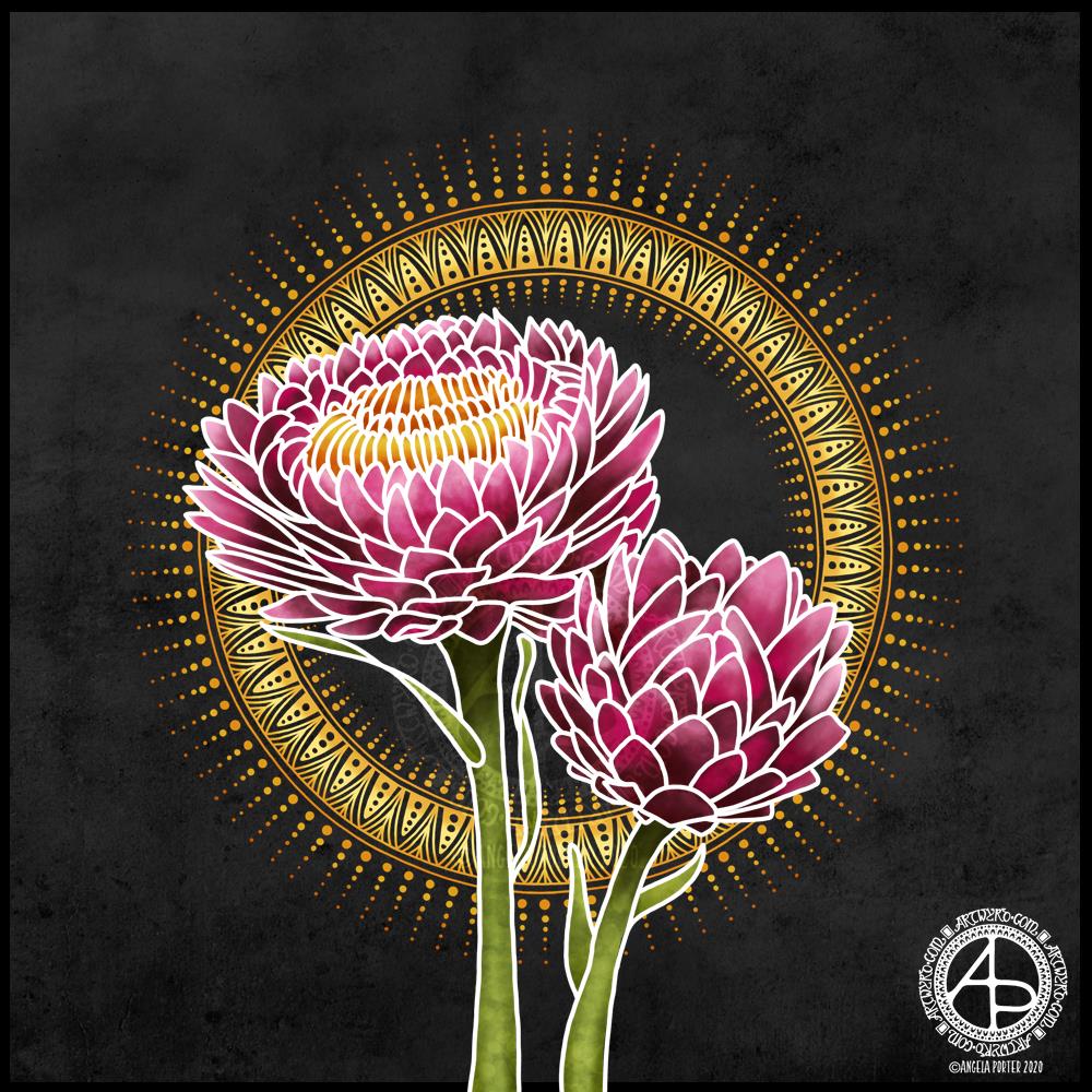
I turned to my folder of photos from my trip to the National Botanic Gardens of Wales last August and found a picture of flowers that inspired me to create this floral design.
I started with the line art with the intention of using it as a guide for painting each petal. However, once I’d completed the line art and added the base colour and some of the brighter tones, I realised I wanted to keep the white lines because it was reminding me of batik or silk painting, particularly as I’d chosen a black background to work against.
I love the vibrance of the colours against the dark background, again very reminiscent of silk painting/batik.
I reined in my usual inclination to intricate, detailed mandalas and kept this particular one quite simple. I decided to echo the golden tones of the stamens in the centre of the flower, and I think that has worked out really, really well.
If I were to try to change something in this artwork, I may try a gold outline – metallic gold. But I like it very much, just as it is.
My tools were Autodesk Sketchbook Pro, Microsoft Surface Studio and Microsoft Surface Slim Pen.
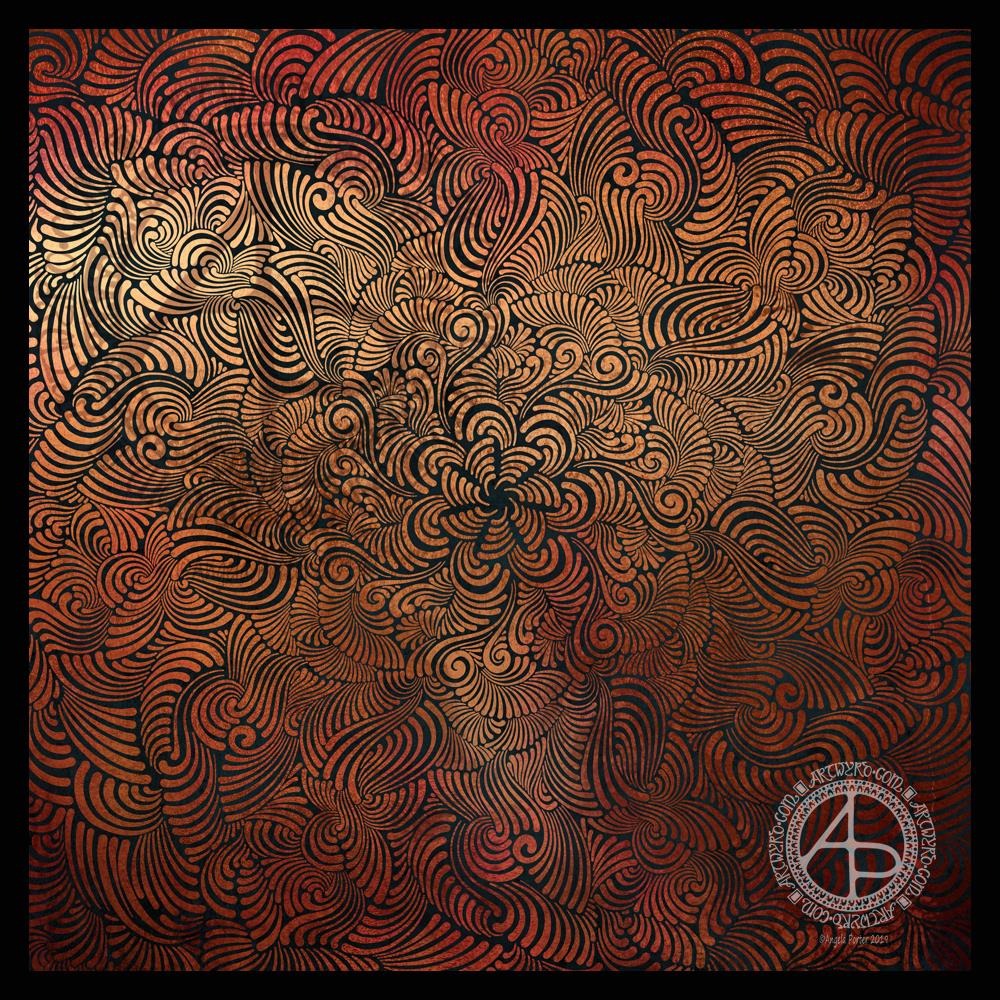
Seven plane symmetry, using a flexible nib pen to carve through black to reveal the design in copper. Done digitally using Autodesk Sketchbook Pro, Microsoft Surface Pen and Surface Studio.
I really have been enjoying creating this kind of design lately and I make no apologies for showing so many that seem to be similar. I find creating these so soothing and calming.
Here, I wanted to see how a metallic background texture would work, and it does really well, just not on WordPress and how the website shows images. The colours never seem to be as vibrant as they do elsewhere.
What I love about this process is that I have no idea of what the end product will be. It’s all about being in the flow, working intuitively, and trusting my skills and creativity.
Often, I’m so zoomed in to the section I’m drawing I’m not aware of how the overall design is looking and working. That means I really do have to trust my instincts, and trust that it will all fit together to create a satisfying end result, and I am happy with it.