Abstract Entangled Art | 03/08/’21

This is now finished! Between drawing, adding colour and embellishments, it’s taken somewhere between six and seven hours, I think.

Materials used:
* SeaWhite all media paper, 8″ x 8″ (195mm x 195mm)
* Uniball Eye Pen – micro
* Uniball Signo DX 0.38 Pen
* Derwent Graphitint pencils
* Brushes and water
* Derwent Drawing Pencils
* Cold Grey IV Pitt Artist Pen
* White and yellow Sakura Soufflé pens
* Clear Sakura Glaze pen

I actually managed to keep some white space in the design! I may have slightly overdone the dottiness. I did mess up by trying to use the Derwent Drawing pencils to add some darker tones to the green ‘leaves’.

Overall, I think this is good enough to move on to the next project, which is likely to be Thursday’s coloring template.

It’s been nice to lose myself in some art for the sake of art. Especially as my emotional weather is still damp, dull and grey and making me doubt myself. It’s been an emotional rainy spell that’s been brewing for a while, and that’s why I’ve returned to the familiarity and comfort of my entangled art.

I always circle back to entangled art, regardless of my experiments with other media and styles and getting frustrated with colour!

My tricksy emotional weather is only exacerbating my frustrations with colour. I know I need to get the coloured plates done for the Whimsical Cats colouring book, but as I am at the moment I will only get myself into a right royal kerfuffle. So, it’s time to just enjoy drawing, maybe using some colour – time for monochrome colour schemes I think.

Blessings

Wibbly-wobbly sculptural columns and arches surrounded by layers and layers of abstract bubbles, ripples and swirls of thoughts, wishes, blessings. Well, that’s what came to my mind as I added the architectural details.

No highlights, no sparkle, limited pattern and texture. Just flowing line work, for the most part. I’ve even left some ‘white space’ in the design, which is becoming less unusual for me.

Rounded arches with patterns reminiscent of Romanesque architecture. The columns are, however, more delicate, which is more reminiscent of the move towards Gothic architecture. Both forms or architecture have long been a source of artistic inspiration for me.

Soothing, relaxing and meditative to draw. Circles and spirals, arches and patterns are always comforting and endlessly fascinating to me.

Drawn using Faber-Castell Pitt artist pens on paper coloured by PaperArtsy Fresco paints. The drawing is approx. 2½” x 6¾”.

Art Quote

Artwork (c) Angela Porter | Artwyrd.com

This is a drawing I did late last night as I settled down to sleep. It feels quite disjointed in places, which was how my mind felt in it’s state of tiredness. Even though I was tired, I wasn’t ready to sleep.

I thought I’d work with it, adding a background and colour to it. I wonder if adding colour will resolve the disjointed areas as it breathes life into the design.

I’ve only taken a short time this morning to ad some colour. I do have to do other things today. The colour certainly helps to lift it from the background, as well as adding dimension to the design.

I’ve chosen fairly dusky, dusty, pastel colours which seem to glow against the darker background. The pinks remind me of faded Victorian velvets.

I drew the design traditionally, using a Tombow Fudenosuke pen and ClaireFontaine dot grid paper. The flexible nib of the fudenosuke pen results in lines of varying thicknesses, and a drawing that reminds me of linocuts or woodcuts.

After scanning the drawing, I removed the dot grids and cleaned up the drawing digitally before adding a background.

I felt this needed quote to go with it, and this one spoke to me today. For the typography, I used Affinity Publisher. The rest of the digital work is being done in Autodesk Sketchbook Pro, using a Surface Pen and Surface Studio from Microsoft.

My art is always ‘pretty’, it’s how I express myself artistically. Some of my inspiration for patterns and motifs comes from things that other smay not consider ‘pretty’, such as rust, run down old industrial machines, ruined buildings.

My art does, I think, speak of who I am. It shows what I’m interested in, what patterns, motifs, shapes, textures, colours, and so on that I find aesthetically pleasing. It also shows, to those who look and think a bit deeper, what things interest me, from prehistoric art to Romanesque architecture to La Tene and Celtic art to Illuminated Manuscripts to flora, foliage, fungi, and lichen to fossils and shells to nature in general, and more besides.

I work very intuitively. It’s when I think too hard about what I want to do that things go to wrack and ruin.

By letting my intuition flow, then drawings have a way of coming together in a way that expresses how I’m feeling and what is fascinating me or soothing me at that time.

This drawing is an example of how my feelings come out. It’s only now I can recognise how disjointed I was feeling within myself last night, how I was out of sorts. I think that’s why the art jars with me today as that feeling has now passed by, like clouds in the wind. It’s a drawing that shows the weather my emotions were experiencing yesterday, weather that just happened and has no real source for it.

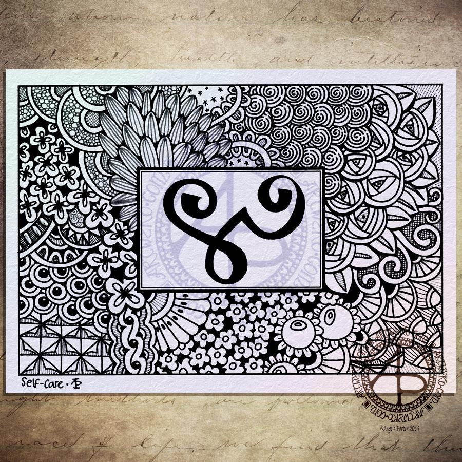
Self-care

©Angela Porter 2019 - Artwyrd.com
©Angela Porter 2019 – Artwyrd.com

I drew this one with Uniball Unipin pens using both black and dark grey pens, though the difference betwixt them hasn’t shown up all that well in the scan and the digital wizardry that followed to add colour, texture and watermarks!

The glyph in the box is the Zibu symbol for ‘self-care’. Most appropriate for me today as I’m reeling more than a tad from yesterday’s EMDR session. I keep thinking I’m ok, then I get overwhelmed by a wave of sadness, despair and such like. The wave eventually passes and I feel ok, but a tad light headed. Then, the wave returns …

I had some appointments this morning and after a quick lunch I thought I’d draw something small and found this blank postcard template in my pile of stuff, with the symbol already drawn upon it.

I’m not entirely sure I’ve done a good job with this one. The overall design has a feeling that it is disjointed, that the parts of it don’t flow from one to another at all easily. It feels stilted and stiff.

Perhaps that is just how I’m feeling at the moment and I’m just projecting it onto my artwork.

As I said the EMDR yesterday had me reeling both yesterday and today. My therapist took up the role of ‘blind therapist’ where I chose a memory that is too difficult for me to speak about, and we just went with the emotions, feelings and thoughts about myself as the EMDR session progressed.

There were some observations made yesterday that were quite upsetting, okay very upsetting to me. They’re not something I can talk about at the moment.

Even though it’s upsetting, I still think progress is being made. That is all that really matters at the moment, I think.

Monograms M and G

Yesterday was a day where I was out of sorts for some unspecified reason. Drawing little, intricate bits of art was the only thing that helped to soothe me and calm me. Along with comfort eating, which was not good way to cope.

I get days like this. I have no idea what triggered this response. It may have been a visit to my accountant on Tuesday and the tax bill to pay – I have absolutely nothing to worry about with either, but dealing with finances is a trigger for the anxiety and depression that are part of my cPTSD.

I know I was on edge about the meeting, even though I knew there would be nothing to worry about. The anxiety had been gradually growing through the previous few days. This anxiety provoked the warning signs of an incipient migraine/stress headache on Tuesday morning. Luckily I caught it in time with painkillers so that it didn’t develop into a full blown migraine and after the meeting I was left tired but feeling more at ease.

Yesterday, the anxiety ramped up again as I went to get the paperwork and bank card to make the payments. So, yesterday I needed to manage my anxiety and tiny, intricate drawings were what was needed.

Today, I know I have to do these things, and I will. I don’t have the anxiety I had about them yesterday. I think yesterday was just too close to a few days of spiralling anxiety as accounts day approached closer and closer.

cPTSD can make doing the simple things in life far more difficult to do. I do get things done, though I do have to be kind to myself at times, making sure I have plenty of time before the deadline.

I used fountain pens on white paper to draw the designs. The M is on paper that is around 4″ x 4″, the G is a little narrower than 4″ for some reason.

After scanning them in, I did a bit of digital wizardry to fill the letters with a gold foil texture, just to see what it would look like, and they look OK to me. I’m not too keen on the black line around the G though. I do like the contrast of the golden letters and the black and white designs around them.

Today, I have to colour the cover for my next book for Dover Publications Creative Haven series. And keep warm and safe. I woke up to a lovely sunrise with a frosty world – everything was covered with white. I know the temperature was down to -3ºC last night as I came home around 10:30 pm, and it would only have got colder as the skies were clear and starry. It’s beginning to go now, but clouds have covered the sky.

The frost is beginning to disappear now, but clouds have covered the blue skies. Snow is forecast for a bit later on today. I like to see snow. I like the way the world falls silent in heavy snow as it seems to muffle the usual background noise of modern times. I’m wise enough to know that for me to go out in snow is never a wise idea; I tend to slip and slide and fall and hurt myself. So, as I have nothing pressing that requires me to leave home, I’ll be staying safe and warm indoors! Once the cover is coloured, my attention will go to February’s templates for the Angela Porter’s Coloring Book Fans Facebook group. Someone there has asked for some simpler templates like my dangle designs, so I think that’s exactly what I’m going to do!

K monogram

©Amge;a {prter 2-19

I wanted to start my arty day with some intricate fountain pen drawing, and this is the result.

I didn’t draw on coloured paper though. I tried on some parchment paper from Manuscript, but the ink smudged so easily…so I thought I’d try some mixed media paper from Claire Fontaine, and I still had some faint smudging, but not as much as on the parchment paper, so I worked with it, knowing that I’d be able to clean it up digitally, which is what I’ve done.

I also added a coloured background to the artwork, trying to mimic the parchment paper. I think I’m going to have to scan those papers in to create texture backgrounds I can use digitally.

I kept the monogram shape really simple, though as I look at it now there’s space inside for some embellishment – maybe a bar or two with finials or beads on, nothing fancy though. Mind you, I’d love to add gold leaf to the borders and colour to the K as well. Maybe something I can do sometime in the future, with another monogram styled like this one but without the ink smudging that I could only remove digitally.

Note to self:-
use paper that fountain pen ink will dry thoroughly on, on bleed
on and won’t smudge easily!

I enjoy the tiny, intricate drawing as well, it is something that brings a gentle smile to my being.

Oh, I did use fountain pens to draw with. I used a broad Kaweco pen for the outlines of the letter and boxes. I then used a fine point Kakuno pen by Pilot for the patterns.

Yesterday I paid a visit to a stationers in Cowbridge called The Pencil Case.

There were lots of oohs and ahhs and wows from me as I browsed around and picked up a fair selection of pens and pencils – a pink Brunnen fountain pen, a teal Faber-Castell Poly Matic 0.7 automatic pencil along with a couple of cases of 2B leads, some spiral pen/pencil grips by Tombow, an set of coloured Pentel Energel pens (12 pens in fabulous colours!), and an R2D2 fountain pen from Shaffer!

I know, I have a problem!

I had a lovely chat with the lady in the shop (whose name I’ve forgotten) about stationery, pens, drawing, teaching and so on. We also experienced a huge bang as a car collided with a big van outside the shop. We weathered the ensuing drama quite well, all things considered.

My pen stash has some lovely new additions, especially the R2D2 pen! If you didn’t know, I love Star Wars, amongst other things.

I’ll definitely be visiting The Pencil Case again, and I’ll be using the pens, fountain and Energel, to draw with alongside my other fountain pens.

Monday, monday

Angela Porter 24 June 2018 Love Yourself watermarked

Rainbow verdigris

I really need to learn to take better photos!  This doesn’t do the artwork justice at all, neither does the curled paper.  If I manage to take a better photo I’ll update it.

*Update*  The image on the left is a scanned image – the iridescence and metallic sheen are lost in the scan, but the image is clearer.

There are patches of textures ‘verdigris’ which has a rainbow iridescence on them, as well as similar colours and patterns elsewhere.

The background shimmers with copper and other iridescent colours, over a soft, chalky coloured surface achieved by using Distress Oxide inks.

I loved the background so much that I really didn’t want to work over it. However, this morning I decided to be brave and to wield a Pebeo Posca black pen to draw circle patterns on it, with the aim of adding colours that would be reminiscent of verdigris on copper.

I think I’ve achieved that in some small measure, and perhaps in a different way.

I learned a lot of things along the way, not least of which is to paint the circle BEFORE I add patterns to them with a pen!  What I may do is prepare sheets of paper with the colours on I want in the circles, draw the patterns on them, cut them out and then collage them on the background to give a more 3D look to the art.

Art is all about experimentation, learning when things don’t work out as you’d like.  However, when things don’t turn out or you think you’ve made a mistake, learn to accept it as a ‘creative opportunity’ and work with it.  There are many ‘creative opportunities’ in this mixed media piece!

Media used:

  • Distress oxide inks
  • Perfect Pearls
  • Liquitex, Decoart Media and Pebeo Dyna iridescent and metallic acrylic paints.
  • Posca pen
  • Stencils by Prima
  • Fresco paints by PaperArtsy
  • Rusty Patina paints by Imagination Crafts
  • Inktense pencils from Derwent