Meh. Just meh.

Sunday morning art

I wasn’t in the mood to continue with the watercolour work in my sketchbook, soI made some Distress Oxide backgrounds on some Bristol board (5.5″ x 4″). I thought I’d do some intuitive drawing on them using metallic gold ink. So much for what I thought I’d do.

Brush and FW pearlescent Mazuma gold liquid acrylic and a brush didn’t work for me. I was getting frustrated with it. So, I tried a gold metallic Gelly Roll pen, which also didn’t feel right. I followed this by a white Gelly Roll pen, a gold glitter Signo gel pen, and finally a black Pitt Artist pen, none of which allowed me to feel I could settle into some art.

Whatever I did I just wasn’t happy with. It seems that this morning I’m not meant to be doing any art.

Feeling Meh

I am feeling meh this morning, meh meaning a lack of enthusiasm, interest and lacking in inspiration. I feel flat, fed up and still emotionally exhausted. This is finally expressing itself in my art today.

So, today is a day to do something different I think. I’ll most probably do some crochet and read.

I started reading a book yesterday by Rupert Sheldrake – “Science and Spiritual Practices”. I’ve long enjoyed reading Sheldrake’s books, after discovering his theory of Morphic Resonance (thanks to the ‘It’s morphic, innit?’ statements in the Discworld books of Terry Pratchett). I also have an interest in what consciousness is, where it resides, and so I find books that tie science into spirituality and a non-mechanistic approach to consciousness and life quite interesting.

For a number of years, I’ve found it difficult to read and focus on reading for any length of time. I experienced burnout, and with it the depression and anxiety related to CPTSD all my life, had become almost unbearable. With these, my ability to read and process written information mostly vanished. That happened nearly seven years ago now. Slowly, my ability to read and understand and retain what has recovered to where I can now enjoy reading, though it’s not always a natural activity to return to.

Today, however, may be the perfect day to snuggle down with a good book, decent mugs of tea, as it’s grey and damp outside. Nice music on would be good too.

Feeling uninspired

This happens to me on a fairly regular basis. I need a break from art and to do something different. I may do some quick, easy, familiar and comforting types of art just to keep my hand and eye in. I do, however, give myself a break from trying to work at any challenging projects. It’s like a short holiday from art. In time my energy, enthusiasm and inspiration returns anew and off I go again.

Learning to be kind to myself, giving myself permission to take a break, hasn’t been easy. It’s taken a long time. On days like this, though. Days when I feel flat, sad, exhausted, it’s easy to beat myself up about being ‘lazy’.

It’s not being lazy at all; I’m busy taking care of myself. I have to work hard at reminding myself of this. And busy taking care of myself means slowing right down and doing activities that soothe, calm, relax and allow my energy to recharge. Today that means rediscovering the joy of reading, something I used to take for granted, and now it’s something that I will appreciate so much more.

Sunday mornings…

This morning I created some tall, thin (or short and wide) backgrounds using Distress Oxides on some Arteza Mixed media paper. The paper is 8.25″ x 2.87″ (21cm x 7.2 cm) in size.

I chose this one to draw on for no other reason that it was the one that appealed to me at this time.
I started with the seed pods and foliage at the bottom, and worked my way through some hand lettering / hand-drawn typography to more abstract line-art.

I drew with a M Pitt Artist Pen from Faber-Castell, though I added the stippling with an XS Pitt Artist pen.

No glitter or glitz on this one, nor any highlights. Not yet. I’m not in the mood for any, not today.

Sketchbook / Art Journal

©Angela Porter | Artwyrd.com

I woke at around 4:30am again today and couldn’t get back to sleep. So, I got up, made tea, and did some work on my art journal / sketchbook.

Making Distressed Paper

I spent a good two or three hours making the papers you can see to the left. I used the following:

  • printer and layout paper, cut to A6 in size (UK size)
  • Distress Oxide Inks
  • 5″ x 7 ” Gelli plate
  • small Brayer roller
  • water in a spray bottle
  • heat tool
  • craft mat
  • pieces of cut and dry foam
  • metallic inks and paints

For some of the pieces, I brayered the Distress Oxides onto a Gelli plate and then pulled the print onto a piece of paper. For others, I used the Brayer to apply the ink to the paper. I also used the black side of a piece of cut and dry foam to apply ink to some of the papers.

I sprayed the papers with water to activiate the Distress Oxide, and used the heat tool to dry them. After doing this, I crumpled up a lot of the papers and then used the brayer to flatten them out. Both of these techniques resulted in textured paper. So, I used the cut and dry foam and some Distress Oxide ink to lightly brush the paper to help to accentuate that texture.

Finally I used cut and dry foam to brush metallic paint or ink over the paper to add some shimmer and shine. I used some textured cut and dry foam to add patterns too.

I now have quite a stash of very distressed papers to use in my art journal in the future.

Both the printer paper and the layout paper are much thinner than I would usually use for such a task. The light spritz of water on each, however, created a lovely, bumpy texture. They were also easy to crumple up, adding that kind of leathery texture.

The subtle shine that the gold metallic ink gave is rather lovely, though I do like the bright, shiny gold of some paint I found in my stash.

I can see me using these papers for collage, for making pockets/envelopes and other bits and bobs for a journal, and no doubt for other things I’ve not yet thought of.

Storing my custom papers.

I realised the papers I’ve made over the past couple of weeks have been piling up and I really needed to do something that would let me find them easily. So, the quickest and easiest solution was to use A4 poly-pockets and a ring binder, both of which I had to hand! That certainly has let me have a tidier desk, and I’ll be able to find the papers easily too.

Art journal pages.

I also finished up the two pages shown to the right. I attached inchies, to fill in some gaps.

I used simple paper hinges to attach the ATC cards on page seen in the bottom image. If I ever wish to remove them to swap/share/gift, then I can remove them easily. That simple solution has relieved my anxiety about adhering them permanently into the sketchbook!

I’ve also folded some squared paper, used distress inks to colour the edges and folds, and put them in the vellum pockets I’d made earlier, all ready for me to journal on. Unusually for me, I made use of some washi tape to embellish the pockets.

I’ve also noticed that I’m very ‘regimented’ about how I put things in my art journal. I much prefer carefully cut paper to torn edges most of the time. Everything needs to be arranged ‘just so’ with me. Just as it is with my line-art – precise and neat. I suppose it’s another example of me expressing my personality through my art.

So, Angela, how are you today?

I’m exhausted. I’m practically falling asleep as I type this; that’s what happens when I wake up at stupid o’clock once again. I’m now officially overtired! I may try to get back to sleep soon; I do have work I need to do today!

As far as me being under the weather goes…

Well, I still have a sensitive digestive system and I feel nauseous from time to time. I did wake with a bit of a headache today, but that could just be lack of sleep, as is the tiredness I feel. I have eaten and my tummy doesn’t seem to be objecting as it has done. This all makes me hopeful that I’m almost over this bout illness. I was really quite grumpy about it yesterday, and I’m entirely sure I’m not grumpy today!

Other than that, emotionally I’m doing just fine. The sunshine helps with my mood for sure, as did being able to hear the bird song as the world was slowly waking up this morning.

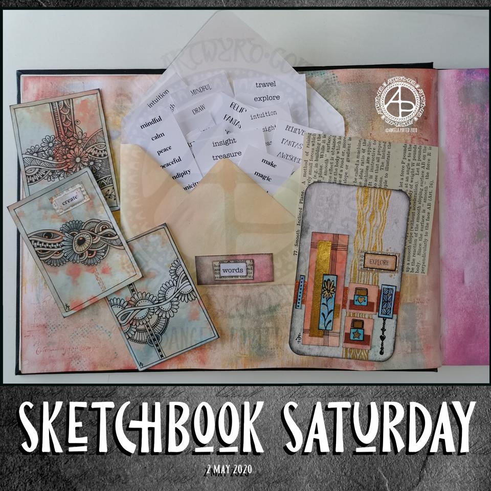
Sketchbook Saturday

Sketchbook Saturday 2 May 2020 ©Angela Porter | Artwyrd.com

I am enjoying working a little either on my sketchbook-journal or preparing bits and bobs for it each day.

The main thing I wanted to do this morning was to get some little word tags prepared and in use.

I created a list of words I’d like to add to bits and bobs of art. I copied the list, using different fonts, then printed out an A4 sheet of the words. I made a second sheet using different words and different fonts. Then, I cut the sheets up into smaller pieces for storage.

Then, I realised I’d need to create a storage space for them in my sketchbook and thought an envelope would be the easiest way. I do have some commercially produced envelopes, but I thought it was time to use my We’R’Memory Keepers envelope punch board for a more custom size.

I cut an 8″ x 8″ piece of ordinary printer paper. I coloured the paper with distress oxide inks (old paper, tea dye and dried marigold) and then made an envelope that measures 3.5″ x 6″.

I then realised I needed a way to keep the envelope closed. I could tuck the flap inside the envelope, but as I used copy paper I didn’t know how durable it would be. So, I came up with the idea of having a little pocket to tuck the corner of the flap into. And that meant I could cut out “words” from one of the lists and add it to the little pocket.

Before I did that, I aged the edges of the label with Distress Ink. Next, I glued it to a an old book page and cut it out with a border of text. That layer was also edged with Distress Ink, then it was added to the pocket. I used a metallic Gelly Roll pen to draw around the label.

On the page, you can see some small drawings I’ve done over the past couple of days.

On the left of the page are three ATC cards (2.5″ x 3.5″) made from a piece of mixed media paper coloured with the same Distress Oxide Inks.

On the right, is a larger artwork, an experiment and exploration of what I could do. I collaged some Distress Oxide coloured pieces of paper on to the background. I added metallic gold and copper paint to some of the pieces, and also to create patterns behind them. I drew little designs too, including a Dangle Design from one.

I’m not all that happy with the ‘explore’ card. There are bits I like, and other bits where I think I messed up. I think if I’d left it with the gold patterning on the background and just some simple patterns on some of the collaged rectangles, maybe some gold paint on the smaller ones, then it would’ve worked out better.

I think I’m going to make a vellum envelope or pocket to store the ATC cards in. Vellum in translucent and so will provide a tantalising glimpse of the card(s) safely stored within.

The ‘explore’ card will be placed into the sketchbook, with notes and reflections about it. It’s one that will be a learning experience more than anything else.

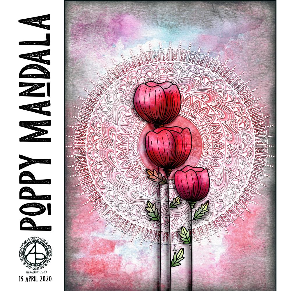
World Art Day 2020

Poppy Mandala ©Angela Porter | Artwyrd.com

The aim of art is to represent not the outward appearance of things, but their inward significance.

-Aristotle

Today is World Art Day.  It is meant to be an international celebration of the fine arts which was declared by the International Association of Art (IAA) in order to promote awareness of creative activity worldwide.

Each year, on 15 April (Leonardo da Vinci’s birthday), World Art Day celebrations help reinforce the links between artistic creations and society, encourage greater awareness of the diversity of artistic expressions and highlight the contribution of artists to sustainable development. (UNESCO)

“Our Organization would thus like to pay tribute to the solidarity shown by artists and institutions at a time when art is suffering the full force of the effects of a global health, economic and social crisis.”

— Audrey Azoulay, Director General of UNESCO

About today’s art

I started by choosing one of my Distress Oxide backgrounds to use for today’s art.

I woke knowing I wanted to do an arrangement of stylised poppies with a mandala for a background, and this is the result.

Poppies symbolise, among other things, a lively imagination, messages delivered in dreams, beauty and success, as well as remembrance. They, along with their seed heads, often appear in my art.

It took me many iterations of colour, shadow and highlight to get the mandala appearing as I wanted it to – lacy, light, in the background but still standing out. I think I’ve managed to achieve that fairly well.

Overall, I’m pleased with the finished artwork. I do think the poppies and mandala could be moved towards the top of the background, something that is easy enough to do as I have the layers saved. However, the artwork is good enough for now.

I suspect I’ll be creating more art using a couple of the backgrounds I’ve created through the day. It’s a satisfying process to use backgrounds I’ve created myself rather than using ones that I have purchased.

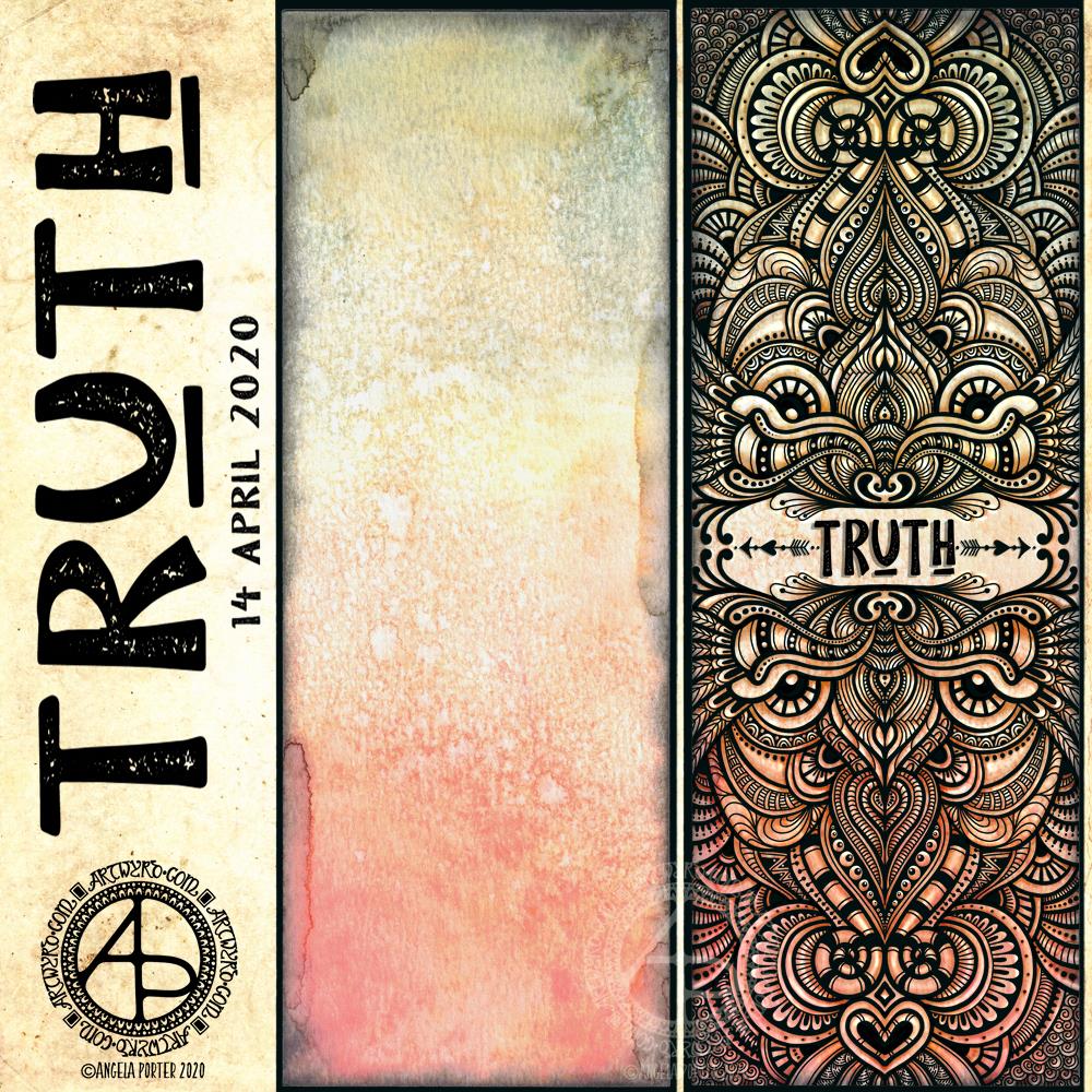
Truth

“Truth” ©Angela Porter | Artwyrd.com

I like to use a word in my artwork from time to time. Truth was the word I knew I had to use as the central point for some artwork, and that’s where I started, along with one of the Distress Oxide backgrounds I made yesterday (in the middle of the image).

After I’d decided on the typography and placed it centrally, I then started to draw digitally. I made use of the symmetry tools in Autodesk Sketchbook Pro, along with a flexible nib and fineliner brushes.

I had no idea what kind of design would result, I just went with the flow and intuition and thoroughly enjoyed doing so and losing myself in the art.

I added shadows and highlights once the drawing was finished for that sense of dimension and ‘life’.

I am really pleased with the finished artwork. There’s something about symmetry, spirals, repeating patterns, and intricate, abstract designs like this that just makes my arty heart smile and sing. I always return to this style, it seems to be at the core of my being.

I also love to draw on coloured and textured backgrounds. I also think I’ve found a way to combine more traditional media (making the backgrounds) with digital art (drawing and adding shadows and highlights) in a way that really works for me.

My only problem is that I do tend to try to branch out into other kinds of art and never seem quite so satisfied with them. This doesn’t mean I’m going to abandon them; they need a lot more work and thought and maybe structure.

Perhaps that’s why I like this particular piece of art so much – it has clearly defined structure. The colour palette is defined by the background and so I’m not struggling with what colours to use. Having the black line structure defines clearly where shadows and highlights need to go.

Autumnly Entangled 5 and 6

AutumnlyEntangled5and6_AngelaPorter_18Sept2017

Last two of the six Distress Oxide coloured 14 x 10 cm sheets of paper.

Autumnly Entangled 1

AutumnlyEntangled1_AngelaPorter_14Sept2018

I’ve had a busy couple of days with this and that and the other.

Yesterday and today it’s been learning about vector files, images, graphics and how to get my artwork done as that kind of file and to a maker so she can use them to laser etch her products – more about this when I have photos of the projects!

Lots of head scratching, googling, and finally settling on downloading a program that works in vector graphics.  So, a lot of learning to do with that, but it’s easy, intuitive and makes a lot more sense than Adobe Illustrator; I chose Serif’s Affinity Designer.  I don’t know if it is as sophisticated as Illustrator, but I can’t see me wanting to get to that kind of level – I love Autodesk Sketchbook Pro way too much for that!

Certainly a different skill set is needed, but I’ll get there as I usually do.

After all the time on the ‘puter, I had the need to return to traditional media, and the photo above is what I’ve spent my evening doing.

First, the paper (approx. 14cm x 21cm), along with a few other sheets, was coloured with distress oxide inks.  Then I drew on it using a mixture of pens.

It was really nice to do, the colours of all the sheets are rather autumnal, and I’m looking forward to drawing on the others over the coming days.

Playing with colour

Angela Porter 29 August 2017Angela Porter 29 August 2018 A

I’ve been quiet around ‘tinternet for a couple of weeks – problems with my mood, instead of starting many new things I’ve been spending time organising a reference collection of my favourite patterns and designs of things like fungi and buildings and creatures and so on and its very much a work in progress!  The process of going through the familiar and organising them is comforting to me …

I have done some new drawings for the Eerie project for Dover – not many left to do for the book, then the hard work is deciding which two I would like to colour in the most, always a problem.

Plans are afoot for a change in my online presence too … more as that happens!

The above images show one artwork I started last night and finished this morning.  Most probably about 8 or 10 hours of work.  Distress Oxides, Cosmic Shimmer watercolours and a Sakura Glaze pen were used. When light strikes the artwork at just the right angle, the metallics and iridescents bring the artwork to life; it’s like it lights up all by itself.  A joyful feeling for sure as I look at it.

It was nice to work with colour and the more traditional media rather than digital art, though, yet again, I noticed how drawing with the Surface Pen on my Microsoft Surface Book are having an effect on my work on paper.

One thing I did enjoy was adding the sparkle and shimmer to the artwork, something I’ve not found out how to do digitally (or even if you can!).

So, I now have satisfied a need in me to work with colour and pen and I can turn my attention back to the illustrations for the Eerie book, and on to other things after that is done.

For today, I head off soon for counselling/EMDR, and to have my acrylic nails removed once again as they really do get in the way of me typing, art-ing, using my phone…and no doubt I’ll do some drawing while I have a late lunch between nail removing and counselling.

Mixed media index cards – 5 June 2017; my own library of digital drawings

AngelaPorter_5June2017_MixedMediaIndexCard1

Mixed media index cards

Two index cards worked on over the last day or two.  The focal points are shells I drew, first on paper, then the image was worked on on my Surface book with Autodesk Sketchbook Pro and my Surface Pen,

I had to use scissors to cut out the shells (not my favourite task as I’m not good with scissors) after I’d coloured them using the Chameleon Color Tones and Color Tops marker pens.  I’m really pleased with the colouring.

Lots of different techniques/media were used on the index cards – stamping, stenciling, inktense pencils, distress inks and distress oxide inks, pebeo dyna paints, perfect pearls sprays, gesso, clear holographic embossing powder from WOW!

I’m happy with them, though I’m not sure they’re quite finished, especially the little one.

Digital drawing library

I’m beginning to build up a library of my own digital drawings – fungi, flowers, shells at the moment, oh and one angler fish skeleton that I’ve not used yet (but that’s an idea for later or tomorrow maybe).

I have to decide if I put these images together as packs of ‘digi-stamps’ for sale…I’m really pleased with my shells here, but the fungi have worked out fine too.  With my limited scissor skills, I’m keeping it in mind I need to keep the outlines relatively simple, but the inside of the design can be rather detailed, which is fun.