Drawing done with Faber-Castell Pitt Artist Pens. Arteza Mixed Media Paper coloured with Distress Oxide Inks (Stormy Skies, Chipped Sapphire, Dusty Concord, edged with Hickory Smoke). Paper measures 3″ x 8.25″ (8.3cm x 21cm).
“I make art to show my soul I am listening.” “This, too, shall pass.”
Art is my solace, my form of expressing my soul, my inner self.
Yesterday, I spent some time adding colour to paper to add to my custom sketchbook. This is one of the papers that I created, with an abstract drawing on it, that is finished enough for the sketchbook.
The artwork measures approx 4″ x 6½”. I used a piece of ClaireFontaine Paint-on mixed media paper which I coloured with Distress Oxide Inks followed by some sprays and splatters of water to create a distressed look. The colours used were Seedless Preserves and Fossilised Amber.
I first drew the basic outline of the design with a M Pitt Artist pen from Faber-Castell. To add colour to the design, I used Distress Inks in Seedless Preserves, Fossilised Amber and Ripe Persimmon like watercolours.
Then, I started to add patterns, lines and stippling to the design to bring out the patterns and add depth, interest and dimension.
I think it’s worked out fairly well. I may well go back to yesterday’s ‘Blessings’ artwork and add colour and more patterns to it at a later date.
I went out!
My blog post is a little later as I decided to go out for a walk this morning. This was a big deal for me. Especially after the effects of the high anxiety/stress I experienced last week.
I went to my local cemetery, Glyntaff Crematorium. It’s fairly large, with lots of paths and roads sectioning the cemetery up. I wandered around the older section, which is full of fascinating funereal sculpture. I had my DSLR camera with me, and managed to take over 100 photos this morning, not just of gravestones, but textures too.
It was so nice to be out in fresh air, moving my body around more than I have done for nearly four months. I had nice music on earphones so that any loud sounds wouldn’t startle me. There was work going on around the crematorium as well as grounds work.
It was also nice to drive my car again. It’s been a week, and I really miss the freedom of just being able to take a drive. It’s important that we still stay home as much as possible and to limit our time where there are people. I think my choice to visit the cemetery was a good one. Very few people, alive or dead, haunt cemeteries!
I think I fall into the group of people known as tapophiles – people who are interested in cemeteries, gravestones and funerals. It’s not a morbid interest, just an interest about the changing styles of funerals, funerary sculpture , practices and how they change over time with society and culture.
I discovered the fascination with gravestones when I walked to and from school through this cemetery. It took me longer to get home than it did to get to school. On the way home I had the time to linger and explore and indulge my curiosity. I remember being too scared to look in the chapels there, but enjoyed popping into the columbarium, which has recently been renovated and reopened.
I think I’ll be looking for other cemeteries fairly local to me to visit in the weeks ahead, ones that offer me a good walk as well as interesting graves to look at.
This index card #ICAD2020 #DYICAD2020 was a bit of fun to create.
I used a mixture of Distress Oxide inks to colour the 6″ x 4″ index card. The colours I used were Old Paper, Bundlesd Sage, Dried Marigold and Chipped Sapphire. I built the background up in two layers, with chipped sapphire lightly dragged across the texture that the spray of water from the first background created. A final spray of water, a dab with some paper towel to leave some bleached areas and the background was done.
I decided I’d go with the typography theme today, so hand-lettered monograms for each letter. I used pieces of Canson XL Bristol paper coloured either with Distress Inks or Distress Oxide inks. After spraying the paper with water, I squished some cling film onto the surface to create abstract patterns in the colour.
Anyway, I used 06 and 03 Sakura Pigma Sensei pens to draw the monograms. Once I was happy with the designs, I edged the monograms with Ground Espresso Distress Ink. Then, I glued them to some brown-ish card, and cut them out with a border. I edged the brown paper mat with Ground Espresso Distress ink.
I then set to adding pattern and colour with Paul Rubens metallic watercolour set. Tiny dots and highlights were sparingly added to the monograms. Then, I used the same 01 brush to draw patterns around each monogram in colours that picked up the background colours of the monograms.
My final step was to edge the index card with Ground Espresso Distress Ink.
This was a perfect little project to practice my hand lettering as well as trying out the Paul Rubens paints. It was also good practice at using a fine brush to draw patterns. I do think a finer brush would’ve worked better.
The scan hasn’t picked up the sparkly, shimmery gorgeousness of the metallic paints.
This was a really nice way to come round after I’d slept off yesterday’s migraine-y stress-come-down headache. It was a small project that I didn’t feel overwhelmed by and there was no pressure on me for it to be perfect, as would be the case for my contracts for coloring books. So, it helped me calm and settle and find that sense of contentment, for a while at least.
On waking this morning, I wanted to work on the cover of my journal.
Yesterday evening, I managed to get a coat of gesso on to the cover and painted edge closest to the wire binding with gold. In hindsight, that may not have been the best idea.
I knew I wanted to use my silhouette iris drawing on the cover. Irises are my favourite flowers. Also, my aim for my journal is to use my own art as much as possible.
So, I printed out an arrangement of three irises, tore them out and coloured the paper with Distress Inks.
For the background, I used a piece of Claire Fontaine mixed media paper. I coloured it with Distress Inks – Old Paper, Tea Dye, a touch of Iced Spruce and a dusting of Vintage Photo around the edges and here and there on the main sheet.
This I adhered to the cover. I’d cut it narrower than the cover so that I didn’t have to butt it up against the wire binding. That’s why I wanted a gold border there.
Anyway, I decided to put some old book paper behind the irises. I added some ink to the edges of this paper too. I then glued them in place, along with the flowers.
I drew a border around this page with a copper-coloured Sakura Metallic gelly roll pen. Then, I used a gold glitter Uniball Signo pen to fill the background with tiny spirals.
I wanted to add the definition of ‘journal’ to the front cover. So, I did the typography in Affinity Publisher and printed it. After tearing the meaning out, I used Old Paper and Tea Dye Distress Inks to colour the paper, followed by Vintage Photo to ink the edge.
I then glued this to an old book page, tore that out and edged the paper with ink once again.
Before adhering the page to the cover, edged the paper with Ground Espresso Distress Ink as I didn’t think the edge was dark enough. I also coloured the edge of the journal cover with the same ink to hide the white.
An application of Distress Micro-glaze to seal the page and I could stick it to the cover.
I love the subtle sparkle of the spiral pattern on the cover. The micro-glaze picked up some of the fine glitter. It also makes the cover sheet feel very smooth.
I’m not happy with the gold edge to the journal, but I will, no doubt, find a way to make it look much better. Otherwise, I’m quite happy with the cover. I think it needs something else there, but I’ll work out what that is in the fullness of time.
The first three pages.
Page 1 I’ve shown before, and it’s now complete (apart from me adding journaling to the envelopes and other spaces.)
On page 2, I’ve added an experiment I did with Tombow Dual Brush Pens and a blender pen to draw designs on paper. I have some ATC cards coloured in the same blues/purples as the background of this page, so I’ll be finding a way to display them on the page when I’ve finished them.
Page 3 is a tiered series of simple pockets. I made them by tearing the paper of each page and layering them to create the pockets. The inserts are pieces of Claire Fontaine Mixed media paper that have been coloured in the same colours of Distress Inks as the pockets have been. I used Distress Oxide Inks for the pockets.
I’m not really sure what I’m going to do with the third page, yet. It will come to me, I’m sure!
Adobe Spark
I thought that I’d use Adobe Spark to make a short video rather than posting a montage of photos. I uploaded it to my channel on youtube so I could share it via social media more easily.
Adobe Spark is straightforward to use, and it does have a free option, though I pay about £10 per month for it. It makes creating simple content for social media really easy.
How am I feeling
I’m feeling much better today. The headache and light-headed/dizzy/drowsy feelings were with me for the whole day, including upset tummy and digestive system. I had weird pains in my right eye too. I slept a lot during the day, and just took it easy when I was awake. I wanted to crochet in the evening but found it hard to do even something familiar to me.
My digestive system is still uncomfortable and not quite right today, and I’m now beginning to feel rather tired. Like I’ve already done too much today. So, I’m going to be taking it easy for the rest of the day.
I’ve become a bit obsessed with making art journal bits and bobs over the last couple of days. This morning has been no exception, other than the more I do and watch, the more ideas that come to me.
Inchies
Yesterday, I created some blank, printable, templates for inchies, twinches and tea cards. I printed them out on plain paper so I could draw in them. I also made a list of themes I could tackle for them too.
I spent an hour or two filling in a sheet of inches with various designs. Then, I printed them on plain paper and also vellum for calligraphy. The vellum has a rough texture, interesting colours and subtle patterns in them. I have a laser printer, so wasn’t sure if it would print on the vellum; it did, however the print does come off if I’m a bit rough with it.
Nevertheless, I coloured some of the inches with Distress Inks and then adhered them to some 1″ tiles of thick chipboard card. I edged them with tresure gold wax from Imagination Crafts. Then, I gently applied a thin layer of Ranger’s gloss multi-media medium, to see if it would seal the laser printing; it did! It also brought out the colours of the Distress Inks.
Seed packets/envelopes
These are simple enough to make. There are plenty of tutorials online for them. I made them from ordinary printer paper, then coloured them with Distress Inks.
Next, I added some dot embellishments using a small ball tool with Imagination Crafts’ Starlights metallic paint in rich gold. This is a beautiful, glittery, shiny paint that leaves some dimension when applied this way.
Finally, I adhered the inchies I’d made, along with some vintage book paper, to the envelopes.
I’m not sure if these envelopes are finished. I do want to use them to store either journaling notes in, or little pieces of art or mementos in them.
Tags
I haven’t been at all sure about tags and using them. However, I thought I’d see what I could do with them after yesterday’s mucking about with a tri-fold tag that turned into one single tag.
I wanted to make some templates for cutting the corners at the top of the tags, so I did that, using various widths of paper and slopes to remove the top corners.
I then realised I needed something to store them in, so I made an envelope for them.
The envelope has a more rectangular top flap and a plain front, perfect for embellishments.
Backgrounds
Something occurred to me this morning while watching someone make tags using background paper. I thought that I could use my colouring sheets and entangled designs as my own background paper. So, I thought I’d try to use some.
I found some old designs on my computer and printed a couple of them both as the black line originals and with a grey line.
I made a tag and cut out a piece of one of the designs. I coloured the design with Distress Inks and used them to subtly colour the tag.
I didn’t like the way the neatly cut out background pattern looked when I placed it on the tag. So, I tore the edges. I still wasn’t happy, so I tried tearing it into strips. That looked better, but I still wasn’t happy with it, but I stuck the pieces down.
I used a gold glitter gel pen to add lines and patterns between the torn pieces, which created some pattern and interest.
Finally, I added a distress ink coloured belly band along with a word, “creativity” to the tag. For now, I tucked one of the seed packets behind the belly band.
The background drawing may be just too busy, detailed, and varied to work well. I need to bear this in mind going forward.
Notebook
I am keeping notes of how I make tags, pockets, and other bits and bobs in an A5 dot grid notebook, along with ideas for other things to do or try. It’s turning out to be rather useful as a reference.
Acceptance
I’m struggling with accepting that what I’m creating for my art journal is “good enough”, “attractive enough”, “pretty”. It’s not like others I’ve seen, which is part of my problem.
I seem to like, mostly, neat edges, borders on work, very organised, neat, and carefully, geometrically arranged elements in my designs. I know I want to use my own artwork to create a journal, but I’m not sure it’s going to be successful in any kind of way. I have no idea if I’m on a wild goose chase.
I know I enjoy making these bits and bobs, I just don’t know if the overall end products actually work, so I’m doubting myself. I’m not sure I like what I’m creating. I mean, I really like individual elements such as the inchies and little panels on the envelopes. It’s when I start to actually combine them or put them into a journal that it all seems to go more than a bit skew-iffy.
I’m at that uncomfortable place I often find myself in when I’m creating a mandala or drawing or digital painting; partway through I want to give up as I think that what I’m creating is awful and not working. With the mandalas, drawings and digital art, I’ve learned to work through that point and, mostly, to complete the work. I’ve learned by experience and perseverance that I can produce art I’m happy with.
I’m not at all sure of that with this art journal type stuff. I’m not sure at all if I can find my own creative ‘voice’ with this, or whether I have to accept that as much as I’d like it to be one of my ‘things’ it’s not meant to be and that I can continue to watch and admire others for what they create.
Maybe, I’ll end up making digital elements for journals for others to use in their creations. Maybe, I’ll find that collections of inchies are my thing (along with twinchies and tea cards and other little designs).
For now, I’ll take a bit of a break from it all, and come back to it with fresh eyes and a fresh mind.
I had an idea that I can use the little drawings I like to do as ephemera and embellishments and focal points in my art journal, rather than using ephemera from other sources like books, printables, and so on. I’m sure I’ll find more uses for them if I persevere with this project.
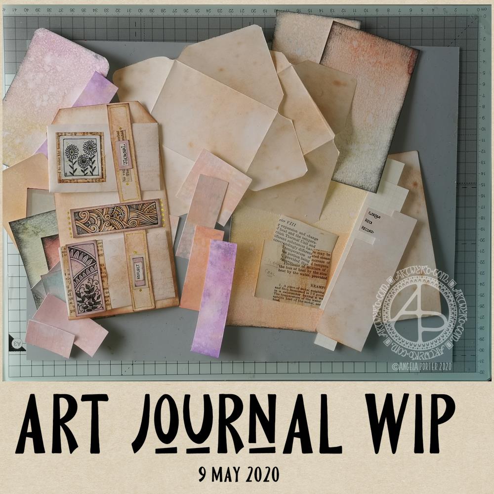
So, back to the tri-fold tag. It was my plan to make such a tag for my art journal. However, as usual, my plans often take a slightly different route!
I started by working out the size of tri-fold tag I wanted to make – to fit an A5 sized art journal.
I settled on a piece of mixed media paper cut down to 11.5″ x 7″, which I scored at 3.75″, 4″, 7.75″ and 8″ to create the three tags joined by hinges. I cut the top corners off each tag panel.
I coloured the front and back of the paper using Distress Oxide inks and sprayed water to distress the surface more. Then, I used vintage photo Distress ink to edge all the sides and folds to frame the panels .
I’d chosen colours that would go with some ATC s I was drawing last night while attending a webinair and listening to the speakers. However, the Distress Oxide inks resulted in a much brighter colour and I really wasn’t happy with the result. I will use this panel to use as a reference in future, not so much for sizes but for ideas for pockets and panels and envelopes and so on.
So, I started again. I used Distress Oxide inks, but this time I used tea dye and vintage photo, applying them as lightly as I could. I also coloured some copier paper using the same colours in Distress Inks, with a hint of rusty hinge added to the mix.
I was much happier with the colours this time around.
I liked the idea of using a ‘belly band’ with little envelopes tucked into it. So, I used 5″ square pieces of the coloured copier paper to make some little envelopes (2.5″ x 3″). Two of these would fit neatly on one of the panels. So, I made a 0.75″ x 7″ belly band, and coloured it with the same inks as the panels. I applied thin beads of glue to the ends and centre of the belly band and then adhered it to the panel, off-set to the right of the centre line.
When the glue dried, I had two sections that would hold one envelope each.
My next job was to rummage through my stash of coloured papers to find ones that would go together and were sympathetic with the background.
I drew some panels to add to the envelopes and also the space between them. I backed the panels with vintage book paper. Then, I hand lettered some words on a piece of coloured copier paper. I chose ‘Journal’ and ‘Reflect’ from the selection, cut them out. I used both vintage book paper and a piece of coloured paper behind them to make labels that I attached to the belly band above each envelope.
Finally, for now, I used a gold glitter Signo gel pen by Uniball to add dots and highlights.
It was then that I realised I really wasn’t happy with the tri-fold tag as I’d made it. So, I set about cutting the tags apart so I had three individual tags. I want to join them together in a different way, using hinges of some kind.
But for now, tiredness has caught up with me, as well as the need for some breakfast. So, I will put my project to one side for now and return to it later.
Reflections
I’m not entirely sure where I’m going with this, not yet anyway. I kind of like what I’ve seen other people do as far as ideas go for pockets, tags, labels, envelopes, pouches and all kinds of ephemera for art journals. However, they’re also not really ‘me’. I’d like to find a way of expressing ‘me’ in an art journal.
The one I have, in an A4 sketchbook is fine, and a perfect place to try things out. But, I’d like to do a smaller art journal that has sturdier, mixed media paper in it.
I do know I want to make use of my own artwork. Today, I drew the designs onto the coloured card. However, I quite like the idea of building up a digital library of my own drawings and designs that I could print out on paper and colour accordingly.
Although I hand lettered the words I used today, part of me isn’t happy with them and wants to create them in Affinity Publisher.
All the paper I start with is bright white in colour. Perhaps I could look at using different papers and colours of paper for future projects.
One other thing I’m doing, is keeping notes and diagrams showing templates and dimensions for various ephemera.
I’m babbling here, now. The early morning and lack of enough sleep last night is really catching up with me now. Time to post this then go get breakfast and more tea!
I woke at around 4:30am again today and couldn’t get back to sleep. So, I got up, made tea, and did some work on my art journal / sketchbook.
Making Distressed Paper
I spent a good two or three hours making the papers you can see to the left. I used the following:
printer and layout paper, cut to A6 in size (UK size)
Distress Oxide Inks
5″ x 7 ” Gelli plate
small Brayer roller
water in a spray bottle
heat tool
craft mat
pieces of cut and dry foam
metallic inks and paints
For some of the pieces, I brayered the Distress Oxides onto a Gelli plate and then pulled the print onto a piece of paper. For others, I used the Brayer to apply the ink to the paper. I also used the black side of a piece of cut and dry foam to apply ink to some of the papers.
I sprayed the papers with water to activiate the Distress Oxide, and used the heat tool to dry them. After doing this, I crumpled up a lot of the papers and then used the brayer to flatten them out. Both of these techniques resulted in textured paper. So, I used the cut and dry foam and some Distress Oxide ink to lightly brush the paper to help to accentuate that texture.
Finally I used cut and dry foam to brush metallic paint or ink over the paper to add some shimmer and shine. I used some textured cut and dry foam to add patterns too.
I now have quite a stash of very distressed papers to use in my art journal in the future.
Both the printer paper and the layout paper are much thinner than I would usually use for such a task. The light spritz of water on each, however, created a lovely, bumpy texture. They were also easy to crumple up, adding that kind of leathery texture.
The subtle shine that the gold metallic ink gave is rather lovely, though I do like the bright, shiny gold of some paint I found in my stash.
I can see me using these papers for collage, for making pockets/envelopes and other bits and bobs for a journal, and no doubt for other things I’ve not yet thought of.
Storing my custom papers.
I realised the papers I’ve made over the past couple of weeks have been piling up and I really needed to do something that would let me find them easily. So, the quickest and easiest solution was to use A4 poly-pockets and a ring binder, both of which I had to hand! That certainly has let me have a tidier desk, and I’ll be able to find the papers easily too.
Art journal pages.
I also finished up the two pages shown to the right. I attached inchies, to fill in some gaps.
I used simple paper hinges to attach the ATC cards on page seen in the bottom image. If I ever wish to remove them to swap/share/gift, then I can remove them easily. That simple solution has relieved my anxiety about adhering them permanently into the sketchbook!
I’ve also folded some squared paper, used distress inks to colour the edges and folds, and put them in the vellum pockets I’d made earlier, all ready for me to journal on. Unusually for me, I made use of some washi tape to embellish the pockets.
I’ve also noticed that I’m very ‘regimented’ about how I put things in my art journal. I much prefer carefully cut paper to torn edges most of the time. Everything needs to be arranged ‘just so’ with me. Just as it is with my line-art – precise and neat. I suppose it’s another example of me expressing my personality through my art.
So, Angela, how are you today?
I’m exhausted. I’m practically falling asleep as I type this; that’s what happens when I wake up at stupid o’clock once again. I’m now officially overtired! I may try to get back to sleep soon; I do have work I need to do today!
As far as me being under the weather goes…
Well, I still have a sensitive digestive system and I feel nauseous from time to time. I did wake with a bit of a headache today, but that could just be lack of sleep, as is the tiredness I feel. I have eaten and my tummy doesn’t seem to be objecting as it has done. This all makes me hopeful that I’m almost over this bout illness. I was really quite grumpy about it yesterday, and I’m entirely sure I’m not grumpy today!
Other than that, emotionally I’m doing just fine. The sunshine helps with my mood for sure, as did being able to hear the bird song as the world was slowly waking up this morning.
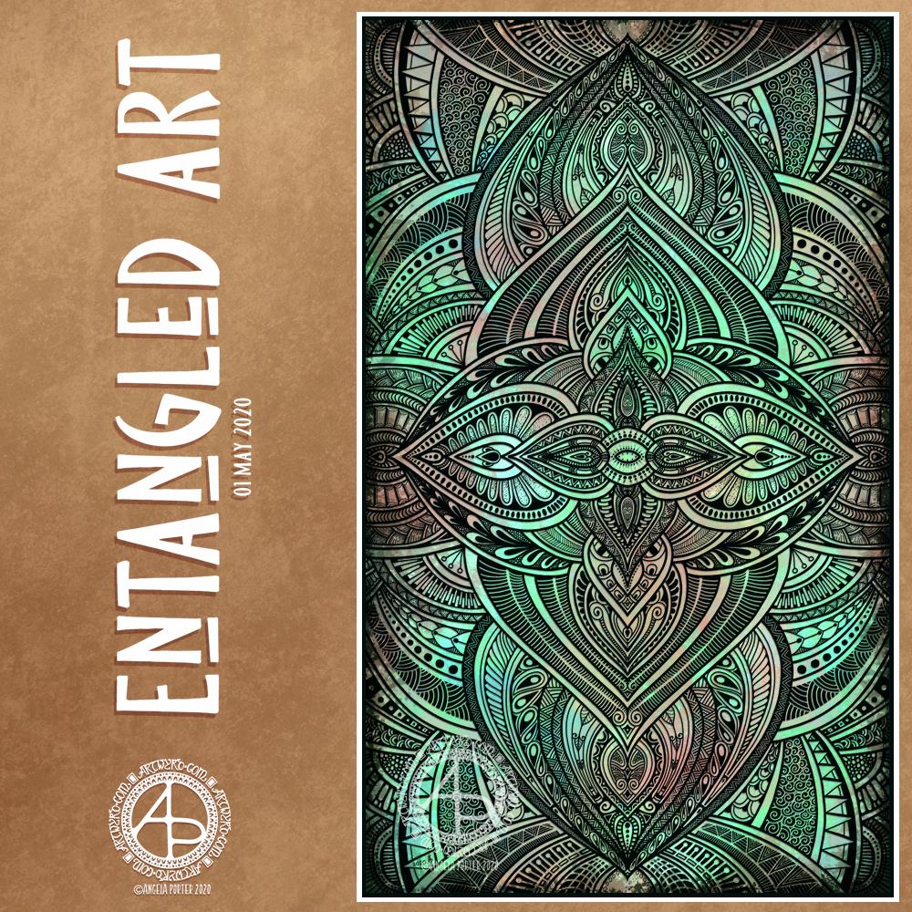
This morning, I finished this Entangled Art drawing.
The background was created using Distress Oxide inks and sprays of water on mixed media paper then scanned in.
The drawing was done digitally using Autodesk Sketchbook Pro.
A very intricate, detailed drawing in my signature ‘Entangled’ art style, that includes inspiration from nature, architecture, geometrical and repeating patterns, and overlaps a little with zentangle.
A new month!
While we may all be in lock-down, the days still pass us by and go into the past.
I sit here, at my desk and looking out of my window as I work. Sunshine, blue sky with some heavy grey clouds cover the world. Fluffy dandelion seeds are dancing around in the air, thanks to a fairly swift breeze. The trees that cover the valley sides are all cloaked in their spring green finery. It’s a fitting view for Beltane, May Day.
The world is now fully awakened from it’s winter sleep. The long, dark days of winter are now behind me and the days have been rapidly lengthening towards the longest days around the summer solstice in June.
In years past I’d be looking forward to days out, enjoying evening activities and meetings in daylight. I was looking forward this year to going out with my DSLR to take photos of flowers and plants, architecture, and anything else that grabbed my attention. That’s not to be. However, I will be looking forward to doing this in the future.
As much as I would like to be wandering around with my camera, I know it’s more important to be at home, to avoid contact with others, and to help slow down, if not halt, the spread of the Covid-19 virus.
The most difficult thing is not knowing when the current restrictions will safely be lifted. And when they are, the number of cases is likely to increase once again and we’ll return to lock-down.
I am so grateful that I am able to work at home, am happy to stay at home, for as long as it takes. The longer this goes on, the easier I find it to remain at home. I do worry that when the lock-down is released I may find I’m filled with fear and anxiety about leaving my home. I struggle with that anyway, but I do wonder what effect this will have on me.
Still, I can still think of things I’d like to do, places I’d like to visit, once it is safe to do so once again, even though that particular point in time is, as of yet, not in the calendar.
I’ve been awake since stupid o’clock, which roughly translates to 3:30am BST. While I was trying to get back to sleep I watched a youtube video about making pockets and tuck-ins for an altered book journal.
I thought that could be something good for my sketchbook-journal. I have worried a little about gluing my little artworks into it, but pockets, tuck-ins, see-through envelopes could be a good way to both show the work and store it in a non-permanent way.
So, with my mind now working and sleep eluding me, I decided to have a go at making my own pockets. You can see the result at the top right, with a journalling card popped in one of them for now.
How I made the pockets
I used some ordinary white card, cut it into what I thought would be good sizes to make a set of stacked pockets for the ATC sized cards I’ve been working on.
I then coloured the cards with Distress Oxide Inks. For one of them, I used a brayer to add ink to a gelli plate. Before pulling a print, I spritzed the gelli plate with water that had some white perfect pearls added to it.
For another panel, I used the brayer to add ink directly to the paper. It did that unevenly. So, I used a ball-tool to carve some texture into the black side of a piece of cut and try foam and used that to add colour. That worked really well! Dabbing the foam added a lovely textured layer of colour. A spritz of water activated the dusty, chalky, soft nature of the Distress Oxides.
I enjoyed the look I achieved with the distressed foam that I coloured the remaining pair of paper panels in the same way.
I then tore the top edge of each panel, for added interest, then used a piece of foam and Rich Mahogany Distress Ink to add grunginess to the edges of each panel.
I wanted to add some embellishments to each panel, so I used a copper sparkle Gelli pen to draw patterns on them.
Finally, I used Tombow Mono adhesive to stick the panels together.
When I put the panels on the page in my sketchbook-journal, I thought a panel behind them. So, I coloured a panel of the same card with Distress Oxide inks and the distressed piece of foam and used the same gelly roll pen to add some sparkly patterns. Then, I adhered the back panel and pockets to my sketchbook.
When I tested some ATC cards in the pockets, I realised I need to work out a way for some more ‘give’ in the pockets as they’re too tightly put together to slip more than one ATC card in them. Also, I placed them just low enough down the page so the ATC card doesn’t stick out of the sides of my sketchbook.
I’m not well known for my fore-planning projects like this, though I do try to learn as I go along.
Inchies and Twinchies
My mind was working in weird ways this morning. As I was making the pockets, my mind strayed to inchies and twinchies. I’ve not made any of these for a long, long time. I thought it could be fun to do so and add them to my sketchbook-journal.
I cut two 1″ wide, and one 2″ wide strips of card. I used the distressed foam to apply Distress Oxide inks to them, spritzing with water to add to the distressed look. Then, after drying with a heat tool, I cut them into squares – 1″ x 1″ inches and 2″ x 2″ twinchies.
I decided to use metallic watercolours from Cosmic Shimmer to add a sparkly, shimmery border to each tile. I used rich gold, pale gold or copper on each tile.
Then, I got to draw on the tiles. Teeny, tiny zentangle-style drawings. That was fun to do!
After adding some dots using a white Sakura Soufflé pen, I adhered the inchies into my sketchbook-journal. I’ve left the twinchies for decoration later.
Journaling cards
I realised that I could stored journalling cards in the pockets. All I needed to do was to colour the back of one of the ATC cards I coloured a few days ago. I also just realised that I could have added a layer of squared, dot grid or lined paper to write on too. That’s an idea for another time, maybe.
After drying the ink, I used a rollerball pen to add what notes I wanted to about this mornings creative sessions.
In fact, I’ve just created another journaling card to jot down ideas and notes to self as a result of reflecting on my pre-dawn arty activities!
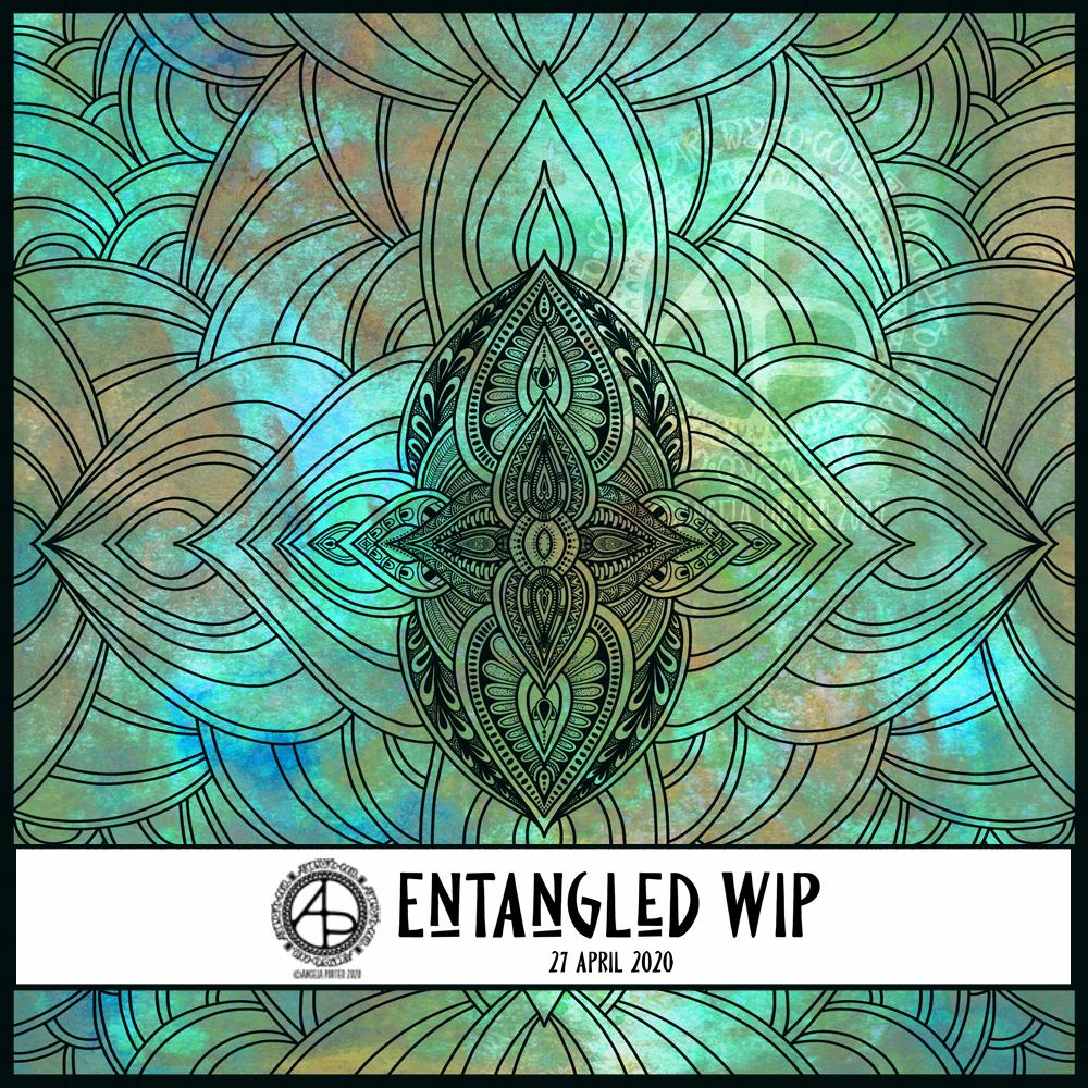
This morning started early and I played around with metallic paints along with Distress Oxide inks in my sketchbook / art journal. I have some interesting backgrounds as a result.
I also created a background for today’s artwork. I have tweaked the colours a little, digitally. I don’t know what WordPress does to the colours, but they look different in Autodesk Sketchbook Pro. I used Distress Oxide inks and have ended up with a rusted, weathered, kind of distressed/grungy texture.
Of course, I can always alter the background later on, if I wish.
I used the symmetry tool to reflect my drawing. You can see I’ve laid out the bare bones of the design and have started to fill the sections in with texture and pattern. I have a lot more work to do to complete the drawing. Then, I’ll think about shadow and highlight to help to bring the design to life some more. Or perhaps I’ll make it look like a stencilled design on the background, one that has some dimension to it.