Wednesday is WIP day! WIP is work in progress, and this is one of my current one.
I’m working on A4 (29.7 cm x 21 cm) Claire Fontaine Paint-On mixed media paper with 05 and 01 Uniball Unipin pens.
It’s taken several hours so far, and there’s several yet to go! I’m enjoying creating such detailed drawing in just black and white. Lots of botanical elements, but there’s also arches and spirals and geometric patterns in there too.
I never have much of a plan in mind when I tackle a drawing like this. I know what patterns I like, and if I lack inspiration I can always refer to my visual dictionary or design motifs and patterns. It’s all about intuition. It’s not entirely mindless. I do make conscious decisions about what design element to use, how to use line and pattern to add volume and contrast.
I sometimes wonder, when I see my work like this, why I try to work with colour. I always feel I struggle with colour, but black and white, with or without grey, always seems to work so well for me.
I love to play with the illusion of volume in a drawing, and whether that is done with density and shape of line/pattern, or with colour (even though I really do feel I struggle with colour).
I will persevere with this illustration, drawing, artwork over the coming days. In fact, I may spend time on it today. I’ve completed my morning errands, so I can remain at home, which is where I need to be. I’m tired today; I didn’t sleep at all well last night, or for the past few nights and my mood and ability to concentrate is suffering as a result.
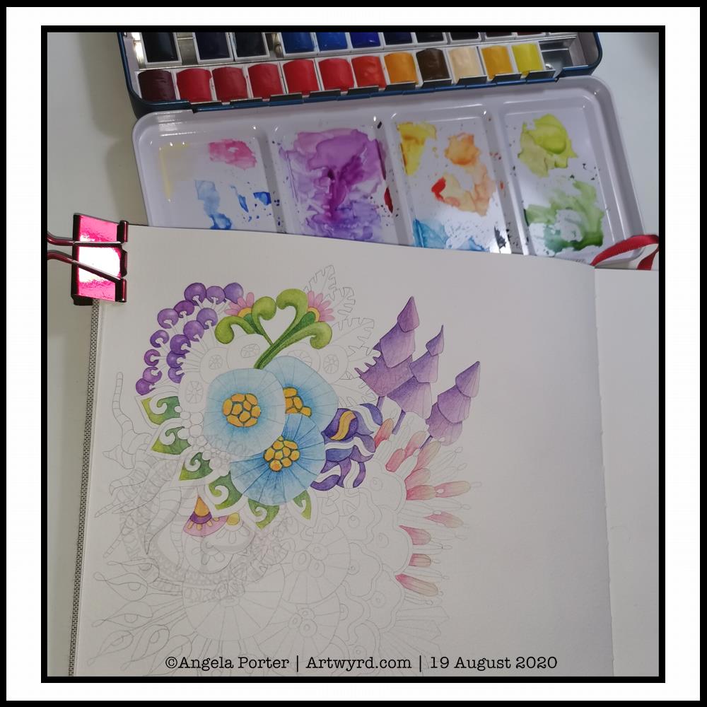
It’s WIP Wednesday, so here’s a work in progress I started this morning.
I woke thinking it was about time I tackled rendering one of my abstract, stylised, imaginary botanical designs in watercolour.
I think I’ve gained a bit of experience with watercolours, kind of have a feel for them and how I like to work with them. Or so I thought.
Anyways, I started by drawing the design lightly in pencil. I used a 0.5mm mechanical pencil by mistaked; I had intended to use a 0.3 mm one instead. No matter, this is an experiment, a trial in my Arteza watercolour sketchbook.
Once I was happy with the drawing, knowing I can always add more to it or alter it before painting it, I started to add colour.
I started with the bottom right blue seed-poddy/stylised flower motif. I thought I’d use two different shades of blue alternately around it, adding shadow and depth. That didn’t work out too well. I tried dry brushing on the ‘spokes’ of the motif. My reaction was ‘yeuch! Angela what were you thinking???’.
I didn’t give up at this point, though it would’ve been easy to do so. I continued on, reminding me this is an experiment, I’m trying something out that I’ve not had much success with in the past; just keep going.
So I did. And I know I have work to do to recognise when the wet paint has dried enough for a different wet colour to spread nicely, but not too much, when dotted into the first colour.
As time was going on, I was becoming more comfortable with how I was adding colour. I was working out that adding glazes was a way to darken areas, and that I could gently blend the edges out while the glaze layer was still damp so I didn’t get harsh lines.
Slowly but surely I coloured in different motifs, careful not to do wet next to wet.
All in all, I’ve worked on this painting for around three hours. There’s a lot more to do, but I can pick at it from time to time.
What I have noticed is, however, how much I want to add colour in the same way I do when working digitally. An interesting observation, the implications of which I have not even started to unpack yet.
Therapeutic art once again…
Once again, I turn to art to help me manage my unsettled emotions and thoughts. I am so tired, again. The stress of the past week or so has taken it’s toll. However, like the heavy rain and rather windy weather we’re experiencing here in the Valleys of South Wales, these will eventually blow over and I’ll be able to focus on my contracted work.
I’ve learned that when I’m all out of balance, it’s best for me to focus on art that is soothing, that no one expects anything from me, that I don’t have to worry about messing up. If I try to do art that others need to be happy with too, then I get frustrated and negative about myself, doubt myself.
So, for today at least, I will be creative in ways that will give me the time and space to heal my frazzled emotions and gradually work my way back to mental and emotional well-being once again.
After a life-time of putting everyone else’s needs and happiness first, I’m gradually learning to take care of my own needs first.
I felt guilty and selfish to say ‘my own needs first’. But it isn’t selfish to look after myself. It’s a recognition of being responsible for myself and my own needs and well-being.
And so, today I art, for art’s and heart’s sake.
I just wish it wasn’t so darned rainy and blowy. The rain alone I’d be happy to go and walk in, or the wind alone. But not both together. It is forecast to ease off in a couple of hours, so maybe I’ll get a walk this afternoon, with brolly and waterproof jacket. I’d like that. But for now, I’m going to go and drink tea, draw the design for Template Thursday, and have the quiet time I need to heal, recharge and refresh.
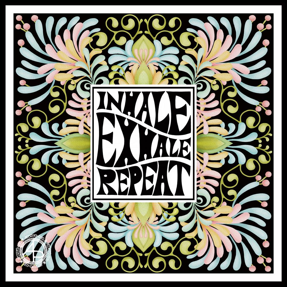
I started with the hand-drawn typography. I’ve just started another Domestika course — Hand-Drawn Typographic Portrait by Sarah King. The first exercise is to letter words boxes divided by wavy lines. Then, creating letters in different weights. And of course, practice is something that needs to be done.
There was just something about her approach to this that grabbed me, and so, I now have many boxes with words and quotes in.
The first lesson shows how to use Photoshop to edit your lettering outlines and fill them with black. I found the process rather clunky and long-winded. Perhaps that’s because I’m used to working in Autodesk Sketchbook Pro with a pen on a screen as if they were pen and paper, that I could do this in my own way.
So that’s what I did. I used one of my pencilled samples to create the typography for the centre panel.
Then, it was adding the background. I just went with the flow on that one. I made use of the symmetry tools in Sketchbook Pro, and just had fun with a limited colour palette and my favourite kinds of shapes.
The course is about portraits. However, I have zero interest in drawing people. However, the techniques shared will spark ideas for how I can use them.
I’ve long been trying to incorporate words, quotes into my artwork and struggling to find my own style. I’m not sure if this will help, but I’m really quite happy with this particular artwork.
It all began with a drawing in my A5 sketchbook. I then wanted to use it for digital art, and this is the result.
I’m really happy with the flower design. The black lines work in this instance; they give a stained-glass feel to the design.
I’m not at all sure about the background, however.I think I’ve just gone over the top, again. I just can’t seem to leave ‘white space’ in my art.
As a result, I tried some gold patterns on a rich, dark colour. Whatever I tried, just didn’t seem to work. Perhaps I could’ve created the line art in gold instead of black before adding colour. That may have worked out OK.
I’ve left it as it is, for now, as I’m tired and hungry. I’ll look at it with fresh eyes at some point. For now it’ll do, even as an example of art to remind me to work out when enough is enough!
Even though I’ve ended up a bit frustrated with my efforts on the background, I still enjoyed the process of creating this morning. It does make my inner light shine that bit brighter, and we all really need that extra bit of shine at this time of pandemics and more going on in the world.
I wanted a quote that went with the art, so I chose one about blooming and that sums up how I feel when I create, be it art or crafty pursuits. Even when the art goes in a direction I’m not happy with, there’s still a happiness inside that comes from just creating. There’s also a positive feeling about things not working as I want them to, artistically. It’s an opportunity to learn something, either artistically or personally. Today, the lesson is a reminder that I need to learn to leave ‘white space’ in my art.
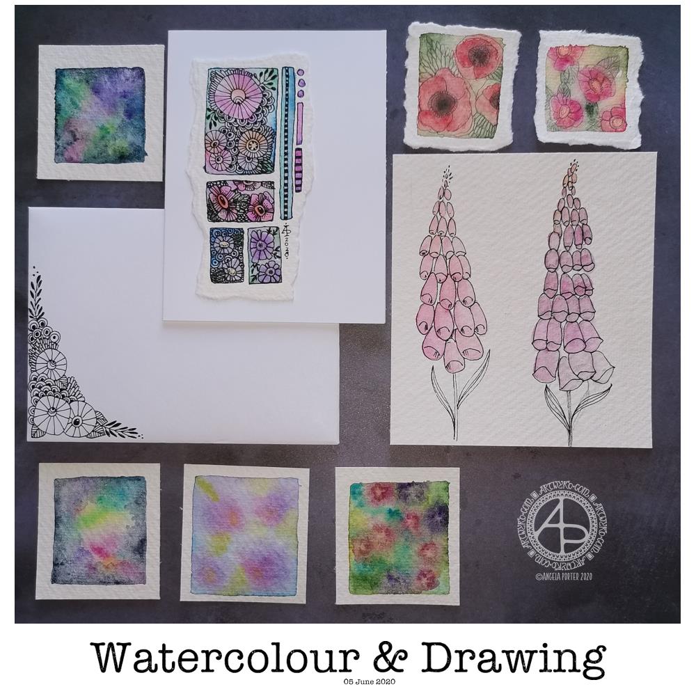
Today’s image is a collection of watercolors and drawings I’ve done over the past couple of days.
There’s a coordinating card and envelope (mail art), along with some small panels of watercolouring (approx 1.5″ x 1.5″, so a bit bigger than inchies). I’ve also included my foxglove experiments, which I did this morning.
Sometimes, black pen looks too harsh against the delicate but vibrant watercolours, so for the poppies, I tried pencil instead. I’m really not at all sure about them.
The foxgloves are symptomatic of how I feel today – out of shape, wobbly, ill-defined with harsh edges. I woke with a stinker of a headache again, definitely stress/anxiety/worry induced, as well as a lack of sleep last night. It will pass. In the meantime, I’m watching The Clone Wars on Disney+.
I don’t know if I’ll be doing any art for a few hours; my head and emotions are all bent out of shape at the moment. I’m dissatisfied with all the above; I know that’s me being so frustrated at the moment and it stops me seeing my art for how it really is. When I’m like this, I know that drawing will frustrate me, and the fact I’m not drawing will frustrate me more, especially as I have deadlines looming. However, I logically know that if I try to do things now, I’ll just prolong the feeling of frustration and I’ll end up having to do much more in the long run than if I’m kind with myself until the headache goes and my mood lifts.
The weird thing, however, is that I can sense that touchstone of contentment inside me. It’s very confusing; on one hand my emotions are really unsettled, yet there’s contentment within. My EMDR therapist mentioned that it’s a peculiarly Western view that you can only experience one feeling at a time when I mentioned this kind of thing to her. So I know it’s possible to be both discontent and content at the same time – discontent with some parts of life yet still have an inner contentedness.
So, I wander off now to sit with these paradoxical feelings, to try to relax and let the headache ease off enough that I can sleep off the extreme tiredness it will leave me with.
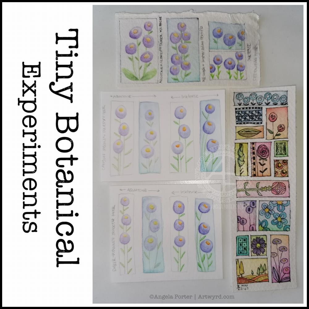
I thought I’d start Sunday morning off with some experiments with my tiny botanical drawings.
I apologise for the photograph quality – I’m really not a good photographer, something I really do need to work at! The pale colours really don’t help at all.
The artwork on the bottom right is one where I applied rectangles of watercolor on 100% cotton rag paper. Then, I used Sakura Pigma Micron pens to draw designs in the windows. Finally, I added some watercolours to the designs to help bring them forward from the background.
I don’t think I messed the drawings up at all, which was my worry. Mind you, I do have to be careful what colours I do add so I don’t make weird colours.
That led to me wanting to try watercolour pencils and Inktense pencils on different watercolour papers: top – 100% cotton rag paper middle – Canson Moulin du Roy paper bottom – Daler-Rowney Smooth watercolour paper.
On each paper, I drew four rectangles, two of which I coloured with a wash of watercolour.
I used the same colours of Derwent Aquatone and Inktense pencils to draw the stylised/abstract floral design and a waterbrush to activate the pigment. I did my best to apply the same amount of pencil in each case. However, I noticed that the papers grabbed different amounts of pencil even though I was using the same kind of pressure.
The amount of pigment grabbed, however, wasn’t at all indicative of how vibrant the colours would be.
The 100% cotton rag paper seemed to have the smallest amount of pigment from the pencils, yet it gave the most intense colours of them all. This paper is quite ‘hard’ in feel and very textured and I was surprised it didn’t seem to take as much pigment. Appearances are deceiving it seems. This paper also allowed me the longest ‘wet’ time to move the coloured pencil pigment around, and to lift some of it where it had got too intense.
The Moulin du Roy paper was a softer texture and it was lovely to colour with the pencils on it. The resultant drawings have a soft quality to them too that I rather like.
The Daler-Rowney seemed to grab the most pigment, yet the colours are not as vibrant, except the for the Inktense on the watercolour background. I think that’s because the watercolour background was still very slightly damp and Inktense pigment activates with the tiniest amount of water. I also think that’s why this one was the hardest to blend the colour smoothly. This was the paper that was the hardest to add the watercolour background to as it dries so darned quickly, or water just puddles on the surface with a tiny bit more water.
The cotton rag paper is, again, my favourite for working with watercolour and Inktense pencils. The vibrancy of the noticeable too – much less pigment is needed to get a rich colour on this paper.
For the other two papers, I did enjoy drawing the flowers on the plain paper and activating the pigment with a waterbrush. I partiuclarly like the Moulin du Roy paper for this technique, though the Daler-Rowney gave a pleasing result on the plain paper.
I have been really enjoying drawing tiny botanicals in little ‘windows’. So, I combined drawing with watercolor practice.
The image on the left involved me using a pencil to draw the boxes and their contents, then watercoloring. For some, I tried painting the image in sections and with layers of colour. I really wasn’t happy with the results. I painted the rest of the boxes with washes of watercolour and then either inked or re-drew the designs in pencil. I felt happier with these.
I used Daler-Rowney Smooth watercolour paper and I’ve been struggling to get the paper to stay wet enough for long enough to mix colours wet in wet. Not even on these tiny little windows. It was becoming very frustrating.
A couple of days ago, I’d ordered a pack of 100% cotton rag paper and it arrived early evening. I used a small piece of it for the illustration on the right.
I started by painting rectangles of colour on the paper. I used a waterbrush rather than a paintbrush for this. I used the same kind of transparency of watercolour for each as I did for the illustration on the left. Oh my gosh, did the colours shine and show up so much more vibrantly! Not only that, it was so easy to mix colours, wet in wet. The cotton rag paper is an absolute joy to work with!
I was beginning to get frustrated with myself and watercolors once again. This has been a common feature of my love-hate affair with them over many years. This paper may change that totally.
This morning, after letting the paper dry, I drew tiny botanicals in each window. I used, as in the image on the left, a 005 Sakura Pigma Micron pen to draw with. I was worried it would struggle with the paper’s rough texture. The lines aren’t as uniform as they’d be on, say, smooth Bristol board. I just went with the rougher nature of the lines and was surprised at how much I enjoyed them. They meant I loosened up my drawing style a little.
I really enjoyed creating these little artworks (the one on the left is approx. 5″ x 5″, the on on the right 4″ x 4.75″). There is something I find really satisfying about creating teeny tiny drawings, in the same way I find drawing intricate designs makes something inside me smile.
What I do want to try later on today is adding some more colour to some of the design elements on both drawings using both watercolours and watercolour pencils or inktense pencils. On second thoughts, I think I’ll do some samples to experiment on, annotate and add to my journal, just in case I don’t like what transpires.
Before I do any of that, I woke with a headache. It’s beginning to shift, but as it lifts it’s leaving me feeling really tired.
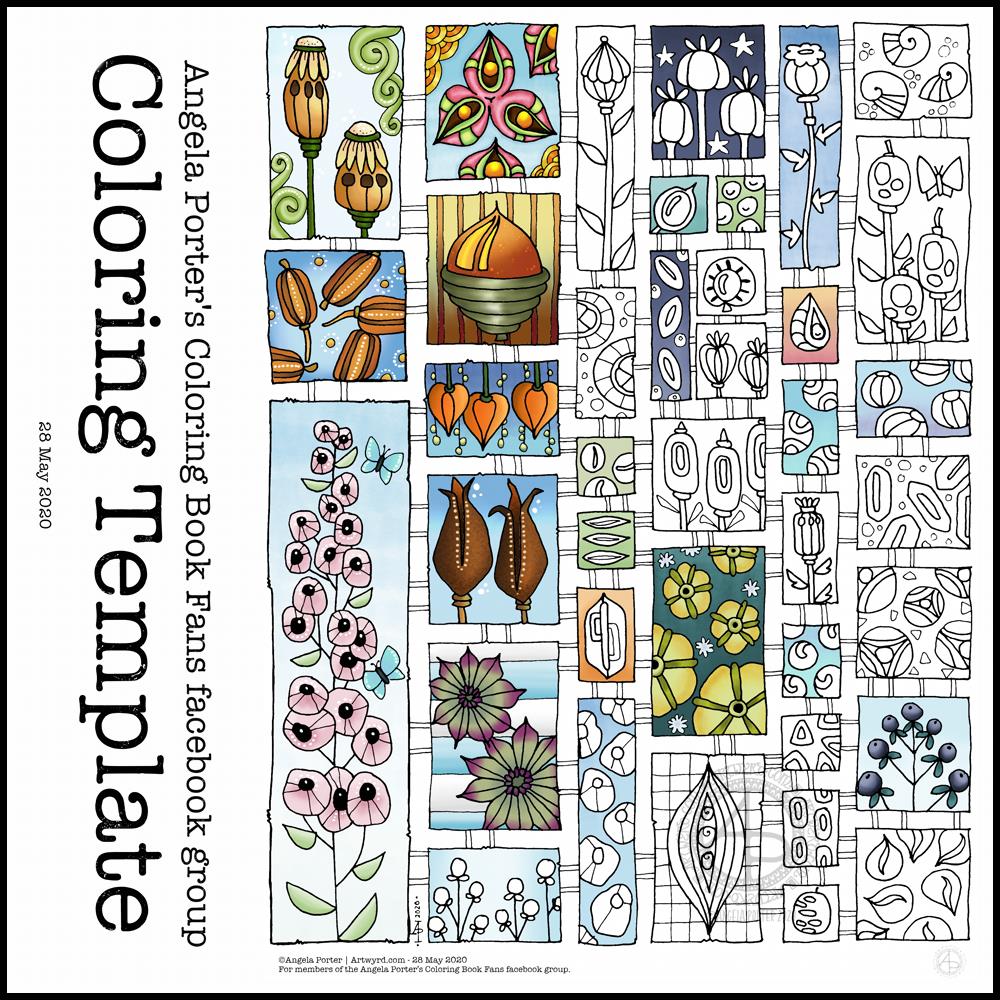
Another week in lock-down has passed us by here in the UK, as well as many places around the world. That means it’s time for another weekly coloring template.
This week, the inspiration for this template has come from the pages full of capsules, pods and seeds in my sketchbook. Lots of opportunity to experiment with colour, but also adding little details to each tiny picture.
Drawn using Sakura Pigma micron pens (05 and 01) on ClaireFontaine dot grid paper. Clean up of drawing, colouring and typography done digitally using Autodesk Sketchbook Pro along with a Microsoft Surface Studio and Microsoft Surface Slim Pen.
I’ve enjoyed creating this sketchbook sampler page. I drew the designs with a mixture of Uniball Unipin pens, Faber-Castell Pitt Artist pens, a medium nib Schaeffer fountain pen, and an extra-fine nib Faber Castell fountain pen. I used dot grid paper from Claire Fontaine.
After scanning the page in, I removed the dot grid and added a grungy paper background. I then decided I’d like to add some colour and shadow/light to the designs. To do this, I used a messy chalk brush, so my colouring isn’t as precise as I usually like it. However, it’s loosened up my expectations of myself as I went with it.
Pastel colours were my palette of choice as I like the way they seem to almost glow against the grungy kraft background. I also like the way they help to enhance the 3-D appearance of the designs. I do enjoy playing with shadow and light.
Some of the designs are examples of my organic, entangled style of drawing. Others are repeating, geometric zentangle-style patterns. And then there’s some inspired by Medieval illuminated manuscripts.
I also enjoy working within a clear border. I like the sense of structure it brings to my work. It also satisfies some kind of aesthetic need within me. Every now and then I try work without a border, but the artwork I produce just never feels quite right to me. So, it’s time for me to accept the need for borders is part of my artistic voice.
There is a purpose for me creating these borders. I’m building up a library of them that I can use to embellish quotes and other projects.
Some of these borders would look fab as greeting cards note cards, bookmarks, and to use in other paper craft projects. They’d also work well as embellishments for BuJo, planner, diary, scrapbook and journal pages.
Others would be a great foundation for dangle designs (my book “A Dangle A Day” is a good place to start drawing dangle designs).
What I do know, is that I find drawing soothing and relaxing. So, I’m going to be spending the rest of my Sunday drawing more borders.