‘Aliferous’ – an Entangled Drawing

I have had a little period of using hand lettering along with my style of entangled drawing. I love words, and aliferous is a word new to me. It comes from the Latin ‘ala’, meaning wing, and the word’s first known use was around 1726.

Over the past week or so, I’ve been losing myself in A5-ish-sized drawings, all Entangled art. The peaceful, quiet time has been and continues to be what I need. I’m sure I’ll find a new equilibrium point regarding focus, a clear mind, and calm emotions and mind. How long that will take… I don’t yet know.

Until that point is reached, I’ll be doing what I can to be gentle and kind to myself. As we all need to be.

Monochrome Abstract

A bit of abstract art, along with a quote today.

The patterns here remind me of the folds of fabric in Romanesque sculpture. The memories of visiting Romanesque churches, cathedrals and abbeys are filled with the sense of awe and wonder at the beauty of the sculpture, as well being fascinated, contented and happy.

The smooth curving forms, the play of light and shadow – these are things I love to play with in my work, whether pure abstract or with coloring templates.

The quote is how I feel about what I create. I know I put more of myself into my art than I realise, but creating beauty, allowing others to share in what I find to be beautiful and fascinating is what I do. And there is nothing wrong with that.

When I create, I carve out time to find a space of peace, calm, contentment in my life. Creating art is my sanctuary, a time and place where I can forget about the pressures of life, the pains of the past, and worry about the future for a while. If viewing my art, or colouring my colouring pages, even for a moment, gives another person a sanctuary from the pressures upon them, then that is a good thing.

Art for heart’s sake.

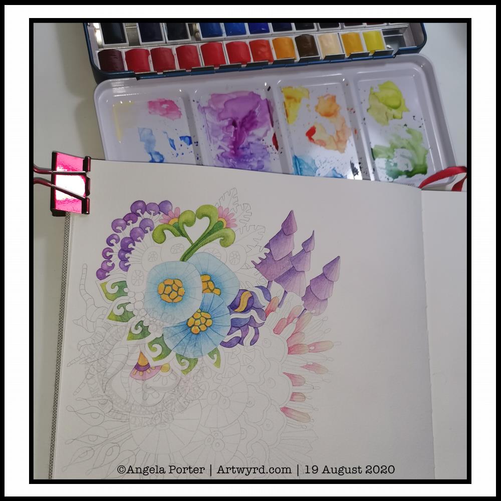
Experiment in watercolour

It’s WIP Wednesday, so here’s a work in progress I started this morning.

I woke thinking it was about time I tackled rendering one of my abstract, stylised, imaginary botanical designs in watercolour.

I think I’ve gained a bit of experience with watercolours, kind of have a feel for them and how I like to work with them. Or so I thought.

Anyways, I started by drawing the design lightly in pencil. I used a 0.5mm mechanical pencil by mistaked; I had intended to use a 0.3 mm one instead. No matter, this is an experiment, a trial in my Arteza watercolour sketchbook.

Once I was happy with the drawing, knowing I can always add more to it or alter it before painting it, I started to add colour.

I started with the bottom right blue seed-poddy/stylised flower motif. I thought I’d use two different shades of blue alternately around it, adding shadow and depth. That didn’t work out too well. I tried dry brushing on the ‘spokes’ of the motif. My reaction was ‘yeuch! Angela what were you thinking???’.

I didn’t give up at this point, though it would’ve been easy to do so. I continued on, reminding me this is an experiment, I’m trying something out that I’ve not had much success with in the past; just keep going.

So I did. And I know I have work to do to recognise when the wet paint has dried enough for a different wet colour to spread nicely, but not too much, when dotted into the first colour.

As time was going on, I was becoming more comfortable with how I was adding colour. I was working out that adding glazes was a way to darken areas, and that I could gently blend the edges out while the glaze layer was still damp so I didn’t get harsh lines.

Slowly but surely I coloured in different motifs, careful not to do wet next to wet.

All in all, I’ve worked on this painting for around three hours. There’s a lot more to do, but I can pick at it from time to time.

What I have noticed is, however, how much I want to add colour in the same way I do when working digitally. An interesting observation, the implications of which I have not even started to unpack yet.

Therapeutic art once again…

Once again, I turn to art to help me manage my unsettled emotions and thoughts. I am so tired, again. The stress of the past week or so has taken it’s toll. However, like the heavy rain and rather windy weather we’re experiencing here in the Valleys of South Wales, these will eventually blow over and I’ll be able to focus on my contracted work.

I’ve learned that when I’m all out of balance, it’s best for me to focus on art that is soothing, that no one expects anything from me, that I don’t have to worry about messing up. If I try to do art that others need to be happy with too, then I get frustrated and negative about myself, doubt myself.

So, for today at least, I will be creative in ways that will give me the time and space to heal my frazzled emotions and gradually work my way back to mental and emotional well-being once again.

After a life-time of putting everyone else’s needs and happiness first, I’m gradually learning to take care of my own needs first.

I felt guilty and selfish to say ‘my own needs first’. But it isn’t selfish to look after myself. It’s a recognition of being responsible for myself and my own needs and well-being.

And so, today I art, for art’s and heart’s sake.

I just wish it wasn’t so darned rainy and blowy. The rain alone I’d be happy to go and walk in, or the wind alone. But not both together. It is forecast to ease off in a couple of hours, so maybe I’ll get a walk this afternoon, with brolly and waterproof jacket. I’d like that. But for now, I’m going to go and drink tea, draw the design for Template Thursday, and have the quiet time I need to heal, recharge and refresh.

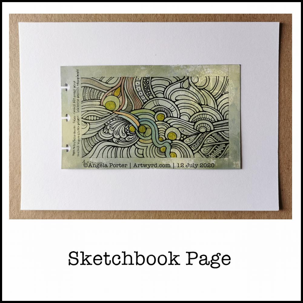
Sketchbook Page

The art

At 4¾” x 2¾”, this is a fairly small drawing.

I used a variety of PaperArtsy Fresco paints to colour a 5¾” x 3⅜” piece of ClaireFontaine Paint-On mixed media paper. I chose, for me, an unusual mixture of colours. It’s ended up looking like old, distressed and grungy painted walls.

Next, I drew the abstract design with Faber-Castell Pitt Artist pens. I did the basic outlines, leaving my decision whether or not to add details for later on.

Then, I tried adding some colour to the background with Inktense Pencils and a damp brush. As this is a sketchbook page, I tried different colours out to see which ones would work well with the background. The finish on the Inktense-d areas was rather chalky and dull, though a subtle colour was achieved on the acrylic paint background. I’m not sure if I like it or not.

I find it difficult to resist a bit of shimmer and shine on my art, so I used a Uniball Signo gold glitter gel pen to fill in some of the circles in the design.

Finally, I added some more complex patterns to some areas in the design. I could’ve filled in more areas, but I’ve decided that this is enough.

Other stuff…

This wasn’t the only piece of paper I coloured with the Fresco paints. As they’re for the sketchbook, I coloured each piece on both sides. So, I now have quite a few prepared pages in my custom sketchbook to draw on as time goes by.

I think I’ve finally settled down after the trip out on Tuesday. I seem to be more settled, for sure. Meditation, self-care, self-soothing and enough rest has worked it’s magic once again. Sunshine today is helping as well, along with the refreshing breeze that is gently flowing in through the windows.

The simple things in life are often the ones that bring most peace to me – art, meditation, quiet times, sunshine.

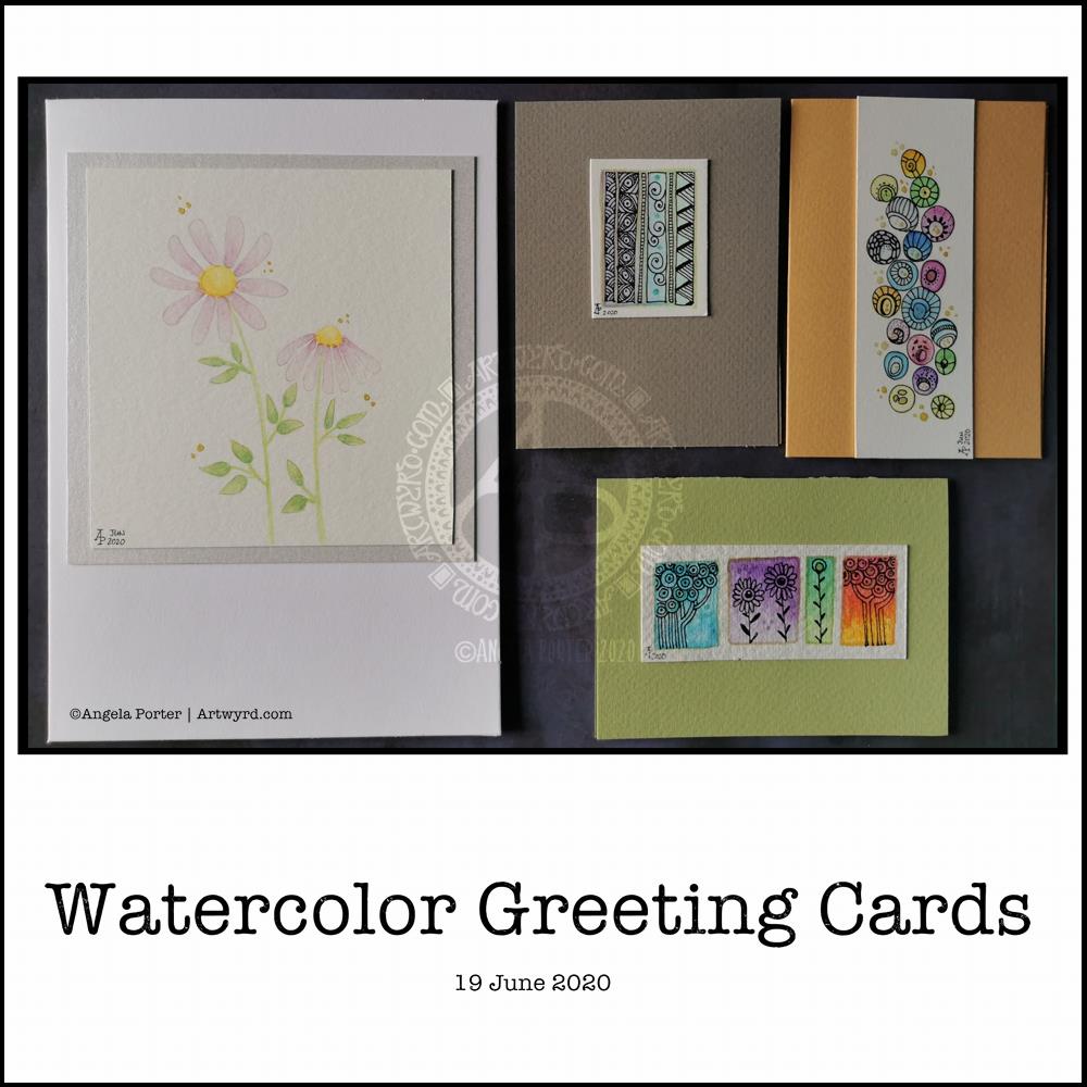
Watercolor Greeting Cards

About the artwork

I needed a quiet morning, again, today. So, I thought I’d dig out my Caran D’Ache Supracolor Soft watercolour pencils and try some stuff with them.

I wanted to use them to draw a flower, or two, and then use water to create a watercolour effect. The result you can see on the left-hand side card. I’ve left loads of white space on this card, which is unusual for me. I couldn’t resist, however, adding some gold dots around the flowers. The colour of the petals was so delicate that I used a 2H 3mm pencil to outline them and the leaves. Just for info, the piece of watercolour paper measures 4″ x 4″.

For the other cards, I just wanted to work with the pencils to create gradients and abstract patterns in colour. I drew on the little panels using a 0.25 Copic Multiliner SP pen and added some lines and details with metallic gold watercolour. These cards are approx 3″ x 4″ in size.

Watercolor pencils are nice to use when it comes to drawing in colour with them, then activiating the colour with water. They really glow on 100% cotton rag paper (bottom right) compared to the other cellulose papers.

Cute and whimsical cards, some very detailed, one not quite so. But a nice way to spend my morning.

Self-care time, again.

There’s a situation going on around me that is draining my emotions greatly at this time. I’m doing my best to not become overly emotionally involved in it, but it’s difficult when it’s to do with people you care about.

It all has a knock on effect with me. I’m anxious, tired verging on exhausted, really grumpy, irritable, and lacking patience at this time. I’m also not able to concentrate too well. These are all behaviours I could do without in dealing with this situation. Yet I’m exhausted by it.

I have been meditating, making sure I take time to do self-calming and self-soothing activities, such as my morning art, Though I have work to do for contracts, I need to take a day away from everything, if I can.

I know there are lessons for me to learn about myself in how I’m reacting ot the situation, stuff from my past that wasn’t processed during my EMDR therapy. If I can work out what it is, I can work through it myself now. Organising EMDR therapy isn’t possible at this time, with lockdown still very much in operation and me being very nervous of going out into the world as well.

So, I’m going to make time today to drink tea, meditate, journal and try to get to the bottom of my own issues and start doing what I can to work through them and heal the past traumas that are causing my reactions at this time.

I think I’ll also take time to crochet (I started a mosaic blanket earlier this week) and watch films or crafting shows on the TV. Eat healthily – I have a yearning for brussel sprouts, of all things! And take time away from social media and news. I may even pick up my flute and play it, for the first time in months and months.

Seeking Calm

Another morning, another migraine-y headache. Yet again caused by stress and worry. Painkillers taken, just waiting for the pain to go so I can sleep the remains off.

I also completed this peace of art which I started last night. I painted circles of watercolour on a 5.5″ x 6.5″ piece of Canson Moulin Du Roy watercolour paper and left it to dry overnight.

This morning, I wanted to add pattern to the circles. I tried using a white gel pen, but it wasn’t quite opaque enough. So, I used a fine brush and white gouache. That worked really well. It was also good practice using a brush like a pen or pencil. Is it still drawing if you draw with a brush, or is it painting? I don’t know!

The circles have ended up looking like diatoms, formanifera, microscopic bits and bobs, seeds, sea urchins…

Once the gouache dried, I added some more watercolour to add shadows and details to help bring some sense of dimension or volume. The white gouache works really nicely with the watercolour. Black pen can often feel too harsh to me with delicate colours. The white lines of gouache seems a lot more sympathetic with the delicate colours. It adds a lightness, airiness, delicateness to the design. The opacity gives a sense of more solid support, architecture.

While I like the transparency of watercolour, the way I’ve added the lines and shadows doesn’t quite work being able to see the lower layers, and my head doesn’t quite work right at the moment to work out how to add details from the lower layers that could be seen. Mind you, it does give me something to think about (when ny head will let me think) in doing similar kinds of work in the future. I definitely want to explore using gouache with watercolours.

I did think of adding some metallic dots, but haven’t done so at this time. I can always revisit this painting in the future.

It’s also giving me something to think about in working digitally, though I’m not sure what those thoughts are at the moment.

While I was doing this, I felt calm, content, at peace, and the headache wasn’t so noticeable. Hence the title – “Seeking Calm”. That’s exactly what I was hoping to find while finishing this artwork off.

Detailed drawing is something I love to do. Creating abstracts based on patterns/shapes that I’ve observed in the world around me and in nature is also something I love to do.

Exploring different ways of working with different media to see how I can get it to work for me (or not work for me) is also important. Watercolour is something I do struggle with and would like to work with. This little work of art is something that is a stepping stone on my way to finding a way of working that works for me.

Another blue mandala

©Angela Porter 2019

Yes, another mandala, but I enjoy creating them so much! I’m also exploring how to create them in a different way than I would usually; instead of drawing with black ink then colouring, I’m drawing in colour itself.

An unusual choice of colour for me too – a navy blue. I must admit, I’m enjoying working in monochrome for these mandalas. The colours are always harmonious and while I love a riot of colour, it’s much harder for me to incorporate that into mandalas like this. Well, at this time it is. Who knows how this is going to evolve.

Yesterday was a busy kind of day that had me away from my workspace from mid-morn. It was fierce chilly out with wintry showers of sleet and heavy-duty hail interspersed with bright, clear winter sunshine which did little to raise the temperature but did raise the spirits.

I was still feeling quite calm after my therapy session on Monday, still having that gentle, subtle inner smile, which I’m doing everything I can to hold on to, gently of course!

It’s always nice when I can find a sense of some kind of balance within me. I sense that these periods are getting longer and longer. However, that means that any downward blips in my mood and state of my mind feel more extreme in comparison. I do have to mention though that the downward blips, though sometimes scary and worrying, don’t seem to last as long as they used to.

Back to my mandala. I used my usual tools trifecta – Microsoft Surface Studio, Microsoft Surface Book and Autodesk Sketchbook Pro. I love that I’ve discovered that I love to carve basic colour shapes into these intricately patterned mandalas.

Coloring Day is tomorrow!

Angela Porter Coloring Day 2018 coloured wip

Tomorrow is National Coloring Day in the USA, but I think it should be an International Coloring Day, a day where people are encouraged to do some colouring as a way to find a little peace and calm in their busy lives, as well as to express themselves creatively.

It doesn’t matter if you only colour in one flower or leaf or letter, or if you complete the whole template on the day; all that matters is that you take time out to just relax with your chosen coloring medium.

It matters not how expensive the medium is, or what the brand is. All that matters is that you enjoy and find the process restful, calming, relaxing and your mind is given a bit of a break from the endless self-talk we all experience.

Each year since it started, I’ve created a coloring template, and this is this years!

Here’s a link so you can download the black and white template . Just right click on the image and save it to where you can find it!

You can also find the image on the Angela Porter’s Coloring Book Fans facebook group. Not a member? Why not sign-up and join in with others who love coloring, particularly my art/templates.

There are just a couple of terms and conditions; please read and follow them:

  • The template is for personal use only. If you want to share the template with others, then please share a link to this blog entry rather than just the template file!
  • The template is not for resale or for inclusion in publications of any kind or in any format (physical or digital) with out my express permission.
  • If you share your coloured version, then it would be really lovely if you would mention me, Angela Porter, as the artist and my blog or facebook page.

I look forward to seeing your colourations. Happy and peaceful coloring!

Are there rules to colouring in?

AngelaPorter_Color Me Stress Free_teaser1I have read many times on various facebook groups how people worry that they aren’t colouring in colouring sheets or books correctly, or they are worried that their work won’t be up to scratch compared to what they see as the amazing work done by others in the groups.

I think I may be qualified to comment on this and to offer some advice, especially as I have now created hundreds of colouring templates for Color Me Calm, Color Me Happy, Color Me Stress-free, Entangled, The Can’t Sleep Colouring Book, Japanese Patterns, Scandinavian Folk Patterns, and 60’s Patterns, with more to come!

Firstly, I’d like to ask you why do you want to spend time colouring in?  Is it for relaxation?  Is it for fun?  Is it to combat boredom?  Is it to while away the time while you are poorly?  Is it for some other reason? Is it for enjoyment?  Is it to lift your mood? Is it because you love colour?  Are there other reasons?

Notice, I ask what your reasons are for colouring, not telling you what mine are.  Your reasons can be as private or as public as you wish.

The colouring templates I have created (and continue to create) have been done with relaxation, joy, enjoyment, lifting moods, taking a break from the crazy pace of modern, technology filled life.  They offer an opportunity to take an almost meditative break from every day life, space for some ‘me time’, some self-caring time.  That was, and is, the aim behind the Color Me books.

In none of the books are there a list of explicit do’s and don’ts for the use of the book (apart from the copyright stuff).  And why should there be?  They are there for you to make your own, for you to have pleasure with, for you to find ways of expressing yourself, to go back to a time of childhood innocence where there were few rules and responsibilities.  They are there for an opportunity for you to become as carefree as you wish. Rules, do’s and don’ts, am I doing it right?, and all these other judgmental thoughts or questions have no place in these books, or similar books.

You can do no wrong!  Trust me.  You really can do no wrong! Really, you are invited to do as you wish to with the colouring templates.

Want to use coloured pencils, wax crayons, chalk pastels, oil pastels, acrylic paints, marker pens, watercolours, collage, glitter, sparkly gel pens, scented pens, stickers?  Want to use many different mediums? Go for it!  Enjoy it! Do whatever you feel inspired to do, whatever you’d like to try out.

Want to split larger sections into smaller ones?  Want to join small sections into big ones?  Great!  Do what you feel you’d like to do!  Trust your instincts, trust how the image is speaking to you.

Want to fill sections in with patterns?  Want to add words or phrases?  Want to add little drawings of your own?  By all means do so!

Worried you’re breaking some rules of art, or colour theory?  Don’t worry!  There are no rules here – if it pleases you that is all that matters!  If you’re using the colouring to get some insight into your emotions or inner thoughts, then don’t worry about all that colour theory stuff, express yourself!

Worried that you’re using the media wrongly?  Don’t worry!  If it works for you, it works for you!  If you’re happy with the result and enjoyed the process, does it really matter what one person or another says?  No, it doesn’t!  If it’s not quite working for you, don’t give up, experiment, and enjoy the process of exploration, of discovery.  You do not have to be an instant expert!  It’s ok to be a learner; in fact we all learn for the whole of our lives and what is so bad about that?  Nothing!  Do you think Leonardo da Vinci just painted the Mona Lisa one day, without years of practice and experimentation, of finding out how to express himself artistically?  Of course he didn’t!

I give you permission to play, to use different media, to shade or not shade, to blend or not blend, to simplify, to make more intricate, to break the rules.

Talking of rules, where did you learn all these shoulds/should nots of colouring?  Why do you still think they are so important? Why do you think that plants can only be green, the sky blue, rocks grey, the Sun yellow, the Moon white.

Let me give you permission to make all these things, and more, any colour you want!  I give you permission to break the rules! You want pink trees with bright purple trunks – absolutely!  You want a lilac Moon – not a problem!  You want to put fuchsia pink and lime green next to each other – what a wonderful idea!

I give you permission to express yourself with colours as a child would, with no rules, but with sheer pleasure and enjoyment!

I believe that inside each and every person there is a creative soul seeking an outlet, and colouring is one way of access things, and who knows where it will lead, what new talents you will discover hiding inside yourself, who knows how it will help you heal, to find new solutions to old problems, new insights to what is going on, as you take a break from worrying and all kinds of thoughts whirling around your head.

Now, what’s the worst that can happen?  You end up disliking something, wasting a little bit of felt tip pen, using up one piece of paper with a printed image on it.  Is that a bad thing?  Ask yourself why you dislike it, what is it trying to tell you, what lessons you can learn from it.  Write notes on the image or the reverse of it, use it to explore yourself, use it in a positive way.

Remember, no one ever has to see what you have done, not unless you wish to show them.

Worried that people will be critical of what you have done?  Don’t show them!  This isn’t for other people.  It’s not a competition.  It’s not to see who can colour the smoothest or stay inside the lines (it’s quite all right to go outside the lines or not go right up to the lines too, you do what you think is right).  It’s something that is entirely for you.  If you’re pleased and proud of what you’ve done and want to share it, then please do, but don’t feel you have to.

Remember, the whole point of this is for you to enjoy yourself, to get messy, to play with different media and images and colours the way you feel you want to at any particular time.

Remember, in art there are no mistakes, only happy accidents!  Sometimes the things we think are mistakes are actually something beautiful and wondrous in their own right, something we learn from and incorporate into our future creativity.

The only ‘rules’ there are in this are the ones you impose upon yourself.  There are no colouring-in police.  There are no international laws about how to colour in.

A last note, I would love to see what you do create and the story behind it and yourself, especially if the process is helping you heal or overcome various difficulties in your life.  That is one of the dreams I have for how my art can be used.

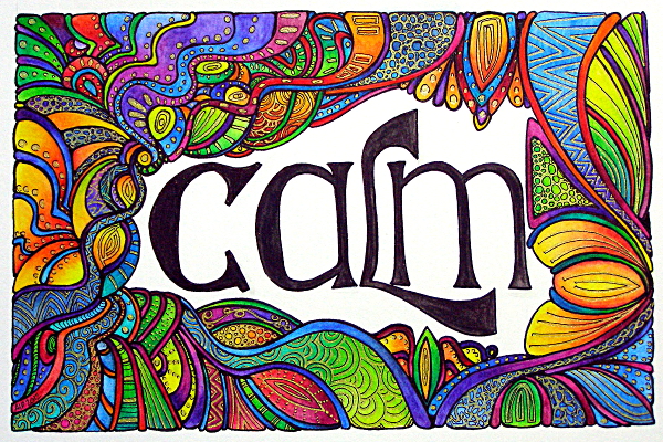
Calm

Calm 24 June 12 © Angela Porter 2012

Approx 19 x 12 cm.  Technical drawing pens and black ink, Derwent Inktense pencils with water wash, Uni-Ball Gold pen.