Entangled Art WIP

Today, I finished drawing this entangled, zentangle inspired kind of floral/botanical design. I did start this yesterday afternoon, but continued it this morning before I settled back to sleep. I’ve had a poor night’s sleep thanks to yet another upset stomach, so after my Wednesday delivery from Abel & Cole, I drew and then settled back to sleep.

I’m still feeling very tired, my digestive system is still uncomfortable, delicate, upset. But I have to run an errand today. I’ll get to that soon enough and then I’ll see how I feel and how that dictates how I look after myself for the rest of the day. I suspect more sleep will be needed.

Anyways, this drawing is on an A5 piece of Canson Imagine mixed media paper. I used a 0.3 Unipin pen to draw the design, and I’m now adding colour using a fairly limited palette of Zig Clean Colour Real Brush pens:
*green gray
*pale dawn gray
*olive green
*deep green
*ochre
*bright yellow
*pale rose
*lilac
*english lavender

I’m considering adding a couple of browns to this palette, as well as using some olive green over the grays.

These pens do move easily with a barely damp brush on this paper making it so easy to get a colour gradient. It’s also easy to add more colour to intensify the dark area.

I have recorded my morning art session as vlog.

In the vlog I talk about how the pressures of being constantly productive turned me into a workaholic when I was a teacher, and then fed negatively into my self-image which ultimately led to my burn-outs/breakdowns. I have learned that taking time for myself, to just be, to relax, to do things I enjoy, to look at ‘goals’ in a realistic kind of way to limit the pressure I put on myself.

I no longer have the external pressures of my career as a teacher, and one of the many hard lessons I’ve had to learn as part of my healing is how to value self-care time, and how that time can change from day to day. It’s so important for me, otherwise life’s own stresses and strains can take their toll on me and leads to physical, emotional and/or mental exhaustion or even ill-health.

Taking time to rest, to relax, is being ‘productive’, but in an important way. The productivity is investing time in one’s self and one’s own well being. And that is so very important.

This is why I take time nearly every day to create art just for myself, for the pleasure of creating, of exploring and experimenting, with no pressure on myself to create a completed work of art or for commercial gain. Just for the simple joy it brings.

Admittedly, I can fixate on art and forget about doing other things I enjoy, such as playing my flute, or learning to play my harp or tongue drum, or reading, or journalling, or even getting out for a walk, or combining my walk with sketching.

I know this is something I do need to work on for sure. But, like everything else, it comes together in it’s own way, in it’s own time, when I am ready to do so.

Small ‘aha’ designs

Lots of little drawings.

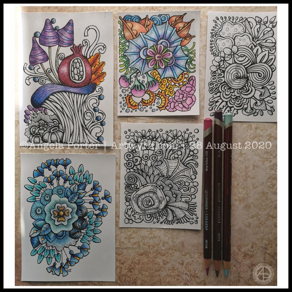
Over the past couple of days I’ve been drawing small designs in pen, including plenty of line detail to add volume and shadow.

Today, I scanned the drawings in and printed them out (after cleaning them up a tad digitally) so I could try colouring them.

I wanted to print them on mixed media paper, which I know my printer will take. However, even with clean scans, the prints were really messy. However, when printed on ordinary paper, the prints were pristine.

I wasn’t happy as I wanted to use a paper with a bit more ‘tooth’ so I could make use of the Derwent Colorsoft pencils. But, I persevered and the results are above.

The first I coloured is in the top middle. My colour sense isn’t always wonderful. Lots of colours, but it just doesn’t feel coherent in any kind of way.

So, I moved on to the next design. This time, I thought I’d use analogous colours (colours next to each other on the colour wheel), with a touch of a complementary colour to add brightness. Complementary colours are opposite each other on the colour wheel.

I like this second one much more. It feels cohesive, like everything belongs together. And the little bursts of yellow/orange just lift it all.

The third design I’ve been colouring is only partly done. I’ve veered away from entirely analogous colours, but I am trying to keep the colour palette simple and with, perhaps, an autumnal feel to it.

As I was working on printer paper, I needed to use some way to blend the colours. I remembered I had some ‘Zest-It’ blending solution and some paper torchons. They worked well. The big frustration was that I couldn’t lay down intense colour. However, as these are prints, I’m not too worried. I do need to find some toothy paper which will go in the main paper drawer of my printer. I do have some cartridge paper here somewhere which should go through it.

Of course, scanning the drawings in means I can also work on adding colour digitally. It means I can try things out until I’m happy with the results.

Pesky printers

I never have much luck with printers. Inkjet printers die on my quickly, even the more expensive professional ones. I thought I’d try a laser printer, but I seem to have problems with this one now not giving clean prints when I use the sheet feeder for specialist papers.

I don’t print much out, to be honest, but it’s frustrating when I want to print artwork out on specialist paper.

A note to self about colour.

What I have learned is that I like to watercolour the designs, but then the addition of coloured pencils to intensify the colours and add shadows works really well for me. I like the intense contrasts that I can get with coloured pencils that I just can’t seem to achieve with watercolours.

Of course, I can always colour digitally, which lets me play with colours, change them, until I get something I really like.

Today, I’ve had a reminder that limited palettes, particularly of analogous colours, seem to be working rather well for me, especially with those accents of complementary colours.

I really do need to put a big ‘note to self’ where I can see it to remind me of this. I can get carried away with colours

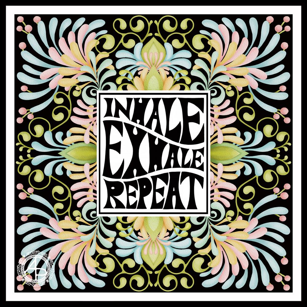
Inhale, Exhale, Repeat

This was so very enjoyable!

I started with the hand-drawn typography. I’ve just started another Domestika course — Hand-Drawn Typographic Portrait by Sarah King. The first exercise is to letter words boxes divided by wavy lines. Then, creating letters in different weights. And of course, practice is something that needs to be done.

There was just something about her approach to this that grabbed me, and so, I now have many boxes with words and quotes in.

The first lesson shows how to use Photoshop to edit your lettering outlines and fill them with black. I found the process rather clunky and long-winded. Perhaps that’s because I’m used to working in Autodesk Sketchbook Pro with a pen on a screen as if they were pen and paper, that I could do this in my own way.

So that’s what I did. I used one of my pencilled samples to create the typography for the centre panel.

Then, it was adding the background. I just went with the flow on that one. I made use of the symmetry tools in Sketchbook Pro, and just had fun with a limited colour palette and my favourite kinds of shapes.

The course is about portraits. However, I have zero interest in drawing people. However, the techniques shared will spark ideas for how I can use them.

I’ve long been trying to incorporate words, quotes into my artwork and struggling to find my own style. I’m not sure if this will help, but I’m really quite happy with this particular artwork.

Mandala – 18 Aug 2019

Mandala ©Angela Porter | Artwyrd.com

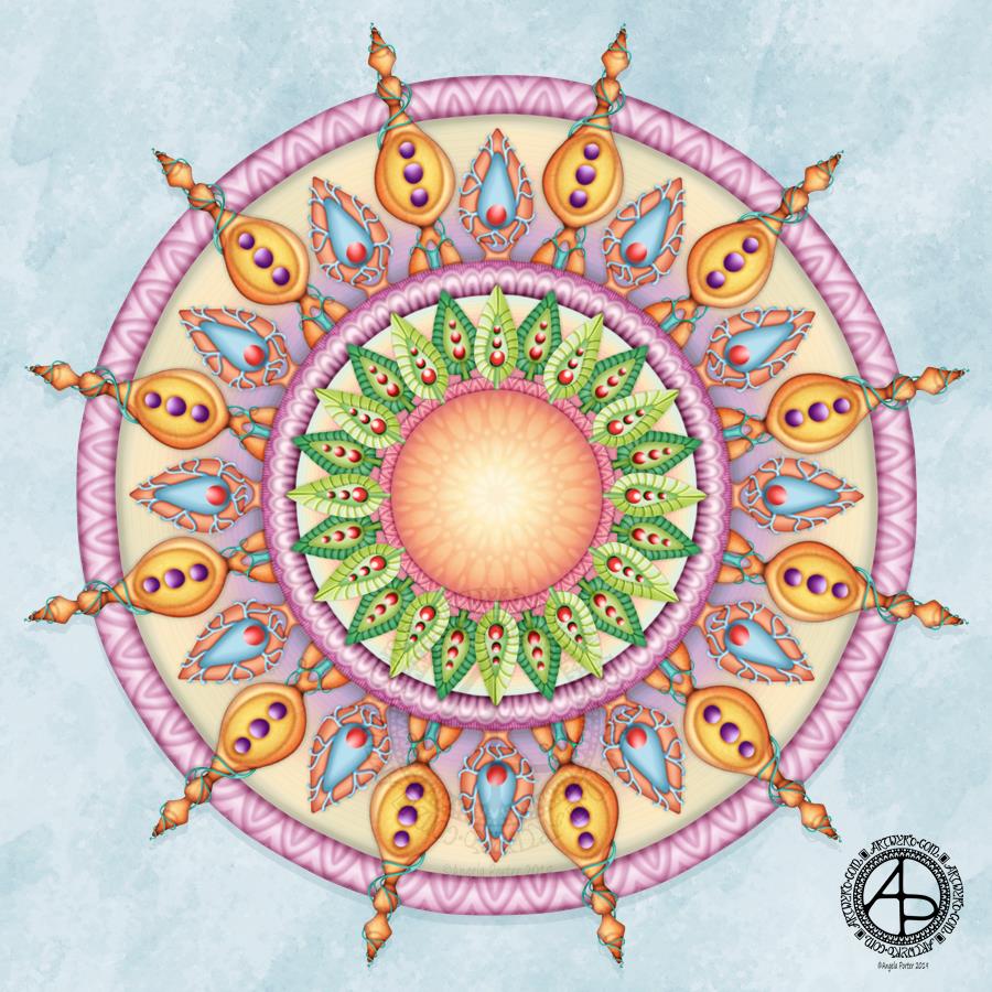
I enjoyed creating this simple, for me, mandala; I am pleased with the result.

It’s not been without the need for editing along the way and changing some of the design elements. That’s the beauty of working digitally; being able to change the design when I realise that some parts just aren’t working.

Of course, it helps if my mood is in the right place too. Last night and today I’ve found my balance once again and the oompf to create. This mandala is a reflection of that.

I also reset the colour palette I’d been using in Autodesk Sketchbook Pro and created one with a limited palette.

Even though I’d limited my colour choices to twelve colours plus greyscale, I think that may still have been too many. So, the next mandala I create will have a smaller palette.

I particularly like how I’ve created texture and dimension in the ‘rings’ and also the central circle. It’s subtle but effective, I think.

One thing I would, perhaps, change if I was super-critical, are the leaves and the background to them. These seem brighter than the rest of the design. However, part of me likes that contrast.

I’m pleased with myself for persevering with this and changing colours that didn’t work as the design unfolded. I think I’m achieving a more coherent design as a result of using a limited palette.

Every time I create digital art, I learn new things and develop accordingly. Today, I have found it a satisfying experience. Even swapping colours hasn’t been the frustrating experience it often is.

So, onwards I travel on my journey of discovery and development as an artist working with digital media. If I look back, I can see how far I have come in the past three years since I bought my Surface Book. Acquiring a Surface Studio and its large screen has allowed me to explore and develop my art even more.