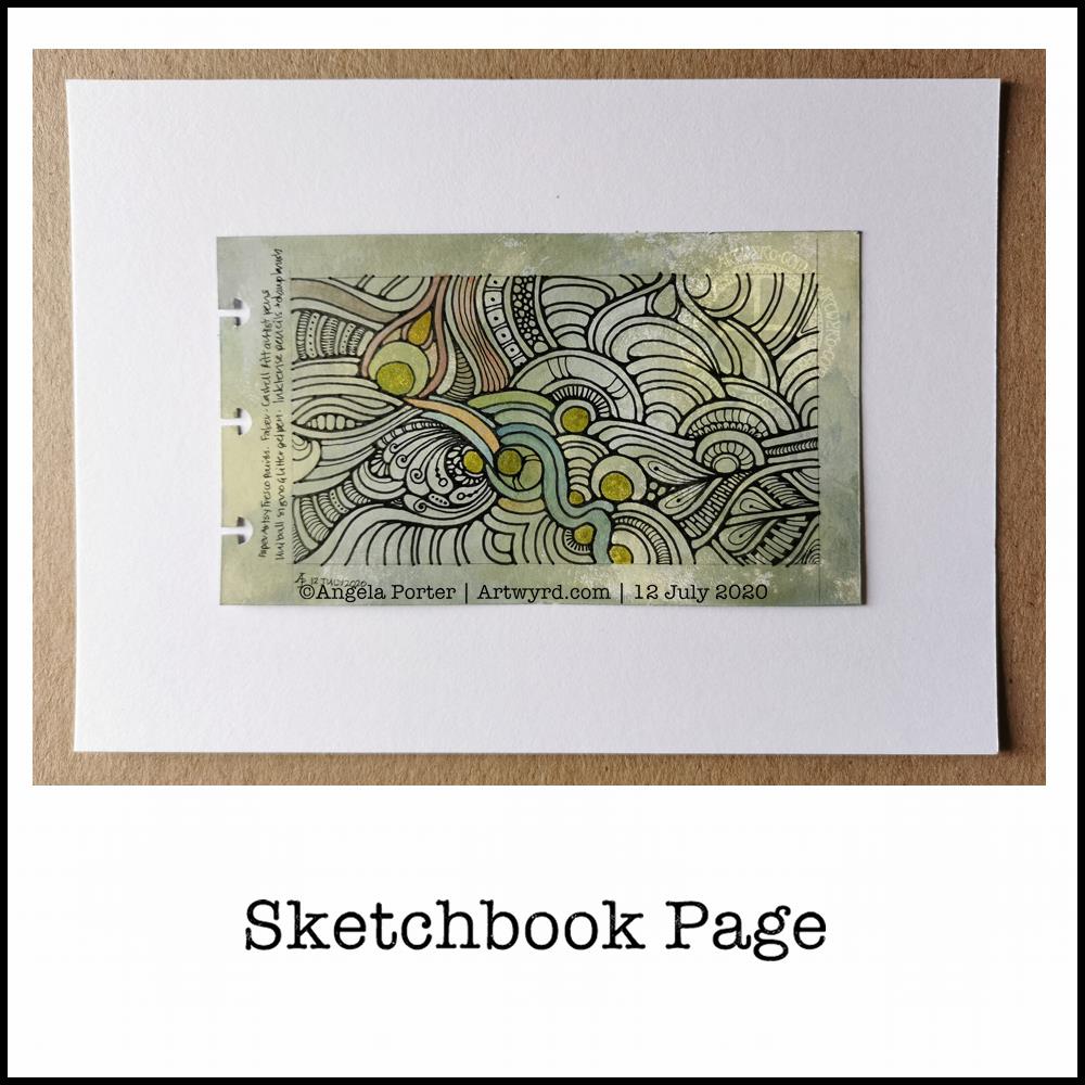
I easily forget how much I enjoy drawing ‘small art’. A small piece of paper is less overwhelming, and the creativity is no less soothing to heart, soul and mind.
Drawing with pen on paper is never overwhelming. It is a contented, peaceful, delighted experience for me, especially when I work intuitively. The flowy, abstract patterns, with various patterns and textures are always a joy to draw and work with. Starting with just one shape and allowing the design to form, not knowing what will appear from the nib of my pen, is a think of wonder, surprise and magic.
I lose myself in the intricacy of the drawing. then, there’s the addition of colour and contrast to bring the drawing to life. What was flat now appears to have volume to it. The colours may evoke emotions or memories. There is a story to be told in the drawing, but not one that is obvious as an illustration would make it. This is an inner story, an inner expression of my creativity, emotions, thoughts, and what shapes, lines, patterns, textures and items that make me smile.
If my art makes you smile, or brings you joy, peace and/or calm, then it’s done it’s job. There is enough in this world to make us think, to make us feel uncomfortable. We’re assaulted by such things constantly through the media. Time and space to have a break from all of that, to remind us that there is still wonder and beauty, kindness and compassion and creativity in this world is important. It’s also important to remind ourselves that us humans have a great capacity to create these important qualities that heal and soothe and connect us, help us to feel we belong as a member of humanity.
I’m not sure I got all the words I could say out there. Hopefully you’ll understand what I’m trying to get across.
I think what I’m trying to say is that I hope my art reminds you that beauty and wonder, times of peace and contentment, joy and belonging are essential to each of us. That’s still not right. Perhaps once day I’ll manage to express these feelings succinctly in words.
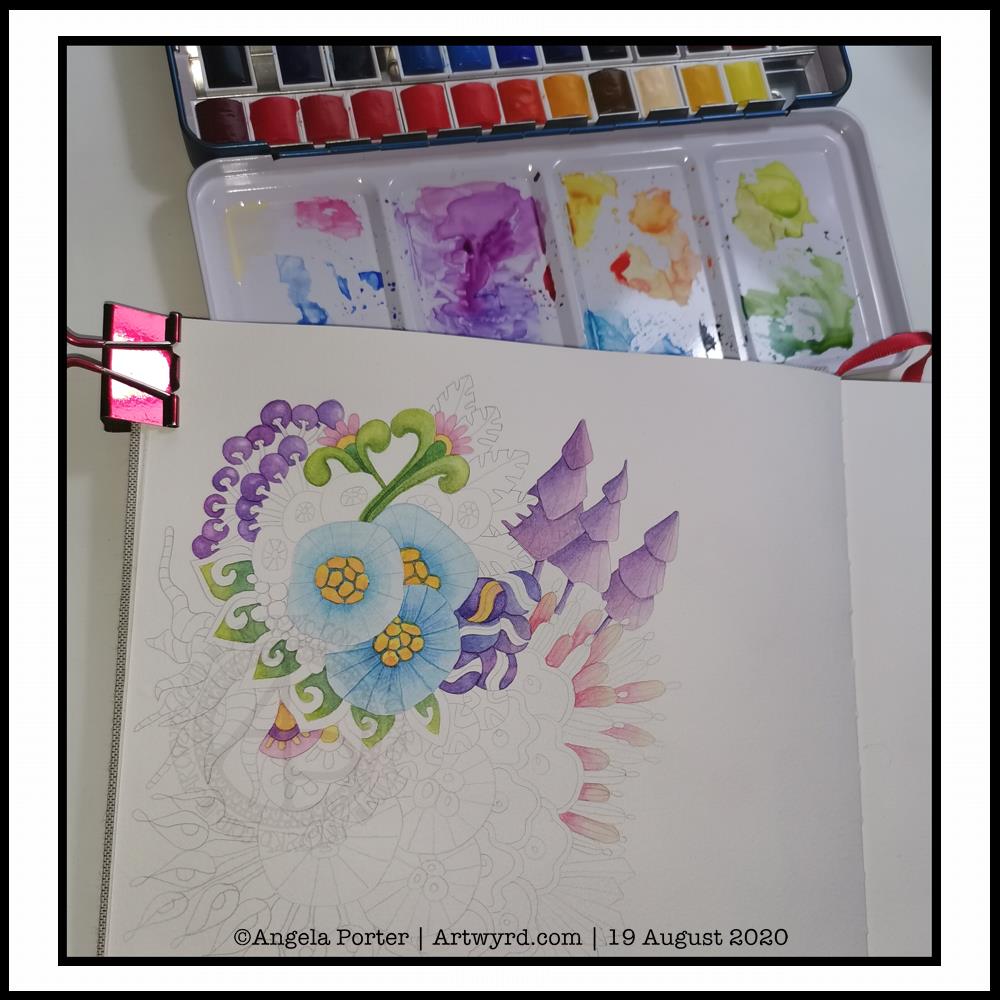
Adding colour, however, is a another tale. I get overwhelmed by the process at times. I doubt my choice of colours, and soon regret what I’ve decided to do. I always try to remember to scan my drawing in before I start to apply colour with traditional media; if I mess up at least I have a clean copy I can add colour to digitally.
Also, there are many times where I just get fed up of the process of adding colour and give up before completion. I can find it a very tedious process. Yet, when I complete the process and it all comes together I’m often really surprised and pleased with the end result. The frustration comes in because it takes so much longer to add colour than it does to draw a design!
Having said that, there have been a couple of pieces of artwork I’ve done recently where I’ve partly coloured them and I really like the effect, especially one where I’ve added shade first. That is something for me to consider going forward for sure.
There is a ‘Draw With Me’ video on my YouTube Channel, available to view from 1900 UK time this evening (19 May ’23).
Here’s a list of the materials I used in the video.
- Canson Imagine mixed media paper – 6.3cm x 21cm (2.5″ x 8.25″)
- TWISBI Eco fountain pen, extra fine nib
- Faber-Castell Pitt Graphite Matt pencil, 4B and a paper stump (tortillon)
- Derwent Inktense Pencils – Madder Brown, Red Oxide, Sienna Gold, Willow, Mustard, Shiraz, Poppy Red, Leaf Green and Fern.
- Kuretake Zig Waterbrush, fine tip.