These three works show my love of intricate, intuitive, flowing art. I continue to explore the use of colour to work on gaining more confidence in using it. I can appreciate how colour brings the drawing to life and sets the mood, too. I find using a fairly limited palette really helps me appreciate this.
I’ve worked on these over two or three weeks, give or take. It’s been a slow process as I’m recovering from a period of burnout from too much adulting and peopling. None are finished yet as I still have to indulge my love of pattern/texture to create more volume in the designs. Also, dots of gold acrylic paint have been added for that little bit of glitz and glimmer – something that makes my raven mind happy!
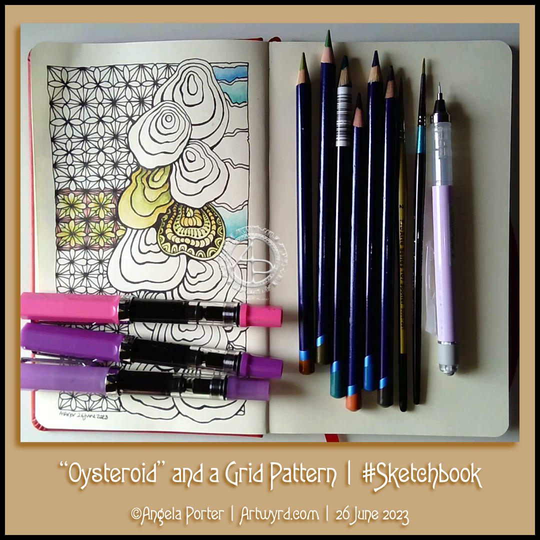
I had a peaceful and content time this afternoon as I created this page in my sketchbook. Well, the pen drawing part with some examples of how I’ll colour it. And I filmed it too, and you can watch it on YouTube.
I started with the stack of Oysteroids, a tangle pattern that I particularly like. I decided that I’d like to use a geometric pattern as a counterpoint to the roundedly organic Oysteroid.
So, I did! I like the way that this instantly gives a feeling of layers or volume.
Colour always vexes me. So, I decided to stick with an analogous colour scheme, choosing Fern and Mustard Inktense pencils to create stripes on the Oysteroids. I carried this palette into the geometric pattern. That was fine until I foolishly decided to use some Red Oxide Inktense. I have no idea what I was thinking! However, it did give a very ‘earthy’ feel to the pattern, in contrast, perhaps, to the sea-related Oysteroid.
That led me to wanting to use colours that remind me of the sea on the right-hand side. I’ll hold judgement on those until more colour is added. If the red oxide doesn’t work out, I have a rather lovely gold ink that can hide it away! Or black with gold highlights…
I used my fine and extra fine nibbed TWISBI Eco fountain pens, which are filled with black Dokumentus ink.
As you can see, I couldn’t help adding some pattern and texture to one of the Oysteroids. I’m sure the others will be treated in a similar way!
FluxEcho, a lovely floral tangle pattern by Lynn Mead CZT, was a delight to draw this morning. you can see my variations of the pattern to the centre-left.
I had decided to stick to a monochrome colour scheme for my Inktober Tangles, but today I decided to go a bit analogous! I’ve added some purple and blue to the design. Analogous colours are next to each other on the colour wheel – so green, blue and purple work well together. Even more so as the background is a grey-green colour.
Something had to be done about the hand-lettered panel. I’d added some colour with Inktense pencils and a water brush, but I wasn’t happy with the finish. So, I filled the panel with black ink and added the hand lettering using a white gel pen. I’m happier with this.
If you’d like to see how I created this partial page for my sketchbook, take a look at this video.
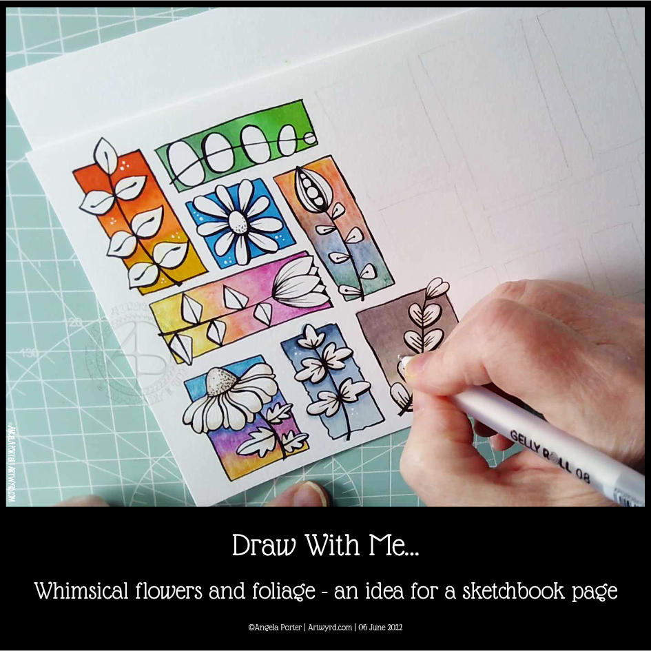
I spent an hour or so doing some warm-up drawing before turning my attention to inking in some colouring pages for “Fanciful Birds”, my next colouring book in the Creative Haven series.
Whimsy is always a welcome thing, flowers and foliage in particular. I also wanted to work with colourful backgrounds for each motif.
I really wasn’t fully awake and didn’t think through the type of paper I was using. I knew I wanted to use alcohol markers to add colour gradients to the background. Did it occur to me to use marker paper? Nope! Of course not! So they bled a tad – the Ohuhu brush markers I used for some of the backgrounds are rather juicy, too juicy for the paper. I liked the backgrounds, however, and knew I could fix the bleeds with a white gel pen.
So, I thought I’d switch to Inktense pencils and a damp brush. Not quite sure that they sit well next to the alcohol marker backgrounds. There’s lots of textureand an unevenness in the colour and gradient. Again, partly down to my choice of paper (all media paper from SeaWhite of Brighton).
So, for the last couple of images, I used some Arteza EverBlend markers for the blue and warm brown backgrounds. The bullet tips let less ink flow onto the paper, minimising the bleed. There was still some bleeding, which I made worse by trying to ‘erase’ it with a colourless blender pen.
I made use of the magic of a white gel pen to cover up these bleeds.
I definitely need to write some reflections for myself to add to this page when it gets put in my sketchbook. For now, I’ll just say that I like the last two I completed the most. Those are the blue and brown backgrounds on the bottom row. I do like the other alcohol marker backgrounds too, but there’s something about the more neutral backgrounds. I just can’t put my finger on what it is.
Right then, time to finish my mug of tea and get some more inking of colouring templates in!
This morning, I spent nearly two hours adding colour to this drawing. It’s getting close to being completed. Well, the adding colour part. There’s embellishing to be done too!
I’ve used Inktense pencils through out, along with a damp brush to activate and blend the colours.
As well as colouring new areas of the design, colour was added to intensify various areas that were appearing too insipid. I still have some of this to do to bring out a sense of volume in various elements.
I’m fairly pleased with this, though in hindsight adding the shadows with a grey Faber Castell Pitt Artist pen first may not have been the best idea. Still, it’s a learning experience, again.
This morning, I wanted to try out some abstract art. The picture above shows the colour to be more uneven than it really is.
Anyways, I’ve got ahead of myself here! This really carries on from yesterday’s blog entry where I discussed my relationship with abstract art, colour and expression of emotions and impressions of an experience.
I used a photo of ice melting in a shallow puddle for the inspiration for the shapes I drew. I didn’t choose to use icy colours, however. This morning I really felt that rusty, vintage, earth tones were what I wanted to work with.
I did do some experiments with both watercolours and inktense pencils on some Aquafine watercolour paper. I’m not at all fussed on Aquafine paper; I find it difficult to work with. However, as I’m experimenting, experiencing and learning it’ll do fine for starters. It did make it difficult to get smoothly blended out colour, but it will do for my purposes to begin with.
The vlog is just a few seconds short of an hour long, so I’ve also done a speeded up, time lapse version, with music.
I’ve written it before, talking as I work helps me to gain an insight into what is going on inside my creative, subconscious mind. It forces me to verbalise the thoughts that are abstract so that I can understand myself better. I also think it is helping me to hone in on my artistic voices/styles too.
Saturday is becoming sketchbook Saturday with a vlog on YouTube!
As well as showing the most recent page(s) in my sketchbook and talking about the media/techniques/inspiration, I spend some time working on the current, higgledy-piggledy page.
I’ve become intrigued with using the humble biro / ballpoint pen in art, especially as they are waterproof. There’s some amazing portraits and other work out there by seriously talented artists.
However, I’m working out how they may work for me, especially in my sketchbook when out and about (when that finally happens!).
As well as talking about the various techniques and inspiration for the art on this page, I also talk about how I want to include more writing in my sketchbooks. I’m intrigued with using creative writing record my experiences, feelings, thoughts and the presence of place alongside any sketches done when visiting somewhere.
I’m also thinking that if I take photographs of what interests me, then sketches and further work could be done later. This is going to be important when I’m not by myself and don’t have the luxury of spending as much time as I’d like.
I’d like to create a story that is in words and pictures, recording my whole experience. Perhaps, I may want to share this with others, so that they can get a glimpse into my mind and emotions.
I’m not too bothered about creating a work of fiction, but to capture all those abstract feelings and observations and communicate them with others…
Actually, it would be about sharing them with myself by becoming more aware of them and giving an outlet for those abstract thoughts and impressions I rarely verbalise as I’m unaware of them unless I’m asked to verbalise them.
Something else I’d like to do is to revisit typographic art with all of this in mind. Finding a way to incorporate words and imagery that expresses who I am, rather than taking quotes from other people.
I do love words, always have. During this past year, I’ve had so few opportunities to speak out loud, that I’m finding it hard to dredge up the right word at times. Previously this was so easy for me. So, it would be good to give my vocabulary a good work out as well as add new words to it!
It’s going to be a work in progress for sure. I doubt I can do this, or that it will be interesting to others, or that it will be any good at all. However, if I don’t take the first tentative steps on this strand of my life’s tapestry, then I may never discover if it is something I can do, nor will I discover where it will lead me.
All that it will take are basic supplies, and to create a new ‘habit’ of writing throughout the day, whether I’m at home, or elsewhere, and drawing things that are of interest/importance to me at the time.
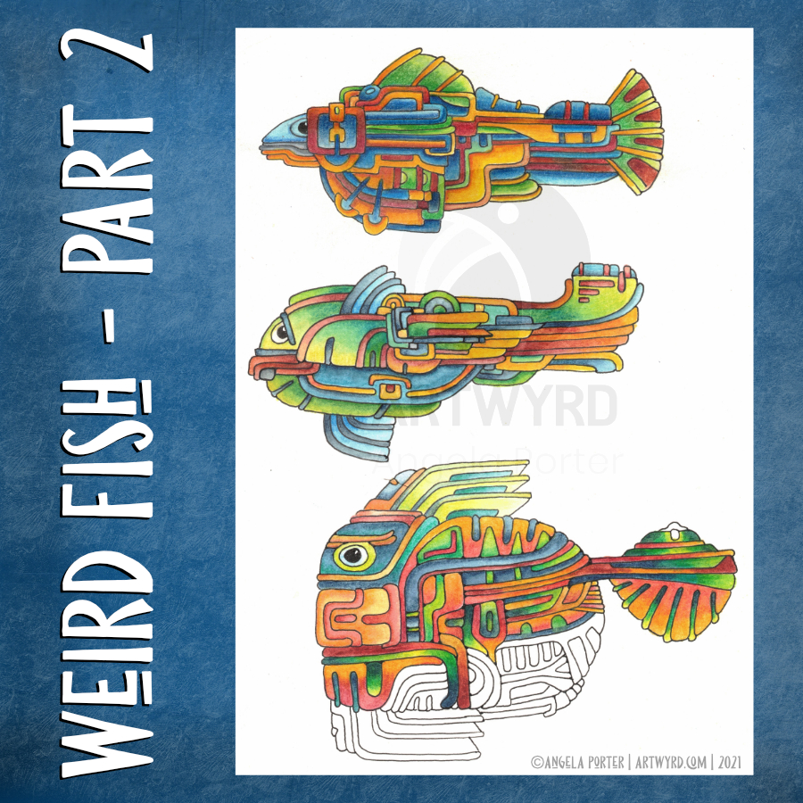
I’ve spent some time drawing a third weird fish and intensifying colour on the two original ones.
For the top fish, I used Derwent Colorsoft pencils to increase the colour. The watercolour underneath does add to the colour in a subtle way.
I used Derwent Inktense pencils and a damp brush to add colour to the central fish.
Finally, I’ve been adding colour to the bottom fish with Inktense pencils too.
As pretty as the watercolours were, they were a tad too subtle for my liking with not enough contrast. So, I used them as the underpainting and then added layers of more intense colour over them. It seemed to work out just fine and well.
I’ve kept the color palettes pretty similar for each of the fish.
Also, I’ve re-drawn them digitally as vectors and I’ve just started colouring one of them.
No matter how I add colour – digitally or using traditional media – it takes me a long time. I fuss around until I get things looking as I like.
This is very much a fun project, and I have no idea where it will lead, if anywhere. The important thing, however, is that I’m enjoying working with traditional media and I’m doing something a bit different too that I can learn from.
Here’s the video of today’s art. I’d appreciate it if you open it in youtube as then your views get counted.
Here’s a plethora of small drawings I’ve done over the past couple of days when I’ve woken up repeatedly through the night and needed to cool down before I could sleep again..
The various sizes are : circles – 8.5 cm and 10.5 cm diameter squares – 7 cm x 7 cm and 7.5 cm x 7.5 cm rectangles – 12.7 cm x 7.7 cm
Media used : Sakura pigma micron and sensei pens Distress Inks to colour the backgrounds Inktense pencils and Kuretake Zig Clean Colour Real Brush pens – colour spread with a damp brush Claire Fontaine Mixed Media Paper and St Cuthbert’s Mill Bockingford watercolour paper.
I sure do have a lot of colour, shadow and light to add to these! It takes me a lot longer to add colour and so on than it does to draw them!
Also, I have a larger drawing that is a work in progress. I think I’ll turn my attention to that one for a while.
I often say to myself, “Angela, what on earth were you thinking?” This is one of those times.
I started with hand lettering the words. Ok-ish Good enough to mess around with. And mess around them I did – with an “aura” and pattern, then more patterns and repeated motifs … until I’d mostly filled a square sketchbook page.
The drawing was OK. I liked some bits, others I didn’t.
Then, I thought, “What would it look like with colour? Let’s try Inktense and water!”
How often have I mused here about how I struggle with colour? All was going OK-ish with just pinks and greens … and then I added blues and browns…
The geometric pattern at the bottom were colours that didn’t fit well. So, I added watercolours to glaze the colours. Big mistake. I lost any sense of shadow and highlight …
So, I used a white graphite/chalk pencil to try to add the highlights back in …
YEUCH!
So, I put it to one side while I did some other stuff and had lunch.
Then, it caught my eye and with fresh eyes I thought that maybe it’s not as bad as I thought it was .. maybe.
I constantly do this – try to add colour with traditional media and fail. Monochrome seems to work best for me. Monochrome where I can play with shadow and light. Monochrome colours that are added digitally seems to work the best of all.
No matter how often I tell myself this, put notes up to remind me of this, I still insist on trying to use traditional coloured media.
I just think that I hope one day that something will just ‘click’ with me. Today wasn’t that day it seems!
So, back to either white or simple coloured backgrounds, and adding monochrome colours for the sense of dimensionality I like. And I have no hopes that I’ll remember this in a day, a week, or a month or two and I’ll end up asking myself the exact same question; “Angela, what were you thinking?”
The end result may be something I’m unhappy with, but adding colour was enjoyable. I just seem unable to stick to just one or two colours, with variations in their intensity and tone. Then, I descend, bit by bit, into insecurity and self-doubt and incredulity that I did it again!
Ho hum! Not to worry, it’s only pen, paper and some other media. It’s yet another experience to help me, hopefully, learn more and be more comfortable with my artistic style. If we did everything perfectly every time we’d never learn and grow.
So, back to a blank piece of paper with pens I go, and may make some art to remind me, “Angela, monochrome is best!”