Abstract Art 9 Jan 2021

I spent yesterday colouring yesterday’s drawing in. That was an interesting experience!

I started out with graphite and coloured drawing pencils. But, as I coloured more and more I got frustrated with them

So, I switched to Inktense pencils and paints and a water brush. That was better, but the results were rather chalky and obscured the black lines a little. So I tried some watercolour paints. Better, but still weren’t feeling right.

Finally, I dug out my set of the Kuretake Zig Clean Colour Real Brush pens, and they hit the spot!

With each type of media I did my best to remain true to the limited colour palette of earth tones, but the more organic parts really did need that muted olive green for some variety. That decision really has helped to tie everything together in this design.

Surprisingly, The whole variety of media seems to work well together. I expected a whole hot mess from my messing around with media. Whatever I did, it’s brought the drawing to life, and there’s a lot of interest in the variations of intensity and vibrancy of colour throughout it.

I’d expected the mixed media paper to be a bit difficult to work with Inktense, watercolours and the brush pens. It wasn’t, it worked really well! Perhaps because I didn’t do much in the way of working in colour layers.

I still have some work to do to this. I want to add some gold accents in places, as well as using a white Gelly Roll pen to add dots of bright white here and there. Oh, I need to remove the margin guidelines, as well as that pesky bit of dirt that is on my scanner!

I really am smiling when I look at this piece of artwork. There’s lots of open space, yet it works. I think it’s done, though I may add some ‘ruins’ peeking above the froth of vegetation. I’ll see what happens over time.

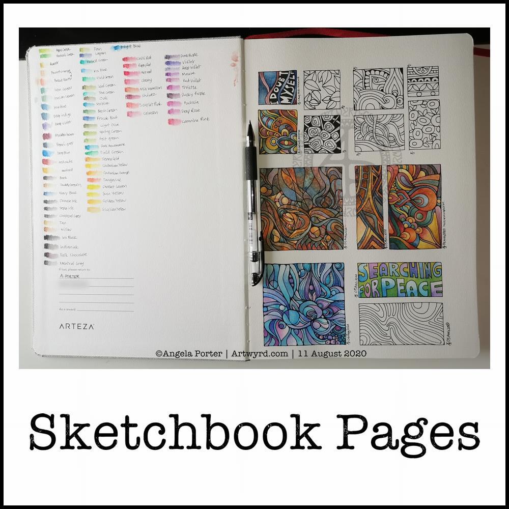
Sketchbook Pages

Today, I share a glimpse into my current sketchbook. It’s an Arteza watercolour A4 sketchbook.

I’ve completed all the drawings in boxes now, and am adding colour to them using watercolours, graphitint watercolours, graphitint pencils and/or inktense pencils.

The paper is rather nice to draw on with Faber-Castell Pitt artist pens or a Uniball Signo DX 0.38 pen.

On the cover page I swatched my collection of Inktense pencils, using a damp brush to bring their true colours out.

Inktense pencils are intense in colour when activated with water. Also, once activated with water and dry they are permanent.

I like all the media I’ve used so far on this page. Which I use does depend on my mood. Today, I wanted to choose an inktense palette of colours that is like the rusty colours I’ve been using with watercolours.

I really am drawn to this colour palette in my work at the moment. The dark blues, rich red-browns, blue-greys, earthy-dark greens and the vibrant mustards. One day I’ll look up the psychology of these colours and see how they relate to my mood/life at this time. But not today.

Today, I need to focus on adding colour to some templates for the Entangled Gardens colouring book that will be released early next year.

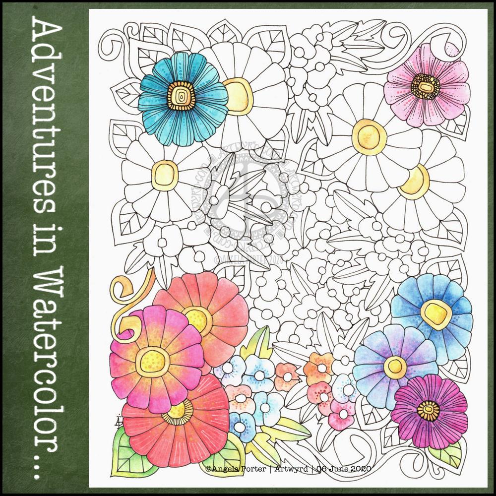
Adventures in Watercolor

I’ve had a stressful couple of days to say the least and all my plans to edit templates and create new ones went out of the window. It was like I had ‘ants in my pants’ and I just couldn’t settle to anything that required concentration and focus.

Last night I was beginning to settle a bit. I’d had some news that had helped to calm me a little, but not enough. While I was attending an online talk, I drew this design on watercolour paper. I used a 05 Sakura Pigma Micron pen. I also scanned the finished drawing into the ‘puter. I really like this drawing, I have to say.

This morning, I wanted to start the day with something relaxing and meditative, so I broke out the watercolour pencils. I have a collection of Derwent Aquatone and Faber-Castell Albrecht Durer. I used them to colour the trios of large flowers at the bottom left and bottom right. For the small flowers, leaves, tendrils and the large flowers at the top I used White Knight watercolours.

I found the watercolour perncils slow and laborious on such a large scale, and I had to lay down layers to get the intensity of colour I like. However, they did mean I could control the gradients a lot more.

On larger flowers, watercolours frustrate me a bit. I can’t seem to get to the right amount of dampness so that colours will flow one into another.

I also found that by drawing the flowers to begin with, I felt compelled to paint each petal one at a time, and I found that may work against me in terms of making the most of watercolour.

Watercolour has always been a medium that vexes and frustrates me, and it’s continuing to do so at times, even as I explore adding colour. I think I’m realising that the best way for me to work with watercolor is by using it for backgrounds which I then draw upon and add more colour to the drawings.

Or, its where I make use of the randomness of loose watercolour, droping colours into a damp surface where they can bloom, flow and blend as they will, without me trying to make them anything in particular. Then, I can draw on this, picking out shapes and colours, bringing structure to where there is none, and I can get intricate with the details too.

Anyway, with the flowery drawing above, I tried to add details using some Paul Rubens metallic watercolours to add patterns of dots, as well as drawing more black or white lines onto the drawing. I really don’t feel they worked out at all well.

I knew this was going to be a bit of an experiment, and I have plenty of flowers to try out different media, such as Inktense pencils, and maybe adding more lines to to add more detail before I start coloring.

It’s been a nice way for me to spend Saturday morning, lost in art whilst listening/watching season 1 of The Clone Wars. I think I’ll continue to watch that this afternoon as I turn my attention to drawing.

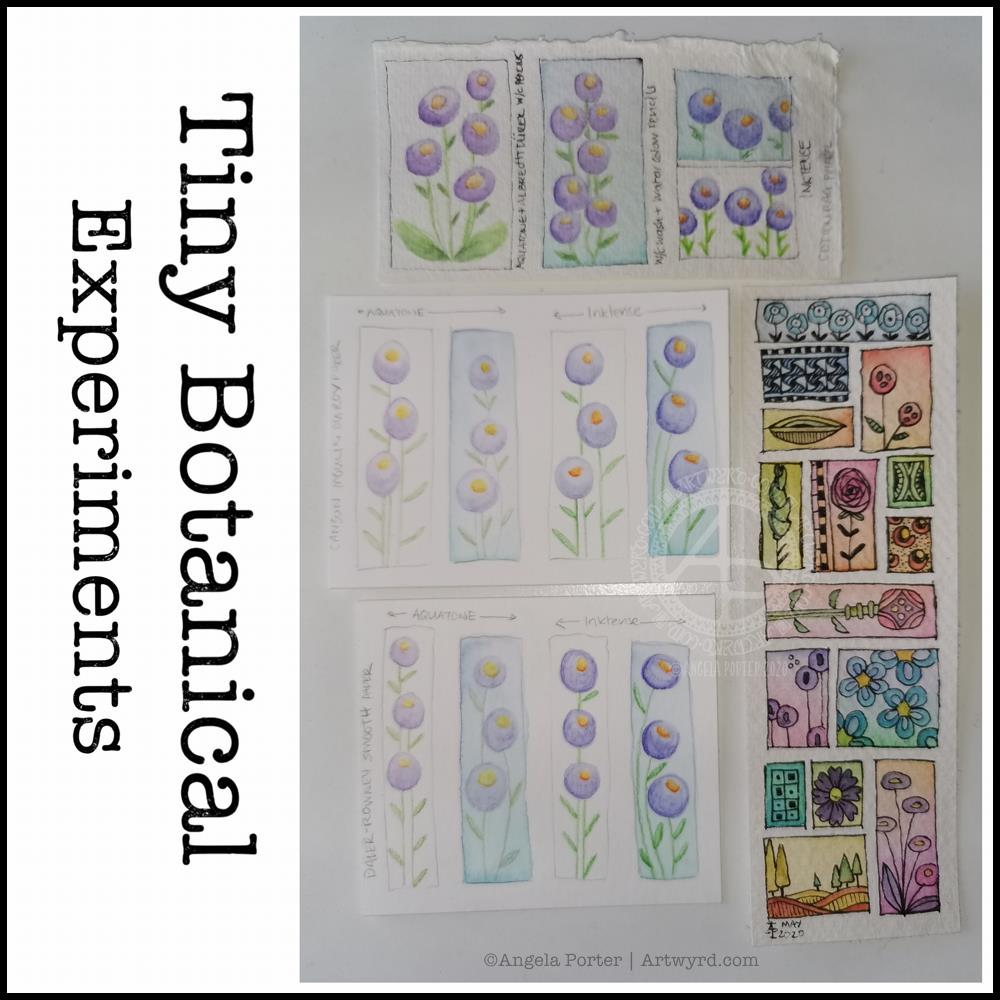
Tiny Botanical Experiments

I thought I’d start Sunday morning off with some experiments with my tiny botanical drawings.

I apologise for the photograph quality – I’m really not a good photographer, something I really do need to work at! The pale colours really don’t help at all.

The artwork on the bottom right is one where I applied rectangles of watercolor on 100% cotton rag paper. Then, I used Sakura Pigma Micron pens to draw designs in the windows. Finally, I added some watercolours to the designs to help bring them forward from the background.

I don’t think I messed the drawings up at all, which was my worry. Mind you, I do have to be careful what colours I do add so I don’t make weird colours.

That led to me wanting to try watercolour pencils and Inktense pencils on different watercolour papers:
top – 100% cotton rag paper
middle – Canson Moulin du Roy paper
bottom – Daler-Rowney Smooth watercolour paper.

On each paper, I drew four rectangles, two of which I coloured with a wash of watercolour.

I used the same colours of Derwent Aquatone and Inktense pencils to draw the stylised/abstract floral design and a waterbrush to activate the pigment. I did my best to apply the same amount of pencil in each case. However, I noticed that the papers grabbed different amounts of pencil even though I was using the same kind of pressure.

The amount of pigment grabbed, however, wasn’t at all indicative of how vibrant the colours would be.

The 100% cotton rag paper seemed to have the smallest amount of pigment from the pencils, yet it gave the most intense colours of them all. This paper is quite ‘hard’ in feel and very textured and I was surprised it didn’t seem to take as much pigment. Appearances are deceiving it seems. This paper also allowed me the longest ‘wet’ time to move the coloured pencil pigment around, and to lift some of it where it had got too intense.

The Moulin du Roy paper was a softer texture and it was lovely to colour with the pencils on it. The resultant drawings have a soft quality to them too that I rather like.

The Daler-Rowney seemed to grab the most pigment, yet the colours are not as vibrant, except the for the Inktense on the watercolour background. I think that’s because the watercolour background was still very slightly damp and Inktense pigment activates with the tiniest amount of water. I also think that’s why this one was the hardest to blend the colour smoothly. This was the paper that was the hardest to add the watercolour background to as it dries so darned quickly, or water just puddles on the surface with a tiny bit more water.

The cotton rag paper is, again, my favourite for working with watercolour and Inktense pencils. The vibrancy of the noticeable too – much less pigment is needed to get a rich colour on this paper.

For the other two papers, I did enjoy drawing the flowers on the plain paper and activating the pigment with a waterbrush. I partiuclarly like the Moulin du Roy paper for this technique, though the Daler-Rowney gave a pleasing result on the plain paper.

Half-term at last…pheweee!

It’s been a long half-term at school; eight weeks to be precise.  In that time there’s been two training days, a twilight training session. a memorial walk to raise money for school funds and the Senghenydd Mining Disaster Memorial, almost daily incidents of poor behaviour/attitude to deal with, lessons observations, book reviews (as in how well and regularly work is being marked), a consultation with my union representative, a stress-meltdown and hopefully the end of three year period of what feels like persecution/bullying in a particular situation at work (culminating in the union consultation and the stress meltdown).

I still have a pupil to be dealt with who has been making threats to physically attack me because I apparently ‘start on him’ by asking him to do his work.  How shocking is that, that I should request he stop shouting around the class, distracting others and to do his work?

Oh the joys of being a teacher.

Having said that, there are joys.  The shared smiles and laughter with pupils enjoying the lessons.  The ones whose faces light up when they see me and who never exhibit poor behaviour in my class, even though they may do in other lessons), the shared laughter with colleagues, morning breakfast with ‘the girls’, the helpfulness of the lab tech, the enthusiasm and questioning of pupils because they are interested in something, their kindness and thoughtfulness.  And so much more that it’s a shame it can become dominated by the negative things that occur and dominate my ruminating, over-analysing, over-thinking brain.

It’s been really busy for me with having to prepare work for a new course I’m running with my special needs classes, as well as teaching mainstream classes that I’ve not done for years.  It’s meant late nights at work and even bringing work home – something I avoid doing as I do not want to go down the route of being a workaholic as I was in the first decade or so of my teaching career.

This busy-ness has really eaten into my creative time.  Little art has been done, and I’m am doing my best to settle back into it in this half-term, especially as I have two contracts to create artwork for two books, though I have been waiting for direction for what the artwork is to be for a long while now.

I’ve barely stopped in the first four day so of the half-term.  I seem to be running away from time with myself.  I can struggle with being alone, feeling lonely and end up keeping moving, moving, moving to avoid it.  Today I am remaining at home and trying to get things out of the way so that I will settle to some arty pursuits, or de-stressing after the last half-term.

I do seem to be a lot more resilient than I was a year ago.  Though things can get to me (such as loneliness, lack of a sense of belonging, the constant worry I’m doing things wrong that have precipitated the situation at work that led to a stress-meltdown), I often find there’s a content ‘centre’ in me that I can access when I do things of a creative nature or things that focus my mind away from it’s rumination and negative thinking.  It’s a little easier to spot when this is happening, though I don’t always catch it in time to stop the tears, the self-loathing and the comfort eating.

I rejoined a choir I’ve been a member of since I was in school myself.  Sadly, I had to leave again once the stress levels rose as my voice was, and still is, affected by the stress.

Out of all of this, and at odd times during the last couple of months, I have managed to do some arty things.  Here’s two mandalas of mine.

Calmly Does It © Angela Porter 2013

Autumn Splendour ©Angela Porter 2013d

Stumbling around…

Stumble Upon

Well, I have finally discovered the delights of stumbleupon.com!  It’s an insidious site, so easy to lose time while engrossed in websites that appear that you’d never have thought of looking at – art, nature, crafts, science, space, writing, quotes… The list goes on!  I have so many websites to revisit and spend time with.

It has also provided me with lots of ideas, inspiration too.  Such as this one – little guiding stars.  What a wonderful idea!  I’ve been practising making stars, but my origami skills have never been very good.  I love the idea of putting an inspirational word or quote in side them for someone to unwrap… So, my mind is working on just who I could create such a gift for, as if I didn’t already know!

There were so many more ideas, inspirations…

I know, I may be late in this discovery, but …

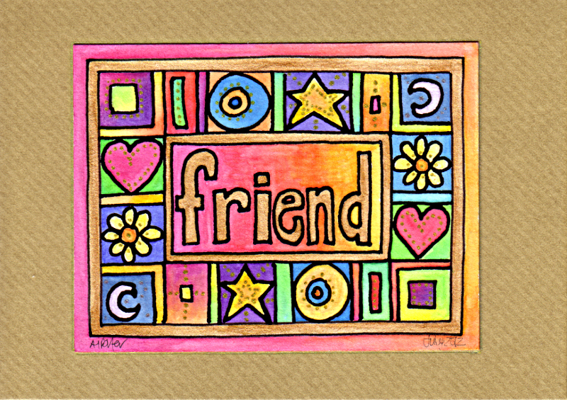
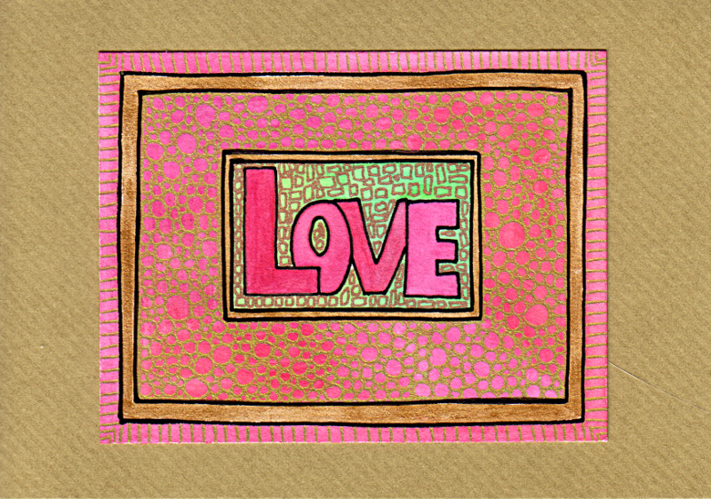
Arty crafty cards

Of course I’ve been making more cards.  They’ve been a pleasant way to spend time of late.  Here’s some of the latest crop.  You can see all of them at Etsy.

Inspire Card 1 © Angela Porter

Friend Card © Angela Porter

Congratulations Card 1 © Angela Porter

Thank You Card 2 © Angela Porter

Friend Card 1 © Angela Porter

Love Card 2 © Angela Porter

Dream Card 4 © Angela Porter

Abstract Rock 2

Abstract Rock 2 © Angela Porter 2012

13cm x 13cm.  Rotring pen, Inktense pencils with water wash, gold metallic watercolour paint.

A small section of the previous Abstract Rock 1 reworked.

Abstract Rock 1

Abstract Rock 1 © Angela Porter 2012

Rotring pens with black ink, watercolour paints, Derwent Inktense pencils and wash, and gold Cosmic Shimmer watercolour paint.

The shapes and colours in this experiment were inspired by a photograph of some Australian sandstone.

I’m not happy with the middle more ‘scribbly’ bit, though the gold highlights have helped to make it part of the the whole. It’s similar to other work, yet different too.

A busily creative and productive couple of days off work – at long last, hurrah!  I do so feel out of sorts when a busy life gets in the way of creativity.

Harvest Angels

Harvest Angels © Angela Porter 2012

12cm x 12cm.  Derwent Metallic pencils, Sakura glaze pen and Cosmic Shimmer metallic/iridescent watercolour paints.

Just finished … kept me busy for a couple of hours…again, I’m not good at photography, this time the colours are washed out … sigh…one day I may crack it!

For Debs

For Debs © Angela Porter 20Apr2012

11cm x 11cm.  Sakura ‘Glaze’ pen, Derwent Coloursoft pencils, Derwent Metallics pencils and Cosmic Shimmer metallic and iridescent watercolour paints on dark blue drawing paper.

A little birthday gift for my pal Debs.