A rainy, windy, grey morning here in the Valleys of South Wales. The perfect day to cwtch up in the warm and dry and work on some art.
I’ve been drawing robots, or bots, in my sketchbook lately. I blame Bill Making Stuff on YouTube. I stumbled across his channel a lil while ago, and it seems his insidious bots and makes have found a corner in my creative mind to lurk. It’s inevitable, I suppose, that they should creep out.
But my drawing style has exerted its muscle …and these are typical ‘Angela’ style drawings! Actually, I had started to work on some new bots and characters for my Doodleworlds style of cute and whimsical art. But Bill gave me, unknowingly by him, the push to have a go at drawing these creations.
Fun. Whimsical. Cute. Different. Just what I needed to do on a rainy, windy, grey morning.
Two sketchbook pages done over the past four days. Abstract patterns and shapes, that’s the theme! Just small drawings, lots of them. Perhaps they’ll inspire work in the future.
Pen drawings done on paper coloured and patterned with Distress Inks. Colour adding using Inktense pencils or Cartothello pastel pencils.
I’ve had a few days of periods of intense anxiety/stress. The come down from each of these has left me exhausted and my mind unfocused. I’m much better now that all the appointments related to the anxiety are over, and all is well. I knew it would be, but my mind and emotions have other ideas about that at times!
Anyhoo, as I had a bit of focus yesterday afternoon/evening, I decided to draw a few buttons for Sketchtember Day 17. A few turned into a whole page full of pen drawings! And some really not good hand-lettering, ho hum.
So, I thought I’d spend some chilled out time this morning starting to add colour to some of the buttons.
Ecoline and an insight..
Ecoline Brush Pens were my medium of choice this morning. A lot of the details on the drawings were just a bit too small for marker pens to cope with. Also, I thought a change of medium could be good for me, and it was!
To start with, I scribbled some colour onto a palette and then picked it up with a damp brush and worked with it like watercolour. However, as the areas dried, the intensity of colour faded.
So, I decided to brave trying to directly add colour to the page and then spread it out with a damp brush. It worked! I suddenly realised that I have a much more illustrative way of adding colour, rather than realistic. It’s about time I accepted that and embraced it too!
A page full of different objects, rather than a single illustration, has helped me to realise this, as well as put it into practice.
Now, I just have to remember this insight, which isn’t as easy as you may think!
Perhaps I should write a list of Angela’s Artwork Insights to refer to before I do any work, as well as while I’m working.
Bright and cheerful!
The other thing I really loved was working with these really bright, vibrant colours. I’ve been using a lot of more muted and vintage colours of late, and I love them. But these bright colours were just what I need during a post-anxiety funk.
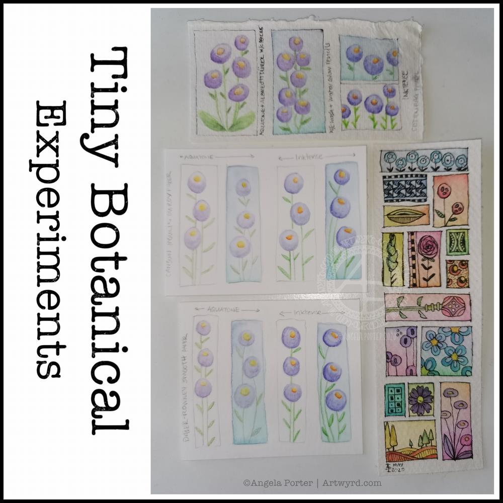
I thought I’d start Sunday morning off with some experiments with my tiny botanical drawings.
I apologise for the photograph quality – I’m really not a good photographer, something I really do need to work at! The pale colours really don’t help at all.
The artwork on the bottom right is one where I applied rectangles of watercolor on 100% cotton rag paper. Then, I used Sakura Pigma Micron pens to draw designs in the windows. Finally, I added some watercolours to the designs to help bring them forward from the background.
I don’t think I messed the drawings up at all, which was my worry. Mind you, I do have to be careful what colours I do add so I don’t make weird colours.
That led to me wanting to try watercolour pencils and Inktense pencils on different watercolour papers: top – 100% cotton rag paper middle – Canson Moulin du Roy paper bottom – Daler-Rowney Smooth watercolour paper.
On each paper, I drew four rectangles, two of which I coloured with a wash of watercolour.
I used the same colours of Derwent Aquatone and Inktense pencils to draw the stylised/abstract floral design and a waterbrush to activate the pigment. I did my best to apply the same amount of pencil in each case. However, I noticed that the papers grabbed different amounts of pencil even though I was using the same kind of pressure.
The amount of pigment grabbed, however, wasn’t at all indicative of how vibrant the colours would be.
The 100% cotton rag paper seemed to have the smallest amount of pigment from the pencils, yet it gave the most intense colours of them all. This paper is quite ‘hard’ in feel and very textured and I was surprised it didn’t seem to take as much pigment. Appearances are deceiving it seems. This paper also allowed me the longest ‘wet’ time to move the coloured pencil pigment around, and to lift some of it where it had got too intense.
The Moulin du Roy paper was a softer texture and it was lovely to colour with the pencils on it. The resultant drawings have a soft quality to them too that I rather like.
The Daler-Rowney seemed to grab the most pigment, yet the colours are not as vibrant, except the for the Inktense on the watercolour background. I think that’s because the watercolour background was still very slightly damp and Inktense pigment activates with the tiniest amount of water. I also think that’s why this one was the hardest to blend the colour smoothly. This was the paper that was the hardest to add the watercolour background to as it dries so darned quickly, or water just puddles on the surface with a tiny bit more water.
The cotton rag paper is, again, my favourite for working with watercolour and Inktense pencils. The vibrancy of the noticeable too – much less pigment is needed to get a rich colour on this paper.
For the other two papers, I did enjoy drawing the flowers on the plain paper and activating the pigment with a waterbrush. I partiuclarly like the Moulin du Roy paper for this technique, though the Daler-Rowney gave a pleasing result on the plain paper.