Happy Thanksgiving! Template Thursday

Happy Thanksgiving to all of you
who are celebrating it today.

This week’s template for members of the Angela Porter’s Coloring Book Fans facebook group is a thanksgiving themed mandala, along with some simple hand-drawn typography.

I create templates for the members of the group as my way of saying ‘thank you’ for supporting my work. I am thankful that I am able to bring some joy and peace into others’ lives through my colouring books and my art.

If you’d like to download and print the template for personal use, head on over to the facebook group. Some simple terms and conditions of use apply.

I’ve chosen warm, autumn colours for my version of the template. How would you bring yours to life with colour? I love to see how people colour my templates, and I can be tagged on twitter and instagram as @artwyrd.

Today in South Wales

It’s a beautiful late autumn day. A hard frost this morning has now melted. The dragons-breath mist flowing down the valley has dissipated leaving the air filled with a silvery mist that diffuses the bright sunlight beaming from the pale blue sky. Trails of smoke and steam trickle through the fairly still atmosphere, making a statement that the colder months are now upon us.

Once I’ve completed all my social media posts, I’m going to put some sunblock and boots on, wrap up warm, and go for a much needed and long-put off walk. It’s time for me to face some of the social anxiety that has built up in me during another lockdown.

Then, it’ll be settling down to ink in some coloring templates for Entangled Starry Skies. I was going to do some yesterday. Unfortunately, I was overcome by the intense fatigue that plagues me from time to time, which hasn’t been helped by a few insomniac nights. I slept lots yesterday, and fairly well last night, so feel better today than I have done for a while.

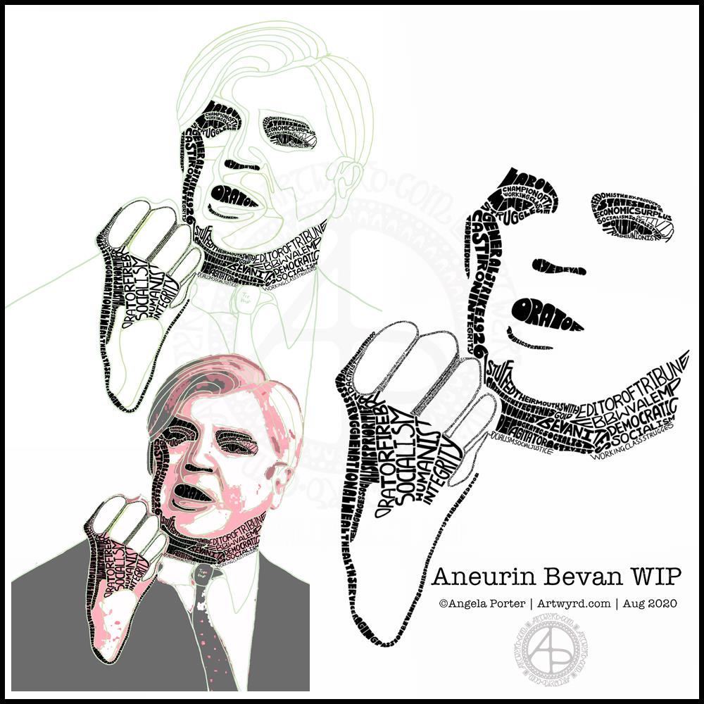
Typographic Portrait WIP

This morning I’ve been working on my typographic portrait of Aneurin Bevan. This portrait is the third iteration. I’m learning as I go along, trying out ideas as they occur to me.

I started with the photograph Nye Bevan and used the posterise tool in Affinity Photo to create areas of contrast. Then, I added colour to these areas to help me differentiate ‘twixt them. I completed this task in Autodesk Sketchbook Pro.

The next stage was to draw lines around these areas of colour, smoothing them out somewhat, and using artistic interpretation where necessary. These are the green lines that delineate the areas for different weights of text. I’ve decided to leave the white areas blank.

The green guidelines have been changed and edited as I work the portrait.

The area that was vexing me most were the fingers. However, I had an idea to use tiny lettering to add some deep shadow. I’m sure I’ll work out how to add some lighter shadow areas later on (my mind is already ticking over that issue) to give more volume to the fingers.

They typography is hand drawn and I’m having to come to terms with the struggle I’m having with my perfectionist side. This isn’t to do with the shapes of the letters, but the weight of them and making sure that they are consistent. As I’m hand-drawing the letters, then they are going to be imperfect, and I need to learn to accept when they are good enough.

Also, those imperfections and style of lettering are personal to me, and that is what will differentiate my work from others.

I’m also struggling with letting go of the desire to be as photographically accurate with the portrait as I can be. This is where learning to simplify the shapes of the different areas of contrast comes in, and recognising they don’t have to be a perfect copy of the photo in order for the resulting portrait to be recognisable as Aneurin Bevan.

One other thing I’ve done is to let go of trying to use full quotes in the portrait. I’m using repetitions of words and short phrases that represent Nye – personally, politically and in terms of achievements. I’ve realised the portrait doesn’t have to be a grammatically correct biography! I will, however, be using quotes to fill in his jacket.

I’m not sure what to do with his shirt and tie yet. It will fall into place soon enough I’m sure.

Working digitally helps me in so many ways. It takes away the frustration of starting over again if I make a mistake, and also minor frustrations. I gain a confidence to try things out, knowing that if they don’t work out I’ve not screwed up the rest of the work I’m happy with.

Working digitally, for me, is like working with pen and pencil on paper. I use a digital pen on the screen of my Surface Studio, just as I would pen on paper. It’s easy to undo and edit changes made. It removes from me the pressure to be perfect first time and helps me to persevere when things aren’t working as I’d like them to.

All the skills I’m learning digitally, in terms of the hand-drawn typography and being more patient with myself and allowing my work to be ‘perfectly imperfect’ is transferable to the work I do with traditional media too.

Hello August!

The calendar page turns over and we’re into a new month.

August always heralds the end of summer and start of autumn, my favourite season. It is the last full month of summer here in the Valleys of South Wales. The evenings come noticeably earlier, always a sign that the year is continuing on its endless cycle of seasons.

We have a grey, damp and blustery start to the first day of the month. There are shafts of sunlight finding their way through gaps in the clouds, but there’s a deliciously refreshing snap to the cool and fresh air after the night-time rain.

I thought I’d create a really simple mandala design for the start of this month, one that is full of warm colours, but that hint of autumnal tones in the background.

I kept things simply stylised in the design. If nothing else, working on it made me smile, inwardly as well as on my lips.

I woke early-ish today and did some work on one of the typographic portraits I’ve been doing. Then, in my rush to get to the shower, I clicked the wrong button and lost my work. Thankfully, it’ll be easy enough to do it again. I also think that with the version I’m working on, I’m finding my way with the process. I have a lot of the portrait left to do, but I feel less frustrated with it and have a clearer idea of what I’d like to achieve now I’ve taken a few days break from this kind of work.

Before I settle back to the typography, I am going to take a walk in the fresh air of the morning. Well, after I’ve done my social media posts!

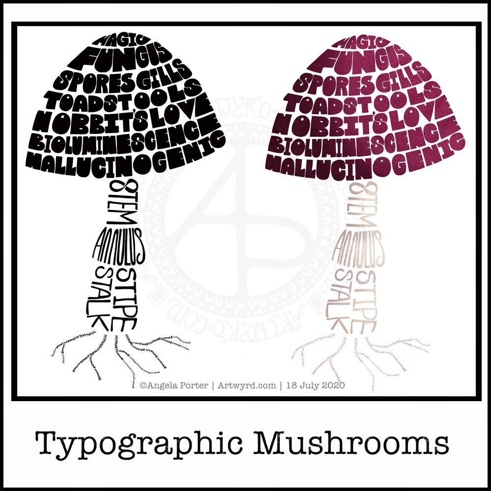
Typographic Mushrooms

Just a little something I wanted to try out – using hand-drawn typography to create illustrations. I chose a mushroom, for no other reason than I like mushrooms.

It’s more about practising the hand-drawn typography or hand lettering than anything else.

What I realised, when I completed the black and white version, is that I could’ve varied the weight of the letters to produce highlights. That’s for another day, I think.

I also had to try adding colour, and in that way adding highlight and shadow.

I like both versions, but I think I like the coloured one a bit more.

I mentioned I’m following the Sarah King Domestika course – Hand-Drawn Typographic Portraits. I have started work on my first portrait, but it’s going to take me a while to do. In the meantime, little projects, like the mushroom, will give me plenty of practice as well as a chance to work out my process and way of working, as well as how I’d like to use it so it adds a note of harmony to my artistic song.

I started with a pencil sketch of the mushroom. Then, I added the words in rough with pencil. I scanned the sketch into Autodesk Sketchbook Pro. I then used my Microsoft Surface Slim Pen, to hand-draw the typography. Even though I’m using digital media. Autodesk Sketchbook Pro is a lot like working on paper, but it streamlines the process and allows me to skip a lot of the tedious steps. It also lets me take a black and white drawing and add colour quite easily.

I’ve done this while I’m waiting for a migraine-type headache to subside enough that I can return to bed and sleep the dregs of it away. I’m nearly at that point now as I’m beginning to feel tired and sleepy. So, I’ll get the rest of the social media postings done, and then crawl back into bed to sleep.

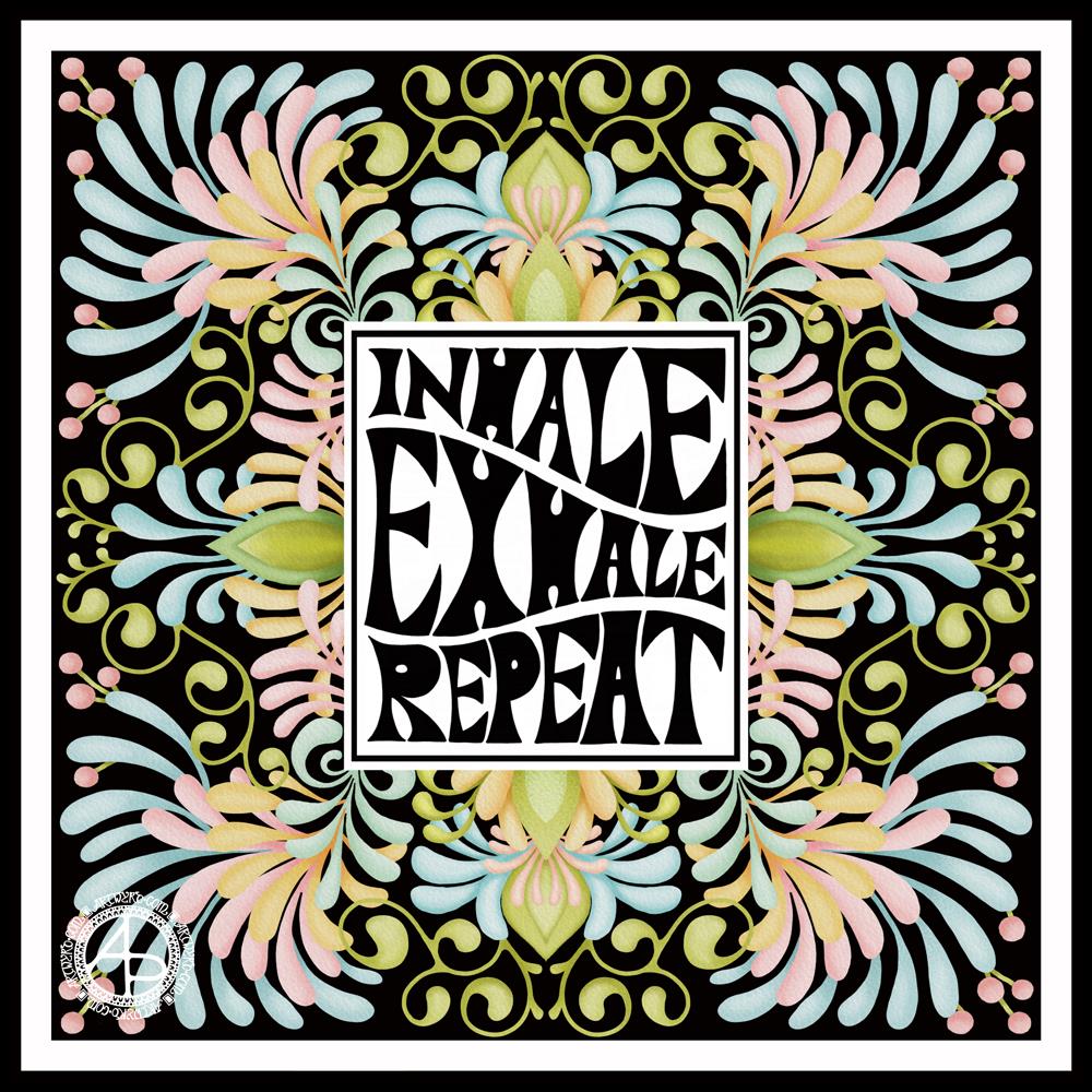
Inhale, Exhale, Repeat

This was so very enjoyable!

I started with the hand-drawn typography. I’ve just started another Domestika course — Hand-Drawn Typographic Portrait by Sarah King. The first exercise is to letter words boxes divided by wavy lines. Then, creating letters in different weights. And of course, practice is something that needs to be done.

There was just something about her approach to this that grabbed me, and so, I now have many boxes with words and quotes in.

The first lesson shows how to use Photoshop to edit your lettering outlines and fill them with black. I found the process rather clunky and long-winded. Perhaps that’s because I’m used to working in Autodesk Sketchbook Pro with a pen on a screen as if they were pen and paper, that I could do this in my own way.

So that’s what I did. I used one of my pencilled samples to create the typography for the centre panel.

Then, it was adding the background. I just went with the flow on that one. I made use of the symmetry tools in Sketchbook Pro, and just had fun with a limited colour palette and my favourite kinds of shapes.

The course is about portraits. However, I have zero interest in drawing people. However, the techniques shared will spark ideas for how I can use them.

I’ve long been trying to incorporate words, quotes into my artwork and struggling to find my own style. I’m not sure if this will help, but I’m really quite happy with this particular artwork.