Feeling in a festive mood? Fancy getting a little creative? Well, there’s no better way than creating some dangle designs to decorate your own Christmas and holiday projects. They’re also a great way to practice hand lettering and drawing cute, whimsical and simple designs.
Being creative is also a great way to relax and take some time out of the hustle and bustle that can overwhelm us at this time of year. I always find it relaxing to sit down with some pens, dot grid paper and a big mug of tea (or mocha as it’s the last days of autumn here in the UK) and just draw for enjoyment. Mind you, all my drawing work is enjoyment, but drawing for just the pleasure of drawing, with no specific brief to work to is a different kind of joy for me.
I’m finding that I need a focus, a project to be creative at the moment. I’m in between contracts and need some time out as I’ve had a crazy few weeks. However, settling to do anything not connected to a contract can cause me some issues. I still feel the need to create for a purpose, and sometimes that simple joy isn’t enough. I still have some issues to work through in therapy it seems. However, I am now aware of them and can work towards releasing these limiting attitudes and behaviours.
Anyway, today, I’ve created a sheet of some examples of design elements, hand lettering and examples of dangle designs to use as is or just to inspire you. There’s plenty more to inspire you in my book “A Dangle A Day”.
My drawings today are a bit rough, ready and wobbly, as is my hand lettering. I coloured them in very loosely, not worrying about keeping inside the lines or perfect coverage or blending. Colour really does make a difference, doesn’t it? It brings the designs alive!
However, this is a page of sketches, ideas. Maybe I’ll use some of them another time, or maybe I’ll leave it as a page of drawing and hand lettering practice, a page that I enjoyed doing with no real reason other than enjoying the process of creating.
I had thought about doing a video of this page – if you’d like to see videos of me drawing pages like this, then leave me a comment.
I used a mixture of Tombow Fudenosuke brush pens and Faber-Castell Pitt Artist pens to draw the designs on ClaireFontaine dot grid paper. I coloured the images digitally.
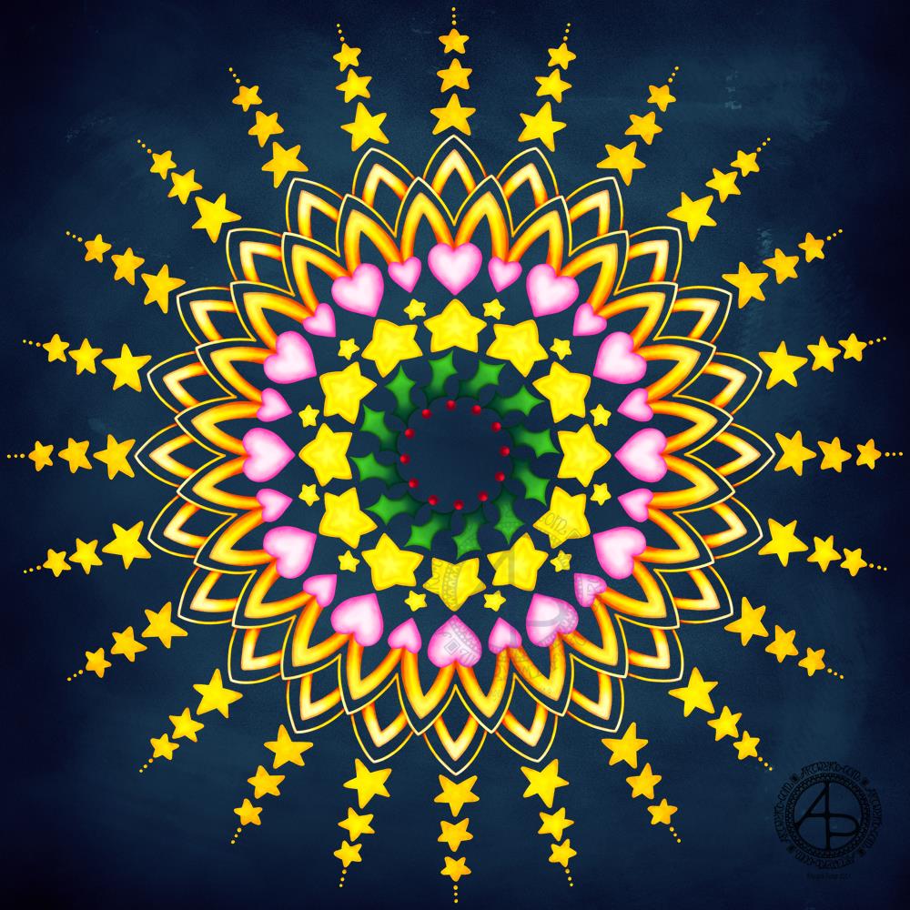
I needed to create a cute, whimsical, simple mandala this morning (and on into the afternoon). This is what I came up with. Plenty of bright colours glowing against the dark background.
Stars and hearts are motifs that often appear in my work, as well as arches that can be like petals, sunshine or architectural. The holly leaves and berries mark this mandala as a winter one.
Digital art worked using Autodesk Sketchbook Pro and Microsoft Surface Pen and Surface Studio.
Of course, December brings Christmas and the start of winter in the Northern Hemisphere. Familiar motifs are stars, hearts, holly, fir trees, gifts, sweet treats, poinsettias, Santa hats, baubles. I’ve included these in this month’s coloring template, though there are many more motifs to consider – ivy, bells, angels, hot chocolate, socks, gloves, scarves, hats, ice skates, sleighs, reindeer, pine cones, fairy lights, to name but a few.
If you’d like to download and print this template then pop along to the facebook group. It’s free to join and free to download the template. All I ask is that you follow the terms and conditions of use and don’t share the uncoloured template. A mention of myself as the artist would be most welcome when you share your gloriously coloured version.
If you’d like to find out more about drawing dangle designs, then my book “A Dangle A Day” is a good place to start. I’ve created over 120 designs, with step by step instructions, for you to use and inspire you.
It’s Friday, so that means it’s dangle designs today!
I drew these on postcard sized (148mm x 105mm) acid free heavy cartridge paper using a mixture of Tombow fudenosuke and Faber-Castell Pitt Artist pens. I then used Chameleon Color Tones and Color Tops to add some colour to the designs.
Again, I’ve drawn some really simple, cute and whimsical dangle designs that leave plenty of space on the paper for hand lettering or a hand-written note or letter.
Dangle designs are, of course, very versatile. I put these on the edge of a postcard sized piece of paper. However, they could be used as the focal point of a greeting card or note card. Lengthen the dangle, and they’d make cute bookmarks. They’d make interesting designs to fill spaces in a BuJo or scrapbook page. They’d also make interesting focal points on art journal pages.
I’d love to see how you use dangle designs – just tag me in social media!
I was absolutely exhausted yesterday evening. Thankfully, I had a long, deep sleep last night and have woken feeling more alert but still fuzzy headed.
Between going to the dentist, sorting out other stuff, I finally managed to get a little drawing for my social media done, along with a quote that I think is most appropriate at the moment.
I used Autodesk Sketchbook Pro, Microsoft Surface Pen and Microsoft Surface Studio to complete the artwork, along with Affinity Publisher to do the typography.
It’s good enough for now. I would’ve liked to have added colour the flowers, but that would’ve taken me quite a few hours I think. Still, it’s there, lurking in my digital art folders for the future.
I wanted to draw simple, flowers, and chose to draw them mandala style. They’re cute and naive enough to work, I think.
So, it’s now some lunch for me and then to turn my attention to the Sea-life colouring book I’m working on!
I thought it would be fun to do a really simple turtle skull drawing along with those Xerocomus fungi and turn them into a dangle design.
I kept to simple line drawings, focused on ocean-themed charms for the dangle, and added really simple colour in places just to give an idea of how it could look fully coloured in.
I worked digitally, with Autodesk Sketchbook Pro along with a Surface Pen and Surface Studio by Microsoft.
The splashes of colour show how the line drawing, as simple as it is, just comes to life with colour.
If you’d like to know more about drawing dangle designs, then my book “A Dangle A Day” is a good place to start. I show you how, one step at a time, you too can draw dangle designs and I have over 150 examples of dangle designs you can copy or use for inspiration.
Inktober – day 5
My prompts for day 5 are owl skull and Favolaschia calocera. The prompt lists I’m using are from two people on instagram – @book_polygamist and @nyan_sun.
I’m partway through my design – the owl skull is drawn and I’m rather pleased with it. I have yet to draw the Favolaschia and other design elements around it.
Again, I’m working digitally for day 5 and pushing stylised design just a little bit more with this one.
Reflecting on Inktober so far.
Five days in and I am really enjoying it. The hardest thing for me is to not let it dominate my arty work each day. For three out of the four days so far I have also managed to get my goal of at least two illustrations for the coloring book I’m working on done. The Inktober drawings are also giving me some ideas for the illustrations for the book as well.
I’m also finding I’m ‘rediscovering’ styles of art that I haven’t done for a long time; the owl skull is an example of this and I will write more about that when I post day 5’s ink.
Can you believe that September is nearly over? I swear that the older I get the faster time seems to go.
Anyway, a new month on the horizon means a new colouring template for the members of the Angela Porter’s Coloring Book Fans facebook group. There just has to be a Hallowe’en theme for October’s page, and you can see a sneak peek of it above. I couldn’t resist colouring some of it in as a way of trying out some new digital brushes and some ideas too.
I put some of my favourite All Hallows’ Eve motifs into the drawing, including a raven, skulls, fungi and a vampire cat! I always enjoy drawing stuff to do with Hallowe’en; it’s my favourite time of year because I don’t have any past traumas associated with it.
If you’d like to colour this template, pop over to the Angela Porter’s Coloring Book Fans facebook group and become a member; each month I do one drawing exclusively for group members (terms and conditions of use and sharing apply).
About the art
I used a combination of fountain pens and fine-line pens to draw the design on dot grid paper. I then scanned the drawing in and cleaned up smudges and smears digitally.
Then, I set about adding colour digitally using my usual tools – Autodesk Sketchbook Pro, Microsoft Surface Pen and Microsoft Surface Studio. I also added a background and surface texture that I had purchased via Creative Market.
I am really quite pleased with how the colour is bringing the illustration to life, especially the skull in a jar. I hope to be able to continue to add colour as the month progresses, though I do know I have quite a bit of work to do and focus on.
To Inktober or not Inktober, that is the question.
Last year, I really enjoyed taking part in Inktober. Inktober has become a really popular social media event where artists and creatives use a daily prompt to draw (or create) something based on that prompt and share it on social media.
There is an official prompt list, but people do create alternative lists and I may look at some of them as there may be variations that might be less time intensive than last years’ was!
I shall see what I find and go from there I think.
So, Angela, how are you today?
Tired. However, I’m am quite content, my mood is good enough today. I do have EMDR later on, and I often feel ‘flat’ before my therapy session. I think my unconscious mind starts to bring stuff up in preparation for EMDR.
I know that the likelihood of me being exhausted later is rather high, so I’m not planning to do loads of stuff later on. Self care will be the order of the late afternoon and evening.
Yesterday evening I had a pleasant hour or so using Distress Oxide and Distress inks to make some backgrounds for future card projects.
I used a soft rubber Brayer roller to add distress oxides to a small Gelli Plate. I then spritzed the Gelli plate with water containing either pearl, copper or gold Perfect Pearls before lifting the print with some Claire Fontaine Mixed Media paper. The water in the spray reacts with the inks to give an oxidised look. The Perfect Pearls in the spray add some subtle shimmer to the finished background.
Once the Distress Oxide background layers were dry, I used a rectangular die to cut a section from them.
To create backgrounds with Distress Inks, I used a mini foam blending tool to cover the card with colour. I then sprayed the card with some water containing pearl, copper or gold Perfect Pearls. Again, the water reacts with the Distress Inks, but this time creating small watermarks. The Perfect Pearls again add shimmer.
Making the card.
I chose a background coloured with Wild Honey, Tea Dye, Old Linen and Walnut Stain Distress Inks which were then spritzed with pearl Perfect Pearls infused water.
I wanted to create a dangle design card. From experience, I know that drawing on backgrounds with added Perfect pearls that my fine-liner Uniball Unipin pens can become clogged by the tiny flakes of mica that comprise Perfect Pearls.
So, I tried using a Uniball Vision Elite rollerball pen. The ink in it is supposed to be water-resistant, tamper-proof, fade-proof. It’s also very black, which suits me just fine.
I was surprised at how well the pen wrote on the background – not just because of the Perfect Pearls and Distress Ink, but also because the mixed media paper is lightly textured.
Once I’d completed the design, I used a needle=tip Pentel Energel Liquid Ink Gel pen to add smaller details.
While the plain black line on the coloured background looked OK, I thought it needed some colour to help lift it from the background.
I launched myself into using Copic markers, using somewhat darker colours than I usually would. That meant it wasn’t until I was adding some colour to the ribbon banner that I discovered that the Copic reacts with the inks in the pens and smears them. I was so disappointed in myself for not checking the pens were Copic safe. Oh well, you live and learn!
Rather than start again, I carried on with the card. I wanted to add some clear embossing powder to help the colours of the Copic markers stand out even more. So, I used a Versamark pen to colour over the designs, and then I sprinkled on the clear Wow Embossing Powder. I used a heat tool to melt the Embossing powder and achieve a glossy, dimensional finish on the dangle design.
The final step was to adhere the dangle design to a card blank, after adding some gold dots with a Uniball Signo glitter gel pen.
Fancy having a go at drawing your own dangle designs and not sure where to start? Well, you could start with my book “A Dangle A Day” where I lead you through the process. I have over 100 designs in the book where I take you step by step through drawing them. I have also included ideas for where you can use them including as cards, bookmarks, in BuJos, journals, scrapbooks and more.
Making the envelope.
I used the pre-made envelope that came with the card blank. I decided to keep the envelope white and add a border using some of the motifs from the dangle design.
I did use the Uniball Vision Elite gel pen and Pentel needlepoint pen to draw the design. This time, I coloured the design with some Mitsubishi Uni coloured pencils.
The low quality of the paper envelope wasn’t conducive to really amazing colouring, but it worked well enough.
Reflecting on the card and envelope.
I could’ve kicked myself for not testing the pens to see if they were Copic friendly. I don’t think I could send this card to anyone as it just isn’t up to scratch. I need to remember this in future projects.
Also, the Versamark pen smeared the ink a little too, but nowhere as much as the Copics did.
I used much darker Copic colours than I usually would without thinking that heat embossing them would intensify the colours even more. The colours aren’t as dark as in the photo, but they are still darker than I would like.
The coloured pencils colouring worked much better and perhaps I would’ve been better off using them on the card panel. Again, something to remember for the future.
I also noticed that the anti-static powder I used before using the Versamark and embossing powder has either removed or covered the Perfect pearls. I used the anti-static powder so prevent the embossing powder sticking to places it didn’t belong. This is always a possibility, especially when using Distress Inks to colour the background.
In hindsight, I may have been better drawing, colouring and heat embossing the design before colouring the background. However, I do like to have pre-coloured backgrounds to use for arty projects.
So, Angela, how are you?
I’m OK, still tired from a busy few days at the weekend and start of the week. I also have a flare-up of an ovarian cyst which is rather painful and achy. I’m feeling content and optimistic otherwise, though still tired even though I slept well last night. The exhaustion that comes with interacting with people, therapy and not enough me-time can linger for a good while — the joys of having CPTSD and being an introvert.
Yesterday, I was fatigued, and the flare-up ramped up in intensity as the day progressed. I wasn’t in the right place to create art or focus on work. I needed to practice self-care.
I chose to do some crochet after hearing about Crochyay, the online presence of a young woman called Olivia who makes flowers and leaves them with a little message tag for people to find and keep – random acts of kindness. She uses crochet to help manage her anxiety and depression as well.
I thought it was a beautiful idea and I thought flowers or little amigurumi hearts or similar would be lovely to make. Small, quick to finish projects that I feel I could manage. I’ve lost the oompf to do larger crochet projects such as shawls and blankets, but some little ones would be lovely to do.
I do find crochet and other crafts quite soothing and calming. I also feel I’m doing something, and they can stop me from just sleeping my day away. Little projects like flowers are fab for me when the thought of anything bigger fills me with procrastination and disinterest. Also, I find it much more motivating to do projects for other people than for myself, even if I don’t know those people.
So I managed to make quite a few flowers yesterday. I now need to make leaves and assemble them into little posies. Then, there are tags to make.
I’m also looking forward to making the tags as I can draw and decorate them too! So, little projects in their own right.
Finally, I’ll need to overcome my self-consciousness and anxiety about leaving them for people to find them.
Today I have two card designs for you, both featuring dangle designs, but in different ways.
If you like dangle designs and you’d like to give drawing them yourself but need a little help or inspiration, then you may find my book “A Dangle A Day”of interest. In the book, I take you, step by step, through how to draw over 100 dangle designs, along with some ideas of how you could use them.
Love Ya and With Love Card.
I started by using the Foursquare Backdrop: Portrait die from lawn fawn to cut the frames and panels from a piece of Winsor and Newton Bristol Board. I purchased this die, and the one in the second card, from Seven Hills Crafts here in the UK.
Next, I used Stormy Skies and Broken China Distress Inks to add a subtle colour gradient to the panels.
My idea was to draw four different dangle designs for each small square panel. I also wanted to include some hand-lettering, which I did.
So, I used Unipin pens from Uniball to do the drawings and lettering. I did use pencil outlines for the ribbon banners and lettering to make sure their placement was just right.
I coloured the design elements and charms using Copic markers. As the individual design elements were so small, I just used two colours to achieve shading in the bigger ones.
I also added a drop shadow around the designs using a BV marker that is a greyish-violet. It’s a very subtle drop shadow.
I had to add some sparkle and shine to the card, so I used a clear Spectrum Noir Sparkle brush pen along with a gold glitter Signo gel pen to do this.
To assemble the card, I glued the frame to the card base using Tombow Mono adhesive. Then, I glued the square panels into place.
I managed to get glue onto the front of the card and trying to rub it off while wet just left a dark, dirty smear. I’ve ordered some Tombow Sand erasers to see if they’ll remove the mark. If not, I’ll have to either work out another way to cover it up or just consign the card to the pile of things not to do again!
Black and white floral card.
Again, my first job was to cut out the frame and panels using a die. For this card, I used the Foursquare Backdrop: Landscape die from lawn fawn along with Winsor and Newton Bristol Board. I also decided to use this die in portrait mode.
To draw the design elements, I used Unipin pens from Uniball. I hung dangle designs from the top of each card to fill in some of the space that was there. I wish I’d used a slightly thicker pen than the 01 though. They look almost like an afterthought.
Anyway, once I finished the drawings, I wasn’t sure whether to add colour or not. So, I’ve left the pictures as black and white line art for now.
I used Tombow Mono glue to attach the frame and panels to a 5″x7″ piece of Winsor and Newton Bristol board. I did this as I realised that the dies are made to fit card blanks made from half a sheet of US letter-sized paper folded in half. In the UK, we use A4 sized paper, which is different enough in size to make it awkward to cut the paper to fit the card. I have ordered some 5″ x 7″ card blanks with envelopes, and then I can finish assembling this card. I’m likely to trim the foundation panel down a little and maybe try to carefully add some colour around the edge. Maybe.
It’s at this point I’ll decide whether or not to add colour and to see if I can thicken the lines around the dangles without messing it up. Mind you, if I do mess it up, it’s another experiment I can learn from, hopefully remembering not to do this again.
Things I’ve learned and techniques I want to try.
The lawn fawn dies work great! They come with smaller dies – heart, cloud, small star, large star, sun, small sun and speech bubble – which may be useful in the future. I had made my mind up that I’d limit myself to die sets that are simple in shape to for cutting out panels to draw on and maybe for layering.
I rolled my eyes at myself when I worked out that dies from an American company would work best with American sized paper for card bases. However, I can work around that now I’ve realised that. I’m comfortable working with inches; most of my craft tools have both inches and centimetres on them. However, the inches are visibly the most dominant measurement system.
Glue. Me and glue. Not sure how I can avoid smearing in the future. Hopefully, the sand eraser will help to remove my gluey, sticky, dirty-looking mistakes.
I like using Distress Inks for backgrounds. However, the pale colours of markers that I prefer to use are translucent and so combine with the background. I could use other media such as coloured pencils for colouring. Or I could use distress inks or water-based marker pens with a damp brush to add colour. I could also use a damp brush to remove some of the distress inks. In that case, I may have to use watercolour paper instead of Bristol Board.
I could also use a Versamark pen – which contains transparent, sticky ink – to colour over my design elements once coloured and then use clear embossing powder and a heat gun to protect the colours. I could then add the distress inks after heat-setting the embossing powder. The embossing powder would add some dimension and shine to the cards. If I used a sparkle pen or gold gel pen, for example, the embossing would encase it and highlight these embellishments Ieven more, I think. I need to try this idea out!
So, there are lots of possibilities for going forward with this.
So, Angela, how are you feeling today?
I’m feeling the more content and optimistic than I have for the past two or three weeks.
I’m still feeling out of kilter; changes are happening in my perceptions around my emotional/mental wellbeing. I’m also aware of shifts that are happening in other parts of me.
I’m still poop-scared about what is going on in the world. I can’t see that ending anytime soon, however. This, and the rest of the emotional rollercoaster I seem to be on, are still upsetting my digestive system, so I’m not feeling too well much of the time.
Yesterday, I was so unsettled and scared that I couldn’t settle to do much art, and I became so dissatisfied and frustrated with whatever I did. I couldn’t settle to anything else either – not crochet, reading, nothing.
As I’ve said, today I do feel better, so I need to turn my attention to trying out Affinity Publisher to create some materials I’ve been commissioned to do (the artwork and inserts for a CD by a band!). I’ll see about setting the templates up first and go from there. I’ve not tried to do this the past couple of days as I know my head and my emotions weren’t in the right place. I’m not sure that they are today; it’s only by doing that I will find out whether they are or not.
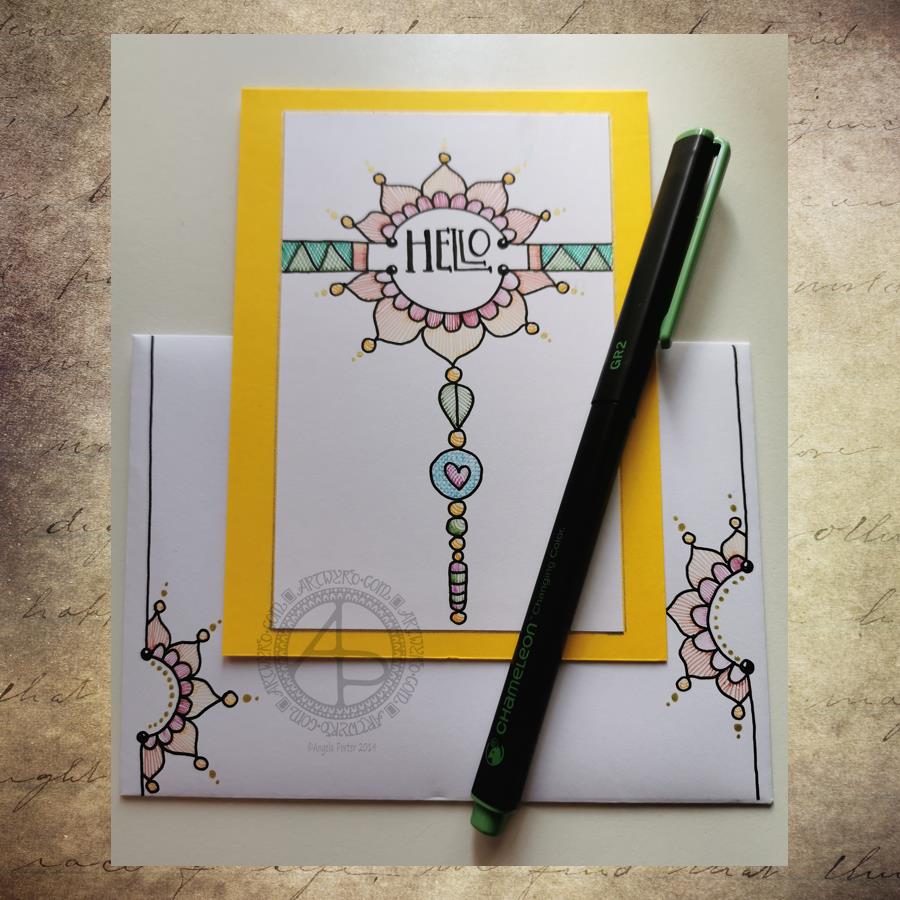
Yesterday I decided to make a second card with a coordinating envelope. I wanted to try out using the Chameleon fine-liners to add colour in the form of lines and cross-hatching. Finally, I added some gold dots to the points of the petals on the flower design.
To draw the design and execute the hand-lettering, I used a Uniball Unipin pen. I then used various pairs of Chameleon fineliners to add the colour.
I prefer this way of adding colour with the Chameleon fine-liners, though I’m not entirely happy about it either. Looking at it now, in the clear light of dawn, I think I could have added a flat colour below the coloured lines. I may go and add that colour in a little while. After all, it’s just a card, an experiment, and if I mess it up, I can always make another one! A lesson learned, an experience gained is worth the few pennies worth of materials and the time it took just as long as I remember the lesson in the future.
I’m also not happy with my hand-lettering; I like the idea of the letter layout, but it’s not centred between the arcs.
I do like the ‘banner’ I’ve used to enclose the hand-lettering. However, there’s something about the rectangular ribbons and the patterns within that I don’t particularly like. I’ll work out what it is in time.
For now, I’ll try adding flat colour to the coloured sections to see how that works out and not worry about messing up the card. I’ll use it as a learning experience.
And that reminds me, I’ve still not set up my One Note journal for my private critiques and what kinds of methods and techniques I use in my art.
Materials
A piece of yellow card cut to 4″ x 11″, scored and folded in half to make a top-fold card measuring 4″ x 5½”.
A piece of white card approx. 4″ x 5″ for the top layer.
A We R Memory Keepers Envelope Punch board and an piece of paper measuring 7⅞” x 7⅞” or a blank envelope that will fit a 4″ x 5½” card.
A pencil and ruler for the guide-lines and a good eraser to remove them.
A black fineliner pen for drawing and hand-lettering; I used a Uniball Unipin pen.
Pens to colour the design; I used Chameleon fineliner pens.
A gold gel pen for the dot embellishments; I used a Uniball Signo gold gel pen.
If you’d like to learn more about dangle designs or are looking for some more inspiration for them and how they can be used in cards, BuJos, scrapbooks, bookmarks, journals, and more then my book ‘A Dangle A Day’is a good place to start. It takes you through how to draw monograms and dangle designs for all kinds of occasions around the year in simple steps.