Draw With Me – A pattern and motif sampler.

Link to today’s video on YouTube.

This seems to be the natural progression of my work earlier this week where I put motifs in boxes and added background colour only.

When looking at Rebecca Blair’s artwork, which I absolutely love, I got inspired to create the first ‘sampler’ on the left. I say sampler because splitting space up in this way reminds me of needlework samplers created to practice different stitches.

This is a lovely way for me to indulge my love of hand-lettering, patterns, stylised motifs, colour, shadow, texture and boxes split into boxes!

Colour continues to vex me. I think my favourite is the centre example in a monochrome colour scheme. No chance of any weird colour combinations with that one!

I keep saying this about me and colour, don’t I? But I really need a huge sign that lights up and flashes to remind me to stick to monochrome colours, possibly analogous, and with tiny flashes of a complementary colour. Actually, I need the sign to detect when I reach for colour and shout this advice at me!

Of course, I wanted to share my experiments with the world; well, a few hundred people may be, who may find this an interesting idea to try. If you’d like to see the video then click on this link!

It’s been a quiet day for me. My digestive system is playing up, and self-care is the order of the day. That means not doing anything that has to be the best I can do. I know today that it’ll be harder for me to get things done because I’m under the weather. Fingers crossed, I’ll be fine and dandy again tomorrow.

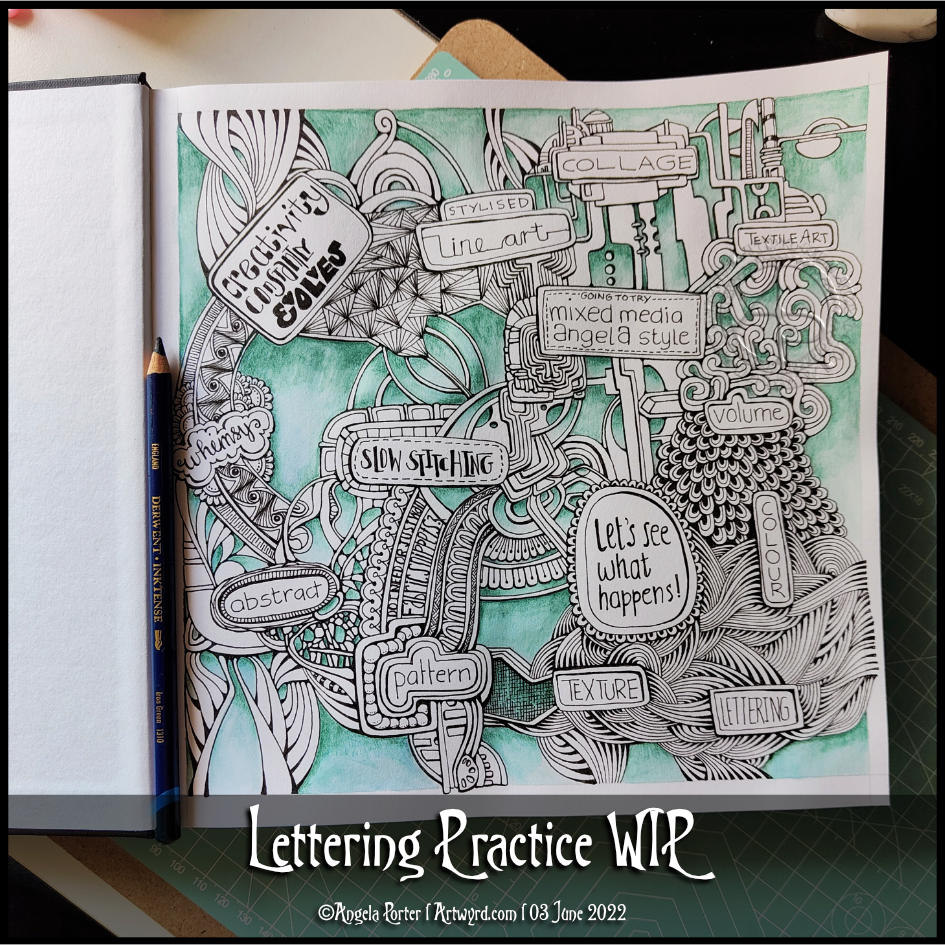
Lettering Practice WIP

How I spent my afternoon – adding colour to this particular design. The colour isn’t even, but I’m fine with that as I do want to add subtle patterns in the coloured sections eventually, I think.

I’m now taking a break from this as I just don’t know what to do next. Do I add more colour? Or is it time to add more pattern or texture? Or, do the patterned areas need shadows and highlights added rather than colour. Dare I add any sparkle and shimmer in places?

I just don’t know at the moment. What I do know is I quite like this way of combining words and patterns – two things I love very much.

A second thing I know is that it’s time for a mug of tea, a biscuit, maybe, and some slow stitching. Oh, and watch episode 3 of Obi-Wan Kenobi!

Funky Fungi Lettering Practice

Carrying on with the mushroom theme … I’m taking a course on hand lettering and it just seemed a good idea to have some fun and combine mushrooms and letters!

I actually did this originally in pen in my sketchbook and I was quite happy with the result. However, I wanted to see how I could rework it digitally. So I did. And here it is!

I’m so much happier adding colour digitally. Though I do need to play around with different kinds of brushes to get different textures in the colours.

Onwards and upwards with the lettering, a little at a time!

Making a simple sketchbook or journal pocket.

Making a Simple Pocket © Angela Porter | Artwyrd.com

Yesterday, I said I’d like to make simple pockets for my sketchbook-journal to hold my artwork rather than gluing it to the pages. So, this morning, I started my day looking on YouTube for some ideas and this video by joie de fi was the top of the list.

While I was watching it, I thought I’d make an instruction sheet to go in my sketchbook (or my virtual one I’m making in One Note).

I picked up some quadrille paper and wrote and drew as I watched the method for the first pocket. I worked in ink without pencil sketches and I made quite a few mistakes. A Tipp-Ex mini pocket mouse was my friend.

When I’d finished the instruction sheet, I scanned it in and used Autodesk Sketchbook Pro to remove the square grid from the paper, clean up some smudges, and correct minor errors.

Then, I added some colour to help bring out the drawings, but also to help with the instructions.

I’ve yet to make this kind of pocket, but I’m sure I’ll be able to do so quite easily now.

Reflecting on the artwork/illustration

This was a lot of fun for me to do. It’s something I’ve not done much since my days as a science teacher, or a learner in school and university myself. I’d forgotten how much I enjoy creating instruction sheets with my own drawings on them.

Back in those days, I would’ve used a ruler to draw straight lines, pencil for the diagrams, pen for the words, and little or no colour. Here, I free-handed the drawings, wobbly lines and all. The colour also adds life and dimension to the diagrams/drawings/illustrations.

The layout of the instructions may not be the best and easiest to follow through. That’s because I did this as I was watching the first part of the video. I think that for the next one, I need to sketch out the steps and notes first, and then work on organising them more clearly.

Yes, I’m going to do some more instruction sheets like this!

I also really need to do more hand lettering! I’ve lapsed in my writing practice, that’s for sure.

May You Know …

©Angela Porter 2019

…love, peace, joy, health.

I started drawing this one a couple of days ago using a fine nib fountain pen on paper. I’ve spent much of today finishing the drawing and I’ve just started to add colour digitally. Not sure about the colour yet though.

The words appeared intuitively, instinctively as I was drawing. Something’s obviously bubbling in my unconscious mind, most probably a result of the loving kindness meditations I’m continuing to do.

It’s always relaxing for me to draw in this way – just letting shapes and patterns flow from the nib onto the page without too much in the way of consideration or fretting about what appears. Partway through the whole drawing, or even sections, it looks like a total hot mess to me, but I push forward. To give in would be easy, to persevere takes a bit of effort. The effort is usually worth it though; my past experiences have taught me this.

I’m looking out of my window as I’m typing. I can see jackdaws swooping and wheeling in the now sunny skies. We’ve just had a wintry snow shower, which hasn’t lasted on the ground at all. The black feathery jokers are revelling in their fun and games in the air, exuberant in the dry but cool air and the sunshine. There are veritable clouds of them and I know they’ll soon return to their roosts, cloaking the winter-bare trees with their featheriness and raucous caws. I’m smiling as I watch them. I do have a big soft spot for the corvids of this world. Their antics delight me, especially the ones that zoom past the window next to my work area! They whooshed off to my left and now some are whooshing back to my right. What a lovely sight close to the end of the daylight hours!

It also brings back memories of sitting with my cat perched upon my chest, both of us looking out of the window and watching the jackdaws flying by, and in the summer dusk hours bats. His eyes would be wide and alert as his head spun back and forth, avidly watching the flying critters. I’d be equally delighted watching the antics of both the flying and cwtched up critters! So many precious times with my companion to treasure though he has been gone to pusscat heaven for nearly 9 months. I’m sure he’s still keeping an eye on things that fly , wherever his little soul, spirit is residing!

Watching the birds brings me some joy and peace too. And happy memories of my companion of sixteen years.

Friday quote

Angela Porter 1 June 2018

I am so lucky being self-employed, doing something that brings me pleasure and never feels like work; it always feels like the weekend for me!

I sketched the words and part of the design on paper, photographed it and opened it in Autodesk Sketchbook, then used my Microsoft Surface Pen on my Microsoft Surface Book to hand-draw the letters and flower wreath.

Yes, it is hand-drawing, even though it’s done in a digital environment. I use my Surface Pen as I would any pen or pencil. I do make use of some of the tools in Autodesk Sketchbook to speed up the drawing – such as the symmetry tool, and the ability to move elements in the hand-lettering around (I’m learning not to be too fussy about size and arrangement in the sketch; that just gives me the general idea of lettering styles and sizes).

All the same, it’s a nice way to start a Friday with a decorated #fridayquote, just to get those #weekendvibes going with #thatfridayfeeling #fridayfeeling.

Hand lettering – Tuesday Tips

tuesdaytips angela porter 2018 My #tuesdaytips are all to do with hand lettering this week, but taken generally, the advice applies to any skill, artistic, creative, practical or otherwise I’m sure.

Lots of people aren’t happy with their handwriting, for many reasons.

I actually am, when I don’t rush any ways.  I worked hard on my handwriting when I was in school; I didn’t like my writing (it was too much like my mother’s), so I worked to change and develop it. It did take time and conscious effort on my part, but I enjoyed writing, I always did. Doing all my homework and re-writing and re-organising my notes in school and in University gave me plenty of practice in honing my handwriting skills.

However, handwriting and hand lettering are not the same thing.

Handwriting is something we do without a lot of thought about how we form the letters, it is a practiced, automatic skill.

Hand lettering involves drawing the letter shapes; it’s more of an artistic skill.

I’m working on my hand lettering skills.  I’m happy with my handwriting, generally, but my writing is naturally very small.  To write big, bold quotes and sentiments is a challenge for me, one that I had to face during my work on A Dangle A Day.

My first and most important tip about hand lettering is practice, practice and more practice.

dav

Here are some of the pages from my hand lettering collection in my BuJo. The pens are a Uniball UniPin, a Faber-Castell Pitt Artist Pen and a Lamy fountain pen with a fine nib.

The more you practice, the more you develop ‘muscle memory’ which makes it easier to be consistent in your lettering in terms of shape and so on.  It also helps it feel more natural and for you to speed up.

You can’t become an expert without first being a beginner.

My second tip is to start by practicing your natural writing style, your printing.  In these days of fonts by the million and perfect replication by computer and printing, I like to see the unique style that only your hand can bring to your hand lettering.

Practice your own printing until you are happy with the shape and style of your lettering, keeping it simple for now.  These letters will form the foundation of every other style you develop.

It’s easy to vary the style of your lettering by making simple changes to the letter height, width, line weight and so on. However, you need foundation letters you are happy with. So focus on this first and foremost.

My third tip is don’t compare your own writing to others’ or give up because you can’t seem to write as beautifully as you think they do.  Practice, practice, practice and work towards becoming the best you can be; it doesn’t happen overnight, it takes a lot of time.

“Daily learning of your craft makes you a master of your craft.” – Seema Brain Openers

“If people knew how hard I worked to get my mastery, it wouldn’t seem so wonderful at all.” – Michaelangelo

My fourth tip is to practice daily, or as often as you can.  In my BuJo (bullet journal) I have a section on my monthly tracker for hand lettering practice. Keeping a BuJo means I do get daily hand lettering practice, but it’s still not enough for me to keep developing the skill.

There’s plenty of advice out there and practice sheets and exercises for hand lettering, calligraphy, faux calligraphy, brush lettering.  What I like to do, however, is to write, using just my basic hand lettering ‘font’.

Writing out the alphabet again and again is productive, but not always enjoyable.  It doesn’t help you with putting the letters together in terms of words.

One of my happy memories is of English lessons when I was in primary school (aged 7 to 11) where we used a book called ‘A New First Aid in English’ to learn about nouns, similes, verbs, plurals and so on.  I enjoyed learning, but I enjoyed writing lists and answers down a lot too.  It so happens I have a copy of this book, one of the few remaining books from my days as a science teacher, and so I dip into this as a source of material to practice my writing.

Of course, you can use anything you like – quotes, names, lyrics, poems, anything that you enjoy but won’t distract from the focus of drawing the letters.

The last tip I will give is to use paper with guide lines on.  I printed paper out to suit my needs; I created it in Microsoft Publisher.  Dot grid or squared (graph) grid paper works well too.

My last words are – practice, practice, practice!