Coloring Page – 29 Sept ’22

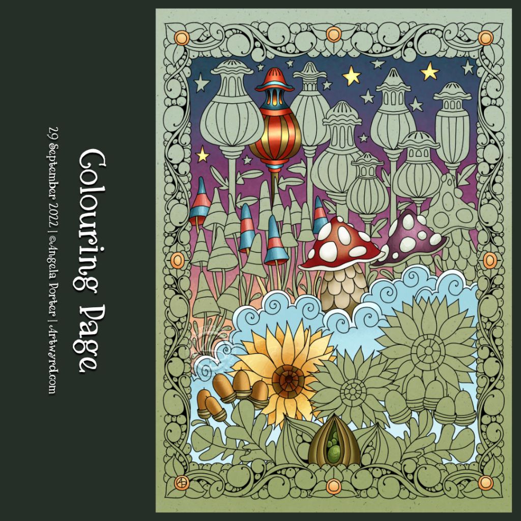
I drew this colouring page for Angela Porter’s Coloring Book Fans Facebook group this morning. It definitely has a fair few autumnal motifs; however, any kind of colours could be used!

I’ve partly added colour to the design, mainly to highlight some trickier areas with lots of detail.

Mushrooms!

Click on this link to view the accompanying Draw With Me tutorial video on YouTube

Today was a day to draw some mushrooms! I do love them, especially the quirky, whimsical and cute ones. These fit the bill, I think, a little resplendent in their autumnal tones.

As far as I’m concerned, I don’t think there is such a thing as too much whimsy or cuteness. Ever. Though I may seemingly stray away from things cute and kawaii from time to time, it’s not long before I feel the pull to add some more whimsy to this worrisome world.

There’s such a huge variety of fungi on the Earth, so much inspiration to draw from. But today, I kept it fairly simple.

To add colour, I used Inktense pencils with a Kuretake Zig water-brush. Oh, and the ‘frame’ was coloured with iridescent gold watercolour paint. And that gave me the perfect excuse, not that I needed one, to scatter some gold dots around the background. Oh, the white dots on the ‘shrooms and foliage were applied with a Sakura white SoufflĂ© pen. Its opaque white ink is perfect for this job, especially as it doesn’t seem to pick up any underlying colours. Must remember to get some more of them.

Zentangle Fengle variations, Pokeleaf and Mooka

I enjoyed drawing this design, though I wasn’t sure of the grubby-looking graphite and white charcoal on the big leaves. However, I persevered and am now fairly happy with this design.

I started with the Zentangle pattern Fengle and drew it in two different ways. The Fengles are stacked on top of each other.

Rather than try to squash another Fengle in, I elected to add some large, furled Pokeleaves, and of course, some Mookas had to grow with them.

The paper I used to draw on was a piece of Fabriano Toned paper in sand. The paper becomes the mid-tone of the design, so it’s perfect for using both graphite and white charcoal to add shade and highlight. Which I did, and the leaves ended up looking rather grubby.

So, while the video was uploading and processing, I completed adding all the shades and highlights. Then, I re-drew all the black and brown lines. Next, I added dotted highlights using white Gellyroll and Posca pens. Finally, I used a brown Arteza Everblend marker pen to fill the background gaps and draw around the design.

I’m so glad I added so many white dots to the pokeleaves and mookas. They just lifted the colour so much. The richer brown background also helped with this, though I think I need to tidy up the edges somewhat.

For someone who really doesn’t like using graphite/white charcoal in this way, I’m quite pleased with how this has turned out. I’m so glad I remembered I had this toned paper in my stash!

Oh, the patterned background is actually my drawing board! I decided to decorate it with all kinds of patterns and motifs. I’ll finish this side, seal it with some tough spray varnish, then start on the t’other side! Inspired by Zentangle’s Maria Thomas’s suede mat.

#DrawWithMe | A small #Zentangle inspired design

Please click on the ‘Watch on YouTube’ button. Cheers!

In this video, I take a small panel of some paper coloured with Paper Artsy Fresco Paints and white gesso and create a small design. Seed pods, Mooka, and a spiral shell – some of my favourite things to draw!

I used Inktense pencils and a damp brush to add colour and shadow. Finally some gold dots for the seeds in the pods.

Small, but nice enough and a needed change while my mind processes what I’m doing with collage and lettering and, and, and …

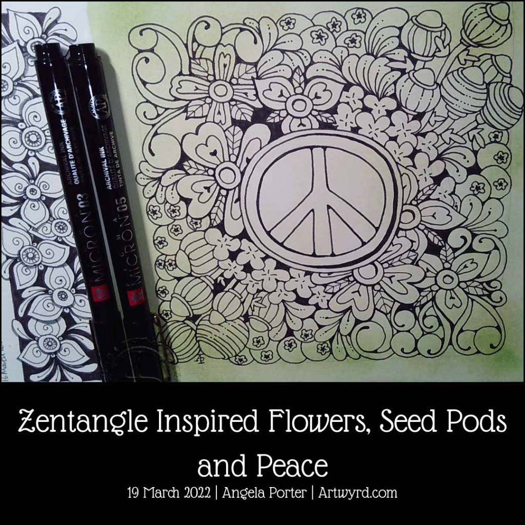
Draw With Me… Zentangle Inspired Flowers, Seed Pods and Peace

I invite you to draw this design with me. Link to today’s video tutorial on YouTube.

On the weekend, I like to do an artwork of some kind using some of the pattern or motif variations that I’ve developed in the week. This week, the seed pods and flowers just needed to be used in some way.

I thought of lettering the word ‘peace’ but decided on using the peace symbol as the focal point instead. Being born in the early 1960s, I do remember hippies, flower power and the peace movement, so popping plenty of flowers and foliage around the symbol seemed the right thing to do.

The seed pods fit in well, and the song ‘Sowing the seeds of love’ by Tears for Fears came to my mind too. so doubly fitting the message of peace.

Naturally, there are some hearts hidden in there too! And the plumptious moonberry blueberries too, adding some delicious goodness too.

The green background was a tad serendipitous. Partway through the drawing, I remembered that green is symbolic of peace and harmony, among other things. Rather fitting!

I’ve only got the skeleton of the design done. I’ve yet to decide on how to add colour, shadow and/or texture. So, I’m taking a bit of a break from it for my mind to mull things over subconsciously. I think I’d better scan the page before I do anything more to it though! Things tend to go awry when I start to add colour etc.

Inktober Tangles 2021 | Day 5 | Ayame

I took one ‘petal’ from the Ayame tangle, designed by Emiko Kaneko CZT, and used it for the outside border. In the inner section, I’ve used a variation of Naaki by Nadine Roller CZT, Lunar Flux by Debbie New CZT, and Printemps and Mooka by Zentangle Inc.