Draw With Me | A sketchbook page full of oyster shells, part 2

Click on this link to watch the step by step drawing video for the second and third oyster shells.

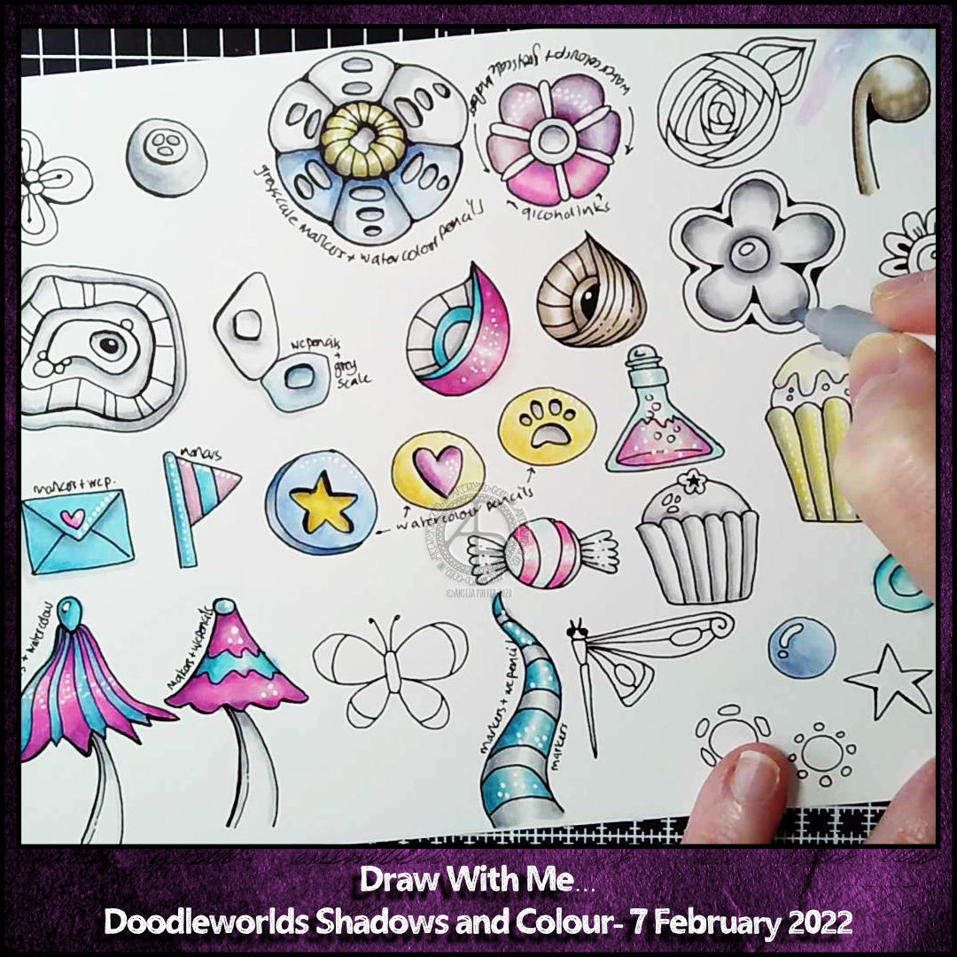
Two more oyster shells have been drawn and added to this sketchbook page. I used two different methods of adding shadow.

For the middle drawing, I used a 6B graphite pencil along with a paper stump or tortillon. Then I added some soft, peachy alcohol markers.

In the right-hand drawing, I added a base layer of a pale peachy alcohol marker. Then, I used red, orange and pink Colorsoft pencils to add shadow and variation in colour.

Then, it was time to add pattern /texture! To do this, I used an 01 Sakura Micron pen. Also, I alternated how intense the patterns were in the layers.

Finally, I added some white highlights with an 08 Sakura Gelly Roll pen. And a bit more graphite here and there to bring out the layers.

Which is your favourite so far?

This sketchbook page isn’t finished. I want to fill it with variations of oyster shells. I do intend to keep to the same kind of colours for the drawings.

Draw With Me … Adding texture, pattern and colour to circle motifs

Today felt like the right day to start jazzing up these simple circle motifs with some texture and pattern before adding colour.

I kept the methods of adding pattern/texture really simple – just lines and circles combined in different ways. It’s amazing how just small, simple patterns can make a difference to the motifs, making them look a lot more intricate than they are.

It’s sketchbook work, so this is a pretty messy page, but that’s fine. I’m learning that getting ideas down quickly as a reference/resource for future work is a good thing. And if they’re messy, then that’s fine! Even with the messy bits, the ideas are clearly seen.

Colour is still the thing that vexes me, and the sketchbook is where I can explore colours and, perhaps, find my confidence in them.

Of course, there’s a video tutorial to go with this sketchbook page, which is only partly done. You can view the tutorial by clicking on this link.

Doodleworlds – A5 Illustration WIP

Adding colour digitally lets me try things

I’ve learned a new ‘trick’! New to me that is. I’ve finally worked out how I can use grey shadow underpainting to increase contrast in my artwork! It’s new to me, but not new to the art world I’m sure.

I’m really happy with the result. Digital art makes it so easy to try things out in layers. So, this is the way for me to go.

Yesterday morning, I started adding shadows to some pen drawn motifs with marker pens. I wanted to see what that would look like. I prefer these shadows to those done with graphite or chalk pastel pencils.

Then, I added colour using watercolour pencils and a damp brush, just to see what would happen. I liked the result! Lots!

I filmed part of this process today, and here’s the video on YouTube

Peace

Peace © Angela Porter | Artwyrd.com

Artistically, I’m feeling cute and whimsical this morning. So a little bit of hand lettering along with some simple, cute and whimsical wreaths have satisfied this feeling.

Pretty hearts with some spiral details that remind me of iced biscuits (cookies to you lovely people in America). Soft pink for love. Evergreen foliage for peace and compassionate love to grow and flourish around this planet. Purple berries to create a harmonious balance of awareness and peace.

Perhaps there’s more symbolism and messages in my art, something that belies my belief I’m just creating pretty things.

I did create this art digitally using Autodesk Sketchbook Pro, Microsoft Surface Studio and a Microsoft Surface Pen.

Monday motivation

Angela Porter 18 June 2018 watermarked

Today has been a quiet day where I’ve spent time playing with colour and pattern. These are some of the results.

I’ve not finished added patterns to the ‘Colourful’ design. The other two I’ve left just as patterns in colour. I like both styles, though it is hard for me not to go to town with entangled embellishments!

I did do another drawing, while having some tea at the Garwnant Centre in a forest at the edge of the Brecon Beacons. It’s in a sketchbook and a bit wibbly wobbly. It was a nice place, a nice way to spend an hour or so, somewhere a bit different.

Supply Saturday

Angela Porter 5 May 2018 watermarkedThis little pattern was created using Inktense pencils from Derwent, and a Pitt Artist Pen from Faber-Castell. Oh, I also used a Kuretake Zig water-brush to blend out the Inktense pigment.

I started by using washi tape to mark out a rectangle to work in.  The washi tape did remove some of the paper to the left hand side, but as this is more of a sketchbook experiment, I’m not too bothered.

Next, I drew in the pattern of arches using a deep rose Inktense pencil and used a just damp water-brush to activate and move the Inktense colour.

Once I had the pattern of loops, and loops within loops, I added more colours to the pattern.

The colours will lie over others as a glaze, but once the wet Inktense pigments have dried, they are permanent. That makes them an excellent medium to create such a colourful pattern.

Finally, as this is an experiment, I used the Pitt Artist Pen to add black lines and details to part of the design to see what difference this makes.

I like the loops of pure colour, but there is something about black outlines and patterns that makes me feel something is finished, complete, defined. I do like how the loops without black outlines seem to recede into the background.

I may add some gold and white details to this design as well later on today, as well as resisting the temptation to add black line details to all of the loops. It would be a nice way to keep the #weekendvibes going!

It’s also supply saturday over on the facebook group called Angela Porter’s Coloring Book Fans.  There’s a lovely group of people over there and they will make you most welcome if you visit and join!


Cool Calm – mixed media, Vida Collection

CoolCalm Angela Porter Small

I’ve spent the last couple of days completing this mixed media drawing/painting where I focus on colour and line.  I’ve called it Cool Calm.  It reminds me very much of stained glass.  I love the warm highlights I’ve added, as well as those sharp, bright green tones too.

What I do want to do, now it’s been scanned for things like Vida and printing, is to add metallic/iridescent elements/patterns to it and then, maybe, put it on Etsy as an original work of art.

I’ve also used it to add new items to my Vida collection, including this tee-shirt: