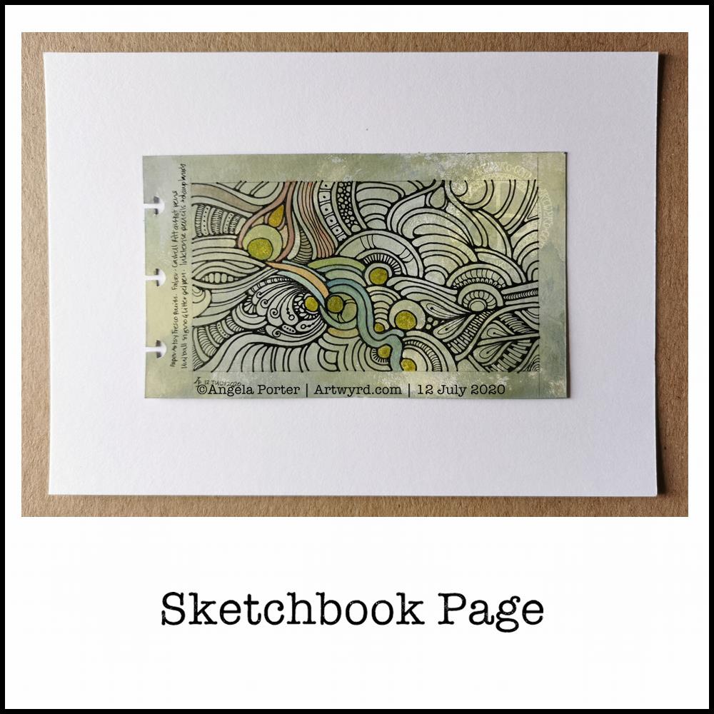
Wibbly-wobbly sculptural columns and arches surrounded by layers and layers of abstract bubbles, ripples and swirls of thoughts, wishes, blessings. Well, that’s what came to my mind as I added the architectural details.
No highlights, no sparkle, limited pattern and texture. Just flowing line work, for the most part. I’ve even left some ‘white space’ in the design, which is becoming less unusual for me.
Rounded arches with patterns reminiscent of Romanesque architecture. The columns are, however, more delicate, which is more reminiscent of the move towards Gothic architecture. Both forms or architecture have long been a source of artistic inspiration for me.
Soothing, relaxing and meditative to draw. Circles and spirals, arches and patterns are always comforting and endlessly fascinating to me.
Drawn using Faber-Castell Pitt artist pens on paper coloured by PaperArtsy Fresco paints. The drawing is approx. 2½” x 6¾”.
I used a variety of PaperArtsy Fresco paints to colour a 5¾” x 3⅜” piece of ClaireFontaine Paint-On mixed media paper. I chose, for me, an unusual mixture of colours. It’s ended up looking like old, distressed and grungy painted walls.
Next, I drew the abstract design with Faber-Castell Pitt Artist pens. I did the basic outlines, leaving my decision whether or not to add details for later on.
Then, I tried adding some colour to the background with Inktense Pencils and a damp brush. As this is a sketchbook page, I tried different colours out to see which ones would work well with the background. The finish on the Inktense-d areas was rather chalky and dull, though a subtle colour was achieved on the acrylic paint background. I’m not sure if I like it or not.
I find it difficult to resist a bit of shimmer and shine on my art, so I used a Uniball Signo gold glitter gel pen to fill in some of the circles in the design.
Finally, I added some more complex patterns to some areas in the design. I could’ve filled in more areas, but I’ve decided that this is enough.
Other stuff…
This wasn’t the only piece of paper I coloured with the Fresco paints. As they’re for the sketchbook, I coloured each piece on both sides. So, I now have quite a few prepared pages in my custom sketchbook to draw on as time goes by.
I think I’ve finally settled down after the trip out on Tuesday. I seem to be more settled, for sure. Meditation, self-care, self-soothing and enough rest has worked it’s magic once again. Sunshine today is helping as well, along with the refreshing breeze that is gently flowing in through the windows.
The simple things in life are often the ones that bring most peace to me – art, meditation, quiet times, sunshine.
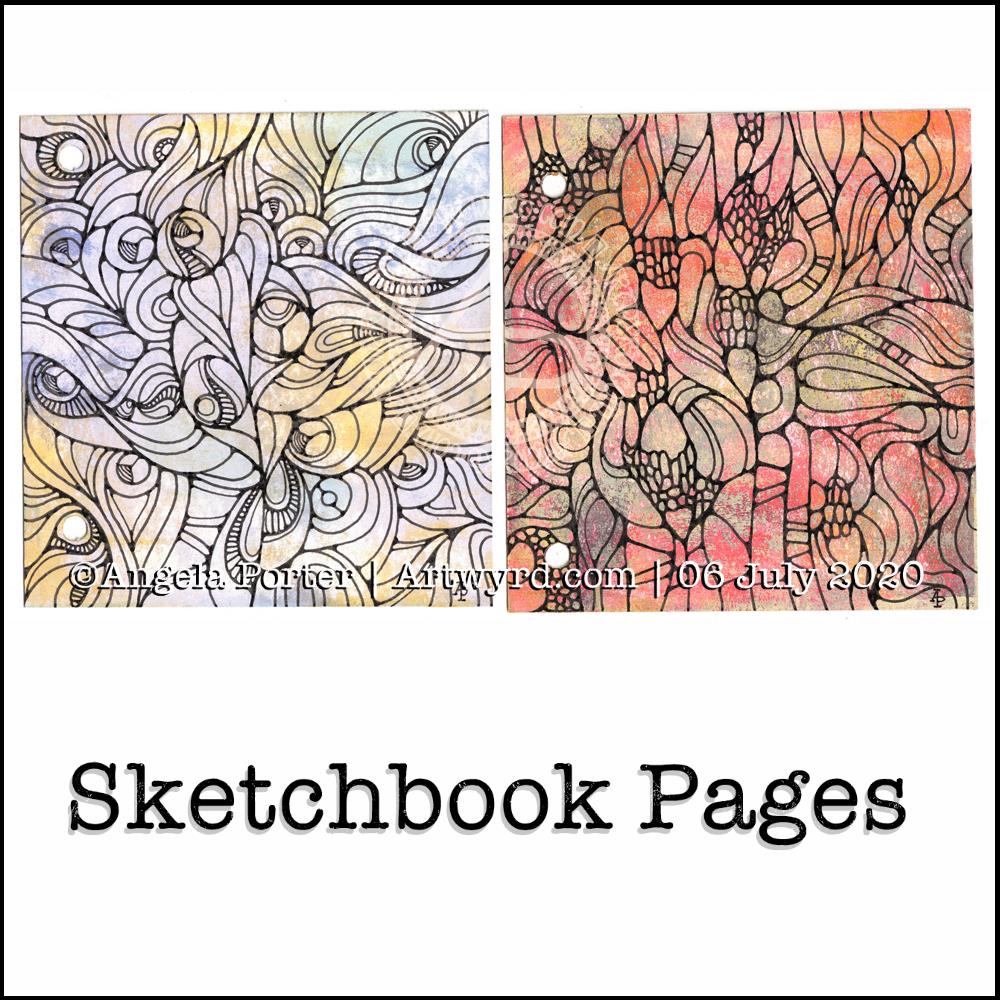
Yesterday, I made a pair of covers for a custom sketchbook. I also spent some time cutting up watercolour and mixed media paper to go into it. Each piece of paper is approx. 4″ square.
I then added colour to both sides of four of the pieces of mixed media paper (Claire Fontaine brand) using PaperArtsy Fresco paints, Daler-Rowney gold acrylic paint and a piece of Cut’n’Dry foam from Ranger.
I also added watercolour to four pieces of watercolour paper, just on one side. I used this as an opportunity to just play with colour, no idea in my head of what to create.
Later on in the day, I wielded Faber-Castell Pitt artist pens on one of the Fresco paint coloured pages (the one on the right). I just wanted to draw. No preconceptions of what would appear on the page.
It’s been quite a while since I’ve created art like this and I actually got a great deal of satisfaction out of the process. That surprised me, as black lines on colour had really not felt right to me for a long while now. It may be that I just needed a break from this style of art.
This morning, I took another piece of the Fresco paints coloured paper and drew a different design. Again, it was something I really enjoyed doing.
I’m really quite pleased with both designs. I think I’ll be using them for inspiration for some watercolour pieces in the near future. My only problem is whether to draw the designs out in black ink, dark pencil or faint pencil before adding watercolour! I think I’ll need to try these out before settling on a method.
What I also really like is working on a small scale. I’ve always been a ‘dainty’ artist; I find it hard to work on large scale artworks. It’s the fine, intricate detailed drawings and paintings that I enjoy creating, as well as abstract art.
Also, I really like the texture the Fresco paints leave on the paper – both for drawing on and the visual interest they create in the background. I’m so glad I haven’t done that destash and tidy-up yet as I know these paints were some of the items that were due to go. Now, they’ll be kept. I’m also glad I have a good supply of the Cut’n’Dry foam too.
I wish I’d placed the holes in the covers of my custom sketchbook closer together. That way I’d be able to add rectangular pieces of paper more easily. That’s something for me to consider the next time I make such a sketchbook.
I have some discs and a punch for disc binding in my stash. This may be something to consider using for another custom sketchbook as it would easily allow the inclusion of different sized papers in the sketchbook. Now my mind is working on using that! I think I need to jot my ideas down in my journal.
What I like about these kinds of systems is the ability to add different papers in where I want them – to shuffle things around as needed.
Last night, I bought a book called “Paint Yourself Calm” by Jean Haines. It’s about playing with watercolours and colour to gain a sense of calm. Not for any other purpose. Not to create great art. Not to produce anything. Just for the sheer enjoyment of working with watercolours and colour.
The concept appealed to me. I do find it hard to let go of the idea that I have to create finished art. I think that’s part of the instinct to start up a sketchbook practice again too. There’s no pressure to complete finished art in a sketchbook.
So, I was taken by one exercise in the book, which is to draw a shape, with watercolour, around five blank areas on the paper, and then colour the rest of the page with watercolours.
I grabbed one of the A5 Arteza mixed media sketchbooks I have. The paper isn’t the thickest and it did warp, but the colour does bloom and flow when the paper is wet in almost as good a way as it does on the high quality 100% cotton papers I have. I was just playing around and, despite the advice in the book, I just couldn’t feel I was wasting some of my best paper.
I used yellow to start with. I needed some sunshine yesterday evening. It had been a dull, grey, high-windy, wet day here in Wales, UK. So, sunshine was needed, and watercolours could provide it.
Once I’d got the area around the white spaces wet with watercolour, I dropped some oranges and reds into it. Small drops that blossom and bloom like tiny flowers and then flow one into another to create patterns of colour.
I also ran water down the page in rivulets to move the colours some more. And I added some pearlescent gold acrylic ink to these rivulets and let it flow and move, blossom and bloom as it wished.
Once it was all dry, I felt the need to add patterns in black pen. I ended up with patterns that remind me very much of plant cells under a microscope.
The whole process was very calming, meditative and settled me down to go to sleep.
Art Journal Covers
To the right of the watercolour, you can see two covers I’ve made for an art journal. I used some really sturdy cardboard and punched two holes in each. This way I’ll be able to use book binding rings to assemble the covers and internal pages. Each board measures 4.5″ x 5″ and I’ll use papers that are a maxium size of approx 4″ square in it.
I covered both sides with white gesso before using PaperArtsy Fresco chalk paints to colour them in a patchy, grungy way. I’m so grateful I hadn’t got rid of them, as I am thinking of having a major clearout of my stash at some point in time.
I wanted the colours to look a bit like the verdigris on weathered copper. Once dry, on the fronts, I added some medium grain texture gel. Once that was dry, I dry-brushed copper paint so it picked up the texture on both the back and fronts of the covers. Finally, I used the copper paint to edge the boards.
You can’t really see the copper in the photos, but it is there! I’m quite pleased with this.
I had a lot of fun drawing these images, and who doesn’t need a koala planet or an angel pusscat in their life? Not forgetting all the crazy aliens and critters and other things!
Colorist is an app that allows you to colour templates in like you’re using a pencil or a gel pen. Great fun, easy to use, and you can colour each template again and again. Oh, and you can add doodles and patterns to the images too!
Dot Mandala
My youtube recommendations today included some videos about how to create ‘dot mandalas’ – the kinds that are seen on stones and also as paintings. They’re made up of patterns of dots, and I watched a couple byKristin Uhrig and Travelling Kindness Rocksand they inspired me to have a go. This is the result:
It’s not perfect – I found out this is much harder than these two ladies make it appear. It was, however, a lot of fun to create!
I used my embossing tools dipped in PaperArtsy Fresco Paint and some gold Liquitex paint, both of which were watered down a little, to make the dots. I did draw some pencil circles on the black card to help keep the design circular; I drew three circles in total! Then, I just let the design flow without over thinking it.
As I’ve said, it was great fun to do, totally engrossing, and I’m quite pleased with my first attempt. I’m sure I’ll be doing more of these, on all kinds of scales!
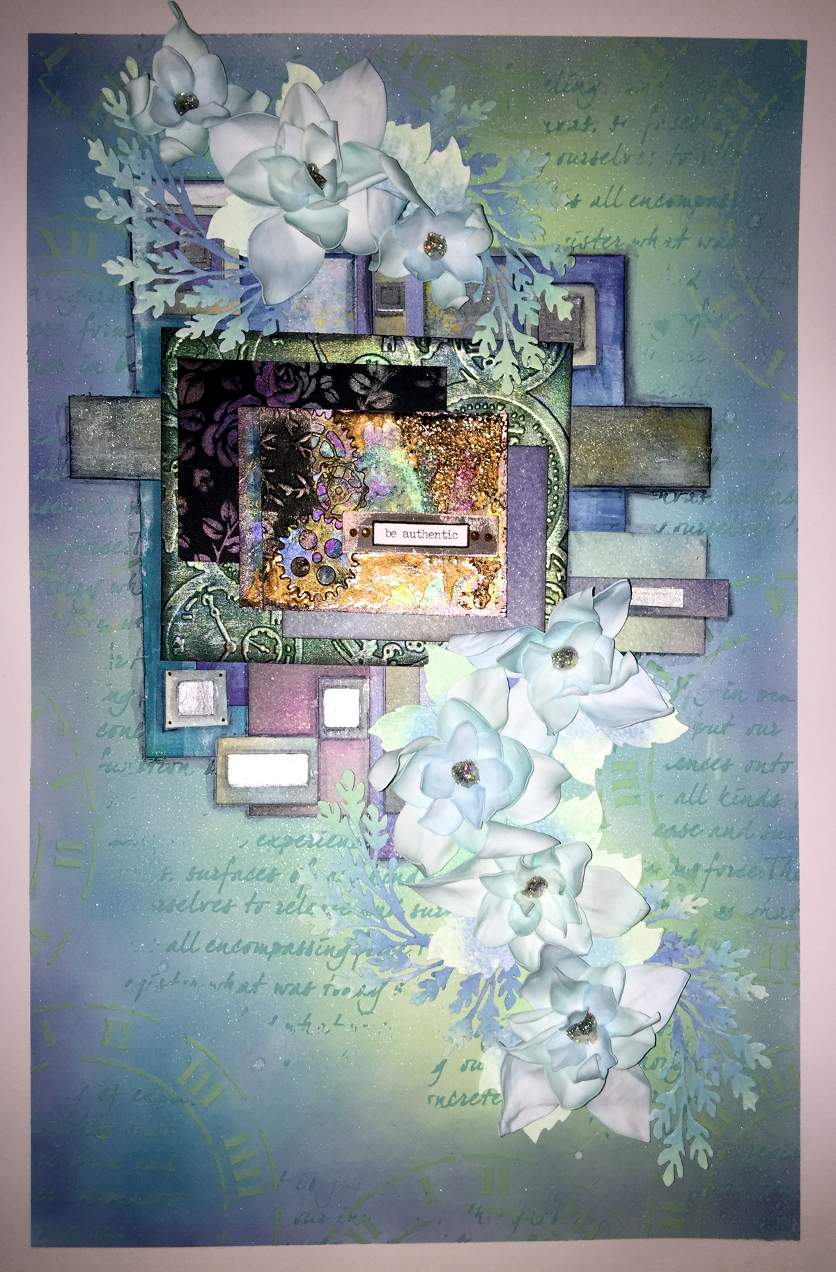
I’ve mostly finished this piece of mixed media art. I think I need to add some pearls or similar, maybe some shadows around the flowers and foliage, but it is, in essence, complete.
I’m quite pleased with it, especially as I kept to a mainly monochrome colour scheme of blues and greens, but pinks and purples had to make a little bit of an appearance just to add some accents.
It’s another big one – A3 in size. Lots of Foamiran flowers have been used; I used Distress crayons and a baby wipe to add colour to the white foamiran before heating and shaping each layer. The colours are the same as some used in the background.
My focal point is an ACEO or ATC that I made a few weeks ago at the start of my mixed media explorations.
In places you can pick out the subtle sparkle on the background and foliage – achieved by spraying with a mist of gold perfect pearls.
Many of the coloured papers I used in the collage were created using a Gelli Plate and PaperArtsy fresco paints.
A fair amount of metallic and iridescent paints from Pebeo, Liquitex and Daler-Rowney have been used too.
The last couple or so days I’ve been working on stuff in preparation for this, though I wasn’t quite sure how it was going to work out, if at all.
The background I made earlier today just wasn’t the right thing…so had to re-do that. I’m happier with this one, and the first background has been consigned to patterned, coloured, embossed papers for future projects.
There’s still a fair amount of work to do on this one, and I think it’ll work out OK in the end.
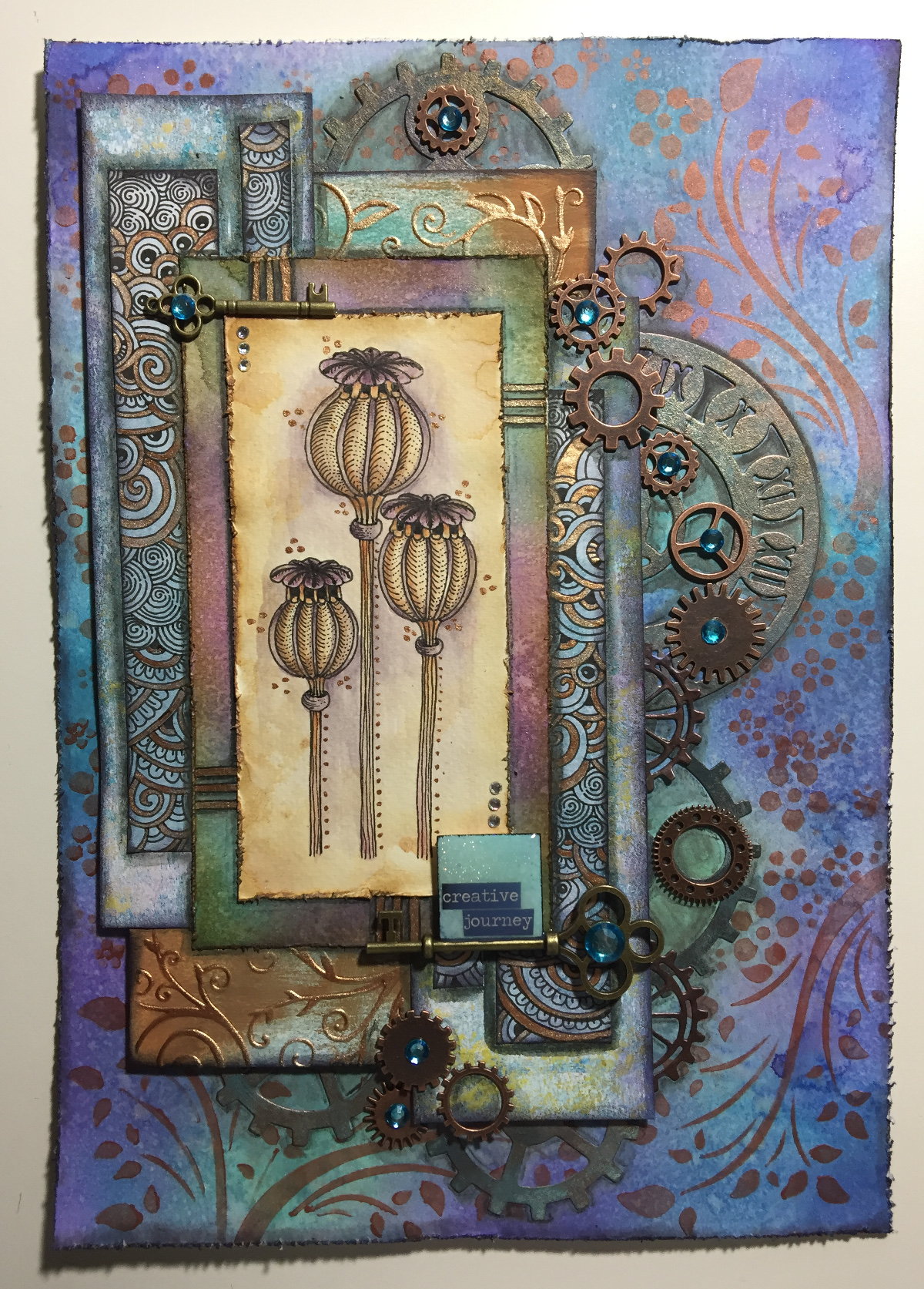
I’ve decided to do my best to be brave and confident and use my own drawings and designs in my mixed media work. The poppy seed heads and the ‘zentangle’ patterns are drawn by myself.
The inchie with the quote on – creative journey – is milky as the Glossy Accents on the tile hasn’t dried yet, but it will dry clear and glossy.
Here’s a list of the media I used:
Papers – 300gsm watercolour paper, cream paper for pencil and pastel work, marker paper, kraft card, mixed media paper
I’ve spent some days preparing backgrounds, die-cutting some items for my stash, drawing and just ‘being’.
I started this one yesterday, but finished it today…well, I think it’s finished!
No quote or words on this one…yet. Maybe something will come to me, or maybe someone will suggest something…feel free to message me if you wish to suggest something!
I’ve had a bit of a week with appointments and then yesterday was a day where I needed some self-care. I did, however, begin work on this particular piece, and I’ve gone crazy on making ATC sized backgrounds ready for work on them, particularly using the Dylusions paints which have laid dormant in my stash for a long, long time.
This particular mixed media pieces has a colour scheme that is not typically ‘Angela’. There’s lots of god in it, and the flowers look more like succulents than flowers, bu tthey do kind of work!
The close-up image shows the ATC that’s become the focal point of the piece, along with the metal charms and keys that have been added.