Sketchbook Page

Sketchbook Page © Angela Porter | Artwyrd.com

I’ve been awake since stupid o’clock, which roughly translates to 3:30am BST. While I was trying to get back to sleep I watched a youtube video about making pockets and tuck-ins for an altered book journal.

I thought that could be something good for my sketchbook-journal. I have worried a little about gluing my little artworks into it, but pockets, tuck-ins, see-through envelopes could be a good way to both show the work and store it in a non-permanent way.

So, with my mind now working and sleep eluding me, I decided to have a go at making my own pockets. You can see the result at the top right, with a journalling card popped in one of them for now.

How I made the pockets

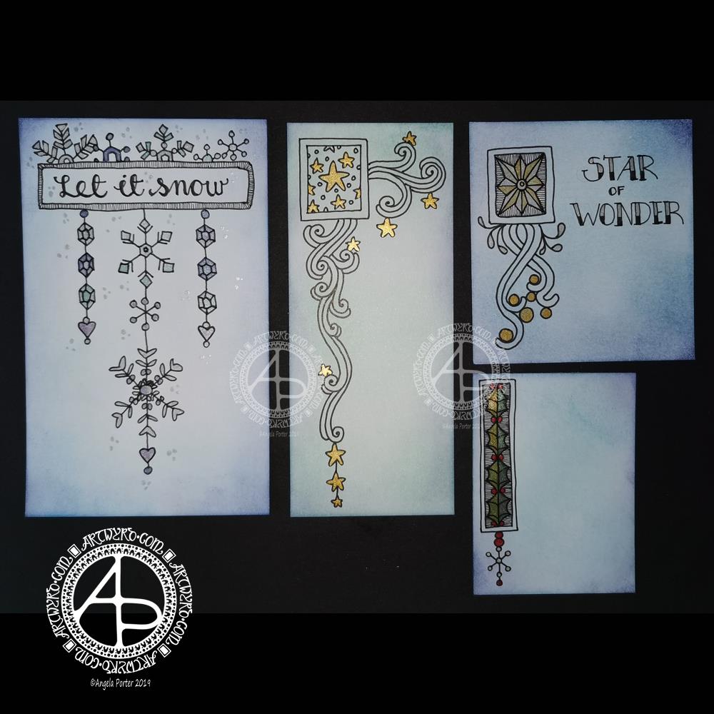
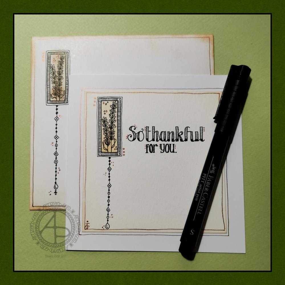
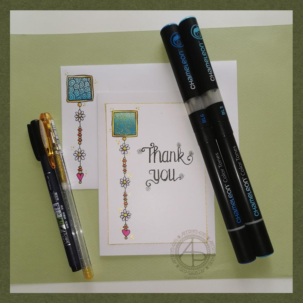
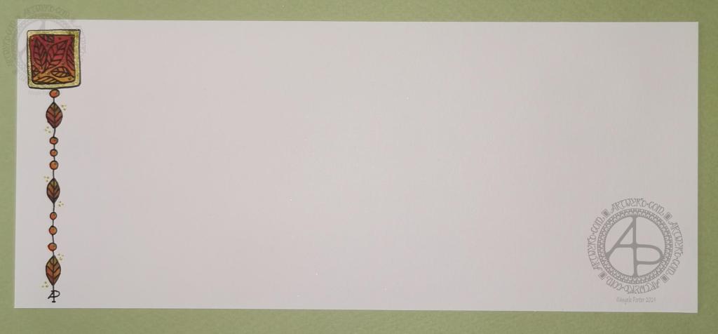
I used some ordinary white card, cut it into what I thought would be good sizes to make a set of stacked pockets for the ATC sized cards I’ve been working on.

I then coloured the cards with Distress Oxide Inks. For one of them, I used a brayer to add ink to a gelli plate. Before pulling a print, I spritzed the gelli plate with water that had some white perfect pearls added to it.

For another panel, I used the brayer to add ink directly to the paper. It did that unevenly. So, I used a ball-tool to carve some texture into the black side of a piece of cut and try foam and used that to add colour. That worked really well! Dabbing the foam added a lovely textured layer of colour. A spritz of water activated the dusty, chalky, soft nature of the Distress Oxides.

I enjoyed the look I achieved with the distressed foam that I coloured the remaining pair of paper panels in the same way.

I then tore the top edge of each panel, for added interest, then used a piece of foam and Rich Mahogany Distress Ink to add grunginess to the edges of each panel.

I wanted to add some embellishments to each panel, so I used a copper sparkle Gelli pen to draw patterns on them.

Finally, I used Tombow Mono adhesive to stick the panels together.

When I put the panels on the page in my sketchbook-journal, I thought a panel behind them. So, I coloured a panel of the same card with Distress Oxide inks and the distressed piece of foam and used the same gelly roll pen to add some sparkly patterns. Then, I adhered the back panel and pockets to my sketchbook.

When I tested some ATC cards in the pockets, I realised I need to work out a way for some more ‘give’ in the pockets as they’re too tightly put together to slip more than one ATC card in them. Also, I placed them just low enough down the page so the ATC card doesn’t stick out of the sides of my sketchbook.

I’m not well known for my fore-planning projects like this, though I do try to learn as I go along.

Inchies and Twinchies

My mind was working in weird ways this morning. As I was making the pockets, my mind strayed to inchies and twinchies. I’ve not made any of these for a long, long time. I thought it could be fun to do so and add them to my sketchbook-journal.

I cut two 1″ wide, and one 2″ wide strips of card. I used the distressed foam to apply Distress Oxide inks to them, spritzing with water to add to the distressed look. Then, after drying with a heat tool, I cut them into squares – 1″ x 1″ inches and 2″ x 2″ twinchies.

I decided to use metallic watercolours from Cosmic Shimmer to add a sparkly, shimmery border to each tile. I used rich gold, pale gold or copper on each tile.

Then, I got to draw on the tiles. Teeny, tiny zentangle-style drawings. That was fun to do!

After adding some dots using a white Sakura Soufflé pen, I adhered the inchies into my sketchbook-journal. I’ve left the twinchies for decoration later.

Journaling cards

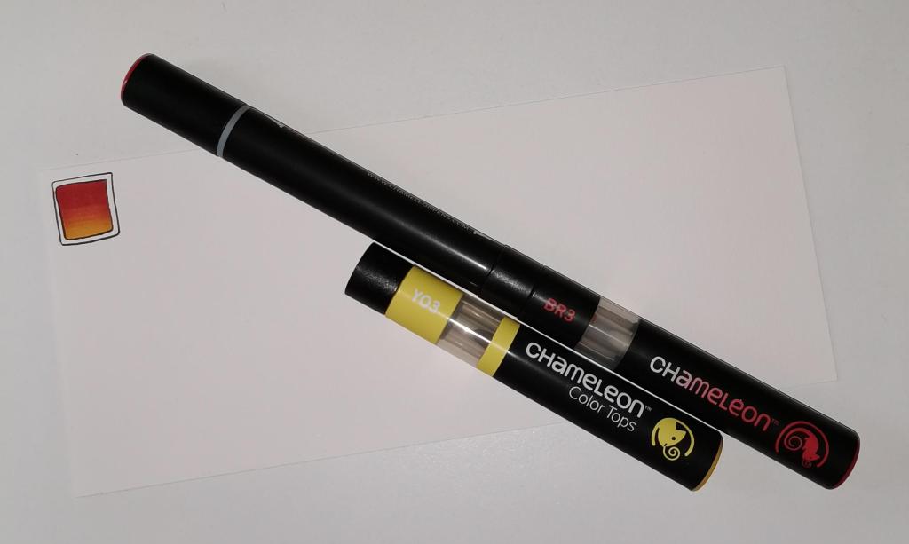
I realised that I could stored journalling cards in the pockets. All I needed to do was to colour the back of one of the ATC cards I coloured a few days ago. I also just realised that I could have added a layer of squared, dot grid or lined paper to write on too. That’s an idea for another time, maybe.

After drying the ink, I used a rollerball pen to add what notes I wanted to about this mornings creative sessions.

In fact, I’ve just created another journaling card to jot down ideas and notes to self as a result of reflecting on my pre-dawn arty activities!

Sketchbook Sunday

Sketchbook Pages – 26 April 2020 ©Angela Porter | Artwyrd.com

Over the week I’ve been adding to my sketchbook- notes and images, ideas and reflections.

Each page has been coloured with combinations of Distress Inks, applied using the black side of a piece of Cut and Dry foam, followed with a spritz of water to bring out some water-staining grungy loveliness.

All the little drawings have been done on either Daler-Rowney Smooth watercolour paper (300gsm) or mixed media paper, either from Claire Fontaine or Daler-Rowney. The papers have been coloured with Distress Oxide Inks, Distress Inks, or a combination of them. Most of the pieces have had the inks applied with the foam, but some were made by brayering Distress Oxide inks onto a gelli plate and taking a print of them.

The reflection about what I like, what I don’t like, and ideas that arise is important to me in my sketchbook/journal. I do reflect on my art, a bit too much in my head. When I write it down, it forces my sometimes abstract and swirling thoughts into some kind of order. When I make these thoughts a material manifestation by writing them down, it helps me to recognise the thoughts, sift through that which is useful, and still record those that are not particularly useful at this moment but may be in the future.

I think I need to find a way to do this with my digital art. My mind goes to using One Note to do this. I shall think on this one, and make a note of it in my physical sketchbook/journal.

Wintry Dangle Designs

Dangle Designs ©Angela Porter | Artwyrd.com

Yesterday was a crazy busy day with no time for art, let alone blogging!

This morning, I finally had some time to myself. As it’s Friday I wanted to do a dangle design, and I ended up doing four!

I cut the card into the wrong dimensions to create a card, so I thought I’d just make use of the pieces I had and make some custom card blanks and envelopes for them another time.

I coloured the pieces of card with Distress Inks in shades of blue and green. I used Chipped Sapphire, Tumbled Glass, Broken China, Evergreen Bough, Cracked Pistachio and Salty Ocean in various combinations.

These colours gave the card a frosty kind of feel, so I went with some snowy, icy, wintry designs.

I drew the designs and completed the hand lettering with Faber-Castell Pitt Artist pens, which are waterproof.

Plain black lines on the coloured background did look a tad lacking. So, I added some shimmer and colour using Cosmic Shimmer watercolour paints.

I’m not so fussed on the ‘Let it snow’ design. However, I am quite pleased with the others.

I am going to mount them as greeting or note cards. However, the designs would look charming in a BuJo, journal, planner, diary or scrapbook. They could easily be adapted to make bookmarks too, or place cards for a special meal.

I hope you’ll give drawing these designs a go, or use them as inspiration for your own projects. I’d love to see what you create – please tag me on social media so I don’t miss them!

If you’d like to know more about dangle designs and have some guidance and inspiration for them, then my book ‘A Dangle A Day’ is a good place to start.

It’s been nice to have a couple of hours to indulge myself in art. The past four weeks or so have been crazy busy with other projects being quite demanding of my time, mind and energy. However, they will soon be over and my focus can return, properly, to art.

So Thankful

So thankful ©Angela Porter | Artwyrd.com

Today, I have a simple dangle design greeting card along with a coordinating envelope. If you’d like some more ideas, inspiration and step by step instructions for drawing dangle designs then my book, A Dangle A Day, is a good place to start.

Materials and dimensions

4″ x 4″ Strathmore Bristol paper with a vellum finish
5″ x 5″ acid-free white card blank
White envelope that card will fit in
Distress inks in Tea Dye and Rusty Hinge
Small piece of foam and a mini foam blending tool
A piece of card with a 1.5″ x 0.75″ window cut in it to use as a stencil.
Faber-Castell Pitt artist pens in F, S and XS
Ruler and pencil
Adhesive
Glass pen and coppper ink by J Herbin

Making the card.
  1. Use the card stencil and a small sponge dauber to apply a rectangle of Distress Ink in the top left of the 4″ x 4″ top layer. I used Tea Dye to colour the whole rectangle in, followed by a subtle gradient of Rusty Hinge from the bottom up.
  2. Use a mini foam blending tool to add Tea Dye Distress ink to the edge of the top layer.
  3. Use a pen to draw the rectangles around the colour block. I like to do this free-hand as it gives a more organic, human feel to the design.
  4. Draw the sprigs and add the lines to the border. Dots help to add some interest to the more empty parts of the design.
  5. Use a ruler and pencil to lightly draw a vertical line as a guide for the dangle. Also, draw pencil lines as guides for the position and size of the hand lettering. Sketch in the letters of the greeting.
  6. Draw round and diamond shaped beads to form the dangle. I like to finish my dangles with a ‘heavier’ or larger bead.
  7. Ink the letters in. I did some faux calligraphy where I made the down-strokes thicker. I added some lines and shading to the top line.
  8. Carefully erase the pencil lines.
  9. Attach the top layer to the card blank.
  10. I used a glass pen and copper ink to add copper dots to highlight the dangle design and the hand lettering. I also drew a box just inside the top layer and another just outside it on the card blank. Again, I free-handed the lines, embracing the wobbliness.
Making the envelope
  1. I used Tea Dye Distress Ink and a mini foam blending tool to edge both the front and back of the envelope.
  2. I then used a sponge dauber and the card stencil to add a rectangle of Tea Dye ink in the top left.
  3. I drew the design on the envelope as I had on the card, including adding a line border in copper ink.
  4. Finally, I drew similar sprigs on the envelope flap, using the glass pen and copper ink.
Before mailing…

Once I’ve addressed the envelope, I’d apply a thin layer of Distress MicroGlaze to the front and back of the envelope to protect the Distress Ink and drawing from the elements. I’ve done this to other cards and they have traversed the UK and US postal systems with no problems.

Ideas for using the design.

Although I’ve presented this dangle design as a greeting card, which is, I think, a lovely way to share a little bit of artistic loveliness with others, there are many other ways the design could be used, with or without any hand lettering.

In a BuJo, journal, planner or diary it would make a lovely little design to fill in a blank space.

This is a design that would work really well as a bookmark.

I’m sure it would look charming as part of a scrapbook spread.

I also think it would look lovely on a ‘with compliments’ slip or decorating the edge of a hand-written letter.

I’m sure there are many other ways and media that this design would be suited to.

Final thoughts…

I’m really enjoying drawing these kinds of dangle designs. They’re simple and elegant, to my mind anyway. They’re also quite easy to draw.

I do prefer to free-hand the lines and let the wobbliness be part of my signature style. It gives that human, hand-made, hand-crafted feel to the finished project, and a warmth to the finished project.

I work hard at finding a way of drawing digitally that lets me keep this uniquely ‘Angela’ way of expressing myself through line and pattern. I’m still working on it and sometimes get frustrated that, to my eye, my digital art seems too, well digitally perfect.

It’s all part of the process though – learning, developing, experimenting, trying out new ideas, techniques and methods. That’s what helps me grow as an artist.

Dangle Designs 22 Nov 19

Dangle Designs 22 Nov 19 ©Angela Porter | Artwyrd

If you’d like to find out more about drawing dangle designs, then my book “A Dangle A Day” is a good place to start. I’ve created over 120 designs, with step by step instructions, for you to use and inspire you.

It’s Friday, so that means it’s dangle designs today!

I drew these on postcard sized (148mm x 105mm) acid free heavy cartridge paper using a mixture of Tombow fudenosuke and Faber-Castell Pitt Artist pens. I then used Chameleon Color Tones and Color Tops to add some colour to the designs.

Again, I’ve drawn some really simple, cute and whimsical dangle designs that leave plenty of space on the paper for hand lettering or a hand-written note or letter.

Dangle designs are, of course, very versatile. I put these on the edge of a postcard sized piece of paper. However, they could be used as the focal point of a greeting card or note card. Lengthen the dangle, and they’d make cute bookmarks. They’d make interesting designs to fill spaces in a BuJo or scrapbook page. They’d also make interesting focal points on art journal pages.

I’d love to see how you use dangle designs – just tag me in social media!

Thank you card – a dangle design

Friday means it’s time for another dangle design, this time a ‘thank you’ card and coordinating envelope.

In previous weeks I’ve had some fun adding patterns to small blocks of colour. So, I thought I’d run with that idea and turn one into a simple dangle design. The steps I used were the same for the card and envelope.

Card size.

The card is an A6 card and I cut a piece of Winsor and Newton Bristol paper to 5″ x 3.5″ for the card topper. The envelope came with the card blank so is A6 in size too.

How to…

I started by drawing a square of colour using the BL3 (Sky Blue) Chameleon Color Tone pen – no gradient, just pure colour.

Then, I added a gradient of BL6 (Royal Blue) over the base colour. I added pure blender to the Royal blue bullet nib using the mixing chamber. I didn’t use the Color Tops to add Royal Blue to the tip of the Sky Blue pen as I wanted a more subtle colour gradient.

Next, I used a Tombow Fudenosuke pen to draw around the block twice. Then, I added a filler pattern of spirals to the colour block. On the card I used a gold Uniball Signo sparkle gel pen. On the envelope I used the fudenosuke pen.

Now the colour block was decorated I turned my attention to the dangle.I decided to draw one dangle as I thought the design would look too crowded if I ad more. Sometimes, less really is more!

After drawing a faint pencil guide-line, I used a combination of beads, daisy-like flowers and a heart for the dangle. I wanted to keep it nice and simple.

Then it was time to add colour to the outline and design elements. I used the Chameleon Colour tops to add very simple colours. I didn’t do any gradients as the designs were so small. Instead I coloured them in the lightest colour, added a touch of darker colour where I wanted shadow and blended that out with the lighter colour.

I decided to hand letter ‘Thank you’ on the card using a soft nib Fudenosuke pen. I also added some tiny daisies to some of the loops and swirls to tie the hand lettering in with the dangle design.

I then mounted the card ‘topper’ on the card blank and added some gold glitter gel dots around the designs. I also added a gold line around the card topper.

Before I post the card, I’ll use some Micro Glaze from Ranger on the envelope to protect the Tombow pen from water damage.

Reflecting on the project…

Overall, I’m quite pleased with this. In hindsight I wish I’d used the Tombow Fudenosuke pen to draw the spiral pattern on the card. I think it’s a cute, simple and versatile design.

It would make lovely stationery, such as note paper or note cards, along with coordinating envelopes. There are lots of ways the design could be used in BuJos, Planners, Journals, Scrapbooks, and Art Journals. The vertical nature of the design means it would make a lovely bookmark.

How would you use this design? I’d love to hear, so leave a comment!

If you have a go at drawing and using this design then please share your finished products with me – I’d love to see how people use dangle designs!

If you want to learn more about drawing dangle designs then my book ‘A Dangle A Day’ is a good place to start. There’s over 120 designs for you to use as they are or for inspiration for your own designs.

Nearly every Friday I publish a new dangle design on my blog for more inspiration.

Remembrance dangle design

Remembrance Dangle Design ©Angela Porter | Artwyrd.com

Today, I have a simple tutorial for a Remembrance dangle design.

To draw and write the design and instructions I used Faber Castell Pitt artist pens and Claire Fontaine Dot Grid Paper. I also used a Tombow Fudenosuke pen for the broader ‘Remembrance’ to the bottom right of the page.

I did colour the design digitally using a very simple colour scheme and colour gradients.

I do hope you have a go at drawing your own version of this design. I’d love to see what you create with it – maybe a greeting card, or in a scrapbook spread about a loved one lost during a war. Perhaps you’ll change the sentiment for a birthday or other occasion, and change the colour scheme with that.

I based this design on the one that is in my book “A Dangle A Day”. There are over 120 dangle designs in the book for you to learn to draw or as inspiration for your own designs.

A simple and elegant Autumn Dangle Design.

Autumn Dangle Design ©Angela Porter | Artwyrd.com

Hello to November, and farewell Inktober. My blog post today looks a bit bare compared to my Inktober creations. However, I have neglected my dangle designs during October, so now’s the time to get back on track with them

Today, I’ve created a simple and elegant dangle design with an autumn colour scheme that could be used in so many different ways. I’ve also put together a step by step set of instructions how you too can create this design (and hoping that it’s not so simple that I come across as patronising).

This is my first time posting a set of instructions – post a comment to let me know what you think of them and if you’d like to see more of them in the future.

I’ve put the dangle design on one side of a slip of paper that would make a perfect compliment slip or a note to slip in with a gift, or just as a short letter to a friend. It would also be perfect for a coordinating piece of envelope art!

This dangle design would be absolutely charming as an embellishment in a BuJo, planner, scrapbook or art journal. It would also make a darling bookmark.

It would be easy to turn this design into a greeting card as well.

So many possible uses for such a simple design.

I do hope that you will give drawing dangles a go – no matter whether you think you’re good at drawing or not! This design is made out of just simple shapes; it’s the colour that brings it to life and masks all kinds of imperfections.

If you’d like more ideas for dangle designs, then please take a look at my book ‘A Dangle A Day’ – it’s filled with examples of dangle designs with step by step instructions and helpful and encouraging words of advice.

One step at a time to a dangle design.

Step 1

Step 1
Draw a square in the top left corner of a piece of paper. I used a piece of paper measuring approx 8.25″ x 3.5″. I used a Tombow Fudenosuke brush pen to draw the box, and outline it. I deliberately made the squares less than perfect to give that human touch as well as a uniquely ‘me’ way of drawing boxes. The Fudenosuke pen allows me to draw lines of variable width quite easily, which adds to the charm of the box. The ink in the pen is also alcohol marker friendly.
Letting your drawings be less than perfect is what makes them uniquely yours.

Step 2

Step 2
I used Chameleon marker pens (BR3 “Cinnamon” and YO3 “Warm Sunset”) to colour the inner box. Autumn is definitely here in the UK, and the combination of these colours reminded me of the leaves. However, you could use any colour combination you like and any medium you prefer to use.
Chameleon pens make it so easy to create a colour gradient – I prefer them to other alcohol marker pens, even Copics.

Step 3

Step 3
I added a simple leaf pattern to the coloured box using a Sakura Pigma Sensei 04 pen.

Step 4

Step 4
Add the dangle! For this dangle I used the same kind of leaves as in the box for a consistent design. I added some round beads as ‘spacers’. Finally, I added my ‘symbol’ to the end of the dangle.
Also, I did draw a faint pencil line with a ruler to help me keep my dangle hanging straight, more or less!

Step 5

Step 5
I coloured the beads and leaves in using the same colours of Chameleon Markers. I then decided I needed to add some shimmer and shine; I used a Uniball Signo gold glitter gel pen to colour in the border of the box and to add some dot highlights here and there.
The Chameleons caused the Sakura Pigma Micron ink to smear a little – I always forget that happens! I should’ve used the Tombow pen again. Oh well, you live and learn, eventually!

Mandala WIP

Mandala WIP 31 July 2019 ©Angela Porter | Artwyrd.com

I’m still in self-soothing mode after Monday’s emotionally draining trigger and EMDR session. I’m feeling a lot brighter, content, and not worried, but I’m tired as the stress from Monday is still affecting my sleep. It takes days for the stress hormones to leak away from me, bearing in mind I always have an elevated level thanks to the CPTSD.

Any way, back to art…

My self-soothing arty activity involved adding some patterns and motifs to my visual Zibladone (kind of a journal thingy). Always a soothing kind of experience for me. It also gave me the practice with pen on paper that I’ve discovered I need to do daily.

While drawing these patterns and motifs, I knew I wanted to try to create some of them in colour, with a lot of texture and dimension. So, the best way for me to do this is with a mandala. Well, that’s what I ended up starting work on. Originally I wanted to create a page similar to one in my Zibladone, with examples of motifs and patterns that are drawn/coloured digitally.

I may turn my attention to that after I’ve had some lunch. I’ll see.

Yesterday, I also completed the August template for the Angela Porter’s Coloring Book Fans facebook group. I’ll post an image of it tomorrow, but it’s up in the group already, along with a colour palette challenge for August. The template is exclusive to members of the group, and new members are always made welcome there. I’m always blown away by the beautiful and unique ways in which the members of the group bring my line art to life with the magic of colour.

Mixed Media ACEOs, and updates

ACEOs_28May2017_AngelaPorter

Mixed Media ACEOs/ATCs

I’ve spent the last four or five hours creating this set of four ACEO/ATC cards.  It’s been a while since I did any mixed media work, but I felt the need to get a bit messy.

Each card measures 2½” x 3½” (approx. 6.5 cm x 9 cm) with the substrate being some fairly thick Kraft card.

I started by using some yellow Frog Tape to hold the cards together so I could make the background at the same time.

I started by applying PaperArtsy Fresco Paints to the kraft card until I had a finish I liked.  The colours I used were Cheesecake, Rose and Sherbet.

The next step was to add some Windsor and Newton Modelling Paste through a couple of stencils (one was the dot fade stencil by Tim Holtz, the other a mini dragonfly stencil by Creative Expressions).

Once the modelling paste was dried, which I hurried along using a Tim Holtz Heat Tool from Ranger, I watered down some Alchemy Waxes from Imagination Crafts  (white gold, tulip and apple green)and used a paintbrush to colour the dragonflies.  I then used the wax and a piece of Cut and Dry Foam from Ranger to apply some of the waxes over the dot patterns.

Once I’d finished applying the wax, I wasn’t happy with the result on the dragonflies, so I used Daler Rowney System 3 acrylic paint in Rich Gold to re-colour them. I was much happer with the results, especially the dragonflies that I’d coloured pink/red.

The next step was to have a furtle through various coloured diecuts I have in my stash.  Every now and again, I spend a day cutting out various die cuts (mainly cogs, flowers and foliage, but sometimes other things too) and then colouring them to add to my stash.  It saves on time when I have the urge to do some mixed media work. It also makes use of my rare urges to do die cutting, which I find a very tedious process.

After a good furtle, I found some cogs that would work on two ACEOs that had just the dots on the background. I couldn’t find anything I’d want to add to the dragonflies; I was just happy with them as they were.

The die cuts were applied with Cosmic Shimmer Acrylic Glue from Creative Expressions, then some Vintage Photo Distress Oxide Ink with a wet brush was used to add shadows.

I used a Quickie Glue pen from Sakura and Gold Superfine Embossing Powder from WOW to add some gold dots and to areas where there was no embossing paste.  Following this, I edged the cards using a piece of Cut and Dry foam and black Archival Ink from Ranger.


I then chose some words from the Tim Holtz Chit Chat stickers and glued them down with the Cosmic Shimmer Acrylic glue, and used a damp brush and a China Black Inktense pencil from Derwent to add shadows around the stickers.

The very final step was to add some sparkly gems, and they were done!  Once all is dry, I can add my information to the back and so on, and I have some ACEO cards to use on other mixed media projects or in my art journal.

Other arty news

Over the past week I’ve been keeping myself artfully busy learning a bit more about Autodesk Sketchbook Pro and how it works for me; you could say I’m building up a relationship with it.

For now, I’ve been drawing LOTS of mandalas!  I’m keeping them back from t’internet as I hope to publish them (some are already spoken for by the Colorist app), and other people asked if I was going to make some available for purchase.  So, I’m building up a collection of them for that purpose – either with a publisher, or I’ll self-publish if necessary.  I’ve also done a couple more small mandalas that work nicely as designs to be coloured and made into greetings cards, kind of like digital stamps.

Talking of digital stamps (digi stamps), there are some ideas rattling around my noggin that I’d like to try out, so there’ll be more news on this later on no doubt.

It looks like I’m going to be doing a colouring book of spooky templates in the near future, so if anyone has any ideas for ‘spooky’ or ‘eerie’ then feel free to share!

I also have a few ideas for written books rumbling around my noggin; however, it’s really hard for me to do something with them as I doubt myself so much, think they’re silly ideas, and so on.  The ideas aren’t wholly in my noggin, I do have notes on them on the ‘puter which need tidying up…but I’m finding it difficult to do this because of all my self-doubt and self-criticism. I just need to keep saying to myself, ‘But you have recorded these ideas so they are there for you, so you have made progress).

Other things going on in my life

A week ago, I finally had the hedge at the front of the house removed, as well as the back garden completely cleared.  My garden is tiny, but it’s amazing how much space was hidden by the cotoneaster and forsythia!  I do have some clean up to do, but there’s no great rush on that.  I also need to consider what to do with the back garden.

The process of getting this done has caused me great anxiety, but there was an ah-ha moment when I realised that some voile panels in the windows in my front room would help me to feel ‘safer’ and more ‘private’ while letting in daylight.  For a long time I’ve hid behind curtains; well, I still am, but at least I can see out through the voiles even if people outside can’t see in!  Why I didn’t think of this a long while ago, I don’t know, but thank goodness I did!

I’ve done a couple of anti-stigma talks for Time to Change Wales, and I’m seriously wondering if I’m really making any difference as my story is so bland and ordinary … after all it’s not a dramatic tale to tell, and I really don’t think it’s anything people haven’t heard/seen on TV on the soaps and so on…so I’m really feeling quite downhearted about that at the moment.

I know it may very well pass, but at the moment … it’s difficult….my therapy?  Art of course!