I woke this morning with the desire to make a little box to store ephemera in. So I did.
I used a video from PootlesPaperCraft to help me make the box, which is 4″ square with a depth of 2″, so sizeable enough for some of my smaller ephemera such as inchies and little shrink plastic charms (you can just see them peeking out from under the envelopes to the left of the photo).
I used plain, white card for the box base, which I coloured with Tea Dye, Rusty Hinge and Vintage Photo Distress Inks. For the top, I used a piece of Tim Holtz card from my stash that I’ve had for a number of years. This I grunged up with Vintage Photo and Rusty Hinge Distress Inks.
Once I made the box up, I used Aged Mahogany to distress the edges of the box.
I coloured a square piece of white card with Aged Mahogany and Rusty Hinge Distress Inks and then used a light brown pen to draw a zentangle design on it. This panel was layered on a piece of the same Tim Holtz card I used to make the lid, and then I adhered it to the box.
The box really needed a label to identify it’s contents. Now, I could’ve printed the label out, but I thought this would be an opportunity to practice my hand lettering, which I did.
Then, I aged the label with Aged Mahogany Distress Ink, applied lightly over the face and a bit darker around the edges. Next, I layered the label on another piece of the Tim Holtz paper. Before adhering the label to the box lid, I edged the panel with some Rich Gold Starlights paint from Imagination Crafts.
It’s been a long time since I made any boxes, but they really are easy enough to do. I need to make a longer, thinner box to store tags and other bits and bobs in, once I work out the size I need to make.
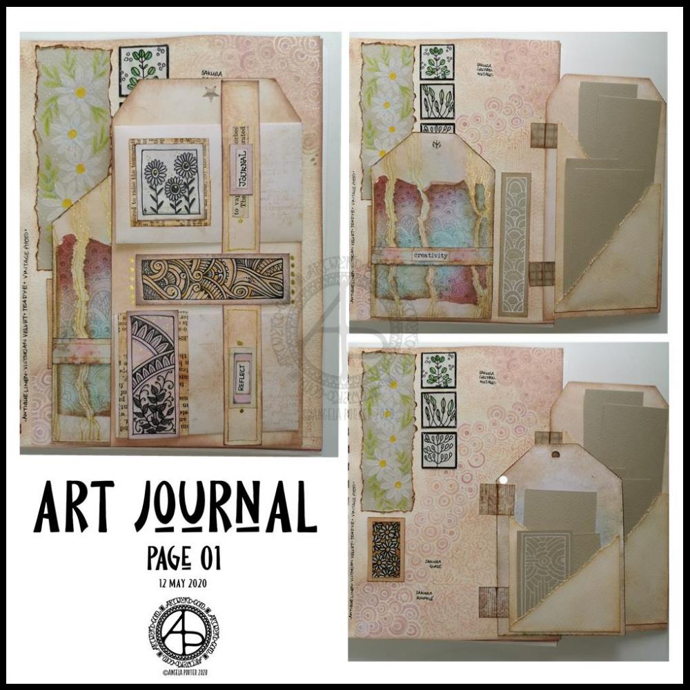
Yesterday I got lost in finishing the first page in my new A5 journal. I’ve put together three photos that show how the page looks as the tags are folded in and as each is opened out.
Every image, pattern, coloured paper, inchie, panel, envelope and tag have been made by myself. Drawing and colouring my own bits of ephemera and the pattern on the page background tool quite a bit of time, but it’s my own work.
I could’ve chosen to use paper from old books, commercially produced designer series paper or digital downloads. Those would’ve saved a lot of time, for sure. The end result would have been my own way of using them. However, I got a lot of pleasure, contentment, peace and calm from creating my own.
I made a note along the edge of the page showing which Distress Oxide inks I’d used to colour the page so that I could use the same for the other elements. Well, mostly the same Distress Ink colours; I did vary them in other places. However, this resulted in a coherent feel to this page – it feels like everything there belongs there!
I also noted on the background what pens I’d used to add the zentangle-style pattern. I then used Distress Inks and a brush and water to bring out that pattern.
Yes, I realise I could’ve used stamps, embossing ink and embossing powder to do something similar. I didn’t want to. I wanted my own, personal touch to this.
I really like how little pretties are hidden behind the tags and only get fully revealed as they are opened. The same is true for the items tucked in the pockets on the backs of the tags. I will replace the pieces of paper with journaling paper or other things as time goes on.
I may very well add danglies to the tops of the tags, possibly little tabs on their sides to help open them.
I’m quietly pleased with this page. It is very much “Angela” in style and feel. I’m feeling a bit more confident about this now, and I’m sure that I will really develop my own style as I go forward.
I really got a a sense of satisfaction and pleasure from creating every little element for this page. When I had it finished (mostly) I knew I’d worked out just how I want to create art journals going forward.
What I do need to remind myself, however, is that I can add to them when I want to – they’re not a full time project. What I could do is combine journaling with them, especially if I include elements that are specifically for journaling.
I do have some other bits and bobs to try making for the journal – little booklets, decorated paper-clips, tabbed cards to fit in pockets (or tabbed booklets, maybe). I certainly want to add quotes, notes, memories and more. And I think I need to work on my hand lettering to do such things as well.
I do plan to build up a library of digital designs I can use for inchies, twinchies, tea-cards, ATCs, panels, quotes, and more. Also, blank ‘templates’ for them, maybe.
Perhaps I should scan the backgrounds in before I add to them so I can use them in my digital art too. I shall think about that going forward. For this page, I really wasn’t sure if my idea of adding the pattern would work. I was pleased it did, I really am. I’m sure to do similar things with the following pages, and now I know what I do like, I can always replicate the background on this particular page, and the notes of which Distress Oxide Inks I used will help me in doing this for sure.
For the rest of today, however, I will be mostly doing other art rather than working on my art journal. I do have some coloring book projects that need some serious attention for starters.
I’ve become a bit obsessed with making art journal bits and bobs over the last couple of days. This morning has been no exception, other than the more I do and watch, the more ideas that come to me.
Inchies
Yesterday, I created some blank, printable, templates for inchies, twinches and tea cards. I printed them out on plain paper so I could draw in them. I also made a list of themes I could tackle for them too.
I spent an hour or two filling in a sheet of inches with various designs. Then, I printed them on plain paper and also vellum for calligraphy. The vellum has a rough texture, interesting colours and subtle patterns in them. I have a laser printer, so wasn’t sure if it would print on the vellum; it did, however the print does come off if I’m a bit rough with it.
Nevertheless, I coloured some of the inches with Distress Inks and then adhered them to some 1″ tiles of thick chipboard card. I edged them with tresure gold wax from Imagination Crafts. Then, I gently applied a thin layer of Ranger’s gloss multi-media medium, to see if it would seal the laser printing; it did! It also brought out the colours of the Distress Inks.
Seed packets/envelopes
These are simple enough to make. There are plenty of tutorials online for them. I made them from ordinary printer paper, then coloured them with Distress Inks.
Next, I added some dot embellishments using a small ball tool with Imagination Crafts’ Starlights metallic paint in rich gold. This is a beautiful, glittery, shiny paint that leaves some dimension when applied this way.
Finally, I adhered the inchies I’d made, along with some vintage book paper, to the envelopes.
I’m not sure if these envelopes are finished. I do want to use them to store either journaling notes in, or little pieces of art or mementos in them.
Tags
I haven’t been at all sure about tags and using them. However, I thought I’d see what I could do with them after yesterday’s mucking about with a tri-fold tag that turned into one single tag.
I wanted to make some templates for cutting the corners at the top of the tags, so I did that, using various widths of paper and slopes to remove the top corners.
I then realised I needed something to store them in, so I made an envelope for them.
The envelope has a more rectangular top flap and a plain front, perfect for embellishments.
Backgrounds
Something occurred to me this morning while watching someone make tags using background paper. I thought that I could use my colouring sheets and entangled designs as my own background paper. So, I thought I’d try to use some.
I found some old designs on my computer and printed a couple of them both as the black line originals and with a grey line.
I made a tag and cut out a piece of one of the designs. I coloured the design with Distress Inks and used them to subtly colour the tag.
I didn’t like the way the neatly cut out background pattern looked when I placed it on the tag. So, I tore the edges. I still wasn’t happy, so I tried tearing it into strips. That looked better, but I still wasn’t happy with it, but I stuck the pieces down.
I used a gold glitter gel pen to add lines and patterns between the torn pieces, which created some pattern and interest.
Finally, I added a distress ink coloured belly band along with a word, “creativity” to the tag. For now, I tucked one of the seed packets behind the belly band.
The background drawing may be just too busy, detailed, and varied to work well. I need to bear this in mind going forward.
Notebook
I am keeping notes of how I make tags, pockets, and other bits and bobs in an A5 dot grid notebook, along with ideas for other things to do or try. It’s turning out to be rather useful as a reference.
Acceptance
I’m struggling with accepting that what I’m creating for my art journal is “good enough”, “attractive enough”, “pretty”. It’s not like others I’ve seen, which is part of my problem.
I seem to like, mostly, neat edges, borders on work, very organised, neat, and carefully, geometrically arranged elements in my designs. I know I want to use my own artwork to create a journal, but I’m not sure it’s going to be successful in any kind of way. I have no idea if I’m on a wild goose chase.
I know I enjoy making these bits and bobs, I just don’t know if the overall end products actually work, so I’m doubting myself. I’m not sure I like what I’m creating. I mean, I really like individual elements such as the inchies and little panels on the envelopes. It’s when I start to actually combine them or put them into a journal that it all seems to go more than a bit skew-iffy.
I’m at that uncomfortable place I often find myself in when I’m creating a mandala or drawing or digital painting; partway through I want to give up as I think that what I’m creating is awful and not working. With the mandalas, drawings and digital art, I’ve learned to work through that point and, mostly, to complete the work. I’ve learned by experience and perseverance that I can produce art I’m happy with.
I’m not at all sure of that with this art journal type stuff. I’m not sure at all if I can find my own creative ‘voice’ with this, or whether I have to accept that as much as I’d like it to be one of my ‘things’ it’s not meant to be and that I can continue to watch and admire others for what they create.
Maybe, I’ll end up making digital elements for journals for others to use in their creations. Maybe, I’ll find that collections of inchies are my thing (along with twinchies and tea cards and other little designs).
For now, I’ll take a bit of a break from it all, and come back to it with fresh eyes and a fresh mind.
I woke at around 4:30am again today and couldn’t get back to sleep. So, I got up, made tea, and did some work on my art journal / sketchbook.
Making Distressed Paper
I spent a good two or three hours making the papers you can see to the left. I used the following:
printer and layout paper, cut to A6 in size (UK size)
Distress Oxide Inks
5″ x 7 ” Gelli plate
small Brayer roller
water in a spray bottle
heat tool
craft mat
pieces of cut and dry foam
metallic inks and paints
For some of the pieces, I brayered the Distress Oxides onto a Gelli plate and then pulled the print onto a piece of paper. For others, I used the Brayer to apply the ink to the paper. I also used the black side of a piece of cut and dry foam to apply ink to some of the papers.
I sprayed the papers with water to activiate the Distress Oxide, and used the heat tool to dry them. After doing this, I crumpled up a lot of the papers and then used the brayer to flatten them out. Both of these techniques resulted in textured paper. So, I used the cut and dry foam and some Distress Oxide ink to lightly brush the paper to help to accentuate that texture.
Finally I used cut and dry foam to brush metallic paint or ink over the paper to add some shimmer and shine. I used some textured cut and dry foam to add patterns too.
I now have quite a stash of very distressed papers to use in my art journal in the future.
Both the printer paper and the layout paper are much thinner than I would usually use for such a task. The light spritz of water on each, however, created a lovely, bumpy texture. They were also easy to crumple up, adding that kind of leathery texture.
The subtle shine that the gold metallic ink gave is rather lovely, though I do like the bright, shiny gold of some paint I found in my stash.
I can see me using these papers for collage, for making pockets/envelopes and other bits and bobs for a journal, and no doubt for other things I’ve not yet thought of.
Storing my custom papers.
I realised the papers I’ve made over the past couple of weeks have been piling up and I really needed to do something that would let me find them easily. So, the quickest and easiest solution was to use A4 poly-pockets and a ring binder, both of which I had to hand! That certainly has let me have a tidier desk, and I’ll be able to find the papers easily too.
Art journal pages.
I also finished up the two pages shown to the right. I attached inchies, to fill in some gaps.
I used simple paper hinges to attach the ATC cards on page seen in the bottom image. If I ever wish to remove them to swap/share/gift, then I can remove them easily. That simple solution has relieved my anxiety about adhering them permanently into the sketchbook!
I’ve also folded some squared paper, used distress inks to colour the edges and folds, and put them in the vellum pockets I’d made earlier, all ready for me to journal on. Unusually for me, I made use of some washi tape to embellish the pockets.
I’ve also noticed that I’m very ‘regimented’ about how I put things in my art journal. I much prefer carefully cut paper to torn edges most of the time. Everything needs to be arranged ‘just so’ with me. Just as it is with my line-art – precise and neat. I suppose it’s another example of me expressing my personality through my art.
So, Angela, how are you today?
I’m exhausted. I’m practically falling asleep as I type this; that’s what happens when I wake up at stupid o’clock once again. I’m now officially overtired! I may try to get back to sleep soon; I do have work I need to do today!
As far as me being under the weather goes…
Well, I still have a sensitive digestive system and I feel nauseous from time to time. I did wake with a bit of a headache today, but that could just be lack of sleep, as is the tiredness I feel. I have eaten and my tummy doesn’t seem to be objecting as it has done. This all makes me hopeful that I’m almost over this bout illness. I was really quite grumpy about it yesterday, and I’m entirely sure I’m not grumpy today!
Other than that, emotionally I’m doing just fine. The sunshine helps with my mood for sure, as did being able to hear the bird song as the world was slowly waking up this morning.
Teeny, tiny one inch square works of art are called inchies. Here are two sets of six inchies.
For each set, I cut an ATC sized (3.5″ x 2.5″) Distress Oxide coloured mixed media paper into one inch squares.
I took the chisel nib of a black Copic Ciao marker to the edges, and then drew on the squares using either Copic Multiliner SP or Faber Castell Pitt artist pens. When I was happy with the designs, I added metallic watercolours to bring out some highlights.
What to do with them? I don’t know…yet. All I know is they were fun to do and quite satisfying.
Under the weather
I’ve not been feeling too grand, hence the lack of a blog post yesterday. I had a stomach upset on Saturday night, along with headache, tiredness and loss of appetite.
I’m still not right today – tired, another headache and an uncomfortable digestive system still. I think it’ll be another quiet day for me.
I’ve been awake since stupid o’clock, which roughly translates to 3:30am BST. While I was trying to get back to sleep I watched a youtube video about making pockets and tuck-ins for an altered book journal.
I thought that could be something good for my sketchbook-journal. I have worried a little about gluing my little artworks into it, but pockets, tuck-ins, see-through envelopes could be a good way to both show the work and store it in a non-permanent way.
So, with my mind now working and sleep eluding me, I decided to have a go at making my own pockets. You can see the result at the top right, with a journalling card popped in one of them for now.
How I made the pockets
I used some ordinary white card, cut it into what I thought would be good sizes to make a set of stacked pockets for the ATC sized cards I’ve been working on.
I then coloured the cards with Distress Oxide Inks. For one of them, I used a brayer to add ink to a gelli plate. Before pulling a print, I spritzed the gelli plate with water that had some white perfect pearls added to it.
For another panel, I used the brayer to add ink directly to the paper. It did that unevenly. So, I used a ball-tool to carve some texture into the black side of a piece of cut and try foam and used that to add colour. That worked really well! Dabbing the foam added a lovely textured layer of colour. A spritz of water activated the dusty, chalky, soft nature of the Distress Oxides.
I enjoyed the look I achieved with the distressed foam that I coloured the remaining pair of paper panels in the same way.
I then tore the top edge of each panel, for added interest, then used a piece of foam and Rich Mahogany Distress Ink to add grunginess to the edges of each panel.
I wanted to add some embellishments to each panel, so I used a copper sparkle Gelli pen to draw patterns on them.
Finally, I used Tombow Mono adhesive to stick the panels together.
When I put the panels on the page in my sketchbook-journal, I thought a panel behind them. So, I coloured a panel of the same card with Distress Oxide inks and the distressed piece of foam and used the same gelly roll pen to add some sparkly patterns. Then, I adhered the back panel and pockets to my sketchbook.
When I tested some ATC cards in the pockets, I realised I need to work out a way for some more ‘give’ in the pockets as they’re too tightly put together to slip more than one ATC card in them. Also, I placed them just low enough down the page so the ATC card doesn’t stick out of the sides of my sketchbook.
I’m not well known for my fore-planning projects like this, though I do try to learn as I go along.
Inchies and Twinchies
My mind was working in weird ways this morning. As I was making the pockets, my mind strayed to inchies and twinchies. I’ve not made any of these for a long, long time. I thought it could be fun to do so and add them to my sketchbook-journal.
I cut two 1″ wide, and one 2″ wide strips of card. I used the distressed foam to apply Distress Oxide inks to them, spritzing with water to add to the distressed look. Then, after drying with a heat tool, I cut them into squares – 1″ x 1″ inches and 2″ x 2″ twinchies.
I decided to use metallic watercolours from Cosmic Shimmer to add a sparkly, shimmery border to each tile. I used rich gold, pale gold or copper on each tile.
Then, I got to draw on the tiles. Teeny, tiny zentangle-style drawings. That was fun to do!
After adding some dots using a white Sakura Soufflé pen, I adhered the inchies into my sketchbook-journal. I’ve left the twinchies for decoration later.
Journaling cards
I realised that I could stored journalling cards in the pockets. All I needed to do was to colour the back of one of the ATC cards I coloured a few days ago. I also just realised that I could have added a layer of squared, dot grid or lined paper to write on too. That’s an idea for another time, maybe.
After drying the ink, I used a rollerball pen to add what notes I wanted to about this mornings creative sessions.
In fact, I’ve just created another journaling card to jot down ideas and notes to self as a result of reflecting on my pre-dawn arty activities!
Last night I had an idea to create a grid of little squares that I could try out some digital art techniques on. It’s ended up as a digital art sampler.
It has been another chance for me to experiment with some of the brushes and brush settings in Autodesk Sketchbook without worrying about messing up any art project I currently have on the go.
The more I play around with things, the more I understand them. I also find techniques or effects that I like-lots. There are quite a few squares in this sampler that I don’t like, but there are some I am pleased with, namely the two in the centre of the bottom row.
Some of the others have shown some interesting effects I could make use of in future artworks. Others I just look at and say to myself, ‘Angela, what on earth were you thinking?’. The answer is that I wasn’t thinking; I was trying different brushes, textures and settings to see what happened.
I certainly have a right mixed bunch of results in this sampler. Also, I have a bit more understanding of how different brush settings work. Having said that, I’m sure I still have an awful lot to experience and understand. Like everything else in life, this is always done one step at a time and when I am ready to explore, experiment and learn.
I also like to show experiments like this. Usually, you only get to see work in progress that I’m quite happy to share or finished artworks that I’m satisfied with. I think it’s important to show that I experiment, make mistakes, create art that is a bit of a mess.
Even when I make something that is a mess, there is always something to learn by reflecting on why I think it’s a mess, what could I do differently, is there anywhere I could make use of this technique where it would work out well for me? These are just a few questions I consider when I reflect and review my art.
I no longer keep a sketchbook/journal for my art as I mostly work digitally now. However, I just realised that I could create a digital version of a sketchbook journal using One Note. Now that’s a little task for me to do once I get rid of a horrible headache I had when I woke.
Sometimes I have to walk away from something I’m working on as I despair it will work out to be anything near good enough. Actually, it’s not sometimes, it’s most of the time! However, I do persevere.
When I went to bed last night, this one was looking horrible. I had the background done, the first layers of collaged patterned paper and the kind of hessian looking die-cut added too I really wasn’t happy with it at all.
However, a good night’s sleep and a bit of inspiration on waking meant I knew where I wanted to go next, especially after I sorted out the jumble of die-cuts I have (note to self-get some way to organise these!).
Once started from the point of inspiration, the picture just grew to it’s finished state (well, I think it’s finished, that may change when I look at it again later on).
Hope. A really good word here. There’s always hope that no matter how bad I think something looks, , pushing past that often results in something good. Indeed, sometimes the work can just be cut into pieces for use in another piece, which is how the iridescent, textured circles came to appear in this one.
Hope. Making art always gives me hope that I can overcome the trials I face when my anxiety/depression/complex post-traumatic stress disorder kitcks itself up a few or several notches. Art always gives me a place where I can lose myself in something that is meditative, mindful, self-soothing, and shows me that I can succeed even when the self-critic is telling me I’m useless, I can never get anything right, nothing is good enough, I’m a failure, and so on.
This past week or so, challenging myself to work with mixed media – something I’ve tried in the past and not really felt I was successful at – has been good to help me with the aftermath of a couple of rather strong anxiety attacks. I’ve not had any for around a year now.
I was surprised by them and at their intensity and how they have impacted on how I live my life at the moment. I find it difficult to go out into the world, want to hide away from people, and when I do go out it’s often in the dark hours so I’m not seen.
It also surprised me that this is how I used to live every single day for a very long time, most probably most of my life, until a few months ago.
Even though these two episodes have happened, I know I’ll get past them; I have in the past, and I can learn more about the triggers for them and also where this all comes from, which will help greatly in the counsellinge process.
So there’s hope I’ll improve in the long term, and blips are just that. Just as I’ve hoped that my confidence and skill and expression via mixed media would improve. I’ve just had a look back at the mixed media I’ve done in the last fortnight or three weeks, and even I can see how it’s all developed, in a positive way.
What’s made the difference for me with mixed media is finding the confidence to do my best to do it my way and to explore it in my way. I have a lot more exploring to do, and a lot more confidence building in what I do with it. I will journey along this road, along with my drawing and illustration skills, maybe even writing, and with healing what I can of my mebtal health issues.
So, choosing the word hope for it to appear on this piece of art was most appropriate.
Over the past two or three days, Ive been making ‘inchies’ and decided it was time to put them together as a mixed media artwork, which isn’t yet finished, as you can see above.
Inchies are 1″x 1″ pieces of art, though I have made some 1″ x 2″ tiles too.
There is something very satisfying in making such tiny pieces of art, and it’s nice to turn them into some kind of mosaic. I’ve chosen inchie (and betwinchie) tiles that say something about me, some of them quite literally by the words on them, others more symbolically.
Making the inchies and betwinchies
To make the inchie and betwinchie tiles I started with mixed media paper. My preferred brand is Claire Fontaine, and I used some sheets of white mixed media paper, and some that are natural in colour.
Distress oxide inks and a stencil brush were used to add colour to the sheets of paper, with a misting of water applied once this was complete to bring out the ‘oxide’ effect. The Distress Oxides look quite different on the natural paper, more muted as the oxide ‘bloom’ is more apparent.
Next, I cut the sheets into 1″ x 1″ and 1″ x 2″ tiles. I edged the tiles with black by using the edge of a wide tip on an alcohol marker. Drawings and patterns were then added using Pitt Artist pens by Faber-Castell. I wrote words on some of the tiles, on a few I used some ChitChat stickers from Tim Holtz’s Ideaology range. Then, Derwent Inktense pencils with a water brush and coloured pencils with a blending stick from Faber Castell were used to add colour depth to the tiles. The next step was to add white highlights and metallic and iridescent details using gel pens and paints.
To finish the tiles, I added a layer of 3D Crystal Lacquer by Sakura Hobby Craft to give them a highly glossy, slightly domed finish.
I then had a small bowl filled with these tiles, and had to try to do something with them. So, I thought I’d make a kind of mosaic of ones that said something about me.
Making the background and mosaic
I needed a background for this, so I took another piece of the Mixed Media paper, in white, and added colour using ink blending tools and the Distress Oxide inks, followed by a light spray of water.
I used various stencils, again with ink blending tools and Distress Oxides to add patterns. After each stencil, I sprayed the stenciled areas quite liberally with water so that the dye part of the Oxides inks ran, but the pigment ink remained in place. I also let any puddles of water form or run as they wished to do so. Finally, I edged the piece of paper with Vintage Photo Distress oxide ink, again using a blending tool, and then sprayed with water once again.
I didn’t take a photo of the background, which I was really pleased with and almost didn’t want to do anything with other than keep it and look at it.
However, I gritted my teeth and started to choose the tiles I wanted to use and to lay them out on the background.
I then used a collage medium to stick the tiles down, and the result is what you see.
It’s all a bit wibbly-wobbly, but that’s quite representative of me!
Learning points
I know it’s not finished yet, but it’s drying as I found that if I got the collage medium on the Crystal Lacquer finish I got dull patches, so an extra layer of Crystal Lacquer has been applied to the affected tiles and these are now drying. So, I need to make the inchies and not finish them off before I adhere them to a project, or I need to find a different way to adhere them!
The background has warped – a lot. I need to think about how to either keep it as flat as possible through all the repeated sprayings and dryings of the paper when the background is made, or I need to find a much thicker paper/card to use for this.