I really do wish I could take better photos! However, I think you get the idea of this pair of pods that I created last night and in the early hours on waking.
These ones I’m really pleased with; they’re the ones that look most like the seed pods I draw. I’ve also progressed to adding leaves to the stems and that funny star-shape.
I’m going to spend the evening doing some more crochet. I had EMDR therapy this morning, and it has totally drained me. I was tired and emotionally fragile, to begin with; I’m now emotionally exhausted and need to take self-care time.
I know that if I were to attempt digital or traditional art/drawing, then I would not feel satisfied with what I do. I’d get frustrated with myself, I’d become overly self-critical and would end up feeling worse than I do now. Although I am emotionally exhausted, I feel calm and fairly content. I need to keep activities that would drag me down to a minimum until I am more emotionally resilient.
So, self-care it really does have to be this evening, and maybe some or all of tomorrow.
After a very late night talking to a friend and not enough sleep, today is a self-care day. I’m going to go back to bed soon and try to sleep some more before driving for four hours tonight.
While waiting for sleep to catch up with me again, I thought I’d make some mail art. The photo isn’t the best; I’ve said it before, I’m not a brilliant photographer. However, I’m sure you get the idea. Also, I wanted to catch a glimpse of the metallic highlights I’ve added to this card, so the angle of the photography was just plain weird!
My brain seemed to have ticked over some ideas while I was asleep and I woke with some things I thought I could try out. This card is the result of some of them.
I started by using a 4″ x 4″ piece of watercolour paper and applying Distress inks to it to create a background.
I used a torn piece of paper to mask off the bottom of the panel so that could use an ink blending tool to apply Pine Needles and Crushed Olive Distress inks to create some land.
A sky was required, so I used Broken China Distress ink to create it so that it faded from top to the land.
I then sprayed the background with a mixture of gold Perfect Pearls and water to create a less perfect appearance.
While this was drying, I flipped through my Zibladone (visual dictionary) and found some motifs I liked. I used Pitt Artist pens from Faber-Castell to draw the motifs on the panel. I chose these pens because they’re waterproof when dry and I knew I wanted to add colour and sparkle to them later on.
To give a sense of dimension, I used black pens for the foreground motifs and a grey brush pen to create the foliage in the background.
To help the seed pods stand out, I used washes of Dusty Concorde and Seedless Preserves Distress inks. Then, I used some Cosmic Shimmer gold iridescent watercolour paint to add the gold highlights.
Once everything was dry, I used a piece of Cut’n’Dry foam to edge the panel with Dusty Concorde Distress Ink. The design was framed nicely by this edging; it also added a sense of dimensionality.
Next, I mounted the panel on a piece of black card and then adhered these layers to a 6″ x 6″ blank Kraft card, all done with Tombow Mono glue.
Finally, I carefully used a gold glitter Uniball Signo gel pen to add lines around the edge of the design panel and also the black mat.
I then turned my attention to the envelope. I drew some more of the seed pods before adding a light wash of Dusty Concorde and Seedless Preserves Distress Inks, being careful not to overwet the envelope. I added dots of gold watercolour paint to the seed pods and the space around them too, making sure I left enough space to write the name and address of the eventual recipient.
I’m quite pleased with the card. I’ve done this style of drawing digitally in the form of a mandala, but never like this. However, as I look at the card, it seems to need a focal motif in the space between the seedpods. I may be wrong; it may just be my constant need to fill up space with line and pattern and the difficulty I have in leaving white space in a design.
I shall let the card ‘sit’ for a while before making my mind up on that issue.
I wanted to try to create a series of templates that could be used as frames for quotes. This is my first one. I remembered to save it as tiff file in layers so that I can easily change the background.
I didn’t start with the intention of creating waves filled with zentangle-type patterns, but that’s how it intuitively flowed from the tip of my Surface Pen onto the screen of my Surface Studio. So, I went with it.
It’s a very comfortable kind of art to create, whether you call it zentangle, zentangle inspired, entangled artwork, line art, doodled art. It’s just about filling space with patterns and lines, using them to add depth and dimension.
It was an enjoyable process that I could complete in a few sessions in-between a hectic few days.
The saga of the keyboard.
Saturday my Bluetooth keyboard decided to not connect to the Surface Studio. It had been finicky for a few days. I changed batteries, I tried disconnecting it and reconnecting it and following all the trouble-shooting processes I could find. All to no avail. This is why I’ve not done any blogs and been quiet around social media, along with life being a bit busy too.
It also worked out that the warranty on my Surface Studio and all it’s attendant bits and bobs had run out just over three weeks ago. Yes, I do have software I can use the Surface Pen with or a keyboard that pops up on the screen that I can tap with my fingers or mouse or pen, but they are so slow and frustrating to use in comparison to the speed at which I can type. I do love to handwrite, even on the screen. However, as I can’t turn the ‘paper’ or ‘writing window’ to an angle that makes it comfortable for me to write at I don’t do as much as I could.
Of course, I’d forgotten I still have, and use my Surface Book. However, when something goes wrong, my mind goes into instant ‘oh my gosh, I’ve got to sort that out as there’s no other way to get things done’ overwhelmed and panic mode. It’s only after I have solved the problem and calm down that I can see that I had alternatives open to me.
So, my brain told me my only option was to buy a new keyboard. Then I had a decision to make. Should I go for a wireless one or a wired one?
I decided on a wired one as that should always connect to the ‘puter. I also was beguiled by a keyboard that has pretty rainbow lights beneath the keys. Sparkly and colourful always attracts me.
So, I now have a keyboard and can email and write and do everything else that requires words from me quickly once again.
World Suicide Prevention Day 2019
Warning – this may contain emotional and mental health triggers.
The World Health Organisation says that one person dies by suicide every 40 seconds.
In the UK, two people take their own lives every day.
In the UK, men account for approximately 75% of all suicides.
In the UK, suicide is the most common cause of death for men aged 20 to 49.
The World Health Organisation (WHO) says suicides are a serious public health problem. They also say that suicides are preventable and give a list of some of the measures that can be taken on their webpage about suicide – https://www.who.int/news-room/fact-sheets/detail/suicide
They also say that one of the biggest obstacles to overcome in suicide prevention is the stigma and taboo that surrounds suicide and mental health problems.
The stigma and taboos that surround talking openly about suicide leads to a lack of awareness about suicide, and also about mental illness.
I am a champion for Time To Change Wales, a campaign whose aim is to get people talking about mental illness to break down the stigma that surrounds it. This also includes suicide.
As a champion, one of the things I do is to go to organisations and other groups to talk about my experience of mental illness and the stigma and discrimination I have faced. This includes self-stigma.
Thanks to self-stigma, I was in denial that I was experiencing mental and emotional ill-health for many years. It led to me not seeking help until I had nearly broken my mind. I ended up being off work as a teacher for almost a year. I went back to work for just eight months before I had another ‘breakdown’ for want of another word.
What I don’t often mention, and what I think also needs to be discussed here, is suicidal ideation or suicidal thoughts. These are thoughts about wishing to die, wanting life to stop, hoping that one would not wake up in the morning. Not actively planning suicide, but wishing that life would end to bring the mental and emotional pain to an end.
For a long as I can remember, right back to being young, I can remember wishing this upon myself. I often wanted to die in my sleep and not have to face another day like the one I just had. I didn’t feel loved or valued in any way, and the constant bullying, name-calling, being ignored and neglected. I felt a burden, a bother, a nuisance, an irritation, a problem to my family. I thought they would be happier without me. That the world would be a better place without me. I never thought of actively taking my own life, but I certainly wished to die.
That belief about myself has followed me throughout my life. Sometimes it would be quiet, at other times it would be shouting through a megaphone in my head.
I remember driving to work most days in the last few years of my teaching career wanting to just keep driving and never come back to my life as it had become so very, very painful for me and I could see no way out of the pain.
I never did drive off towards the horizon as I didn’t actually know what I would do. Also, the thought of my cat and how he’d not cope without me would pop into my head. And so I would get myself to work so I could look after my cat.
At the time, it felt my cat was the only living thing that was consistently and unconditionally there for me, sharing love and affection with me. I still miss him now, a bit more than a year when I had to say goodbye to him.
I owe my life to my cat, and to the one friend (now my brother of the heart/choice) who kept nagging me about getting help, and the GP who knew the right words to say to me to get me to understand I needed help and a break from work and also from my mind. Now, I am also so grateful to my EMDR therapist for persisting with me.
I have tears flowing down my face as I write about this. The tears represent the sadness that I feel that I was ignorant of what good mental and emotional health is and of the stigma I held about it in regards to myself. Oddly, I never had those thoughts about others who were experiencing mental illness, having helped others during their own crises. I feel sad that I have lived most of my life with poor mental and emotional health, thinking that was how everyone else was. I feel sad that only now am I learning what it is like to have a touchstone of contentment and optimism to hold onto when times get tough.
The tears are also ones of gratitude that I’m still here. I have come through the darkest days of my life. My career has changed, and my life is gradually changing for the better, as is my mental and emotional health.
I rarely have suicidal thoughts now. In fact, I can’t remember the last time I did. That says something about how far along my healing journey I have come.
If someone had told me in my darkest days that my life would be as it is now, with that contentment within me, an optimism for my future, I might not have believed them. In fact, I most probably wouldn’t have.
However, I am here to say that I made it through it all. Through my childhood and adulthood and now into middle age.
I wish I’d known what I know now as a child. Maybe I would’ve sought help sooner in my life.
What I wish for everyone is that every person on this planet is given the information about what good mental and emotional health is. I want mental and emotional health to be seen as important as physical health with the links between them fully recognised, and support is available to all who need it.
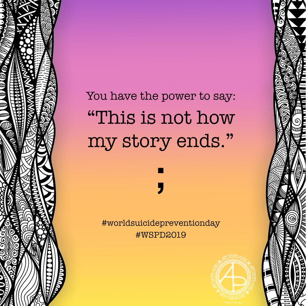
No matter how bad life seems, there are always options to improve it. This is something I’ve had to learn. In fact, I’m still learning about it. When I get overwhelmed, or something goes wrong, I tend to slip into the black and white thinking mode.
That’s what the black and white borders to today’s art is about. The complexity shows just how crazily my mind was working during the darkest days.
For the space between them, the background on which the quote sits, I chose colours that remind me of a sunrise. A new day, with a fresh mind and eyes always comes with new options, if only we can see them.
My story has not ended. It will not end until my life is naturally completed. For the first time in my life, I have a feeling of optimism for my future. It may have taken me two severe episodes of mental ill-health and several years of EMDR therapy and counselling to get to this point. But I’ve got there.
No matter how much of my life I have left, it will be lived with some contentment, peace and hope for my future. I wish the same for each and every person.
Yesterday evening I had a pleasant hour or so using Distress Oxide and Distress inks to make some backgrounds for future card projects.
I used a soft rubber Brayer roller to add distress oxides to a small Gelli Plate. I then spritzed the Gelli plate with water containing either pearl, copper or gold Perfect Pearls before lifting the print with some Claire Fontaine Mixed Media paper. The water in the spray reacts with the inks to give an oxidised look. The Perfect Pearls in the spray add some subtle shimmer to the finished background.
Once the Distress Oxide background layers were dry, I used a rectangular die to cut a section from them.
To create backgrounds with Distress Inks, I used a mini foam blending tool to cover the card with colour. I then sprayed the card with some water containing pearl, copper or gold Perfect Pearls. Again, the water reacts with the Distress Inks, but this time creating small watermarks. The Perfect Pearls again add shimmer.
Making the card.
I chose a background coloured with Wild Honey, Tea Dye, Old Linen and Walnut Stain Distress Inks which were then spritzed with pearl Perfect Pearls infused water.
I wanted to create a dangle design card. From experience, I know that drawing on backgrounds with added Perfect pearls that my fine-liner Uniball Unipin pens can become clogged by the tiny flakes of mica that comprise Perfect Pearls.
So, I tried using a Uniball Vision Elite rollerball pen. The ink in it is supposed to be water-resistant, tamper-proof, fade-proof. It’s also very black, which suits me just fine.
I was surprised at how well the pen wrote on the background – not just because of the Perfect Pearls and Distress Ink, but also because the mixed media paper is lightly textured.
Once I’d completed the design, I used a needle=tip Pentel Energel Liquid Ink Gel pen to add smaller details.
While the plain black line on the coloured background looked OK, I thought it needed some colour to help lift it from the background.
I launched myself into using Copic markers, using somewhat darker colours than I usually would. That meant it wasn’t until I was adding some colour to the ribbon banner that I discovered that the Copic reacts with the inks in the pens and smears them. I was so disappointed in myself for not checking the pens were Copic safe. Oh well, you live and learn!
Rather than start again, I carried on with the card. I wanted to add some clear embossing powder to help the colours of the Copic markers stand out even more. So, I used a Versamark pen to colour over the designs, and then I sprinkled on the clear Wow Embossing Powder. I used a heat tool to melt the Embossing powder and achieve a glossy, dimensional finish on the dangle design.
The final step was to adhere the dangle design to a card blank, after adding some gold dots with a Uniball Signo glitter gel pen.
Fancy having a go at drawing your own dangle designs and not sure where to start? Well, you could start with my book “A Dangle A Day” where I lead you through the process. I have over 100 designs in the book where I take you step by step through drawing them. I have also included ideas for where you can use them including as cards, bookmarks, in BuJos, journals, scrapbooks and more.
Making the envelope.
I used the pre-made envelope that came with the card blank. I decided to keep the envelope white and add a border using some of the motifs from the dangle design.
I did use the Uniball Vision Elite gel pen and Pentel needlepoint pen to draw the design. This time, I coloured the design with some Mitsubishi Uni coloured pencils.
The low quality of the paper envelope wasn’t conducive to really amazing colouring, but it worked well enough.
Reflecting on the card and envelope.
I could’ve kicked myself for not testing the pens to see if they were Copic friendly. I don’t think I could send this card to anyone as it just isn’t up to scratch. I need to remember this in future projects.
Also, the Versamark pen smeared the ink a little too, but nowhere as much as the Copics did.
I used much darker Copic colours than I usually would without thinking that heat embossing them would intensify the colours even more. The colours aren’t as dark as in the photo, but they are still darker than I would like.
The coloured pencils colouring worked much better and perhaps I would’ve been better off using them on the card panel. Again, something to remember for the future.
I also noticed that the anti-static powder I used before using the Versamark and embossing powder has either removed or covered the Perfect pearls. I used the anti-static powder so prevent the embossing powder sticking to places it didn’t belong. This is always a possibility, especially when using Distress Inks to colour the background.
In hindsight, I may have been better drawing, colouring and heat embossing the design before colouring the background. However, I do like to have pre-coloured backgrounds to use for arty projects.
So, Angela, how are you?
I’m OK, still tired from a busy few days at the weekend and start of the week. I also have a flare-up of an ovarian cyst which is rather painful and achy. I’m feeling content and optimistic otherwise, though still tired even though I slept well last night. The exhaustion that comes with interacting with people, therapy and not enough me-time can linger for a good while — the joys of having CPTSD and being an introvert.
Yesterday, I was fatigued, and the flare-up ramped up in intensity as the day progressed. I wasn’t in the right place to create art or focus on work. I needed to practice self-care.
I chose to do some crochet after hearing about Crochyay, the online presence of a young woman called Olivia who makes flowers and leaves them with a little message tag for people to find and keep – random acts of kindness. She uses crochet to help manage her anxiety and depression as well.
I thought it was a beautiful idea and I thought flowers or little amigurumi hearts or similar would be lovely to make. Small, quick to finish projects that I feel I could manage. I’ve lost the oompf to do larger crochet projects such as shawls and blankets, but some little ones would be lovely to do.
I do find crochet and other crafts quite soothing and calming. I also feel I’m doing something, and they can stop me from just sleeping my day away. Little projects like flowers are fab for me when the thought of anything bigger fills me with procrastination and disinterest. Also, I find it much more motivating to do projects for other people than for myself, even if I don’t know those people.
So I managed to make quite a few flowers yesterday. I now need to make leaves and assemble them into little posies. Then, there are tags to make.
I’m also looking forward to making the tags as I can draw and decorate them too! So, little projects in their own right.
Finally, I’ll need to overcome my self-consciousness and anxiety about leaving them for people to find them.
I need some quietly creative, self-care, self-comforting time today. What is more perfect for doing this than creating a mandala?
I turned to my digital tools to do this – Autodesk Sketchbook Pro, Microsoft Surface Pen and Microsoft Surface Studio. I also wanted to work with just colour – no black outlines and no sketches to start me off. I just wanted to let the design flow and unfold as it needed to. And it did.
This mandala isn’t finished, it is a work in progress. The outer ring may disappear as I work on it more; it seems to help to create a finished mandala at this point in time.
I knew the mandala needed to titled ‘Hope is rekindled’. That seems to be quite apt for me at the moment.
So, Angela, how are you feeling today?
I’ve had a heck of a busy couple of days. Monday I popped in to see Russell at the Time to Change Wales offices to pick up some resources for an upcoming stand. Then, I had therapy followed by an extremely late lunch and a slightly late tea before going to something in the evening. I eventually got home less than an hour before midnight feeling exhausted.
Tuesday was an early start to get myself to Llantrisant Leisure Centre by 9:30am to set up a Time to Change Wales stand at Rhondda Cynon Taff Council’s corporate induction day. That lasted until nearly 4pm, so it was a mad dash home to get something to eat and to warm up. I was cold and chilly. I was also feeling quite low – mental exhaustion does not help with my emotional resilience. I’d not had time to recover from therapy on Monday nor the rest of the busy day.
I was glad to look after the stand, but interacting with strangers, as lovely as that was, took it’s toll on me emotionally and energetically. Not only do I have CPTSD but I’m also an introvert so a double whammy! My protective mask of jolly, happy, extrovert Angela during the stand; keeping that mask in place is exhausting. Yesterday I got a glimpse of just how exhausting it is to keep the mask raised.
Yesterday, I also realised how I don’t raise that mask too often nowadays.
After something to eat and a hot drink, I had a meeting to go. The meeting had some parts that had me quite fraught. I was glad to come home, deal with bits and bobs of emails and then go to bed, snuggled up under the comforting weight of my weighted blanket.
I’m tired today. However, later this afternoon I’m on the go yet again. My sister has asked me to accompany her to an appointment. I then have something on this evening too, if I have the energy to go there!
Time to get another big mug of tea and start to get myself ready for this afternoons outings.
Template for the Angela Porter’s Coloring Book Fans facebook group, September 2019
The first day of a new month means I add a colouring template to the “Angela Porter’s Coloring Book Fans” Facebook group. I make the template an exclusive freebie for members of the group. The group is free to join. Why not pop over get access to this and all other group templates.
I drew the template on Winsor and Newton Bristol Board using a couple of Uniball Unipin pens. I scanned it in, cleaned up some smudges overruns.
As it’s September, my mind is on the changing seasons; we’re heading into autumn here in the UK. The rowan and hawthorn trees are laden with red berries already. The sycamore helicopters and ash keys are turning golden and are visible amongst the still-green foliage.
It is my favourite time of year. I love the comfortably warm days and the chilly nights. It’s a delight to snuggle down in bed with a warm body and a cool head. I sleep so much better too. Mind you, I think my weighted blanket is helping with that.
I love the change in the colour and quality of light – the golden hue delights me. I’m also looking forward to seeing the relatively rapid colour-changes that happen as the dull, dark greens of summer give way to the fiery conflagration of autumn.
So, my September template has autumnal motifs in it, though they’d work for any season no matter where you are in the world.
I will continue to add colour to this template throughout the month, hopefully. Then, at the close of September, I’ll show the finished coloured version.
I always look forward to seeing how different people colour the drawing. I love to see the different colours, media and techniques they use.
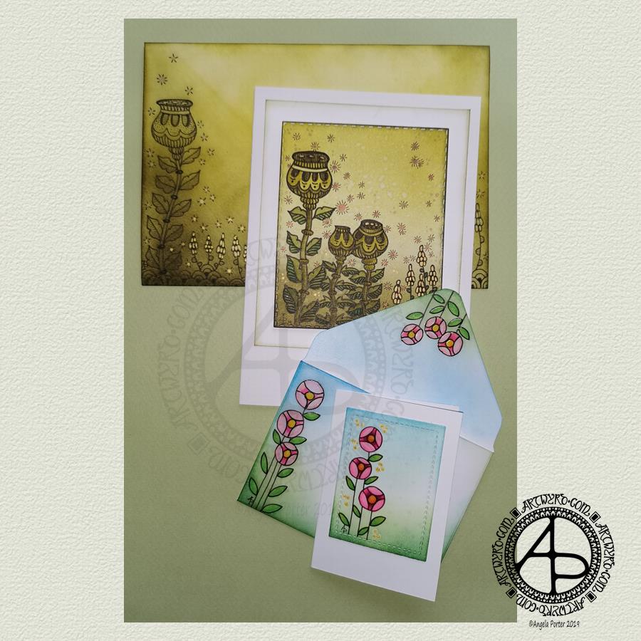
I’ve woken to a grey, wet, fresh day here in the Welsh Valleys. The coolness is actually quite delicious on my skin. The rain is freshening the air and world up, clearing the dust away. What a way for the weather to see out August!
It’s a perfect morning to do some artsy crafty stuff. For me, that meant finishing off a pair of cards with coordinating envelopes.
Making the larger entangled seed pods card.
The top panel measures 3″ x 3.75″, mounted on an A6 card (UK sizes).
I coloured The envelope, top panel and the border of the middle panel envelope and the edge of the middle panel with Crushed Olive, Forest Moss and Shabby Shutters Distress inks. I used a mini foam blending tool to achieve a gradient.
I sprayed water onto the top panel. Distress Inks react with water and results in some interesting textural patterns. I didn’t spray water onto the envelope; the paper is too thin to take such treatment.
My next task was to draw the entangled designs; I chose to go with some seed pods, leaves, a geometric pattern and some little flowers too. I added some ‘sparkle’ patterns around the main elements to give the illusion of little things floating in the air.
Next, I added some sparkle and shine with some gold and copper ink. I placed ink inside the sparkles, the seeds inside the larger seed pods and the flowers too.
I used a brush and Distress inks to add some depth of colour to the design on the card. I decided not to do this on the envelope, again because of the quality of the paper.
Once I have someone to send the card to, I will address the envelope and seal it with Distress Micro Glaze so that moisture won’t damage the envelope.
The colour choice on this card is unusual for me, but it’s worked out nicely, particularly with the gold and copper accents.
The tiny floral card.
This card is tiny, measuring just 2.25″ x 3.25″. It’s envelope is a little larger than needed, but the We R Memory Keepers Envelope Punch Board didn’t have measurements on it for a card this size, so I just used the closest available.
The panel on the card measures 1.75″ x 2.375″. It is one of the panels from the Foursquare background frames I messed up while making yesterdays cards.
I used one of my ideas from yesterdays musings on the cards I’d made. I drew a simple design on both the card panel and the envelope front and flap using Uniball Unipin pens and then coloured it with Copic markers. I added some gold glitter dots with a Uniball Signo gel pen.
Once all was dry, I used a Versamark Pen to colour over the flowers, leaves and gold sparkles. Versamark ink is colourless and sticky and is made by Tsukineko; it comes in ink pads but also in double-ended pens – a bullet point at one end and a brush tip at the other. The ink takes a little while to dry.
I covered the sticky areas with WOW super fine clear embossing powder and used a heat tool from Ranger to melt it, giving the design elements a glossy, protective and slightly raised finish. It also intensifies the colours somewhat, which I rather like.
So, I could now colour the background and envelope with Distress Inks without affecting the colours of the flowers, leaves and gold dots. I used a mini foam blending tool along with Pine Needles, Mowed Lawn, Tumbled Glass and Salty Ocean Distress Inks.
The final task was to glue the card panel to the card blank as well as the envelope flaps.
Again, once I’ve addressed the envelope, I’ll use Distress Micro Glaze to seal the inks and prevent any damage to the artwork while journeying to the recipient.
Reflecting on the cards.
I enjoyed making these cards. I particularly like the simplicity of the small card and the effect of the embossing powder. There’s something about teeny-tiny cards that really pleases me. I think it’s that their size makes them just so darned cute!
The larger card I am also pleased with, particularly in my use of colours that are unusual for me. I’m glad I added colour to the seedpods on the card; it helps them to stand out. I do love the copper and gold ink on this darker background too and how well they stand out.
Making envelopes that coordinate with the card is also something I enjoy doing; hopefully, the recipients see them as something a bit special dropping through their letterbox.
So, what’s on the cards for today?
It’s the last day of August, so I need to get a wiggle on to create a September colouring template for the Angela Porter’s Coloring Book Fans facebook group. I feel the need to include some autumn imagery in this one as we are in the dog days of summer for sure.
Tell me, Angela, how are you feeling today?
I’m tired but feeling quite content and optimistic again. I slept well last night; the weighted blanket really is working wonders for me as far as sleep is concerned. One problem is that I don’t want to get out from under it in the morning, so it must be comforting or soothing me.
I seem to have turned in a magnet for people who have escaped narcissistic abuse of all kinds. It’s nice to be able to help others by giving them space where I will believe their experiences, and I can help them, hopefully, to understand that they are not at fault but are victims.
Synchronicity pointing out to me how much I have learned and understood and healed and am now able to help others, perhaps?
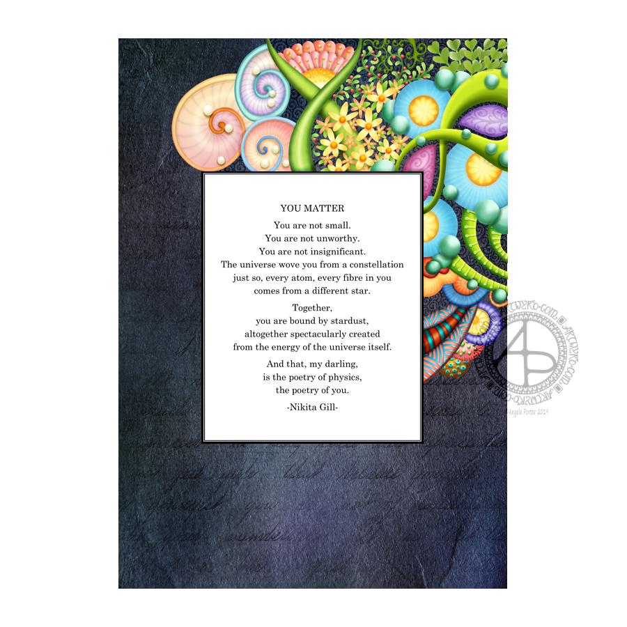
You Matter by Nikita Gill | Artwork by Angela Porter
After a few very tricky days with emotions and time away with a friend and his partner I finally got some work done on this, and also another project I have on the go.
Digital art – Autodesk Sketchbook Pro, Microsoft Surface Pen, Microsoft Surface Studio.
I’m really very emotionally fragile at the moment. Lots of things have stirred up things and it’s taking time for a settling to happen and me to find the new place of balance. The contentment is still there, but the waves on the surface are strong at the moment. Changes are happening and it takes time to settle into the new state of things emotional and mental. But settle they will, as will I. I have EMDR therapy tomorrow …
Today, I have a dangle design card along with a coordinating envelope for you. I’ve kept the construction of the card simple with just one layer on the card blank. The dangle design and hand lettering are also quite simple as well as whimsical in character.
If you’d like to find out more about drawing dangle designs, then A Dangle A Dayis my book about dangle designs with plenty of inspiration and suggestions.
Materials and dimensions of the card and envelope
The yellow card blank is 5½” x 4″ in size with a top fold. So, I started with a piece of card measuring 11″ x 4″.
I also cut a piece of Winsor and Newton Bristol board to 5″ x 3½” for the top panel.
Next, I used some thick printer paper to make an envelope. I used the We R Memory Keepers Envelope Punch Board. The size of paper needed and the position of the first score line are printed on the board. This tool from WRMK makes it so easy to create custom envelopes.
To make an envelope to fit a 5½” x 4″ card I needed to cut a piece of paper measuring 7⅞” x 7⅞”. I used 120gsm white printer paper for the envelope.
Pencil guide-lines
Before I started, I used a ruler and pencil to draw in some faint guide-lines for the banner ribbon and the hand lettering on the top layer. I also pencilled in the hand lettering.
On the envelope, I added some guide-lines on the left and bottom to give me a border.
Hand-lettering and drawing the design
I started by hand-lettering the sentiment, then I drew the ribbon banner around it.
My next task was to draw the dangle comprising of beads and hearts.
Finally, for the top layer, I drew in the arrangement of plants and added some shells and butterflies.
I didn’t use a pencil to sketch the design before I drew it in ink simply because I’m confident in drawing these kinds of designs. However, it is a good idea to do so if you’re less than confident. I started with the central flower pot and let the design grow out from there.
I then took my attention to the envelope. I started by drawing in the ledge on the bottom. Next, I added the plants, flowers, shells and butterflies. I then drew a black border around the envelope, just inside the edge. This line gave me something to hang the dangle from; I added a dangle similar to the one on the card.
Adding colour
With all the drawing complete, it was time to add some colour.
I’d received my Chameleon fineliners yesterday, so I thought I’d try them out as there are lots of small areas in this design. I love my Chameleon markers, but using them to add colour to tiny spaces can be a little tricksy.
I did try the Chameleon fineliners out yesterday for drawing lines and hand lettering. I found that they give a very long gradient, even with the shortest of touches of the cap to the pen. I thought this might work well in colouring the flowers in. I achieved a pleasing change of colour of the petals on each bloom from just one blending process. This blending also worked well for the butterflies.
What I did notice is that the fineliners moved some of the black pigment from the Uniball Unipin pens that I used to draw the design with. That was a bit disappointing. It may be that in the future I will need to draw, scan and then laser print the design out. That’s a bit of a faff, but it’s doable.
I’ve never been a fan of fineliners for colouring; I find they leave lines and tend to pill the paper. This is just a personal gripe about all fineliners.
The Chameleon fineliners are pleasant and comfortable to write with – comparable to other fineliners. So, unless I want to add colour using lines and cross-hatching, writing is going to be my primary use for these pens.
To colour the pots, banner, leaves, cacti, shells and ledge, I used some of my Copic Ciao markers. I chose to use these as the brush nib lets me colour tiny areas. Also, I wanted to use pastel-ish colours to tone in with the colouring from the Chameleon fineliners.
I did add some very simple Copic shading to the design.
The Chameleon fineliners had spread the black dots I’d added to the flower centres. So, I broke out a gold Uniball Signo pen to colour in the centres of all the flowers. I also used it to add a sprinkling of little dots around the design.
Reflections
I enjoyed creating this card and envelope. It was a quick, simple project. I also do enjoy drawing whimsical designs.
I like the sunshiny yellow card blank; it makes me smile, especially as it is currenty a grey and rainy day here in the valleys of Welsh Wales.
I think the card may benefit from the use of a bit of Wink of Stella to add some shimmer and shine to the wings of the butterflies and maybe the hearts.
I could’ve ink blended a background to the design using Distress Inks. I also could’ve added a drop shadow around the design to give it some dimension. Today, I chose not to do these things to keep the card relatively simple.
I also only added one layer to the card. I could’ve cut a piece of contrasting colour to go beneath the top layer to give a bit more of a layer. Alternatively, I could’ve used amarker to colour the edge of the layer to give a border, or ink blended some distress ink around the edge. Again, I chose not to do so; I wanted to keep the card simple and easy to do.
I think the result is cute and whimsical. I now have to find someone to send it to! I think that I’ll use some Distress Micro Glaze to protect the artwork on the envelope before posting it though.
Hand writing matters!
In a blog post called “Handwriting matters!”by Marie Celineshe discusses why she thinks handwriting still matters in this age of digital communication.
I agree that handwriting does matter. Handwriting is as unique and individual as the person creating it. It’s also a much more personal way to communicate with others. It takes longer to handwrite a letter, note or memo and then deliver it either to the person or the post office.
It’s always nice to receive chatty, friendly emails from friends, and of course this is a quick and instant communication. However, there’s something to be said about the slower nature of communication by traditional post and that personal touch that handwriting gives.
I make these cards but rarely send them to another person, let alone include a handwritten note or letter. The cards sit around my home and never get shared with another person.
I think that needs to change, don’t you?
Not sure how to go about it, but if anyone who reads this would like to receive one of my cards and maybe a letter then leave a comment or contact me via social media or email.
I actually do love to hand-write; I always have and I’ve always taken a lot of pride in my handwriting. I remember making a huge effort to change it when I realised it was looking like my mother’s writing.
My preferred way of learning was to write and re-write my notes, condensing them into just a few lines of ‘memory joggers’. If my notes in lessons or lectures were messy, I would make it my task to tidy them up as soon as I could, which was also a way for me to review, consolidate and learn.
I have the facilities to hand-write digitally. I could keep a journal by writing on the screen. However, such activities frustrate me as I can’t turn the writing area to the angle I like to write at!
Also, as much as I love working digitally in so many artistic pursuits, there’s nothing quite like the feel of pen on paper, and I do love pens! I have a bit of an obsession with stationery, even though much of my work is digital these days.
Handwriting and therapy
Nowadays most of my handwriting is in my journals. It’s not as neat as I’d like it to be. I make mistakes. I like to hand-write my journals as the process of putting pen to paper slows my mind down. It gives me a chance to reflect and review what’s been going on in my life and also with my emotions.
Of course, reflecting on my thoughts and emotions, catching them in action is important to me as I continue with my journey to recovery from CPTSD. It also helps me to record events, emotions and thoughts that need to be discussed in EMDR therapy.
Handwriting vs Hand Lettering
Handwriting is that almost unconscious way we write things down – thoughts, notes, memos, to-do lists etc, as well as our signatures.
Hand lettering is a much more deliberate activity. It is like drawing the shapes of letters, not writing the whole word in one go. It’s consciously deciding what the shape, size and embellishments of a letter should be.
I enjoy hand lettering and I do tend to use the shapes of letters that I use in my handwriting. But that’s where the similarities end for me.
Do you still hand-write? How do you make use of handwriting? Do you think it’s still an important skill?
Leave a comment, I’d be really interested to hear what you think?
This morning I started to colour the reef illustrations I posted yesterday. I’m using a mixture of Chameleon marker pens and pencils to do this. My photograph of the work in progress isn’t brilliant, but you get the idea I’m sure.
In the larger motifs, I’m using the Chameleon Color Tones markers along with the Color Tops to achieve gradient colouring. Flat colour is added to smaller areas using the pen.
Then, I use Chameleon pencils to add depth and dimension. I’m also adding more depth and dimension by using a white gel pen and a fine Unipin pen to add highlights and texture.
I’m enjoying the process, but I must admit I’m finding it more ‘fussy’ to do than when I digitally colour! Continually swapping pens and pencils is a little frustrating for me.
Maybe that’s just today as I’m tired. I didn’t sleep at all well last night. Stomach cramps were plaguing me throughout the night, though they do seem better today. Painkillers have stopped the pain completely today; yesterday, they merely dulled it.
Also, when I woke, my mind was very active with flashbacks related to my EMDR therapy yesterday. It was a very emotional session, lots of tears and upset. However, my therapist tells me I’m making good progress. I believe her.
Today, everything seems like hard work as I’m so exhausted, not just from the lack of sleep, but emotionally too. These feelings will pass; they always do.
I don’t know how much more I’ll do today. I don’t think I’ll get a lot of colouring done. I do feel I need to draw though, so perhaps I’ll do that after I’ve done some errands today. Typical of ‘adulting’ to get in the way of self-soothing and self-care.