Thinking of you – dangle design card and envelope

Thinking of you © Angela Porter | Artwyrd.com

Dangle designs

Today, I have a dangle design card along with a coordinating envelope for you. I’ve kept the construction of the card simple with just one layer on the card blank. The dangle design and hand lettering are also quite simple as well as whimsical in character.

If you’d like to find out more about drawing dangle designs, then
A Dangle A Day is my book about dangle designs with plenty of inspiration and suggestions.

Materials and dimensions of the card and envelope

The yellow card blank is 5½” x 4″ in size with a top fold. So, I started with a piece of card measuring 11″ x 4″.

I also cut a piece of Winsor and Newton Bristol board to 5″ x 3½” for the top panel.

Next, I used some thick printer paper to make an envelope. I used the We R Memory Keepers Envelope Punch Board. The size of paper needed and the position of the first score line are printed on the board. This tool from WRMK makes it so easy to create custom envelopes.

To make an envelope to fit a 5½” x 4″ card I needed to cut a piece of paper measuring 7⅞” x 7⅞”. I used 120gsm white printer paper for the envelope.

Pencil guide-lines

Before I started, I used a ruler and pencil to draw in some faint guide-lines for the banner ribbon and the hand lettering on the top layer. I also pencilled in the hand lettering.

On the envelope, I added some guide-lines on the left and bottom to give me a border.

Hand-lettering and drawing the design

I started by hand-lettering the sentiment, then I drew the ribbon banner around it.

My next task was to draw the dangle comprising of beads and hearts.

Finally, for the top layer, I drew in the arrangement of plants and added some shells and butterflies.

I didn’t use a pencil to sketch the design before I drew it in ink simply because I’m confident in drawing these kinds of designs. However, it is a good idea to do so if you’re less than confident. I started with the central flower pot and let the design grow out from there.

I then took my attention to the envelope. I started by drawing in the ledge on the bottom. Next, I added the plants, flowers, shells and butterflies. I then drew a black border around the envelope, just inside the edge. This line gave me something to hang the dangle from; I added a dangle similar to the one on the card.

Adding colour

With all the drawing complete, it was time to add some colour.

I’d received my Chameleon fineliners yesterday, so I thought I’d try them out as there are lots of small areas in this design. I love my Chameleon markers, but using them to add colour to tiny spaces can be a little tricksy.

I did try the Chameleon fineliners out yesterday for drawing lines and hand lettering. I found that they give a very long gradient, even with the shortest of touches of the cap to the pen. I thought this might work well in colouring the flowers in. I achieved a pleasing change of colour of the petals on each bloom from just one blending process. This blending also worked well for the butterflies.

What I did notice is that the fineliners moved some of the black pigment from the Uniball Unipin pens that I used to draw the design with. That was a bit disappointing. It may be that in the future I will need to draw, scan and then laser print the design out. That’s a bit of a faff, but it’s doable.

I’ve never been a fan of fineliners for colouring; I find they leave lines and tend to pill the paper. This is just a personal gripe about all fineliners.

The Chameleon fineliners are pleasant and comfortable to write with – comparable to other fineliners. So, unless I want to add colour using lines and cross-hatching, writing is going to be my primary use for these pens.

To colour the pots, banner, leaves, cacti, shells and ledge, I used some of my Copic Ciao markers. I chose to use these as the brush nib lets me colour tiny areas. Also, I wanted to use pastel-ish colours to tone in with the colouring from the Chameleon fineliners.

I did add some very simple Copic shading to the design.

The Chameleon fineliners had spread the black dots I’d added to the flower centres. So, I broke out a gold Uniball Signo pen to colour in the centres of all the flowers. I also used it to add a sprinkling of little dots around the design.

Reflections

I enjoyed creating this card and envelope. It was a quick, simple project. I also do enjoy drawing whimsical designs.

I like the sunshiny yellow card blank; it makes me smile, especially as it is currenty a grey and rainy day here in the valleys of Welsh Wales.

I think the card may benefit from the use of a bit of Wink of Stella to add some shimmer and shine to the wings of the butterflies and maybe the hearts.

I could’ve ink blended a background to the design using Distress Inks. I also could’ve added a drop shadow around the design to give it some dimension. Today, I chose not to do these things to keep the card relatively simple.

I also only added one layer to the card. I could’ve cut a piece of contrasting colour to go beneath the top layer to give a bit more of a layer. Alternatively, I could’ve used amarker to colour the edge of the layer to give a border, or ink blended some distress ink around the edge. Again, I chose not to do so; I wanted to keep the card simple and easy to do.

I think the result is cute and whimsical. I now have to find someone to send it to! I think that I’ll use some Distress Micro Glaze to protect the artwork on the envelope before posting it though.

Hand writing matters!

In a blog post called “Handwriting matters!” by Marie Celine she discusses why she thinks handwriting still matters in this age of digital communication.

I agree that handwriting does matter. Handwriting is as unique and individual as the person creating it. It’s also a much more personal way to communicate with others. It takes longer to handwrite a letter, note or memo and then deliver it either to the person or the post office.

It’s always nice to receive chatty, friendly emails from friends, and of course this is a quick and instant communication. However, there’s something to be said about the slower nature of communication by traditional post and that personal touch that handwriting gives.

I make these cards but rarely send them to another person, let alone include a handwritten note or letter. The cards sit around my home and never get shared with another person.

I think that needs to change, don’t you?

Not sure how to go about it, but if anyone who reads this would like to receive one of my cards and maybe a letter then leave a comment or contact me via social media or email.

I actually do love to hand-write; I always have and I’ve always taken a lot of pride in my handwriting. I remember making a huge effort to change it when I realised it was looking like my mother’s writing.

My preferred way of learning was to write and re-write my notes, condensing them into just a few lines of ‘memory joggers’. If my notes in lessons or lectures were messy, I would make it my task to tidy them up as soon as I could, which was also a way for me to review, consolidate and learn.

I have the facilities to hand-write digitally. I could keep a journal by writing on the screen. However, such activities frustrate me as I can’t turn the writing area to the angle I like to write at!

Also, as much as I love working digitally in so many artistic pursuits, there’s nothing quite like the feel of pen on paper, and I do love pens! I have a bit of an obsession with stationery, even though much of my work is digital these days.

Handwriting and therapy

Nowadays most of my handwriting is in my journals. It’s not as neat as I’d like it to be. I make mistakes. I like to hand-write my journals as the process of putting pen to paper slows my mind down. It gives me a chance to reflect and review what’s been going on in my life and also with my emotions.

Of course, reflecting on my thoughts and emotions, catching them in action is important to me as I continue with my journey to recovery from CPTSD. It also helps me to record events, emotions and thoughts that need to be discussed in EMDR therapy.

Handwriting vs Hand Lettering

Handwriting is that almost unconscious way we write things down – thoughts, notes, memos, to-do lists etc, as well as our signatures.

Hand lettering is a much more deliberate activity. It is like drawing the shapes of letters, not writing the whole word in one go. It’s consciously deciding what the shape, size and embellishments of a letter should be.

I enjoy hand lettering and I do tend to use the shapes of letters that I use in my handwriting. But that’s where the similarities end for me.

Do you still hand-write? How do you make use of handwriting? Do you think it’s still an important skill?

Leave a comment, I’d be really interested to hear what you think?

Hello Friday – a dangle design

Hello Friday - a dangle design © Angela Porter 2019 Artwyrd.com
Hello Friday – a dangle design © Angela Porter 2019 Artwyrd.com

A cute, whimsical dangle design today to say hello Friday, the gateway to the weekend.

Sunshine and grey clouds fill the skies today in the Valleys of South Wales, so if it rains there’s a good chance of rainbows. That’s why I chose a rainbow and sun design to hang the dangles from today. I love rainbows!

A bit of hand lettering in the ribbon banner to proclaim Friday is welcomed. Hearts feature simply because I like hearts and i used little gold beads as spacers.

I also included a bluebell. The hedgerows, shady spaces and woodlands are coloured blue at the moment with all the bluebells that are still flowering. It’s a beautiful thing to see, and every year I’m always wowed by their appearance.

Behind I’ve put pale blue and a little drop shadow so the dangle designs appears to float a little.

A lovely little design that would look rather pretty in a BuJo, planner, journal, diary, scrapbook, greeting card, notecard…the list is as endless as your imagination or needs!

I did draw and hand letter this one using digital media – Microsoft Surface Pen, Microsoft Surface Studio and Autodesk Sketchbook Pro. However, it’s a cute and simple design that would be easy to draw on dot grid paper for sure.

Just a little reminder that my book ‘A Dangle A Day’ is available from various outlets. It’s my tutorial book that takes you step by step through creating your own dangle designs.

A year has passed me by …

A year ago today I picked up Binky, my then brand new Smartfortwo SmartCar. Just five days before that I said goodbye to my furbaby companion of just over sixteen years – Cuffs the whoosh kittencat.

A year. One whole year. We have so many days in our lives that mark the end of one cycle of time and the start of another.

I still have and greatly enjoy driving Binky.

I still miss Cuffs. I’m still not ready to have another cat yet, for lots of complex reasons, a lot to do with me becoming so attached to my furbaby companion that I’d not do the exploring and travelling that I want to be able to do as I progress in my CPTSD healing journey.

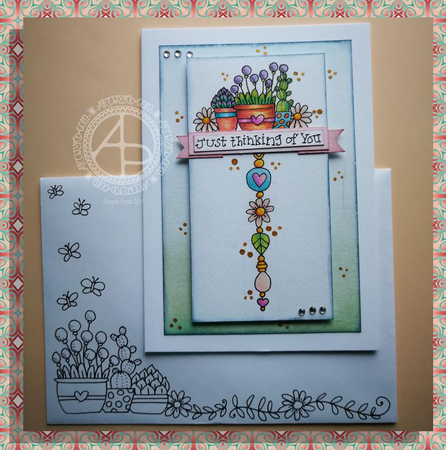
Thinking of you – a dangle design card

© Angela Porter 2019

This little card and envelope took me around 3 hours to make. I had to remember how to do various things and find my supplies to do them with!

My first task was to make the sentiment banner. I had the idea for this one after someone asked me for recommendations of good books for learning hand lettering as they’re not at all happy with their handwriting.

Hand lettering and handwriting are not the same thing. Hand lettering is something you unconsciously do. Hand lettering is the conscious and deliberate drawing of letters, one by one. Practice, like everything else you want to learn and become good enough at, is important. I suggested that they try printing the sentiments out on their computer or using words cut out of books or magazines or stickers or stamps and ink pads used by card makers until they’re comfortable with their own lettering style.

That led me to thinking that rather than writing the sentiment directly onto the paper that I’m going to draw the dangle design on, what about if I hand lettered it on paper again and again until I’m happy with it and then cut that version out. I could then layer it onto coloured card to make a border, or onto the paper or or or…

So, that’s what I wanted to use here. A variation on what I’ve done in previous cards. I cut two trips of mixed media paper, one around 1cm wide, the other around 0.7cm wide.

On the narrow strip I wrote my sentiment. I did this confidently as I knew if I got it wrong I could always write it again – I’d not ruin my dangle design in any way. I then trimmed the strip close to the start and end of the sentiment.

Next, I coloured the wider strip of paper with victorian velvet Distress Ink. I trimmed one piece so it was just a little longer than the sentiment. Then, I cut two rectangles from the coloured strip. I cut triangular notches into one end of each of the rectangles. I used the sponge applicator to make sure the edges of the coloured pieces, including inside the notches, and the sentiment strip coloured. By doing this, there’s a darker edge to the pieces and this defines them against the background. The final step in making the banner was to glue the pieces together as shown in the photo.

I cut two pieces of mixed media paper for the front of the card. The smaller one I made a little narrower than the sentiment banner; I wanted the ribbon to hang over the edge a little. I used a pencil to mark where I wanted the banner to sit on the card. I then used a pencil to mark out the centre of the card so I could position my dangle centrally.

Above where the ribbon would sit I wanted to place an arrangement of pot plants – succulents and a cacti. Below I wanted a fairly simple dangle, but one that had elements that appeared in the arrangement of pot plants. I drew these with a 05 Uniball Unipin Pen.

I then wanted to colour the two pieces of mixed media paper before I coloured the designs in.

For the larger one I used Peacock Feathers, Bundled Sage, Weathered Wood and Tumbled Glass Distress Inks to colour the whole of the paper panel. I edged this panel with Faded Denim Distress Ink. Then, I lightly sprayed the panel with water so that I’d get some faded watermarks as a texture in the colour.

For the upper panel, I used a very light hand to add the same Distress Inks to the paper, but in a much paler shade. I also edged this panel with the Faded Denim Distress Ink. I realised it hadn’t erased the pencil guidelines before I added the Distress Ink so when I went to erase them they wouldn’t fully erase. I’d forgotten that I had to do that! Still, it adds a bit to the distressed feel of the cards, that and the damage marks that were on the larger panel too.

To colour the dangle design I used Mitsubishi Uni coloured pencils. I used a fairly limited palette across the design.

The last two steps before assembling the card were add dots of gold ink and some shiny adhesive crystal gems.

To assemble the card I used glue to adhere the lower panel directly to the card. I then used foam squares to adhere the dangle design panel to the lower panel and the sentiment ribbon to the dangle design panel. This card has quite a bit of dimension to it.

My final job was to decorate the envelope. I decided to draw some pot plants and some of the daisies along the bottom. I added some butterflies to the left as the area above the pot plant seemed empty, unbalance. I haven’t coloured the envelope in as I’m in two minds whether to or not. Also, it would be nice to edge the envelope with the Faded Jeans Distress ink too, maybe even colouring the envelope with the same Distress Inks as the card. There’s also the back flap of the envelope that would benefit from a little potted succulent drawing I think.

Distress Inks are water-reactive, so if I do this, once the envelope is addressed a light application of Micro Glaze would seal the colour in so it wouldn’t be damaged in the mail.

I’m actually quite pleased with this card. It’s got me thinking about how to do more of this kind of stuff – card making the ‘Angela’ way!

If you give making cards like this a go, I’d love to see what you create! Happy art-ing, lettering and crafting!

Lots of ideas for dangle designs are shown in my book
‘A Dangle A Day’.

Dangle Design Card and Envelope

© Angela Porter 2019

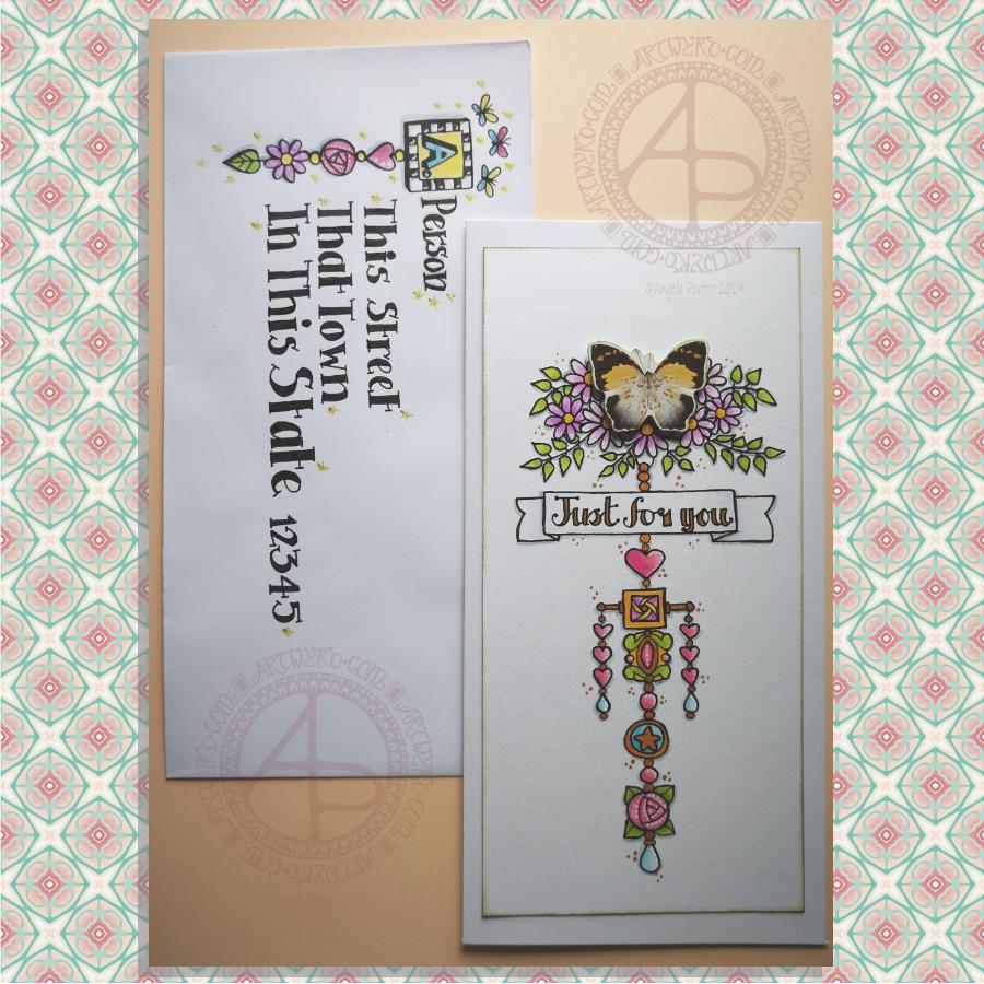
Here’s a pretty pair of whimsical and cute dangle designs card and envelope.

For the focal point of the card I used a butterfly from a pack of Ephemera from Tim Holtz called Botanical. I added some metallic gold ink highlights to the butterfly as I knew I’d be adding gold to the design. I also edged the butterfly with some Peeled Paint Distress Ink using a sponge ink applicator.

I then cut my paper to fit the card blank I wanted to use; I learned my lesson from the the last card I made! The card blank measured 8½” by 4¼”. So, I cut a piece of Claire Fontaine Mixed Media paper 7¾” by 3¾” to create the dangle design on.

I used the butterfly as a guide as to where I wanted to add some flowers upon which it could alight. I also drew pencil guidelines in for the centre of the design and the sentiment banner.

Then it was drawing the design. I used a 05 Unipin pen from Uniball.

I started by drawing the flowers at the top of the design.

Next, it was the hand lettering for the sentiment ‘Just for you’.

Flowers, hearts, stars and spherical and teardrop shaped beads are my goto choices for dangles. I did add a charm that was based on some jewellery, as well as a square charm with a geometric pattern inside it.

When I’d drawn the main dangle I realised I wanted to add a bit of width to it. So, I added two bars stretching out from the side of the square charm and used the ends to hang dangles made up of hearts and beads.

Colouring was the next task. I used Tombow Dual Brush pens to colour the design in. The colour gradients weren’t strong enough for me, so I used Chameleon Duotone Pencils to add depth to the colours.

Then, it was time to attach the butterfly using some foam squares.

I then used a dip ink pen to add some dots of gold FW Pearlescent ink around the design. I also used gold to fill in the lettering of the sentiment and various elements of the dangle design.

Next, I added white dots highlights to some of the design elements using a Sakura Souffle pen.

I also used a blue-grey Chameleon pencil to add shadows to the design at this point.

Before affixing the design to the card blank I used a sponge ink applicator and Peeled Paint Distress Ink to edge the design. That was the card done.

I then thought it would be fun to create an example of an addressed envelope using a dangle design as a monogram. I used some of the charms from the card for this design. I also drew some simple, whimsical butterflies above the monogram. I used Chameleon Duotone Pencils to colour the dangle design and to add a shadow to the dangle.

Pencil guidelines helped me to keep my lettering evenly spaced and of a consistent size. In this case I just guesstimated them, but in future I think I will need to measure the spacing of the lines!

Finally, I added some glittery golden stars with a gold glitter Uniball Gel pen as well as some white dot highlights using a white Sakura Gelly Roll pen.

One thing I realise I didn’t do was to make the colours in the dangle more harmonious with the butterfly. The color tones of the butterfly are quite antique and grungy and I used rather bright, clean colours to colour the design with. I also am not happy with the monogram on the envelope; it’s too small and the lettering style doesn’t seem sympathetic to the rest of the lettering.

I’m going to put these down to me still suffering the lingering effects of the stinking cold I’ve had for the past three days. It’s definitely broken now, but I’m still not 100%.

It’s also a learning experience. I’m not a wonderful card maker; I do dabble in it from time to time, however dangle cards are fun to make and with the decorated envelopes it’s double the fun! I think I need to start sending happy mail to people! I’d be happy to receive this card with a letter inside – how would you feel about it?

‘A Dangle A Day’ was published on 15 Jan 2019 and many of the dangle design elements can be found in this book.