If you’d like to find out more about drawing dangle designs, then my book “A Dangle A Day” is a good place to start. I’ve created over 120 designs, with step by step instructions, for you to use and inspire you.
It’s Friday, so that means it’s dangle designs today!
I drew these on postcard sized (148mm x 105mm) acid free heavy cartridge paper using a mixture of Tombow fudenosuke and Faber-Castell Pitt Artist pens. I then used Chameleon Color Tones and Color Tops to add some colour to the designs.
Again, I’ve drawn some really simple, cute and whimsical dangle designs that leave plenty of space on the paper for hand lettering or a hand-written note or letter.
Dangle designs are, of course, very versatile. I put these on the edge of a postcard sized piece of paper. However, they could be used as the focal point of a greeting card or note card. Lengthen the dangle, and they’d make cute bookmarks. They’d make interesting designs to fill spaces in a BuJo or scrapbook page. They’d also make interesting focal points on art journal pages.
I’d love to see how you use dangle designs – just tag me in social media!
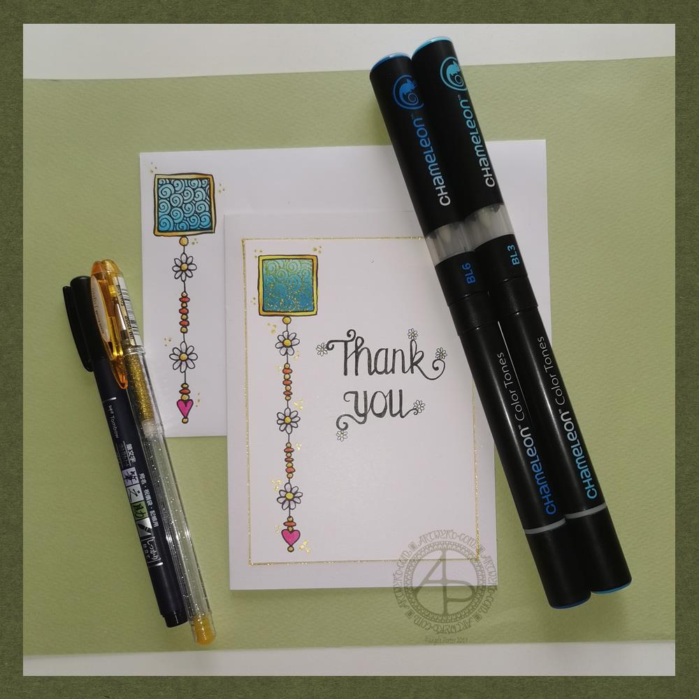
Friday means it’s time for another dangle design, this time a ‘thank you’ card and coordinating envelope.
In previous weeks I’ve had some fun adding patterns to small blocks of colour. So, I thought I’d run with that idea and turn one into a simple dangle design. The steps I used were the same for the card and envelope.
Card size.
The card is an A6 card and I cut a piece of Winsor and Newton Bristol paper to 5″ x 3.5″ for the card topper. The envelope came with the card blank so is A6 in size too.
How to…
I started by drawing a square of colour using the BL3 (Sky Blue) Chameleon Color Tone pen – no gradient, just pure colour.
Then, I added a gradient of BL6 (Royal Blue) over the base colour. I added pure blender to the Royal blue bullet nib using the mixing chamber. I didn’t use the Color Tops to add Royal Blue to the tip of the Sky Blue pen as I wanted a more subtle colour gradient.
Next, I used a Tombow Fudenosuke pen to draw around the block twice. Then, I added a filler pattern of spirals to the colour block. On the card I used a gold Uniball Signo sparkle gel pen. On the envelope I used the fudenosuke pen.
Now the colour block was decorated I turned my attention to the dangle.I decided to draw one dangle as I thought the design would look too crowded if I ad more. Sometimes, less really is more!
After drawing a faint pencil guide-line, I used a combination of beads, daisy-like flowers and a heart for the dangle. I wanted to keep it nice and simple.
Then it was time to add colour to the outline and design elements. I used the Chameleon Colour tops to add very simple colours. I didn’t do any gradients as the designs were so small. Instead I coloured them in the lightest colour, added a touch of darker colour where I wanted shadow and blended that out with the lighter colour.
I decided to hand letter ‘Thank you’ on the card using a soft nib Fudenosuke pen. I also added some tiny daisies to some of the loops and swirls to tie the hand lettering in with the dangle design.
I then mounted the card ‘topper’ on the card blank and added some gold glitter gel dots around the designs. I also added a gold line around the card topper.
Before I post the card, I’ll use some Micro Glaze from Ranger on the envelope to protect the Tombow pen from water damage.
Reflecting on the project…
Overall, I’m quite pleased with this. In hindsight I wish I’d used the Tombow Fudenosuke pen to draw the spiral pattern on the card. I think it’s a cute, simple and versatile design.
It would make lovely stationery, such as note paper or note cards, along with coordinating envelopes. There are lots of ways the design could be used in BuJos, Planners, Journals, Scrapbooks, and Art Journals. The vertical nature of the design means it would make a lovely bookmark.
How would you use this design? I’d love to hear, so leave a comment!
If you have a go at drawing and using this design then please share your finished products with me – I’d love to see how people use dangle designs!
If you want to learn more about drawing dangle designs then my book ‘A Dangle A Day’ is a good place to start. There’s over 120 designs for you to use as they are or for inspiration for your own designs.
Nearly every Friday I publish a new dangle design on my blog for more inspiration.
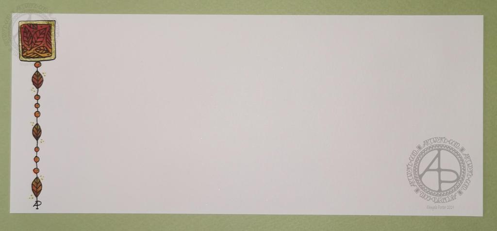
Hello to November, and farewell Inktober. My blog post today looks a bit bare compared to my Inktober creations. However, I have neglected my dangle designs during October, so now’s the time to get back on track with them
Today, I’ve created a simple and elegant dangle design with an autumn colour scheme that could be used in so many different ways. I’ve also put together a step by step set of instructions how you too can create this design (and hoping that it’s not so simple that I come across as patronising).
This is my first time posting a set of instructions – post a comment to let me know what you think of them and if you’d like to see more of them in the future.
I’ve put the dangle design on one side of a slip of paper that would make a perfect compliment slip or a note to slip in with a gift, or just as a short letter to a friend. It would also be perfect for a coordinating piece of envelope art!
This dangle design would be absolutely charming as an embellishment in a BuJo, planner, scrapbook or art journal. It would also make a darling bookmark.
It would be easy to turn this design into a greeting card as well.
So many possible uses for such a simple design.
I do hope that you will give drawing dangles a go – no matter whether you think you’re good at drawing or not! This design is made out of just simple shapes; it’s the colour that brings it to life and masks all kinds of imperfections.
If you’d like more ideas for dangle designs, then please take a look at my book ‘A Dangle A Day’ – it’s filled with examples of dangle designs with step by step instructions and helpful and encouraging words of advice.
One step at a time to a dangle design.
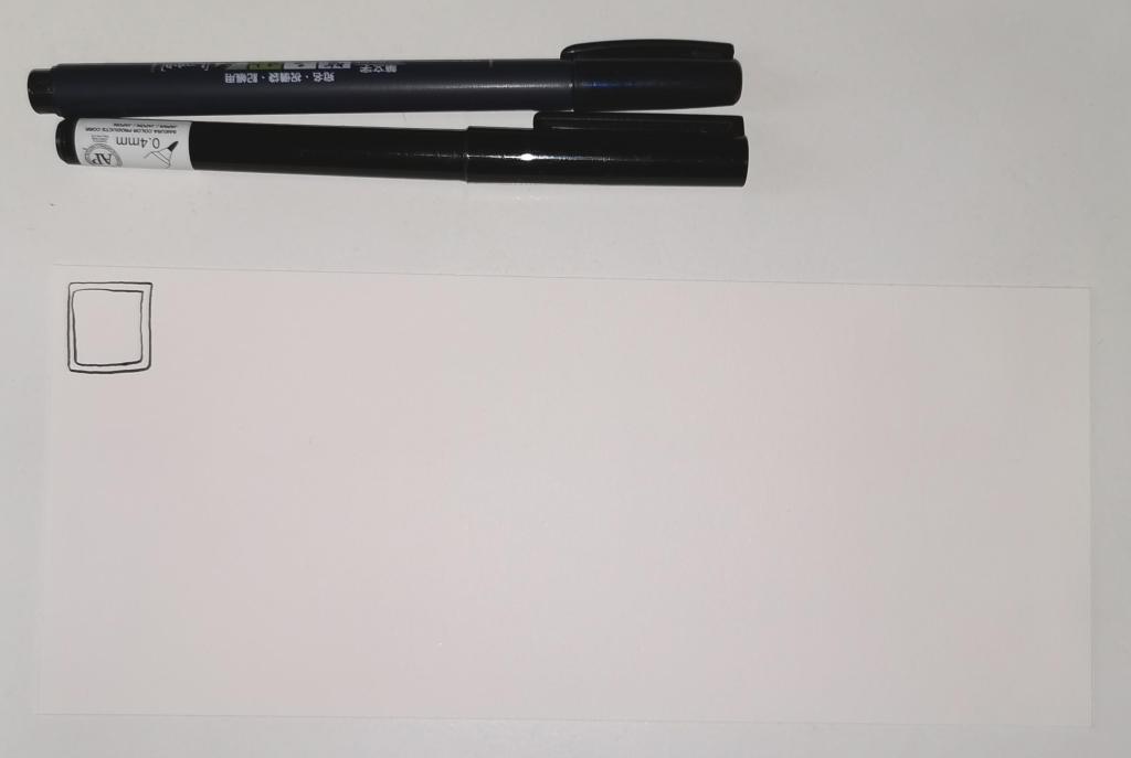
Step 1
Step 1 Draw a square in the top left corner of a piece of paper. I used a piece of paper measuring approx 8.25″ x 3.5″. I used a Tombow Fudenosuke brush pen to draw the box, and outline it. I deliberately made the squares less than perfect to give that human touch as well as a uniquely ‘me’ way of drawing boxes. The Fudenosuke pen allows me to draw lines of variable width quite easily, which adds to the charm of the box. The ink in the pen is also alcohol marker friendly. Letting your drawings be less than perfect is what makes them uniquely yours.
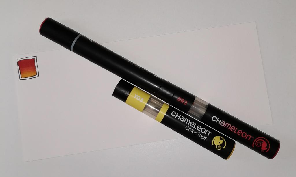
Step 2
Step 2 I used Chameleon marker pens (BR3 “Cinnamon” and YO3 “Warm Sunset”) to colour the inner box. Autumn is definitely here in the UK, and the combination of these colours reminded me of the leaves. However, you could use any colour combination you like and any medium you prefer to use. Chameleon pens make it so easy to create a colour gradient – I prefer them to other alcohol marker pens, even Copics.
Step 3
Step 3 I added a simple leaf pattern to the coloured box using a Sakura Pigma Sensei 04 pen.
Step 4
Step 4 Add the dangle! For this dangle I used the same kind of leaves as in the box for a consistent design. I added some round beads as ‘spacers’. Finally, I added my ‘symbol’ to the end of the dangle. Also, I did draw a faint pencil line with a ruler to help me keep my dangle hanging straight, more or less!
Step 5
Step 5 I coloured the beads and leaves in using the same colours of Chameleon Markers. I then decided I needed to add some shimmer and shine; I used a Uniball Signo gold glitter gel pen to colour in the border of the box and to add some dot highlights here and there. The Chameleons caused the Sakura Pigma Micron ink to smear a little – I always forget that happens! I should’ve used the Tombow pen again. Oh well, you live and learn, eventually!
Distress Inks in Bundled Sage, Weathered Wood and Stormy Sky.
Distress Oxide Inks in Iced Spruce and Peeled paint.
Small paint brushes – I used a 0 for the details and a 4 for the circles.
Mini foam blending tool.
A spray bottle containing a mixture of gold Perfect Pearls and water.
Tim Holtz’s Distress Micro Glaze and a dedicated foam blending pad. (or just your fingers!).
A glass pen or other fine nib dip pen.
Gold and Silver inks from J Herbin
White Sakura Glaze pen.
Gold glitter Uniball Signo Pen.
Light grey 05 Unipin pen by Uniball.
Glue or strong tape to adhere the card layers (I used Tombow Mono glue)
Method:
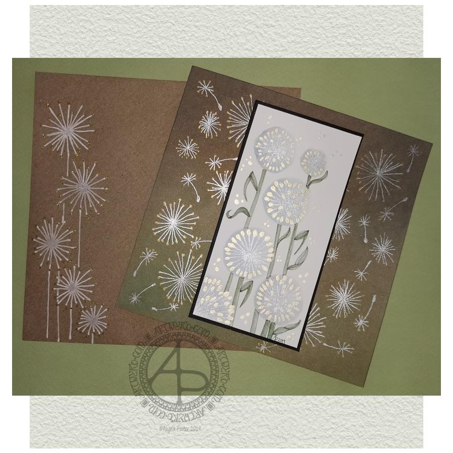
I started with a 2.5″ x 5″ piece of watercolour paper and a brush. I used water to draw circles where I wanted the dandelion heads to be. I then used the brush to add Stormy Skies and Weathered Wood Distress Inks into the water, letting it spread as it liked. To ensure I had a darker area of the seedhead, I dropped the watered-down inks to the bottom and left of the circles.
While the circles were drying, I worked on the card base. I applied Peeled Paint and Iced Spruce Distress Oxide Inks with a mini foam blending tool. Then, I sprayed the card with a mixture of gold Perfect Pearls and water and let it dry. Finally, I used Tim Holtz’s Micro Glaze to seal in the Distress Oxides – they react all too quickly with the sweat in fingers.
By the time I’d set the card base aside to dry I could return to the dandelion seed heads. I used a fine paintbrush, and some Titanium Iridescent Watercolour paint from Cosmic Shimmer to add the stems of the seeds. Once they had dried, I added dots of Enchanted Gold Iridescent Watercolour paint to the stems and set the panel aside to dry.
I wanted to add some dandelion heads and seeds to the card base. I used a glass pen along with silver and gold inks from J Herbin. I didn’t think these would adhere to the micro glaze treated surface, but they did. On a darker background, I could really see how these inks look like liquid metals as they flow onto the paper. They didn’t dull as they dried, thanks to the micro glaze acting as a barrier to the Distress Oxide ink.
Next, I wanted to add the stems and leaves to the dandelions on the watercolour paper panel. I used some Bundled Sage, Weathered Wood and Stormy Skies Distress inks for this. I pressed them onto a sheet of plastic, diluted and mixed them with water and a brush and then used the mixture to add the stems and leaves. I started with a lighter colour wash, adding darker colours to the left of the stem and also under the dandelion heads to add some dimension.
Once I was reasonably happy with the stems, I worked on the leaves. Again, I started with a pale-coloured wash to get the shape of the leaves in place. Then I gradually added darker tones to give a sense of dimension.
When I’d finished this, I looked at the panel, and I wasn’t happy with the stems and leaves. They looked unfinished. So, I dug out a light grey Uniball Unipin pen and proceded to outline the stems and leaves. This improved matters greatly to my mind. I like the way the stems and leaves are now defined and how they contrast nicely with the airy, ephemeral feel of the seedheads.
I then set about adding some dots of the gold watercolour around the arrangement of dandelion seedheads, added my symbol and year, and that completed the top panel.
I cut a piece of black card that was approx. 5.25″ x 2.75″ and adhered the top panel to it. I then adhered these layers to the card base.
My last task was to decorate the envelope. I used a white Sakura Glaze pen to draw some dandelion seedheads. When the Glaze pen lines had dried, I used a gold glitter Uniball Signo gel pen to add dots.
My reflections.
I started with a 2.5″ x 5″ piece of watercolour paper and a brush. I used water to draw circles where I wanted the dandelion heads to be. I then used the brush to add Stormy Skies and Weathered Wood Distress Inks into the water, letting it spread as it liked. To ensure I had a darker area of the seedhead, I dropped the watered-down inks to the bottom and left of the circles.
While the circles were drying, I worked on the card base. I applied Peeled Paint and Iced Spruce Distress Oxide Inks with a mini foam blending tool. Then, I sprayed the card with a mixture of gold Perfect Pearls and water and let it dry. Finally, I used Tim Holtz’s Micro Glaze to seal in the Distress Oxides – they react all too quickly with the sweat in fingers.
By the time I’d set the card base aside to dry I could return to the dandelion seed heads. I used a fine paintbrush, and some Titanium Iridescent Watercolour paint from Cosmic Shimmer to add the stems of the seeds. Once they had dried, I added dots of Enchanted Gold Iridescent Watercolour paint to the stems and set the panel aside to dry.
I wanted to add some dandelion heads and seeds to the card base. I used a glass pen along with silver and gold inks from J Herbin. I didn’t think these would adhere to the micro glaze treated surface, but they did. On a darker background, I could really see how these inks look like liquid metals as they flow onto the paper. They didn’t dull as they dried, thanks to the micro glaze acting as a barrier to the Distress Oxide ink.
Next, I wanted to add the stems and leaves to the dandelions on the watercolour paper panel. I used some Bundled Sage, Weathered Wood and Stormy Skies Distress inks for this. I pressed them onto a sheet of plastic, diluted and mixed them with water and a brush and then used the mixture to add the stems and leaves. I started with a lighter colour wash, adding darker colours to the left of the stem and also under the dandelion heads to add some dimension.
Once I was reasonably happy with the stems, I worked on the leaves. Again, I started with a pale-coloured wash to get the shape of the leaves in place. Then I gradually added darker tones to give a sense of dimension.
When I’d finished this, I looked at the panel, and I wasn’t happy with the stems and leaves. They looked unfinished. So, I dug out a light grey Uniball Unipin pen and proceded to outline the stems and leaves. This improved matters greatly to my mind. I like the way the stems and leaves are now defined and how they contrast nicely with the airy, ephemeral feel of the seedheads.
I then set about adding some dots of the gold watercolour around the arrangement of dandelion seedheads, added my symbol and year, and that completed the top panel.
I cut a piece of black card that was approx. 5.25″ x 2.75″ and adhered the top panel to it. I then adhered these layers to the card base.
My last task was to decorate the envelope. I used a white Sakura Glaze pen to draw some dandelion seedheads. When the Glaze pen lines had dried, I used a gold glitter Uniball Signo gel pen to add dots.
Reflections on this project.
When I started, I only had a rough idea of what I’d like to do. I knew I wanted to use watercolour media and stylised dandelion heads.
At first, I tried to make the circles for the seed heads by using a Tombow Dual Brush pen to draw the outer circle. Then, I used water and a brush to get the ink to bleed into the circle.
The result wasn’t pretty.
So, I regrouped and tried Distress Inks and water, and I was much happier with the result, and the card grew from there.
I’m pleased that I ran with a more stylised dandelion head than I’d initially considered. One of my artistic strengths is my ability to create stylised motifs. I certainly think I managed to do that with the dandelion heads and their leaves, especially as watercolour media is not a strength of mine.
I’m also glad I used the iridescent paints to add the details. That makes my inner raven very happy. The use of metallic inks on the card base increased the happiness of the raven even further!
I was about to give up on the card when I’d added the stems and leaves with just Distress Inks; I wasn’t happy with them. However, trying the grey line made all the difference in the world. The dandelions went from almost being consigned to the waste bin to being good enough.
I’m now happy with the card and the envelope; it’s something I’ll try again in the future, maybe. After all, I do have a few more watercolour paper panels that need to be used!
So, Angela, how are you today?
Yesterday, I had EMDR therapy. The session was quite painful, physically, and a bit distressing emotionally. I felt content and optimistic going to the appointment, and I left feeling pretty much the same. However, I suddenly became exhausted when I was half-way home. And I do mean exhausted. I felt my eyes trying to cross and close.
I made it safely home and, after having a little something to eat, I collapsed into bed and slept until early evening.
I was still really tired when I woke, but a random chancing upon crochet patterns for hyperbolic surfaces and ammonites kept me up for a while. Indeed, I lost myself in crocheting hyperbolic forms.
This morning I woke feeling content and optimistic and cheerful. The sun was shining, which always helps my mood for sure.
Even though I was feeling sunny inside, I wanted to spend time on a little project or two today. I didn’t want to push myself after what turned out to be a gruelling EMDR session yesterday. So, that’s why I threw myself into creating this little card.
Now, it’s nearly 7 pm here in the UK, and I’m bone-tired once again. I’ll spend the evening either creating another card or crocheting. Either way, it’s self-care time.
Yesterday, I mentioned some things I’d like to try out after my experience creating a greeting card using vellum and Distress Inks along with some die-cutting.
So, rather than take the nap I’d said I was likely to, I endeavoured to make another card in the same kind of entangled art style. This time, the two Distress Inks I used were Peacock Feathers and Mermaid Lagoon.
I used these inks to colour the reverse of the vellum and to add colour to the card base – Mermaid Lagoon at the top, Peacock Feathers at the bottom and blending them in the middle.
I used the piece of card I’d cut the frame from as a stencil for the addition of colour, so I was sure it wouldn’t bleed out of the edge of the frame.
After dry embossing the design on the vellum, I passed it just once through a hot laminator. The vellum became flat without losing too much of the definition given by the dry embossing.
I trimmed the vellum panel so it would fit neatly under the frame. I adhered the vellum to the frame using strong double-sided tape.
I wanted to lift the vellum above the card base. I doubled up some double-sided foam tape, using thin strips. In hindsight, I would’ve been happier with just one thickness of the foam tape.
By applying the Distress Inks to the card base the colour has been intensified, and the dry embossing stands out better. I’m quite pleased with the result of this card.
I do wish I hadn’t added the gold dots around the frame though; I thought I needed some to complement the gold dots that I added to the entangled design.
On the whole, I’m much happier with the entangled in blue card.
I’ve just thought that it could be relatively easy to turn that panel into a shaker card by making sure the space beneath the vellum is completely sealed by the foam tape at the edges and then adding some sequins and/or glass beads — something for me to try another time maybe.
Comfort art.
The drawings in both of these panels are an example of me slipping into ‘comfort art’ mode. I tend to draw this way when I’m feeling emotionally vulnerable or fragile. Entangled art like this is familiar to me, like a comfortable pair of old slippers, and it soothes me somewhat.
Entangled art is very much my ‘style’ of art. Digitally, I’m pushing my boundaries with it by not using black outlines or outlines in any colour. When I feel the way I have in the past few weeks, it can be tough for me to settle into art that challenges me even a little bit and digital art has been doing that. That’s why I’ve started many projects and not finished them; I get dissatisfied with what I’m doing and just stop it. That’s a sign that I really am not feeling as balanced as usual.
In the past, I’ve mentioned that redrawing my favourite patterns and motifs in a zibladone ( a mixture of journal and random notes or interesting things) is comforting, soothing to me. I have only just noticed that drawing in this way is also so.
The challenging thing in these cards is the die-cutting and the use of various adhesives. And scissors. Scissors always cause me problems. Although I’m mostly right-handed, I use scissors in my left hand. I use right-handed scissors, and I find that problematic, but left-handed scissors are even worse for me! Craft knives have their own added issues for me.
A little more of a challenge.
Today I received two die sets in the post, both from Lawn Fawn and from Seven Hills Crafts. They’re the foursquare landscape and portrait backdrop die sets.
I want to try to make a pair of dangle design cards with these for tomorrow. So that’s one of my tasks for this afternoon.
So, Angela, how are you feeling today?
I’m OK. I’m tired; I drove for over four hours yesterday, and when I got home, I was not only exhausted but cold as well. I didn’t sleep all that well as I didn’t warm up until around 6 am and I kept waking up shivering.
I’m experiencing a lot of anxiety and even fear about the current state of the world; I feel tearful about this a lot of the time and not very optimistic.
Other than that, I think my life is settling down into a new kind of ‘normal’ after spending time with my friend and his partner last week. I still have lots of things to sort out that were stirred up from the pandora’s box of trauma within me. But now they’ve been identified they can be processed in EMDR.
Being tired makes me a lot less resilient to all this.
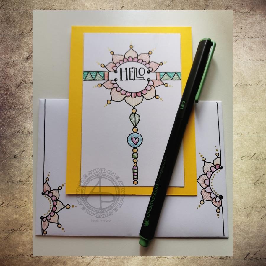
Yesterday I decided to make a second card with a coordinating envelope. I wanted to try out using the Chameleon fine-liners to add colour in the form of lines and cross-hatching. Finally, I added some gold dots to the points of the petals on the flower design.
To draw the design and execute the hand-lettering, I used a Uniball Unipin pen. I then used various pairs of Chameleon fineliners to add the colour.
I prefer this way of adding colour with the Chameleon fine-liners, though I’m not entirely happy about it either. Looking at it now, in the clear light of dawn, I think I could have added a flat colour below the coloured lines. I may go and add that colour in a little while. After all, it’s just a card, an experiment, and if I mess it up, I can always make another one! A lesson learned, an experience gained is worth the few pennies worth of materials and the time it took just as long as I remember the lesson in the future.
I’m also not happy with my hand-lettering; I like the idea of the letter layout, but it’s not centred between the arcs.
I do like the ‘banner’ I’ve used to enclose the hand-lettering. However, there’s something about the rectangular ribbons and the patterns within that I don’t particularly like. I’ll work out what it is in time.
For now, I’ll try adding flat colour to the coloured sections to see how that works out and not worry about messing up the card. I’ll use it as a learning experience.
And that reminds me, I’ve still not set up my One Note journal for my private critiques and what kinds of methods and techniques I use in my art.
Materials
A piece of yellow card cut to 4″ x 11″, scored and folded in half to make a top-fold card measuring 4″ x 5½”.
A piece of white card approx. 4″ x 5″ for the top layer.
A We R Memory Keepers Envelope Punch board and an piece of paper measuring 7⅞” x 7⅞” or a blank envelope that will fit a 4″ x 5½” card.
A pencil and ruler for the guide-lines and a good eraser to remove them.
A black fineliner pen for drawing and hand-lettering; I used a Uniball Unipin pen.
Pens to colour the design; I used Chameleon fineliner pens.
A gold gel pen for the dot embellishments; I used a Uniball Signo gold gel pen.
If you’d like to learn more about dangle designs or are looking for some more inspiration for them and how they can be used in cards, BuJos, scrapbooks, bookmarks, journals, and more then my book ‘A Dangle A Day’is a good place to start. It takes you through how to draw monograms and dangle designs for all kinds of occasions around the year in simple steps.
Last night I bit the marker pen and uploaded two sets of small greetings cards to my Etsy shop, Artwyrd.
Each set has ten cards featuring a coloured flower/mandala design stored in a small, custom made box along with matching envelopes.
The flower/mandala designs I drew myself in Autodesk Sketchbook Pro on my Microsoft Surface book. I printed out multiple copies of the designs and then used my Chameleon Markers and Copic Markers to colour them. Distress Ink was used to add colour around the designs.
The next step was to create colour mats for the designs; I used my marker pens to colour some Centaura Pearl card.
Before mounting them on the 3″ x 3″ (7.5cm x 7.5cm) card blanks, I embellished the designs with dots of metallic and pearlescent acrylic paint, as well as adding coloured gems.
Of course the cards sparkle!
The boxes are made from cardstock with the lids decorated with designer series paper; the colour ways chosen are complementary to the colours of the cards. I also used Distress Inks to distress the edges and corners of the boxes. I’ve yet to embellish the boxes.
These are my fifth and sixth attempts at making the boxes. I had to purchasing a new paper cutter that’s more accurate than the one I had been using. I had used a template for a box that would take ten 3″ x 3″ cards, but wasn’t big enough for the envelopes. So, I also had to work out and adjust the measurements needed for the base and lid so that the envelopes would fit in the box! Frustrating, especially as maths isn’t my strong point …but I got there in the end.
I do have a couple of jobs to do to the cards/boxes; the boxes need some embellishment, and I need to add makers labels to them too.
The boxes will be nice for other things once the cards are used up – the lids are a snug fit.
All of the designs I have stored and may, in the fullness of time, put them together as a pack of digi-stamps so people can use them to create their own cards!
I’ve spent the last four or five hours creating this set of four ACEO/ATC cards. It’s been a while since I did any mixed media work, but I felt the need to get a bit messy.
Each card measures 2½” x 3½” (approx. 6.5 cm x 9 cm) with the substrate being some fairly thick Kraft card.
I started by using some yellow Frog Tape to hold the cards together so I could make the background at the same time.
I started by applying PaperArtsy Fresco Paints to the kraft card until I had a finish I liked. The colours I used were Cheesecake, Rose and Sherbet.
Once I’d finished applying the wax, I wasn’t happy with the result on the dragonflies, so I used Daler Rowney System 3 acrylic paint in Rich Gold to re-colour them. I was much happer with the results, especially the dragonflies that I’d coloured pink/red.
The next step was to have a furtle through various coloured diecuts I have in my stash. Every now and again, I spend a day cutting out various die cuts (mainly cogs, flowers and foliage, but sometimes other things too) and then colouring them to add to my stash. It saves on time when I have the urge to do some mixed media work. It also makes use of my rare urges to do die cutting, which I find a very tedious process.
After a good furtle, I found some cogs that would work on two ACEOs that had just the dots on the background. I couldn’t find anything I’d want to add to the dragonflies; I was just happy with them as they were.
I then chose some words from the Tim Holtz Chit Chat stickers and glued them down with the Cosmic Shimmer Acrylic glue, and used a damp brush and a China Black Inktense pencil from Derwent to add shadows around the stickers.
The very final step was to add some sparkly gems, and they were done! Once all is dry, I can add my information to the back and so on, and I have some ACEO cards to use on other mixed media projects or in my art journal.
Other arty news
Over the past week I’ve been keeping myself artfully busy learning a bit more about Autodesk Sketchbook Pro and how it works for me; you could say I’m building up a relationship with it.
For now, I’ve been drawing LOTS of mandalas! I’m keeping them back from t’internet as I hope to publish them (some are already spoken for by the Colorist app), and other people asked if I was going to make some available for purchase. So, I’m building up a collection of them for that purpose – either with a publisher, or I’ll self-publish if necessary. I’ve also done a couple more small mandalas that work nicely as designs to be coloured and made into greetings cards, kind of like digital stamps.
Talking of digital stamps (digi stamps), there are some ideas rattling around my noggin that I’d like to try out, so there’ll be more news on this later on no doubt.
It looks like I’m going to be doing a colouring book of spooky templates in the near future, so if anyone has any ideas for ‘spooky’ or ‘eerie’ then feel free to share!
I also have a few ideas for written books rumbling around my noggin; however, it’s really hard for me to do something with them as I doubt myself so much, think they’re silly ideas, and so on. The ideas aren’t wholly in my noggin, I do have notes on them on the ‘puter which need tidying up…but I’m finding it difficult to do this because of all my self-doubt and self-criticism. I just need to keep saying to myself, ‘But you have recorded these ideas so they are there for you, so you have made progress).
Other things going on in my life
A week ago, I finally had the hedge at the front of the house removed, as well as the back garden completely cleared. My garden is tiny, but it’s amazing how much space was hidden by the cotoneaster and forsythia! I do have some clean up to do, but there’s no great rush on that. I also need to consider what to do with the back garden.
The process of getting this done has caused me great anxiety, but there was an ah-ha moment when I realised that some voile panels in the windows in my front room would help me to feel ‘safer’ and more ‘private’ while letting in daylight. For a long time I’ve hid behind curtains; well, I still am, but at least I can see out through the voiles even if people outside can’t see in! Why I didn’t think of this a long while ago, I don’t know, but thank goodness I did!
I’ve done a couple of anti-stigma talks for Time to Change Wales, and I’m seriously wondering if I’m really making any difference as my story is so bland and ordinary … after all it’s not a dramatic tale to tell, and I really don’t think it’s anything people haven’t heard/seen on TV on the soaps and so on…so I’m really feeling quite downhearted about that at the moment.
I know it may very well pass, but at the moment … it’s difficult….my therapy? Art of course!
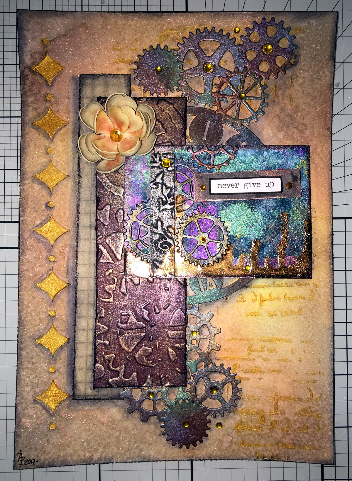
Back to playing with mixed media today, and this is the result…
It’s around 8″ x 6″ in size and 300lb Smooth watercolour paper by Daler-Rowney is the substrate.
First, I coloured the paper using Distress Oxide inks, with a light spray of gold mica mixture.
Once that had dried, I added the diamond motif and text to the background using texture paste through stencils. Once the paste had dried, I used a rich gold System 3 acrylic paint from Daler-Rowney to paint the texture paste.
Yesterday, I had used embossing folders with my Big Shot from Sizzix to emboss coloured card which I then added metallic and iridescent colours to. The dark red-brown layer of cogs is part of one of these papers. Behind it, there’s a piece of patterned paper. Both have had their edges roughed up (distressed) and then inked using black Archival Ink from Ranger.
I next chose an ACEO or ATC card from my stash to act as a focal point. I also firtled through my stash of steampunk diecuts to find some cogs and a clock dial to add to the background.
The diecuts were all made from kraft card and I used Distress inks to add the base colours of a rich blue, an intense blue-green and a red-brown before dry brushing metallic and iridescent acrylic paints from Liquitex over them to give the appearance of old metal.
Finally, I assembled everything together in an arrangement that pleased me. I used a Payne’s Grey Inktense pencil and a water brush to add shadows, and finally a few sparkly gems (I can’t resist the use of sparkle!).
I thought I’d finished, however, the postman brought me a box that contained some Foamiran sheets I’d ordered a couple of days ago, and I just had to have a go at making some flowers. You can see one of the flowers on the mixed media piece.
The flowers are quite easy to make. I die cut flower shapes from the Foamiran. I then used a couple of Faber-Castell Gelatos and a damp baby wipe to apply colour the the front and back of the flowers.
Next, I used my heat tool to warm the foam so it curled up a little and then shaped the petals before using hot glue to stick the layers together to make fluffy flowers. Finally, I used an alcohol marker to colour some clear gems in so they complemented the flowers and attached to their centres.
I think I’m going to be making more of the flowers, they are easy to make, if a little fiddly given the current manicure I’m sporting. Next time my nails are done, I’ll make sure they are kept fairly short!
I’ve spent much of the day so far making these two little books. The smaller one is made out of one piece of 12″x12″ designer paper and some raspberry red cardstock with some strips of designer paper for the front. The interior of the book has little pockets as well as places for words and pictures on the front and back of the pockets. It’s not perfect, not by a long shot, but it’s a learning experience.
The bigger one is made from envelopes – I have blue and red ones that vibrate against each other. I’ve decorated the front but am not too happy with it. I’ve not done a brill job of putting the book together either.
However, in both cases I see it as a learning experience, and they are perfectly imperfect given that they are my first attempt at such projects.