I often say to myself, “Angela, what on earth were you thinking?” This is one of those times.
I started with hand lettering the words. Ok-ish Good enough to mess around with. And mess around them I did – with an “aura” and pattern, then more patterns and repeated motifs … until I’d mostly filled a square sketchbook page.
The drawing was OK. I liked some bits, others I didn’t.
Then, I thought, “What would it look like with colour? Let’s try Inktense and water!”
How often have I mused here about how I struggle with colour? All was going OK-ish with just pinks and greens … and then I added blues and browns…
The geometric pattern at the bottom were colours that didn’t fit well. So, I added watercolours to glaze the colours. Big mistake. I lost any sense of shadow and highlight …
So, I used a white graphite/chalk pencil to try to add the highlights back in …
YEUCH!
So, I put it to one side while I did some other stuff and had lunch.
Then, it caught my eye and with fresh eyes I thought that maybe it’s not as bad as I thought it was .. maybe.
I constantly do this – try to add colour with traditional media and fail. Monochrome seems to work best for me. Monochrome where I can play with shadow and light. Monochrome colours that are added digitally seems to work the best of all.
No matter how often I tell myself this, put notes up to remind me of this, I still insist on trying to use traditional coloured media.
I just think that I hope one day that something will just ‘click’ with me. Today wasn’t that day it seems!
So, back to either white or simple coloured backgrounds, and adding monochrome colours for the sense of dimensionality I like. And I have no hopes that I’ll remember this in a day, a week, or a month or two and I’ll end up asking myself the exact same question; “Angela, what were you thinking?”
The end result may be something I’m unhappy with, but adding colour was enjoyable. I just seem unable to stick to just one or two colours, with variations in their intensity and tone. Then, I descend, bit by bit, into insecurity and self-doubt and incredulity that I did it again!
Ho hum! Not to worry, it’s only pen, paper and some other media. It’s yet another experience to help me, hopefully, learn more and be more comfortable with my artistic style. If we did everything perfectly every time we’d never learn and grow.
So, back to a blank piece of paper with pens I go, and may make some art to remind me, “Angela, monochrome is best!”
Over the past week or so I’ve been gradually adding to this sketchbook page. It is entirely what a sketchbook should be, in my opinion. Pages full of ideas, sketches, unfinished drawings, practice of techniques, written notes… a visual zibladone for the creative soul!
It is a reflection of what is catching my attention in my world. That world encompasses the inner worlds of imagination and emotion, as well as the outer world of books, nature, architecture, photographs, and so on.
This page includes inspiration from Mayan glyphs/sculpture, rocks, nature, mushrooms, magic wands/staves/sceptres, pen textures and some inspiration from Hundertwasser.
Everything on the page is a bit wonky (not perpendicular), and I’m OK about that – it’s a sketchbook! But then wonky art, particularly colouring pages, seems to be part of my signature style. Perfectly straight lines just don’t look right to me, nor do sharp corners. Perhaps that’s why I like Hundertwasser so much.
The English gardener William Kent said, “Nature abhors a straight line”. Hundertwasser said, ” The straight line is godless and immoral.”
A sketchbook is always a work in progress (WIP), even when every page is full, it’s full of incomplete drawings and ideas, sketches and notes, jottings and doodlings. Nothing has to be perfect. Not a single thing.
A sketchbook is a place to try things out, experiment, just see what happens. With that comes an acceptance that not everything will work out, and where surprising things happen and discoveries are made that may otherwise never happen.
Sometimes the gems of ideas and colour combinations and ways of using media remain hidden until much later. A sketchbook is a place to practice and learn, to note down what is of interest at this time, what needs to be expressed, without any pressure to produce a finished, polished artwork.
That doesn’t mean, however, that a sketchbook can’t be something interesting to look at, even with it’s own kind of beauty. They are a reflection of the artist that creates them and so is a window into their arty heart and feelings. They are very personal things.
A sketchbook encourages me to use media that are gathering dust because I do so much art digitally. In a physical sketchbook, if I want any colour, then I have to use some of these media.
On this one page I’ve used Pilot Hi-Tec C4, Pilot Maica, Rotring Rapidograph and Uniball Unipin pens. To add colour, watercolours, Tombow Dual Brush pens, Derwent ColorSoft pencils, Derwent Procolour pencils, Derwent Inktense pencils have been used.
I had a very fitful night’s sleep (or non-sleep) last night. So, around 5:30am I decided to get up and ‘art’.
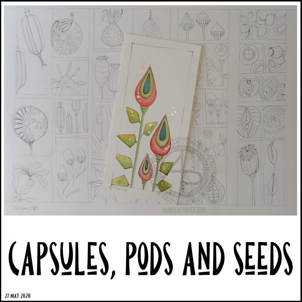
I finished off the watercolour of some seed capsules.
I’m really, really happy with this watercolour illustration, with an unusual color palette for me. I smile when I look at it! I decided to use a 0.5mm HB pencil to add heavier lines to the more shadowed parts, as well as a little bit of subtle line to help give the pods some volume. It’s difficult to see on the image.
I am so happy I drew a ‘window’ on the paper to draw within. I’m never happy drawing without a frame to keep within and the edge of the paper just never feels right for me. I also like the way that it feels like you’re looking through a window and that it’s OK to cut things off (apart from one cheeky leaf that I just had to have overlying the frame!).
There may be a bit too much white space above the seed capsules, I don’t know for sure. It’s so unusual for me to leave space around the various elements in a design that it feels a bit weird. However, I do like the space in this illustration.
Once I finished the watercolour, I turned my attention to drawing more capsules, pods and seeds in my A4 sketchbook. I completed two pages of small drawings, one of which you can see in the background.
Unusually for me, I drew in pencil. I’d usually use pen straight away. I have no idea what that is about, but it was a pleasant and soothing experience for me. I now have plenty of sketches I can use to create more watercolour paintings from, small ones as I really enjoy working on a small scale. Creating my own little treasures, complete with some precious, metallic details.
Painting little treasures will have to wait though. My eyelids are becoming leaden with a need to sleep. This frustrates me as I had things I wanted to get done today, things that need focus and concentration. So, I’ll soon be back in the land of nod.
Distress Inks in Bundled Sage, Weathered Wood and Stormy Sky.
Distress Oxide Inks in Iced Spruce and Peeled paint.
Small paint brushes – I used a 0 for the details and a 4 for the circles.
Mini foam blending tool.
A spray bottle containing a mixture of gold Perfect Pearls and water.
Tim Holtz’s Distress Micro Glaze and a dedicated foam blending pad. (or just your fingers!).
A glass pen or other fine nib dip pen.
Gold and Silver inks from J Herbin
White Sakura Glaze pen.
Gold glitter Uniball Signo Pen.
Light grey 05 Unipin pen by Uniball.
Glue or strong tape to adhere the card layers (I used Tombow Mono glue)
Method:
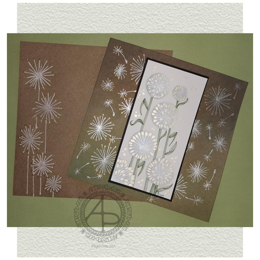
I started with a 2.5″ x 5″ piece of watercolour paper and a brush. I used water to draw circles where I wanted the dandelion heads to be. I then used the brush to add Stormy Skies and Weathered Wood Distress Inks into the water, letting it spread as it liked. To ensure I had a darker area of the seedhead, I dropped the watered-down inks to the bottom and left of the circles.
While the circles were drying, I worked on the card base. I applied Peeled Paint and Iced Spruce Distress Oxide Inks with a mini foam blending tool. Then, I sprayed the card with a mixture of gold Perfect Pearls and water and let it dry. Finally, I used Tim Holtz’s Micro Glaze to seal in the Distress Oxides – they react all too quickly with the sweat in fingers.
By the time I’d set the card base aside to dry I could return to the dandelion seed heads. I used a fine paintbrush, and some Titanium Iridescent Watercolour paint from Cosmic Shimmer to add the stems of the seeds. Once they had dried, I added dots of Enchanted Gold Iridescent Watercolour paint to the stems and set the panel aside to dry.
I wanted to add some dandelion heads and seeds to the card base. I used a glass pen along with silver and gold inks from J Herbin. I didn’t think these would adhere to the micro glaze treated surface, but they did. On a darker background, I could really see how these inks look like liquid metals as they flow onto the paper. They didn’t dull as they dried, thanks to the micro glaze acting as a barrier to the Distress Oxide ink.
Next, I wanted to add the stems and leaves to the dandelions on the watercolour paper panel. I used some Bundled Sage, Weathered Wood and Stormy Skies Distress inks for this. I pressed them onto a sheet of plastic, diluted and mixed them with water and a brush and then used the mixture to add the stems and leaves. I started with a lighter colour wash, adding darker colours to the left of the stem and also under the dandelion heads to add some dimension.
Once I was reasonably happy with the stems, I worked on the leaves. Again, I started with a pale-coloured wash to get the shape of the leaves in place. Then I gradually added darker tones to give a sense of dimension.
When I’d finished this, I looked at the panel, and I wasn’t happy with the stems and leaves. They looked unfinished. So, I dug out a light grey Uniball Unipin pen and proceded to outline the stems and leaves. This improved matters greatly to my mind. I like the way the stems and leaves are now defined and how they contrast nicely with the airy, ephemeral feel of the seedheads.
I then set about adding some dots of the gold watercolour around the arrangement of dandelion seedheads, added my symbol and year, and that completed the top panel.
I cut a piece of black card that was approx. 5.25″ x 2.75″ and adhered the top panel to it. I then adhered these layers to the card base.
My last task was to decorate the envelope. I used a white Sakura Glaze pen to draw some dandelion seedheads. When the Glaze pen lines had dried, I used a gold glitter Uniball Signo gel pen to add dots.
My reflections.
I started with a 2.5″ x 5″ piece of watercolour paper and a brush. I used water to draw circles where I wanted the dandelion heads to be. I then used the brush to add Stormy Skies and Weathered Wood Distress Inks into the water, letting it spread as it liked. To ensure I had a darker area of the seedhead, I dropped the watered-down inks to the bottom and left of the circles.
While the circles were drying, I worked on the card base. I applied Peeled Paint and Iced Spruce Distress Oxide Inks with a mini foam blending tool. Then, I sprayed the card with a mixture of gold Perfect Pearls and water and let it dry. Finally, I used Tim Holtz’s Micro Glaze to seal in the Distress Oxides – they react all too quickly with the sweat in fingers.
By the time I’d set the card base aside to dry I could return to the dandelion seed heads. I used a fine paintbrush, and some Titanium Iridescent Watercolour paint from Cosmic Shimmer to add the stems of the seeds. Once they had dried, I added dots of Enchanted Gold Iridescent Watercolour paint to the stems and set the panel aside to dry.
I wanted to add some dandelion heads and seeds to the card base. I used a glass pen along with silver and gold inks from J Herbin. I didn’t think these would adhere to the micro glaze treated surface, but they did. On a darker background, I could really see how these inks look like liquid metals as they flow onto the paper. They didn’t dull as they dried, thanks to the micro glaze acting as a barrier to the Distress Oxide ink.
Next, I wanted to add the stems and leaves to the dandelions on the watercolour paper panel. I used some Bundled Sage, Weathered Wood and Stormy Skies Distress inks for this. I pressed them onto a sheet of plastic, diluted and mixed them with water and a brush and then used the mixture to add the stems and leaves. I started with a lighter colour wash, adding darker colours to the left of the stem and also under the dandelion heads to add some dimension.
Once I was reasonably happy with the stems, I worked on the leaves. Again, I started with a pale-coloured wash to get the shape of the leaves in place. Then I gradually added darker tones to give a sense of dimension.
When I’d finished this, I looked at the panel, and I wasn’t happy with the stems and leaves. They looked unfinished. So, I dug out a light grey Uniball Unipin pen and proceded to outline the stems and leaves. This improved matters greatly to my mind. I like the way the stems and leaves are now defined and how they contrast nicely with the airy, ephemeral feel of the seedheads.
I then set about adding some dots of the gold watercolour around the arrangement of dandelion seedheads, added my symbol and year, and that completed the top panel.
I cut a piece of black card that was approx. 5.25″ x 2.75″ and adhered the top panel to it. I then adhered these layers to the card base.
My last task was to decorate the envelope. I used a white Sakura Glaze pen to draw some dandelion seedheads. When the Glaze pen lines had dried, I used a gold glitter Uniball Signo gel pen to add dots.
Reflections on this project.
When I started, I only had a rough idea of what I’d like to do. I knew I wanted to use watercolour media and stylised dandelion heads.
At first, I tried to make the circles for the seed heads by using a Tombow Dual Brush pen to draw the outer circle. Then, I used water and a brush to get the ink to bleed into the circle.
The result wasn’t pretty.
So, I regrouped and tried Distress Inks and water, and I was much happier with the result, and the card grew from there.
I’m pleased that I ran with a more stylised dandelion head than I’d initially considered. One of my artistic strengths is my ability to create stylised motifs. I certainly think I managed to do that with the dandelion heads and their leaves, especially as watercolour media is not a strength of mine.
I’m also glad I used the iridescent paints to add the details. That makes my inner raven very happy. The use of metallic inks on the card base increased the happiness of the raven even further!
I was about to give up on the card when I’d added the stems and leaves with just Distress Inks; I wasn’t happy with them. However, trying the grey line made all the difference in the world. The dandelions went from almost being consigned to the waste bin to being good enough.
I’m now happy with the card and the envelope; it’s something I’ll try again in the future, maybe. After all, I do have a few more watercolour paper panels that need to be used!
So, Angela, how are you today?
Yesterday, I had EMDR therapy. The session was quite painful, physically, and a bit distressing emotionally. I felt content and optimistic going to the appointment, and I left feeling pretty much the same. However, I suddenly became exhausted when I was half-way home. And I do mean exhausted. I felt my eyes trying to cross and close.
I made it safely home and, after having a little something to eat, I collapsed into bed and slept until early evening.
I was still really tired when I woke, but a random chancing upon crochet patterns for hyperbolic surfaces and ammonites kept me up for a while. Indeed, I lost myself in crocheting hyperbolic forms.
This morning I woke feeling content and optimistic and cheerful. The sun was shining, which always helps my mood for sure.
Even though I was feeling sunny inside, I wanted to spend time on a little project or two today. I didn’t want to push myself after what turned out to be a gruelling EMDR session yesterday. So, that’s why I threw myself into creating this little card.
Now, it’s nearly 7 pm here in the UK, and I’m bone-tired once again. I’ll spend the evening either creating another card or crocheting. Either way, it’s self-care time.
I’ve spent much of the day working on this, and it’s been a pleasure to create as it has combined many of my favourite techniques.
First, I coloured the background with Distress Inks, starting at the centre with a pale pink, follwed by a pale blue, a sea green and finally a blue with a hint of green around the edge.
A light spray of water and a dry and the sheet was ready to have the black line design drawn on it, once I’d put a pencil grid down.
Next, the colours in the various sections were intensified using Zig Clean Colour Real Brush Markers from Kuretake, along with a brush and water to fade the colours out.
Finally, all the dots were addded using pearlescent/iridescent watercolour paints.
I’ve smudged some dots, others insisted in running into each other, but I’m fairly pleased with the outcome. As I’ve already said, I really enjoyed doing this one.
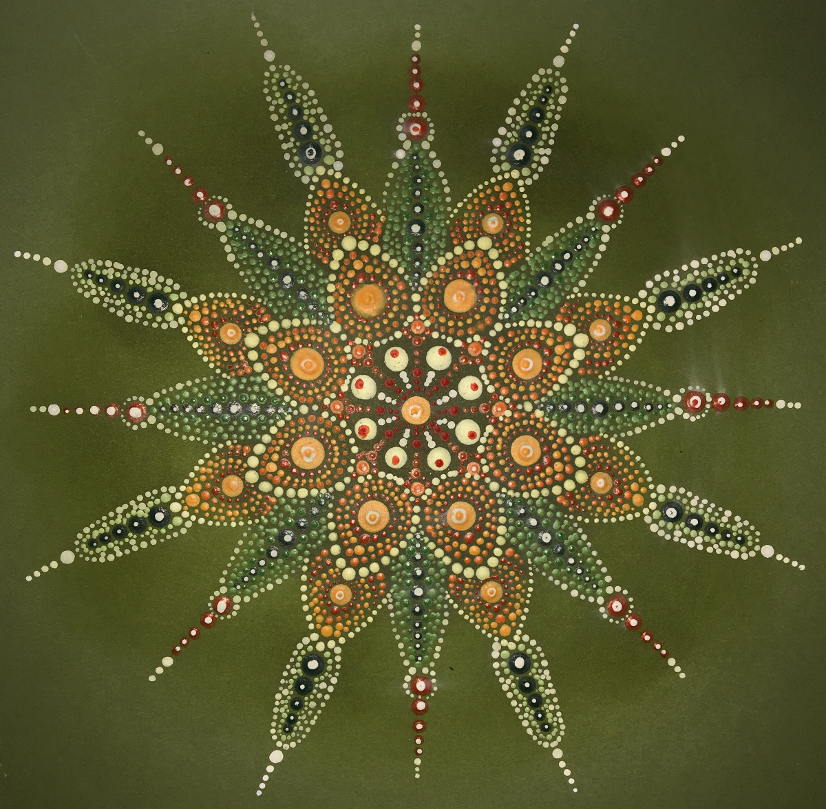
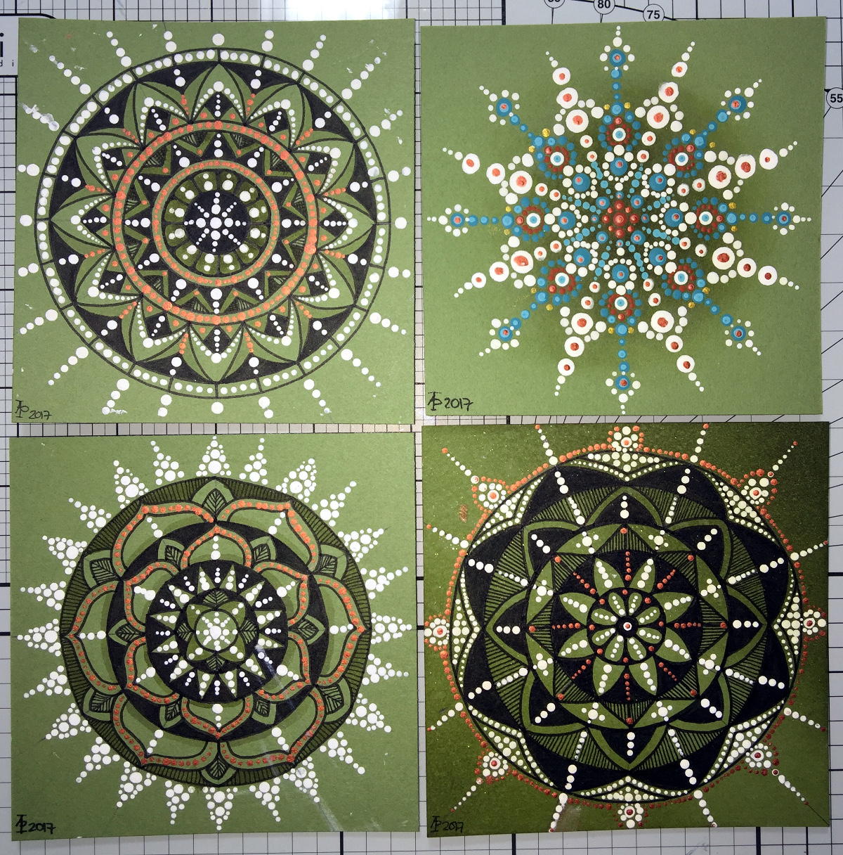
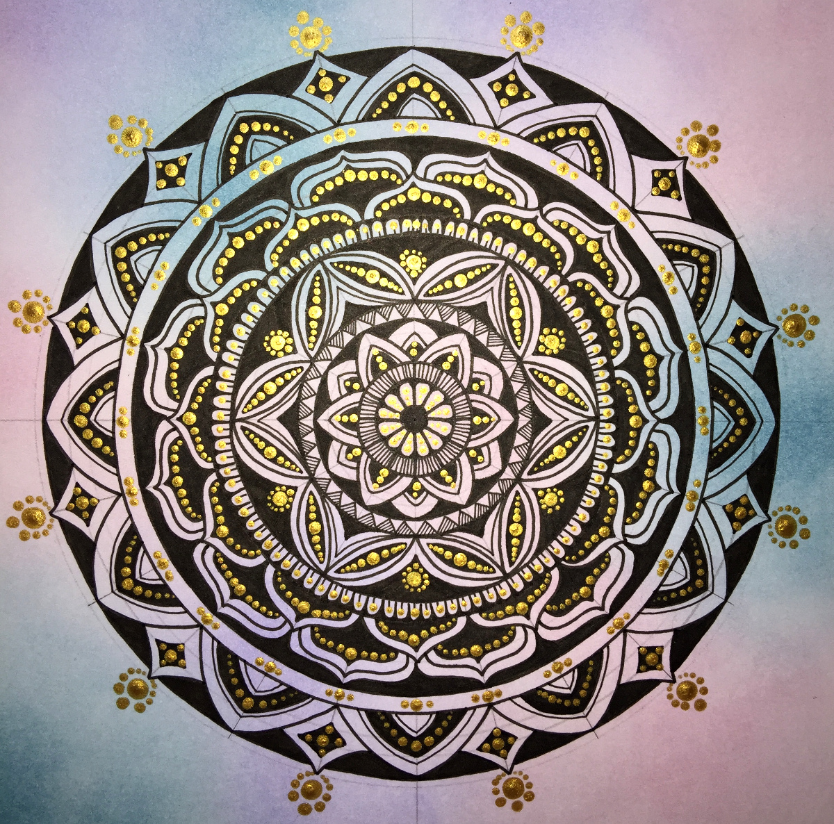
Over the last couple or three days I’ve been playing with mandalas and dots, just purely for fun!
To create the mandala above, I used shimmery, iridescent watercolour paints on black card. The photo really doesn’t capture the shimmery loveliness of the mandala. The mandala measures approx. 8″ x 8″.
This next mandala, again 8″ x 8″, was made using acrylic paints with green card as the substrate. Once I thought the paints were dry, I tried adding some distress inks so that there were shades of green in the background. However, not all of the dots were completely dry and some smeared. Also, the ink coloured the white dots. So, the lesson is to add the shading before doing the dotting!
These four small mandalas (approx. 4″x4″) I added shading using a damp paintbrush and Distress ink. I thought I’d try drawing the design in ink in three of them then adding dots in white and copper to add more/different patterns as well a some shininess.
Oh, the mandala with the teal and red-brown dots had distress ink sponged in the centre. The white acrylic paint wasn’t stained by the ink. These dots had a lot longer to dry than the previous mandala.
For this mandala (approx 8″ x 8″) I first applied some distress inks to white watercolour paper Then I drew the mandala in black ink. Finally, I added dots with gold acrylic paint. You can still see the pencil construction lines as I want to give the gold paint plenty of time to dry before trying to erase the lines.
This final mandala, approx 6″ x 6″, was drawn using black ink on pink card. Once the drawing was complete, distress inks were applied to give different shades of pink/purple. Then dot patterns were applied using white acrylic paint and iridescent watercolour paints.
This is most definitely a work in progress, and my first piece of raven art. I have an affinity with and a love of ravens, as well as the rest of the corvids.
My time with art has been very limited simply because being back at teaching is exhausting me. I do my best to find time to do art, but I often just fall asleep in the evenings because my brain is so tired from focusing and monitoring all day. The weekends seem to be vanishing in long periods of sleep too.
It’s been a long half-term at school; eight weeks to be precise. In that time there’s been two training days, a twilight training session. a memorial walk to raise money for school funds and the Senghenydd Mining Disaster Memorial, almost daily incidents of poor behaviour/attitude to deal with, lessons observations, book reviews (as in how well and regularly work is being marked), a consultation with my union representative, a stress-meltdown and hopefully the end of three year period of what feels like persecution/bullying in a particular situation at work (culminating in the union consultation and the stress meltdown).
I still have a pupil to be dealt with who has been making threats to physically attack me because I apparently ‘start on him’ by asking him to do his work. How shocking is that, that I should request he stop shouting around the class, distracting others and to do his work?
Oh the joys of being a teacher.
Having said that, there are joys. The shared smiles and laughter with pupils enjoying the lessons. The ones whose faces light up when they see me and who never exhibit poor behaviour in my class, even though they may do in other lessons), the shared laughter with colleagues, morning breakfast with ‘the girls’, the helpfulness of the lab tech, the enthusiasm and questioning of pupils because they are interested in something, their kindness and thoughtfulness. And so much more that it’s a shame it can become dominated by the negative things that occur and dominate my ruminating, over-analysing, over-thinking brain.
It’s been really busy for me with having to prepare work for a new course I’m running with my special needs classes, as well as teaching mainstream classes that I’ve not done for years. It’s meant late nights at work and even bringing work home – something I avoid doing as I do not want to go down the route of being a workaholic as I was in the first decade or so of my teaching career.
This busy-ness has really eaten into my creative time. Little art has been done, and I’m am doing my best to settle back into it in this half-term, especially as I have two contracts to create artwork for two books, though I have been waiting for direction for what the artwork is to be for a long while now.
I’ve barely stopped in the first four day so of the half-term. I seem to be running away from time with myself. I can struggle with being alone, feeling lonely and end up keeping moving, moving, moving to avoid it. Today I am remaining at home and trying to get things out of the way so that I will settle to some arty pursuits, or de-stressing after the last half-term.
I do seem to be a lot more resilient than I was a year ago. Though things can get to me (such as loneliness, lack of a sense of belonging, the constant worry I’m doing things wrong that have precipitated the situation at work that led to a stress-meltdown), I often find there’s a content ‘centre’ in me that I can access when I do things of a creative nature or things that focus my mind away from it’s rumination and negative thinking. It’s a little easier to spot when this is happening, though I don’t always catch it in time to stop the tears, the self-loathing and the comfort eating.
I rejoined a choir I’ve been a member of since I was in school myself. Sadly, I had to leave again once the stress levels rose as my voice was, and still is, affected by the stress.
Out of all of this, and at odd times during the last couple of months, I have managed to do some arty things. Here’s two mandalas of mine.
I’ve been a little busy with some monograms. They’re either 7.5cm x 12cm or 10cm x 10cm in size. The rectangular ones are on watercolour paper, the square on bristol board.
This design started with the kind of infinity loop towards the top left. The loops coming from it eventually were seen as a letter ‘B’ and the word believe seemed to be the right one to put on this. Everything else grew, quite literally in some cases, from this point.
There are golden stars to wish upon and golden seeds and flowers and growth and sun and rain … and hope.
Approx. 6″ x 8″. The black lines were worked using Uni-Ball UniPin pens. Colour was applied using watercolours and gold watercolour paint. The paper is heavyweight cartridge.
As always, I am the owner of this creation and it may not be used, shared, distributed or altered in any kind of way without permission from me. Thank you.