Template Thursday

It’s #TemplateThursday when I create and post a colouring template to the Angela Porter’s Coloring Book Fans facebook group. The template is free to members, though there are a few terms and conditions associated with it’s use. It’s also free to join the group!

This week, I decided to draw some cute and whimsical bugs, each having their very own portrait. Lots of small, individual pictures that a perfect for quick, mindful colouring.

I know I often get overwhelmed by a huge artwork I’m working on and that is most likely to happen when I’m experiencing a lot of anxiety, and I seem to have waves of anxiety the like I haven’t seen for a long time, most related to the pandemic.

When I need to take time out, to do art that will soothe me, calm me, let me relax and find that mindful, content space within myself, I turn to creating small artworks.

I drew this template with a Faber-Castell Pitt Artist pen on ClaireFontaine dot grid paper. Colouring has been done digitally in Autodesk Sketchbook Pro.

Template Thursday

Template Thursday – 23 April 2020 ©Angela Porter | Artwyrd.com

Another week in lock-down has gone by. Thursday has arrived again and that means a new coloring template for members of the Angela Porter’s Coloring Book Fans facebook group.

Floral designs, an entangled garden was my fancy this morning and this is the result, not fully coloured though.

Coloring is a great way to find some calm and peace during troubled times, such as the times we find ourselves in. Scientific studies have shown it has a similar effect on the brain as meditation.

I have a number of templates available for free in the facebook group, including this one.

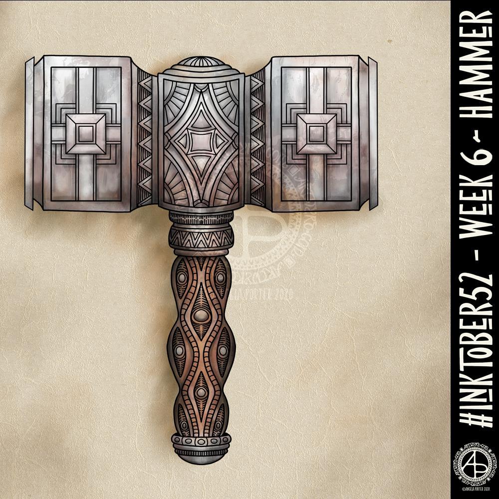
#Inktober52 – Week 6

#Inktober52 – Week 6 – Hammer ©Angela Porter | Artwyrd.com

I’ve never drawn a hammer before, of any kind. I thought I’d have a go though and try my hand at a fantasy style, possibly dwarfish one.

Not only was designing one a problem for me, adding colour, dimension and texture were some other problems.

I think I’ve left areas a bit bare of line and pattern. Others I could’ve done a better job of creating highlights and shadows. However, overall I’m ok with this, especially as it’s not something I’d usually draw.

Next week’s prompt is ‘dinner’. Sheesh…

I made use of various tools in Autodesk Sketchbook Pro to help me design the hammer, some of the them tools I’ve not used before.

I did consider making a drawing of the hammer from a different angle, but this one has taken me so long that I now need to do some other stuff today.

Inktober 2019 – Day 31

Inktober 2019 Day 31 ©Angela Porter | Artwyrd.com

Happy Hallowe’en to you all and here is my last skully Inktober drawing for 2019.

The skull prompt was ‘duck’, so I just had to draw a duck-billed dinosaur (hadrosaur) skull! I’ve always had a love of dinosaurs and prehistoric critters, so it’s fab I can include one of their skulls.

I wanted to do a woodcut style skull drawing, but I wanted to use white ink as well as black. So, I used some digital craft paper to draw on. I think it’s worked out well, though some areas of highlights look a bit too geometric. I’ve also just realised that I didn’t add highlights/shadows to the teeth. Oh well.

The mushroom prompt was, quite appropriately, Rubroboletus satanus, and you can see outline drawings of the mushroom in the mandala.

The tangle pattern for today was Florz, and that forms the tiled floor pattern.

When I’d completed the mandala on the same kraft paper as the skulls, I realised that I needed a lighter background, so I just added a different kraft paper to the background.

Reflecting on Inktober

I’ve enjoyed Inktober this year for sure. Picking prompt lists that appealed to me helped a lot. I did start off trying out different ways of approaching drawing skulls and the like. However, I settled on combining the skull illustrations with a mandala. I’ve also discovered a great fondness for woodcut-style drawings.

I now need to work out what to do with my Inktober artworks. Some of them will become available as tee-shirts and other products in the days and weeks ahead; I do want to tweak some of them first.

I’m feeling a bit sad at it being over. Having a ‘brief’ to work to certainly helps to focus my sparkly, grasshoppery mind and takes me out of my ‘comfort zone’ (I absolutely hate that phrase!). I’ve certainly found a passion for skulls; so many more to draw, so many different angles too.

It’s the focus that has been the most helpful. This is something I need to sort out, I think. I do have themes for the colouring books I do, but I think I could do with a theme (or series of themes that repeat over a week) that will help focus my creativity outside of the book.

Inktober has taken over my creativity this month. However, I think I needed that to freshen me up.

So, I shall look forward to Inktober 2020, while doing my best to put into practice some of the things I’ve learned from this year’s challenge.

So, Angela, how are you feeling today?

I’m OK today, a bit tired and the grey, gloomy, damp weather isn’t helping much. I have used my light therapy lamp this morning; that did lift my mood somewhat, to be fair.

Yesterday was the toughest day, emotionally, I’ve had for a while. I was really feeling rather low. It had been coming, however, for over a week. I’m not entirely over it; I’m still feeling emotionally vulnerable and fragile today, but nowhere near as bad as I felt yesterday.

I do know what has caused the stormy weather; being aware of such things shows I’ve come a long way from the start of therapy for CPTSD. I also know that these storms don’t last forever, and that self-care and self-soothing is needed.

That will be the order of the day today. I do have an errand or two to run as soon as I post Inktober, and I do have something happening this evening. However, the rest of the day will be self-care, starting with making a hot, nutritious meal from scratch. I’m tending towards a veggie bolognaise, the leftovers of which can be turned into a veggie chilli for tomorrow.

So, I’d better get this social media stuff done and get on with my day!

Work in progress

©Angela Porter 2019 - Artwyrd.com
©Angela Porter 2019 – Artwyrd.com

As well as working on templates for my latest book, I like to have some personal artwork on the go.

These two are the current works in progress. The dragon is partly through having the patterns added to it. I’m not sure about the circular fill pattern yet, hence the break from it. I also wanted to include some dangles, especially as his front paws seemed to be quite the right shape/posture to be holding the threads of the dangles betwixt the talons. As this is a digital drawing (I did start with a sketch on paper with pencil which I scanned in), it’s easy enough to edit and alter. Microsoft Surface Pen, Microsoft Surface Studio and Autodesk Sketchbook Pro were my tools for the dragon.

The other has all the linework finished. Like the dragon, I’ve added a ready-made background I purchased from Creative Market ahead of me adding colour, in this case it will be primarily blue. The symbol is a Zibu symbol that represents release. Again this is something that ties in with my EMDR journey. Part EMDR is about processing and releasing past trauma. Of course, the symbol does look like a fancy ‘h’ or maybe a capital ‘L’. This was drawn on bristol board with Sakura Pigma Micron pens; it’s postcard sized.

Yesterday was a funny day for me. I thought I had a meeting in the morning only to discover that I was two weeks early! That’ll teach me to read my emails properly rather than assuming the meeting would be, as it has been, on the first Saturday of the month. I then had an event in the late afternoon to attend and I didn’t get home from that to nigh on 8pm and I was absolutely shattered, so just needed some quiet time.

The weather has changed here in the UK, as is it’s wont. Wild, windy and wet over night and it’s still wet today. I’m not sure if it’s the weather, me being tired, it being the eve of therapy, or any possible combination that has mee feeling a tad low and flat today. I’m happy to stay inside today in the warm and dry, taking my time over doing things.

I do have some templates for the latest book sketched out, but not sure I want to ink them in at the moment.

Another mug of mocha is needed I think…before I decide what to do.

Merry and Bright

©Angela Porter 2018

A Christmas Greeting

Wishing everyone who visits this little space on the interwebs all the very best blessings and wishes of the season.

I also wish to thank you for visiting, for sharing my posts.

However you spend this day, whether with friends, family, at work, or by yourself, I wish you well and the best.

About this image

I woke early-ish this morning and had an idea that involved creating this mandala/wreath design, so I had to do it!

Unusually, I drew the motifs in colour! Yup. No black line, just colour.

They’re all very simple with simple colour gradations. The black lines were created by removing colour so the dark background would show through.

I think the outer ring of leaves could be a little lighter, but then it does give a sense of the outer ring bending away, with the hearts and mistletoe on the high point of the ‘wreath’.

Adding texture to the design helped to scuff up the perfection of the colours.

I really enjoyed doing this, as simple as it is.

I am really grateful that I used an insulated mug for my gingerbread mocha latte this morning – I forgot all about it for over 3 hours, so engrossed in my art as I was, and it’s now just the perfect temperature for drinking!

My tools were Microsoft Surface Pen, Microsoft Surface Studio and Autodesk Sketchbook Pro. Yes, this is a digital piece of art.

The rest of the day I intend to spend in arty/creative pursuits, including finishing off my knitted cuddly triceratops (yes, I know yesterday I incorrectly said it was a stegosaurus).

Snowflake Mandala – WIP

This one is very much a work in progress. Drawn using a Microsoft Surface Pen on the screen of a Microsoft Surface Studio, I made good use of the symmetry tools in Autodesk Sketchbook Pro.

When ice crystals form they have a symmetry based on hexagonal shapes, so my mandala is separated into 12 sections, though I’m choosing to bring out the six-pointed patterns in different colour schemes.

I’m not sure if that makes sense – I know what I mean!

Of course, there’s only so much pointy-ness I can have in anything I draw, so curves have to make an appearance. And this is very much apparent in the fine detailed patterns within each section. Here I’ve used simple line patterns to more complex pattern fills using spirals and swirls. I’ve played around with adding a drop shadow and a highlight to these patterns to add a sense of dimension, not that it’s easy to see in a low-resolution image for the web.

I do like my colour choices of cool purples, blues and aquas so far. I think I’ll go with a more blue-purple to complement the purple in the design so far.

I do have an idea or two as to what I can do about the black lines as well, though they may not work out. As I’ve said often before, I do like black lines in my art; I like the way they define spaces and patterns and often give that feel of ‘stained glass’ to my work. However, sometimes I think they look a tad childish too, but that’s mostly on days where I doubt myself an awful lot, rather than the usual little to a lot.

The design isn’t quite as open as perhaps a snowflake is considered to be, but I rather like filling spaces in, though I may leave some of these spaces open so the background, when I add one, can shine through. That means I may end up erasing some of the colour I’ve added already to created a more open feel to the design.

It’s a lovely way to spend a Sunday morning, especially now I’ve finished downloading all the Amazon invoiced for the last financial year in preparation to getting my accounts to my lovely accountant, Leah.

B is for … a dangle design

Angela Porter 7 Nov 2018 B is for

B is for birthday balloons, birthday cupcakes, birthday gifts…baking … beads …beautiful cats, beautiful flowers…bullet journal (BuJo)…

It’s Friday and it’s taken me a couple or three days to get this monogram dangle design finished, mainly because yesterday was another jolly jaunty day with Liz (more of that on my other blog – Curious Stops and Tea Shops – when I get to write it, that is).

Today’s dangle design features some cute kitties, as is the theme of my current series of monogram dangle designs.

I started by sketching out my ideas in pencil on dot grid paper then scanning it into Autodesk Sketchbook Pro. The next step was digitally inking in and adjusting the design. Finally, colour and texture was added to the design before adding my watermarks. My digital tools were my trusty Microsoft Surface Pen and Microsoft Surface Studio.

I like the design, not so sure about the colour choices though. I also got a bit heavy handed with the added textures in some places.

After I’ve got my other tasks done today, I think I may print this design out and colour it with my Chameleon markers and see the difference. It looks like we’re going to have some heavy rain and some strong winds here today, so cwtching up indoors with some nice arty stuff to do could be the way to spend some of the day.

Friday means it’s #dangleday. My tutorial book about designing dangles, called ‘A Dangle A Day’ is available to preorder. In it I take you step by step through simple hand lettering, monogram dangle designs, and other kinds of dangle designs, showing how you too can draw and design your own. There’s lots and lots of examples in the book as well as suggestions of how to use them as greeting cards, notecards, bookmarks and framed pictures, as well as in BuJos, planners, diaries, scrapbooks…how to use them is limited only by your creativity!


Second version of my BuJo Monthly Cover page for November

Angela Porter November Bujo 2018 v2

Ah! That’s better!

I wasn’t happy with my first version, so I thought I’d use it as a start to create a digital version of my November BuJo page.

Done with the magic of my Microsoft Surface Pen and Studio and Autodesk Sketchbook Pro.

The only place I made use of gradient fills were the hearts, the rest was coloured as if I was using marker pens, with the use of a blending tool.

A couple of simple dangles add some interest to the space below the wreath of poppies, foliage and berries.

I kept the colour scheme really simple to the reds, greens and dark greys so that the design is much more cohesive. The use of a texture brush makes the colouring a little less perfect, as it does on the background too.

I also added a drop shadow to give the illusion that the design is floating a little bit above the page.

My current thoughts on BuJo-ing

My current BuJo is a very minimalist one, though I enjoy designing pages like this. I found I was spending more time on my BuJo in terms of prettying it up rather than using it in a functional way. I do add dangles to the daily logs, when I feel the urge to.

This means I’m making far more use of my BuJo than I was when it was just an artistic/creative endeavour.

Not that there is anything wrong in that. It’s just that I wanted to immerse myself in bullet journaling in a way that it could help me with memories, thoughts, tasks and so on, in a way that I wasn’t doing previously.

And, not worrying if it’s not perfectly written/drawn/recorded is quite liberating actually! It takes a lot of pressure off BuJo-ing.

If I’d thought about it, I could’ve left a page blank at the start of the November logs for a pretty page like this. However, everything is getting rather more mixed up in my BuJo than when it was in my first versions of BuJos, and that makes me feel it’s working more for me as a record of my life, as well as planning a little more, though I don’t over-work that. Keeping track of ideas and notes and events is far more important to me, a more reflective kind of BuJo.

What I love about the BuJo system is it evolves as you need it to. You’re not limited by someone else’s structure, such as in a planner or diary. As your needs for it change, it changes.

Now, that doesn’t mean I don’t make use of colour. Of course I do! That helps in the index to pick out different kinds of contents and helps me separate tasks from events from notes – the symbols are great, but colour really helps me see them. That is a personal preference.

Collections, as always, are really important, and after reading a fair amount of Ryder Carroll’s book on the Bullet Journal Method the idea of threading and indexing back to earlier BuJos actually makes sense to me and seems to be a really valuable thing for me to do as I move forward with this.

As I’m typing away my mind is working on how I could work pretty pages into my working BuJo. I don’t think it’s working pages I need, more like book marks or maybe a postcard or a print out of my design I can use as a book mark …

Oh, the one thing I do pretty up a little bit are my monthly logs, with a pretty border next to the name of the month and year. At present they’re just black and white linework and I rather like the graphic nature of them.

What’s surprised me is how I’ve gone with this more minimal way of doing it. I mean, I love to see how people organise their BuJos ahead of time and so on and the beautiful things they create and there is absolutely nothing wrong with this and if it’s someone’s way to express themselves and/or be creative then I’m definitely all for it!

However, for me I’ve found that setting my daily logs up ahead of time can be a problem as some days I need a LOT more space than I’ve allowed for, and I do like to to make notes in the daily log.

What I have to do is work out if I’m going to do more than the monthly cover and monthly logs for my BuJo or whether I’m still going to come up with ideas for the weekly/daily logs or trackers and collections just for fun.

I don’t know the answer to that rhetorical question at the moment. It will work itself out over time I’m sure.

I have wondered about making some of my monthly cover designs and others available as digital downloads so people can print and add them to their BuJo’s, or use as greetings cards or note cards or or or … leave me a comment with your ideas!

Work in Progress Wednesday

Angela Porter 9 September 2019 02 coloured small1

This was drawn on paper with Sakura Pigma Micron pens, scanned in and is in the process of being digitally coloured in Autodesk Sketchbook Pro. I’m using my Surface Studio and a Surface Pen, both from Microsoft.

The background may go a little darker on this one, but I’ll decide on that when I’ve completed colouring the design elements in.

It’s also work in progress Wednesday over on the Angela Porter’s Coloring Book Fans facebook group. We’d love to see your colouring works in progress of pages from my coloring books. Why  not pop along and join in? You’d be very welcome there.