Practice, practice, practice!

I did spend some time working on a second typographic portrait of Aneurin Bevan yesterday, using a photographic reference that had more detail in it in terms of grey scale.

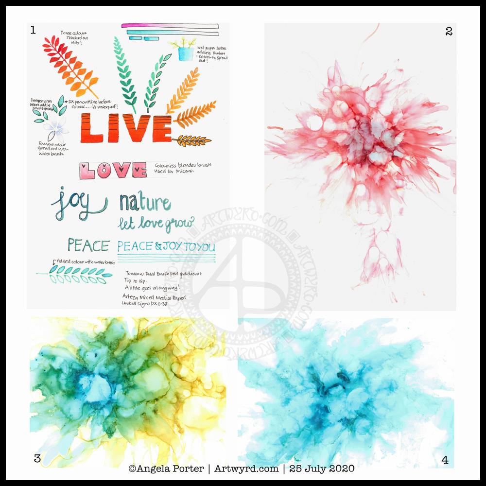
Before bed, I wanted to relax with some colour (1). For some reason, I pulled out my set of Tombow Dual Brush pens and tried working with them on an A5 piece of Arteza mixed media paper. Hand lettering with gradients, with and without black outlines resulted, and then I wanted to try drawing with colour gradients.

To create gradients, I held the tip of one pen on top of the tip of the other. I then used the lower pen to draw or write with. I used the bullet nib for the lower examples. I used the brush nib for the larger lettering and also the leaves and flowers and so on.

I made some notes as I went, to remind me what I did and what I liked about them. I used a Uniball Signo DX 0.38 pen to do this, which is also waterproof. So, I used it to add lines.

This morning, I wanted to start my arty day experimenting with alcohol inks, once again (2, 3 and 4). All because I’d watched a YouTube videos where people use a straw to blow the ink and alcohol blending solution/rubbing alcohol/isopropyl alcohol/propan-2-ol around the yupo paper.

One helpful piece of advice I heard along the way was it’s best to use only a small amount of alcohol ink. Which is what I did. One drop to start with and then add more ink of the same or different colour(s) as needed.

It took me a while to work out not to blow as hard as I could, and to try different angles to hold the straw at, as well as moving the ink in different directions.

I’m much happier with the results this time, though the scans have bleached the colours out a little. I really must work out the best settings on my scanner so that this doesn’t happen.

Anyway, I need to find a way to seal the alcohol ink so I can draw on top of it without wrecking the pens. I also want to do some better scans so I can make use of these alcohol ink backgrounds in digital art.

Today I want to continue work on the typographic portrait. This second one seems to be building up more quickly than the first one. I think that’s all due to me becoming familiar with the process and accepting that my hand lettering based on my handwriting is good enough. I’m also working out my own ways to fit letters to curves and the shapes at the ends of the sections.

So, all of these activities – using waterbased media, hand lettering, hand drawn typography, and alcohol ink backgrounds all have one thing in common – practice, practice, practice!

B is for … a dangle design

Angela Porter 7 Nov 2018 B is for

B is for birthday balloons, birthday cupcakes, birthday gifts…baking … beads …beautiful cats, beautiful flowers…bullet journal (BuJo)…

It’s Friday and it’s taken me a couple or three days to get this monogram dangle design finished, mainly because yesterday was another jolly jaunty day with Liz (more of that on my other blog – Curious Stops and Tea Shops – when I get to write it, that is).

Today’s dangle design features some cute kitties, as is the theme of my current series of monogram dangle designs.

I started by sketching out my ideas in pencil on dot grid paper then scanning it into Autodesk Sketchbook Pro. The next step was digitally inking in and adjusting the design. Finally, colour and texture was added to the design before adding my watermarks. My digital tools were my trusty Microsoft Surface Pen and Microsoft Surface Studio.

I like the design, not so sure about the colour choices though. I also got a bit heavy handed with the added textures in some places.

After I’ve got my other tasks done today, I think I may print this design out and colour it with my Chameleon markers and see the difference. It looks like we’re going to have some heavy rain and some strong winds here today, so cwtching up indoors with some nice arty stuff to do could be the way to spend some of the day.

Friday means it’s #dangleday. My tutorial book about designing dangles, called ‘A Dangle A Day’ is available to preorder. In it I take you step by step through simple hand lettering, monogram dangle designs, and other kinds of dangle designs, showing how you too can draw and design your own. There’s lots and lots of examples in the book as well as suggestions of how to use them as greeting cards, notecards, bookmarks and framed pictures, as well as in BuJos, planners, diaries, scrapbooks…how to use them is limited only by your creativity!


Autumn mandala 6 November 2018

Angela Porter Mandala 4 Nov 2018

This has taken me a couple of days to complete, mainly because of appointments but also a big need for some self-care.

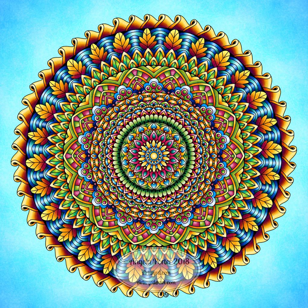
Autumn Mandala

I don’t get to create many mandalas at times. So, On Sunday, after creating the cute angel kitty dangle design, I put my creative energy into drawing and starting to colour a mandala.

I worked directly on my Surface Studio screen with the Surface pen using Autodesk Sketchbook Pro and it’s fab symmetry tool to outline the the design in black ink.

Next, I used a marker brush and a blender brush to colour the design.

It’s the colouring that takes a lot of time.

I wanted to keep the colour scheme fairly simple, so I chose some vibrant shades of blue, green, yellow, orange and red.

Finally, I added a beautiful blue background and texture to the finished artwork.

On the whole, I’m quite pleased with it. The bright colours have been needed today as it’s a rather grey and damp day here in the Valleys of South Wales. Someone has a bonfire burning on the hillside opposite my home and the smoke is floating down the valley. There’s a temperature inversion that’s trapping the smoke quite low.

Add to that all the smoke and particulates from the plethora of fireworks that have been set off in the past few days and the air is rather fuggy, hazy.

However, the golden hues of the autumn trees glow all the more brightly against the grey skies, especially with a dusting of rain on them.

What I absolutely love to see are the dark trunks and branches becoming more visible as the leaves fall from the trees. The architectural contrast fascinates me; it’s being able to clearly see the skeleton that gives the tree form.

I didn’t have autumn in my mind when I was drawing or coloring this mandala, even though autumn is my favourite season. However, the jewel tones and the gradual predominance of the autumnal golds, oranges and reds on the outside of the mandala give it that kind of autumnal feel. The greens gradually change from blue-greens to more yellow-greens from the centre out, adding to that sense of a seasonal progression.

The coloured mandala also has a feeling of stained glass. I love stained glass windows and this one would make a very interesting ‘rose’ window! That I adhere to using black lines to delineate my design only reinforces the suggestion of stained glass.

What I haven’t done is add detailed patterns to the mandala. I don’t think this one needs it, though the leaves may need a bit of shadow and highlight to make them feel less ‘flat’.

On the whole, I’m quite pleased with this one. I think I’ve manged to get enough contrast from dark to light in each section to give that sense of dimension – something else I like to incorporate into my artwork.

The need for self-care

I’ve been rather emotional over the past few days. The post about remembrance and my Dad tapped into some grief, a door that had never opened before I had to say goodbye to my beautiful white cat Cuffs back in May.

I took time out of things to watch some Harry Potter films. I do get emotional when I watch them (or read the books) even though I know what’s going to happen. However, this weekend I was more emotional than I’ve been before.

Yesterday, was EMDR therapy day, and various memories had cropped up and one we worked with yesterday. That left me absolutely pole-axed, emotionally that is.

Part of my mental health – the CPTSD – is that I avoid emotions and when I get emotional I have shoved it aside and locked the emotions in a box, symbolically. I also shove the memories away, something referred to as dissociation.

I have very few memories of my childhood, adolescence or even adulthood. That’s because many of them are painful in some way or another and they have been locked away.

Locking them away means I have never worked through, processed, them and the trauma or emotions that go with them. The trauma is still there and is still hurting my emotional and mental health.

EMDR is helping to unlock memories, sometimes very painful memories I don’t want to believe happened or believe certain  things about people. I always want to see the best and believe the best in people, except when it comes to myself; then, it’s always the worst possible.

I’ve been experiencing some cognitive dissonance and some very uncomfortable times as I try to come to terms with various realisations.

Add into the mix a busy week or so with appointments and events and I’m emotionally tired. Oh, not to mention the constant jumpiness with all the fireworks going off.

So, self-care is important. I watch films. Knit. Drink lots of tea. Snuggle up under a cosy throw. Nap if I need to. Eat healthily, when I can. Create art that I want to create rather than any that I feel I have to to meet a contract or some deadline or other, either real or self-imposed. Have some alone time – being an introvert beneath the face I present to the world I need alone time to recharge.

I know I’m on a jolly tomorrow with my pal Liz, so it’s even more important I recharge before that day out.

So, that’s why I’ve needed some self-care time.


Dangle Day Friday

Angela Porter September 2018 coloured

Friday is dangle day!

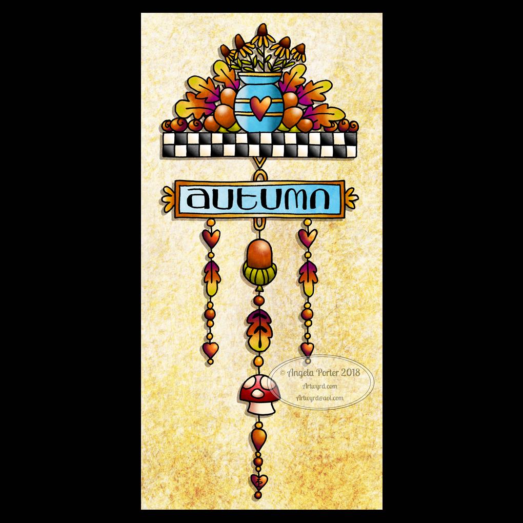
We’re a week into September and autumn is nearly here in the Northern hemisphere, so I thought my dangle design should be one for this season. I think this would be a lovely BuJo page to separate the autumn months. I also think it would make a pretty notecard or greetings card. The hand lettering could be changed for another sentiment and it would be suitable for an autumn celebration. Alternatively, it would look great framed and hung as part of a quartet of designs that cover the four seasons; now there’s a project for me to do!

I drew the design on squared paper using Sakura pigma micron pens.

Then, I scanned the image in, used GiMP to remove the squares and create a transparent background

Next, I used Autodesk Sketchbook Pro to colour the image, create the textured background and add a shadow to the design.

I’ve said it before, and I’ll say it again, I love autumn! I love the way the world changes in terms of colours over the space of a few weeks, and the colours can be absolutely glorious.

I don’t know how the long, very hot and dry summer in here in the UK will affect autumn this year.

If you would like to design some dangles and not quite sure how, then my upcoming book A Dangle A Day (available for pre-order) will lead you through the steps as well as giving you plenty of ideas for dangle design.

Friday freebie

Just a reminder that today is the last day for you to enter any of my giveaways, the prizes being signed copies of Eerily Entangled Art, my latest book in Dover’s Creative Haven series of coloring books.

See my previous blog post for details on how to enter.  I’ll be drawing the winners at random tomorrow evening, UK time.

Furbaby Friday

Over on the Angela Porter’s Coloring Book Fans facebook group, it’s furbaby friday.

Of course, it’s Furbaby Everyday over on the Happy Tails Animal Group facebook group.

Both groups would love to see your pictures of your furbabies, as would I.

Lazy daisy sunday

Angela Porter 24 June 2018 watermarked

I really am on a daisy-kick in my drawing lately! Such happy little flowers, resilient too.

I did do this drawing last Monday, but decided to post it today after I spent much of my morning colouring one of the templates for Entangled Butterflies (available to preorder).