#Inktober52 Weeks 8, 9 & 10

#Inktober 52 weeks 8, 9 & 10 ©Angela Porter | Artwyrd.com

Today, I thought I’d tackle the last three weeks of #Inktober52 in the form of a digital sketchbook page.

I took it as an opportunity to try out the new techniques I’ve been learning in Autodesk Sketchbook Pro, and a chance to try out different ways of using them.

One of the prompts was for ‘spider’. You can see the basic sketch I started with for one spider, and the main steps I took. I drew a cuter, face-on spider as well, trying out some other techniques.

I’m really pleased with the cute spider; I really had to figure out how to lose the line art I drew to begin with and I kind of ‘dissolved’ it into the colours.

For wave I ended up drawing some simple waves and colouring them in ‘flat’.

Elf was the most troublesome prompt. I don’t like to draw people, so did a couple of elf hats, and then I thought I’d write the word elf in different styles, including an elvish script, runes, Star Wars alphabets and some hand-lettering too. This turned out to be a good idea as I got to practice my digital hand lettering!

I would like to revisit the lettering and add shadows/highlights to the letters to help them look less ‘flat’. Maybe I’ll do that after I’ve done my ‘adulting’ that I need to get done today.

Just in case you’re interested, this sheet took me over five hours to complete. I used Autodesk Sketchbook Pro, Microsoft Surface Studio and Microsoft Surface Slim Pen.

#Inktober52 Week 7 – Dinner

#Inktober52 Week 7 – Dinner ©Angela Porter | Artwyrd.com

The art…

What else could I do for dinner other than have the etymology of the word along with a collage of just a few of my favourite foods! And I do mean only some.

I looked up the etymology of ‘dinner’ on Etymology Online, did a little bit of typography using Affinity Publisher.

I then drew the foods on Claire Fontaine dot grid paper using an 0.8 Uniball Unipin pen.

I scanned the drawing in and removed the dot grid and removed smudges and so on in Autodesk Sketchbook Pro.

My next step was to add a coloured background and some colour to some of the drawings. Only to some, as this was a ‘for fun’ project as part of the #Inktober52 challenge organised by Jake Parker, the founder of Inktober.

Missing in action…

It’s been a couple of days since my last blog. It seems that life and demands on me have taken over arty pursuits. And when I wasn’t seeing to the life demands, I was taking some time out by needlefelting.

I managed to needlefelt a cute rabbit and owl over the last two or three days. I’ll post pictures of them in another post.

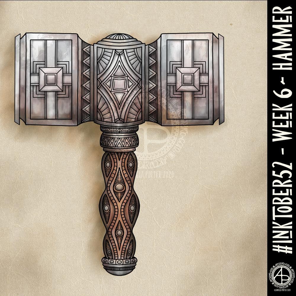
#Inktober52 – Week 6

#Inktober52 – Week 6 – Hammer ©Angela Porter | Artwyrd.com

I’ve never drawn a hammer before, of any kind. I thought I’d have a go though and try my hand at a fantasy style, possibly dwarfish one.

Not only was designing one a problem for me, adding colour, dimension and texture were some other problems.

I think I’ve left areas a bit bare of line and pattern. Others I could’ve done a better job of creating highlights and shadows. However, overall I’m ok with this, especially as it’s not something I’d usually draw.

Next week’s prompt is ‘dinner’. Sheesh…

I made use of various tools in Autodesk Sketchbook Pro to help me design the hammer, some of the them tools I’ve not used before.

I did consider making a drawing of the hammer from a different angle, but this one has taken me so long that I now need to do some other stuff today.

Inktober52 – Weeks 3, 4 and 5

Inktober52-Weeks 3, 4 & 5 © Angela Porter | Artwyrd.com

I managed to miss #Inktober52 weeks 3 and 4 so I thought I’d combine them into a sketchbook page along with week 5.

The prompts were
*week 3 – brick
*week 4 – snake, and
*week 5 – balloon.

I’ve not been imaginative with those prompts. I’ve included some sinuous snake borders and bricks. Some classic brick patterns. I’ve only added a smattering of balloons, and a repeating balloon pattern.

Of course, I’ve also practised my hand lettering.

I hand lettered and drew this page on ClaireFontaine dot grid paper and I used Uniball Unipin pens to do so.

I added the kraft paper background and colour digitally. It never ceases to amaze me that, as much as I love my line art, colour really brings it to life. I especially like the way the colours seem to glow against the kraft paper.

I’ve just had a giggle. I realised I coloured the balloon that is hanging down in leaden greys, almost like it’s filled with mercury. That was a totally unconscious decision of mine!

“Shadow” – Inktober52

“Shadow” #Inktober 52, week 2
Artwork © Angela Porter | Artwyrd.com

I finished this artwork off this morning, finding a perfect quote about shadow, this week’s prompt for #inktober52.

Border design drawn using Unipin pens on dot grid paper. Typography was done using Affinity Publisher. Colour, background and composition were achieved in Autodesk Sketchbook Pro using a Surface Pen and Surface Studio by Microsoft.

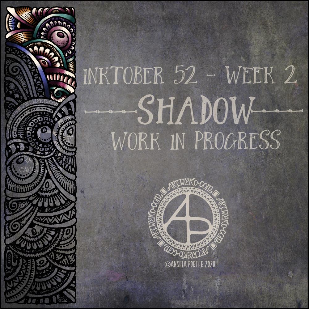
Inktober52 – “Shadow” – WIP

Inktober52 “Shadow” WIP ©Angela Porter | Artwyrd.com

I managed to get a fair bit of colouring done yesterday and this morning. It never ceases to amaze me how colour can add so much dimension to the design, particularly as I use quite high contrast. It’s possible to see the dimension in the line art, but colour really brings it out.

There are areas that look a little flat, but I can sort those out later on by adding more shadow and highlight.

So far, I am pleased with how it’s working out. I’m also enjoying the hybrid art that results from traditional drawing and then the application of colour digitally.

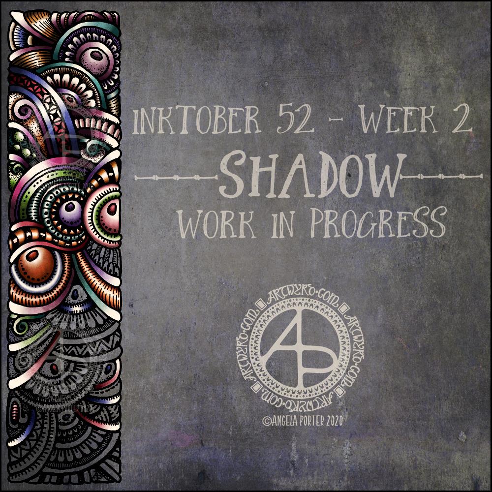
Inktober52 Week 2 “Shadow” WIP

Inktober52 “Shadow” WIP ©Angela Porter | Artwyrd.com

I like this week’s prompt for #Inktober52 – Shadow. I like to work with quite high contrast colours/shades to give the illusion of dimension. So, I thought I’d take one of my borders, add it to a very shadowy background, add colour, light and shadow, and finally I’ll put a quote about shadow on to it. My only problem with adding a quote is which one to choose! There are so many fine quotes about shadow and light.

It’s nice to have a whole week to work on the prompt. I’ve already spent over two hours adding colour to that little section of the border design, just to give you an idea of how long it takes me to work in colour.

What this means is that I can use my Inktober52 project as ‘warm up’ or ‘comfort’ art over the next few days if I wish.

The colours I’m choosing are quite ‘dull’ for me – they are hues that have a lot of black/ in them and they do give a quite vintage or grungy feel. However, against the dark background they glow.

They’re not my usual choice of bright, pure colour. I think that’s simply because it’s taken me a long time to work with them and become comfortable with them too. That’s another reason why Inktober52, and Inktober, are so good – I end up trying things out that I wouldn’t necessarily do for my publishers.