Inktober 2019 – Day 23

Inktober 2019 Day 23 ©Angela Porter | Artwyrd.com

Today’s prompts are cockatoo skull, Marasmius (parachute mushrooms) and Pixiose tangle pattern. I’m using Inktober 2019 prompt lists by Instagrammers @book_polygamist, @nyan_sun and @havepen_willdraw.

I’ve returned to the woodcut style of illustration for the cockatoo skull; the contrast betwixt the bone and beak made it a natural choice for me. Also, I do like drawing in this kind of style.

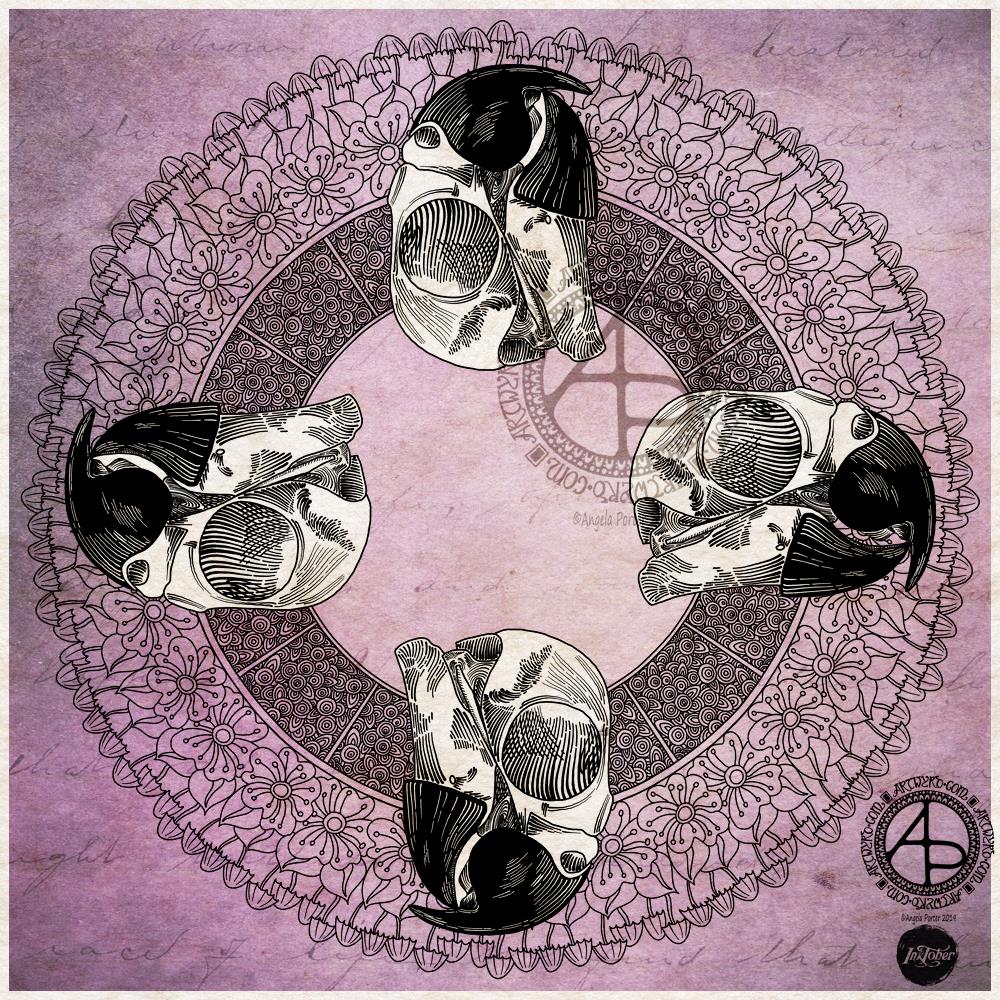
As my emotional weather is on the drizzly and gloomy side, I opted for the soothing qualities of mandala drawing for today’s illustration. I don’t know why I chose to have four skulls as part of the mandala; it just seemed a good idea at the time. However, it does work out quite nicely. The spacing means I can still draw the skulls fairly large, yet have plenty of space fo the mandala to show through.

Today’s tangle pattern is a filler design, so I thought adding it in panels would work well and this formed the first ring. I also wanted to add in some tropical flowers, so the second ring has stylised flowers forming it. It was then I remembered about the fungi and so added them as the outer ring.

For now, I’ve left the design in black and white with a coloured background. I may return to this mandala at another time and add colour and more line work. For now, it’s good enough.

To create the artwork, I used Autodesk Sketchbook Pro along with a Microsoft Surface Pen and Microsoft Surface Studio.

So, Angela, how are you today?

I said that my emotional weather is still gloomy and drizzly. I really don’t feel I have the oompf to do anything much today. All I want to do is sleep, and when I want to sleep all the time, it’s one of my warning signs that something’s not right emotionally. I’ve also had some of the old inner critics and thought patterns rearing their heads once again, causing a lot of tears. It seems I’m not as resilient as I think I am when doing what I can to help others.

I can still sense that contentment within, but the emotional weather seems to be clouding it somewhat today. I have used my light therapy lamp, which helped a little, especially as the weather outside is mirroring my emotions today.

I know what’s caused this change in my inner weather: therapy and a couple of recent events.

I managed to put a smiley face on to go to a meeting last night, but I was so tired after it, even though I’d slept for a couple of hours in the afternoon.

I do know this is not permanent. I’m processing some recent and less recent traumatic experiences.

So, I will do what I can to get some work done today, work that doesn’t require much in the way of focus. I do believe I have some sketches for my Spectacular Sea Life Designs colouring book scanned in ready to be inked. I think I can manage that today.

Mail Art – sneak peek

Mail art – sneak peek © Angela Porter | Artwyrd.com

Making the mail art

I woke this morning and had a fancy to make a card along with a coordinating envelope. I’m going to be sending these to someone, so I didn’t want to show the whole design, so a sneak peek it is. I don’t think it gives much away about the mail art. I hope it doesn’t spoil the surprise for the recipient.

I used a pre-made card blank and envelope. The card is nearly 8½” x 4¼” in size and is plain white.

I cut a piece of Winsor and Newton Bristol board to 3½” x 7½”. I added some score lines ⅛” in from each edge and let them overlap to form little squares at the corners. To do this I used a score board and bone folder. I’ve never done this before, but it actually adds a nice touch. It also gives me an even border to work within, which is always useful.

My next step was to add colour to the top layer and the envelope. I decided to do some ink blending with Distress Inks. Here’s a list of the colours I used:

  • scattered straw
  • wild honey
  • crushed olive
  • candied apple
  • evergreen bough

Once I was happy with the colour gradient, I broke out my Uniball Unpin pens and started to draw the design. As I had a coloured background, I made use of lines and patterns to add texture and dimension.

When I was happy with the design, it was missing something. It needed some colour or shading. I decided to add some colour with Copic markers, being mindful of using colours that would work harmoniously with the background.

My final step was to add some dots of gold glitter to add some ‘bling’ to the card.

My attention then turned to the envelope.

First, I added some pencil lines to help me keep my hand lettering level and neat. I then used a black Tombow Fudenosuke pen to brush letter the recipient’s name. I then used a grey Tombow Fudenosuke pen to add shadow to the letters.

I then used a Uniball Unipin 08 pen to add the address. For this, I used simple capital letters for the hand-lettering.

My next task was to draw the design on the envelope. I used some elements from the card for this, plus a couple of extra ones. I also added texture and shadow with lines.

My final task, after I’d written my name and address on the back of the envelope, was to seal the envelope art with a thin layer of Distress Micro Glaze, carefully avoiding the area where stamps will be affixed. The Micro Glaze creates a waterproof layer so the Distress and Tombow inks shouldn’t run if they get wet.

Once the recipient has the card, I’ll post a full image of the mail art, carefully obscuring their information.

So, Angela, how are you today?

I’m ok today. I’m a tad tired, but I don’t seem as emotionally fragile as I have been. There’s still a bit of ‘flatness’ or ‘heaviness’ inside me, but the contentedness is of equal or greater intensity.

Today I need a quiet day at home; the last week or so has been crazy busy with either emotional upsets occurring or commitments I have to keep. The next commitment I have is on Thursday evening, so I’m going to make the most of the time I have to myself. Creating mail art was one activity in self-soothing.

I doubted that I would find this more settled state any time soon. That it’s appeared today is a real bonus. How long it stays for I don’t know as I know what is in my diary.

I’m not going to worry about that, well not much. I’m going to enjoy the contentedness and Use my quiet time to soothe my still fragile emotions.

Yes, I feel mostly content, but I also know that it won’t take much to provoke me to tears and some emotional distress.

One thing we talked about in therapy on Monday was the need for me to protect myself in situations where I’m emotionally vulnerable. I’ve had a lot of time interacting with people over the past few days. I now need time to relax, breathe, re-energise.

I enjoy being with people, but it also drains me. That’s one of the consequences of being an introvert. When I’m socially exhausted, it makes me more emotionally vulnerable than I usually am. So, I need time to recover from this.

I will recover. Nowadays, I always do given enough self-care and self-soothing time.

I also am self-aware enough to know that to start important projects is not a good idea at this time. It becomes all too easy for me to find fault with everything I do and for me to end up spiralling downwards into a mood where I am harsh to myself.

It is still hard to be kind to myself on days like this. There’s a nagging voice that I should be doing this or doing that and not indulging myself in activities that help me to heal. Other inner critics join in, telling me I’m worthless, useless, a failure, unloveable then join in, sensing the vulnerability in me. So, I’m learning to ignore that voice, even if I still feel a little guilty. As I feel better, refreshed and re-energised and more emotionally resilient, the inner critics become inaudible once again.

So, as hard as it is to accept that I need to be kind and to spend today doing what will help me heal, this is precisely what I am going to do. And that starts with me writing a letter to accompany the mail art. I also want to create some designs that I can print to colour and use to create greeting cards.

Yet another mandala…number 6 of the month!

August Mandala 6 © Angela Porter 2013

This is approx. 17.5 x 17.5cm and was created by me using UniPin pens, Zig Art and Graphic Twin pens with water as a wash, coloured fineliner pens and coloured pencils on acid-free bristol board.

Art is my solace, even though at times I’m doing the work through tears.  Today was one of those days.  I’m really struggling with the inner critics who are beating me up so badly at the moment, and despite me trying my best to quell them, to soothe them, they are currently stronger than I am and are winning.  Art has soothed them a tad…just a tad.

Some days it’s hard to find anything to be proud of about myself, to feel I am as important and matter as much as every other person on this planet, that I’m a good person, a kind person, a caring person and so on.

On days like these, days like today, creating something pretty through my art reminds me that there is something in me, about me, that appreciates pretty things and can create pretty things and so there must be something pretty or even beautiful within me.

This one is ‘pretty’.

Astrologically pinks and greens belong to Venus, the planet of love, beauty and harmony, romance, relationships the urge to empathise and unite with others, pleasure, joy and sensuality.

The lilacs and sea-greens belong to Neptune, the planet of dreams and fantasies and helps to dissolve boundaries and change existing rules.  Neptune can also result in confusion, and confusion is often experienced during profound and/or subtle changes in thinking, rules, beliefs.  Change is never easy.

Interestingly, both planets are related to artistic pursuits and aesthetics and our own personal tastes.

Now, I’m a scientist as well as an artist and all round oddbod, so why the astrological meanings of the colours?  I find it helps me to understand the art that I create intuitively, especially the colours.  Perhaps the colours are telling me to allow the old rules of the inner critics to go and to change them, to let the boundaries they have created dissolve and in so doing let love into myself, first for myself …

Maybe … or maybe it’s just pretty!