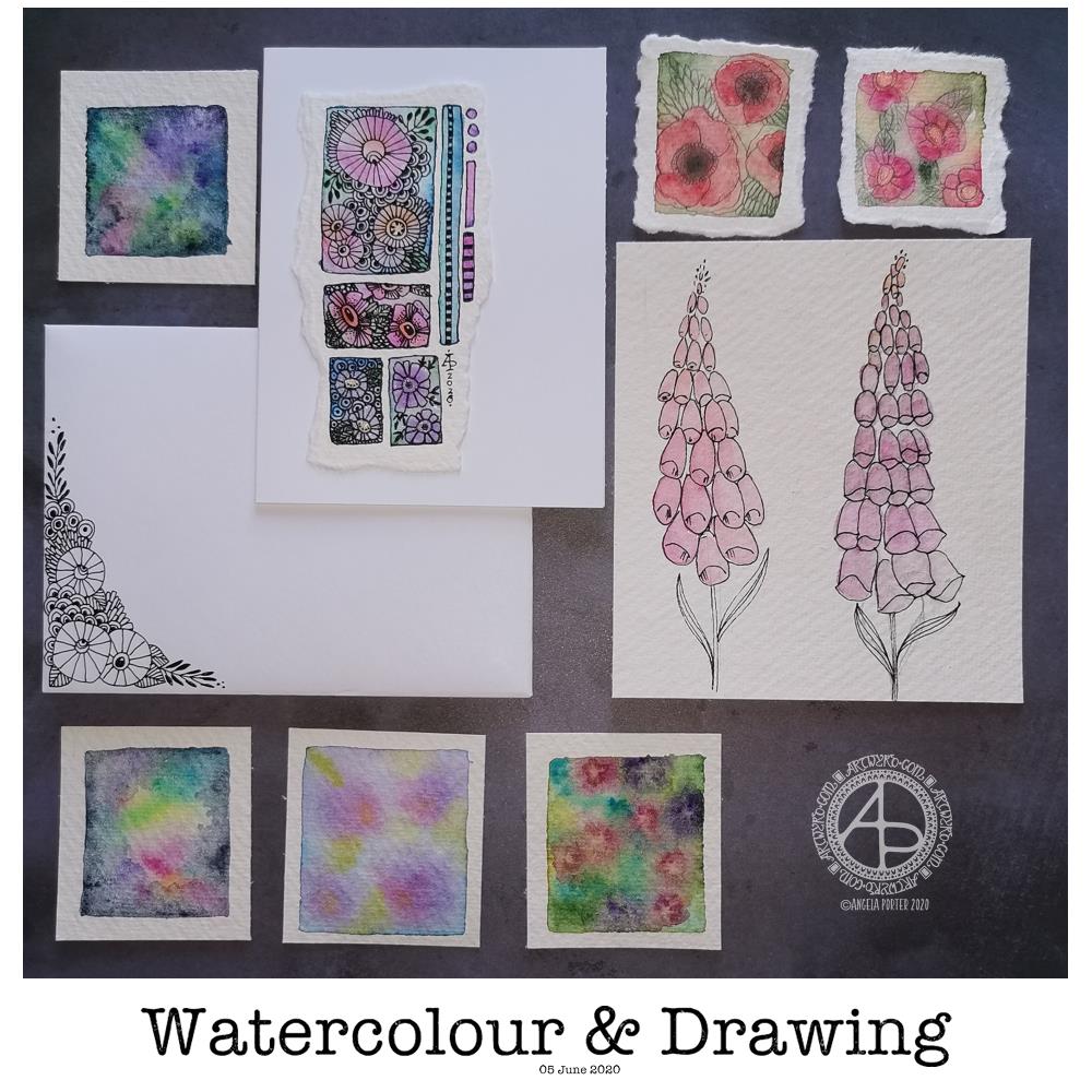
Today’s image is a collection of watercolors and drawings I’ve done over the past couple of days.
There’s a coordinating card and envelope (mail art), along with some small panels of watercolouring (approx 1.5″ x 1.5″, so a bit bigger than inchies). I’ve also included my foxglove experiments, which I did this morning.
Sometimes, black pen looks too harsh against the delicate but vibrant watercolours, so for the poppies, I tried pencil instead. I’m really not at all sure about them.
The foxgloves are symptomatic of how I feel today – out of shape, wobbly, ill-defined with harsh edges. I woke with a stinker of a headache again, definitely stress/anxiety/worry induced, as well as a lack of sleep last night. It will pass. In the meantime, I’m watching The Clone Wars on Disney+.
I don’t know if I’ll be doing any art for a few hours; my head and emotions are all bent out of shape at the moment. I’m dissatisfied with all the above; I know that’s me being so frustrated at the moment and it stops me seeing my art for how it really is. When I’m like this, I know that drawing will frustrate me, and the fact I’m not drawing will frustrate me more, especially as I have deadlines looming. However, I logically know that if I try to do things now, I’ll just prolong the feeling of frustration and I’ll end up having to do much more in the long run than if I’m kind with myself until the headache goes and my mood lifts.
The weird thing, however, is that I can sense that touchstone of contentment inside me. It’s very confusing; on one hand my emotions are really unsettled, yet there’s contentment within. My EMDR therapist mentioned that it’s a peculiarly Western view that you can only experience one feeling at a time when I mentioned this kind of thing to her. So I know it’s possible to be both discontent and content at the same time – discontent with some parts of life yet still have an inner contentedness.
So, I wander off now to sit with these paradoxical feelings, to try to relax and let the headache ease off enough that I can sleep off the extreme tiredness it will leave me with.
Two fairly quick, small projects this morning – small botanical cards. Simple, cute, whimsical, darling. Little treasures.
These were fun to make, relatively quick too. They’d be darling little cards to receive in the post or in person. They’d also work nicely as an addition to a journal – a place to journal or keep little memory making bits and bobs in the envelope too.
Each card is 3″ x 4″ in size and the panels are approx 3.5″ x 2″ in size. I made the envelopes to fit and decorated them with one of the motifs from the designs on each card. I did a tiny bit of hand lettering on one of them too.
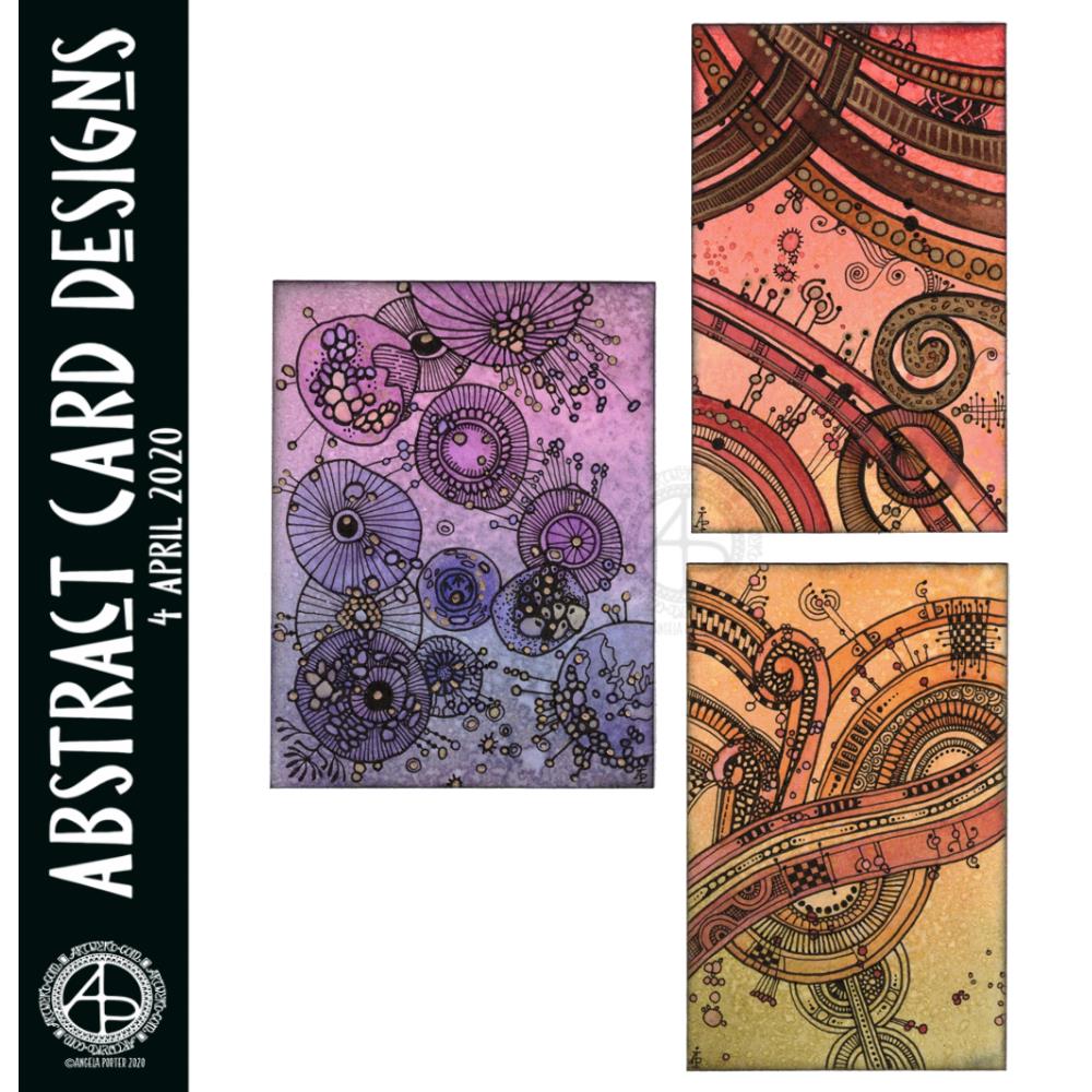
I had so much fun making these little abstract art creations! They really do go back to my roots, but in the way I like to create now.
To give you an idea of size, the purple one is 3″ x 4″, the other two are 2½” x 4″ in size. I have mounted them on cards that are 4½” x 5″ in size, made from some white Daler-Rowney mixed media paper, and I love how they look!
I started by creating the backgrounds using Distress Inks, a mini foam blending tool and a spritz of water.
Then, I painted on some basic shapes using a brush, water and either colour from Zig Clean Real Brush pens or Distress Inks, followed by some splatters of colour.
The the real fun began. Taking some things I really wasn’t happy with and adding line and pattern to them to give them form, definition, and some dimension.
I used Sakura Pigma Micron pens (05 and 02). I also used a glass pen and gold ink in the top right design. For all designs, I used a gold Sakura Gelly Roll pen to add gold highlights, which haven’t shown up well in the scans.
There was something so satisfying and pleasing in working with vague shapes and patterns, the random nature of the background, and using them to inform how my art would develop in each case.
I really, really enjoyed creating these, and I will do more in the future.
I’m not sure how I could create similar digitally – the randomness of wet media isn’t something I’ve worked out how to do…yet. Maybe I never will. Maybe it’s the case of me creating the backgrounds separately using traditional media, then adding the lines digitally. I don’t know yet, however. It may be that this is something I reserve solely for traditional media.
What I do know, is that each design is a work of art in it’s own right and these would look fab framed. In fact, I had a huge inner smile as I mounted them on the card blanks, giving them a simple frame, and saw how finished they then looked. Teeny, tiny pieces of art, by me, Angela.
Yet again I woke with my mind swimming with an idea I wanted to try out. I’d had a problem when I was trying to add colour to drawings I’d done on distress ink backgrounds. Whether I used water and a brush or a Tombow Blender pen, the pigment from the Sakura Micron and Uniball Unipin pens bled, and I really wasn’t happy with that.
I spent some time yesterday trying different pens out, with no luck in finding any that didn’t smear/bleed. So, I put this to one side until I had a chance to think about it.
I slept on it and woke with an idea to try.
Why not use the Tombow blender to draw the basic shapes of my design in colour and then add black lines afterwards. Seed pods seem to be my default design when I’m experimenting, but I’m fine with that.
So that’s what I did. And this card is the result.
As I was starting to add the black lines to the design I thought I’d made a horrible mistake, had a bad idea. However, as I added more and more detail, I realised it would work out, and I think it did.
I added some gold to the seeds in the seed pod with a glitter gel pen. I also splattered some gold watercolour paint over the design.
The envelope is really simple; three seed pods, black line art with golden seeds.
Not a unique artistic approach, but it is something that has never worked for me before.
It’s not a dissimilar approach I take to my digital art, where I start with the basic shapes and then add shading and detail. I do use line art as a guide for my design, and that is an approach I can apply to traditional art in that I may need to pencil in the design, then colour, then add the line art.
Who would’ve thought it – working digitally is helping me develop my traditional art methods and skills.
I’ve been awake way too long already today. I just couldn’t settle to get back to sleep when I woke around 4am. I gave up trying just before 6am and thought I’d do some drawing to see if it would settle me.
The soothing style of choice at the moment is zentangle, so I made use of some of the coloured ’tiles’ I made yesterday, and these are the result. I’ve yet to decide whether I will actually turn them into cards, or whether I’ll just keep them as references for the future.
I thought plain black line looked a bit ‘flat’. That may be a consequence of me working digitally so much and the way I achieve dimensionality in my art.
So, in the top design, I used brush, water and some colour from Zig Clean Colour Real Brush Pens by Kuretake. I enjoyed adding shading with colour, though it was hard work with the fine brush I’d chosen, especially when I turned my attention to the one on the bottom left. So, I used a Tombow Blender pen with the colour for the third card on the bottom right. I’m much happier with the smoothness of the gradients here, compared to the other two.
What I’m not happy with is the way the pigment from the black lines seems to move, particularly when I used the brush. I’m not sure whether this is a result of me drawing on top of the distress ink coloured paper, or whether it’s to do with the friction of brush on the lines. I did get a little bit of movement of the pigment with the Tombow blender pen, but not so much it seems.
As I’m digging into my stash of media from past times, I remembered I had some Nuvo Drops from Tonic. So, instead of using a metallic gel pen to add some embellishments, I added some of these drops.
I’m not entirely sure they work. I think I’ll have to look at these cards again after I’ve had a good sleep and a break from them
I am glad I tried adding more saturated colour to the designs to give that illusion of dimension, even though I had to rediscover the joys of using a blender pen. I do find pens so much easier to work with than brushes, that’s for sure. That may be a knock on effect of me using pen ‘brushes’ so much in digital art.
I’m exhausted now, but I won’t go back to bed until my grocery deliveries have arrived.
I needed to draw something that would be calming and also purposeful. So, as I’ve been enjoying drawing zentangle-style designs, I thought I’d create a greeting card.
How I made the card …
To start, I cut some Claire Fontaine mixed media paper into a 5″ x 5″ tile. Then, I used a mini foam blending tool to colour the paper with Tea Dye and Old Paper Distress Inks. A quick spritz with water to add some more texture followed by a blast with a hair drier, and the paper was ready to draw on.
I used the tangle pattern generator to give me some patterns to use. Today they were: *Scena (bottom and middle top) *Sedgling (the weird mushroomy things) *Squill (the top left pattern) *Well (the top right pattern) *Arukas (the central pattern)
I also added some gold dots to the centre of the ‘flowers’ that make up the Well pattern, as well as to the central circle of Arukas.
Before adhering the design to a blank kraft paper card, I used a piece of foam to add some Black Soot Distress Ink around the edges of the card. Once adhered, I used the gold Gelly Roll pen to draw a line around the design.
It was then the envelope’s turn for attention.
I started with a lower border of Scena with some Sedgling growing from the top left and right. To finish the envelope, I added some gold dots.
Reflecting on the finished card
I actually quite like the design of this card. I started with Scena at the bottom and it ended up looking like hills and fields. So, it was a natural progression to add the Sedgling as mushrooms or trees growing on top of Scena.
The next two patterns were geometric ones, and it felt natural to join them with some more scena at the top. Scena also looks like clouds. Arukas was the final pattern to be generated, and it fit perfectly in the space left, filling it like a brightly shining sun.
I had no idea what I was going to create today, just let the random patterns lead me forward.
The only thing I need to do now is to find someone to send the card to! Mind you, I do have quite a few cards in my stash, so I need to find some ones to send them to!
I’ve enjoyed creating this sketchbook sampler page. I drew the designs with a mixture of Uniball Unipin pens, Faber-Castell Pitt Artist pens, a medium nib Schaeffer fountain pen, and an extra-fine nib Faber Castell fountain pen. I used dot grid paper from Claire Fontaine.
After scanning the page in, I removed the dot grid and added a grungy paper background. I then decided I’d like to add some colour and shadow/light to the designs. To do this, I used a messy chalk brush, so my colouring isn’t as precise as I usually like it. However, it’s loosened up my expectations of myself as I went with it.
Pastel colours were my palette of choice as I like the way they seem to almost glow against the grungy kraft background. I also like the way they help to enhance the 3-D appearance of the designs. I do enjoy playing with shadow and light.
Some of the designs are examples of my organic, entangled style of drawing. Others are repeating, geometric zentangle-style patterns. And then there’s some inspired by Medieval illuminated manuscripts.
I also enjoy working within a clear border. I like the sense of structure it brings to my work. It also satisfies some kind of aesthetic need within me. Every now and then I try work without a border, but the artwork I produce just never feels quite right to me. So, it’s time for me to accept the need for borders is part of my artistic voice.
There is a purpose for me creating these borders. I’m building up a library of them that I can use to embellish quotes and other projects.
Some of these borders would look fab as greeting cards note cards, bookmarks, and to use in other paper craft projects. They’d also work well as embellishments for BuJo, planner, diary, scrapbook and journal pages.
Others would be a great foundation for dangle designs (my book “A Dangle A Day” is a good place to start drawing dangle designs).
What I do know, is that I find drawing soothing and relaxing. So, I’m going to be spending the rest of my Sunday drawing more borders.
This morning, I made a video of me drawing and colouring this festive dangle design and turning it into a card.
This video shows me drawing in real time, and I hope you enjoy it, despite the wobbliness in places.
Here’s a list of materials I used:
8″x 8″ Winsor and Newton Bristol Board folded to make an 8″ x 4″ card
7″ x 3″ piece of Winsor and Newton Bristol Board to draw the design on
Faber-Castell Pitt Artist Pen, medium
Pencil and ruler
Various Chameleon Color tones marker pens
White Uniball Signo gel pen
Tombow Mono glue
Tumbled Glass Distress Ink and a mini foam blending tool
I hope you have a go at drawing this dangle design and making your own papercraft or craft projects with it. If you do, I’d love to see them!
If you’d like to know more about drawing dangle designs, or would like more inspiration, step by step instructions, and encouraging words, then my book “A Dangle A Day” is a good place to start.
Yesterday was a crazy busy day with no time for art, let alone blogging!
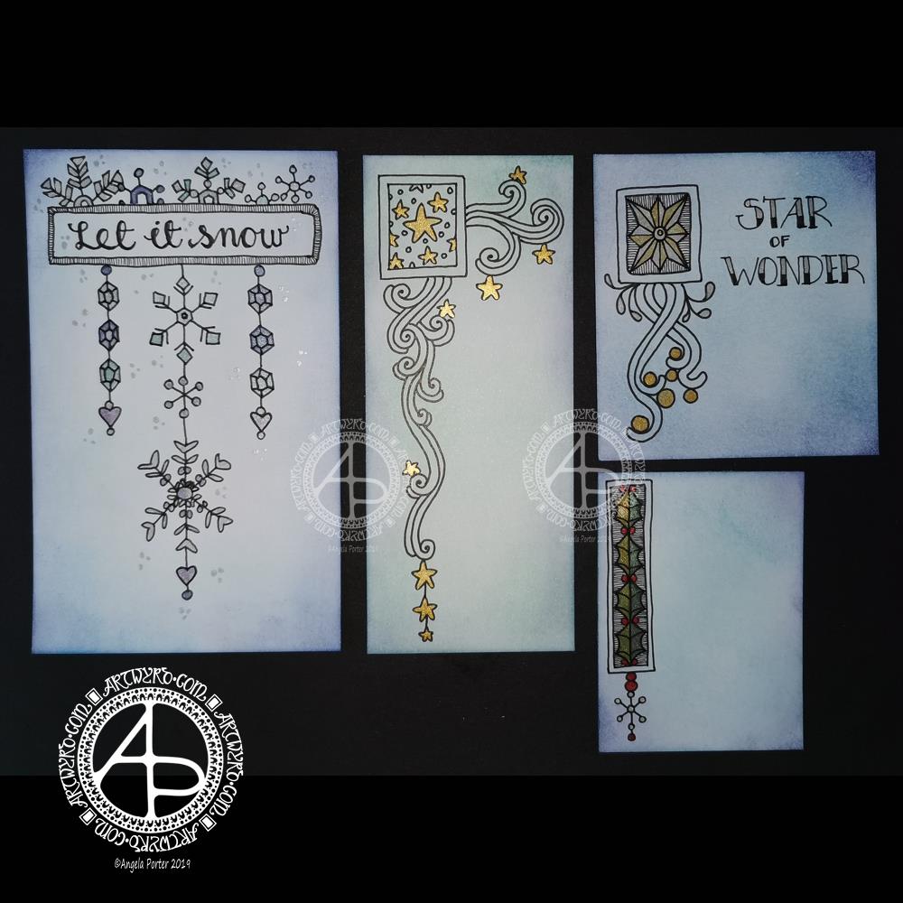
This morning, I finally had some time to myself. As it’s Friday I wanted to do a dangle design, and I ended up doing four!
I cut the card into the wrong dimensions to create a card, so I thought I’d just make use of the pieces I had and make some custom card blanks and envelopes for them another time.
I coloured the pieces of card with Distress Inks in shades of blue and green. I used Chipped Sapphire, Tumbled Glass, Broken China, Evergreen Bough, Cracked Pistachio and Salty Ocean in various combinations.
These colours gave the card a frosty kind of feel, so I went with some snowy, icy, wintry designs.
I drew the designs and completed the hand lettering with Faber-Castell Pitt Artist pens, which are waterproof.
Plain black lines on the coloured background did look a tad lacking. So, I added some shimmer and colour using Cosmic Shimmer watercolour paints.
I’m not so fussed on the ‘Let it snow’ design. However, I am quite pleased with the others.
I am going to mount them as greeting or note cards. However, the designs would look charming in a BuJo, journal, planner, diary or scrapbook. They could easily be adapted to make bookmarks too, or place cards for a special meal.
I hope you’ll give drawing these designs a go, or use them as inspiration for your own projects. I’d love to see what you create – please tag me on social media so I don’t miss them!
If you’d like to know more about dangle designs and have some guidance and inspiration for them, then my book ‘A Dangle A Day’ is a good place to start.
It’s been nice to have a couple of hours to indulge myself in art. The past four weeks or so have been crazy busy with other projects being quite demanding of my time, mind and energy. However, they will soon be over and my focus can return, properly, to art.
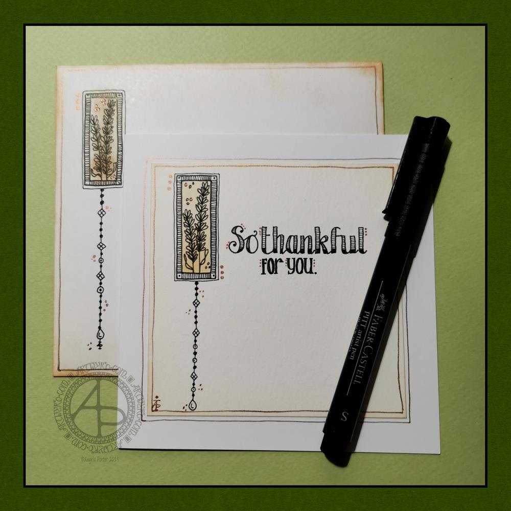
Today, I have a simple dangle design greeting card along with a coordinating envelope. If you’d like some more ideas, inspiration and step by step instructions for drawing dangle designs then my book, A Dangle A Day, is a good place to start.
Materials and dimensions
4″ x 4″ Strathmore Bristol paper with a vellum finish 5″ x 5″ acid-free white card blank White envelope that card will fit in Distress inks in Tea Dye and Rusty Hinge Small piece of foam and a mini foam blending tool A piece of card with a 1.5″ x 0.75″ window cut in it to use as a stencil. Faber-Castell Pitt artist pens in F, S and XS Ruler and pencil Adhesive Glass pen and coppper ink by J Herbin
Making the card.
Use the card stencil and a small sponge dauber to apply a rectangle of Distress Ink in the top left of the 4″ x 4″ top layer. I used Tea Dye to colour the whole rectangle in, followed by a subtle gradient of Rusty Hinge from the bottom up.
Use a mini foam blending tool to add Tea Dye Distress ink to the edge of the top layer.
Use a pen to draw the rectangles around the colour block. I like to do this free-hand as it gives a more organic, human feel to the design.
Draw the sprigs and add the lines to the border. Dots help to add some interest to the more empty parts of the design.
Use a ruler and pencil to lightly draw a vertical line as a guide for the dangle. Also, draw pencil lines as guides for the position and size of the hand lettering. Sketch in the letters of the greeting.
Draw round and diamond shaped beads to form the dangle. I like to finish my dangles with a ‘heavier’ or larger bead.
Ink the letters in. I did some faux calligraphy where I made the down-strokes thicker. I added some lines and shading to the top line.
Carefully erase the pencil lines.
Attach the top layer to the card blank.
I used a glass pen and copper ink to add copper dots to highlight the dangle design and the hand lettering. I also drew a box just inside the top layer and another just outside it on the card blank. Again, I free-handed the lines, embracing the wobbliness.
Making the envelope
I used Tea Dye Distress Ink and a mini foam blending tool to edge both the front and back of the envelope.
I then used a sponge dauber and the card stencil to add a rectangle of Tea Dye ink in the top left.
I drew the design on the envelope as I had on the card, including adding a line border in copper ink.
Finally, I drew similar sprigs on the envelope flap, using the glass pen and copper ink.
Before mailing…
Once I’ve addressed the envelope, I’d apply a thin layer of Distress MicroGlaze to the front and back of the envelope to protect the Distress Ink and drawing from the elements. I’ve done this to other cards and they have traversed the UK and US postal systems with no problems.
Ideas for using the design.
Although I’ve presented this dangle design as a greeting card, which is, I think, a lovely way to share a little bit of artistic loveliness with others, there are many other ways the design could be used, with or without any hand lettering.
In a BuJo, journal, planner or diary it would make a lovely little design to fill in a blank space.
This is a design that would work really well as a bookmark.
I’m sure it would look charming as part of a scrapbook spread.
I also think it would look lovely on a ‘with compliments’ slip or decorating the edge of a hand-written letter.
I’m sure there are many other ways and media that this design would be suited to.
Final thoughts…
I’m really enjoying drawing these kinds of dangle designs. They’re simple and elegant, to my mind anyway. They’re also quite easy to draw.
I do prefer to free-hand the lines and let the wobbliness be part of my signature style. It gives that human, hand-made, hand-crafted feel to the finished project, and a warmth to the finished project.
I work hard at finding a way of drawing digitally that lets me keep this uniquely ‘Angela’ way of expressing myself through line and pattern. I’m still working on it and sometimes get frustrated that, to my eye, my digital art seems too, well digitally perfect.
It’s all part of the process though – learning, developing, experimenting, trying out new ideas, techniques and methods. That’s what helps me grow as an artist.