Between some adulting today, I’ve drawn this design in my sketchbook. I’m quite pleased with it, unusually for me!
I like black and white drawings. I like texture and pattern, and I like to then add colour and/or contrast to my artwork. I’ve yet to decide what I’ll do with this, though digital colouring is likely to be my thing. Traditional drawing followed by digital colouring makes it tradigital art! Whoever coined that term is fab.
In the last few days, I have played around with using coloured inks to draw designs. I’m happy if I use one colour for the drawing, texture and pattern. If I start to use other colours, I become confused and not at all happy with the outcome. It never looks ‘right’ to me. Not for my own art, anyway. I do like how other people manage to use different colours for various parts of the lineart, pattern and texture.
Maybe this is because I’m so used to drawing with just one colour. I then use colour to bring out dimension in the finished artwork. I have drawn designs in a colour other than black, using just that colour; I’m quite happy with them.
So, onwards I go, continuing to learn more about my style as I go outside the area I’m comfortable in. I may return to the experiments with different ink colours another time, or not. Only time will tell, though.
Today I’ve added the tangle pattern Kos, deconstructed by Anica Gabrovec CZT, known as Zen Linea. This panel is to the top and centre-right. The other panel is towards the bottom left and is one inspired by Rebecca Blair.
It’s funny how the internet seems to conspire to remind me of my early artwork nearly 20 years ago. One of my drawings turned up on Pinterest today. And it was this kind of sampler, but with patterns from Romanesque architecture, nature and textures drawn in pen and white ink on a kraft paper background. Seems I was doing this kind of thing before I’d heard of Zentangle or Rebecca Blair or many other artists and CZTs!
I keep trying to settle on a clear artistic voice, if not chorus, and it may always have been there, but I just don’t seem to accept it for some reason.
Perhaps these kinds of synchronicities are nudging me to accept this is something that I like to do and need to work more with. Time will tell, that’s for sure.
I think I’ve accepted, mostly, that I need to put watercolours and similar media to one side and focus on alcohol markers. I like the control I have over them. And using digital art to add colour, shadow and highlight too.
As much as I like the fluid, random effects you can get with water-soluble media, my ability to work with these media seems to be limited. Still, no doubt I’ll keep returning to them in the hope I’ll have a different outcome at some point in time. I’m not going to hold my breath on that, though!
I also think that I’m zeroing in on the best way for me to work with colour – monochrome or analogous colour schemes, maybe with a pop of complementary colour here and there.
I always relax, feel my whole body let out a sigh of relief as I work on drawings like this one. Purely abstract, line and pattern being the focus, with healthy doses of black giving a very graphic feel to the design.
Playing with line width and pattern to bring layers and depth to the design is always something I’ve enjoyed.
I start with one single line, shape or motif and go from there instead of having an overall plan for the design all sketched out and ready to go. I like this organic, intuitive way of letting the design grow, developing it one pen stroke at a time.
I’m learning, slowly but surely, that areas of white space can be a powerful part of the overall design. It’s been a long journey to realise I don’t have to fill the whole sheet of paper with line and pattern.
I need to have a lot of trust in the whole of this process; that something pleasing will be created after hours of work with very fine nibbed pens.
What next when I’ve finished the pen-work? Do I add shadows, colour, highlights with traditional media or digitally? Do I just add a background coloured/textured paper? Do I leave it in it’s very graphic black and white?
Working digitally with a scan of the finished drawing allows me to experiment, though I’ve yet to work out how to add shadows in the way a blended graphite or pastel pencil would do. And I do have a tendency to use much brighter, saturated colours than I would with traditional media.
Perhaps it’s time I sorted out my own digital colour palettes from my traditional media. That is something for another day, however. For the rest of the day, I’m going to lose myself in completing this drawing.
A mandala in my entangled assemblage style. I really enjoyed drawing this, not least because I proved to myself I can transfer this way of drawing to digital art.
Unusually, there’s not a single botanical element in this artwork. Not one leaf, not one flower, nor any seed pods. It’s purely abstract.
I think I may have used up too much of my time this morning (a deadline is about to go whoosh past me), but it has given me ideas for some of the remaining templates I need to complete.
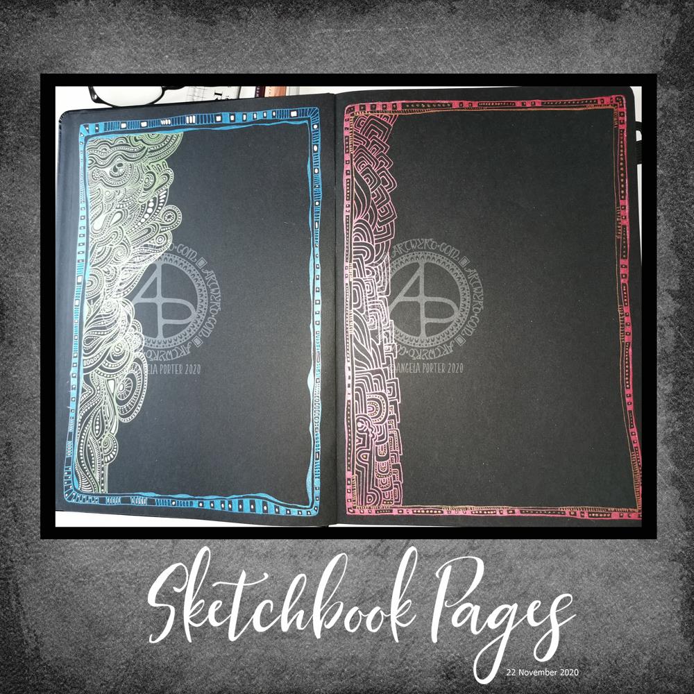
Sakura white, metallic and starlight gelly roll pens in a black Sakura journal/sketchbook. I had a lovely few hours last night, sat in bed, settling down for a good sleep.
What you can’t see in the photos is how the matt white and shiny blue/green inks create interesting weirdness visually. By weirdness, I mean a strange kind of 3D effect that I can’t put into words. That was totally unexpected.
I haven’t decided what to do with these pages yet. Will I fill them in completely with colour/pattern, or will I leave the pages as they are. If I leave them as they are then they can be used for journaling, writing, and I quite like that idea to be honest. As the writing is likely to be very personal, I’m not likely to share that, but maybe I’ll mock something up digitally, see for myself what it’s like and then decide.
And with that last sentence, I may scan these in and use them as templates for a digital journal, which would then take away my worries about making a mess of the page by writing on it!
Of course, they’d work quite nicely as frames for quotes too.
Too many possibilities!
Whatever I decide to do – and it may be all of these things – there is something satisfying about working with shimmer and shine and the contrast with the matt white ink on black. The sparkle and shine makes my arty soul rather happy.
Just a note on the black Sakura sketchbook / notebook /journal. I like it! It has a LOT of pages in it of acid-free, sturdy enough, smooth paper.
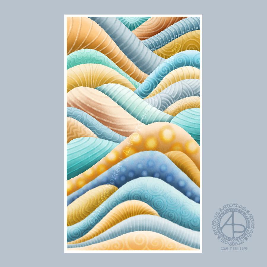
This was a lovely way to spend the first three hours or so of Sunday morning. Abstract digital painting. Chilled out music playing on Spotify. A slow sunrise behind the grey, rain-dropping clouds.
Again, the pattern was inspired by rocks and geology. Some of the patterns I’ve added remind me of rocks and shells, others are a bit too geometric.
It’s always nice to play around with pattern, texture and colour. And when I limit my palette to just a couple of colour families I get much better results. Today, I used the B and YR Copic colour families from the Copic palette included with Autodesk Sketchbook Pro.
While not reminiscent of rocks, the colours remind me of sea and sand. This year, I’ve not been able to get to the coast, other than once way back in February. The colour choice is a subconscious desire for the sea and shore, a liminal place, a boundary between one element and another.
The coast is a place where I feel my whole body exhale and relax. Sadly, it’s not possible to visit at this time, maybe not for a long while. However, the pandemic won’t last forever and the coastline will still be there.
Anyways, creating this artwork was a lovely way of spending some time on a Sunday morning. I can see where I’ve been clumsy with the patterns, making the layers look flatter than I wanted them to.
Wibbly-wobbly sculptural columns and arches surrounded by layers and layers of abstract bubbles, ripples and swirls of thoughts, wishes, blessings. Well, that’s what came to my mind as I added the architectural details.
No highlights, no sparkle, limited pattern and texture. Just flowing line work, for the most part. I’ve even left some ‘white space’ in the design, which is becoming less unusual for me.
Rounded arches with patterns reminiscent of Romanesque architecture. The columns are, however, more delicate, which is more reminiscent of the move towards Gothic architecture. Both forms or architecture have long been a source of artistic inspiration for me.
Soothing, relaxing and meditative to draw. Circles and spirals, arches and patterns are always comforting and endlessly fascinating to me.
Drawn using Faber-Castell Pitt artist pens on paper coloured by PaperArtsy Fresco paints. The drawing is approx. 2½” x 6¾”.
This index card #ICAD2020 #DYICAD2020 was a bit of fun to create.
I used a mixture of Distress Oxide inks to colour the 6″ x 4″ index card. The colours I used were Old Paper, Bundlesd Sage, Dried Marigold and Chipped Sapphire. I built the background up in two layers, with chipped sapphire lightly dragged across the texture that the spray of water from the first background created. A final spray of water, a dab with some paper towel to leave some bleached areas and the background was done.
I decided I’d go with the typography theme today, so hand-lettered monograms for each letter. I used pieces of Canson XL Bristol paper coloured either with Distress Inks or Distress Oxide inks. After spraying the paper with water, I squished some cling film onto the surface to create abstract patterns in the colour.
Anyway, I used 06 and 03 Sakura Pigma Sensei pens to draw the monograms. Once I was happy with the designs, I edged the monograms with Ground Espresso Distress Ink. Then, I glued them to some brown-ish card, and cut them out with a border. I edged the brown paper mat with Ground Espresso Distress ink.
I then set to adding pattern and colour with Paul Rubens metallic watercolour set. Tiny dots and highlights were sparingly added to the monograms. Then, I used the same 01 brush to draw patterns around each monogram in colours that picked up the background colours of the monograms.
My final step was to edge the index card with Ground Espresso Distress Ink.
This was a perfect little project to practice my hand lettering as well as trying out the Paul Rubens paints. It was also good practice at using a fine brush to draw patterns. I do think a finer brush would’ve worked better.
The scan hasn’t picked up the sparkly, shimmery gorgeousness of the metallic paints.
This was a really nice way to come round after I’d slept off yesterday’s migraine-y stress-come-down headache. It was a small project that I didn’t feel overwhelmed by and there was no pressure on me for it to be perfect, as would be the case for my contracts for coloring books. So, it helped me calm and settle and find that sense of contentment, for a while at least.
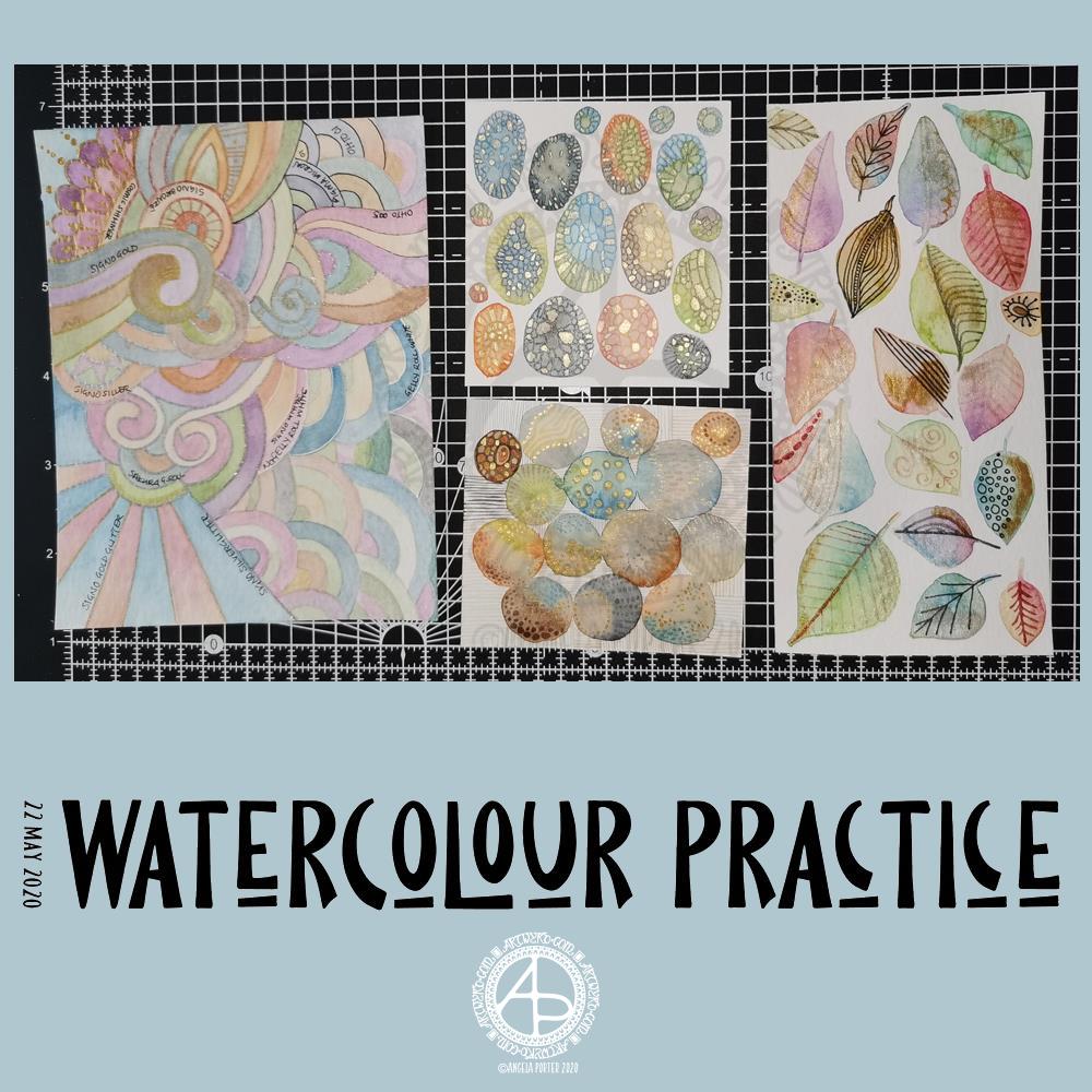
Yesterday was another day where I got lost in watercolour practice – unintentionally! I had planned to do some editing of drawings for ‘Entangled Gardens’. However, time ran away with me.
Panel 1
The first panel I completed was the one with leaves on. They do have plenty of gold metallic/iridescent watercolour paint along with traditional paint, though it doesn’t show up in the photo.
I tried different ways of adding details to the leaves – Faber-Castell Pitt Artist Pen (F) and metallic watercolour and brush. I find the black pen either too black or I used too thick a point. The metallics in a red-copper, gold and grey-black were more sympathetic to the colours of the leaves, in my opinion.
Panel 2
The next panel I created is the one at middle bottom. I made circles of watercolour and let them touch while wet so there was some flow of colour from one to another. After they’d dried I used a fine brush and both watercolours and metallic watercolours to add line and pattern to it.
I enjoyed making this one very much. I used some quite earthy colours that are unusual for me. The line and pattern added a lot of interest, though I did wonder if I’d covered up too much of the underlying watercolours.
Looking at this with fresh eyes today, I think it shows through just fine. I want to try using metallic paints that are complementary to the main colours in the watercolour to see how that works out.
Panel 3
This is the one at the middle top. I created ovals of watercolour, again using unusually muted, earthy tones.
Once they’d dried I used some Caran D’Ache Luminance coloured pencils, well sharpened, to add patterns to each oval. I used the variation in colour/tone to help me add the patterns, as well as to choose the colours of pencils I used on each oval.
Finally, I used a yellow-green metallic/iridescent watercolour paint to fill in some of the patterned areas.
I enjoyed making this panel too. Again, I thought when I finished it that the pencil lines were a bit thick. However, after a night’s sleep and with fresh eyes I can see that it’s worked out well. I think that using coloured fineliner pens may work out better than coloured pencils – something I’ll try another time.
Panel 4
The last panel I created yesterday was the fourth panel. I used a different kind of watercolour paper, by Tim Holtz. The paint just dried so quickly on it I couldn’t really drop colours in, though the paints would re-wet and I could blend colours that way. I didn’t really enjoy using this paper.
Anyway, I thought I’d make a typically ‘Angela’ entangled style painting. I did use a raw umber Caran D’Ache Luminance pencil to draw the design on the paper. This was such a pale colour it disappeared into the watercolour sections. Again, I used uncharacteristically earthy, muted colours.
The final panel was nice enough, however, it was lacking in pattern and interest. So, I decided to use it to experiment with different ways of adding outlines and pattern to the various sections. I also noted on the panel what method I’d used next to each one.
The metallic paints and pens worked nicely and were practically or totally opaque. I prefer using a pen rather than a brush, though I’d not be averse to adding line and pattern using a fine brush and watercolour.
The gold and silver Uniball Signo glitter pens worked really nicely, and because the glitter is suspended in a transparent ink, there’s interesting effect where the watercolour shows through. I actually really like this a lot.
I couldn’t find a gold Sakura Gelly Roll pen, so I used a silver one instead. This, surprisingly, wasn’t as shiny as the Signo silver pen, but it worked just as well in terms of opacity.
I tried two white gel pens – a Uniball Signo and Sakura Gelly Roll. Both seemed to be fairly opaque, the Sakura being very slightly more so.
Finally, I dug out some really fine black pens – 005 and 01 OHTO Graphic Liners and a 01 Sakura Pigma Micron. These worked much nicer than the thicker pen I’d used on the leaf panel.
Of course, I left some areas of the panel without any lines added for comparison.
Of all the pens I tried, I like the metallic and glitter gel pens the best for this.
On reflection…
I’ve found I really like to work on a smaller scale. I feel like I’m creating small ‘treasures’ full of interest and fascination. I’m happier working smaller and more detailed than I am working on a larger scale.
I want to try coloured fineliner pens to draw patterns on watercolours.
Another experiment will be for me to use metallic and plain acrylic and other inks to draw with. I do have a glass pen that will work nicely with indian ink and writing ink. I’ll have to dig some dip-nib pens out to try with the metallic acrylic paints as well as a brush. I think that ball tools could be used to dot spots of ink onto the work rather than a brush; something else to try.
I also need to find a way of leaving a border on the page! When I draw a colouring template or other piece of lineart, I start by drawing a pencil line to demarcate the area I want to draw in, leaving a border around the line. I need to do the same for watercolour panels, either using a pencil or masking or washi tape.
Something else I’ve worked out is that I tend to use too much water when I paint, and I need to experiment with using less and trying dropping colours in when the area is at different levels of dryness.
Lots of things to try and consider.
Doodling? Really?
I see a lot of people calling the addition of line, texture and pattern as part of an artwork ‘doodling’. I don’t like doodling being used in that way.
Here are the definitions for ‘doodle’ from Dictionary.com
verb (used with or without object), doo·dled, doo·dling. *to draw or scribble idly: He doodled during the whole lecture. *to waste (time) in aimless or foolish activity. noun *a design, figure, or the like, made by idle scribbling.
When I add line or pattern to my drawing, it’s not an idle or unconscious activity. I deliberately choose what patterns and textures I want to use and where to place them. The process of adding the lines, patterns and textures may be a more mindful process if the pattern is familiar to me.
The lines, textures and patterns are used to add interest to elements of the overall design. But they are not meaningless, as implied in the words scribble and doodle, and they are anything but idle or mindless scribbles. There is purpose in them, and this is why the use of the word ‘doodle’ irks me!
What am I going to do with the panels?
The leafy panel I created to add to a tag to put in my journal. The other panels will also live in my journal, even the one with annotations, possibly with a pocket behind it for my notes and reflections!
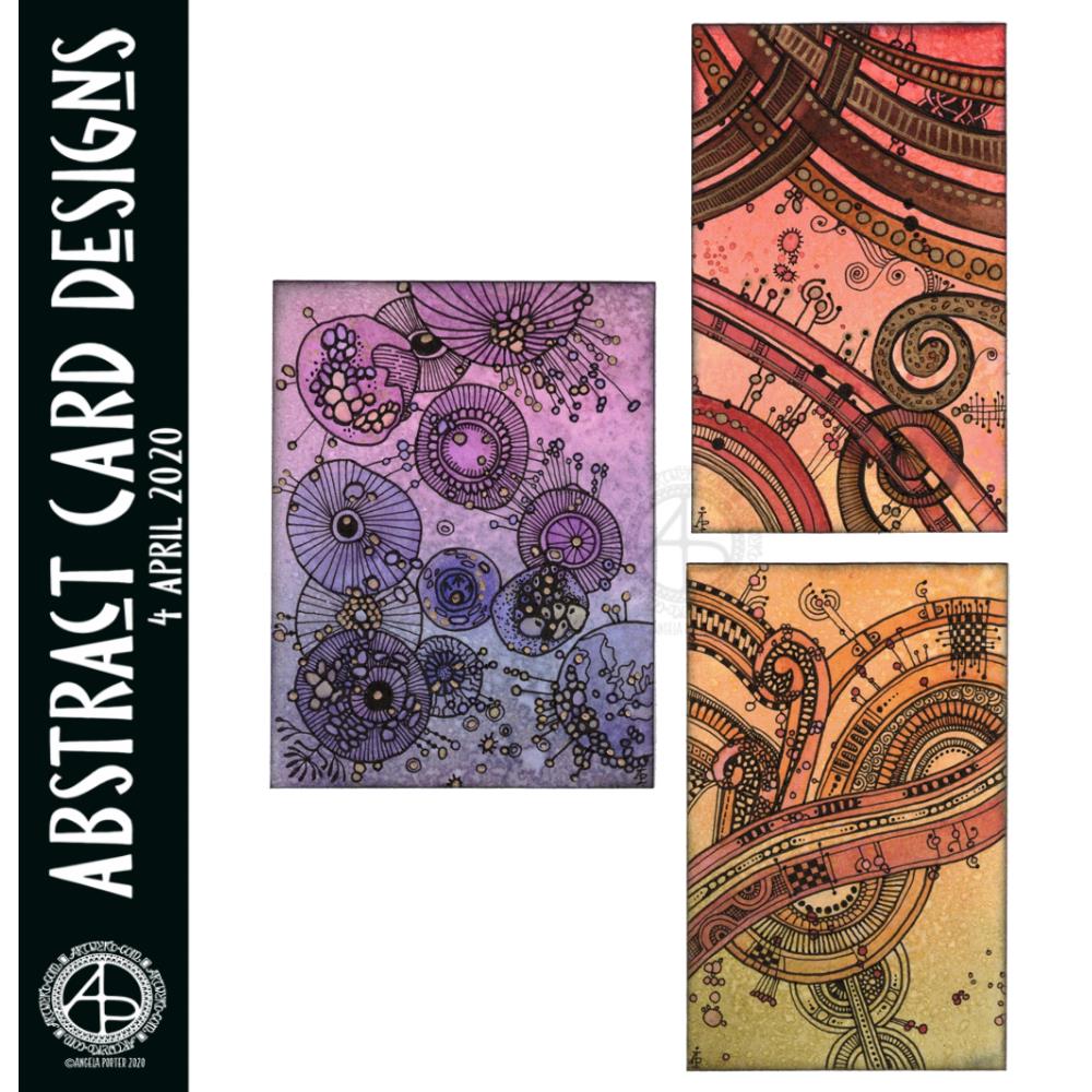
I had so much fun making these little abstract art creations! They really do go back to my roots, but in the way I like to create now.
To give you an idea of size, the purple one is 3″ x 4″, the other two are 2½” x 4″ in size. I have mounted them on cards that are 4½” x 5″ in size, made from some white Daler-Rowney mixed media paper, and I love how they look!
I started by creating the backgrounds using Distress Inks, a mini foam blending tool and a spritz of water.
Then, I painted on some basic shapes using a brush, water and either colour from Zig Clean Real Brush pens or Distress Inks, followed by some splatters of colour.
The the real fun began. Taking some things I really wasn’t happy with and adding line and pattern to them to give them form, definition, and some dimension.
I used Sakura Pigma Micron pens (05 and 02). I also used a glass pen and gold ink in the top right design. For all designs, I used a gold Sakura Gelly Roll pen to add gold highlights, which haven’t shown up well in the scans.
There was something so satisfying and pleasing in working with vague shapes and patterns, the random nature of the background, and using them to inform how my art would develop in each case.
I really, really enjoyed creating these, and I will do more in the future.
I’m not sure how I could create similar digitally – the randomness of wet media isn’t something I’ve worked out how to do…yet. Maybe I never will. Maybe it’s the case of me creating the backgrounds separately using traditional media, then adding the lines digitally. I don’t know yet, however. It may be that this is something I reserve solely for traditional media.
What I do know, is that each design is a work of art in it’s own right and these would look fab framed. In fact, I had a huge inner smile as I mounted them on the card blanks, giving them a simple frame, and saw how finished they then looked. Teeny, tiny pieces of art, by me, Angela.