Journal Ephemera

This morning, I woke early-ish and thought I’d spend a little time on my journal.

On page 2 I’ve added one of my silhouette irises backed onto some pearlescent card that i coloured with Chameleon Color Top marker pens. I’ll be adding a quote beside the flower, when I find the perfect quote to go there!

Above the flower you can see a little tag with a semi-circular bottom that has a little pocket in it. The tag will flip up so I can hide some journaling or quote or something pretty and surprising behind it.

On both pages you can see paperclips that have inchies embellishing them. This is a fab way for me to use my inchies in a practical way.

Finally, you can see three mini paintings – two floral, one abstract – that I can use in future pages.

Unusually for me I started by painting the basic shapes of flowers and leaves. Then, I added stems and details using various colours of fineliner pens as well as a white Sakura Gelly Roll pen. I added some sparkly dot details with Sakura Stardust and Uniball Signo glitter gel pens.

For the abstract pattern, I painted arcs on the watercolour paper and when they were dried I added curved lines using a white Sakura Gelly Roll pen and a gold glitter Uniball Signo pen.

I’m not at all sure how I’ll use these, other than the colours of the three cards go really well together so they’ll help me with the colour scheme for another pair of pages further on in the journal, as well as making other ephemera and so on for it.

I do like relatively straight edges, neatly regimented bits and bobs in my journal. I’m not one for lace and frills and frothy additions. It’s not completely clean and simple; I do like old book paper that’s been torn. It’s like I need to control shapes and positions and arrange things ‘just so’, neat and tidy like. That may very well be my way with journal creation, which is in juxtaposition with those I see on youtube.

Being confident with something new, like making my own journal, is something that takes time, perseverance and patience – the patience mostly being with myself until I gain enough confidence.

It’s also the confidence that doing something different to others is perfectly fine.

Yesterday

I was missing in action yesterday. I was unsettled, dissatisfied with anything I tried to do, and needing a lot of sleep it seems. I kept away from the ‘puter and social media. So, no art was done (other than a couple of templates for Entangled Gardens) and no blog post was written (nor any other social media).

One lesson I have learned from my time in counselling/therapy was the importance of knowing when to exercise self-care. I try my best to do this, though sometimes it’s difficult as I know there are expectations and pressures I place on myself.

However, I have learned that if I try to push myself to do things when I’m just not in the right place to do them, I just get more and more frustrated and fed up. If I give myself the time and space to do what I need to do to take care of my emotional and mental health, when I settle down to work, the work flows more easily and I’m more satisfied with what I create.

Although I did draw two templates yesterday, I started three or four others and just threw them as I really wasn’t at all happy with them, and they really were nonredeemable.

Once those two were complete, I felt better about my deadline for the book, a bit more settled in myself. However, any other artistic things I tried I was just frustrated with. So, a complete break away was needed. So, it was crochet while binge watching American Gods on Amazon Prime Video.

I don’t know if I’m feeling any better today as far as art goes, I do know I need breakfast before I consider doing any!

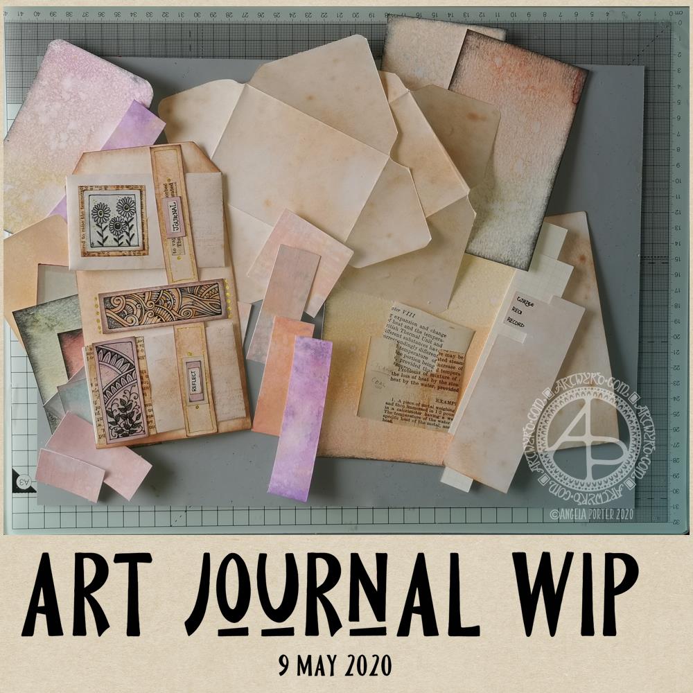
Art Journal WIP

Art Journal WIP © Angela Porter | Artwyrd.com

I’ve been awake since around 4 am yet again, and after watching a couple of journal making videos on youtube by Wendy’s Journal Adventure and Tracie Fox LoveJunk Journals, I wanted to get up and have a go at creating a tri-fold tag for my own art journal.

I had an idea that I can use the little drawings I like to do as ephemera and embellishments and focal points in my art journal, rather than using ephemera from other sources like books, printables, and so on. I’m sure I’ll find more uses for them if I persevere with this project.

So, back to the tri-fold tag. It was my plan to make such a tag for my art journal. However, as usual, my plans often take a slightly different route!

I started by working out the size of tri-fold tag I wanted to make – to fit an A5 sized art journal.

I settled on a piece of mixed media paper cut down to 11.5″ x 7″, which I scored at 3.75″, 4″, 7.75″ and 8″ to create the three tags joined by hinges. I cut the top corners off each tag panel.

I coloured the front and back of the paper using Distress Oxide inks and sprayed water to distress the surface more. Then, I used vintage photo Distress ink to edge all the sides and folds to frame the panels .

I’d chosen colours that would go with some ATC s I was drawing last night while attending a webinair and listening to the speakers. However, the Distress Oxide inks resulted in a much brighter colour and I really wasn’t happy with the result. I will use this panel to use as a reference in future, not so much for sizes but for ideas for pockets and panels and envelopes and so on.

So, I started again. I used Distress Oxide inks, but this time I used tea dye and vintage photo, applying them as lightly as I could. I also coloured some copier paper using the same colours in Distress Inks, with a hint of rusty hinge added to the mix.

I was much happier with the colours this time around.

I liked the idea of using a ‘belly band’ with little envelopes tucked into it. So, I used 5″ square pieces of the coloured copier paper to make some little envelopes (2.5″ x 3″). Two of these would fit neatly on one of the panels. So, I made a 0.75″ x 7″ belly band, and coloured it with the same inks as the panels. I applied thin beads of glue to the ends and centre of the belly band and then adhered it to the panel, off-set to the right of the centre line.

When the glue dried, I had two sections that would hold one envelope each.

My next job was to rummage through my stash of coloured papers to find ones that would go together and were sympathetic with the background.

I drew some panels to add to the envelopes and also the space between them. I backed the panels with vintage book paper. Then, I hand lettered some words on a piece of coloured copier paper. I chose ‘Journal’ and ‘Reflect’ from the selection, cut them out. I used both vintage book paper and a piece of coloured paper behind them to make labels that I attached to the belly band above each envelope.

Finally, for now, I used a gold glitter Signo gel pen by Uniball to add dots and highlights.

It was then that I realised I really wasn’t happy with the tri-fold tag as I’d made it. So, I set about cutting the tags apart so I had three individual tags. I want to join them together in a different way, using hinges of some kind.

But for now, tiredness has caught up with me, as well as the need for some breakfast. So, I will put my project to one side for now and return to it later.

Reflections

I’m not entirely sure where I’m going with this, not yet anyway. I kind of like what I’ve seen other people do as far as ideas go for pockets, tags, labels, envelopes, pouches and all kinds of ephemera for art journals. However, they’re also not really ‘me’. I’d like to find a way of expressing ‘me’ in an art journal.

The one I have, in an A4 sketchbook is fine, and a perfect place to try things out. But, I’d like to do a smaller art journal that has sturdier, mixed media paper in it.

I do know I want to make use of my own artwork. Today, I drew the designs onto the coloured card. However, I quite like the idea of building up a digital library of my own drawings and designs that I could print out on paper and colour accordingly.

Although I hand lettered the words I used today, part of me isn’t happy with them and wants to create them in Affinity Publisher.

All the paper I start with is bright white in colour. Perhaps I could look at using different papers and colours of paper for future projects.

One other thing I’m doing, is keeping notes and diagrams showing templates and dimensions for various ephemera.

I’m babbling here, now. The early morning and lack of enough sleep last night is really catching up with me now. Time to post this then go get breakfast and more tea!

Zentangle ‘toppers’ for cards

©Angela Porter | Artwyrd.com

I’ve been awake way too long already today. I just couldn’t settle to get back to sleep when I woke around 4am. I gave up trying just before 6am and thought I’d do some drawing to see if it would settle me.

The soothing style of choice at the moment is zentangle, so I made use of some of the coloured ’tiles’ I made yesterday, and these are the result. I’ve yet to decide whether I will actually turn them into cards, or whether I’ll just keep them as references for the future.

I thought plain black line looked a bit ‘flat’. That may be a consequence of me working digitally so much and the way I achieve dimensionality in my art.

So, in the top design, I used brush, water and some colour from Zig Clean Colour Real Brush Pens by Kuretake. I enjoyed adding shading with colour, though it was hard work with the fine brush I’d chosen, especially when I turned my attention to the one on the bottom left. So, I used a Tombow Blender pen with the colour for the third card on the bottom right. I’m much happier with the smoothness of the gradients here, compared to the other two.

What I’m not happy with is the way the pigment from the black lines seems to move, particularly when I used the brush. I’m not sure whether this is a result of me drawing on top of the distress ink coloured paper, or whether it’s to do with the friction of brush on the lines. I did get a little bit of movement of the pigment with the Tombow blender pen, but not so much it seems.

As I’m digging into my stash of media from past times, I remembered I had some Nuvo Drops from Tonic. So, instead of using a metallic gel pen to add some embellishments, I added some of these drops.

I’m not entirely sure they work. I think I’ll have to look at these cards again after I’ve had a good sleep and a break from them

I am glad I tried adding more saturated colour to the designs to give that illusion of dimension, even though I had to rediscover the joys of using a blender pen. I do find pens so much easier to work with than brushes, that’s for sure. That may be a knock on effect of me using pen ‘brushes’ so much in digital art.

I’m exhausted now, but I won’t go back to bed until my grocery deliveries have arrived.