Mail Art

Mail Art ©Angela Porter | Artwyrd.com

Yet again I woke with my mind swimming with an idea I wanted to try out. I’d had a problem when I was trying to add colour to drawings I’d done on distress ink backgrounds. Whether I used water and a brush or a Tombow Blender pen, the pigment from the Sakura Micron and Uniball Unipin pens bled, and I really wasn’t happy with that.

I spent some time yesterday trying different pens out, with no luck in finding any that didn’t smear/bleed. So, I put this to one side until I had a chance to think about it.

I slept on it and woke with an idea to try.

Why not use the Tombow blender to draw the basic shapes of my design in colour and then add black lines afterwards. Seed pods seem to be my default design when I’m experimenting, but I’m fine with that.

So that’s what I did. And this card is the result.

As I was starting to add the black lines to the design I thought I’d made a horrible mistake, had a bad idea. However, as I added more and more detail, I realised it would work out, and I think it did.

I added some gold to the seeds in the seed pod with a glitter gel pen. I also splattered some gold watercolour paint over the design.

The envelope is really simple; three seed pods, black line art with golden seeds.

Not a unique artistic approach, but it is something that has never worked for me before.

It’s not a dissimilar approach I take to my digital art, where I start with the basic shapes and then add shading and detail. I do use line art as a guide for my design, and that is an approach I can apply to traditional art in that I may need to pencil in the design, then colour, then add the line art.

Who would’ve thought it – working digitally is helping me develop my traditional art methods and skills.

My new facebook profile banner.

Just a quick bit of fun this morning. I thought it would be nice to create a little banner for my facebook account and page, and this is the result. Something a bit mystical in nature.

Digital art created with Autodesk Sketchbook Pro along with the usual Surface Slim Pen and Surface Studio from Microsoft.

I used this as an opportunity to try out some new ideas, and it’s worked out well enough I think.

Today, I’m feeling content, at ease and that inner smile is back. It’s nice, once again, to have the windows open a little and to feel the gentle flow of cooler air into my work space warmed by hazy sunlight.

Being creative certainly does help me to find and keep my sense of contentment and to keep the anxiety and fear at bay.

Now, it’s time for me to go get my breakfast. I was so determined to create this new border that I got lost in it!

Nature

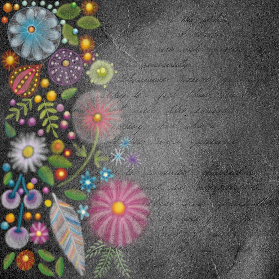
Nature © Angela Porter | Artwyrd.com

This image is in the vein of experiments in digital art. It reminds me very much of chalk/soft pastels, a traditional medium I did experiment with many, many years ago. However, I abandoned it as I didn’t like the feel of the soft pastels nor the messiness of them.

Using a kind of digital version of them means no mess!

I like this pot potpourri of motifs quite a lot. The softness of the lines and translucency of the colours appeals to me. I also like the way the colours glow against the black background. Surprisingly, the simplicity of the motifs appeals to me as well, giving a folk art kind of vibe to this work. Overall this design has an ethereal, ghostly, perhaps even magical feel to it.

My usual style of art is quite intricate and detailed, so this is definitely a departure from this. It’s certainly a style I want to experiment with more.

As it’s digital art, I used Autodesk Sketchbook Pro along with a Microsoft Surface Pen and Microsoft Surface Studio.

Magical landscape mandala

Magical landscape mandala © Angela Porter 2019 - Artwyrd.com
Magical landscape mandala © Angela Porter 2019 – Artwyrd.com

Creating this mandala has had me smiling. Gentle smiles on my face and in my heart. There’s something about the graphic black and white, the grey foliage in the background and the mystical, magical moonlight illuminating the design. I look at it and I feel a sense of achievement and satisfaction with this one. It’s not perfect. There’s things I want to do with it, and working digitally allows me to do that. However, for now, it’s more than good enough. I need more tea and a bit of a break from it.

I have to say that it looks really nice in just black and white. but, the simple gradient background really sets the atmosphere for the design. I did use a gradient fill tool to create the coloured background, but I do want to go back and create one that I can have a bit more control over for sure, maybe using watercolour brushes to do that, and adding spots of glow too.

I’m really pleased with the lighter foliage in the background, adding depth and dimension to the design, adding interest. It’s delicate and ephemeral, misty too.

I want to try not letting the background colour the motifs. That’ll involve me adding white to the white spaces. For some reason I created them with transparent ink.! No great problem to go back and sort that out though.

I also want to try working on a landscape that isn’t a mandala, using the same kind of style of drawing and adding magical, mystical coloured backgrounds.

But overall, I’m pleased with this and I’m pleased with the progress I seem to be making in both digital art and in developing my art ‘voice’.

There’s been quite a few pieces of art I’ve created that have made me smile recently – many of my mandalas and entangled drawings, my cute kitty ‘cartoons’ spring to mind, especially one I did of the pink anti-stigma badger as a Jedi knight!

I can honestly say that this mandala, and my previous one, have made me smile more than most.