I matter. I matter equally. Not ‘If only’, not ‘as long as’. I matter. Full Stop.” – Chimamanda Adichie, Nigerian writer.
A balanced world is a better world. How can you help forge a more gender-balanced world? Celebrate women’s achievement. Raise awareness against bias. Take action for equality. www.internationalwomensday.com
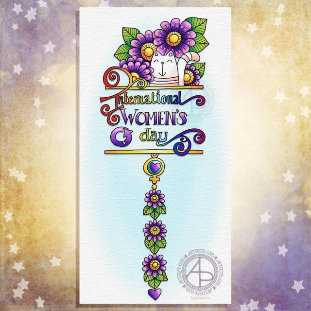
Today is International Women’s Day, Furbaby Friday and Dangle Day so what else could I do but combine them all into one design?
I started by sketching them out on dot grid paper. My favourite sketching tool at the moment is any one of the darker tones in the Koh-I-Noor Magic multicoloured pencils range. The thickness of the lead encourages me to be bold in my hand lettering and drawing. It also encourages me to draw on a larger scale than I usually do.
Something else I’ve noticed is that drawing with such a thick (but fun and coloured) pencil,I can’t put all the small details in that appear in the final image in the sketch. It really is a sketch which I can then use as the skeleton, the framework, the architecture for the final design.
The thickness of the pencil also means that my hand lettering is bigger than usual. I can also deliberately wear the lead down into more of a chisel shape which helps with the thick downstrokes and thin upstrokes.
It’s also a pleasure to write with pencil and my writing always feels neater when I do write with a pencil. I have no idea why that is, but it just is.
Anyways, once the design was sketched out, I scanned the design into the Microsoft Surface Studio and used Autodesk Sketchbook Pro and a Microsoft Surface pen to first ink in the outlines and then add colour, details and texture.
For the colours I kept to a fairly simple colour scheme with pink and purple for the flowers and hearts and the Women’s Day symbol. I just had to use a rainbow to fill the hand lettering (apart from the word ‘women’s’). And the pusscat just had to be mainly white, but I thought peachy-pink stripes would be quite nice.
This became yesterday’s self-care drawing. When I’m not feeling all that right my default setting is this kind of drawing. It really does help soothe my unbalanced mental and emotional health. Thank goodness that today I’m feeling a lot more myself, whatever that means. In this context I think it means more emotionally calm and kind of content and a less worrisome and fretting mind. My background anxiety levels are still a tad elevated, but not as bad as they were over the weekend and through to yesterday.
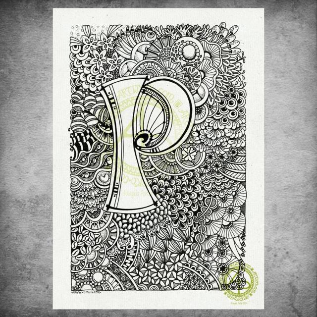
I hand lettered the monogram on an A4 sheet of Daler-Rowney Bristol Board using Uniball Unipin pens. I then just let my pens draw some new and old favourite motifs and patterns to create this abstract, entangled art.
Yes, the P is a bit off-centre, but I didn’t measure it out! I just drew it. I didn’t plan on doing the entangled drawing stuff. I was just going to spend sometime with hand lettering…just goes to show that instinctively I knew what I needed yesterday to help soothe me. I could lose myself in the flow and give my mind and emotions a bit of a break.
It took me several hours to complete, and this morning I scanned it in, added a background texture and the watermarks with digital wizardry.
My only consideration for it at the moment is whether to leave it as is (black and white), to add shading in greys, or whether to add colour. I’m also quite tempted to add some gold to the monogram, just in places. I could print it out and try that on a copy before I commit myself to altering the original.
Today I do need to settle to inking in some sketches for the next coloring book. Maybe do some more sketches as well.
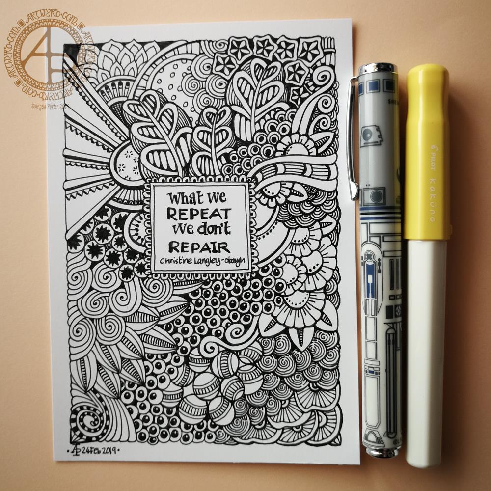
This is a postcard sized drawing with some not very good hand lettering. The pens I used were a Schaeffer R2D2 pen for the broader lines and a Pilot Kakuno for the rest. Oddly, they both have medium nibs, but the width of medium nibs vary from brand to brand. Both pens are, however, smooth writers and a pleasure to hold and use.
Part of my self-care over the past week has been pulling together my favourite patterns and motifs into my visual dictionary. I find something soothing in repeating something that is familiar to me. Perhaps because I know I can do it. Perhaps because I feel I’m organising, taking control of something I can organise and take control of. Perhaps it is just the familiarity of the process and knowing the outcome will be a positive one.
However, in doing this, I rediscover patterns I’ve used in the past that I’ve forgotten about and it’s nice to use them once again.
Of course there are some of my old favourites in this drawing, but there are some that haven’t seen the tip of my pen in a long while, and couple that have only been added to my visual dictionary and not used in a piece of art by myself.
It’s very easy for me to fall into the familiar, especially when I’m having a bit of a tough time with my mental and emotional health, when EMDR or life has provoked a response in me that affects my ability to believe in myself and my art. These past six days have been a period of time just like that. I’ve gradually been recovering over the week, in general terms, but there have been some rather tough times too.
I think I’ve mis-written the quote from Christine Langley-Obaugh though, but the meaning is the same. I’m increasingly becoming aware of myself and the repetitions of feelings and thoughts and events in my life that cause me emotional and mental pain. Sometimes even physical pain when they’re revisited in EMDR or even in loving-kindness meditations too it seems.
This kind of reorganisation of my visual notes is just like how I used to write and rewrite and rewrite again and reorganise again and again my notes when I was in school, university and as a teacher. Trying to make things better, perfect and starting over again if I made a single mistake.
What I have noticed is that in my A5 dot grid journal from Claire Fontaine is that I’m not so ‘perfectionist’. I want to gather together my favourite patterns and motifs, doodles and alphabets in one place for a quick and easy reference, as a way to spark my creative juices when I feel I need that happening. There’s mistakes in them. They’re drawn with different degrees of precision and neatness. I’m working hard on not starting over, again, even though I know I’ve most probably got repeats of the same pattern or motif in there. But that’s fine. I’m telling myself that is perfectly fine.
That is a huge change in how I would call myself stupid and useless and a failure if I made one mistake in my pristine page of notes during my educational years or time as a teacher.
Working digitally allows me to achieve a level of perfection in my drawings as any ‘mistakes’ are easy to change.
Working with pen and ink on paper, with few pencil lines, means I have to live with the ‘mistakes’ or adapt them to be part of the design. I can edit out smudges if I scan the artwork in, but I rarely make changes to it unless it is at the behest of the publishers.
I think shows how I have a bit of a healthier relationship with myself now.
It’s always good when I can make connections between present behaviours and those in the past and to see how they have helped me but also how I have healed and made positive progress in my journey to CPTSD recovery.
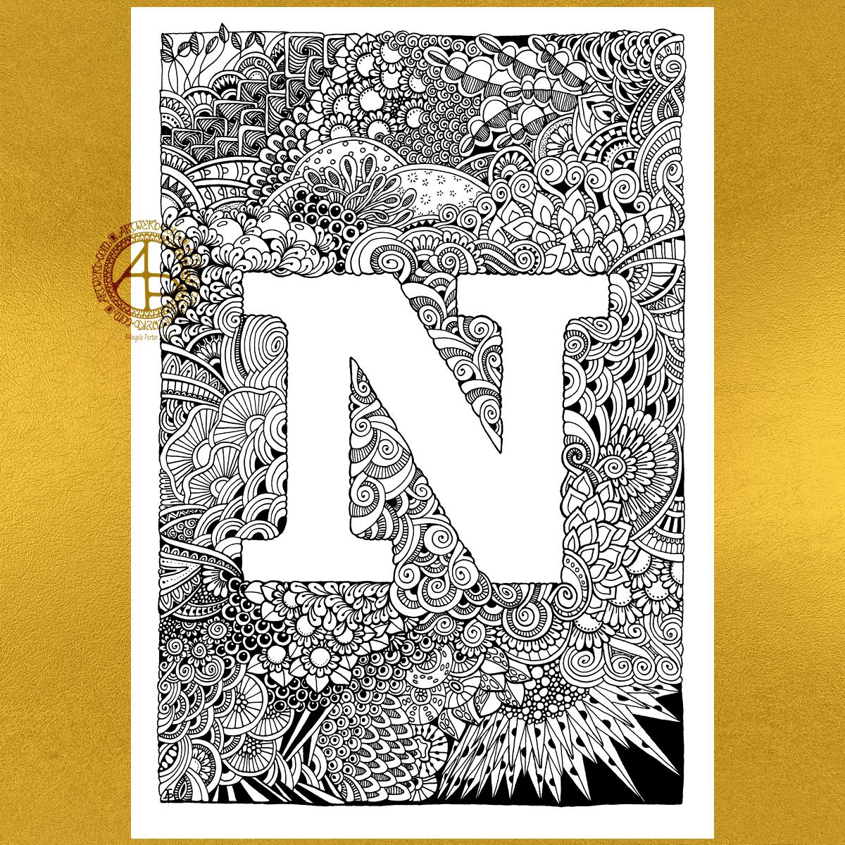
Enjoyable few hours (around 6) drawing this one. I have toyed with the idea of mocking up gold foil for the N…not sure if it works though having tried it out.
I still think the edges of the N are either too wobbly or too straight … not sure if the patterns should just peek over the edge in places with clear lines in others …
Let’s go try another letter out! I will eventually crack this … I will …
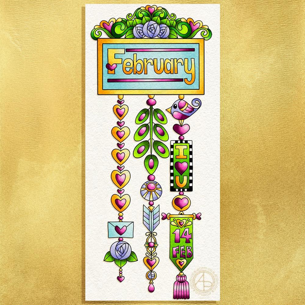
Friday is dangle day here in my arty world, and as it’s the first day of February the dangle needs to relate to that!
I created this design for members of the Angela Porter’s Coloring Book Fans facebook group (where today is furbaby friday). If you pop over then, join, then you can download the template to colour yourself.
The world is still in the grip of winter; I woke up this morning to a coverlet of snow covering everything. Yet again, I’m am so grateful that I work at home and don’t have to go out until it clears, even if that takes a day or so.
I wanted the colours in the dangle to reflect winter, but I also made Valentine’s Day a focus for the design, and I used that as an opportunity to include some more bits of hand lettering.
I did sketch the design out on Rhodia dot grid paper then scanned it in. I then re-drew the design digitally using my usual trio of Autodesk Sketchbook Pro, Microsoft Surface Pen and Microsoft Surface Book.
Today, I have a template or two to create for a colouring day at the Welsh Office in Cardiff on Time to Talk Day next Thursday. Time to Talk Day is the day where we’re encouraged to talk to people about mental health and well being. I don’t have anything to do on this day for Time to Change Wales, yet, or at any point in the week. I do have other projects to work on as well.
My own anxiety seems to have slid back to it’s usual constant background level after a stressful time earlier this week. It takes time. Mindfulness meditation helps somewhat, but it does take time for those stress response chemicals/hormones to leach out from my body even when I calm myself down.
Yesterday was a day where I was out of sorts for some unspecified reason. Drawing little, intricate bits of art was the only thing that helped to soothe me and calm me. Along with comfort eating, which was not good way to cope.
I get days like this. I have no idea what triggered this response. It may have been a visit to my accountant on Tuesday and the tax bill to pay – I have absolutely nothing to worry about with either, but dealing with finances is a trigger for the anxiety and depression that are part of my cPTSD.
I know I was on edge about the meeting, even though I knew there would be nothing to worry about. The anxiety had been gradually growing through the previous few days. This anxiety provoked the warning signs of an incipient migraine/stress headache on Tuesday morning. Luckily I caught it in time with painkillers so that it didn’t develop into a full blown migraine and after the meeting I was left tired but feeling more at ease.
Yesterday, the anxiety ramped up again as I went to get the paperwork and bank card to make the payments. So, yesterday I needed to manage my anxiety and tiny, intricate drawings were what was needed.
Today, I know I have to do these things, and I will. I don’t have the anxiety I had about them yesterday. I think yesterday was just too close to a few days of spiralling anxiety as accounts day approached closer and closer.
cPTSD can make doing the simple things in life far more difficult to do. I do get things done, though I do have to be kind to myself at times, making sure I have plenty of time before the deadline.
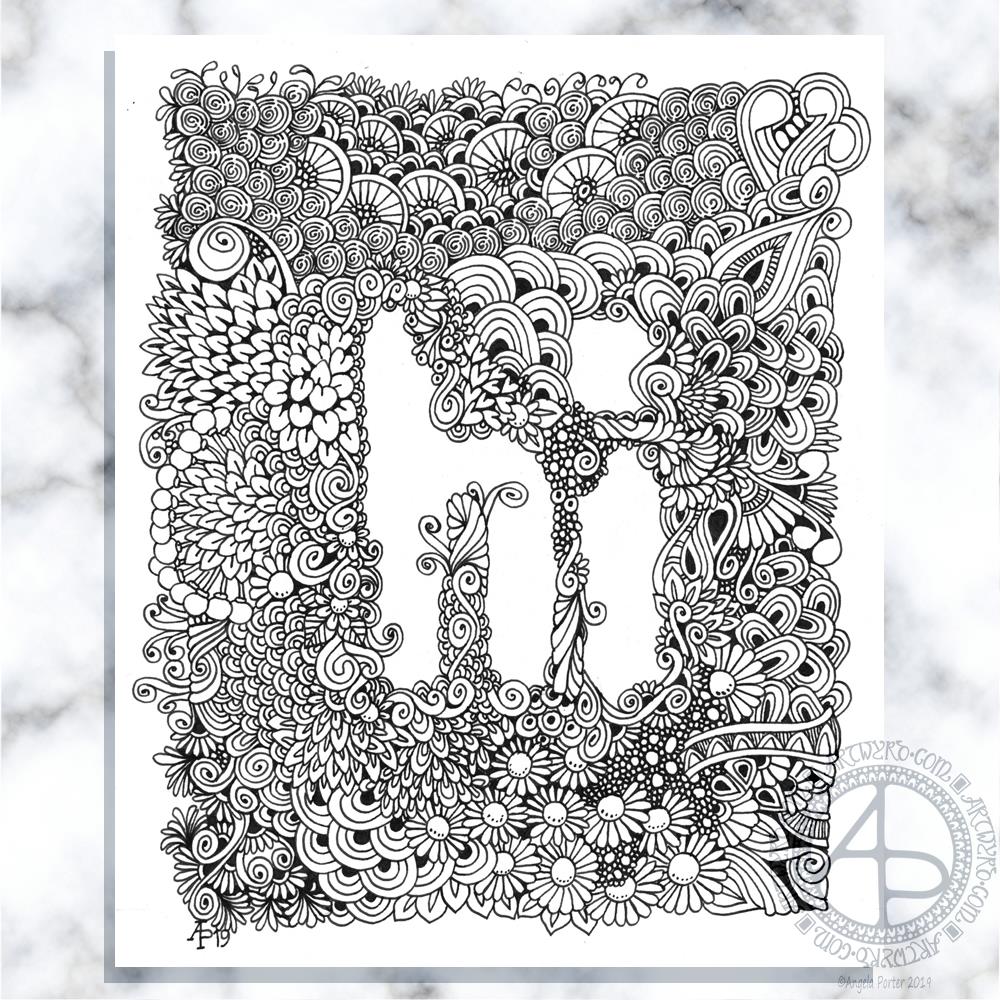
I used fountain pens on white paper to draw the designs. The M is on paper that is around 4″ x 4″, the G is a little narrower than 4″ for some reason.
After scanning them in, I did a bit of digital wizardry to fill the letters with a gold foil texture, just to see what it would look like, and they look OK to me. I’m not too keen on the black line around the G though. I do like the contrast of the golden letters and the black and white designs around them.
Today, I have to colour the cover for my next book for Dover Publications Creative Haven series. And keep warm and safe. I woke up to a lovely sunrise with a frosty world – everything was covered with white. I know the temperature was down to -3ºC last night as I came home around 10:30 pm, and it would only have got colder as the skies were clear and starry. It’s beginning to go now, but clouds have covered the sky.
The frost is beginning to disappear now, but clouds have covered the blue skies. Snow is forecast for a bit later on today. I like to see snow. I like the way the world falls silent in heavy snow as it seems to muffle the usual background noise of modern times. I’m wise enough to know that for me to go out in snow is never a wise idea; I tend to slip and slide and fall and hurt myself. So, as I have nothing pressing that requires me to leave home, I’ll be staying safe and warm indoors! Once the cover is coloured, my attention will go to February’s templates for the Angela Porter’s Coloring Book Fans Facebook group. Someone there has asked for some simpler templates like my dangle designs, so I think that’s exactly what I’m going to do!
I wanted to start my arty day with some intricate fountain pen drawing, and this is the result.
I didn’t draw on coloured paper though. I tried on some parchment paper from Manuscript, but the ink smudged so easily…so I thought I’d try some mixed media paper from Claire Fontaine, and I still had some faint smudging, but not as much as on the parchment paper, so I worked with it, knowing that I’d be able to clean it up digitally, which is what I’ve done.
I also added a coloured background to the artwork, trying to mimic the parchment paper. I think I’m going to have to scan those papers in to create texture backgrounds I can use digitally.
I kept the monogram shape really simple, though as I look at it now there’s space inside for some embellishment – maybe a bar or two with finials or beads on, nothing fancy though. Mind you, I’d love to add gold leaf to the borders and colour to the K as well. Maybe something I can do sometime in the future, with another monogram styled like this one but without the ink smudging that I could only remove digitally.
Note to self:- use paper that fountain pen ink will dry thoroughly on, on bleed on and won’t smudge easily!
I enjoy the tiny, intricate drawing as well, it is something that brings a gentle smile to my being.
Oh, I did use fountain pens to draw with. I used a broad Kaweco pen for the outlines of the letter and boxes. I then used a fine point Kakuno pen by Pilot for the patterns.
Yesterday I paid a visit to a stationers in Cowbridge called The Pencil Case.
There were lots of oohs and ahhs and wows from me as I browsed around and picked up a fair selection of pens and pencils – a pink Brunnen fountain pen, a teal Faber-Castell Poly Matic 0.7 automatic pencil along with a couple of cases of 2B leads, some spiral pen/pencil grips by Tombow, an set of coloured Pentel Energel pens (12 pens in fabulous colours!), and an R2D2 fountain pen from Shaffer!
I know, I have a problem!
I had a lovely chat with the lady in the shop (whose name I’ve forgotten) about stationery, pens, drawing, teaching and so on. We also experienced a huge bang as a car collided with a big van outside the shop. We weathered the ensuing drama quite well, all things considered.
My pen stash has some lovely new additions, especially the R2D2 pen! If you didn’t know, I love Star Wars, amongst other things.
I’ll definitely be visiting The Pencil Case again, and I’ll be using the pens, fountain and Energel, to draw with alongside my other fountain pens.
I’ve worked on this one over the past three days. It all started with the pencilled in letters and then I went to town adding tiny, entangled patterns around them.
I used a fountain pen on marker paper and the final image size is approx. 16cm x 14cm.
I started drawing this one a couple of days ago using a fine nib fountain pen on paper. I’ve spent much of today finishing the drawing and I’ve just started to add colour digitally. Not sure about the colour yet though.
The words appeared intuitively, instinctively as I was drawing. Something’s obviously bubbling in my unconscious mind, most probably a result of the loving kindness meditations I’m continuing to do.
It’s always relaxing for me to draw in this way – just letting shapes and patterns flow from the nib onto the page without too much in the way of consideration or fretting about what appears. Partway through the whole drawing, or even sections, it looks like a total hot mess to me, but I push forward. To give in would be easy, to persevere takes a bit of effort. The effort is usually worth it though; my past experiences have taught me this.
I’m looking out of my window as I’m typing. I can see jackdaws swooping and wheeling in the now sunny skies. We’ve just had a wintry snow shower, which hasn’t lasted on the ground at all. The black feathery jokers are revelling in their fun and games in the air, exuberant in the dry but cool air and the sunshine. There are veritable clouds of them and I know they’ll soon return to their roosts, cloaking the winter-bare trees with their featheriness and raucous caws. I’m smiling as I watch them. I do have a big soft spot for the corvids of this world. Their antics delight me, especially the ones that zoom past the window next to my work area! They whooshed off to my left and now some are whooshing back to my right. What a lovely sight close to the end of the daylight hours!
It also brings back memories of sitting with my cat perched upon my chest, both of us looking out of the window and watching the jackdaws flying by, and in the summer dusk hours bats. His eyes would be wide and alert as his head spun back and forth, avidly watching the flying critters. I’d be equally delighted watching the antics of both the flying and cwtched up critters! So many precious times with my companion to treasure though he has been gone to pusscat heaven for nearly 9 months. I’m sure he’s still keeping an eye on things that fly , wherever his little soul, spirit is residing!
Watching the birds brings me some joy and peace too. And happy memories of my companion of sixteen years.
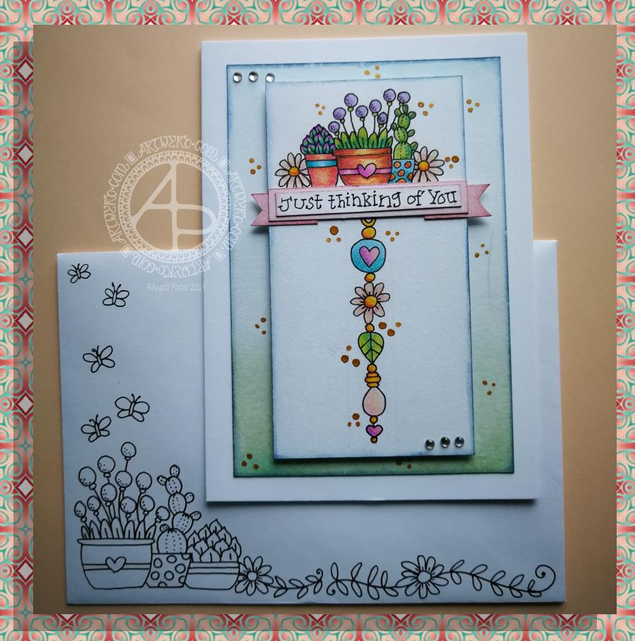
This little card and envelope took me around 3 hours to make. I had to remember how to do various things and find my supplies to do them with!
My first task was to make the sentiment banner. I had the idea for this one after someone asked me for recommendations of good books for learning hand lettering as they’re not at all happy with their handwriting.
Hand lettering and handwriting are not the same thing. Hand lettering is something you unconsciously do. Hand lettering is the conscious and deliberate drawing of letters, one by one. Practice, like everything else you want to learn and become good enough at, is important. I suggested that they try printing the sentiments out on their computer or using words cut out of books or magazines or stickers or stamps and ink pads used by card makers until they’re comfortable with their own lettering style.
That led me to thinking that rather than writing the sentiment directly onto the paper that I’m going to draw the dangle design on, what about if I hand lettered it on paper again and again until I’m happy with it and then cut that version out. I could then layer it onto coloured card to make a border, or onto the paper or or or…
So, that’s what I wanted to use here. A variation on what I’ve done in previous cards. I cut two trips of mixed media paper, one around 1cm wide, the other around 0.7cm wide.
On the narrow strip I wrote my sentiment. I did this confidently as I knew if I got it wrong I could always write it again – I’d not ruin my dangle design in any way. I then trimmed the strip close to the start and end of the sentiment.
Next, I coloured the wider strip of paper with victorian velvet Distress Ink. I trimmed one piece so it was just a little longer than the sentiment. Then, I cut two rectangles from the coloured strip. I cut triangular notches into one end of each of the rectangles. I used the sponge applicator to make sure the edges of the coloured pieces, including inside the notches, and the sentiment strip coloured. By doing this, there’s a darker edge to the pieces and this defines them against the background. The final step in making the banner was to glue the pieces together as shown in the photo.
I cut two pieces of mixed media paper for the front of the card. The smaller one I made a little narrower than the sentiment banner; I wanted the ribbon to hang over the edge a little. I used a pencil to mark where I wanted the banner to sit on the card. I then used a pencil to mark out the centre of the card so I could position my dangle centrally.
Above where the ribbon would sit I wanted to place an arrangement of pot plants – succulents and a cacti. Below I wanted a fairly simple dangle, but one that had elements that appeared in the arrangement of pot plants. I drew these with a 05 Uniball Unipin Pen.
I then wanted to colour the two pieces of mixed media paper before I coloured the designs in.
For the larger one I used Peacock Feathers, Bundled Sage, Weathered Wood and Tumbled Glass Distress Inks to colour the whole of the paper panel. I edged this panel with Faded Denim Distress Ink. Then, I lightly sprayed the panel with water so that I’d get some faded watermarks as a texture in the colour.
For the upper panel, I used a very light hand to add the same Distress Inks to the paper, but in a much paler shade. I also edged this panel with the Faded Denim Distress Ink. I realised it hadn’t erased the pencil guidelines before I added the Distress Ink so when I went to erase them they wouldn’t fully erase. I’d forgotten that I had to do that! Still, it adds a bit to the distressed feel of the cards, that and the damage marks that were on the larger panel too.
To colour the dangle design I used Mitsubishi Uni coloured pencils. I used a fairly limited palette across the design.
The last two steps before assembling the card were add dots of gold ink and some shiny adhesive crystal gems.
To assemble the card I used glue to adhere the lower panel directly to the card. I then used foam squares to adhere the dangle design panel to the lower panel and the sentiment ribbon to the dangle design panel. This card has quite a bit of dimension to it.
My final job was to decorate the envelope. I decided to draw some pot plants and some of the daisies along the bottom. I added some butterflies to the left as the area above the pot plant seemed empty, unbalance. I haven’t coloured the envelope in as I’m in two minds whether to or not. Also, it would be nice to edge the envelope with the Faded Jeans Distress ink too, maybe even colouring the envelope with the same Distress Inks as the card. There’s also the back flap of the envelope that would benefit from a little potted succulent drawing I think.
Distress Inks are water-reactive, so if I do this, once the envelope is addressed a light application of Micro Glaze would seal the colour in so it wouldn’t be damaged in the mail.
I’m actually quite pleased with this card. It’s got me thinking about how to do more of this kind of stuff – card making the ‘Angela’ way!
If you give making cards like this a go, I’d love to see what you create! Happy art-ing, lettering and crafting!