Remembrance Sunday Mandala

Remembrance Sunday Mandala ©Angela Porter | Artwyrd.com

A Short History of Remembrance Poppies

In Flanders Fields

In Flanders fields the poppies blow
Between the crosses, row on row,
That mark our place; and in the sky
The larks, still bravely singing, fly
Scarce heard amid the guns below.


We are the Dead. Short days ago
We lived, felt dawn, saw sunset glow,
Loved and were loved, and now we lie
In Flanders fields.


Take up our quarrel with the foe:
To you from failing hands we throw
The torch; be yours to hold it high.
If ye break faith with us who die
We shall not sleep, though poppies grow
In Flanders fields.


John McCrae, May 1915

Poppies have been the symbol of remembrance for those fallen on the fields of battle since Moina Belle Michael was deeply moved by the last verse of John McCrae’s poem. She vowed to always wear a red poppy of Flanders Fields on her lapel in memory of those who had died in WWI, and wrote this poem in response to McCrae’s.

We Shall Keep The Faith

Oh! you who sleep in Flanders Fields,
Sleep sweet – to rise anew!
We caught the torch you threw
And holding high, we keep the Faith
With All who died.


We cherish, too, the poppy red
That grows on fields where valor led;
It seems to signal to the skies
That blood of heroes never dies,
But lends a lustre to the red
Of the flower that blooms above the dead
In Flanders Fields.


And now the Torch and Poppy Red
We wear in honor of our dead.
Fear not that ye have died for naught;
We’ll teach the lesson that ye wrought
In Flanders Fields.


Moina Belle Michael

Moina wrote her poem on 9th November 1918 while working at the 25th Annual Conference of the YMCA War Secretaries’ Headquarters in New York.

Some of the delegates approached her and gave her a $10 donation in appreciation of the flowers she had used to brighten up the place. She showed them the poem she had written and vowed she would buy twenty-five red poppies with the donation, which she did later that day. On returning to duty, delegates at the conference taking place in the headquarters crowded around her, asking for poppies to wear. She gave out all but one of the poppies, which she wore herself.

Moina campaigned to get the red poppy adopted as the symbol for Remembrance for the fallen. However, it wasn’t until the 29th September 1920, that the National American Legion adopted the red poppy as a symbol of remembrance.

Anna Guerin, a French woman, was present at the National American Legion convention. She was inspired by Moina’s efforts, and saw how the poppy could be extended to raise funds for the needy.

Anna founded the American and French Children’s League, and she organised French women, children and war veterans to make cloth poppies to be sold, the proceeds of which could be used to help fund the restoration of the war ravaged regions of France.

In 1921, Anna either went herself or sent representatives to America, Australia, Britain, Canada and New Zealand, to tell them about the poppy and the work of the American and French Children’s League.

Anna went in person to meet Field Marshal Earl Douglas Haig, founder and President of The British Legion. She persuaded him to adopt the Flanders Poppy as an emblem for The Legion. This was formalized in the autumn of 1921.

The first British Poppy Appeal occurred in 1921, in the run up to 11th November – the third anniversary of the Armistice of the Great War.

Since then, red poppies have been sold during October and early November to raise funds for the charitable causes of the Royal British Legion.

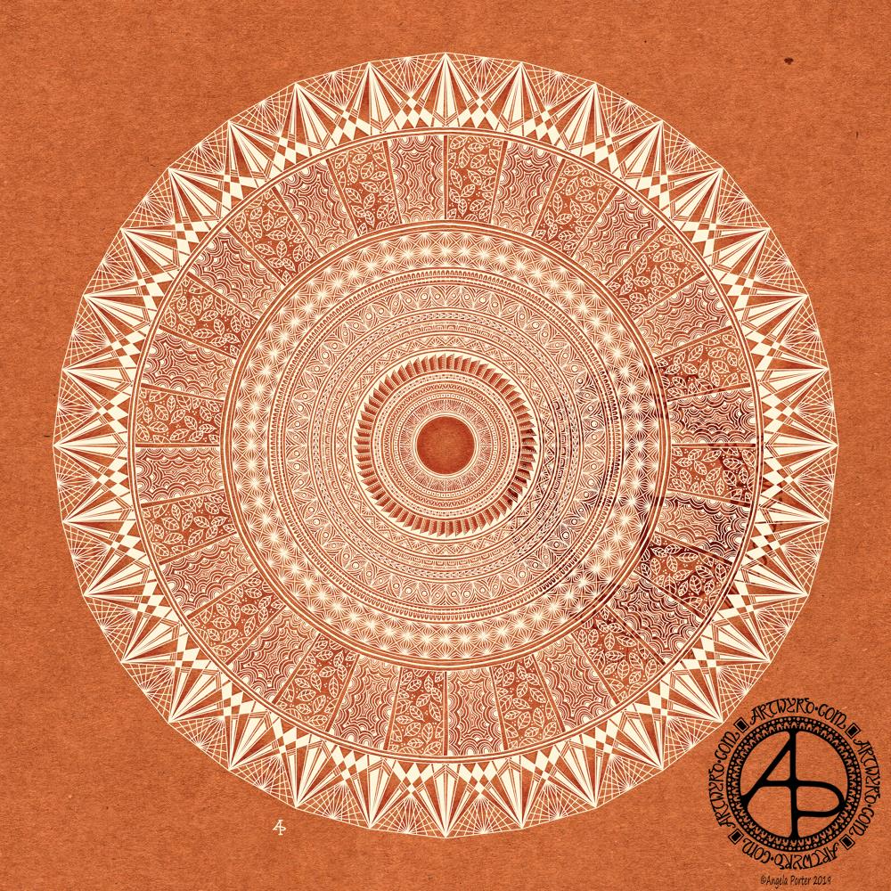
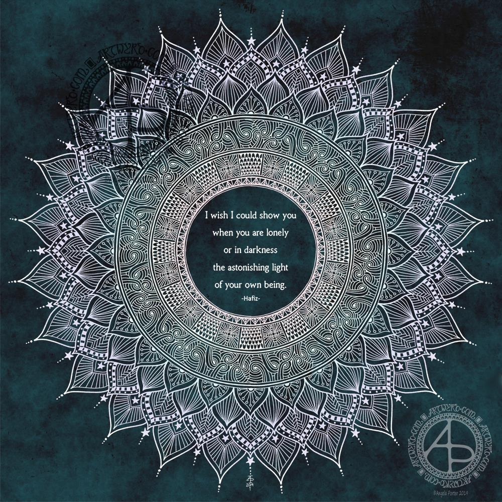
About my Remembrance Mandala

I chose green and red for the background to the white poppies.

Green represents the battlefields that so many lives were lost on, and so many more changed forever.

Red represents the blood spilled that soaked into the ground.

The black lines represent the death of so very, very many during the World Wars, and so many other wars and conflicts since.

Why have I not coloured the poppies red?

White peace poppies are warn by many. Not as a sign of disrespect, but as a sign of respect and a sign of hope for peace in the world, so that no more lives will be lost through war and conflict.

My white poppies are that wish for peace, but also tolerance, compassion and understanding. They are also a reminder of how the causes of past wars still haunt humanity today, of how hate-speech is on the rise, how societies have become divided in ways that are reminiscent of the times before WWII.

I have always hoped I would live in a world where peace reigned between all peoples, where there was enough for everyone, and everyone’s needs were catered for. I hope for a world described in John Lennon’s “Imagine”.

Yes, I know I’m a dreamer, an idealist. I’m also a realist and know it’s not likely in my lifetime. It doesn’t stop me dreaming and doing what little I can to help make the world a better place.

Before anyone complains or criticises me, my father was a veteran of WWII, Korea and Burma. He rarely spoke of his experiences; when he did, it was usually the humorous ones. Once, when he was drunk one New Year’s Eve, he mentioned he’d been at a concentration camp. When he realised what he’d said, he refused to speak any more and I will never forget the haunted, pained, deeply saddened look on his face that showed the ghosts of his past had risen up to torment him once again. I have the deepest respect for my father, for what he must have gone through, and for how he carried that pain with him through his life.

I have the greatest respect for all those who have served in the armed forces, for all they give to help to restore and maintain peace.

I do, however, wish there was no need of them; that all nations, all religions, all people could come together and work out how we can all live together in peace and find better ways to work out our differences rather than through threats, violence and hate-filled rhetoric.

There Will Be Peace

There will be peace:
when attitudes change; 
when self-interest is seen as part of common interest; 
when old wrongs, old scores, old mistakes 
are deleted from the account; 
when the aim becomes co-operation and mutual benefit 
rather than revenge or seizing maximum personal or group gain; 
when justice and equality before the law 
become the basis of government; 
when basic freedoms exist; 
when leaders – political, religious, educational – and the police and media 
wholeheartedly embrace the concepts of justice, equality, freedom, tolerance, and reconciliation as a basis for renewal; 
when parents teach their children new ways to think about people.
There will be peace: 
when enemies become fellow human beings. 

David Roberts  1999.

Remembrance dangle design

Remembrance Dangle Design ©Angela Porter | Artwyrd.com

Today, I have a simple tutorial for a Remembrance dangle design.

To draw and write the design and instructions I used Faber Castell Pitt artist pens and Claire Fontaine Dot Grid Paper. I also used a Tombow Fudenosuke pen for the broader ‘Remembrance’ to the bottom right of the page.

I did colour the design digitally using a very simple colour scheme and colour gradients.

I do hope you have a go at drawing your own version of this design. I’d love to see what you create with it – maybe a greeting card, or in a scrapbook spread about a loved one lost during a war. Perhaps you’ll change the sentiment for a birthday or other occasion, and change the colour scheme with that.

I based this design on the one that is in my book “A Dangle A Day”. There are over 120 dangle designs in the book for you to learn to draw or as inspiration for your own designs.

Throwback Thursday

Remembrance Mandala 2018 ©Angela Porter | Artwyrd.com

My life has suddenly gotten busier than I expected. I’m having to juggle a new challenge over the next few weeks with existing commitments, appointments and life in general.

So, as it’s #throwbackthursday around the interwebs I thought I’d post the mandala I created last year for Remembrance Sunday.

A year ago, I was starting to get to grips with digital art. I can see how far I’ve come in developing my own digital art ‘voice’. This mandala, however, is still lovely.

I used Autodesk Sketchbook Pro along with a Microsoft Surface Pen and Microsoft Surface Studio.

Terracotta mandala

Terracotta Mandala © Angela Porter | Artwyrd.com

This morning I awoke with a pounding headache, an introvert’s hangover from a therapy session and a busy meeting in the evening with lots of people and noise. A big mug of tea, a couple of Anadin Extra and the head has cleared somewhat, though I still feel quite fuzzy-headed and tired.

Despite the headache, or perhaps because of it, I slipped into mandala mode to start my day. I had wanted to include some wise words in it, but my mind just wasn’t functioning clearly enough.

Unusually for me, I chose a terracotta-coloured kraft paper background to draw with a creamy coloured ink. I added some shading behind the design in places, just to try to increase the depth and dimension. I’m not sure I’ve achieved it well this time, however. Once my head fully clears, I may do the shading afresh.

The resulting mandala is far more geometric and structured than is often the case with me, especially the outside ring. However, I’m quite pleased with it, especially given the state of my head!

I do like the warm, earthy tones of paper and ink in this design. The colours have been quite comforting and soothing to work with.

I drew this digitally, using my favourite combination of Autodesk Sketchbook Pro along with my Microsoft Surface Pen and Microsoft Surface Studio (which are the digital analogues of pen and paper).

Tuesday Thoughts

Tuesday Thoughts 5 November 2019 ©Angela Porter | Artwyrd.com

Another mandala today, this time with my favourite Hafiz quote in the centre.

I wanted a mandala that seemed to be almost glowing for this quote. Also, I added a very subtle rainbow colouring to it too. I’m quite happy with this mandala, though some darker shading behind some of the parts, along with some subtle highlights, would’ve helped with the dimensionality of the design.

I didn’t hand-letter the quote; instead I used a clear and simple pair of fonts. I do want to learn how to create circles of typography; I think the quotes would then be more sympathetic to the circular geometry of mandalas. I’ll need a bit of time to play around in Affinity Publisher and Affinity Designer to see if I can achieve this. Mind you, I do need to practice my hand lettering a lot more too.

All the same, I’m still happy with this design. The lettering will do – for now.

I always enjoy drawing mandalas, and it’s nice to revisit the line-art style of mandalas with lots of intricate patterns in them once again. They are so delicate, airy, lacy in feel compared to my more arty, abstract, coloured mandalas. They’re also a lot quicker to create!

Monday Mandala

Monday Mandala 4 Nov 2019 ©Angela Porter | Artwyrd.com

It’s definitely a mandala morning here in the autumnal valleys of South Wales. The sun is managing to peek out through the pale grey clouds – the light is wintery wan.

I’m not sure if that description of the sky has influenced my colour choices for this mandala today or not; maybe on a subconscious level it has.

I’m really pleased with this particular drawing today. I like the pale, chalky colour on the darker background. I think I’ve got a nice balance betwixt densely patterned areas and more open designs. I also like the shading I’ve added to the background; it’s added a fair amount of depth and dimension to the design.

It has been a lovely way to spend an hour or so as I slowly come around this morning.

I was going to draw a flower or three to float above the mandala, similar to the skulls I drew through Inktober. However, I like the mandala just as it is, for now.

Digital Art created using Autodesk Sketchbook Pro along with a Microsoft Surface Pen and the digital paper that is the screen of my Microsoft Surface Studio.

An Entangled Sunday

An Entangled Sunday ©Angela Porter | Artwyrd.com

Yesterday evening, I took a combination of Tombow Fudenosuke, Sakura Pigma Micron and Faber-Castell Pitt Artist pens to a 6″ x 6″ piece of Strathmore vellum surface Bristol Board. I ended up with a black and white entangled drawing. This morning, I scanned the image in and added a kraft paper background and then some subtle shading and highlights in Autodesk Sketchbook Pro.

After Inktober and my focus on digital art, it was nice to draw traditionally for a change. My mood and energy levels were such that I needed to slip back into the familiar, comforting entangled style of art to soothe my emotions once again.

This drawing worked out OK. However, I don’t feel it flows at all well, though that does reflect yesterday’s mood and mindset.

The part I really like is the rectangle towards the bottom left. I’m also fond of the arcs to the right. Actually, I like all the design elements, I’m just not happy with how they’ve been lumped together. Maybe I’m just being overly self-critical here.

It’s a sunny Sunday morning in the Valleys of South Wales. I think it’s going to be a quietly artsy day, with a trip out for some essential groceries in a short while I think.

November’s coloring template

November colouring template ©Angela Porter | Artwyrd.com

A new month means a new colouring template exclusively for members of the Angela Porter’s Coloring Book Fans facebook group. If you’d like to download, print and colour a template, then pop over to the group, join (it’s free!).

A few, simple terms and conditions apply. All I ask is that you follow them and mention myself and the facebook group when you share the coloured template on social media. Tag me in your posts and I’ll definitely get to see them!

Autumn is well established here in the UK, so I wanted to combine leaves, berries and some acorns in a mandala.

I used an autumnal colour palette to bring the template to life. I think mine looks like a rich, decorative rug. However, I love to see how creative you people are with your colour schemes, particularly those of you who are heading into Spring or who don’t really experience Autumn in your part of the world.

I did draw and colour this mandala digitally, using Autodesk Sketchbook Pro along with my Microsoft Surface pen and the paper that is the screen of my Microsoft Surface Studio.

A simple and elegant Autumn Dangle Design.

Autumn Dangle Design ©Angela Porter | Artwyrd.com

Hello to November, and farewell Inktober. My blog post today looks a bit bare compared to my Inktober creations. However, I have neglected my dangle designs during October, so now’s the time to get back on track with them

Today, I’ve created a simple and elegant dangle design with an autumn colour scheme that could be used in so many different ways. I’ve also put together a step by step set of instructions how you too can create this design (and hoping that it’s not so simple that I come across as patronising).

This is my first time posting a set of instructions – post a comment to let me know what you think of them and if you’d like to see more of them in the future.

I’ve put the dangle design on one side of a slip of paper that would make a perfect compliment slip or a note to slip in with a gift, or just as a short letter to a friend. It would also be perfect for a coordinating piece of envelope art!

This dangle design would be absolutely charming as an embellishment in a BuJo, planner, scrapbook or art journal. It would also make a darling bookmark.

It would be easy to turn this design into a greeting card as well.

So many possible uses for such a simple design.

I do hope that you will give drawing dangles a go – no matter whether you think you’re good at drawing or not! This design is made out of just simple shapes; it’s the colour that brings it to life and masks all kinds of imperfections.

If you’d like more ideas for dangle designs, then please take a look at my book ‘A Dangle A Day’ – it’s filled with examples of dangle designs with step by step instructions and helpful and encouraging words of advice.

One step at a time to a dangle design.

Step 1

Step 1
Draw a square in the top left corner of a piece of paper. I used a piece of paper measuring approx 8.25″ x 3.5″. I used a Tombow Fudenosuke brush pen to draw the box, and outline it. I deliberately made the squares less than perfect to give that human touch as well as a uniquely ‘me’ way of drawing boxes. The Fudenosuke pen allows me to draw lines of variable width quite easily, which adds to the charm of the box. The ink in the pen is also alcohol marker friendly.
Letting your drawings be less than perfect is what makes them uniquely yours.

Step 2

Step 2
I used Chameleon marker pens (BR3 “Cinnamon” and YO3 “Warm Sunset”) to colour the inner box. Autumn is definitely here in the UK, and the combination of these colours reminded me of the leaves. However, you could use any colour combination you like and any medium you prefer to use.
Chameleon pens make it so easy to create a colour gradient – I prefer them to other alcohol marker pens, even Copics.

Step 3

Step 3
I added a simple leaf pattern to the coloured box using a Sakura Pigma Sensei 04 pen.

Step 4

Step 4
Add the dangle! For this dangle I used the same kind of leaves as in the box for a consistent design. I added some round beads as ‘spacers’. Finally, I added my ‘symbol’ to the end of the dangle.
Also, I did draw a faint pencil line with a ruler to help me keep my dangle hanging straight, more or less!

Step 5

Step 5
I coloured the beads and leaves in using the same colours of Chameleon Markers. I then decided I needed to add some shimmer and shine; I used a Uniball Signo gold glitter gel pen to colour in the border of the box and to add some dot highlights here and there.
The Chameleons caused the Sakura Pigma Micron ink to smear a little – I always forget that happens! I should’ve used the Tombow pen again. Oh well, you live and learn, eventually!

Inktober 2019 – Day 31

Inktober 2019 Day 31 ©Angela Porter | Artwyrd.com

Happy Hallowe’en to you all and here is my last skully Inktober drawing for 2019.

The skull prompt was ‘duck’, so I just had to draw a duck-billed dinosaur (hadrosaur) skull! I’ve always had a love of dinosaurs and prehistoric critters, so it’s fab I can include one of their skulls.

I wanted to do a woodcut style skull drawing, but I wanted to use white ink as well as black. So, I used some digital craft paper to draw on. I think it’s worked out well, though some areas of highlights look a bit too geometric. I’ve also just realised that I didn’t add highlights/shadows to the teeth. Oh well.

The mushroom prompt was, quite appropriately, Rubroboletus satanus, and you can see outline drawings of the mushroom in the mandala.

The tangle pattern for today was Florz, and that forms the tiled floor pattern.

When I’d completed the mandala on the same kraft paper as the skulls, I realised that I needed a lighter background, so I just added a different kraft paper to the background.

Reflecting on Inktober

I’ve enjoyed Inktober this year for sure. Picking prompt lists that appealed to me helped a lot. I did start off trying out different ways of approaching drawing skulls and the like. However, I settled on combining the skull illustrations with a mandala. I’ve also discovered a great fondness for woodcut-style drawings.

I now need to work out what to do with my Inktober artworks. Some of them will become available as tee-shirts and other products in the days and weeks ahead; I do want to tweak some of them first.

I’m feeling a bit sad at it being over. Having a ‘brief’ to work to certainly helps to focus my sparkly, grasshoppery mind and takes me out of my ‘comfort zone’ (I absolutely hate that phrase!). I’ve certainly found a passion for skulls; so many more to draw, so many different angles too.

It’s the focus that has been the most helpful. This is something I need to sort out, I think. I do have themes for the colouring books I do, but I think I could do with a theme (or series of themes that repeat over a week) that will help focus my creativity outside of the book.

Inktober has taken over my creativity this month. However, I think I needed that to freshen me up.

So, I shall look forward to Inktober 2020, while doing my best to put into practice some of the things I’ve learned from this year’s challenge.

So, Angela, how are you feeling today?

I’m OK today, a bit tired and the grey, gloomy, damp weather isn’t helping much. I have used my light therapy lamp this morning; that did lift my mood somewhat, to be fair.

Yesterday was the toughest day, emotionally, I’ve had for a while. I was really feeling rather low. It had been coming, however, for over a week. I’m not entirely over it; I’m still feeling emotionally vulnerable and fragile today, but nowhere near as bad as I felt yesterday.

I do know what has caused the stormy weather; being aware of such things shows I’ve come a long way from the start of therapy for CPTSD. I also know that these storms don’t last forever, and that self-care and self-soothing is needed.

That will be the order of the day today. I do have an errand or two to run as soon as I post Inktober, and I do have something happening this evening. However, the rest of the day will be self-care, starting with making a hot, nutritious meal from scratch. I’m tending towards a veggie bolognaise, the leftovers of which can be turned into a veggie chilli for tomorrow.

So, I’d better get this social media stuff done and get on with my day!