Dangle Day Friday

Angela Porter Dangle Day 14 September 2018

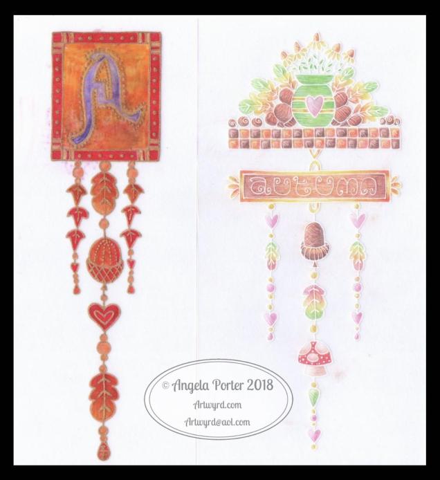
Here’s two dangle designs for dangle day Friday. Simple designs, perfect for getting into the weekend vibe.

These are both experiments where I’ve worked on vellum/parchment, the kind that is used for Pergamano.

The one on the left – the monogram A – is nowhere near as garish in colour in real-life; I really don’t know what the scanner has done to the colours. I drew the design with a metallic gold Sakura Gellyroll pen. I then used Tombow Dual brush pens to colour the design on the reverse. I used shades of yellow, orange, red and magenta, but the scanner seems to have removed much of the red. I also managed to smudge the colours too. I don’t think I’ll be using Tombows on Vellum again.

I do like the gold linework and I think I’ll draw this design out again and colour on the reverse with coloured pencils, like in the dangle design on the right.

You may recognise the design on the right as last weeks dangle design. I traced that design onto vellum using a white Uniball Signo pen. I altered some of the details and the style of lettering.

Next, I did a little bit of ‘whitework’ on the reverse. This gave the highlights on the design that help to give the illusion of dimension as well as some texture. I let the design rest under a heavy book for an hour or so.

Finally, I used my Chameleon coloured pencils to colour the design in, again doing this on the reverse.

I like the colours on this one. The vellum mutes the colours somewhat, but it also softens any imperfections in the colouring.

I’m not sure about the white lines though. I need to try this one with some coloured paper underneath to help the lines stand out a bit more. I’ll post an image of it if it works.

I’d like to draw this design in gold and see how that looks. I may try black too. As well as using coloured pencils, I want to try using Copic  or Chameleon markers to colour the designs in, to see how they work on vellum.

These certainly were experiments, which I’ve learned from. Not only that, I’ve got some ideas to try out the next time I use vellum. I’m trusting I’ll find the combination of line colour and colouring medium that works for me and my style of working.

What would I do with these designs? Well, they would both work really well as spreads in Bujos, planners, journals and scrapbooks. I also think the monogram would make a lovely bookmark. They’d both make nice greetings cards or notecards. I’m sure there’s lots of other things they could be used for, such as framed pictures.

If you have any suggestions for how they could be used, leave a comment.

Peace

Angela Porter Peace 10 Sept 2018
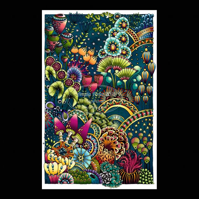
Drawn using a Microsoft Surface Pen on a Microsoft Surface Studio screen in Autodesk Sketchbook Pro.

It’s been a couple of weeks since I last hand-lettered and patterned a word, and this morning it seemed really appropriate to do so.

Yes, hand-lettered, in a digital environment. Working with the Surface Pen on the screen of a Surface Studio is just like working with pen on paper in terms of physically hand-lettering and drawing the patterns.

The ability to work in layers, add effects to layers and use gradients to colour the background is a bit different to working in traditional media.

I do like doing these words; they’re fun to do! Also, a nice way to spend a few hours of a Monday morning.

Abstract Botanical 9 September 2018

Angela Porter 9 September 2018

This one has taken many hours to do, and I’m not quite happy with the background colour/texture, but I need a break from it.

I drew the black and white line art on paper with Sakura Pigma Micron pens, scanned it in, created a transparent background and then coloured it digitally.

I used Autodesk Sketchbook Pro with a Microsoft Surface Pen on my Microsoft Surface Studio.

Fun to do. A nice way to spend time, jut playing. And it’s unusual for me to colour in one of my black and white pieces of line art.

Dangle Day Friday

Angela Porter September 2018 coloured

Friday is dangle day!

We’re a week into September and autumn is nearly here in the Northern hemisphere, so I thought my dangle design should be one for this season. I think this would be a lovely BuJo page to separate the autumn months. I also think it would make a pretty notecard or greetings card. The hand lettering could be changed for another sentiment and it would be suitable for an autumn celebration. Alternatively, it would look great framed and hung as part of a quartet of designs that cover the four seasons; now there’s a project for me to do!

I drew the design on squared paper using Sakura pigma micron pens.

Then, I scanned the image in, used GiMP to remove the squares and create a transparent background

Next, I used Autodesk Sketchbook Pro to colour the image, create the textured background and add a shadow to the design.

I’ve said it before, and I’ll say it again, I love autumn! I love the way the world changes in terms of colours over the space of a few weeks, and the colours can be absolutely glorious.

I don’t know how the long, very hot and dry summer in here in the UK will affect autumn this year.

If you would like to design some dangles and not quite sure how, then my upcoming book A Dangle A Day (available for pre-order) will lead you through the steps as well as giving you plenty of ideas for dangle design.

Friday freebie

Just a reminder that today is the last day for you to enter any of my giveaways, the prizes being signed copies of Eerily Entangled Art, my latest book in Dover’s Creative Haven series of coloring books.

See my previous blog post for details on how to enter.  I’ll be drawing the winners at random tomorrow evening, UK time.

Furbaby Friday

Over on the Angela Porter’s Coloring Book Fans facebook group, it’s furbaby friday.

Of course, it’s Furbaby Everyday over on the Happy Tails Animal Group facebook group.

Both groups would love to see your pictures of your furbabies, as would I.

#wednesdaywisdom

Angela Porter 5 September 2018 small watermarked

Another Goethe quote today, this time hand-lettered.

The design was drawn using Sakura Pigma Micron pens, and then scanned in and the black and white line drawing altered to this.

Hello September!

Angela Porter September Template 2018 small

September 2018’s coloring template

A new month begins and a coloring template for September 2018(above) for the Angela Porter’s Coloring Book Fans facebook group is now available.

If you’d like to access to September 2018’s uncoloured template, which is exclusive to members of the group, just wander over to the group, join and download. Please note, that terms and conditions do apply.

I drew this in Autodesk Sketchbook Pro on my Microsoft Surface Studio using my Microsoft Surface Pen.

Autumn is a-coming!

With the calendar turning to September, my heart lifts with the expectation of the glory of nature as autumn asserts it’s influence.

It’s my favourite season of the year. I love the bright, vivid colours that replace the darker, duller greens of summer. Nature’s picks out it’s most glorious paintbox and sets the world alight in fiery autumnal hues.

I also luxuriate in the cooler evenings and mornings and look forward to waking up to see dew, or even frost, on Binky, my Smartcar.

The fresh, clean, clear air that the turning season brings blows away the dustiness of the hot, dry summer.

There’s also the return of the pleasure and comfort of snuggling up under a duvet as night time is cooler. Not to mention the relief of sleeping well throughout the night.

There are other things I’m looking forward to this year too.

It’s hard to remember now the fear and trepidation that the return to school as a teacher that would come with the start of this month as the new school year starts.

Now, I look forward to the start of the new school year as the world is calmer, quieter during the school day and I can begin to venture forth from my home without my CPTSD panic kicking in when I hear the sound of teenagers shouting and arguing and swearing and being belligerent, just them being themselves really.

It’s not their fault, I know, but their sounds are triggers for my fear, anxiety, panic and cause me to want to hide in a quiet dark corner of my safe home. So much so, that I find it so difficult to venture out of my front door during daytime during the school holidays.

Through therapy, I will overcome this, but the reaction is so ingrained in me and goes right back to my earliest years; teaching, dealing with the dramas of teens on a daily basis as well as being the focus for some to vent their anger, just reinforced these automatic responses. This means not just unraveling the web of trauma that resulted in the panic response, it means learning a healthy response to such triggers, one that I’ve never, ever had in the first place.

Now, with the start of the school year, and a daytime world that is quieter, I’ll be able to find my courage to venture forth during the day once again. Maybe not often, but from time to time.

With it being my favourite season, with the theme of my next book being forests, to sketch and find inspiration in woods and forests during autumn is something I want to do this year.

It’s all part of my road to recovery from CPTSD. Autumn always feels like a time of new starts, more so than New Year. As nature begins to shed what is unnecessary so survival through winter is possible, so I work on shedding the trauma that has kept me in a metaphorical winter in terms of my mental and emotional health for a very, very long time.


Abstract Botanical 27 August 2018

Angela Porter 27 August 2018 small

Started yesterday, finished this morning. Another intricate, abstract botanical

I coloured the paper first and worked with the patterns made, mostly. Intuitive drawing with detail and intricacy and black lines is my favourite to do. Botanical things, abstract motifs, from my imagination are also some of my favourite things to draw.

My colour choices are a bit different for me, the way I blended the colours resulted in some unusual, subdued, almost grungy tones. I think I like it.


BuJo September 2018

Angela Porter Bujo Sept 2018

It’s nearly the end of August so it’s time for my BuJo pages for this month.

I used Tombow Dual Brush Pens and a Chameleon Detail Pen for these pages in my Leuchtturm 1917 dot grid notebook.

My colour scheme is quite autumnal as September is the month of the Autumn Equinox here in the Northern Hemisphere.

I’ve used a simple dangle design for the Monthly Cover Page. My tutorial book, A Dangle A Day takes you through dangle designs step by step and has lots of ideas for charms and dangles. It’s available for preorder now.

I kept the monthly planner simple as that really suits my needs.

For my mood tracker, I used leaves, acorns and seeds, perfect for an autumn theme. I’ve not added colours to my key yet, but I will. I may add more leaves and seeds as the month goes on and I fill in the elements I’ve already drawn. Or maybe I’ll add some autumnal quotes instead. I’ll let my mood and the events in the month dictate what I do.

Dangle Day

Angela Porter 24 August 2018

It’s Friday so it’s time for one of my occasional dangle designs.

This one involves elements from my latest bits and bobs of abstract botanical art.

Want to learn how to draw your own dangles? Just follow this link for my upcoming book  ‘A Dangle A Day’ to preorder.

It’s furbaby friday over on the Angela Porter’s Coloring Book Fans facebook group – join to share pictures of your furbabies! You’ll be most welcome there.

It’s always furbaby friday in the Happy Tails facebook group. If you love animals, this is a lovely group for you to join.

Abstract Botanical 22 August 2018

Angela Porter 22 August 2018

Another day, another drawing/artwork/illustration/design. This one is only a little one; it’s approximately A5 in size.

I used some new watercolour paper from Canson – Moulin du Roy. It’s smooth, slightly off-white, pure cotton mould made and seems to work nicely with Intense pencils and a waterbrush.

I’m waiting for some metallic paints to arrive so I can add some highlights to this – there are places where a dot of gold will really work nicely, but not too many places methinks.

Also, I chose just seven colours to be my palette – sherbert lemon, apple green, iron green, lagoon, violet, red-violet and sienna gold. I thought that a smaller number of colours could result in a more cohesive feel to the design, and I think that it may have done so!

For this one, I drew the design first in pen then added colour.

When I draw first I do tend to fill the space with drawings. When I add colour shapes first I end up with more white space and a more random ‘edge’ to the design.

Why that is, I don’t know, other than it may have something to do with me filling spaces in with pen and ink habitually.

A habit I need to modify I think.

All the same, it’s nice to do little designs. I already have another drawn out waiting for colour!