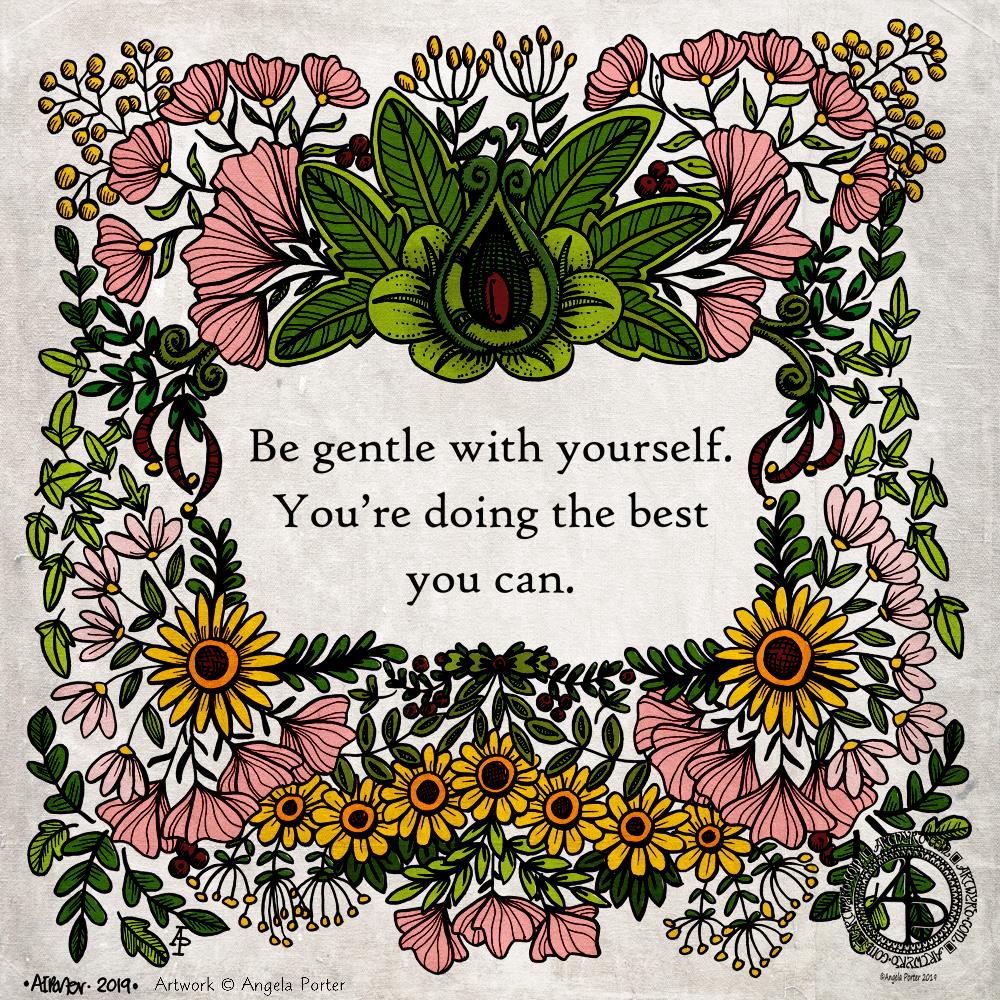
This is the same illustration I used for yesterday’s quote, however, after adding some textural lines to the drawing, I’ve coloured the design.
I decided to use flat colours as it brings a feeling of a coloured wood cut or lino cut print to the design. I used a grungy texture overlay to enhance the vintage feel of the coloured design.
The line art was drawn using Tombow Fudenosuke and Faber-Castell Pitt Artist pens on paper, but the colouring, textures and text have been added digitally. I used Affinity Publisher to produce the typography. A Microsoft Surface Pen and Surface Studio along with Autodesk Sketchbook Pro were used to complete the colouring
It’s always interesting how just small changes can make such a big difference to artwork.
So, Angela, how are you feeling today?
I’m feeling fairly content and quite optimistic. I am, however, still a little tired to say the least.
My trip to Llandridnod Wells yesterday left me exhausted. I went there to give an antistigma talk as a champion for Time to Change Wales. Telling my story of cPTSD still leaves me emotionally exhausted and vulnerable. This is, however, a small price to pay for giving people food for thought and getting people talking about mental illness.
As I was feeling so emotional after the talk I didn’t take a walk around Llandridnod Wells. When I’m feeling the way I was it’s all too easy for me to panic and enter flight-mode when I’m overwhelmed by noise or an unfamiliar place. The anxiety I feel about getting myself turned-about and lost and not able to find my way back to the car just adds to the vulnerability.
So, I thought I’d drive back and see if I could find the courage to stop at a cafe on the way. I’d passed a nice-looking one called the Wye Knot. However, I just couldn’t bring myself to stop there. I was still too overwhelmed.
My brain kicked in and I thought I’d head to Honey Cafe in Bronllys. I’ve been there a few times before and it’s a familiar setting to me. However, when I went in there were so many people milling around the counter and others coming in the door and pushing past me that I went into flight-mode and dashed back to the car in tears.
I just drove home then, doing a mental inventory of what I had in the way of food.
I had something quick to eat and a big mug of tea and then I curled up in bed to sleep; a nap is one of my self-care activities. I know that if I can sleep for a while I wake feeling refreshed and more resilient than I was.
The exhaustion comes not just from being emotionally overwhelmed and triggered but from the effort of keeping a happy smiling mask up. Yesterday the mask wasn’t as ‘solid’ as on Monday, but I knew it was still there. Once the talk was over, I let the mask drop and I was suddenly exhausted.
This is, as I mentioned earlier, worth getting the word out about the stigma and discrimination that surrounds mental illness, giving people some advice on what to and what not to do, and starting conversations.
I’m beginning to flag here; tiredness/exhaustion is catching up with me. I have managed to get some work done this morning. However, before I try to do anything else I need some more sleep I think.
So, I’m taking the advice of today’s quote – I’m going to be gentle with myself today.
Emotional Pain – A quote. Artwork by Angela Porter of Artwyrd.com
About the art
This Nicola Lyons quote is another that resonated with me and brought some tears to my eyes and echoes of pain to my heart too. I just had to make it pretty – Angela style of course.
I used a script font and printed the quote out in a square format. I added the illustration around it using a combination of Tombow Fudenosuke and Faber-Castell Pitt Artist Pens. I kept to a small number of repeating motifs in this design. I can now see that I may go back and add some texture and pattern to the leaves, berries and some flowers that are quite bare to help to bring them to add depth and dimension.
I scanned the drawing in, cleaned it up digitally and then added a background to it rather than colour the elements in. I may return to colouring the design in, but I think I’ll use colours that are reminiscent of linocut artworks – flat colour and letting the lines add the shadow and texture, depth and dimension to the image.
So, Angela, how are you feeling today?
I’m tired. I got to sleep early enough but I woke around 3:30am and couldn’t get back to sleep until gone 5am. I’d set my alarm for 7:30am as I have to be in Llandridnod Wells before 11am to give an anti-stigma talk on behalf of Time to Change Wales.
I expect that I’ll be drained after the talk – I usually am. So self-care will be important later on in the day. I need lots of tea before I leave – I have less than an hour to sort myself out.
Warning – the following may contain triggers.
The quote above relates to me being a ‘people-pleaser’, which is one way that CPTSD presents in me.
From as early as I can remember, I tried to do and be what would make others around me like me or love me, even if it meant doing things that made me feel horrible. It’s a pattern of behaviour that carried on through my life.
It never worked though; other people would get what they wanted and in return I would not get what I was hoping for or was told I would get. I’ve been left believing that I am unlovable and unlikable and not good-enough. There’s a good helping of shame around all this too, along with a lot of grief for what never was and never could be.
Nowadays, I’m more aware of my emotional, physical and mental needs now, thanks to EMDR therapy. However, I can still default to this ‘people-pleaser’ setting when I’m anxious or emotionally vulnerable.
It took a lot of work in various forms of counselling, self-reflection and EMDR for me to recognise that I have been a people-pleaser. Once aware of this tendency I could start to change my behaviour. I don’t know how successful I’ve been. One coping strategy I have is that I don’t let people get close to me, yet I yearn for meaningful, deep connection with like-minded souls, kindred spirits.
It’s a conundrum and I’m not sure how I’m going to solve it other than by valuing myself in a healthy way, being able to put up healthy boundaries, and being able to say ‘no’ if I’m uncomfortable about something or it would cause me difficulties.
I don’t know who said these words, but they resonated with me when I stumbled upon them. Not only did they resonate, but they also brought tears to my eyes and my heart too. I have words for one of my goals for recovery from cPTSD. This is why I had to do something with the quote in my own inimitable style.
So, I took the words and chose a pretty font for them, arranged them as I wished and then printed them out onto acid-free paper. I trimmed the paper to approx 21cm x 21cm and added some pencil guidelines for space around the quote and the edge of the paper.
Next, I used Tombow Fudenosuke and Faber-Castell Pitt Artist Pens to draw a design. I stuck to just a few motifs that I repeated to fill the space. I also let the design elements to spill over the pencil margins here and there to give a more organic feel to the artwork.
Finally, after erasing the pencil lines, I scanned the drawing in, increased the contrast a little to remove most of the remaining pencil marks. I then added a grungy, colourful, autumnal background.
I’m pleased with this one. I really like the way the Fudenosuke pens work for me now. I love the variation of line and the bolder line that I have used. I also think that using just a few design elements and repeating them to fill the space results in a more cohesive design.
I think I could have left a bit more space around the quote; however, it is good enough.
So, Angela, how are you feeling today?
And for me to say something is good enough is a sign that I am recovering from a bad day yesterday. I’m still somewhat emotionally fragile and vulnerable, but I’m able to see that my art is good enough.
Yesterday, nothing I did was good enough. I lost faith in my crochet, my digital art, my drawing. Nothing seemed to work out, and I really was doubting my abilities.
EMDR therapy for my cPTSD was rather distressing and left me exhausted. Mind you, I was exhausted to begin with. Monday I wore my protective mask as I had to go somewhere where I’d be with people I didn’t know, doing something I was really anxious about, and I didn’t know the place I was going to. I was exhausted after keeping my mask on for just four or so hours.
How on earth did I find the energy to keep the mask up for all those years?
One good thing has come from this experience – I can see how exhausting it is to keep up a mask for even a short time. I wonder how on earth I managed it for most of my life!
Anyway, after EMDR, I was more exhausted and came home and slept. In the evening, I thought I needed to be creative. It all led to me being hard and overly critical of myself. Little comments made to me just made it worse, even though the comments weren’t negative, my emotionally vulnerable and exhausted state twisted them that way.
Even though I was emotionally vulnerable and caught up in a storm of thoughts and feelings, I was still aware of this contentedness inside me, but I just couldn’t anchor myself fully to it. I was a little bit adrift in the turbulent waters of my emotions and thoughts.
I should know by now that I need to choose what activities I do carefully at times like this. Last night, I didn’t do that. However, I eventually got back to sleep, and I woke this morning feeling more content.
There’s not quite the sunshine within present today; there are still some emotional clouds covering it up. However, I know that they will not persist and will move along as I practice self-soothing and self-care and do creative activities that won’t push me too much and won’t engage the inner critics.
I’m still drained, physically, mentally and emotionally, but I am in a better place today. I think my drawing above shows that too.
This could be the last piece of mail art from me for a few days. I need to get focused on art that is ‘work’ rather than just ‘for fun’. I enjoy my art, no matter what it is, but I can be easily distracted by the metaphorical shiny, bright new toy.
Mind you, once I’ve spent time doing art ‘for fun’, the commissioned work then feels like fun. A change is as good as a rest for sure. Different styles and methods of working keep everything fresh for me.
Here’s a brief outline of how I created the card:
Distress Ink background on watercolour paper. Use torn paper to use as a mask for the landscape. Use a circular mask for the sun.
Spray with a mixture of Perfect Pearls and water.
Use Faber-Castell Pitt Artist Pens to draw the design.
Add metallic highlights using a fine brush and Cosmic Shimmer Iridescent Shimmering Watercolour paints.
Add a distress ink ‘frame’ to the image.
Mount the design on black card. Attach the black card to the 6″ x 6″ card blank.
Use a gold glitter Uniball Signo gel pen to outline the top panel and black panel.
And here’s a brief outline of how I created the envelope:
Use a white Sakura Glaze pen to draw the flower motifs.
Use a fine paintbrush to add Cosmic Shimmer Iridescent Shimmering Watercolour paints.
For the envelope, I used a rainbow of colours for the flowers.
I like using Sakura Glaze pens to draw motifs when I’m adding watercolour; the ink dries to give a raised line that is waterproof. The thicker line width can also give stained glass feel to the artwork; this is particularly true for the black Glaze pens.
I’ve woken to a grey, wet, fresh day here in the Welsh Valleys. The coolness is actually quite delicious on my skin. The rain is freshening the air and world up, clearing the dust away. What a way for the weather to see out August!
It’s a perfect morning to do some artsy crafty stuff. For me, that meant finishing off a pair of cards with coordinating envelopes.
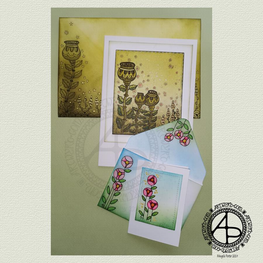
Making the larger entangled seed pods card.
The top panel measures 3″ x 3.75″, mounted on an A6 card (UK sizes).
I coloured The envelope, top panel and the border of the middle panel envelope and the edge of the middle panel with Crushed Olive, Forest Moss and Shabby Shutters Distress inks. I used a mini foam blending tool to achieve a gradient.
I sprayed water onto the top panel. Distress Inks react with water and results in some interesting textural patterns. I didn’t spray water onto the envelope; the paper is too thin to take such treatment.
My next task was to draw the entangled designs; I chose to go with some seed pods, leaves, a geometric pattern and some little flowers too. I added some ‘sparkle’ patterns around the main elements to give the illusion of little things floating in the air.
Next, I added some sparkle and shine with some gold and copper ink. I placed ink inside the sparkles, the seeds inside the larger seed pods and the flowers too.
I used a brush and Distress inks to add some depth of colour to the design on the card. I decided not to do this on the envelope, again because of the quality of the paper.
Once I have someone to send the card to, I will address the envelope and seal it with Distress Micro Glaze so that moisture won’t damage the envelope.
The colour choice on this card is unusual for me, but it’s worked out nicely, particularly with the gold and copper accents.
The tiny floral card.
This card is tiny, measuring just 2.25″ x 3.25″. It’s envelope is a little larger than needed, but the We R Memory Keepers Envelope Punch Board didn’t have measurements on it for a card this size, so I just used the closest available.
The panel on the card measures 1.75″ x 2.375″. It is one of the panels from the Foursquare background frames I messed up while making yesterdays cards.
I used one of my ideas from yesterdays musings on the cards I’d made. I drew a simple design on both the card panel and the envelope front and flap using Uniball Unipin pens and then coloured it with Copic markers. I added some gold glitter dots with a Uniball Signo gel pen.
Once all was dry, I used a Versamark Pen to colour over the flowers, leaves and gold sparkles. Versamark ink is colourless and sticky and is made by Tsukineko; it comes in ink pads but also in double-ended pens – a bullet point at one end and a brush tip at the other. The ink takes a little while to dry.
I covered the sticky areas with WOW super fine clear embossing powder and used a heat tool from Ranger to melt it, giving the design elements a glossy, protective and slightly raised finish. It also intensifies the colours somewhat, which I rather like.
So, I could now colour the background and envelope with Distress Inks without affecting the colours of the flowers, leaves and gold dots. I used a mini foam blending tool along with Pine Needles, Mowed Lawn, Tumbled Glass and Salty Ocean Distress Inks.
The final task was to glue the card panel to the card blank as well as the envelope flaps.
Again, once I’ve addressed the envelope, I’ll use Distress Micro Glaze to seal the inks and prevent any damage to the artwork while journeying to the recipient.
Reflecting on the cards.
I enjoyed making these cards. I particularly like the simplicity of the small card and the effect of the embossing powder. There’s something about teeny-tiny cards that really pleases me. I think it’s that their size makes them just so darned cute!
The larger card I am also pleased with, particularly in my use of colours that are unusual for me. I’m glad I added colour to the seedpods on the card; it helps them to stand out. I do love the copper and gold ink on this darker background too and how well they stand out.
Making envelopes that coordinate with the card is also something I enjoy doing; hopefully, the recipients see them as something a bit special dropping through their letterbox.
So, what’s on the cards for today?
It’s the last day of August, so I need to get a wiggle on to create a September colouring template for the Angela Porter’s Coloring Book Fans facebook group. I feel the need to include some autumn imagery in this one as we are in the dog days of summer for sure.
Tell me, Angela, how are you feeling today?
I’m tired but feeling quite content and optimistic again. I slept well last night; the weighted blanket really is working wonders for me as far as sleep is concerned. One problem is that I don’t want to get out from under it in the morning, so it must be comforting or soothing me.
I seem to have turned in a magnet for people who have escaped narcissistic abuse of all kinds. It’s nice to be able to help others by giving them space where I will believe their experiences, and I can help them, hopefully, to understand that they are not at fault but are victims.
Synchronicity pointing out to me how much I have learned and understood and healed and am now able to help others, perhaps?
Today I have two card designs for you, both featuring dangle designs, but in different ways.
If you like dangle designs and you’d like to give drawing them yourself but need a little help or inspiration, then you may find my book “A Dangle A Day”of interest. In the book, I take you, step by step, through how to draw over 100 dangle designs, along with some ideas of how you could use them.
Love Ya and With Love Card.
I started by using the Foursquare Backdrop: Portrait die from lawn fawn to cut the frames and panels from a piece of Winsor and Newton Bristol Board. I purchased this die, and the one in the second card, from Seven Hills Crafts here in the UK.
Next, I used Stormy Skies and Broken China Distress Inks to add a subtle colour gradient to the panels.
My idea was to draw four different dangle designs for each small square panel. I also wanted to include some hand-lettering, which I did.
So, I used Unipin pens from Uniball to do the drawings and lettering. I did use pencil outlines for the ribbon banners and lettering to make sure their placement was just right.
I coloured the design elements and charms using Copic markers. As the individual design elements were so small, I just used two colours to achieve shading in the bigger ones.
I also added a drop shadow around the designs using a BV marker that is a greyish-violet. It’s a very subtle drop shadow.
I had to add some sparkle and shine to the card, so I used a clear Spectrum Noir Sparkle brush pen along with a gold glitter Signo gel pen to do this.
To assemble the card, I glued the frame to the card base using Tombow Mono adhesive. Then, I glued the square panels into place.
I managed to get glue onto the front of the card and trying to rub it off while wet just left a dark, dirty smear. I’ve ordered some Tombow Sand erasers to see if they’ll remove the mark. If not, I’ll have to either work out another way to cover it up or just consign the card to the pile of things not to do again!
Black and white floral card.
Again, my first job was to cut out the frame and panels using a die. For this card, I used the Foursquare Backdrop: Landscape die from lawn fawn along with Winsor and Newton Bristol Board. I also decided to use this die in portrait mode.
To draw the design elements, I used Unipin pens from Uniball. I hung dangle designs from the top of each card to fill in some of the space that was there. I wish I’d used a slightly thicker pen than the 01 though. They look almost like an afterthought.
Anyway, once I finished the drawings, I wasn’t sure whether to add colour or not. So, I’ve left the pictures as black and white line art for now.
I used Tombow Mono glue to attach the frame and panels to a 5″x7″ piece of Winsor and Newton Bristol board. I did this as I realised that the dies are made to fit card blanks made from half a sheet of US letter-sized paper folded in half. In the UK, we use A4 sized paper, which is different enough in size to make it awkward to cut the paper to fit the card. I have ordered some 5″ x 7″ card blanks with envelopes, and then I can finish assembling this card. I’m likely to trim the foundation panel down a little and maybe try to carefully add some colour around the edge. Maybe.
It’s at this point I’ll decide whether or not to add colour and to see if I can thicken the lines around the dangles without messing it up. Mind you, if I do mess it up, it’s another experiment I can learn from, hopefully remembering not to do this again.
Things I’ve learned and techniques I want to try.
The lawn fawn dies work great! They come with smaller dies – heart, cloud, small star, large star, sun, small sun and speech bubble – which may be useful in the future. I had made my mind up that I’d limit myself to die sets that are simple in shape to for cutting out panels to draw on and maybe for layering.
I rolled my eyes at myself when I worked out that dies from an American company would work best with American sized paper for card bases. However, I can work around that now I’ve realised that. I’m comfortable working with inches; most of my craft tools have both inches and centimetres on them. However, the inches are visibly the most dominant measurement system.
Glue. Me and glue. Not sure how I can avoid smearing in the future. Hopefully, the sand eraser will help to remove my gluey, sticky, dirty-looking mistakes.
I like using Distress Inks for backgrounds. However, the pale colours of markers that I prefer to use are translucent and so combine with the background. I could use other media such as coloured pencils for colouring. Or I could use distress inks or water-based marker pens with a damp brush to add colour. I could also use a damp brush to remove some of the distress inks. In that case, I may have to use watercolour paper instead of Bristol Board.
I could also use a Versamark pen – which contains transparent, sticky ink – to colour over my design elements once coloured and then use clear embossing powder and a heat gun to protect the colours. I could then add the distress inks after heat-setting the embossing powder. The embossing powder would add some dimension and shine to the cards. If I used a sparkle pen or gold gel pen, for example, the embossing would encase it and highlight these embellishments Ieven more, I think. I need to try this idea out!
So, there are lots of possibilities for going forward with this.
So, Angela, how are you feeling today?
I’m feeling the more content and optimistic than I have for the past two or three weeks.
I’m still feeling out of kilter; changes are happening in my perceptions around my emotional/mental wellbeing. I’m also aware of shifts that are happening in other parts of me.
I’m still poop-scared about what is going on in the world. I can’t see that ending anytime soon, however. This, and the rest of the emotional rollercoaster I seem to be on, are still upsetting my digestive system, so I’m not feeling too well much of the time.
Yesterday, I was so unsettled and scared that I couldn’t settle to do much art, and I became so dissatisfied and frustrated with whatever I did. I couldn’t settle to anything else either – not crochet, reading, nothing.
As I’ve said, today I do feel better, so I need to turn my attention to trying out Affinity Publisher to create some materials I’ve been commissioned to do (the artwork and inserts for a CD by a band!). I’ll see about setting the templates up first and go from there. I’ve not tried to do this the past couple of days as I know my head and my emotions weren’t in the right place. I’m not sure that they are today; it’s only by doing that I will find out whether they are or not.
Yesterday I decided to make a second card with a coordinating envelope. I wanted to try out using the Chameleon fine-liners to add colour in the form of lines and cross-hatching. Finally, I added some gold dots to the points of the petals on the flower design.
To draw the design and execute the hand-lettering, I used a Uniball Unipin pen. I then used various pairs of Chameleon fineliners to add the colour.
I prefer this way of adding colour with the Chameleon fine-liners, though I’m not entirely happy about it either. Looking at it now, in the clear light of dawn, I think I could have added a flat colour below the coloured lines. I may go and add that colour in a little while. After all, it’s just a card, an experiment, and if I mess it up, I can always make another one! A lesson learned, an experience gained is worth the few pennies worth of materials and the time it took just as long as I remember the lesson in the future.
I’m also not happy with my hand-lettering; I like the idea of the letter layout, but it’s not centred between the arcs.
I do like the ‘banner’ I’ve used to enclose the hand-lettering. However, there’s something about the rectangular ribbons and the patterns within that I don’t particularly like. I’ll work out what it is in time.
For now, I’ll try adding flat colour to the coloured sections to see how that works out and not worry about messing up the card. I’ll use it as a learning experience.
And that reminds me, I’ve still not set up my One Note journal for my private critiques and what kinds of methods and techniques I use in my art.
Materials
A piece of yellow card cut to 4″ x 11″, scored and folded in half to make a top-fold card measuring 4″ x 5½”.
A piece of white card approx. 4″ x 5″ for the top layer.
A We R Memory Keepers Envelope Punch board and an piece of paper measuring 7⅞” x 7⅞” or a blank envelope that will fit a 4″ x 5½” card.
A pencil and ruler for the guide-lines and a good eraser to remove them.
A black fineliner pen for drawing and hand-lettering; I used a Uniball Unipin pen.
Pens to colour the design; I used Chameleon fineliner pens.
A gold gel pen for the dot embellishments; I used a Uniball Signo gold gel pen.
If you’d like to learn more about dangle designs or are looking for some more inspiration for them and how they can be used in cards, BuJos, scrapbooks, bookmarks, journals, and more then my book ‘A Dangle A Day’is a good place to start. It takes you through how to draw monograms and dangle designs for all kinds of occasions around the year in simple steps.
Today, I have a dangle design card along with a coordinating envelope for you. I’ve kept the construction of the card simple with just one layer on the card blank. The dangle design and hand lettering are also quite simple as well as whimsical in character.
If you’d like to find out more about drawing dangle designs, then A Dangle A Dayis my book about dangle designs with plenty of inspiration and suggestions.
Materials and dimensions of the card and envelope
The yellow card blank is 5½” x 4″ in size with a top fold. So, I started with a piece of card measuring 11″ x 4″.
I also cut a piece of Winsor and Newton Bristol board to 5″ x 3½” for the top panel.
Next, I used some thick printer paper to make an envelope. I used the We R Memory Keepers Envelope Punch Board. The size of paper needed and the position of the first score line are printed on the board. This tool from WRMK makes it so easy to create custom envelopes.
To make an envelope to fit a 5½” x 4″ card I needed to cut a piece of paper measuring 7⅞” x 7⅞”. I used 120gsm white printer paper for the envelope.
Pencil guide-lines
Before I started, I used a ruler and pencil to draw in some faint guide-lines for the banner ribbon and the hand lettering on the top layer. I also pencilled in the hand lettering.
On the envelope, I added some guide-lines on the left and bottom to give me a border.
Hand-lettering and drawing the design
I started by hand-lettering the sentiment, then I drew the ribbon banner around it.
My next task was to draw the dangle comprising of beads and hearts.
Finally, for the top layer, I drew in the arrangement of plants and added some shells and butterflies.
I didn’t use a pencil to sketch the design before I drew it in ink simply because I’m confident in drawing these kinds of designs. However, it is a good idea to do so if you’re less than confident. I started with the central flower pot and let the design grow out from there.
I then took my attention to the envelope. I started by drawing in the ledge on the bottom. Next, I added the plants, flowers, shells and butterflies. I then drew a black border around the envelope, just inside the edge. This line gave me something to hang the dangle from; I added a dangle similar to the one on the card.
Adding colour
With all the drawing complete, it was time to add some colour.
I’d received my Chameleon fineliners yesterday, so I thought I’d try them out as there are lots of small areas in this design. I love my Chameleon markers, but using them to add colour to tiny spaces can be a little tricksy.
I did try the Chameleon fineliners out yesterday for drawing lines and hand lettering. I found that they give a very long gradient, even with the shortest of touches of the cap to the pen. I thought this might work well in colouring the flowers in. I achieved a pleasing change of colour of the petals on each bloom from just one blending process. This blending also worked well for the butterflies.
What I did notice is that the fineliners moved some of the black pigment from the Uniball Unipin pens that I used to draw the design with. That was a bit disappointing. It may be that in the future I will need to draw, scan and then laser print the design out. That’s a bit of a faff, but it’s doable.
I’ve never been a fan of fineliners for colouring; I find they leave lines and tend to pill the paper. This is just a personal gripe about all fineliners.
The Chameleon fineliners are pleasant and comfortable to write with – comparable to other fineliners. So, unless I want to add colour using lines and cross-hatching, writing is going to be my primary use for these pens.
To colour the pots, banner, leaves, cacti, shells and ledge, I used some of my Copic Ciao markers. I chose to use these as the brush nib lets me colour tiny areas. Also, I wanted to use pastel-ish colours to tone in with the colouring from the Chameleon fineliners.
I did add some very simple Copic shading to the design.
The Chameleon fineliners had spread the black dots I’d added to the flower centres. So, I broke out a gold Uniball Signo pen to colour in the centres of all the flowers. I also used it to add a sprinkling of little dots around the design.
Reflections
I enjoyed creating this card and envelope. It was a quick, simple project. I also do enjoy drawing whimsical designs.
I like the sunshiny yellow card blank; it makes me smile, especially as it is currenty a grey and rainy day here in the valleys of Welsh Wales.
I think the card may benefit from the use of a bit of Wink of Stella to add some shimmer and shine to the wings of the butterflies and maybe the hearts.
I could’ve ink blended a background to the design using Distress Inks. I also could’ve added a drop shadow around the design to give it some dimension. Today, I chose not to do these things to keep the card relatively simple.
I also only added one layer to the card. I could’ve cut a piece of contrasting colour to go beneath the top layer to give a bit more of a layer. Alternatively, I could’ve used amarker to colour the edge of the layer to give a border, or ink blended some distress ink around the edge. Again, I chose not to do so; I wanted to keep the card simple and easy to do.
I think the result is cute and whimsical. I now have to find someone to send it to! I think that I’ll use some Distress Micro Glaze to protect the artwork on the envelope before posting it though.
Hand writing matters!
In a blog post called “Handwriting matters!”by Marie Celineshe discusses why she thinks handwriting still matters in this age of digital communication.
I agree that handwriting does matter. Handwriting is as unique and individual as the person creating it. It’s also a much more personal way to communicate with others. It takes longer to handwrite a letter, note or memo and then deliver it either to the person or the post office.
It’s always nice to receive chatty, friendly emails from friends, and of course this is a quick and instant communication. However, there’s something to be said about the slower nature of communication by traditional post and that personal touch that handwriting gives.
I make these cards but rarely send them to another person, let alone include a handwritten note or letter. The cards sit around my home and never get shared with another person.
I think that needs to change, don’t you?
Not sure how to go about it, but if anyone who reads this would like to receive one of my cards and maybe a letter then leave a comment or contact me via social media or email.
I actually do love to hand-write; I always have and I’ve always taken a lot of pride in my handwriting. I remember making a huge effort to change it when I realised it was looking like my mother’s writing.
My preferred way of learning was to write and re-write my notes, condensing them into just a few lines of ‘memory joggers’. If my notes in lessons or lectures were messy, I would make it my task to tidy them up as soon as I could, which was also a way for me to review, consolidate and learn.
I have the facilities to hand-write digitally. I could keep a journal by writing on the screen. However, such activities frustrate me as I can’t turn the writing area to the angle I like to write at!
Also, as much as I love working digitally in so many artistic pursuits, there’s nothing quite like the feel of pen on paper, and I do love pens! I have a bit of an obsession with stationery, even though much of my work is digital these days.
Handwriting and therapy
Nowadays most of my handwriting is in my journals. It’s not as neat as I’d like it to be. I make mistakes. I like to hand-write my journals as the process of putting pen to paper slows my mind down. It gives me a chance to reflect and review what’s been going on in my life and also with my emotions.
Of course, reflecting on my thoughts and emotions, catching them in action is important to me as I continue with my journey to recovery from CPTSD. It also helps me to record events, emotions and thoughts that need to be discussed in EMDR therapy.
Handwriting vs Hand Lettering
Handwriting is that almost unconscious way we write things down – thoughts, notes, memos, to-do lists etc, as well as our signatures.
Hand lettering is a much more deliberate activity. It is like drawing the shapes of letters, not writing the whole word in one go. It’s consciously deciding what the shape, size and embellishments of a letter should be.
I enjoy hand lettering and I do tend to use the shapes of letters that I use in my handwriting. But that’s where the similarities end for me.
Do you still hand-write? How do you make use of handwriting? Do you think it’s still an important skill?
Leave a comment, I’d be really interested to hear what you think?
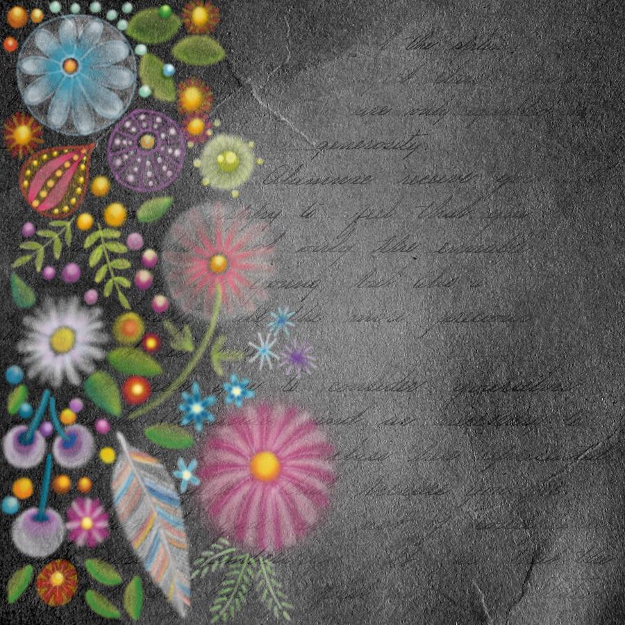
This image is in the vein of experiments in digital art. It reminds me very much of chalk/soft pastels, a traditional medium I did experiment with many, many years ago. However, I abandoned it as I didn’t like the feel of the soft pastels nor the messiness of them.
Using a kind of digital version of them means no mess!
I like this pot potpourri of motifs quite a lot. The softness of the lines and translucency of the colours appeals to me. I also like the way the colours glow against the black background. Surprisingly, the simplicity of the motifs appeals to me as well, giving a folk art kind of vibe to this work. Overall this design has an ethereal, ghostly, perhaps even magical feel to it.
My usual style of art is quite intricate and detailed, so this is definitely a departure from this. It’s certainly a style I want to experiment with more.
As it’s digital art, I used Autodesk Sketchbook Pro along with a Microsoft Surface Pen and Microsoft Surface Studio.
Congratulations to you all as you’ve made it through another week and the weekend is upon us!
I made it a cute and simple design today. Easy motifs to draw. Simple hand lettering. Even the colouring is simple as I used flat colours with the only gradient being behind the sentiment.
My first step is to write the sentiment; I use this as the anchor for the rest of the design. I just used simple letters today; I made them all the same height. Actually, this is my favourite way of lettering sentiments; I think it looks quite cute and whimsical.
Also, I used squared paper as a guide for my design. It helps to keep my lettering on the level (and the letters the same height in this case). It also helps to keep the dangles vertical and the design symmetrical.
My sketch was really basic. I used concentric semi-circles for the leafy bush the flowers are growing out of. I used circles for the flower placement. I drew really sketchy butterflies. I drew lines for the dangles and placed the main motifs on them.
Once I was happy with the sketch, I inked it in using a digital brush pen in Autodesk Sketchbook Pro. Varying pressure on the pen varies the line width. I think it adds a bit more human character to the drawing, and a bit more interest.
During the inking phase, I refined my sketch – adding petals to the flowers, detail to the leaves and groups of beads to complete the dangle.
Once I was happy with the inked design, it was time to add colour.
I chose fairly pastel colours with a summery feel for the design. Also, I used the same colours above and below the sentiment to give a more coherent design. I did add two extra colours to the dangles to give some more variety in the beads that join the dangles.
My final task was to add a bit of colour behind the dangle design. This is a simple gradient from a pale yellow, to aqua to blue.
I didn’t add any drop shadows this week – I wanted to keep the design simple.
And it really is simple to draw, honestly! Have a go! I’d love to see what you create using this as inspiration, be it a card, BuJo page, journal page, in a scrapbook, diary or any other way you can think of to use dangles. Post on my facebook page or tag me on Instagram!
Just a little reminder that I have a book called ‘A Dangle A Day‘ if you’d like to find out a little more about drawing and using dangle designs.