Fly Away 2019 – re-imagined entangled dragonfly drawing

Fly Away © Angela Porter 2019 - Artwyrd.com - all rights reserved.
Fly Away © Angela Porter 2019 – Artwyrd.com – all rights reserved.

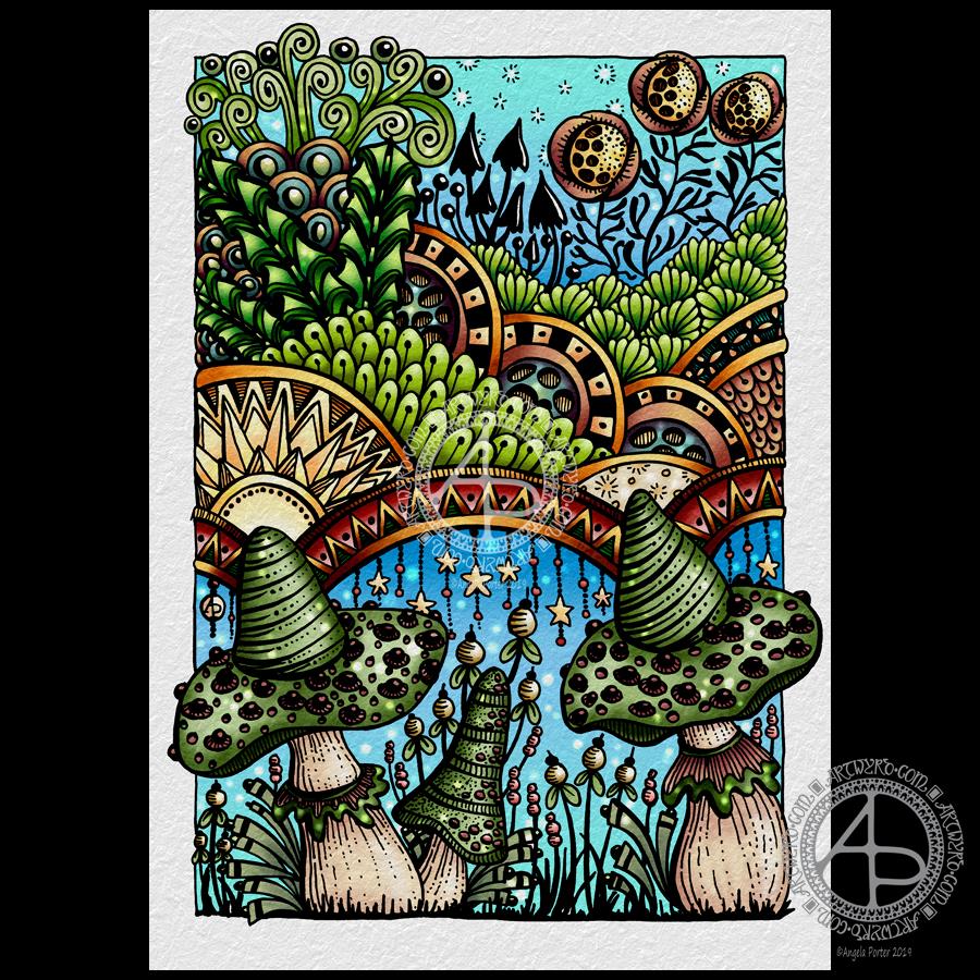
It’s been an *interesting* couple of days to say the least, and the root cause of the *interesting times* was the discovery of my dragonfly drawing entitled ‘Fly Away’ from back in 2012 (which you can see in my deviantART account).

I re-imagined it digitally, using my Microsoft Surface Studio and Surface Pen along with Autodesk Sketchbook Pro. It’s obviously hand drawn – I left lots of little imperfections in the drawing, including wobbly lines in places. I wanted it to have the human touch, not the slick perfection that can result from digital art. It took me around 12 hours or so to re-draw. That’s more than one day’s work.

Complaints, complaints and a heartwarming tale

I sent a message to the owners of the ‘Dragonfly Lovers’ facebook page explaining that they were using my artwork without my permission, effectively stealing my work for their own profit. Surprisingly I’ve not had a reply. My messages on their page have been deleted and I’ve been blocked too.

I have also submitted an official complaint of infringement of copyright/intellectual property to teespring.com, which is the website where they are selling merchandise with my dragonfly art on.

In the midst of this, with family and friends seeing what was going on and getting a good sense of righteous indignation, a woman from Texas sent me a message saying she’d seen the comments on the facebook page mentioned above and she’d decided to approach me directly. She was going to buy the dragonfly art from that page for her daughter’s birthday party. Instead, she asked if I would sell her a print so she’s supporting the artist who created the art.

I was touched. When people approach me I always try to help. Sometimes I waive my fees, such as when someone wants permission to use a design of mine to cover up a mastectomy scar.

Anyways, back to the tale. I told the texas lady that I’d have to re-draw the image as the original had been sold years ago via Etsy and I didn’t have a high resolution image of it.

More about the drawing

So, I got to drawing it again. The image above is the result of some 12 hours work.

I used a low resolution image of the original artwork as a guide and I worked digitally. I was quite keen to do this. I wanted to try out my new skills with brushes that change width with pressure, as well as showcase how my skills have developed in the 7 years since the original was drawn.

The drawing is NOT an exact copy at all. The dragonfly itself is pretty much similar, but the flowers are different as are the spirally branches in the background. I also added tiny seed pods and flourishes to add interest.

I let the varying line weight add depth and dimension to the elements of the image. Overall, I think it’s a more balanced design. Some of the branches look a little ‘flat’ and maybe would benefit from some grey shadows. But it’s good enough I think.

Did something good come from this debacle?

The intellectual property thieves did something good – they spurred me into action in terms of reworking an old image, using my new skills, the way my art has developed.

I also now have a very high resolution image which will print beautifully on many products – it’s up in my RedBubble Shop!

They’ve also made me realise that if my art is good enough for them to steal and use to profit from then my art must be good enough for me to sell.

My problem is promoting myself and getting word out there that I have stuff available to buy with my art on it, officially! I’ve given myself permission to put my artwork on products to sell.

A never ending battle…

I know I’m never going to stop the thieves. There are always unscrupulous people out there, willing to use anything or anyone for their own profit. But when I find them I will challenge them. What they are doing is wrong – WRONG I tell you!

The only way to defeat them in some ways is not to join them, it’s not to let it all slide, but it’s to offer my art with really good quality images on good quality products at a reasonable price.

It’s also getting the word out that this kind of thing is unacceptable, and to challenge the myth that just because an image is on the internet it’s free for anyone to use, even to make money for themselves.

So, from now on, I will be adding more prominent watermarks to my art and making sure it’s at a low resolution that will not print well. I’ll do what I can to make it more difficult for them to steal, to remove my signature or symbol and watermarks and so on.

I also have a plan to add a notice to my art warning people that it is copyrighted and it’s use without permission is illegal. Well, not quite those words, but that kind of meaning.

The easiest way to stop the unscrupulous out there would be to stop sharing my art. However, there’s been people saying they hope it doesn’t stop me as they like to see what I’m up to…so I’m going to have to learn how to protect my images, my art more and more. And if I find someone using my artwork for their own gain without my permission then I will do what I can to stop them.

Entangled Fantastic Fungi – coloured

Entangled Fantastic Fungi © Angela Porter 2019 - Artwyrd.com
Entangled Fantastic Fungi © Angela Porter 2019 – Artwyrd.com

Yesterday, I took some time to finish colouring my ‘Entangled Fantastic Fungi’ drawing from the other day.

I’ve said it before and, no doubt, I’ll say it again: colour brings my drawings to life. It also takes me a lot, lot longer to colour the artwork than it does to draw it! I think it would’ve been quicker with traditional media, such as Chameleon marker pens. However, I like using digital tools for coloring and I use opportunities like this to explore the different settings and various brushes so that I can add to my range of techniques I like to use and the effects I can get.

It’s a slow process for me, and it can be both enjoyable, satisfying and rather frustrating! However, I think I’m making some progress in finding my way through the plethora of options available and gaining some understanding of what they do and how to make them work the way I’d like them to work for me.

I also am enjoying drawing on paper with these Tombow Fudenosuke pens. Using Autodesk Sketchbook Pro to add colour to my drawings is me having the best of both words for sure!

There’s also the addition of a background texture, which, I think, makes all the difference. The pale grey tone of the background helps to tone down the brighter colours in the image, enhancing that kind of vintage kind of vibe I was going for.

Of course, it goes without saying that I used my Microsoft Surface Pen and Surface Studio to colour the image. Being able to use the pen on the screen, just like pen or brush or pencil on paper, is fantastic! I’m finally getting to grips with making use of the pressure sensitivity of the pen and exploring ways in which I can use it, as well as setting up brushes to suit my needs.

When I think back to when I bought my Surface Book, my aim was to draw templates for coloring books digitally so I didn’t have to scan in paper. It was also to make it easier to clean up the images. I had no intention of colouring the images digitally.

I think I’ve come a fair distance since those early days. I’m still surprised at how the ability to create digital art by using a Surface Pen on the screen of the Surface Studio as if the screen was paper, has opened doors to creative expression for me.

Entangled garden

Entangled Garden ©Angela Porter 2019 - Artwyrd.com
Entangled Garden ©Angela Porter 2019 – Artwyrd.com

Drawn with a Tombow Fudenosuke (hard) pen on A4 11¾” x 8¼” Winsor and Newton Bristol Board.

I worked on this one over three days, both to get used to working with the Fudenosuke pen but also for some self-soothing self-care.

It does need some colour and I think I may try a more vintage/distressed/grungy color palette with it, once I get round to adding color.

At the moment, my focus is on colouring the sample colored templates for my latest book for Dover Publications Creative Haven Series –Entangled Christmas.

I’m feeling more content today and less exhausted too, which is a good thing after this weeks rather intense EMDR session.

Entangled fantastic fungi

Entangled Fantastic Fungi © Angela Porter 2019 at Artwyrd.com

I’ve had a lovely, quiet Sunday and I’m glad to say my emotional wellbeing is better than yesterday. Still a bit fragile, but there’s that hint of contentment that has been lacking over the past few days.

I’ve even had my oompf back to draw. This took the guise of adding patterns and outline drawings to my visual reference journal, and then using some of these ideas, plus some old favourites, in this drawing. I even added some dangles in places. Just little, delicate dangles, but still there’s dangles there.

For the drawing, I used a hard nib Tombow Fudenosuke pen. This has a flexible nib, not overly flexible, and so I could vary line weight while drawing.

I was inspired to try the Fudenosuke pen again after my experiments with digital brushes that vary line width with pressure and found that so much fun.

I found it much easier to use the Fudenosuke pen after my experience with digital brushes; it turns out working digitally does influence my work in traditional media and helps me gain new skills or confidence in new media.

I drew this design on an A5 piece of Winsor and Newton Bristol Board which is white and very smooth. Then, scanned it in and digitally added a background texture and some colour, along with my watermarks.

The drawing was mainly to try out the Fudenosuke pen, but also a bit of quiet self-care too. I’m quite happy with it, especially as it’s main purpose was to explore using the pen for drawing with.

I’ve relied on line weight to add some dimension to the drawing, though some colour and/or shading could help a lot. Maybe that’ll be my next task with this – to colour it either digitally or to use my Chameleon DuoTone and Color Tops marker pens after I print the image out.

Entangled landscape

Entangled Landscape © Angela Porter 2019 - Artwyrd.com
Entangled Landscape © Angela Porter 2019 – Artwyrd.com

I’ve really not been myself the past few days. With a couple of busy days this week, the emotional fallout from EMDR on Tuesday finally caught up with me as I slowed down Thursday afternoon. I’m so tired, and my mood isn’t the brightest to say the least.

It’s always a sign that even when I’m tired I can usually draw and create, but not much this week. I haven’t been able to find the inspiration to draw, nor have I found the interest or energy.

Today, around a meeting, I managed to draw this.

It’s a throwback to the more familiar art of earlier days. It has given me a chance to use some new motifs, as well as some favourite ones that crop up often.

The process of drawing was soothing, and I did my very best not to be too judgemental, though I did want to throw it out and restart several times as I wasn’t at all happy with what was coming out of the nib of my fountain pens or Uniball Unipins.

I switched to the Uniballs as the fountain pen ink was smudging lightly. I’ve fixed that, mostly, by digital wizardry. I also added the Distress Ink background digitally.

I know my inspiration and energy to draw will return, I’m just not feeling at all myself at the moment.

I do have a new self-care activity, which is sitting in/on the bed, crocheting shawls and listening to audiobooks – currently working my way through the Harry Potter series.

The rhythmic nature of crocheting is soothing. The familiarity of the Harry Potter story is also soothing. Being upstairs makes me feel safe, secure and it’s also comforting.

The memory being worked on in EMDR certainly has stirred some stuff up. I’ve had some very upsetting insights into how I’ve viewed myself. Releasing the trauma associated with this particular memory will be accompanied by a better view of myself. I may not fully believe it, but if I can believe a little of it then that is good enough for now.

I have to believe that with each memory and its associated traumatic experiences that are processed via EMDR I’ll believe the healthier, more positive statements about myself more and more.

These are some quotes I’ve found recently that are helpful to me in understanding me, helping me through this.

Trauma creates changes you don’t chose. Healing is about creating change that you do choose.

What happened to you was not your fault. The struggles you have today, like your cPTSD symptoms, are a normal response to abnormal events. So, please be kind to yourself.

The poison leaves bit by bit, not all at once. Be patient. You are healing.

Easter Dangle Design

Easter Dangle Design © Angela Porter 
From 'A Dangle A Day'
Easter Dangle Design © Angela Porter
From ‘A Dangle A Day’

This cutely whimsical dangle design is from my tutorial book ‘A Dangle A Day’, which has the step-by-step instructions for drawing this design. They really are simple to draw, and the hand lettering is based on your own writing style too.

For this design, I chose spring-time colours, more pastel than bright. Of course Easter eggs and a bunny balloon had to feature, along with all the lovely spring flowers and a sprinkling of hearts. I even snuck a star in, hearts and stars being some of my favourite motifs to include.

This design would make a really cute greetings card or notecard. The dangles can easily be drawn shorter. It would also make a lovely bookmark. As a BuJo page, planner page or an element on a scrapbook page it would be lovely.

Using Nuvo drops or Ranger’s Stickles or similar to make dots where the beads are as well as a sprinkling of them around the top of the design would add some lovely dimension and sparkle for sure.

I do hope you give drawing dangle designs a go. They are so much fun and a lot easier to do than you think they are. They can also be used in many, many ways, especially when it comes to sharing love with others at different times and events throughout the years of our lives.

About the drawing…

When it came to designing the dangle designs and monograms for A Dangle A Day, I started off by sketching the idea out on dot grid paper using either a pencil or a pen. I could then adjust the lines and draw guidelines in to help me with the design quite easily.

When I was happy with the sketch, I scanned it in and then re-drew it in a digital form. For drawing digitally I use a Microsoft surface pen directly on the screen of a Microsoft surface book or surface studio. This is like drawing with pen or pencil on paper, or even painting or colouring.

So, although my designs were created in a digital environment, they were still very much drawn by hand.

I used very little in the way of smoothing lines – only enough to remove the wobbliness that comes from the great sensitivity of the pen and screen position sensoring stuff, and never used the predictive line tools available in Autodesk Sketchbook Pro. I worked out how to set up pens that would leave a line texture similar to the pens I like to use to draw on paper with. I determined I wouldn’t make everything perfect, that there would be that perfectly imperfect human touch to everything that I created. I also made sure I included examples of dangles drawn and coloured on paper and turned into cards, bookmarks and BuJo pages too.

Working digitally to draw and then colour the designs allowed me to edit, erase, adjust and keep the image free of smudges and blots that would require re-drawing. It also made it a lot easier to make the edits my lovely editors suggested to improve the work.

It certainly saved a lot of time scanning image after image in – something I find extremely tedious.

Although I may have used digital tools to draw with, the techniques I used were the same as if I’d drawn on paper with pen and then coloured with various traditional media.

I also have to say that the year to year and a half ago when I was colouring these I was only just starting to explore the realms of digital colouring and I hadn’t quite worked out exactly how I’d like to do it. They worked out good enough, but now I think I’d approach it a bit differently.

I had such a lot of fun creating the dangle designs season by season, month by month, celebration by celebration and I hope you have the same amount of fun doing this too.

Magical landscape mandala

Magical landscape mandala © Angela Porter 2019 - Artwyrd.com
Magical landscape mandala © Angela Porter 2019 – Artwyrd.com

Creating this mandala has had me smiling. Gentle smiles on my face and in my heart. There’s something about the graphic black and white, the grey foliage in the background and the mystical, magical moonlight illuminating the design. I look at it and I feel a sense of achievement and satisfaction with this one. It’s not perfect. There’s things I want to do with it, and working digitally allows me to do that. However, for now, it’s more than good enough. I need more tea and a bit of a break from it.

I have to say that it looks really nice in just black and white. but, the simple gradient background really sets the atmosphere for the design. I did use a gradient fill tool to create the coloured background, but I do want to go back and create one that I can have a bit more control over for sure, maybe using watercolour brushes to do that, and adding spots of glow too.

I’m really pleased with the lighter foliage in the background, adding depth and dimension to the design, adding interest. It’s delicate and ephemeral, misty too.

I want to try not letting the background colour the motifs. That’ll involve me adding white to the white spaces. For some reason I created them with transparent ink.! No great problem to go back and sort that out though.

I also want to try working on a landscape that isn’t a mandala, using the same kind of style of drawing and adding magical, mystical coloured backgrounds.

But overall, I’m pleased with this and I’m pleased with the progress I seem to be making in both digital art and in developing my art ‘voice’.

There’s been quite a few pieces of art I’ve created that have made me smile recently – many of my mandalas and entangled drawings, my cute kitty ‘cartoons’ spring to mind, especially one I did of the pink anti-stigma badger as a Jedi knight!

I can honestly say that this mandala, and my previous one, have made me smile more than most.

Mandala

Mandala © Angela Porter 2019 - Artwyrd.com
Mandala © Angela Porter 2019 – Artwyrd.com
Available on a range of quality products from Artwyrd on Redbubble.com

The art…

A black and white mandala today. No colour. No shading. Just black and white and varying line width.

I set up one of my pen brushes in Autodesk Sketchbook Pro to vary it’s width with pressure. I’ve only ever used brushes where I’ve had their thickness set at one size as that has usually been my style of drawing in both traditional and digital media.

My favourite pens to draw with on paper are Sakura Pigma Micron, Sakura Pigma Sensei, Uniball Unipin, fountain pens, or technical drawing pens from Rotring or Staedtler. So, it was natural for me to set the digital pen brushes to mimic them and the lines they leave on paper – which are usually rather uniform in thickness, but with a bit of feathering around the edges.

I’ve never had much success or satisfaction in using dip pens or brush pens with drawing. No matter how much I practiced I never got a result I thought was good enough. The only dip pen I like to use is a glass dip pen as it has a very uniform line and writes smoothly too.

Late last night, I thought it was time that I experimented with a pen brush where I could vary the thickness with the pressure of my Microsoft Surface Pen on the screen of my Microsoft Surface Book.

I did set the pen to have a sharp edge and to vary in size from 1px to 9px with pressure, Then off I went with the intention to draw a mandala.

It took me a few attempts to work out how the new kind of pen brush worked for me. It also reminded me of lino prints, so I wanted to get that kind of graphic quality into my drawing.

I like it just as it is. I may try adding colour, even if it’s a subtle background colour, at some point. But I do like it.

What I particularly like is that the brush pen made it possible for me to draw lines that started fine and became thick in a gradual way and with a neat edge, something I struggle with when using my favoured pens or brush pens or flexible nibs.

I feel that this experiment has taken my drawing to a bit of a different level.

What I think I need to consider in future is adding elements of the design in shades of grey to create depth and dimension to the image. Perhaps even using different colours to draw such designs on a coloured background.

I also need to use this pen on drawings other than mandalas, such as the fantasy garden type design I did the other day ago.

I also think playing a little with the pressure sensitivity settings is on the cards, until I get it just right for me!

My mental and emotional wellbeing

I’m feeling more resilient today and I have a soft smile on my lips and in my heart.

The feeling of satisfaction with the mandala, and also completing the edits of the templates for the new book has contributed to this, along with a goodly amount of rest.

Days like this are nice for me. Days where I’m content. Days where my emotional and mental wellbeing are ‘good enough’. And they are today.

I may not feel brave enough to go out into the busy and people-y world today. If I can find a crochet pattern for a pretty shawl I may head out later to get some yarn with which to create that. I’ve almost successfully finished a crochet shopping/market bag for a friend and that has given me the confidence to try a different project. I love pashminas at all times of year. So I’d love to successfully crochet a pashmina/shawl for myself in yarn that changes from one colour to another perhaps. First to find the pattern.

Yes, the success with something I’ve struggled with – two failed attempts at a bag for myself had me feeling really useless, but the perseverance and success has lifted me. In fact, there’s been a lot of perseverance this week, what with EMDR and foiling and now the different kind of pen brush for digital drawing.

I need to make notes of this in my ‘When it’s dark, look for stars’ book as a reminder that things can be surprisingly good and I do do good stuff on my darker days. In fact, I need to start to add patterns/designs around the quotes and so on in this little book, and colour some more pages with Distress and Distress Oxide Inks for future use.

My biggest problem at the moment is feeling overwhelmed with all the ideas I have that involve drawing, foiling, creating digital stamps, a mandala coloring book, another tutorial book, designs for RedBubble, and more. This is part and parcel of cPTSD. So much I could do that it overwhelms so much that I can think and organise myself at all…

Despite that, it’s still a day where I feel what I’ve done recently is good enough, at the least it’s good enough. And for me to recognise and accept that is quite a step forward.

Here’s to getting a ‘good enough’ life and opinion of myself through EMDR and recovery from CPTSD!

Dangle Design

Dangle design 5 Apr 2019 © Angela Porter

It’s Friday and that means it’s dangle day!

Given my experiments with thermal foiling this week, today’s dangle had to be foiled, in gold this time.

As I enjoyed creating a dangle design inspired by Art Nouveau last week I thought I’d like to do that again this week, and this is the result.

I drew the design digitally, using my usual tools of choice viz. Autodesk Sketchbook Pro, Microsoft Surface Pen and Microsoft Surface Studio.

I coloured the design in using Chameleon Markers. Then I added the blue background with Distress Inks, followed by a pink edge to the card. Not sure pink was the right choice, but it’s ok I suppose.

I mounted the design on an A5 card blank and drew a glittery gold line around it with a Uniball Signo gel pen. I also added some small groups of glittery gold drops to the design.

Overall, I’m quite pleased with this one. I like the combination of the more geometric designs with the more organic motifs.

I didn’t add any hand lettering or a sentiment so it makes it perfect for any occasion or as a note card. It would also make a fantastic page design for a BuJo (bullet journal) or as part of a scrapbook, journal, diary or notebook spread.

If you’d like to try your hand at creating your own dangle design but don’t think you could, well you could find my book ‘A Dangle A Day’ helpful. Not only are well over 100 different monograms and dangle designs included that you can use, but help and advice is given for creating your own, as well as plenty of words of encouragement. I’d love to see your dangle designs too.

I really needed some quiet, creative time this morning. Some time without any pressure on me in terms of requirements from publishers and others. Dangle designs are simple to draw, and there is a soothing quality in simplicity. Colouring is also a very soothing activity and the magic of hot foiling always makes me smile.

I’m feeling a bit below par in terms of my mental and emotional wellbeing. I have a stinking headache, which isn’t helping, and I’m feeling exhausted again. That’s all to do with emotional exhaustion.

Fortunately, I can take time today to just do what I need to do in terms of self-care. I managed to get three and a half out of the four edits for my next coloring book done. I have until Monday to get the other half finished, so that’s definitely do-able, either later today when the headache subsides or tomorrow.

My emotional and mental sea has some smooth waves on it, not stormy, not choppy, just swells that come and go. I may be in a bit of a trough at the moment, but I’ll soon be heading back up to the crest of the gentle swells.

Entangled garden scene

Entangled Garden Scene © Angela Porter 2019

This took me a bit longer than I expected this morning. I did, however, enjoy creating this card.

First, I drew the design out on a piece of paper that is 10cm x 14cm using various sizes of Uniball Unipin pens.

I copied the image using my Brother Laser printer. I didn’t scan it in at this time, but will do later on. All I needed was a copy to play around with.

The next step involved the use of Chameleon Duo Tone and Color Top markers to colour the design elements in. Even though some areas were quite small, I still managed to get bits of shading there.

Once the colouring with the Chameleon markers was done it was time to hot foil the design, and you can see where the gold foil catches the light in places as I took the photo. A friend of mine saw some of my foiling yesterday in person and she was said she was wowed by it. She thought it was good in the photos, but the photos really don’t do it justice at all.

After foiling, it was time to colour the background. I used a selection of Distress Inks, starting with mustard seed in the centre to give a subtle glow, then tumbled glass, crushed olive, peeled paint, pine needles and evergreen bough. I used a piece of cut and dry foam and a very light touch to add the colour.

I was worried that the Distress Inks may muddy up the colouring done with the Chameleon markers. Yes, they subtly changed the colours in some places, but I was careful to choose colours that wouldn’t make mud. Also, so little Distress Ink is added it barely alters the colours.

I can tell you I was well relieved by that!

Distress Inks are water reactive, so I gave the image a light spray of water knowing that only the Distress Inks would be affected. After a short while I dabbed the water off with a piece of paper towel. This lifted some of the colour leaving a subtle background texture.

As this point, after letting the paper dry completely, I could’ve added more Distress ink. Instead, I decided to use aged mahogany, again on a small piece of cut and dry foam, to edge the paper, to give it a border, and also to add a darker layer at the bottom of the design to ‘ground’ the image.

When I can find my Wink of Stella pen from Kuretake I’ll add some very subtle shimmer to the dragonflies, maybe to the seeds in the seedpods too. I also think some gold dots in small clusters would enhance the background.

I also need to think about adding a bit more shading to the bottoms of the laves to give a more dimensional look to them I think. I could definitely do the same to the dragonflies’ wings too.

Those are simple and quite minor changes that will make a difference I think. It’s only as I’m looking at the finished image now that I can see how those things would help. I often don’t think to step back and give myself time to look at the image with fresh and kindly critical eyes, seeing what I could do to improve my work.

In hindsight, the dragonflies may have worked well as black silhouettes in the design, which would then become totally covered in foil. Or just outlines that would be foiled. That’s something for me to try another time and see if I like that idea more.

I think you can tell I’m really enjoying this branch of my artistic journey. I’ve concentrated a lot on digital art of late. I’m not going to abandon my digital art journey at all; I can do things digitally that I can’t with traditional media.

However, it is showing me that working with traditional media is also a pleasurable and successful activity for me to do.

What am I going to do with this? I don’t know. Part of me wants to add it to my BuJo. Another part wants to mount it on a blank greeting card to send to a friend. Another part of me wants to put it into a reference sketchbook or folder for inspiration in the future.