All done and coloured now, but o,h, WordPress, why do you change the colours on my images?
The colours are a lot more vibrant in my non-uploaded file. But I’m sure you get the idea.
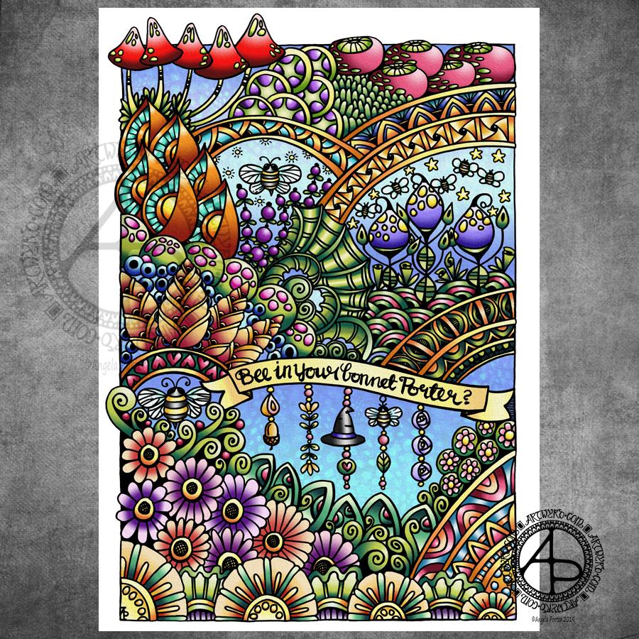
Anyways, I drew the image with Tombow Fudenosuke pens on Winsor and Newton Bristol Board. After scanning the drawing, I used my favourite digital tools – Autodesk Sketchbook Pro, Microsoft Surface Pen, Microsoft Surface Studio – to add colour and texture (and watermarks) to the image.
The original drawing was a little less that A4 (US letter-ish) in size.
I’m quite happy with this. I’m also really happy I’ve managed to incorporate some dangle designs into my art. Something I’m going to continue to do now. I think they work really well with hand lettered banners and probably really well with arches too. Hmm, perhaps dangling from the edges of large fungi too… I know I’ll work it out!
Fancy trying your hand at dangle designs? Well, I have a tutorial book that takes you through monogram and dangle designs. It’s called A Dangle A Day.
Yesterday, I took some time to finish colouring my ‘Entangled Fantastic Fungi’ drawing from the other day.
I’ve said it before and, no doubt, I’ll say it again: colour brings my drawings to life. It also takes me a lot, lot longer to colour the artwork than it does to draw it! I think it would’ve been quicker with traditional media, such as Chameleon marker pens. However, I like using digital tools for coloring and I use opportunities like this to explore the different settings and various brushes so that I can add to my range of techniques I like to use and the effects I can get.
It’s a slow process for me, and it can be both enjoyable, satisfying and rather frustrating! However, I think I’m making some progress in finding my way through the plethora of options available and gaining some understanding of what they do and how to make them work the way I’d like them to work for me.
I also am enjoying drawing on paper with these Tombow Fudenosuke pens. Using Autodesk Sketchbook Pro to add colour to my drawings is me having the best of both words for sure!
There’s also the addition of a background texture, which, I think, makes all the difference. The pale grey tone of the background helps to tone down the brighter colours in the image, enhancing that kind of vintage kind of vibe I was going for.
Of course, it goes without saying that I used my Microsoft Surface Pen and Surface Studio to colour the image. Being able to use the pen on the screen, just like pen or brush or pencil on paper, is fantastic! I’m finally getting to grips with making use of the pressure sensitivity of the pen and exploring ways in which I can use it, as well as setting up brushes to suit my needs.
When I think back to when I bought my Surface Book, my aim was to draw templates for coloring books digitally so I didn’t have to scan in paper. It was also to make it easier to clean up the images. I had no intention of colouring the images digitally.
I think I’ve come a fair distance since those early days. I’m still surprised at how the ability to create digital art by using a Surface Pen on the screen of the Surface Studio as if the screen was paper, has opened doors to creative expression for me.
I’ve had a lovely, quiet Sunday and I’m glad to say my emotional wellbeing is better than yesterday. Still a bit fragile, but there’s that hint of contentment that has been lacking over the past few days.
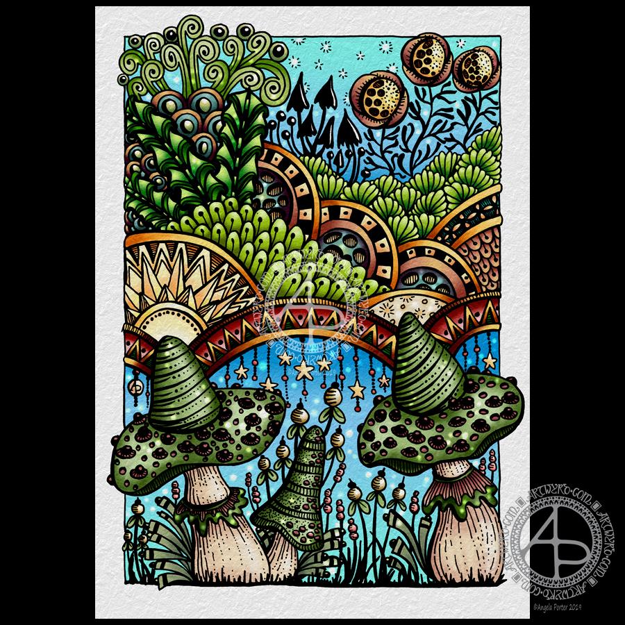
I’ve even had my oompf back to draw. This took the guise of adding patterns and outline drawings to my visual reference journal, and then using some of these ideas, plus some old favourites, in this drawing. I even added some dangles in places. Just little, delicate dangles, but still there’s dangles there.
For the drawing, I used a hard nib Tombow Fudenosuke pen. This has a flexible nib, not overly flexible, and so I could vary line weight while drawing.
I was inspired to try the Fudenosuke pen again after my experiments with digital brushes that vary line width with pressure and found that so much fun.
I found it much easier to use the Fudenosuke pen after my experience with digital brushes; it turns out working digitally does influence my work in traditional media and helps me gain new skills or confidence in new media.
I drew this design on an A5 piece of Winsor and Newton Bristol Board which is white and very smooth. Then, scanned it in and digitally added a background texture and some colour, along with my watermarks.
The drawing was mainly to try out the Fudenosuke pen, but also a bit of quiet self-care too. I’m quite happy with it, especially as it’s main purpose was to explore using the pen for drawing with.
I’ve relied on line weight to add some dimension to the drawing, though some colour and/or shading could help a lot. Maybe that’ll be my next task with this – to colour it either digitally or to use my Chameleon DuoTone and Color Tops marker pens after I print the image out.