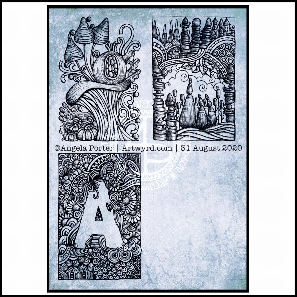
Wednesday is WIP day! WIP is work in progress, and this is one of my current one.
I’m working on A4 (29.7 cm x 21 cm) Claire Fontaine Paint-On mixed media paper with 05 and 01 Uniball Unipin pens.
It’s taken several hours so far, and there’s several yet to go! I’m enjoying creating such detailed drawing in just black and white. Lots of botanical elements, but there’s also arches and spirals and geometric patterns in there too.
I never have much of a plan in mind when I tackle a drawing like this. I know what patterns I like, and if I lack inspiration I can always refer to my visual dictionary or design motifs and patterns. It’s all about intuition. It’s not entirely mindless. I do make conscious decisions about what design element to use, how to use line and pattern to add volume and contrast.
I sometimes wonder, when I see my work like this, why I try to work with colour. I always feel I struggle with colour, but black and white, with or without grey, always seems to work so well for me.
I love to play with the illusion of volume in a drawing, and whether that is done with density and shape of line/pattern, or with colour (even though I really do feel I struggle with colour).
I will persevere with this illustration, drawing, artwork over the coming days. In fact, I may spend time on it today. I’ve completed my morning errands, so I can remain at home, which is where I need to be. I’m tired today; I didn’t sleep at all well last night, or for the past few nights and my mood and ability to concentrate is suffering as a result.
I finished the top right design, and have completed the ‘A’ illustration on the bottom left. That leaves one space to be filled, no doubt later today.
I’ve used either Faber-Castell Pitt Artist pens or Uniball Unipin pens to complete the drawings on ClaireFontaine’s Paint-On mixed media paper. This paper is fairly weighty (250g/m²) and has a lovely velvety feel to it.
The only pencil lines I’ve used have been to delineate the ‘boxes’ to draw in, and for a couple of the design elements in the top left image as well as the A.
Reflecting on the designs
The white space in the top left design works really well I think, and is quite an accomplishment for me. The same is true, to a lesser extent for the top right design. In both cases, the white space brings attention to the design.
In contrast, the densely pattered area helps to bring out the monogram A, making the white space the focus of the design.
I think I’m going to work on some more monograms in this style. They are fun to do, and dense, entangled patterns are one of my signature artistic voices. It’s been a long time since I’ve completed art like this, with a lot of detail to bring out dimension/volume in the design.
In fact, I’ve enjoyed using line and stipple to add volume in all the designs, exploring how I like to do this as I go. All the work I do with colouring books means I have put this to one side. It’s interesting how I’ve circled back to this style. It’s even more interesting to look at how my drawing skills have developed and evolved over time as well.
I found some peace, contentment and joy while drawing these, and feel a sense of accomplishment, particularly with the two on the left.
Do I prefer digital or traditonal drawing?
A difficult question to answer. I think it depends on what I’m creating.
I really do enjoy using pen on paper. I get a better sense of the overall design. Paper and pen is very portable too – whether I’m sketching when out and about, or drawing in different places at home.
Drawing on the screen of my Surface Studio with a pen is a lot like drawing on paper. The smoothness of the screen makes it a very different tactile experience. It also is great for inking in sketches. It also makes correcting mistakes or re-working areas a lot easier, and there are techniques I can use that are near impossible or very time consuming when working traditionally.
Sometimes, the lines produced digitally are too perfect. I’m still working on developing the brush styles that will mimic the unevenness of an inked line. I do have to use some element of line-smoothing as I draw; without it the lines are really wobbly, but with it they can be too perfect and I lose, to a degree, that personal and unique way that my pen moves on paper.
I also find it difficult to have a sense of proportion or detail when working digitally, even though I can look at the design at the same size as it will be printed. The ability to zoom in and work on a small area means I lose all sense of relative size and complexity/detail of a design. So, if I’m going to work on a drawing digitally, I prefer to start with a sketch to give me that sense of scale.
I rarely sketch out my design when I work on paper, except if I need the outlines of a design element as I’m drawing. I do tend to work very intuitively.
So the answer is, I prefer each for different purposes, and also to suit my different moods and purposes.
Of course, once I’ve drawn a design, I then have to decide if I want to add colour, and then what media I will use – traditional or digital!
This morning I created some tall, thin (or short and wide) backgrounds using Distress Oxides on some Arteza Mixed media paper. The paper is 8.25″ x 2.87″ (21cm x 7.2 cm) in size.
I chose this one to draw on for no other reason that it was the one that appealed to me at this time. I started with the seed pods and foliage at the bottom, and worked my way through some hand lettering / hand-drawn typography to more abstract line-art.
I drew with a M Pitt Artist Pen from Faber-Castell, though I added the stippling with an XS Pitt Artist pen.
No glitter or glitz on this one, nor any highlights. Not yet. I’m not in the mood for any, not today.
Wibbly-wobbly sculptural columns and arches surrounded by layers and layers of abstract bubbles, ripples and swirls of thoughts, wishes, blessings. Well, that’s what came to my mind as I added the architectural details.
No highlights, no sparkle, limited pattern and texture. Just flowing line work, for the most part. I’ve even left some ‘white space’ in the design, which is becoming less unusual for me.
Rounded arches with patterns reminiscent of Romanesque architecture. The columns are, however, more delicate, which is more reminiscent of the move towards Gothic architecture. Both forms or architecture have long been a source of artistic inspiration for me.
Soothing, relaxing and meditative to draw. Circles and spirals, arches and patterns are always comforting and endlessly fascinating to me.
Drawn using Faber-Castell Pitt artist pens on paper coloured by PaperArtsy Fresco paints. The drawing is approx. 2½” x 6¾”.
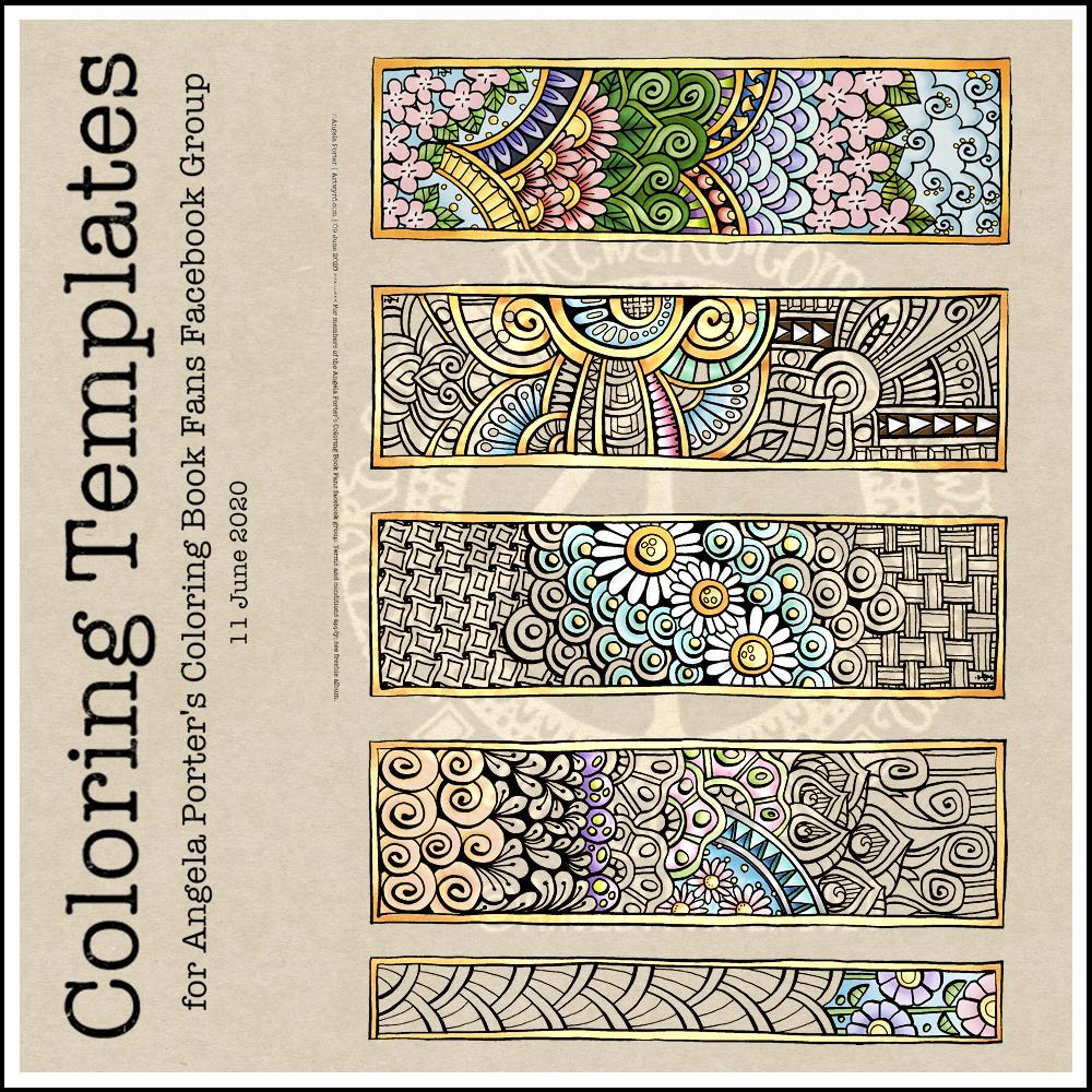
This week’s coloring template is a series of bookmarks. A member of the Angela Porter’s Coloring Book Fans facebook group said they’d like some designs that could be used as bookmarks, and so I went with the suggestion.
The designs are typically ‘Angela’ and ‘entangled’. I used a Tombow Fudenosuke along with an 04 Pigma Sakura Sensei pen to draw the designs. After scanning and cleaning up, I’ve partially coloured the designs, as well as adding a pale kraft paper background.
To use them as bookmarks, I suggest printing them on some card. If that’s not possible, then gluing the whole sheet to some card and then cutting out the book marks would make them sturdier. Of course, a laminator could prove most useful in preserving your beautiful coloring, as well as making really long lasting book marks that could be given as beautiful gifts, or used to mark the coloring page you’re working on too.
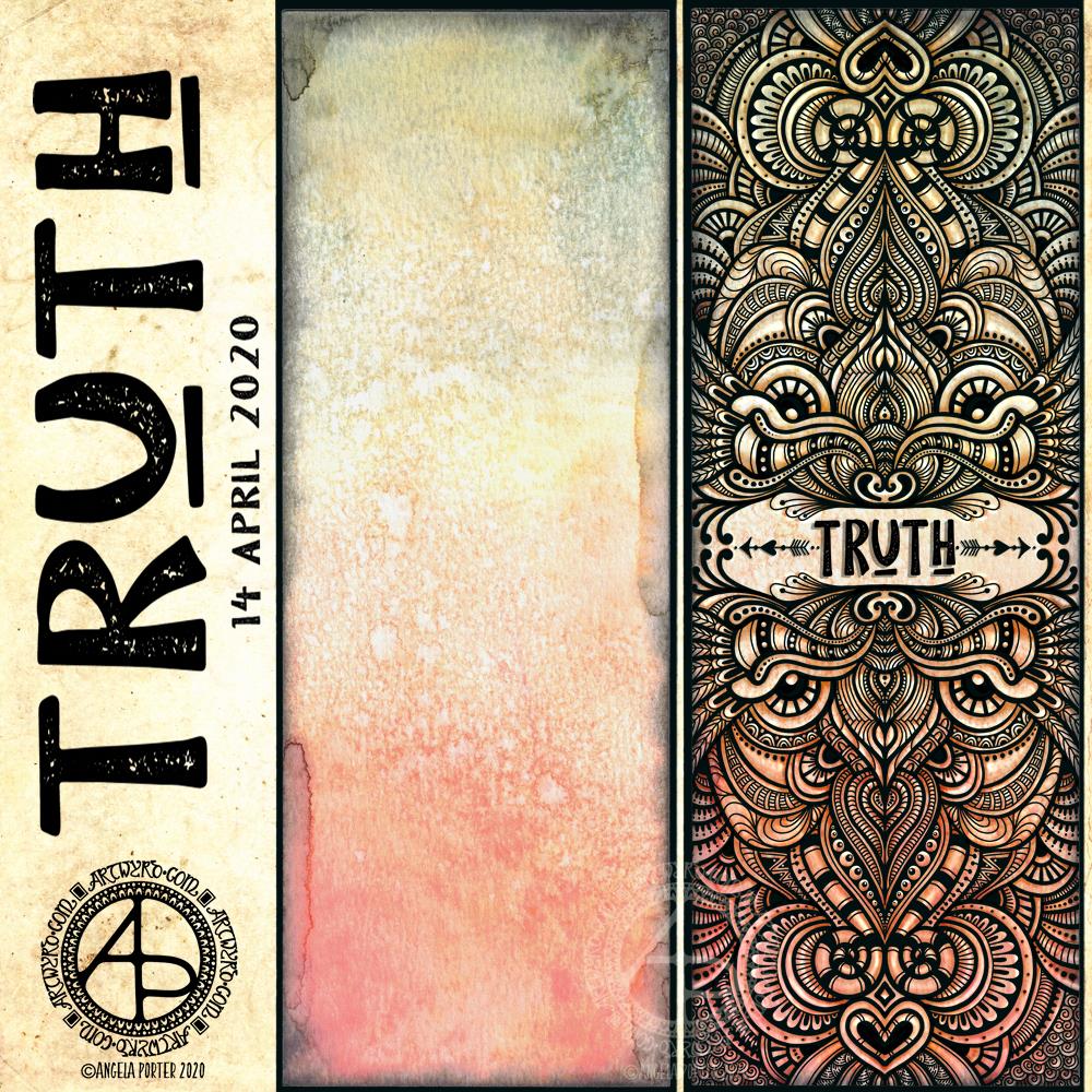
I like to use a word in my artwork from time to time. Truth was the word I knew I had to use as the central point for some artwork, and that’s where I started, along with one of the Distress Oxide backgrounds I made yesterday (in the middle of the image).
After I’d decided on the typography and placed it centrally, I then started to draw digitally. I made use of the symmetry tools in Autodesk Sketchbook Pro, along with a flexible nib and fineliner brushes.
I had no idea what kind of design would result, I just went with the flow and intuition and thoroughly enjoyed doing so and losing myself in the art.
I added shadows and highlights once the drawing was finished for that sense of dimension and ‘life’.
I am really pleased with the finished artwork. There’s something about symmetry, spirals, repeating patterns, and intricate, abstract designs like this that just makes my arty heart smile and sing. I always return to this style, it seems to be at the core of my being.
I also love to draw on coloured and textured backgrounds. I also think I’ve found a way to combine more traditional media (making the backgrounds) with digital art (drawing and adding shadows and highlights) in a way that really works for me.
My only problem is that I do tend to try to branch out into other kinds of art and never seem quite so satisfied with them. This doesn’t mean I’m going to abandon them; they need a lot more work and thought and maybe structure.
Perhaps that’s why I like this particular piece of art so much – it has clearly defined structure. The colour palette is defined by the background and so I’m not struggling with what colours to use. Having the black line structure defines clearly where shadows and highlights need to go.
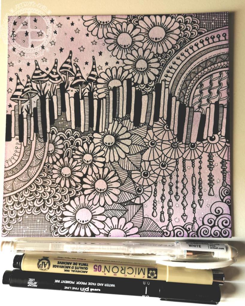
Another day on lock-down, and I started the day by colouring a Strathmore Bristol Board tile with Distress Inks, then drawing. You can see the result above, sorry for the poor photo.
The random generated tangle pattern for today is ‘BB‘, and it’s the wavy set of blocks across the middle of the design. The rest of the design is made up from some of my favourite patterns and motifs, as well as a few dangle designs.
The overall design doesn’t feel as if it flows. That may be a reflection of my emotional state, which is a mixture of anxiety, fear, being overwhelmed and exhausted.
So, self-care is in order. So that’s doing things that won’t frustrate me, or that won’t having me feel that whatever I do is rubbish.
March the 1st is St David’s Day, the patron saint of Wales, which is where I live. The daffodil is one of his emblems and so it was fitting I included some in this month’s template. As we are heading towards the spring equinox and the official start of spring here in the Northern Hemisphere, I’ve also included plenty of flowers that would be lovely coloured in spring colours. They’d be lovely in colours of all the seasons, however. Flowers are beautiful no matter what season we’re in.
The template is drawn in my signature ‘Entangled’ style of line art, with very stylised flowers, foliage, and even butterflies and shells, along with patterns derived from architecture, sculpture, pottery, and more. Lots of my favourite things all in one abstract image.
If you’d like to print and colour this template, then please pop along to the facebook group where the members, and I, would love to see how you bring it to life with your own kind of colour magic.
This is a drawing I did late last night as I settled down to sleep. It feels quite disjointed in places, which was how my mind felt in it’s state of tiredness. Even though I was tired, I wasn’t ready to sleep.
I thought I’d work with it, adding a background and colour to it. I wonder if adding colour will resolve the disjointed areas as it breathes life into the design.
I’ve only taken a short time this morning to ad some colour. I do have to do other things today. The colour certainly helps to lift it from the background, as well as adding dimension to the design.
I’ve chosen fairly dusky, dusty, pastel colours which seem to glow against the darker background. The pinks remind me of faded Victorian velvets.
I drew the design traditionally, using a Tombow Fudenosuke pen and ClaireFontaine dot grid paper. The flexible nib of the fudenosuke pen results in lines of varying thicknesses, and a drawing that reminds me of linocuts or woodcuts.
After scanning the drawing, I removed the dot grids and cleaned up the drawing digitally before adding a background.
I felt this needed quote to go with it, and this one spoke to me today. For the typography, I used Affinity Publisher. The rest of the digital work is being done in Autodesk Sketchbook Pro, using a Surface Pen and Surface Studio from Microsoft.
My art is always ‘pretty’, it’s how I express myself artistically. Some of my inspiration for patterns and motifs comes from things that other smay not consider ‘pretty’, such as rust, run down old industrial machines, ruined buildings.
My art does, I think, speak of who I am. It shows what I’m interested in, what patterns, motifs, shapes, textures, colours, and so on that I find aesthetically pleasing. It also shows, to those who look and think a bit deeper, what things interest me, from prehistoric art to Romanesque architecture to La Tene and Celtic art to Illuminated Manuscripts to flora, foliage, fungi, and lichen to fossils and shells to nature in general, and more besides.
I work very intuitively. It’s when I think too hard about what I want to do that things go to wrack and ruin.
By letting my intuition flow, then drawings have a way of coming together in a way that expresses how I’m feeling and what is fascinating me or soothing me at that time.
This drawing is an example of how my feelings come out. It’s only now I can recognise how disjointed I was feeling within myself last night, how I was out of sorts. I think that’s why the art jars with me today as that feeling has now passed by, like clouds in the wind. It’s a drawing that shows the weather my emotions were experiencing yesterday, weather that just happened and has no real source for it.
A new month and a new coloring template, exclusive to members of the Angela Porter’s Coloring Book Fans facebook group. If you’d like to download and print this template for your personal use, then pop along to the group.
The days are slowly lengthening here in the Northern Hemisphere. The first signs of nature waking up can be seen in the form of snowdrops and crocuses. It can also be heard in the raucous and beautiful birdsong.
To the template. I drew this on Rhodia dot grid paper using a Sakura Pigma PN pen. For my partially coloured version, I added a coloured background and colour digitally.