This design does make me smile gently! I’m rather pleased with the end result. If you’d like to #drawwithme, then the accompanying YouTube video goes live today, 3 June ’23, at 18:00 UK Time.
Distress Ink background. Design drawn with black Dokumentus ink in a TWISBI Eco EF fountain pen. Extra colour/shade added with Derwent Chromaflow pencils and Gamsol. Highlights/shimmer added using a white Uniball Hybrid Gel DX pigment ink pen and gold Winsor and Newton Calligraphy Ink applied with a brush.
This morning I wanted to do something fairly simple, soothing and relaxing. So, I chose to look at some variations of a stylised flower motif.
The version I started with is in the centre bottom of the design.
I used various Distress Watercolour Pencils and a water brush to add colour.
The white and gold highlights and patterns were added using gold and white acrylic ink and a dip pen.
Finally, the more intense shade was added using a graphite pencil and a paper stump. I even put some graphite around the gold foliage surrounding the design.
Overall, I’m quite happy with this one. I like the mostly monochrome blue/teal colour scheme on the grey tile. I wasn’t sure bout the gold patterns, but now it’s finished, I think It’s turned out just fine.
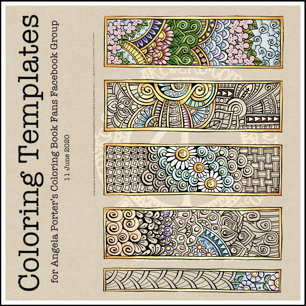
This week’s coloring template is a series of bookmarks. A member of the Angela Porter’s Coloring Book Fans facebook group said they’d like some designs that could be used as bookmarks, and so I went with the suggestion.
The designs are typically ‘Angela’ and ‘entangled’. I used a Tombow Fudenosuke along with an 04 Pigma Sakura Sensei pen to draw the designs. After scanning and cleaning up, I’ve partially coloured the designs, as well as adding a pale kraft paper background.
To use them as bookmarks, I suggest printing them on some card. If that’s not possible, then gluing the whole sheet to some card and then cutting out the book marks would make them sturdier. Of course, a laminator could prove most useful in preserving your beautiful coloring, as well as making really long lasting book marks that could be given as beautiful gifts, or used to mark the coloring page you’re working on too.
I’ve had a stressful couple of days to say the least and all my plans to edit templates and create new ones went out of the window. It was like I had ‘ants in my pants’ and I just couldn’t settle to anything that required concentration and focus.
Last night I was beginning to settle a bit. I’d had some news that had helped to calm me a little, but not enough. While I was attending an online talk, I drew this design on watercolour paper. I used a 05 Sakura Pigma Micron pen. I also scanned the finished drawing into the ‘puter. I really like this drawing, I have to say.
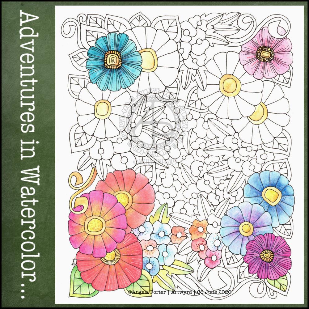
This morning, I wanted to start the day with something relaxing and meditative, so I broke out the watercolour pencils. I have a collection of Derwent Aquatone and Faber-Castell Albrecht Durer. I used them to colour the trios of large flowers at the bottom left and bottom right. For the small flowers, leaves, tendrils and the large flowers at the top I used White Knight watercolours.
I found the watercolour perncils slow and laborious on such a large scale, and I had to lay down layers to get the intensity of colour I like. However, they did mean I could control the gradients a lot more.
On larger flowers, watercolours frustrate me a bit. I can’t seem to get to the right amount of dampness so that colours will flow one into another.
I also found that by drawing the flowers to begin with, I felt compelled to paint each petal one at a time, and I found that may work against me in terms of making the most of watercolour.
Watercolour has always been a medium that vexes and frustrates me, and it’s continuing to do so at times, even as I explore adding colour. I think I’m realising that the best way for me to work with watercolor is by using it for backgrounds which I then draw upon and add more colour to the drawings.
Or, its where I make use of the randomness of loose watercolour, droping colours into a damp surface where they can bloom, flow and blend as they will, without me trying to make them anything in particular. Then, I can draw on this, picking out shapes and colours, bringing structure to where there is none, and I can get intricate with the details too.
Anyway, with the flowery drawing above, I tried to add details using some Paul Rubens metallic watercolours to add patterns of dots, as well as drawing more black or white lines onto the drawing. I really don’t feel they worked out at all well.
I knew this was going to be a bit of an experiment, and I have plenty of flowers to try out different media, such as Inktense pencils, and maybe adding more lines to to add more detail before I start coloring.
It’s been a nice way for me to spend Saturday morning, lost in art whilst listening/watching season 1 of The Clone Wars. I think I’ll continue to watch that this afternoon as I turn my attention to drawing.
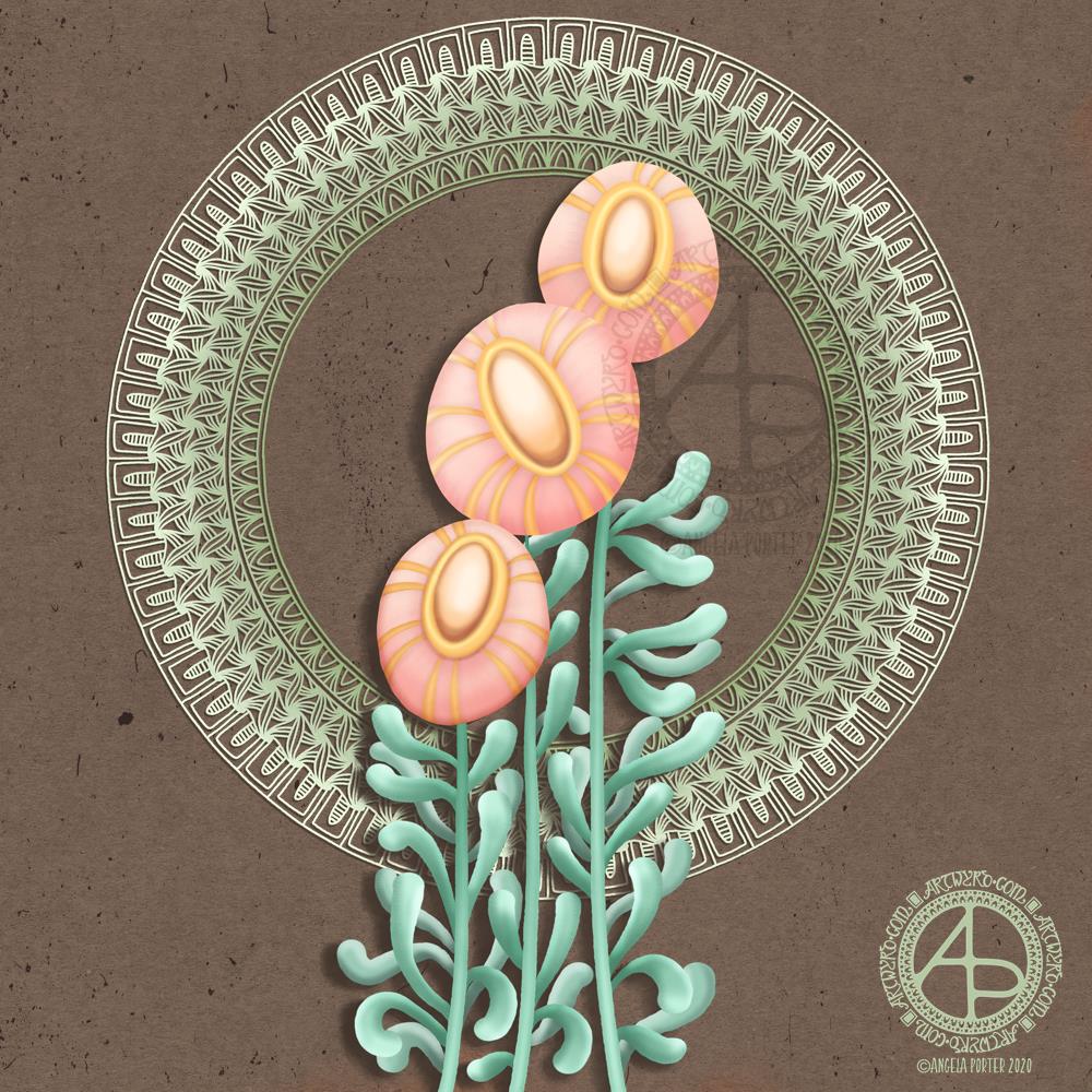
This was a nice one to do. There seems to be a bit of a theme with my colour palettes lately though. Another theme is stylised, abstract flowers. Overall, I am pretty happy with this particular design.
Flowers, foliage, mandalas, geometric repeating patterns – all my favourite things!
Abstract flowers with a simple mandala/wreath in the background. Created digitally using Autodesk Sketchbook Pro, Microsoft Surface Studio and Microsoft Surface Pen. Simple. Stylised. Satisfying to create.
It is the Summer Solstice here in the Northern Hemisphere, the longest day of the year and from here on in the days will slowly get shorter. Still, it’s lovely to have daylight well into the evening with the sky still being fairly light at 10pm or so.
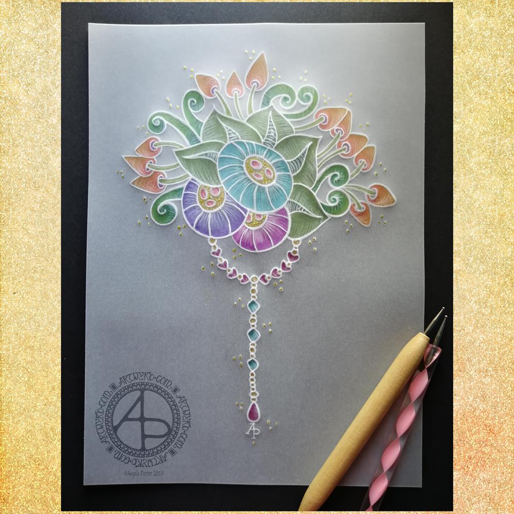
Yesterday evening I had a bit of an idea to try creating a dangle design on parchment, and this is the result. I needed a bit of a break from digital art after the hours and hours spent on my most recent mandala.
Parchment craft, or Pergamano, is an old craft and a lot of the work done, while beautiful, is really not my style. So I thought I’d try my style of art with it.
I used some ball tools to emboss the parchment with my design and then to add some shading. I drew the design directly onto the parchment with the embossing tools.
I started with the stylised flowers and worked out from there. Once I was happy with my design, I added a simple dangle consisting of round, heart-shaped and diamond shaped beads with a tear-drop bead to add some weight to the dangle.
I then added colour with some Kuretake Zig Writer pens on the reverse of the design. I chose colours that remind me of summer – the mature greens of summer foliage along with the bright colours of tropical flowers. I thought these would work well for the Solstice. Of course the hearts needed to be pink and I added some teal-blue to the small diamond beads for a bit of variety.
On top of the dots around the design I added tiny dots of gold glittery loveliness using a Uniball Signo glitter gel pen. I also added some tiny dots in the centres of the stylised flowers.
To give an idea of the size of this design, the black paper behind the parchment is A4 (approx US letter) in size.
Adhering the parchment to the black paper was a problem as glue shows through, so I had to use some tiny dots where the white lines were thick enough to disguise the glue.
I really think that the white lines of the parchment create something that is equally as lovely and maybe a bit more delicate than my usual black line art.
The uses of this design are many – greeting cards, note cards, framed artwork or used in Bullet Journals, journals, planners, scrapbooks, and more. In fact, I may replicate the design for my July cover spread in my BuJo.
If you’d like to learn more about drawing your own dangle designs, then my book “A Dangle A Day” is, perhaps, a good place to start.
So, Angela, how are you feeling today?
I’m feeling quite content today. Tired still, but content.
It seems the anti-stigma talk for Time to Change Wales and the anxiety I had around doing it on Wednesday has taken it’s toll on me just a bit. I do know, however, that I will recover in the fullness of time for sure.
This is part of the emotional/mental weather that is part of life. Beneath this weather is a calmer, more content Angela. I find this version of me from time to time; indeed I’m content in myself on many more days than I am discontented. Even with the bout of anxiety on Wednesday there was still a sense of being content.
It’s a strange thing to feel both at the same time. A bit like feeling the firm ground beneath my feet as a wild wind is buffeting me and trying to blow me down. I can feel that firm footing even when my emotions are a bit on the wild and windy side.
That’s progress on my journey to recover from CPTSD. Even more progress that I can recognise and describe this feeling.
This realisation makes me smile.
It’s progress, but it’s not where I want to be. I want to be able to go out and about without being scared of my own shadow. To be able to travel to unfamiliar places and actually get out of my car when I don’t have an appointment of some kind. To be able to go into an unfamiliar cafe or eatery when I’m by myself when I’m hungry and thirsty. To not go into full flight mode when something small has spooked me. To not be startled by loud noises. I want to be able to reach out to people without fear of rejection or to allow people into my home. To have all kinds of relationships with healthy boundaries where my needs and boundaries are respected by myself. To be able to go shopping without being overwhelmed by the choices available so I end up leaving without getting anything that’s needed.
These are but a few of ways that CPTSD affects my life and that I’d like to change through the healing journey I’m undertaking with the help of EMDR and therapy.
I’ve never been anything other than this permanently scared, extremely self-conscious person. Different events and places result in different levels of fear/anxiety in me. Even sat here, at my familiar desk, I feel anxious about writing about it.
The progress is that I recognise it now. I have identified it. Although it’s still there, it’s slowly being dis-empowered. Slowly means it’s being done properly and that I have time for the new level of anxiety or the increased self-awareness has time to become familiar to me before the next step forward is made. Familiar means it’s the more healed me. Healing bit by bit.