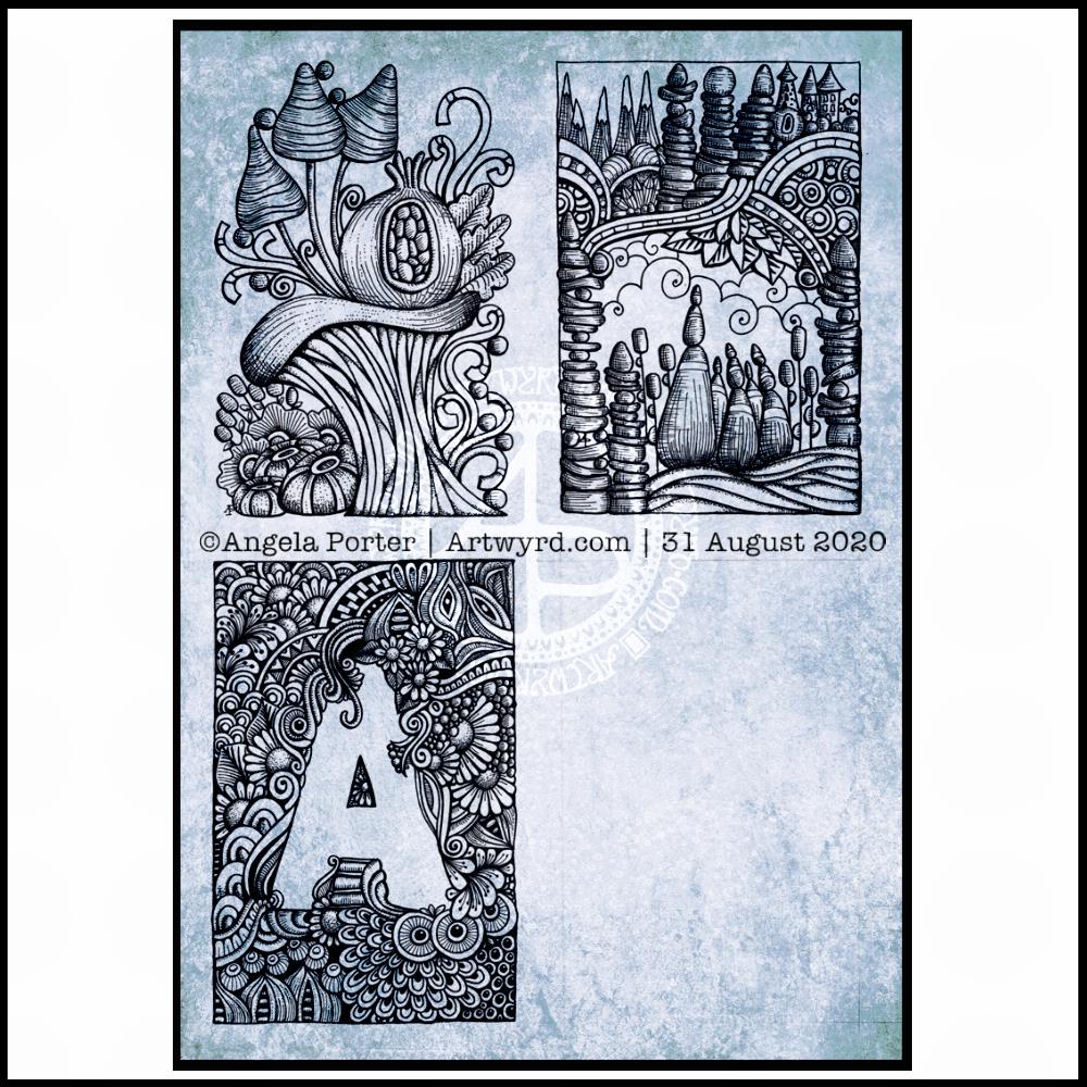
I finished the top right design, and have completed the ‘A’ illustration on the bottom left. That leaves one space to be filled, no doubt later today.
I’ve used either Faber-Castell Pitt Artist pens or Uniball Unipin pens to complete the drawings on ClaireFontaine’s Paint-On mixed media paper. This paper is fairly weighty (250g/m²) and has a lovely velvety feel to it.
The only pencil lines I’ve used have been to delineate the ‘boxes’ to draw in, and for a couple of the design elements in the top left image as well as the A.
Reflecting on the designs
The white space in the top left design works really well I think, and is quite an accomplishment for me. The same is true, to a lesser extent for the top right design. In both cases, the white space brings attention to the design.
In contrast, the densely pattered area helps to bring out the monogram A, making the white space the focus of the design.
I think I’m going to work on some more monograms in this style. They are fun to do, and dense, entangled patterns are one of my signature artistic voices. It’s been a long time since I’ve completed art like this, with a lot of detail to bring out dimension/volume in the design.
In fact, I’ve enjoyed using line and stipple to add volume in all the designs, exploring how I like to do this as I go. All the work I do with colouring books means I have put this to one side. It’s interesting how I’ve circled back to this style. It’s even more interesting to look at how my drawing skills have developed and evolved over time as well.
I found some peace, contentment and joy while drawing these, and feel a sense of accomplishment, particularly with the two on the left.
Do I prefer digital or traditonal drawing?
A difficult question to answer. I think it depends on what I’m creating.
I really do enjoy using pen on paper. I get a better sense of the overall design. Paper and pen is very portable too – whether I’m sketching when out and about, or drawing in different places at home.
Drawing on the screen of my Surface Studio with a pen is a lot like drawing on paper. The smoothness of the screen makes it a very different tactile experience. It also is great for inking in sketches. It also makes correcting mistakes or re-working areas a lot easier, and there are techniques I can use that are near impossible or very time consuming when working traditionally.
Sometimes, the lines produced digitally are too perfect. I’m still working on developing the brush styles that will mimic the unevenness of an inked line. I do have to use some element of line-smoothing as I draw; without it the lines are really wobbly, but with it they can be too perfect and I lose, to a degree, that personal and unique way that my pen moves on paper.
I also find it difficult to have a sense of proportion or detail when working digitally, even though I can look at the design at the same size as it will be printed. The ability to zoom in and work on a small area means I lose all sense of relative size and complexity/detail of a design. So, if I’m going to work on a drawing digitally, I prefer to start with a sketch to give me that sense of scale.
I rarely sketch out my design when I work on paper, except if I need the outlines of a design element as I’m drawing. I do tend to work very intuitively.
So the answer is, I prefer each for different purposes, and also to suit my different moods and purposes.
Of course, once I’ve drawn a design, I then have to decide if I want to add colour, and then what media I will use – traditional or digital!
One of my ideas is to create a digital library of designs of things that interest me and that may be useful in my journal making, card making, or just other kinds of art.
For some reason, I decided on dragonflies. So, I sketched out some ideas and then inked the drawings in digitally. I also added details and patterns ot the designs that weren’t present in the sketches. The dragonflies are in my signature entangled style for sure.
I still have a few sketches to work on, and some alternatives of the wing shapes and body designs. I also want to do them as silhouettes. I like silhouettes on coloured backgrounds, like the one I’ve used today.
I used Autodesk Sketchbook Pro to ink in the designs. I also used it to add the background, shadows and typography.
The background is one of my own made using Distress Oxide inks and water. I love that I can recolour the image digitally; the original was in shades of pink and purple, but I thought that blues and greens would suit the dragonflies much more.
I’ve left the dragonflies uncoloured, for now, though adding colour will bring the designs to life and add some dimension to them.
I don’t have a colour printer anymore, just a black and white laser printer. I may consider getting a colour printer in the future, however, as I think being able to print my own digital art would be useful, especially for using in journal making. An inkjet printer would be the most useful; it would allow me to print on many different kinds of paper and lightweight card.
I’m also thinking of putting together digital collections of backgrounds and ephemera and/or digi stamps for sale via my Etsy shop. Let me know if you think that’s a good idea by dropping a comment.
I wanted a circular frame in which to put quotes. So, I started by drawing some pencil guidelines for the circle and the outer borders on some dot grid paper.
I used 08 and 02 Uniball Unipin pens to draw the circle of flowers and foliage. Then, to start filling the space around the flowers with entangled designs.
It’s very much a work in progress. Part of me thinks I could’ve left an empty border around the circular flower and foliage arrangement to separate it from the background. The other part of me likes it as it is.
I want to try to get a balance of less detailed areas with the more densely detailed sections so that there’s space for the eye to rest.
I also suspect I’ll be adding colour or, at the very least, shadow and highlights to the design to bring it to life.
I’ve woken to a grey, wet, fresh day here in the Welsh Valleys. The coolness is actually quite delicious on my skin. The rain is freshening the air and world up, clearing the dust away. What a way for the weather to see out August!
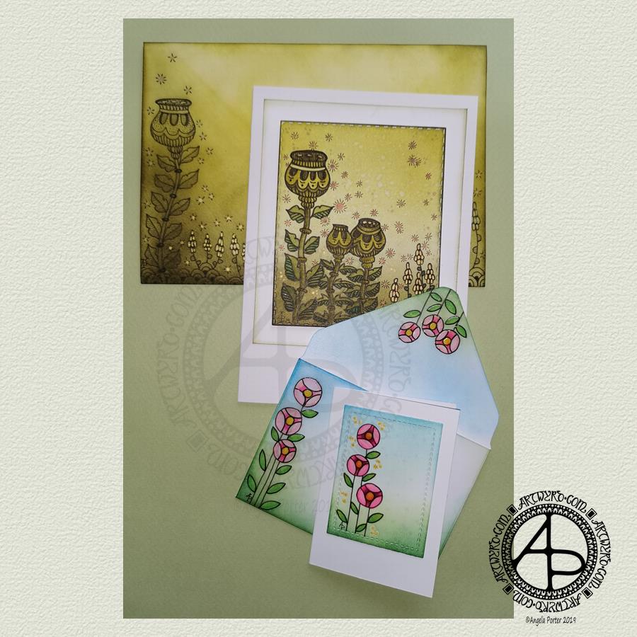
It’s a perfect morning to do some artsy crafty stuff. For me, that meant finishing off a pair of cards with coordinating envelopes.
Making the larger entangled seed pods card.
The top panel measures 3″ x 3.75″, mounted on an A6 card (UK sizes).
I coloured The envelope, top panel and the border of the middle panel envelope and the edge of the middle panel with Crushed Olive, Forest Moss and Shabby Shutters Distress inks. I used a mini foam blending tool to achieve a gradient.
I sprayed water onto the top panel. Distress Inks react with water and results in some interesting textural patterns. I didn’t spray water onto the envelope; the paper is too thin to take such treatment.
My next task was to draw the entangled designs; I chose to go with some seed pods, leaves, a geometric pattern and some little flowers too. I added some ‘sparkle’ patterns around the main elements to give the illusion of little things floating in the air.
Next, I added some sparkle and shine with some gold and copper ink. I placed ink inside the sparkles, the seeds inside the larger seed pods and the flowers too.
I used a brush and Distress inks to add some depth of colour to the design on the card. I decided not to do this on the envelope, again because of the quality of the paper.
Once I have someone to send the card to, I will address the envelope and seal it with Distress Micro Glaze so that moisture won’t damage the envelope.
The colour choice on this card is unusual for me, but it’s worked out nicely, particularly with the gold and copper accents.
The tiny floral card.
This card is tiny, measuring just 2.25″ x 3.25″. It’s envelope is a little larger than needed, but the We R Memory Keepers Envelope Punch Board didn’t have measurements on it for a card this size, so I just used the closest available.
The panel on the card measures 1.75″ x 2.375″. It is one of the panels from the Foursquare background frames I messed up while making yesterdays cards.
I used one of my ideas from yesterdays musings on the cards I’d made. I drew a simple design on both the card panel and the envelope front and flap using Uniball Unipin pens and then coloured it with Copic markers. I added some gold glitter dots with a Uniball Signo gel pen.
Once all was dry, I used a Versamark Pen to colour over the flowers, leaves and gold sparkles. Versamark ink is colourless and sticky and is made by Tsukineko; it comes in ink pads but also in double-ended pens – a bullet point at one end and a brush tip at the other. The ink takes a little while to dry.
I covered the sticky areas with WOW super fine clear embossing powder and used a heat tool from Ranger to melt it, giving the design elements a glossy, protective and slightly raised finish. It also intensifies the colours somewhat, which I rather like.
So, I could now colour the background and envelope with Distress Inks without affecting the colours of the flowers, leaves and gold dots. I used a mini foam blending tool along with Pine Needles, Mowed Lawn, Tumbled Glass and Salty Ocean Distress Inks.
The final task was to glue the card panel to the card blank as well as the envelope flaps.
Again, once I’ve addressed the envelope, I’ll use Distress Micro Glaze to seal the inks and prevent any damage to the artwork while journeying to the recipient.
Reflecting on the cards.
I enjoyed making these cards. I particularly like the simplicity of the small card and the effect of the embossing powder. There’s something about teeny-tiny cards that really pleases me. I think it’s that their size makes them just so darned cute!
The larger card I am also pleased with, particularly in my use of colours that are unusual for me. I’m glad I added colour to the seedpods on the card; it helps them to stand out. I do love the copper and gold ink on this darker background too and how well they stand out.
Making envelopes that coordinate with the card is also something I enjoy doing; hopefully, the recipients see them as something a bit special dropping through their letterbox.
So, what’s on the cards for today?
It’s the last day of August, so I need to get a wiggle on to create a September colouring template for the Angela Porter’s Coloring Book Fans facebook group. I feel the need to include some autumn imagery in this one as we are in the dog days of summer for sure.
Tell me, Angela, how are you feeling today?
I’m tired but feeling quite content and optimistic again. I slept well last night; the weighted blanket really is working wonders for me as far as sleep is concerned. One problem is that I don’t want to get out from under it in the morning, so it must be comforting or soothing me.
I seem to have turned in a magnet for people who have escaped narcissistic abuse of all kinds. It’s nice to be able to help others by giving them space where I will believe their experiences, and I can help them, hopefully, to understand that they are not at fault but are victims.
Synchronicity pointing out to me how much I have learned and understood and healed and am now able to help others, perhaps?
Easy listening playlist on Spotify, creating art. What a lovely way to spend a Saturday morning!
I’ve been working at this monogram now for several days. It is coming along.
It really feels like a an embroidery sampler where the learning embroiderer would try out different patterns and shapes and still create something beautiful.
For me, the sampler is more about out different ideas as they come to me and increasing my knowledge and understanding of the digital art tools available to me in Autodesk Sketchbook Pro.
Of course being able to draw directly on the screen of my Microsoft Surface Studio with a Surface Pen makes creating digital art a dream for me; it’s like working with pens and pencils and so on on paper. However, I’m able to do things I don’t think I’d ever be able to do with traditional media.
I still love working with pen on paper; I currently have one drawing on the go and I may convert it into a digital artwork when it’s done.
Exploring the realms of digital art has opened doors to me that have expanded my creativity in ways I never could have imaged previously.
Yes, I learn by doing myself rather than following tutorials. My experience of watching tutorials is that I end up more confused than I started.
Don’t get me wrong, the ones I watched were excellent. However, they are by people who really know the software and what everything does, and they speak to people who have some idea of it all.
Besides, I want to do art my way, and these artists tend to show how they do things and that often doesn’t make any sense to me.
I’m grateful they share, and one day I may watch some more, but for now the exploration in my own realms of creativity is what is best for me.
As I look at my sampler monogram, I can see how I’m developing my own digital art voice in terms of techniques and effects that suit my style of rather intricate, abstract art based on patterns, curves, swirls and arches, along with a lot of motifs based on nature.
The plain curves in this monogram are adding some much needed scaffolding or girders to support and separate the patterns. Some of the fancily patterned curves are getting lost in the crazy intricacy of adjoining sections.
There are no individual sections that I really don’t like. However, some combinations of sections don’t seem to gel well, at least not to my eye.
What I do love is the layers of diversity of colour and pattern. Each glance reveals something new, whether it’s the way I’ve played with light and shadow, the way patterns look together, or the way colours I’d not normally put together seem to work together.
However, as this is turning out to be a sampler, then that’s fine. It’s all learning for me, and that’s good.
I’ve noticed I’ve not left any white space in this design, so far. I may do that in the area that is left to complete, just to contrast with the pattern-dense areas done so far.
It is a fascinating journey for me, and while this may not be an artwork that I’d offer for sale at redbubble.com or zippi, it’s something that is worth its weight in gold for me in terms of lessons learned and also gaining some confidence in my style of digital art.
I was looking at the monogram I started a few days back and I’m really not happy with it at the moment. I don’t like the shape of the letter. So, I thought I’d try out a more ‘blocky’ letter. I also thought I’d try filling the letter with abstract patterns and shapes to see how that goes too.
You can see the result of my last two or three hours of work. I like what’s happening here, but I’m not too sure about my colour choices. Time to get limited colour palettes going again I think!
I’m perplexed as to how I can so easily create abstract mandalas that are really quite complex, but something like this seems to cause me no end of troubles.
I will persevere. I always do when it’s art.
As usual, I’m using Autodesk Sketchbook Pro along with a Microsoft Surface Pen and Surface Studio.
So, tell me Angela, how are you today?
I’m tired. I’m content but feeling ‘flat’ at the same time. The ‘flatness’ is draining some of the contentedness away from me today. I don’t feel as ebullient as I did in the last week.
EMDR yesterday was puzzling, confusing and overwhelming. I also think I went with the expectation of the same kind of thing happening as last week.
It didn’t.
Last week, we worked with one negative belief about myself and the image that popped up when I thought of myself as a baby or child while holding that belief and the feelings it generated inside me.
This week I went to therapy with an image of a ‘monster’ that had cropped up this week.
While processing in EMDR, the negative thoughts just kept coming and coming. The pain and sensations in my body were quite overwhelming.
At the end of the session, my therapist said we need to go back to how we’d worked in the last couple of weeks.
I agreed.
I’m so glad that despite the tiredness and flatness, the contentedness is still there, despite me feeling deflated from EMDR yesterday. Me being overly tired isn’t really helping things either.
I left the session feeling tired and I wanted to sleep. I couldn’t, however, as I had a commitment in the evening. That left me more tired. I really haven’t slept enough overnight to overcome the tiredness. It’ll soon be time to nap I think!
However, I did wake up with an idea about what I could do about a monogram, and wanted to explore that.
I also have to remind myself that yesterday in EMDR wasn’t a step backwards. It was finding out that the way to work is with a negative belief, just one, to prevent overwhelming, confusing sessions. Maybe not a lot of processing was done yesterday, but a lesson was learned.
On a positive note, I did some ‘adulting’ yesterday that involved going into a branch of my bank to pay a couple of cheques in and to enquire as to whether I’d received a payment, and to get the online banking thingy sorted it. It won’t let me log on. I can’t log on until I recieve this card reader thingy, but it should be a lot easier to do so in the future – woohoo!
I also had lunch in the park in Neath. Eating while out and about can be a huge problem for me, but yesterday I had the courage to do this again.
So, when I see those two things, I can see how much progress I have made, even though the tiredness and deflation are sapping me of a little bit of positivity today.
It’s only temporary, the tiredness and deflation. A nap could seriously help me out!
This is my way of saying thank you to those who follow my work, particularly the colouring books I have created.
If you’d like to download and colour, you need to be a member of the group and agree to follow the T’s & C’s.
I’m looking forward to seeing what members of the group will do with this one! I love to see the different colour schemes and media that they use to bring the drawing to life with the magic of colour.
To create this template, I started with a sketch on square gridded paper. It was a very basic sketch with just outline shapes, lines and so on. I then scanned it into the Surface Studio and completed this drawing using my Surface Pen along with Autodesk Sketchbook Pro.
I had to include some of my favourite design elements – butterflies, stars, flowers, fungi, seed pods, arches and geometric patterns.
It was fun to draw, even the sketch was as I love to use a Koh-i-Noor Magic pencil to do the sketching with, one that has quite different colours in the lead so that I get a fair rainbow of colours.
I’m warming to sketching things out before drawing them in ink (either traditional ink/pens or digital) to give me a skeleton I can put flesh on in terms of details and patterns.
So Angela Porter, how are you feeling today?
I’m feeling contented. My stomach/digestive system is back to normal. All just in time for today’s EMDR session this afternoon.
That’s all I have to say about that today. I’m sure I’ll have more tomorrow post EMDR.
It’s a new month so that means a new coloring template is available to members of the Angela Porter’s Coloring Book Fans facebook group, and this is the template! I thought I’d add some colour to it before I head out for the rest of the day.
I drew the template with Fudenosuke pens from Tombow on Bristol Board from Winsor and Newton. The paper is A4 in size (that’s approx. US letter size).
I’ve started coloring it digitally (Autodesk Sketchbook Pro, Microsoft Surface Pen, Microsoft Surface Studio), as that’s what I’m enjoying at the moment.
This month I’ve gone for my signature entangled style of art, but using the Fudenosuke pens, which I’m really enjoying using, gives varying linewidths and heavier lines and a more graphic feel to the art.
It’s free to join the group, there are some terms and conditions attached to the template use. If you’d like to download and colour the image then pop along to the group and you’d be made most welcome!
I’d also love to see how you colour this template. Yes, really, I would!
This morning, I’ve spent a pleasant four hours or so drawing this A5 design for the month of May.
It combines some hand lettering along with my signature style of entangled art. I’ve included plenty of floral motifs as here in the Northern Hemisphere the world is filled with flowers, especially on the trees.
Of course I’ve included more abstract motifs that are inspired by seedpods and patterns found in nature and architecture and so on.
I drew the design on white Bristol Board by Winsor and Newton. My pens of choice today were Tombow Fudenosuke, Sakura Pigma Sensei 04 and 0.1 Unball Unipin. Also, I’ve used some digital wizardry to add coloured paper as the background, along with my watermarks.
This would be lovely in a BuJo I think. I think it would be lovely in a planner, a journal or diary.
It’s perfect for colouring, as long as you’d be happy to colour across sections that have fine lines in them.
I think if I was more confident with metallic inks and either dip nib pens or fine brushes I’d’ve liked to do the lettering in metallic gold or copper. Of course, I could’ve done the lettering, scanned, laser printed it and then added the patterns around the lettering. I didn’t think of that until now though! Duh!
I’m fairly happy with adding ‘auras’ around the lettering to separate it from the entangled design around/below it.
I’m not sure I’m happy with the design spilling out over the edge as it has done; it doesn’t feel balanced to me, but other than that I’m quite happy with the design. Of course I could edit the image to even up the edges, but it is what it is for now.
Post EMDR
EMDR was quite gentle yesterday but lots of body work occurring. During EMDR stored trauma is released through pains and other sensations in the body. Yesterday I had eyes that hurt, part of my head, my throat, my thumbs and wrists. I had a lot of pain where I broke my leg when I was six. Lots of prickling as well as electric shocks in various parts of my body.
I actually felt quite upbeat, if a little tired, when I left the session. But by late evening I was really tired and feeling a bit teary and lonely.
I’m tired today. I didn’t sleep too well last night. I had hoped to go out for the day today, but I really wanted to stay home and draw and I think I’ll be back in bed before too much longer. I really am tired.
One thing that I was asked about, without me mentioning it first, was what I was going to do about getting out and about a bit more! I’m sure my therapist must read my blog. Just joking, I know she doesn’t!
I need to make a list of places I’d like to visit. Familiar places to revisit to ease me back into getting out and about by myself. Then ones not so familiar that could involve some time away from home too.
I will be going out later this week. I have something to do this evening and tomorrow, however. Another reason I am having a quiet day today. I’m not just tired; I know that I’m also emotionally fragile still.
I am determined to heal as much as I can from the CPTSD and to do the things I’d like to do that the inner critic sabotages way too often.
Another lovely day or so spent hand lettering and drawing the etntangled designs around the monograms.
I used Tombow Fudenosuke, Uniball Unipin and Sakura Pigma Sensei pens on 15cm x 15cm pieces of Winsor and Newton Bristol Board.
The Tombow Fudenosuke pens are giving me a much thicker line than I’d usually use, along with variable line width too. I must admit I rather like the bolder lines as they really define the designs. What do you think about my use of bolder line?
I have scanned these, and yesterday’s A and B monograms, so I can add colour digitally, should I choose to do so. At the moment I’m really just enjoying the graphic quality of the black and white line art.
Therapy day
Today is EMDR therapy day for me. My appointment is mid-afternoon and it’s been almost a fortnight since my last one as there’s been a Bank Holiday in between.
I must say that I’ve had quite a contented fortnight. The last session was rather disturbing and distressing and though I was absolutely exhausted emotionally, mentally and physically after it for the rest of the day and part of the next, I think I found my balance much quicker than I expected.
I’ve had my moments, hours, mind you. Often when I’m tired and need a nap. So, I take a nap if I can. That’s one of the fab things about being a self-employed/freelancing artist/illustrator/author. It’s a lot easier to do self-care things when self-care is needed. If I need a nap, I can often take a nap. If I need a day or three to recover from EMDR I can take that time, or at least break the time up so I have chunks of self-care in amongst the work I need to do to fulfil contracts.
I really am grateful for this flexibility, a flexibility that is in sharp contrast with the very structured, timetabled, hamster-wheel existence of my life as a teacher.
Flexibility and freedom – a double edged sword
It’s really difficult for me to make full use of the flexibility and freedom I have. I often have an urge to go out somewhere, but I can never decide on where to go, or when to go, or whether I should even bother going as really, what do I want to go there for. Telling myself it’s to sketch, draw, photograph, gain inspiration, for the experience, because I like to walk when I do go and walk, because being in nature is good for my emotional and mental wellbeing, or just because I CAN just doesn’t cut it with the problems that arise from the CPTSD, especially anxiety and social anxiety that forms part of the experience of being a survivor of trauma.
Sometimes I manage to sneak up on myself and surprise myself and get out and about and visit somewhere either familiar or new to me.
More often than not the inner critic manages to talk me out of it.
I think I need to make a list of places close to me, and a bit further away, that I’d like to visit. A list that contains both familiar and unfamiliar places.
Familiar places are less stressful for me to visit on my own. Knowing my way around, knowing where I can enjoy lunch or tea, knowing where I can park my car and knowing I can find my way back to the car, and so on and so forth makes it a much easier experience for me.
Going somewhere unfamiliar increases stress for me as simple things like going into an unfamiliar cafe for some tea or lunch causes me huge anxiety when I’m by myself. The worry about not being able to find my way back to my car is another added source of anxiety too. Even going into unfamiliar shops, cathedrals, museums and so on provokes anxiety in me.
It’s that old fear from being a bullied, abused child that rises up where I worry if I’ll get hurtful comments from people, if I’ll make a fool of myself in some way and people will laugh, if they’ll pass comment about my choice of food or tea.
None of these things have happened to me as an adult, yet the anxiety that lurks within me rises up and tells me again and again that these things may happen. The voice of my anxiety, of my inner critic, can paralyse me or cause me to flee back home without even getting out of my car, that’s if I even manage to drive to where I’d like to go.
If I have company I’m really brave. I’m often the first to enter a cafe or similar and ask for a table and so on. I’m the one who will bravely explore a new cathedral or museum or place quite eagerly.
On my own though, the inner critic is way too strong as I feel vulnerable. As vulnerable as I did when I was a child and all the way through my adult life.
I can overcome this vulnerability, the anxiety, if there is a purpose to my trip, such as giving an anti-stigma talk for Time to Change Wales. I do it because I don’t want to let others down (as well as because I believe in the mission of Time to Change Wales).
Part of my anxiety is that I never, or rarely, ask anyone to go out with me (not go out in a romantic sense, just go out as in a jolly day out visiting somewhere of mutual interest and enjoying pleasant company). The fear of rejection is still too huge. I’m also very much aware that people I’d call friends and family are busy with their own family and work and so on, and I never, ever, want to become a burden to anyone.
That’s something that I learned early in my life – not to bother anyone with my needs or problems or issues. It’s something as an adult I’ve not gotten over yet.
I also am aware that there are trips I need to make solo. I like to sit and draw and write in places I visit. I can lose myself in this for a long time, I can take as much time as I need to look at . If I’m with someone I don’t want to spoil their day by indulging myself in such an activity. If I’m by myself I don’t have to worry about them not enjoying themselves as much as they could, so I tend to put my needs completely to one side to make sure they’re happy.
Being a people pleaser is part of the CPTSD. It’s what I did to try to gain approval of people who would never approve of anything I did or said or how I looked. Rejection, ridicule, being put down was par for the course no matter what I did. That didn’t stop me trying to please others, to make sure they were happy as if they were happy then perhaps I’d have an easier time of it and wouldn’t be pushed away yet again.
CPTSD sure messes a person up.
I know that there are plenty of people who experience anxiety who are able to do these simple, everyday, taken for granted things like going into a cafe for a cup of tea. They’re able to overcome that anxiety and don’t buy into it’s messages.
I’ve not learned to overcome it or have disempowered the inner critic enough that I can do these simple everyday things, well not yet. I think the critic has a way to go to be disempowered first.
Still, there are days when I’ll be able to sneak up on myself and head out and actually visit places, sketchbook and visual BuJo in my bag, and take that time and will wonder at how I don’t do things like that more often as it’s really not that bad.
I hope those days will eventually outweigh the days where the inner critic wins out.
Until that days comes I just need to be kind to myself and not beat myself up about giving in to the inner critic once again and remind myself a day will soon come where through sneakery or just disempowering the inner critic enough that I can go out.