This could be the last piece of mail art from me for a few days. I need to get focused on art that is ‘work’ rather than just ‘for fun’. I enjoy my art, no matter what it is, but I can be easily distracted by the metaphorical shiny, bright new toy.
Mind you, once I’ve spent time doing art ‘for fun’, the commissioned work then feels like fun. A change is as good as a rest for sure. Different styles and methods of working keep everything fresh for me.
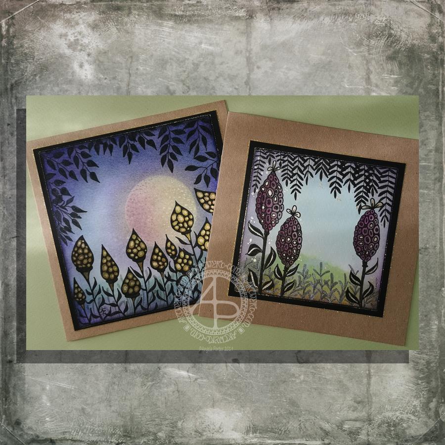
Here’s a brief outline of how I created the card:
Distress Ink background on watercolour paper. Use torn paper to use as a mask for the landscape. Use a circular mask for the sun.
Spray with a mixture of Perfect Pearls and water.
Use Faber-Castell Pitt Artist Pens to draw the design.
Add metallic highlights using a fine brush and Cosmic Shimmer Iridescent Shimmering Watercolour paints.
Add a distress ink ‘frame’ to the image.
Mount the design on black card. Attach the black card to the 6″ x 6″ card blank.
Use a gold glitter Uniball Signo gel pen to outline the top panel and black panel.
And here’s a brief outline of how I created the envelope:
Use a white Sakura Glaze pen to draw the flower motifs.
Use a fine paintbrush to add Cosmic Shimmer Iridescent Shimmering Watercolour paints.
For the envelope, I used a rainbow of colours for the flowers.
I like using Sakura Glaze pens to draw motifs when I’m adding watercolour; the ink dries to give a raised line that is waterproof. The thicker line width can also give stained glass feel to the artwork; this is particularly true for the black Glaze pens.
I had a lovely time this morning making the card on the left. Before I started drawing, I added a moon or planet to the background. It really adds something to the card, I think. Something like this is needed on the card to the right I think. However, as I’ve assembled the card it’s not going to be easy to alter!
How I made the cards.
I used Distress Inks and a mini-foam blending tool to colour the backgrounds. I used a circle of paper as a mask for the moon/planet in the left-hand card. To create the land, I used a torn piece of paper to mask off part of the card.
Once I was pleased with the backgrounds, I sprayed the image with a mixture of Perfect Pearls and water and let it dry.
The next step was to draw the designs. I used black and grey Pitt Artist Pens by Faber Castell.
Metallic/iridescent highlights were added; I used Cosmic Shimmer watercolour paints and a fine brush.
The final steps were to adhere the top layer to a black mat, and then this to the card base. Finally, I edged the mat and the top layer with a gold glitter Uniball Signo gel pen.
I have made coordinating envelopes for each card.
My thoughts on the cards.
I think you can tell that the card on the left is the second made. I can see how I’ve learned from the first card. I do like them both.
I would, if I could, add a moon/planet to the right hand card. It would fill that space rather nicely and give a more magical, mystical, ethereal feel to the landscape.
As to the left hand card, I wish I hadn’t done the pods all in black; they appear a tad ‘flat’. In hindsight, I could have used just black outlines and then filled the pod with a colour gradient before adding the metallic highlights.
I also am glad I didn’t try to add a spine to each leaf as I did on the right hand card. However, a highlight at the top of each leaf, suggesting the moon/planet light is reflecting from them.
Oh the whole, however, I am pleased with these cards. They are a new style of working for me. leaving open space is never easy for me, but I’ve managed it with these cards.
Would you like some happy mail?
I’ve already got some recipients in mind for these cards. However, if you’d like some happy mail then send me a message.
I had a lovely time this morning making the card on the left. Before I started drawing, I added a moon or planet to the background. It really adds something to the card, I think. Something like this is needed on the card to the right, I guess. However, as I’ve assembled the card, it’s not going to be easy to alter!
How I made the cards.
I used Distress Inks and a mini-foam blending tool to colour the backgrounds. I used a circle of paper as a mask for the moon/planet in the left-hand card. To create the land, I used a torn piece of paper to mask off part of the card.
Once I was pleased with the backgrounds, I sprayed the image with a mixture of Perfect Pearls and water and let it dry.
The next step was to draw the designs. I used black and grey Pitt Artist Pens by Faber Castell.
Metallic/iridescent highlights were added; I used Cosmic Shimmer watercolour paints and a fine brush.
The final steps were to adhere the top layer to a black mat and then this to the card base. Finally, I edged the mat and the top layer with a gold glitter Uniball Signo gel pen.
I have made coordinating envelopes for each card.
My thoughts on the cards.
I think you can tell that the card on the left is the second made. I can see how I’ve learned from the first card. I do like both cards, though.
I would, if I could, add a moon/planet to the right-hand card. It would fill that space rather nicely and give a more magical, mystical, ethereal feel to the landscape.
As to the left-hand card, I wish I hadn’t done the pods all in black; they appear a tad ‘flat’. In hindsight, I could have used just black outlines and then filled the pod with a colour gradient before adding the metallic highlights.
I also am glad I didn’t try to add a spine to each leaf as I did on the right-hand card. However, a highlight at the top of each leaf, suggesting the moon/planet light is reflecting from them.
Oh the whole, however, I am pleased with these cards. They are a new style of working for me. Leaving open space is never easy for me, but I’ve managed it with these cards.
Would you like some happy mail?
I’ve already got some recipients in mind for these cards. However, if you’d like some happy mail then send me a message.
I’ve already got some recipients in mind for these cards. However, if you’d like some happy mail then send me a message.
After a very late night talking to a friend and not enough sleep, today is a self-care day. I’m going to go back to bed soon and try to sleep some more before driving for four hours tonight.
While waiting for sleep to catch up with me again, I thought I’d make some mail art. The photo isn’t the best; I’ve said it before, I’m not a brilliant photographer. However, I’m sure you get the idea. Also, I wanted to catch a glimpse of the metallic highlights I’ve added to this card, so the angle of the photography was just plain weird!
My brain seemed to have ticked over some ideas while I was asleep and I woke with some things I thought I could try out. This card is the result of some of them.
I started by using a 4″ x 4″ piece of watercolour paper and applying Distress inks to it to create a background.
I used a torn piece of paper to mask off the bottom of the panel so that could use an ink blending tool to apply Pine Needles and Crushed Olive Distress inks to create some land.
A sky was required, so I used Broken China Distress ink to create it so that it faded from top to the land.
I then sprayed the background with a mixture of gold Perfect Pearls and water to create a less perfect appearance.
While this was drying, I flipped through my Zibladone (visual dictionary) and found some motifs I liked. I used Pitt Artist pens from Faber-Castell to draw the motifs on the panel. I chose these pens because they’re waterproof when dry and I knew I wanted to add colour and sparkle to them later on.
To give a sense of dimension, I used black pens for the foreground motifs and a grey brush pen to create the foliage in the background.
To help the seed pods stand out, I used washes of Dusty Concorde and Seedless Preserves Distress inks. Then, I used some Cosmic Shimmer gold iridescent watercolour paint to add the gold highlights.
Once everything was dry, I used a piece of Cut’n’Dry foam to edge the panel with Dusty Concorde Distress Ink. The design was framed nicely by this edging; it also added a sense of dimensionality.
Next, I mounted the panel on a piece of black card and then adhered these layers to a 6″ x 6″ blank Kraft card, all done with Tombow Mono glue.
Finally, I carefully used a gold glitter Uniball Signo gel pen to add lines around the edge of the design panel and also the black mat.
I then turned my attention to the envelope. I drew some more of the seed pods before adding a light wash of Dusty Concorde and Seedless Preserves Distress Inks, being careful not to overwet the envelope. I added dots of gold watercolour paint to the seed pods and the space around them too, making sure I left enough space to write the name and address of the eventual recipient.
I’m quite pleased with the card. I’ve done this style of drawing digitally in the form of a mandala, but never like this. However, as I look at the card, it seems to need a focal motif in the space between the seedpods. I may be wrong; it may just be my constant need to fill up space with line and pattern and the difficulty I have in leaving white space in a design.
I shall let the card ‘sit’ for a while before making my mind up on that issue.
Today I have two card designs for you, both featuring dangle designs, but in different ways.
If you like dangle designs and you’d like to give drawing them yourself but need a little help or inspiration, then you may find my book “A Dangle A Day”of interest. In the book, I take you, step by step, through how to draw over 100 dangle designs, along with some ideas of how you could use them.
Love Ya and With Love Card.
I started by using the Foursquare Backdrop: Portrait die from lawn fawn to cut the frames and panels from a piece of Winsor and Newton Bristol Board. I purchased this die, and the one in the second card, from Seven Hills Crafts here in the UK.
Next, I used Stormy Skies and Broken China Distress Inks to add a subtle colour gradient to the panels.
My idea was to draw four different dangle designs for each small square panel. I also wanted to include some hand-lettering, which I did.
So, I used Unipin pens from Uniball to do the drawings and lettering. I did use pencil outlines for the ribbon banners and lettering to make sure their placement was just right.
I coloured the design elements and charms using Copic markers. As the individual design elements were so small, I just used two colours to achieve shading in the bigger ones.
I also added a drop shadow around the designs using a BV marker that is a greyish-violet. It’s a very subtle drop shadow.
I had to add some sparkle and shine to the card, so I used a clear Spectrum Noir Sparkle brush pen along with a gold glitter Signo gel pen to do this.
To assemble the card, I glued the frame to the card base using Tombow Mono adhesive. Then, I glued the square panels into place.
I managed to get glue onto the front of the card and trying to rub it off while wet just left a dark, dirty smear. I’ve ordered some Tombow Sand erasers to see if they’ll remove the mark. If not, I’ll have to either work out another way to cover it up or just consign the card to the pile of things not to do again!
Black and white floral card.
Again, my first job was to cut out the frame and panels using a die. For this card, I used the Foursquare Backdrop: Landscape die from lawn fawn along with Winsor and Newton Bristol Board. I also decided to use this die in portrait mode.
To draw the design elements, I used Unipin pens from Uniball. I hung dangle designs from the top of each card to fill in some of the space that was there. I wish I’d used a slightly thicker pen than the 01 though. They look almost like an afterthought.
Anyway, once I finished the drawings, I wasn’t sure whether to add colour or not. So, I’ve left the pictures as black and white line art for now.
I used Tombow Mono glue to attach the frame and panels to a 5″x7″ piece of Winsor and Newton Bristol board. I did this as I realised that the dies are made to fit card blanks made from half a sheet of US letter-sized paper folded in half. In the UK, we use A4 sized paper, which is different enough in size to make it awkward to cut the paper to fit the card. I have ordered some 5″ x 7″ card blanks with envelopes, and then I can finish assembling this card. I’m likely to trim the foundation panel down a little and maybe try to carefully add some colour around the edge. Maybe.
It’s at this point I’ll decide whether or not to add colour and to see if I can thicken the lines around the dangles without messing it up. Mind you, if I do mess it up, it’s another experiment I can learn from, hopefully remembering not to do this again.
Things I’ve learned and techniques I want to try.
The lawn fawn dies work great! They come with smaller dies – heart, cloud, small star, large star, sun, small sun and speech bubble – which may be useful in the future. I had made my mind up that I’d limit myself to die sets that are simple in shape to for cutting out panels to draw on and maybe for layering.
I rolled my eyes at myself when I worked out that dies from an American company would work best with American sized paper for card bases. However, I can work around that now I’ve realised that. I’m comfortable working with inches; most of my craft tools have both inches and centimetres on them. However, the inches are visibly the most dominant measurement system.
Glue. Me and glue. Not sure how I can avoid smearing in the future. Hopefully, the sand eraser will help to remove my gluey, sticky, dirty-looking mistakes.
I like using Distress Inks for backgrounds. However, the pale colours of markers that I prefer to use are translucent and so combine with the background. I could use other media such as coloured pencils for colouring. Or I could use distress inks or water-based marker pens with a damp brush to add colour. I could also use a damp brush to remove some of the distress inks. In that case, I may have to use watercolour paper instead of Bristol Board.
I could also use a Versamark pen – which contains transparent, sticky ink – to colour over my design elements once coloured and then use clear embossing powder and a heat gun to protect the colours. I could then add the distress inks after heat-setting the embossing powder. The embossing powder would add some dimension and shine to the cards. If I used a sparkle pen or gold gel pen, for example, the embossing would encase it and highlight these embellishments Ieven more, I think. I need to try this idea out!
So, there are lots of possibilities for going forward with this.
So, Angela, how are you feeling today?
I’m feeling the more content and optimistic than I have for the past two or three weeks.
I’m still feeling out of kilter; changes are happening in my perceptions around my emotional/mental wellbeing. I’m also aware of shifts that are happening in other parts of me.
I’m still poop-scared about what is going on in the world. I can’t see that ending anytime soon, however. This, and the rest of the emotional rollercoaster I seem to be on, are still upsetting my digestive system, so I’m not feeling too well much of the time.
Yesterday, I was so unsettled and scared that I couldn’t settle to do much art, and I became so dissatisfied and frustrated with whatever I did. I couldn’t settle to anything else either – not crochet, reading, nothing.
As I’ve said, today I do feel better, so I need to turn my attention to trying out Affinity Publisher to create some materials I’ve been commissioned to do (the artwork and inserts for a CD by a band!). I’ll see about setting the templates up first and go from there. I’ve not tried to do this the past couple of days as I know my head and my emotions weren’t in the right place. I’m not sure that they are today; it’s only by doing that I will find out whether they are or not.
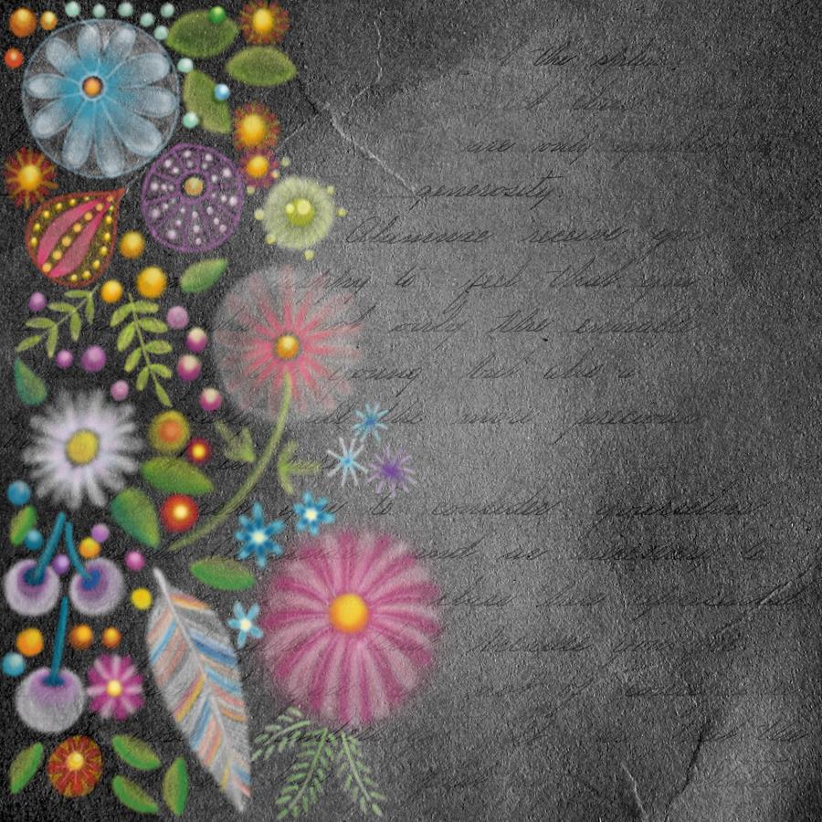
This image is in the vein of experiments in digital art. It reminds me very much of chalk/soft pastels, a traditional medium I did experiment with many, many years ago. However, I abandoned it as I didn’t like the feel of the soft pastels nor the messiness of them.
Using a kind of digital version of them means no mess!
I like this pot potpourri of motifs quite a lot. The softness of the lines and translucency of the colours appeals to me. I also like the way the colours glow against the black background. Surprisingly, the simplicity of the motifs appeals to me as well, giving a folk art kind of vibe to this work. Overall this design has an ethereal, ghostly, perhaps even magical feel to it.
My usual style of art is quite intricate and detailed, so this is definitely a departure from this. It’s certainly a style I want to experiment with more.
As it’s digital art, I used Autodesk Sketchbook Pro along with a Microsoft Surface Pen and Microsoft Surface Studio.
Today I thought I’d create a monogram dangle design for ‘F’ with some cute fish, as well as a couple of shells. Of course a whimsical crown with golden foliage tops the design off just nicely!
Fish means a water theme, so I used blues, and blue-greens quite liberally. However, golds and shades of red and magenta really give a tropical feel to the jolly little fish.
Fairly simple gradient colouring this week. No drop shadows, other than the one around the whole design.
Looking at it now, I think the monogram might benefit from a drop shadow or two. However, it’ll do just fine as it is I think.
It would be lovely on a card for someone with the initial F, especially if they love fish or fishing. Of course the colours can be adjusted accordingly, as can the particular kind of fish. I’m particularly fond of cute, whimsical, happy little fish.
It could happily find a place in a BuJo, scrapbook, planner, journal or diary. Making the monogram narrower and the dangles longer, it would make a lovely bookmark too, I think.
Just a little mention here about my book “A Dangle A Day”. It’s a dangle design tutorial book, Angela -style dangles that is. Lots of monograms as well as dangle designs for use around the year. It’s a good place for beginners, but is also full of ideas for the more experienced among you. And, of course, I add a new dangle design on this blog most Fridays which you can use for inspiration. I’d love to see what you create! Tag me on social media!
It is the Summer Solstice here in the Northern Hemisphere, the longest day of the year and from here on in the days will slowly get shorter. Still, it’s lovely to have daylight well into the evening with the sky still being fairly light at 10pm or so.
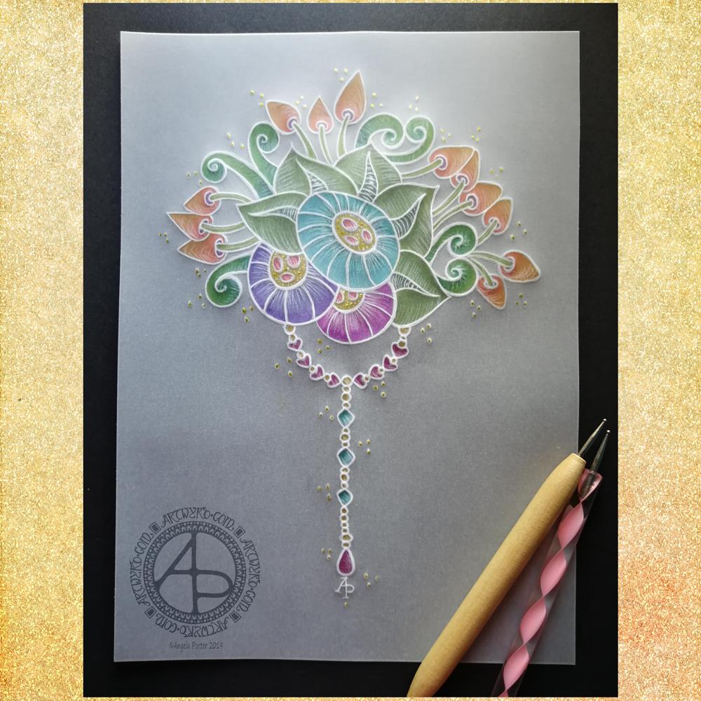
Yesterday evening I had a bit of an idea to try creating a dangle design on parchment, and this is the result. I needed a bit of a break from digital art after the hours and hours spent on my most recent mandala.
Parchment craft, or Pergamano, is an old craft and a lot of the work done, while beautiful, is really not my style. So I thought I’d try my style of art with it.
I used some ball tools to emboss the parchment with my design and then to add some shading. I drew the design directly onto the parchment with the embossing tools.
I started with the stylised flowers and worked out from there. Once I was happy with my design, I added a simple dangle consisting of round, heart-shaped and diamond shaped beads with a tear-drop bead to add some weight to the dangle.
I then added colour with some Kuretake Zig Writer pens on the reverse of the design. I chose colours that remind me of summer – the mature greens of summer foliage along with the bright colours of tropical flowers. I thought these would work well for the Solstice. Of course the hearts needed to be pink and I added some teal-blue to the small diamond beads for a bit of variety.
On top of the dots around the design I added tiny dots of gold glittery loveliness using a Uniball Signo glitter gel pen. I also added some tiny dots in the centres of the stylised flowers.
To give an idea of the size of this design, the black paper behind the parchment is A4 (approx US letter) in size.
Adhering the parchment to the black paper was a problem as glue shows through, so I had to use some tiny dots where the white lines were thick enough to disguise the glue.
I really think that the white lines of the parchment create something that is equally as lovely and maybe a bit more delicate than my usual black line art.
The uses of this design are many – greeting cards, note cards, framed artwork or used in Bullet Journals, journals, planners, scrapbooks, and more. In fact, I may replicate the design for my July cover spread in my BuJo.
If you’d like to learn more about drawing your own dangle designs, then my book “A Dangle A Day” is, perhaps, a good place to start.
So, Angela, how are you feeling today?
I’m feeling quite content today. Tired still, but content.
It seems the anti-stigma talk for Time to Change Wales and the anxiety I had around doing it on Wednesday has taken it’s toll on me just a bit. I do know, however, that I will recover in the fullness of time for sure.
This is part of the emotional/mental weather that is part of life. Beneath this weather is a calmer, more content Angela. I find this version of me from time to time; indeed I’m content in myself on many more days than I am discontented. Even with the bout of anxiety on Wednesday there was still a sense of being content.
It’s a strange thing to feel both at the same time. A bit like feeling the firm ground beneath my feet as a wild wind is buffeting me and trying to blow me down. I can feel that firm footing even when my emotions are a bit on the wild and windy side.
That’s progress on my journey to recover from CPTSD. Even more progress that I can recognise and describe this feeling.
This realisation makes me smile.
It’s progress, but it’s not where I want to be. I want to be able to go out and about without being scared of my own shadow. To be able to travel to unfamiliar places and actually get out of my car when I don’t have an appointment of some kind. To be able to go into an unfamiliar cafe or eatery when I’m by myself when I’m hungry and thirsty. To not go into full flight mode when something small has spooked me. To not be startled by loud noises. I want to be able to reach out to people without fear of rejection or to allow people into my home. To have all kinds of relationships with healthy boundaries where my needs and boundaries are respected by myself. To be able to go shopping without being overwhelmed by the choices available so I end up leaving without getting anything that’s needed.
These are but a few of ways that CPTSD affects my life and that I’d like to change through the healing journey I’m undertaking with the help of EMDR and therapy.
I’ve never been anything other than this permanently scared, extremely self-conscious person. Different events and places result in different levels of fear/anxiety in me. Even sat here, at my familiar desk, I feel anxious about writing about it.
The progress is that I recognise it now. I have identified it. Although it’s still there, it’s slowly being dis-empowered. Slowly means it’s being done properly and that I have time for the new level of anxiety or the increased self-awareness has time to become familiar to me before the next step forward is made. Familiar means it’s the more healed me. Healing bit by bit.
My morning task, afore heading out for my EMDR session later, was to finish this drawing.
I used a combination of a Tombow Fudenosuke pen along with a medium nib Lamy fountain pen on Winsor and Newton Bristol Board, A4 in size, to draw this design and add the hand lettering.
The white space really helps to break up the intricate details; helps to separate out the sections and gives the eyes and brain a bit of a rest from it.
I will add colour to this in the fullness of time, most probably digitally.
So, how are you today Angela?
I’m content. Not quite as smiley happy as yesterday, but content. Calm too, or relatively so. There’s a low level background noise of anxiety there.
I do wonder if the weather affects my moods more than I thought it did. Yesterday was both sunny and rainy – rather heavy spells of rain. The sun and driving in the sun was lovely and helped to lift my spirits somewhat.
Today there’s no sun. Just grey clouds and there’s been rain. I’m not quite as tickettyboo as yesterday.
I think I may need to add a weather tracker to my BuJo alongside my mood tracker to see if there is a correlation.
I have my EMDR session in a couple of hours time. I have no idea how that will affect me at this point in time, nor what memory we’ll work on. I won’t dwell or ruminate on it for now. Just get myself sorted to make the hour-long journey to Neath in a little while. Yes, I think that’s best for now.
I drew this a little while ago and thought I’d show it today. Another in my Entangled Monogram series. I’m up to H now, though I’m not happy with them all, this being one of them.
I’m not sure if it’s the rather thick outline around the F, or the complex pattern inside the F, or the disjointed pattern to the top left of the letter.
Drawn on bristol board with Tombow Fudenosuke and Uniball Unipin pens.
It’s been a funny kind of day today. I’ve been quietly busy with art, as well as tidying up my home and dyson-ing and so on. My sister and niece are visiting soon for a ‘chip night’, which essentially involves them picking up some chips from a local fish and chip shop, coming to mine to eat and chat and catch up on life for a couple of hours.
In between I’ve managed to draw this little design, and it is little being approx 15cm x15cm (approx 6″ x 6″). Drawn using Unipin and Tombow Fudenosuke pens on bristol board. I then added the shading digitally. I may go on to add some colour at a later time.