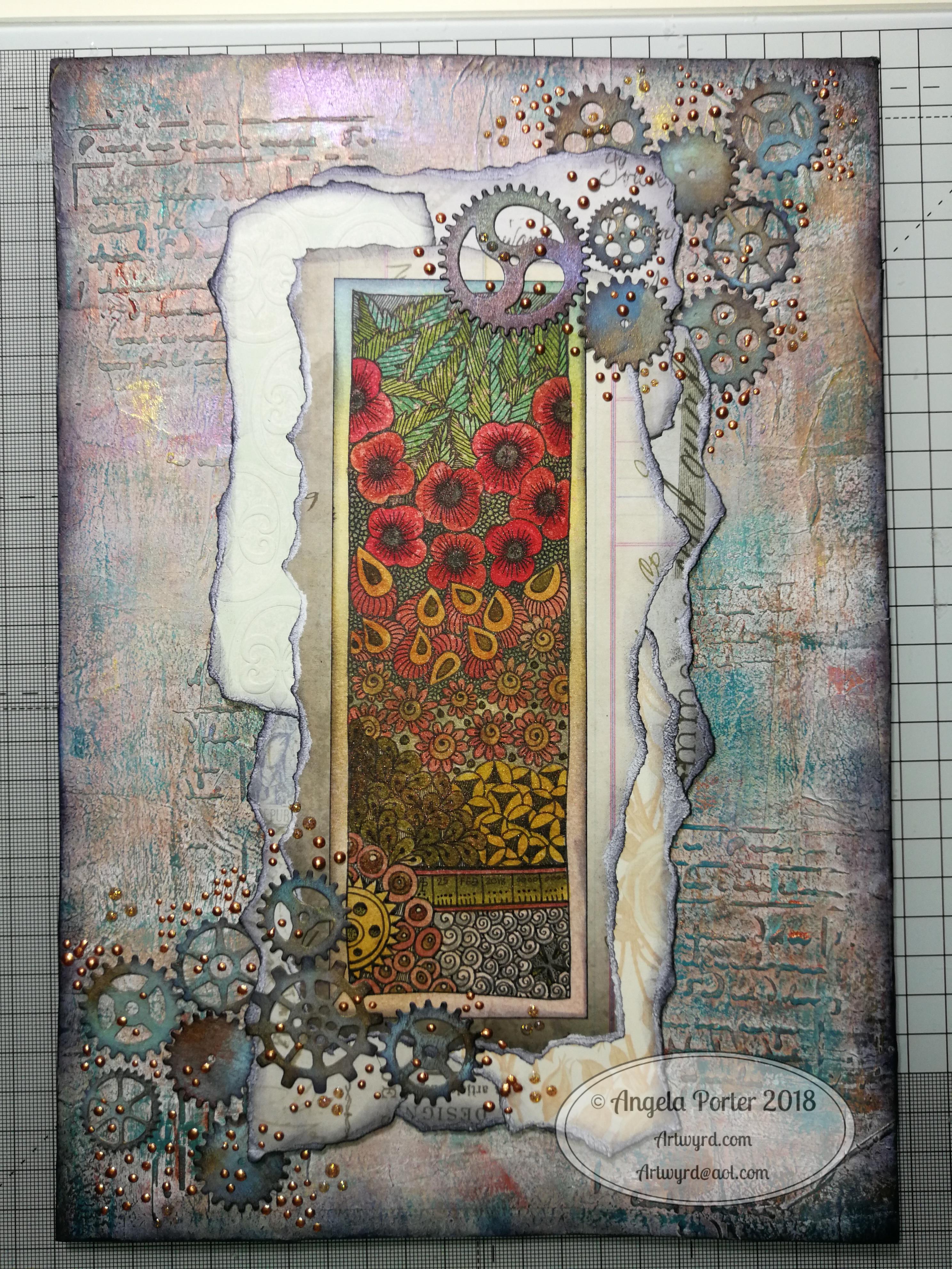
Mail Art – sneak peek

Mail art – sneak peek © Angela Porter | Artwyrd.com

Making the mail art

I woke this morning and had a fancy to make a card along with a coordinating envelope. I’m going to be sending these to someone, so I didn’t want to show the whole design, so a sneak peek it is. I don’t think it gives much away about the mail art. I hope it doesn’t spoil the surprise for the recipient.

I used a pre-made card blank and envelope. The card is nearly 8½” x 4¼” in size and is plain white.

I cut a piece of Winsor and Newton Bristol board to 3½” x 7½”. I added some score lines ⅛” in from each edge and let them overlap to form little squares at the corners. To do this I used a score board and bone folder. I’ve never done this before, but it actually adds a nice touch. It also gives me an even border to work within, which is always useful.

My next step was to add colour to the top layer and the envelope. I decided to do some ink blending with Distress Inks. Here’s a list of the colours I used:

  • scattered straw
  • wild honey
  • crushed olive
  • candied apple
  • evergreen bough

Once I was happy with the colour gradient, I broke out my Uniball Unpin pens and started to draw the design. As I had a coloured background, I made use of lines and patterns to add texture and dimension.

When I was happy with the design, it was missing something. It needed some colour or shading. I decided to add some colour with Copic markers, being mindful of using colours that would work harmoniously with the background.

My final step was to add some dots of gold glitter to add some ‘bling’ to the card.

My attention then turned to the envelope.

First, I added some pencil lines to help me keep my hand lettering level and neat. I then used a black Tombow Fudenosuke pen to brush letter the recipient’s name. I then used a grey Tombow Fudenosuke pen to add shadow to the letters.

I then used a Uniball Unipin 08 pen to add the address. For this, I used simple capital letters for the hand-lettering.

My next task was to draw the design on the envelope. I used some elements from the card for this, plus a couple of extra ones. I also added texture and shadow with lines.

My final task, after I’d written my name and address on the back of the envelope, was to seal the envelope art with a thin layer of Distress Micro Glaze, carefully avoiding the area where stamps will be affixed. The Micro Glaze creates a waterproof layer so the Distress and Tombow inks shouldn’t run if they get wet.

Once the recipient has the card, I’ll post a full image of the mail art, carefully obscuring their information.

So, Angela, how are you today?

I’m ok today. I’m a tad tired, but I don’t seem as emotionally fragile as I have been. There’s still a bit of ‘flatness’ or ‘heaviness’ inside me, but the contentedness is of equal or greater intensity.

Today I need a quiet day at home; the last week or so has been crazy busy with either emotional upsets occurring or commitments I have to keep. The next commitment I have is on Thursday evening, so I’m going to make the most of the time I have to myself. Creating mail art was one activity in self-soothing.

I doubted that I would find this more settled state any time soon. That it’s appeared today is a real bonus. How long it stays for I don’t know as I know what is in my diary.

I’m not going to worry about that, well not much. I’m going to enjoy the contentedness and Use my quiet time to soothe my still fragile emotions.

Yes, I feel mostly content, but I also know that it won’t take much to provoke me to tears and some emotional distress.

One thing we talked about in therapy on Monday was the need for me to protect myself in situations where I’m emotionally vulnerable. I’ve had a lot of time interacting with people over the past few days. I now need time to relax, breathe, re-energise.

I enjoy being with people, but it also drains me. That’s one of the consequences of being an introvert. When I’m socially exhausted, it makes me more emotionally vulnerable than I usually am. So, I need time to recover from this.

I will recover. Nowadays, I always do given enough self-care and self-soothing time.

I also am self-aware enough to know that to start important projects is not a good idea at this time. It becomes all too easy for me to find fault with everything I do and for me to end up spiralling downwards into a mood where I am harsh to myself.

It is still hard to be kind to myself on days like this. There’s a nagging voice that I should be doing this or doing that and not indulging myself in activities that help me to heal. Other inner critics join in, telling me I’m worthless, useless, a failure, unloveable then join in, sensing the vulnerability in me. So, I’m learning to ignore that voice, even if I still feel a little guilty. As I feel better, refreshed and re-energised and more emotionally resilient, the inner critics become inaudible once again.

So, as hard as it is to accept that I need to be kind and to spend today doing what will help me heal, this is precisely what I am going to do. And that starts with me writing a letter to accompany the mail art. I also want to create some designs that I can print to colour and use to create greeting cards.

Entangled garden scene

Entangled Garden Scene © Angela Porter 2019

This took me a bit longer than I expected this morning. I did, however, enjoy creating this card.

First, I drew the design out on a piece of paper that is 10cm x 14cm using various sizes of Uniball Unipin pens.

I copied the image using my Brother Laser printer. I didn’t scan it in at this time, but will do later on. All I needed was a copy to play around with.

The next step involved the use of Chameleon Duo Tone and Color Top markers to colour the design elements in. Even though some areas were quite small, I still managed to get bits of shading there.

Once the colouring with the Chameleon markers was done it was time to hot foil the design, and you can see where the gold foil catches the light in places as I took the photo. A friend of mine saw some of my foiling yesterday in person and she was said she was wowed by it. She thought it was good in the photos, but the photos really don’t do it justice at all.

After foiling, it was time to colour the background. I used a selection of Distress Inks, starting with mustard seed in the centre to give a subtle glow, then tumbled glass, crushed olive, peeled paint, pine needles and evergreen bough. I used a piece of cut and dry foam and a very light touch to add the colour.

I was worried that the Distress Inks may muddy up the colouring done with the Chameleon markers. Yes, they subtly changed the colours in some places, but I was careful to choose colours that wouldn’t make mud. Also, so little Distress Ink is added it barely alters the colours.

I can tell you I was well relieved by that!

Distress Inks are water reactive, so I gave the image a light spray of water knowing that only the Distress Inks would be affected. After a short while I dabbed the water off with a piece of paper towel. This lifted some of the colour leaving a subtle background texture.

As this point, after letting the paper dry completely, I could’ve added more Distress ink. Instead, I decided to use aged mahogany, again on a small piece of cut and dry foam, to edge the paper, to give it a border, and also to add a darker layer at the bottom of the design to ‘ground’ the image.

When I can find my Wink of Stella pen from Kuretake I’ll add some very subtle shimmer to the dragonflies, maybe to the seeds in the seedpods too. I also think some gold dots in small clusters would enhance the background.

I also need to think about adding a bit more shading to the bottoms of the laves to give a more dimensional look to them I think. I could definitely do the same to the dragonflies’ wings too.

Those are simple and quite minor changes that will make a difference I think. It’s only as I’m looking at the finished image now that I can see how those things would help. I often don’t think to step back and give myself time to look at the image with fresh and kindly critical eyes, seeing what I could do to improve my work.

In hindsight, the dragonflies may have worked well as black silhouettes in the design, which would then become totally covered in foil. Or just outlines that would be foiled. That’s something for me to try another time and see if I like that idea more.

I think you can tell I’m really enjoying this branch of my artistic journey. I’ve concentrated a lot on digital art of late. I’m not going to abandon my digital art journey at all; I can do things digitally that I can’t with traditional media.

However, it is showing me that working with traditional media is also a pleasurable and successful activity for me to do.

What am I going to do with this? I don’t know. Part of me wants to add it to my BuJo. Another part wants to mount it on a blank greeting card to send to a friend. Another part of me wants to put it into a reference sketchbook or folder for inspiration in the future.

Thinking of you – a dangle design card

© Angela Porter 2019

This little card and envelope took me around 3 hours to make. I had to remember how to do various things and find my supplies to do them with!

My first task was to make the sentiment banner. I had the idea for this one after someone asked me for recommendations of good books for learning hand lettering as they’re not at all happy with their handwriting.

Hand lettering and handwriting are not the same thing. Hand lettering is something you unconsciously do. Hand lettering is the conscious and deliberate drawing of letters, one by one. Practice, like everything else you want to learn and become good enough at, is important. I suggested that they try printing the sentiments out on their computer or using words cut out of books or magazines or stickers or stamps and ink pads used by card makers until they’re comfortable with their own lettering style.

That led me to thinking that rather than writing the sentiment directly onto the paper that I’m going to draw the dangle design on, what about if I hand lettered it on paper again and again until I’m happy with it and then cut that version out. I could then layer it onto coloured card to make a border, or onto the paper or or or…

So, that’s what I wanted to use here. A variation on what I’ve done in previous cards. I cut two trips of mixed media paper, one around 1cm wide, the other around 0.7cm wide.

On the narrow strip I wrote my sentiment. I did this confidently as I knew if I got it wrong I could always write it again – I’d not ruin my dangle design in any way. I then trimmed the strip close to the start and end of the sentiment.

Next, I coloured the wider strip of paper with victorian velvet Distress Ink. I trimmed one piece so it was just a little longer than the sentiment. Then, I cut two rectangles from the coloured strip. I cut triangular notches into one end of each of the rectangles. I used the sponge applicator to make sure the edges of the coloured pieces, including inside the notches, and the sentiment strip coloured. By doing this, there’s a darker edge to the pieces and this defines them against the background. The final step in making the banner was to glue the pieces together as shown in the photo.

I cut two pieces of mixed media paper for the front of the card. The smaller one I made a little narrower than the sentiment banner; I wanted the ribbon to hang over the edge a little. I used a pencil to mark where I wanted the banner to sit on the card. I then used a pencil to mark out the centre of the card so I could position my dangle centrally.

Above where the ribbon would sit I wanted to place an arrangement of pot plants – succulents and a cacti. Below I wanted a fairly simple dangle, but one that had elements that appeared in the arrangement of pot plants. I drew these with a 05 Uniball Unipin Pen.

I then wanted to colour the two pieces of mixed media paper before I coloured the designs in.

For the larger one I used Peacock Feathers, Bundled Sage, Weathered Wood and Tumbled Glass Distress Inks to colour the whole of the paper panel. I edged this panel with Faded Denim Distress Ink. Then, I lightly sprayed the panel with water so that I’d get some faded watermarks as a texture in the colour.

For the upper panel, I used a very light hand to add the same Distress Inks to the paper, but in a much paler shade. I also edged this panel with the Faded Denim Distress Ink. I realised it hadn’t erased the pencil guidelines before I added the Distress Ink so when I went to erase them they wouldn’t fully erase. I’d forgotten that I had to do that! Still, it adds a bit to the distressed feel of the cards, that and the damage marks that were on the larger panel too.

To colour the dangle design I used Mitsubishi Uni coloured pencils. I used a fairly limited palette across the design.

The last two steps before assembling the card were add dots of gold ink and some shiny adhesive crystal gems.

To assemble the card I used glue to adhere the lower panel directly to the card. I then used foam squares to adhere the dangle design panel to the lower panel and the sentiment ribbon to the dangle design panel. This card has quite a bit of dimension to it.

My final job was to decorate the envelope. I decided to draw some pot plants and some of the daisies along the bottom. I added some butterflies to the left as the area above the pot plant seemed empty, unbalance. I haven’t coloured the envelope in as I’m in two minds whether to or not. Also, it would be nice to edge the envelope with the Faded Jeans Distress ink too, maybe even colouring the envelope with the same Distress Inks as the card. There’s also the back flap of the envelope that would benefit from a little potted succulent drawing I think.

Distress Inks are water-reactive, so if I do this, once the envelope is addressed a light application of Micro Glaze would seal the colour in so it wouldn’t be damaged in the mail.

I’m actually quite pleased with this card. It’s got me thinking about how to do more of this kind of stuff – card making the ‘Angela’ way!

If you give making cards like this a go, I’d love to see what you create! Happy art-ing, lettering and crafting!

Lots of ideas for dangle designs are shown in my book
‘A Dangle A Day’.

Inktober 2018 Day 10 ‘Flowing’ and World Mental Health Day 2018 #wmhd

Angela Porter Inktober 2018 Day 10 Flowing watermarked

Today’s #inktober2018 prompt is ‘Flowing’, so I knew I had to incorporate ripples into my art for today. I also wanted a blue-green colour scheme, so I used Distress Inks and an ink blending tool to colour an A4 piece of Bristol Board from Frisk.

After drawing pencil lines to allow me margins, I set to work with a range of Uniball Unipin pens to draw my design.

I started with the wavy lines in the bottom left corner and just let everything flow out from there quite intuitively, as is usual for myself.

It’s taken me quite a while to do; I think I started it around 7:30am and it’s now nearly 3pm. Sheesh, that’s nearly 8 hours!  Here was me at the beginning of Inktober stating I was going to do little drawings and so on.

However, there’s a dual purpose in today’s art.

Although I’m not doing anything specific for World Mental Health Day (#wmhd #worldmentalhealthday #wmhd2018) I am taking care of my own mental and emotional health by creating this drawing.

Yesterday was a tough day for me emotionally. In my role as a champion for Time to Change Wales (#ttcw) I gave an anti-stigma talk to HR people in a college, both of which triggered some quite strong emotional flashbacks for me.

A couple of hours after that talk ended, I had my weekly EMDR therapy session which resulted in some strong and painful releases of trauma stored in my body as well as some emotional flashbacks of trauma in my childhood that I’d dissociated from.

So between the two, I was emotionally exhausted yesterday evening and night and I woke up headachy and tired today.

Part of my self-care for my emotional and mental well-being is being creative and it just so happens that Inktober’s prompt was a perfect one for today, yet again.

When I get lost in my artwork I enter a state called ‘flow’. It’s a kind of meditative state of calm, peacefulness. My self-talk (which is often so very negative) is either quieted or loses it’s power over me. It’s almost like I’m outside of time and space.

So, the approx 8 hours of drawing (well more like 6 or 7 as I had a break to meditate mid-morning and took a short time out to get a veggie bacon sandwich for a late lunch) had just flown by.

I’m still tired, but there’s a peace there within me that wasn’t there when I woke.

Creating a drawing that is rather intricate is something I don’t get to do often when I’m working on coloring books, but it is definitely something that soothes my sore emotions and mind.

Not only is it time that the stigma and discrimination around mental health is brought to an end, it’s time we all looked after our mental and emotional health as much as we do our physical health.

I have a couple of chronic health problems and during my regular checkups I’m asked about my mental and emotional health as it’s known that people can develop mental ill-health when they live day to day with a chronic illness.

I know from personal experience that when I don’t take care of my emotional/mental health I become physically ill, so the state of our mental health, emotional health and physical health interact with one another, of that I’m sure.

So, try everyday to take the time to do something that lets you relax and find joy and peace in doing. There are so many things that people use for this – drawing, coloring, painting, playing music, gardening, walking, cooking, exercising, dancing, singing, meditation, mindful activities, taking a relaxing bath by candle light, a massage, a cup of tea somewhere with a beautiful view, a walk in the surf’s edge on a sunset beach, yoga, tai chi….the list goes on!

What do you do for your own mental and emotional self-care? What do you love to do where you can find yourself in ‘flow state’ or a meditative state that gives your mind a rest?


Inktober 2018 – Day 5 ‘Chicken’ and Day 6 ‘Drooling’

Angela Porter Inktober 2018 Day 5 - ChickenAngela Porter Inktober 2018 Day 6 - Drooling

Day 5 – Chicken

Chicken, I mean, chicken?!? Really? the best I could come up with were some cute, cuddly, doodle chooks, along with some eggs and feathers to decorate the hand-lettered ‘chicken’.

Oh, and I made it another dangle design. (A Dangle A Day is available for preorders).

I used Sakura Pigma Micron and Uniball Unipin pens to draw the design. I drew everything directly in ink, though I did add some pencil guidelines to make sure the letters were on the level and roughly the same height.

To add colour I used Copic markers. I added some highlights of gold using a Sakura Metallic Gelly Roll. Oh, and I added some white highlights using a Sakura Souffle pen.

It’s worked out ok…

Day 6 – Drooling

Drooling, dribbling just said ‘monsters’ to me, and as the only monsters I draw are cutesy ones this is what I came up with. Some of the monsters are dribbling/drooling, but the page most definitely is drooling from the top.

I started by colouring the paper with Distress Inks and an ink blending tool. I wanted it to look grungy and old.

Next, I started by drawing the border, then the drooling pattern at the top of the page, and added stippling for shadow.

After that, I started drawing from the bottom up, starting with some weird alien plants.

Sakura Pigma Micron and Uniball Unipin pens were used for the drawing.

After the outlines were drawn, I used the same pens to add shadows and patterns to the design. I followed this up with a white Uniball Signo pen to add the white highlights.

All caught up

These two mean I’ve caught up with the Inktober 2018 challenge! They have taken me a few hours of my Saturday morning to do, but it’s been a pleasurable time for sure.

Inktober – Day 3 “Roasted”

Angela Porter Inktober 2018 Day 3 - Roasted

It’s taken me a good 2 or 3 hours to create this one!

The ‘roasted’ element is the background colour scheme. I created the roasting hot background with Distress Inks on Daler-Rowney mixed media paper (3″x7″).

I then used Ohto Graphic Liner pens to draw the design and added gold and white highlights to some of the design elements.

I like this one; the colours are what make it for me!

#inktober2018 #inktober

Practice…

Angela Porter 28 June 2018 watermarked

I had some fun with this one. Lots of zentangle-y patterns in a zentangle style ‘string’. I eventually worked out how to get a better ‘separation’ of the areas that worked aesthetically for me (and was more my kind of style). I added a quote and some darker shades of the same colours in the background it was all done.

I am enjoying my current phase of just creating for the sake of creating, especially adding quotes in very simple hand-lettering. I expect there’s going to be quite a few more created as time goes on.

Oh, the holes are in the top as I took the sheet out of my A5 discbound sketchbook; I’ve coloured most of the pages with distress ink in various ways. Should I wish to frame or reproduce this, I can easily remove that area of  the page.

I also quite like having the empty space above the quote and design. My art can become very, very busy and intricate, but this seems to bring some balance to the overall design.

Sunday funday

experiment 8april 2018 angela porter It’s Sunday, so that means it must be #fundaySunday #Sundayfunday.

This was my bit of fun for the day.  I created a background using Distress Inks, a mini-blending tool and a stencil.

After scanning it into my Microsoft Surface Book, I imported it into AutodeskSketchbook Pro and started to draw entangled patterns on the top of it.

It was just an experiment to see how it worked out, including the use of colour gradient fills for the entangled patterns.

I think it worked out ok.  I think there’s some more things I’d like to try out using this method; scanning backgrounds and then working on them digitally opens a new world of possibilities for me, as well as keeping me playing with more traditional media.  I do love the mix of the old with the new.

Of course, drawing on my Surface with the Surface pen is a lot like drawing with pen and ink on paper but with more possibilities…

Mixed media 25 Feb 2018

Angela Porter mixed media 25Feb2018

I’ve been hard at work on my ‘A Dangle A Day’ book and felt I needed a break from the computer screen.  As much as I love working digitally, I believe it does the soul good to work in different ways from time to time.  A change is as good as a rest, it is said, and also a change can get the creative juices flowing!

A trip to Hobbycraft in Newport, Gwent, yesterday had me buying some A4 Daler-Rowney Mixed Media boards.

These are 1.4mm thick and sturdy board forms of their mixed media paper.  The board did warp when I added tissue paper with matt medium, and it’s still a little wobbly today.

The pictures shows how far I’ve got for now.  I’m letting the little drops of copper and golden glitter dry as I take a break from it to decide if I need to do any more to it.

The image I drew and then coloured using Distress Inks.

I’ve enjoyed getting a little inky, painty and messy for a change.

Autumnly Entangled 7 to 11

davdav

Lots of drawing done over the past three or so days and I haven’t had a chance to upload these.

The set of four are approx. 4″ square and the paper has been coloured with distress inks.

The bigger one is drawn on ombre paper for ‘scrapbookers’.  The central image is 6″ square.  It was a bit of a ‘mare to draw; the paper isn’t absorbent and the ink takes ages to dry, which means smudging was a bit of a problem, but I’ve managed to mostly disguise it with patterns.   I need to dry different pens on this paper, as I do like the colours.  If I can’t find a way to draw on it, then I’ll be using it to mount other artwork on and in mixed media and card making endeavours.

Yes, it did seem a good idea at the time!  It could be back to colouring all my own paper again ….