Template Thursyay! Adding colour to the template…

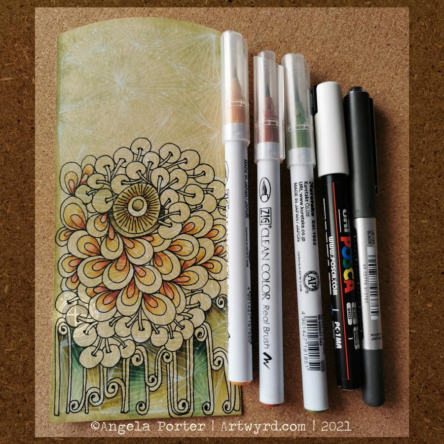
Yesterday, I shared a partly digitally coloured version of this week’s coloring template. Today, I’ve coloured some of the original template using Tombow Dual Brush markers with a waterbrush.

The template is now available in the Angela Porter’s Coloring Book Fans facebook group.

I filmed this process and turned it into a vlog. I speeded the footage up, as the original colouring took over an hour and a half.

I then spent another half hour or so experimenting with fineliners and white, metallic and glitter gel pens to add texture and pattern to the coloured areas. I didn’t film that though, but the results are in the photo above.

I set myself three intentions for this morning:
a) enjoy the process of working with the media
b) experiment with fineliners and pens to add pattern, highlight/shadow and texture
c) to not invest in the outcome or fret about colour choices

I think I achieved those intentions.

Sometimes, often even, just enjoying the process of creating, with no expectations or pressures of any particular outcome is so important. To be able to relax and enjoy the process, the colours, the way the media work is as valuable an experience as producing for a specific purpose.

It’s nice to be able to take the time to do this, without worrying about any particular project. Being able to put aside the “I should be doing x, y and z” and realising that just taking time to do something that makes me smile inside is as important as doing projects that fulfill a contract or business thingy.

Adding colour

I was awake just before 5am today. So, as I waited for my weekly Abel & Cole delivery I decided to add colour to yesterday’s drawing.

I used a selection of Kuretake Zig Clean Colour Real Brush pens, along with a paintbrush and water to do this. Finally, I added some details to the flower petals with a white Uniball Posca pen.

I kept my colour palette sympathetic to the Rusty Hinge and Chipped Sapphire Distress Inks I’d used to colour the background.

I always seem to forget how I like to use these pens to create a gentle gradient of colour. Also, they move so easily with a damp brush on this paper.

I’m quite happy with this drawing. In fact, I may use it as a basis for this week’s coloring template for the Angela Porter’s Coloring Book Fans facebook group members. And, I think I’ll video my drawing process again. I have an idea what I’d like to do already!

Of course, I created a vlog of the colouration of this drawing. If you’ve enjoyed the video, please pop along to YouTube and give it a like. A subscribe to my channel would be most appreciated too.

Experiment in Entangled art

Today, an unfinished experiment into ‘tranzending’ layers.

I dug out a piece of natural mixed media paper that had been coloured with some Distress Inks. My aim was to see if the white under pattern would work with such a piece of paper.

It did. You can see the underlying pattern coming through the more darkly coloured areas. Also, the Zig clean colour real brush pens (what a mouthful of a name!) worked beautifully on the background. I was careful to choose colours that would work sympathetically with the Distress Ink background. Distress Inks are water-reactive so any wet media will reactivate them

I haven’t finished colour this one; it was just an experiment. The final part of the experiment was to add a layer of Distress Micro-glaze. This seals in the art, making it waterproof and just about impossible to work on again. Why did I do this? Well, the micro glaze is a bit like a gloss varnish and it enhances the colours, making them more vibrant and more transparent too. I wanted to see if the glaze would move the black ink and/or the posca pen. It didn’t. Sure, there was some black pigment on the paper towel I used to polish the surface, but not much.

The microglaze is likely to be handy should I choose to decorate envelopes in the future. It may be useful in other ways.

There’s a constant spiralling round of techniques and media with me. And I usually end up returning to digital art in one way or another. What is interesting to me, though, is how these experiments give me ideas for things to try out digitally. My mind is ticking over those ideas at the moment and I’m likely to go and them out in a short while.

Rainbow verdigris

I really need to learn to take better photos!  This doesn’t do the artwork justice at all, neither does the curled paper.  If I manage to take a better photo I’ll update it.

*Update*  The image on the left is a scanned image – the iridescence and metallic sheen are lost in the scan, but the image is clearer.

There are patches of textures ‘verdigris’ which has a rainbow iridescence on them, as well as similar colours and patterns elsewhere.

The background shimmers with copper and other iridescent colours, over a soft, chalky coloured surface achieved by using Distress Oxide inks.

I loved the background so much that I really didn’t want to work over it. However, this morning I decided to be brave and to wield a Pebeo Posca black pen to draw circle patterns on it, with the aim of adding colours that would be reminiscent of verdigris on copper.

I think I’ve achieved that in some small measure, and perhaps in a different way.

I learned a lot of things along the way, not least of which is to paint the circle BEFORE I add patterns to them with a pen!  What I may do is prepare sheets of paper with the colours on I want in the circles, draw the patterns on them, cut them out and then collage them on the background to give a more 3D look to the art.

Art is all about experimentation, learning when things don’t work out as you’d like.  However, when things don’t turn out or you think you’ve made a mistake, learn to accept it as a ‘creative opportunity’ and work with it.  There are many ‘creative opportunities’ in this mixed media piece!

Media used:

  • Distress oxide inks
  • Perfect Pearls
  • Liquitex, Decoart Media and Pebeo Dyna iridescent and metallic acrylic paints.
  • Posca pen
  • Stencils by Prima
  • Fresco paints by PaperArtsy
  • Rusty Patina paints by Imagination Crafts
  • Inktense pencils from Derwent


A colourful bunch

IMG_0579

This is just finished, though the 3D Crystal Lacquer on the flower centres hasn’t dried yet, so they’re a tad on the cloudy side.

I’m really pleased with this.  Not least of which for bravely, possibly even crazily, using some of my entangled, abstract art to make the flowers!

So, how did I do this?

Firstly, I made the background.  I used a piece of cream paper that has a texture on it that is designed for use with pastels, charcoal and coloured pencils, and I added colour using Distress Oxide inks.  I then sprayed it with a solution of gold Perfect Pearls which gave water spots and gold shimmers to the background.

Next, I’d had this crazy idea to use some of my art to create the flowers.  I chose some art that had colours that would stand out against the background and each other and I used circle punches to cut out circles of varying sizes.  I used a mini ink blending tool and sponge to add jet black Archival Ink to the edges of the circles to distress them as well as to give them a definite edge against each other.

The circles were stuck together in groups of three and then stuck onto the background in a pleasing arrangement, as if they were flowers in a bunch.

Next, came the outlining with a black Sharpie, as well as adding patterns to the circles to create petals and so on.  The white was added using a Sakura Glaze pen.  I also added gold patterns and highlights using a UniBall Signo pen.

The next step was to draw the stems and leaves, which was done with the Sharpie pen.  I used a waterbrush with paint from some of Derwent’s line painter pens.

Next, I intensified and added shadows under and around the flowers, stems and leaves using Inktense pencils and a waterbrush.

This was followed by the creation of the border using a black Posca pen.

Finally, the mixed media panel was adhered to a black background and the gold pen was used to add lines around the panel.  Oh, and then I decided to add 3D Crystal Lacquer to the flower centres.  An accidental drop of the lacquer on the background led to me adding more drops.

I’ve really surprised myself with this project.  I really enjoyed it, and even though I was wondering what on Earth I was thinking in ‘destroying’ some artwork I liked, I came to realise it was repurposing the artwork to create something new, different and allowing me to explore the world of mixed media more, particularly how it relates to myself.