Abstract Botanical 22 August 2018

Angela Porter 22 August 2018

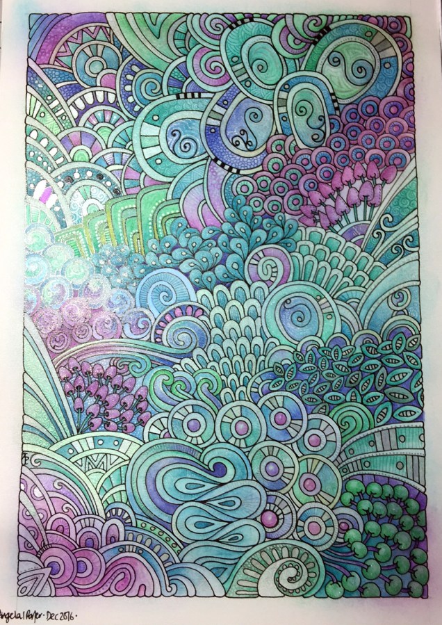
Another day, another drawing/artwork/illustration/design. This one is only a little one; it’s approximately A5 in size.

I used some new watercolour paper from Canson – Moulin du Roy. It’s smooth, slightly off-white, pure cotton mould made and seems to work nicely with Intense pencils and a waterbrush.

I’m waiting for some metallic paints to arrive so I can add some highlights to this – there are places where a dot of gold will really work nicely, but not too many places methinks.

Also, I chose just seven colours to be my palette – sherbert lemon, apple green, iron green, lagoon, violet, red-violet and sienna gold. I thought that a smaller number of colours could result in a more cohesive feel to the design, and I think that it may have done so!

For this one, I drew the design first in pen then added colour.

When I draw first I do tend to fill the space with drawings. When I add colour shapes first I end up with more white space and a more random ‘edge’ to the design.

Why that is, I don’t know, other than it may have something to do with me filling spaces in with pen and ink habitually.

A habit I need to modify I think.

All the same, it’s nice to do little designs. I already have another drawn out waiting for colour!

Perfectly Imperfect and an Abstract Botanical 21 August 2018

Angela Porter 21 August 2018

My latest design. It took nearly 2 days work to complete, though I may add some metallic highlights here.

I used Inktense pencils and blocks with water brushes, Uniball Unipin pens and Daler-Rowney Aquafine smooth watercolour paper.

Black line definitely keeps my need for that high contrast work happy, but the ability to add layers of colour or create gradations in colour with the Inktense also keeps me happy. Together, they work for me.

I did start off the central area with shapes of colour, but then I started to draw in the designs around the edge and then add colour. Both ways work for me for sure. Also, there’s a kind of randomness to the colour and some over-spill outside the lines, and that is something I’m learning to live with and like.

Perfectly imperfect.

Just like me. Just like us all. We are all perfectly imperfect and that is OK. In fact, it’s more than ok, it’s just perfect and I think we should all embrace it. The imperfections are what contribute to our uniqueness, our individuality as much as anything else (perhaps even more). Society sends a message we all need to be perfect as people with perfect lives and perfect homes and perfect bodies and perfect smiles, hair and so on.

The reality is, however, that we aren’t.

We are all imperfect. Life is imperfect. Nature is imperfect.

But all is perfectly imperfect.

And that is good. It is. At any moment in our lives we are all doing the best we can.  Sometimes things work out perfectly. Sometimes they go wrong. The balance of it all is that it is all perfectly imperfect.

My artwork is perfectly imperfect. I do my best with digital art, but I’m not really happy with what I do often. I learn each time I do some, and move forward, improving. The same is true when I use traditional media.

The same is true of life. Of my life. Of all our lives, our perfectly imperfect lives from which we can learn and grow as people.


Imagination

Angela Porter 20 June 2018 watermarked

A little drawing for today, including some iridescent paint.

Imagination is important. Einstein said, “Logic can take you from A to B. Imagination will take you everywhere.”

My art is often imaginative, nearly always intuitive, and this is an example of both.

WIP Wednesday

WIP 27 Dec 2017 Angela Porter

It’s WIP Wednesday once again over at the Angela Porter’s Coloring Book Fans facebook group. This is my current work in progress. I think I’m in touch with my inner bohemian/hippy once again in my colour choices, or maybe I just need a break from all the Christmassy/Winter colour schemes.  Perhaps I just need some bright colour in my life at the moment.  I do know using bright, vibrant colours always makes me smile.

#createdonsurface  #autodesksketchbook

Artistic journeys…

Mixed media

IMG_0650My previous blog post about a mixed media work in progress is still on hold, although I have added a crackle paint to it in places, which has added some texture to it.  I’m pleased with the result, but I still am not sure what else to do to complete it.

I have completed a very textured background for some mixed media work; you can see it above.  What I’m going to do with it I’m not quite sure, but I’m sure it will all come together at the right time.

Abstract Line Art

I’ve been drawing more ‘Doodle Worlds’ images from time to time and now need to gather them together to see if there’s enough for another ‘book’ for the Colorist app.

IMG_0646

IMG_0648

I also turned my attention to colour and pattern and the two images above are the results of around three to four days work.

I used A4 300g/m² smooth watercolour paper and applied distress inks to create the coloured areas.  I wanted to create the illusion of shadow and light in these areas.  Next, I used various drawing pens to add the patterns.  On the green piece, I’ve added copper and gold coloured metallic highlights.  The pink one isn’t quite finished yet.

Sketchbooks and my artistic journey

IMG_0649

As the days are becoming lighter and warmer, my thoughts are going to getting out to visit places and to do some sketching/drawing (intense anxiety and intense self-consciousness allowing).

With this in mind, I’ve prepared pages in an A5 and an A4 sketchbook.  I’ve used Distress and Distress Oxide Inks.

The image above shows the first page in my A4 sketchbook, a page full of daisies, worked using different media, trying out different styles and degrees of detail.

I like to work on a coloured background, I don’t know why, I just do.  I think it may be that I like to add shadows and highlights to create and image from the colour on the page.

I’ve not done much in the way of sketchbook work for a long while, but the need to revisit and to continue to explore different ways of expressing myself artistically has surfaced.  I think this is a much over-due response to the surfeit of work on colouring books in the past three or so years, as well as the struggle I’ve had with my mental health.

My energy, when mentally able, has been focused on completing the work I was contracted for with various publishers.  I enjoyed the work, the subject matter pushed my boundaries in the subjects I tackled.  I’m so grateful for that work as well as it allowed me to make changes in my working life that helps me to take care of my mental health.  It was/is also an activity that helps me manage my mood.  I lose myself in drawing/creating, finding myself ‘in the flow’ where my mind stills, or, rather, where I no longer pay attention to the inner critic.

However, the colouring book work was the focus of my artistic energies for much of that time, and I had little energy left to explore other areas of artistic expression.  I didn’t mind that at all, as I’ve said, I enjoyed all the work I did, and I will continue to create templates.  However, that is not all I want to do or to create.

I now have time to revisit ways of artistic expression I put to one side in my focus on the work for publishers, and I have the chance to see how my skills and expression have developed/changed.  I also get the chance to explore and discover new ways of expressing myself, using new media.

In this way I can continue to discover, practice and refine my artistic voice and vocabulary.  I still feel like a toddler in the world of art.  I wonder if I’ll ever progress from that state.

The biggest obstacle to me doing this is the lack of belief and confidence I have in myself and my artistic abilities.  I also have a problem in deciding on what to draw.  Then, there’s also the issue of finding themes/styles/media to explore that will challenge me just enough that I feel I can make a good attempt at them and gain confidence in them, but not so much that it overwhelms me and I fail before even trying.

The most important thing for me, however, is to enjoy my artistic journey, no matter where it leads me.  The pleasure and peace I get from creating will be something that will serve me extremely well throughout the rest of my days on this planet.


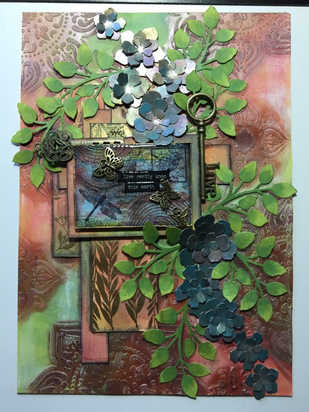
Live gently upon this Earth – Mixed media artwork

IMG_0614IMG_0615

I’ve had a bit of a week with appointments and then yesterday was a day where I needed some self-care.  I did, however, begin work on this particular piece, and I’ve gone crazy on making ATC sized backgrounds ready for work on them, particularly using the Dylusions paints which have laid dormant in my stash for a long, long time.

This particular mixed media pieces has a colour scheme that is not typically ‘Angela’.  There’s lots of god in it, and the flowers look more like succulents than flowers, bu tthey do kind of work!

The close-up image shows the ATC that’s become the focal point of the piece, along with the metal charms and keys that have been added.

Blooming rain

Angela Porter 20170311_002

Another mixed media piece just finished, I think. I may add glossy accents or 3D crystal lacquer to the bubbles/drops and parts of the flowers, or maybe not.

The image has been scanned so the iridescence and glimmer doesn’t show up, sadly.  Also, I’ve been a bit heavy handed with the shadows around the flowers and bubbles/raindrops.

Here’s the list of media I used:

  • PaperArtsy Fresco paints
  • Distress Oxide inks
  • Liquitex and Pebeo iridescent and metallic acrylic paints
  • Perfect Pearl spray in gold
  • Posca pens in black and white
  • Derwent’s Inktense pencils
  • Uniball Signo white gel pen

Rainbow verdigris

I really need to learn to take better photos!  This doesn’t do the artwork justice at all, neither does the curled paper.  If I manage to take a better photo I’ll update it.

*Update*  The image on the left is a scanned image – the iridescence and metallic sheen are lost in the scan, but the image is clearer.

There are patches of textures ‘verdigris’ which has a rainbow iridescence on them, as well as similar colours and patterns elsewhere.

The background shimmers with copper and other iridescent colours, over a soft, chalky coloured surface achieved by using Distress Oxide inks.

I loved the background so much that I really didn’t want to work over it. However, this morning I decided to be brave and to wield a Pebeo Posca black pen to draw circle patterns on it, with the aim of adding colours that would be reminiscent of verdigris on copper.

I think I’ve achieved that in some small measure, and perhaps in a different way.

I learned a lot of things along the way, not least of which is to paint the circle BEFORE I add patterns to them with a pen!  What I may do is prepare sheets of paper with the colours on I want in the circles, draw the patterns on them, cut them out and then collage them on the background to give a more 3D look to the art.

Art is all about experimentation, learning when things don’t work out as you’d like.  However, when things don’t turn out or you think you’ve made a mistake, learn to accept it as a ‘creative opportunity’ and work with it.  There are many ‘creative opportunities’ in this mixed media piece!

Media used:

  • Distress oxide inks
  • Perfect Pearls
  • Liquitex, Decoart Media and Pebeo Dyna iridescent and metallic acrylic paints.
  • Posca pen
  • Stencils by Prima
  • Fresco paints by PaperArtsy
  • Rusty Patina paints by Imagination Crafts
  • Inktense pencils from Derwent


Little drawings

img_0564

Today, I’ve taken a bit of a break from drawing doodle art and played with Distress Oxides and other media.  The photo above shows just a couple of the small pieces of art I’ve created.

The top two are drawn on Strathmore Bristol paper with a vellum surface which was prepared with Distress Oxide inks brushed on using a stencil brush.  That worked really nicely!  I used a Faber-Castell Pitt Artists pen to draw the design on and then I used Inktense pencils to deepen colours and add shading, before adding just a few metallic highlights here and there.  I really enjoyed drawing these ones, and I have some more pieces of the inked paper ready to draw on – that’s the rest of my evening sorted then!

The bottom two are from some experimenting I did earlier in the day. Both were drawn using a Sakura Glaze pen.  I used Derwent Color Soft pencils to add colour to the design drawn on Kraft paper, and Inktense pencils with a damp brush on the other.

I also had some 3D Crystal Lacquer made by Sakura Hobby Craft arrive today, so I added dots of that to various elements in the bottom two to see what it’s like.

I have been trying out watercolouring with the Distress Oxides, and they end up with a finish that is similar to gouache.  I’m not sure I like using them in this way, however.

Finished art

angela-porter-3-january-2017

This is now finished!  It’s taken a lot of time over the past few days, but I’m happy with it now.

It’s been completed on A3 mixed media paper using a variety of media.  Details have been added using coloured pencils and iridescent/metallic paints, hence the shimmery, shiny spot to the left.  These details are a nightmare to photograph, but hopefully you’ll get enough of an idea from what you can see in the image.

Adding the iridescent patterns was a bit like using ithildin; I had to have the light at the right angle so I could see what I was doing and that also involved me cricking my neck at awkward angles!

My only problem now is to put a price on my work to sell it; so any sensible help/advice would be greatly recieved!  Oh, I also need to find a name for it too…