
Happy New Year to you one and all!
This is my coloured version of this week’s template for the Angela Porter’s Coloring Book Fans facebook group.
Happy New Year to you one and all!
This is my coloured version of this week’s template for the Angela Porter’s Coloring Book Fans facebook group.

Feeling in a festive mood? Fancy getting a little creative? Well, there’s no better way than creating some dangle designs to decorate your own Christmas and holiday projects. They’re also a great way to practice hand lettering and drawing cute, whimsical and simple designs.
Being creative is also a great way to relax and take some time out of the hustle and bustle that can overwhelm us at this time of year. I always find it relaxing to sit down with some pens, dot grid paper and a big mug of tea (or mocha as it’s the last days of autumn here in the UK) and just draw for enjoyment. Mind you, all my drawing work is enjoyment, but drawing for just the pleasure of drawing, with no specific brief to work to is a different kind of joy for me.
I’m finding that I need a focus, a project to be creative at the moment. I’m in between contracts and need some time out as I’ve had a crazy few weeks. However, settling to do anything not connected to a contract can cause me some issues. I still feel the need to create for a purpose, and sometimes that simple joy isn’t enough. I still have some issues to work through in therapy it seems. However, I am now aware of them and can work towards releasing these limiting attitudes and behaviours.
Anyway, today, I’ve created a sheet of some examples of design elements, hand lettering and examples of dangle designs to use as is or just to inspire you. There’s plenty more to inspire you in my book “A Dangle A Day”.
My drawings today are a bit rough, ready and wobbly, as is my hand lettering. I coloured them in very loosely, not worrying about keeping inside the lines or perfect coverage or blending. Colour really does make a difference, doesn’t it? It brings the designs alive!
However, this is a page of sketches, ideas. Maybe I’ll use some of them another time, or maybe I’ll leave it as a page of drawing and hand lettering practice, a page that I enjoyed doing with no real reason other than enjoying the process of creating.
I had thought about doing a video of this page – if you’d like to see videos of me drawing pages like this, then leave me a comment.
I used a mixture of Tombow Fudenosuke brush pens and Faber-Castell Pitt Artist pens to draw the designs on ClaireFontaine dot grid paper. I coloured the images digitally.
Yesterday was a crazy busy day with no time for art, let alone blogging!
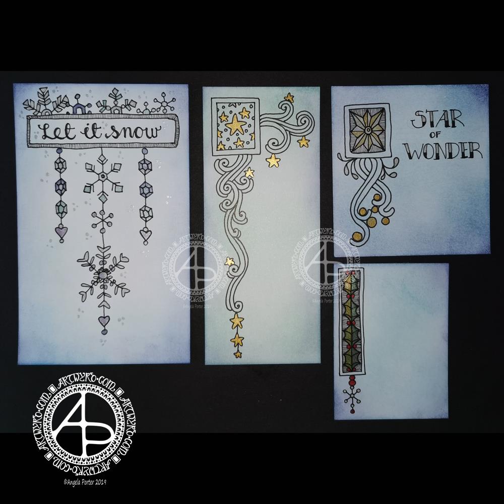
This morning, I finally had some time to myself. As it’s Friday I wanted to do a dangle design, and I ended up doing four!
I cut the card into the wrong dimensions to create a card, so I thought I’d just make use of the pieces I had and make some custom card blanks and envelopes for them another time.
I coloured the pieces of card with Distress Inks in shades of blue and green. I used Chipped Sapphire, Tumbled Glass, Broken China, Evergreen Bough, Cracked Pistachio and Salty Ocean in various combinations.
These colours gave the card a frosty kind of feel, so I went with some snowy, icy, wintry designs.
I drew the designs and completed the hand lettering with Faber-Castell Pitt Artist pens, which are waterproof.
Plain black lines on the coloured background did look a tad lacking. So, I added some shimmer and colour using Cosmic Shimmer watercolour paints.
I’m not so fussed on the ‘Let it snow’ design. However, I am quite pleased with the others.
I am going to mount them as greeting or note cards. However, the designs would look charming in a BuJo, journal, planner, diary or scrapbook. They could easily be adapted to make bookmarks too, or place cards for a special meal.
I hope you’ll give drawing these designs a go, or use them as inspiration for your own projects. I’d love to see what you create – please tag me on social media so I don’t miss them!
If you’d like to know more about dangle designs and have some guidance and inspiration for them, then my book ‘A Dangle A Day’ is a good place to start.
It’s been nice to have a couple of hours to indulge myself in art. The past four weeks or so have been crazy busy with other projects being quite demanding of my time, mind and energy. However, they will soon be over and my focus can return, properly, to art.

Happy Thanksgiving!
I’ve created a simple bit of line art to celebrate the day, and it’s available exclusively to members of the Angela Porter’s Coloring Book Fans facebook group. It’s free to join and I have a number of templates that are exclusive and free to members of the group.
I love to see how people use colour to bring my drawings to life. I provide the bones, the colorists add the flesh in the form of colour.

I woke up this morning with an idea for a background for quotes, and this is the result!
I thought the kind of abstract, organic, swirling patterns I’ve been drawing would work well as a border, and I’m happy with what I’ve created. However, I do think there’s just too much purple, perhaps.
In hindsight, I wish I’d taken a bit more care with the laying out of the quote. I would like to emphasise the key words and phrases. Maybe, if I have time later I’ll do just that.
Sometimes, maybe often, I don’t really see the flaws in my work until I’m writing my blog. A lesson to be learned here I think. Today, however, I am under a lot of time pressure and I feel I may have spent too much time on this already.
However, despite the flaws I can see in my work, particularly the typography/hand-lettering, this is good enough for now.
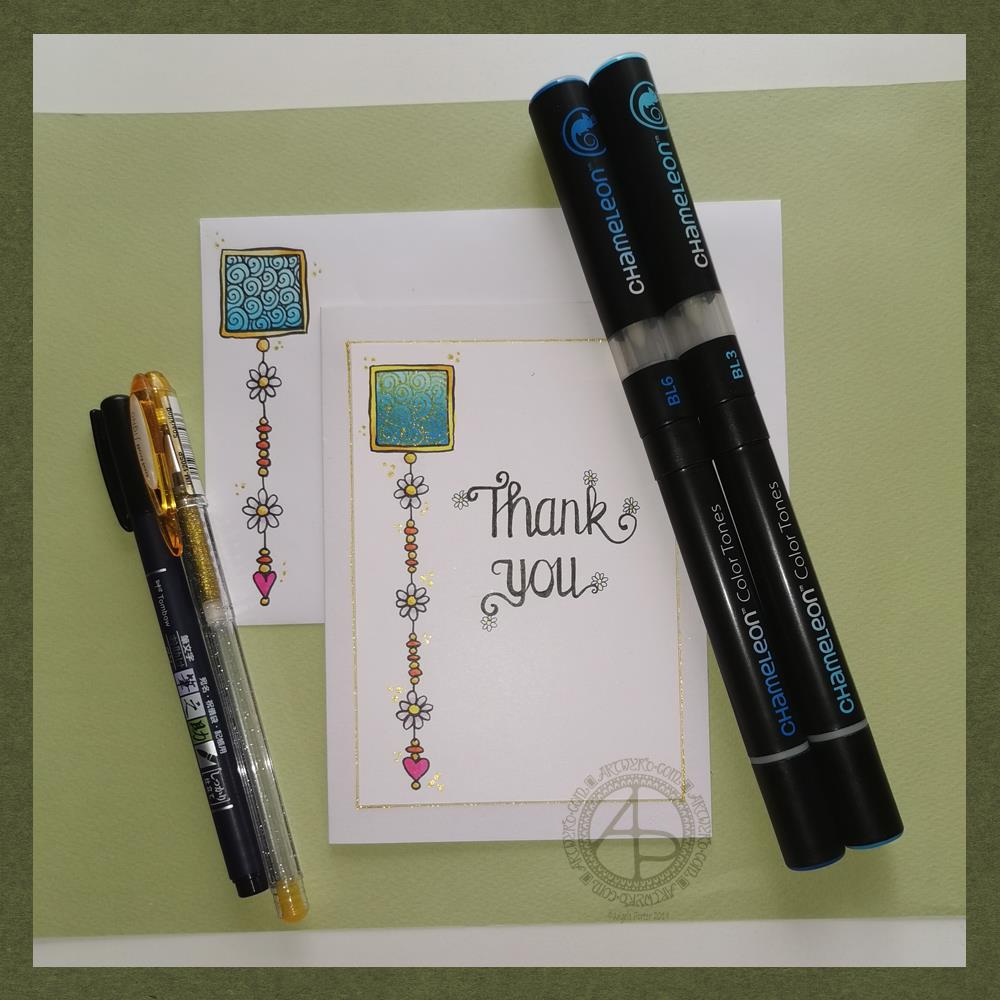
Friday means it’s time for another dangle design, this time a ‘thank you’ card and coordinating envelope.
In previous weeks I’ve had some fun adding patterns to small blocks of colour. So, I thought I’d run with that idea and turn one into a simple dangle design. The steps I used were the same for the card and envelope.
Card size.
The card is an A6 card and I cut a piece of Winsor and Newton Bristol paper to 5″ x 3.5″ for the card topper. The envelope came with the card blank so is A6 in size too.
How to…
I started by drawing a square of colour using the BL3 (Sky Blue) Chameleon Color Tone pen – no gradient, just pure colour.
Then, I added a gradient of BL6 (Royal Blue) over the base colour. I added pure blender to the Royal blue bullet nib using the mixing chamber. I didn’t use the Color Tops to add Royal Blue to the tip of the Sky Blue pen as I wanted a more subtle colour gradient.
Next, I used a Tombow Fudenosuke pen to draw around the block twice. Then, I added a filler pattern of spirals to the colour block. On the card I used a gold Uniball Signo sparkle gel pen. On the envelope I used the fudenosuke pen.
Now the colour block was decorated I turned my attention to the dangle.I decided to draw one dangle as I thought the design would look too crowded if I ad more. Sometimes, less really is more!
After drawing a faint pencil guide-line, I used a combination of beads, daisy-like flowers and a heart for the dangle. I wanted to keep it nice and simple.
Then it was time to add colour to the outline and design elements. I used the Chameleon Colour tops to add very simple colours. I didn’t do any gradients as the designs were so small. Instead I coloured them in the lightest colour, added a touch of darker colour where I wanted shadow and blended that out with the lighter colour.
I decided to hand letter ‘Thank you’ on the card using a soft nib Fudenosuke pen. I also added some tiny daisies to some of the loops and swirls to tie the hand lettering in with the dangle design.
I then mounted the card ‘topper’ on the card blank and added some gold glitter gel dots around the designs. I also added a gold line around the card topper.
Before I post the card, I’ll use some Micro Glaze from Ranger on the envelope to protect the Tombow pen from water damage.
Reflecting on the project…
Overall, I’m quite pleased with this. In hindsight I wish I’d used the Tombow Fudenosuke pen to draw the spiral pattern on the card. I think it’s a cute, simple and versatile design.
It would make lovely stationery, such as note paper or note cards, along with coordinating envelopes. There are lots of ways the design could be used in BuJos, Planners, Journals, Scrapbooks, and Art Journals. The vertical nature of the design means it would make a lovely bookmark.
How would you use this design? I’d love to hear, so leave a comment!
If you have a go at drawing and using this design then please share your finished products with me – I’d love to see how people use dangle designs!
If you want to learn more about drawing dangle designs then my book ‘A Dangle A Day’ is a good place to start. There’s over 120 designs for you to use as they are or for inspiration for your own designs.
Nearly every Friday I publish a new dangle design on my blog for more inspiration.

Today, I have a simple tutorial for a Remembrance dangle design.
To draw and write the design and instructions I used Faber Castell Pitt artist pens and Claire Fontaine Dot Grid Paper. I also used a Tombow Fudenosuke pen for the broader ‘Remembrance’ to the bottom right of the page.
I did colour the design digitally using a very simple colour scheme and colour gradients.
I do hope you have a go at drawing your own version of this design. I’d love to see what you create with it – maybe a greeting card, or in a scrapbook spread about a loved one lost during a war. Perhaps you’ll change the sentiment for a birthday or other occasion, and change the colour scheme with that.
I based this design on the one that is in my book “A Dangle A Day”. There are over 120 dangle designs in the book for you to learn to draw or as inspiration for your own designs.

I’ve spent an hour or so creating this small design; the paper is 4″ (10cm) square. It’s been an enjoyable time. I needed to spend some time warming up my pen skills before returning to drawing the October colouring template for the Angela Porter’s Coloring Book Fans facebook group.
My first step was to use a Tombow fudenosuke pen to hand letter ‘believe’. I wanted to make sure that the word stood out from the rest of the design, so I used a Faber-Castell Pitt Artist Pen to draw two ‘auras’ around the word.
The rest of the design flowed onto the page, starting with the flowers to the top right of the word. I used a variety of nib thicknesses in the drawing. I used quite a few of my favourite patterns and motifs in this design; this makes the drawing quite soothing for me as I don’t really have to think and concentrate on constructing the design elements.
Once I was happy with the design, I decided to add some shadows with some grey-coloured pencils. I’m not satisfied with this at all. The pencil ‘leads’ were too hard to get a soft line. In future I need to remember to use a 2B or softer graphite pencil and some kind of blending tool.
I am happy with the design though, apart from the bit I let spill out to the edge of the paper. I also need to note that I’m happy with my hand lettering here too! Using fudenosuke pens with flexible tips for drawing has allowed me to develop the pressure control I need to complete the brush lettering. The brush nibs on the pens are quite small, so the contrast betwixt thick down-strokes and thin upstrokes isn’t as noticeable as with a broader nib, but all the same, I’m still quite happy with it.
I have no idea what I’m going to do with this little panel. It could become the top layer of a greeting card, or frame it and hang it. Perhaps I may add it to my BuJo. It could, of course, end up amongst the piles of artwork I have stored away.
It’s something that I’m working on – believing in myself. Believing that I deserve better in life than what I grew up with and unconsciously seek to replicate to try to get a different outcome (one of the features of CPTSD). I am beginning to believe that I can turn the negative beliefs I was taught as a child into positive beliefs about myself.
Part of this is believing in my art, believing in my self-expression and not looking to others for approval and validation of what I’ve created. I want to believe that it’s enough to create art that makes me smile, and hopefully other people too. There are plenty of artists in the world who make social statements, political statements and thought-provoking images with their art. I’m not one of them. I just want to add some prettiness and smiles to the world.
Sometimes, part of my art may have quotes that are thought-provoking in them, but the art is, I think, pretty.
To believe that I am the opposite of what I was brought up to believe myself to be (which wasn’t very nice).
There’s so much more I could add here, but I’d need to explain it, and I’m not up to doing that in public. Maybe in the future I will, once I’ve overcome those negative beliefs about myself.
I believe I’m feeling quite content, though that tiredness has sneaked up on me once again. However, there is that contentment there, and that’s a good thing.
I believe I’m feeling quite content, though that tiredness has sneaked up on me once again. However, there is that contentment there and that’s a good thing.
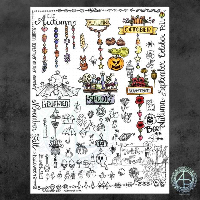
It’s been a while since I did any whimsical dangle designs, so here’s an A4 sheet full of ideas!
There are six complete dangle designs on this sheet along with lots of ideas for motifs to use. I’ve also done some hand lettering, something I don’t do often enough these days.
I know there are likely to be things associated with autumn missing from the sheet, but it is a collection of some of my favourites. I had a lot of fun filling in some of the space around the dangle designs with the lettering and design elements.
I used Tombow Fudenosuke and Faber-Castell Pitt Artist pens to draw and hand letter on an A4 sheet of dot grid paper by Claire Fontaine.
After scanning in, I decided I’d like to add some colour digitally. I used a different kind of brush setting – natural blend with an airbrush. I’ve not quite worked out how it works, but I like the way it’s turned out here. The colour blends turn out quite soft and gentle, however this brush setting does need some more experimentation by me.
These are lovely, simple designs that would be perfect for using in bullet journals (BuJos), planners, diaries, scrapbooks and journals as well as for greeting cards, bookmarks and more.
My book “A Dangle A Day” is a great resource for dangle designs and design elements (called ‘charms’ in the book), even if I say so myself. It also has easy to follow step by step instructions for beginners to more confident creatives, as well as lots of inspiration – there’s nearly 200 dangle designs in the book!
I’m feeling content, fairly upbeat and the exhaustion of the past few days seems to have mostly subsided. There’s still some tiredness there, but I feel more able to cope with the demands of daily life.
I do have to venture forth into the world; in my rather emotionally fragile state the thought of going grocery shopping filled me with, well not horror but trepidation. Fortunately, I keep a fairly well stocked fridge, freezer and cupboard, but now I do need to go get some fresh fruit and veg, which I will do in a short while I expect.
It is good to be back to having the contentedness the dominant feeling – it’s not as strong as it has been which tells me there’s still some emotional distress lingering. However, it is the prevalent emotion.
I’ve weathered another emotional storm. I do try to remind myself that I’ve come through plenty of hurricane force emotional and mental storms in the past and I can come through them again. Nowadays, I know what contentedness feels like and during emotional storms it acts a lighthouse to guide me back to emotionally calm waters.
Now, that’s a nice metaphor!

Making coloured backgrounds.
Yesterday evening I had a pleasant hour or so using Distress Oxide and Distress inks to make some backgrounds for future card projects.
I used a soft rubber Brayer roller to add distress oxides to a small Gelli Plate. I then spritzed the Gelli plate with water containing either pearl, copper or gold Perfect Pearls before lifting the print with some Claire Fontaine Mixed Media paper. The water in the spray reacts with the inks to give an oxidised look. The Perfect Pearls in the spray add some subtle shimmer to the finished background.
Once the Distress Oxide background layers were dry, I used a rectangular die to cut a section from them.
To create backgrounds with Distress Inks, I used a mini foam blending tool to cover the card with colour. I then sprayed the card with some water containing pearl, copper or gold Perfect Pearls. Again, the water reacts with the Distress Inks, but this time creating small watermarks. The Perfect Pearls again add shimmer.
Making the card.
I chose a background coloured with Wild Honey, Tea Dye, Old Linen and Walnut Stain Distress Inks which were then spritzed with pearl Perfect Pearls infused water.
I wanted to create a dangle design card. From experience, I know that drawing on backgrounds with added Perfect pearls that my fine-liner Uniball Unipin pens can become clogged by the tiny flakes of mica that comprise Perfect Pearls.
So, I tried using a Uniball Vision Elite rollerball pen. The ink in it is supposed to be water-resistant, tamper-proof, fade-proof. It’s also very black, which suits me just fine.
I was surprised at how well the pen wrote on the background – not just because of the Perfect Pearls and Distress Ink, but also because the mixed media paper is lightly textured.
Once I’d completed the design, I used a needle=tip Pentel Energel Liquid Ink Gel pen to add smaller details.
While the plain black line on the coloured background looked OK, I thought it needed some colour to help lift it from the background.
I launched myself into using Copic markers, using somewhat darker colours than I usually would. That meant it wasn’t until I was adding some colour to the ribbon banner that I discovered that the Copic reacts with the inks in the pens and smears them. I was so disappointed in myself for not checking the pens were Copic safe. Oh well, you live and learn!
Rather than start again, I carried on with the card. I wanted to add some clear embossing powder to help the colours of the Copic markers stand out even more. So, I used a Versamark pen to colour over the designs, and then I sprinkled on the clear Wow Embossing Powder. I used a heat tool to melt the Embossing powder and achieve a glossy, dimensional finish on the dangle design.
The final step was to adhere the dangle design to a card blank, after adding some gold dots with a Uniball Signo glitter gel pen.
Fancy having a go at drawing your own dangle designs and not sure where to start? Well, you could start with my book “A Dangle A Day” where I lead you through the process. I have over 100 designs in the book where I take you step by step through drawing them. I have also included ideas for where you can use them including as cards, bookmarks, in BuJos, journals, scrapbooks and more.
Making the envelope.
I used the pre-made envelope that came with the card blank. I decided to keep the envelope white and add a border using some of the motifs from the dangle design.
I did use the Uniball Vision Elite gel pen and Pentel needlepoint pen to draw the design. This time, I coloured the design with some Mitsubishi Uni coloured pencils.
The low quality of the paper envelope wasn’t conducive to really amazing colouring, but it worked well enough.
Reflecting on the card and envelope.
I could’ve kicked myself for not testing the pens to see if they were Copic friendly. I don’t think I could send this card to anyone as it just isn’t up to scratch. I need to remember this in future projects.
Also, the Versamark pen smeared the ink a little too, but nowhere as much as the Copics did.
I used much darker Copic colours than I usually would without thinking that heat embossing them would intensify the colours even more. The colours aren’t as dark as in the photo, but they are still darker than I would like.
The coloured pencils colouring worked much better and perhaps I would’ve been better off using them on the card panel. Again, something to remember for the future.
I also noticed that the anti-static powder I used before using the Versamark and embossing powder has either removed or covered the Perfect pearls. I used the anti-static powder so prevent the embossing powder sticking to places it didn’t belong. This is always a possibility, especially when using Distress Inks to colour the background.
In hindsight, I may have been better drawing, colouring and heat embossing the design before colouring the background. However, I do like to have pre-coloured backgrounds to use for arty projects.
So, Angela, how are you?
I’m OK, still tired from a busy few days at the weekend and start of the week. I also have a flare-up of an ovarian cyst which is rather painful and achy. I’m feeling content and optimistic otherwise, though still tired even though I slept well last night. The exhaustion that comes with interacting with people, therapy and not enough me-time can linger for a good while — the joys of having CPTSD and being an introvert.
Yesterday, I was fatigued, and the flare-up ramped up in intensity as the day progressed. I wasn’t in the right place to create art or focus on work. I needed to practice self-care.
I chose to do some crochet after hearing about Crochyay, the online presence of a young woman called Olivia who makes flowers and leaves them with a little message tag for people to find and keep – random acts of kindness. She uses crochet to help manage her anxiety and depression as well.
I thought it was a beautiful idea and I thought flowers or little amigurumi hearts or similar would be lovely to make. Small, quick to finish projects that I feel I could manage. I’ve lost the oompf to do larger crochet projects such as shawls and blankets, but some little ones would be lovely to do.
I do find crochet and other crafts quite soothing and calming. I also feel I’m doing something, and they can stop me from just sleeping my day away. Little projects like flowers are fab for me when the thought of anything bigger fills me with procrastination and disinterest. Also, I find it much more motivating to do projects for other people than for myself, even if I don’t know those people.
So I managed to make quite a few flowers yesterday. I now need to make leaves and assemble them into little posies. Then, there are tags to make.
I’m also looking forward to making the tags as I can draw and decorate them too! So, little projects in their own right.
Finally, I’ll need to overcome my self-consciousness and anxiety about leaving them for people to find them.


