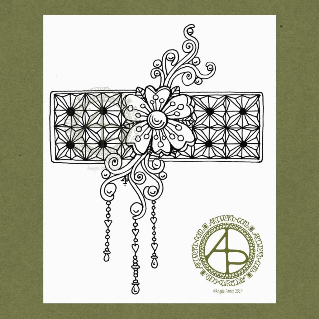
I woke this morning, refreshed after a long, deep sleep, and wanted to draw something relatively simple, something I could work on in the future.
I used a Uniball Vision Elite pen on a sheet of dot grid paper from Claire Fontaine. If you zoom in, you can still see the dots of the dot grid.
I had no idea of what I was going to draw. All I knew was I wanted to draw, and I wanted to start with a flower. Which I did.
I then started to grow the design by adding the swirls. Those swirls had shapes in them perfect to add some round seeds.
Next, I thought a rectangular background panel, filled with a geometric design, would be a good counterpoint to the more organic flower and swirls. So, I did draw in a pencil grid to use as a guide for my inked lines.
After adding a narrow border to the panel, I decided to add some simple dangles to the lower swirls. I thought the design needed to be lengthened a little.
When I’d finished the dangles, I knew the design was complete. I felt no need to add anything more to it, despite having a lot of white space! So, I scanned it in and prepared it for posting to social media.
I’d like to work this one with some colour to the flower and swirls, maybe the dangles too. The geometric pattern I’d like to add shading to bring out a more dimensional appearance to it. I may add that shading as shades of grey, or maybe as lines.
If you’d like more ideas about drawing dangles, then my book “A Dangle A Day” is a good place to start.
That’s where I have to leave it for now as I have a busy day away from home today.
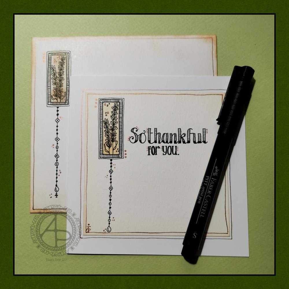
Today, I have a simple dangle design greeting card along with a coordinating envelope. If you’d like some more ideas, inspiration and step by step instructions for drawing dangle designs then my book, A Dangle A Day, is a good place to start.
Materials and dimensions
4″ x 4″ Strathmore Bristol paper with a vellum finish 5″ x 5″ acid-free white card blank White envelope that card will fit in Distress inks in Tea Dye and Rusty Hinge Small piece of foam and a mini foam blending tool A piece of card with a 1.5″ x 0.75″ window cut in it to use as a stencil. Faber-Castell Pitt artist pens in F, S and XS Ruler and pencil Adhesive Glass pen and coppper ink by J Herbin
Making the card.
Use the card stencil and a small sponge dauber to apply a rectangle of Distress Ink in the top left of the 4″ x 4″ top layer. I used Tea Dye to colour the whole rectangle in, followed by a subtle gradient of Rusty Hinge from the bottom up.
Use a mini foam blending tool to add Tea Dye Distress ink to the edge of the top layer.
Use a pen to draw the rectangles around the colour block. I like to do this free-hand as it gives a more organic, human feel to the design.
Draw the sprigs and add the lines to the border. Dots help to add some interest to the more empty parts of the design.
Use a ruler and pencil to lightly draw a vertical line as a guide for the dangle. Also, draw pencil lines as guides for the position and size of the hand lettering. Sketch in the letters of the greeting.
Draw round and diamond shaped beads to form the dangle. I like to finish my dangles with a ‘heavier’ or larger bead.
Ink the letters in. I did some faux calligraphy where I made the down-strokes thicker. I added some lines and shading to the top line.
Carefully erase the pencil lines.
Attach the top layer to the card blank.
I used a glass pen and copper ink to add copper dots to highlight the dangle design and the hand lettering. I also drew a box just inside the top layer and another just outside it on the card blank. Again, I free-handed the lines, embracing the wobbliness.
Making the envelope
I used Tea Dye Distress Ink and a mini foam blending tool to edge both the front and back of the envelope.
I then used a sponge dauber and the card stencil to add a rectangle of Tea Dye ink in the top left.
I drew the design on the envelope as I had on the card, including adding a line border in copper ink.
Finally, I drew similar sprigs on the envelope flap, using the glass pen and copper ink.
Before mailing…
Once I’ve addressed the envelope, I’d apply a thin layer of Distress MicroGlaze to the front and back of the envelope to protect the Distress Ink and drawing from the elements. I’ve done this to other cards and they have traversed the UK and US postal systems with no problems.
Ideas for using the design.
Although I’ve presented this dangle design as a greeting card, which is, I think, a lovely way to share a little bit of artistic loveliness with others, there are many other ways the design could be used, with or without any hand lettering.
In a BuJo, journal, planner or diary it would make a lovely little design to fill in a blank space.
This is a design that would work really well as a bookmark.
I’m sure it would look charming as part of a scrapbook spread.
I also think it would look lovely on a ‘with compliments’ slip or decorating the edge of a hand-written letter.
I’m sure there are many other ways and media that this design would be suited to.
Final thoughts…
I’m really enjoying drawing these kinds of dangle designs. They’re simple and elegant, to my mind anyway. They’re also quite easy to draw.
I do prefer to free-hand the lines and let the wobbliness be part of my signature style. It gives that human, hand-made, hand-crafted feel to the finished project, and a warmth to the finished project.
I work hard at finding a way of drawing digitally that lets me keep this uniquely ‘Angela’ way of expressing myself through line and pattern. I’m still working on it and sometimes get frustrated that, to my eye, my digital art seems too, well digitally perfect.
It’s all part of the process though – learning, developing, experimenting, trying out new ideas, techniques and methods. That’s what helps me grow as an artist.
I’ve created a simple bit of line art to celebrate the day, and it’s available exclusively to members of the Angela Porter’s Coloring Book Fans facebook group. It’s free to join and I have a number of templates that are exclusive and free to members of the group.
I love to see how people use colour to bring my drawings to life. I provide the bones, the colorists add the flesh in the form of colour.
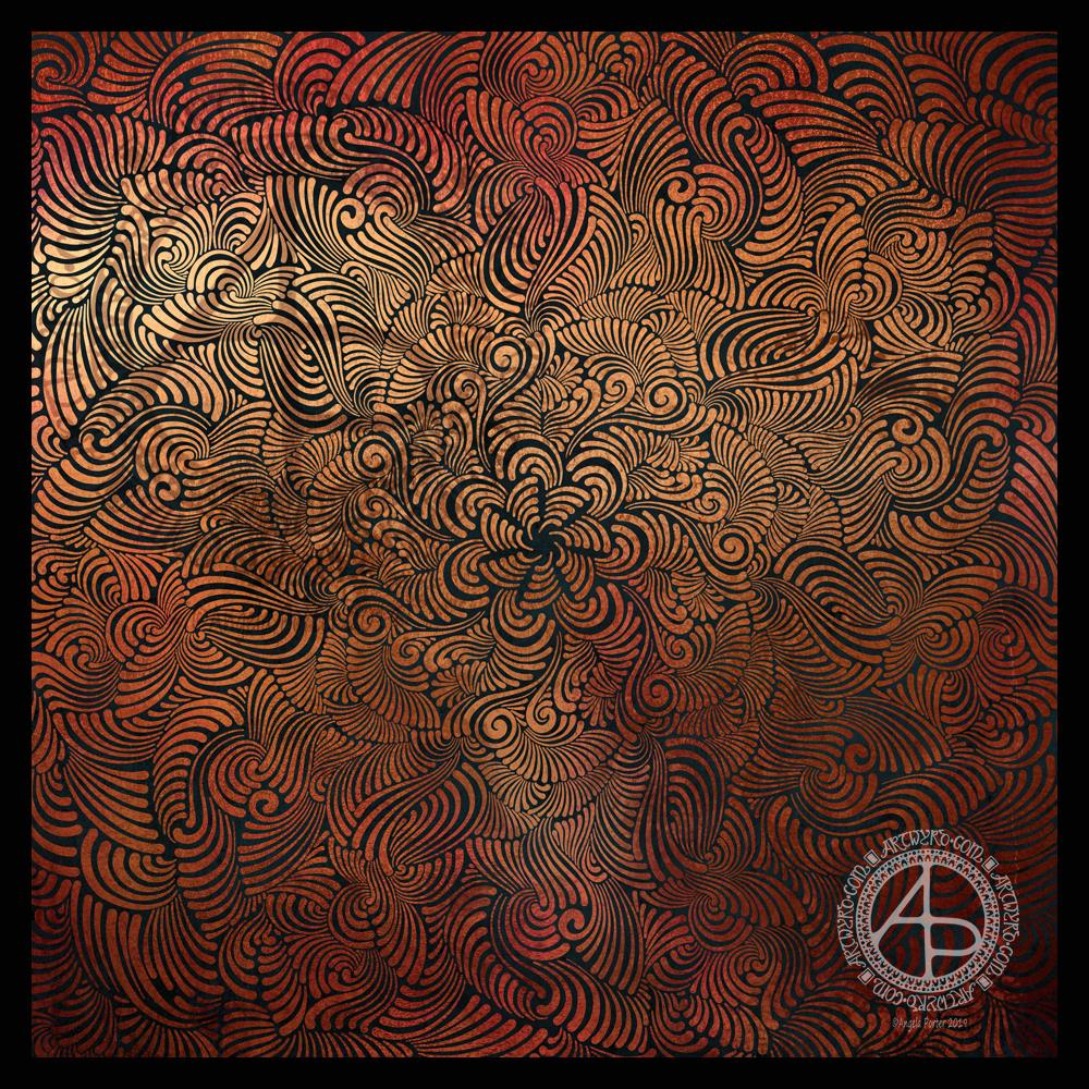
I wanted to try out an idea I had, and it’s worked out fine, I think. Mind you, I’m not thinking well today – I’m experiencing an ‘introvert hangover’ from being in a large group of people last night. I come across as quite an extrovert to people, but that is a well practiced mask and to keep it up is rather exhausting. It’s also tiring to be around people with all the noise, various emotions, and just the number of people there.
I have a couple of things that I need to get done this afternoon, and I also need to take care of myself and this ‘hangover’ of a headache and tiredness. I really need a good amount of alone and self-caring time. Maybe when I get home this evening I’ll manage to do that.
Anyways, the arty idea I had has ended up as a rather ghostly, faded design, which actually describes how I feel at the moment.
I like the softness of both the contrast but also of the lines that form the mandala. I do have a bit of a thing for grungy backgrounds at the moment. The texture really appeals to me and I like the contrast between the more orderly mandala designs and the chaotic grungy-ness.
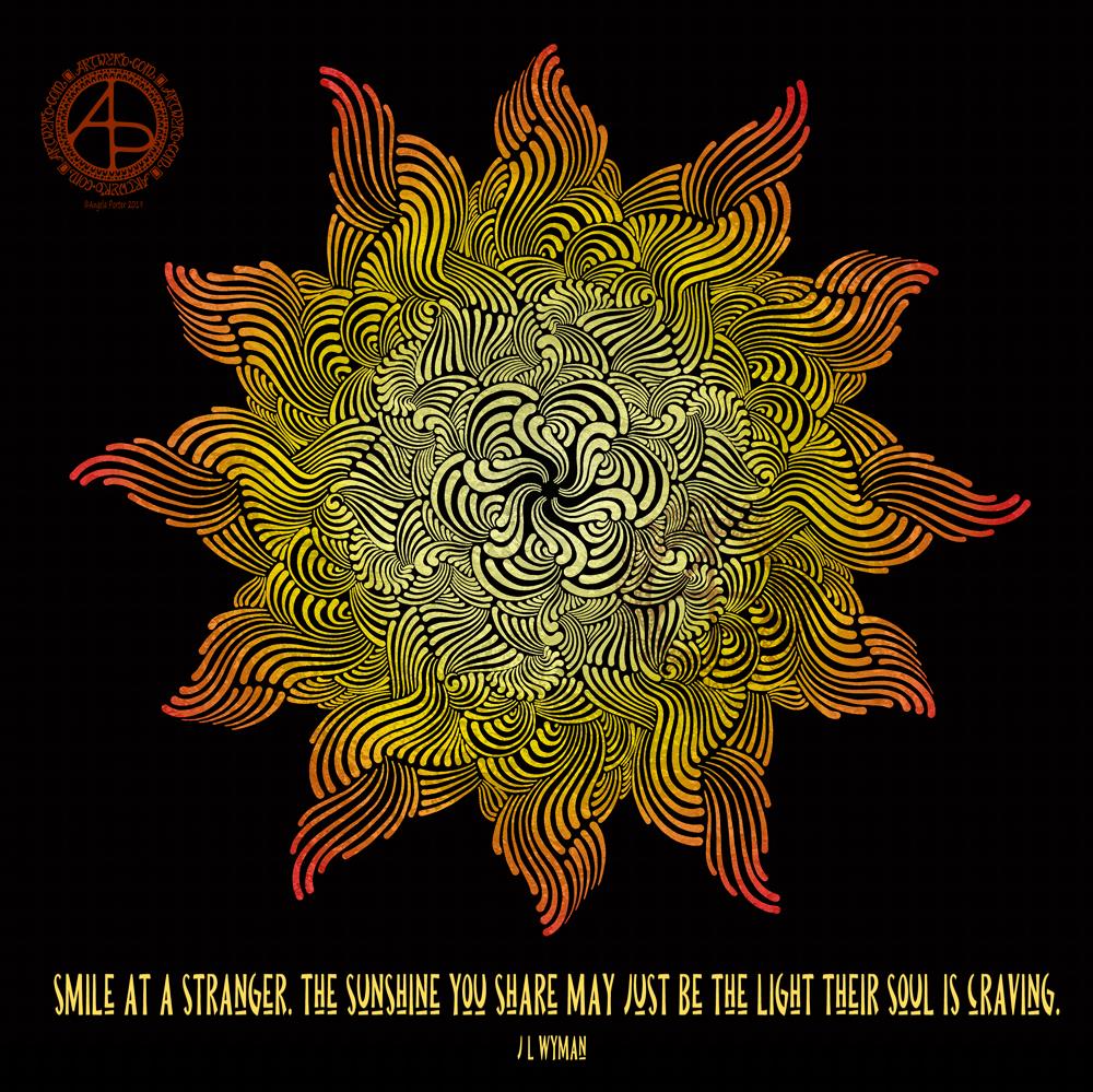
I’ve had a busy day learning new things to do with video and so on. The concentration has taxed my brain just a bit, and I needed some time in an arty happy place.
My first task was to find a quote that appealed to me today. This one is quite apt I think, for many reasons. I’m not entirely sure my typography is right for the quote, but it will do for now.
I then knew I wanted to do a mandala as a background. I find this style of mandala very soothing to draw, and soothing was just what I needed today.
Once I’d finished the mandala, I added colour in greens and teal. Calming, soothing, balancing colours for today. Colours of calm contentment, which is just how I feel at the moment. Also hopeful colours. That green reminds me a lot like the first leaves showing themselves at the tail end of winter, spreading hope that the warmer, lighter days will soon be here.
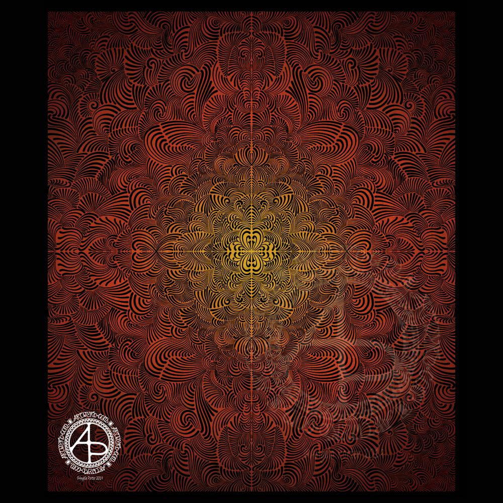
Seven plane symmetry, using a flexible nib pen to carve through black to reveal the design in copper. Done digitally using Autodesk Sketchbook Pro, Microsoft Surface Pen and Surface Studio.
I really have been enjoying creating this kind of design lately and I make no apologies for showing so many that seem to be similar. I find creating these so soothing and calming.
Here, I wanted to see how a metallic background texture would work, and it does really well, just not on WordPress and how the website shows images. The colours never seem to be as vibrant as they do elsewhere.
What I love about this process is that I have no idea of what the end product will be. It’s all about being in the flow, working intuitively, and trusting my skills and creativity.
Often, I’m so zoomed in to the section I’m drawing I’m not aware of how the overall design is looking and working. That means I really do have to trust my instincts, and trust that it will all fit together to create a satisfying end result, and I am happy with it.
If you’d like to find out more about drawing dangle designs, then my book “A Dangle A Day” is a good place to start. I’ve created over 120 designs, with step by step instructions, for you to use and inspire you.
It’s Friday, so that means it’s dangle designs today!
I drew these on postcard sized (148mm x 105mm) acid free heavy cartridge paper using a mixture of Tombow fudenosuke and Faber-Castell Pitt Artist pens. I then used Chameleon Color Tones and Color Tops to add some colour to the designs.
Again, I’ve drawn some really simple, cute and whimsical dangle designs that leave plenty of space on the paper for hand lettering or a hand-written note or letter.
Dangle designs are, of course, very versatile. I put these on the edge of a postcard sized piece of paper. However, they could be used as the focal point of a greeting card or note card. Lengthen the dangle, and they’d make cute bookmarks. They’d make interesting designs to fill spaces in a BuJo or scrapbook page. They’d also make interesting focal points on art journal pages.
I’d love to see how you use dangle designs – just tag me in social media!
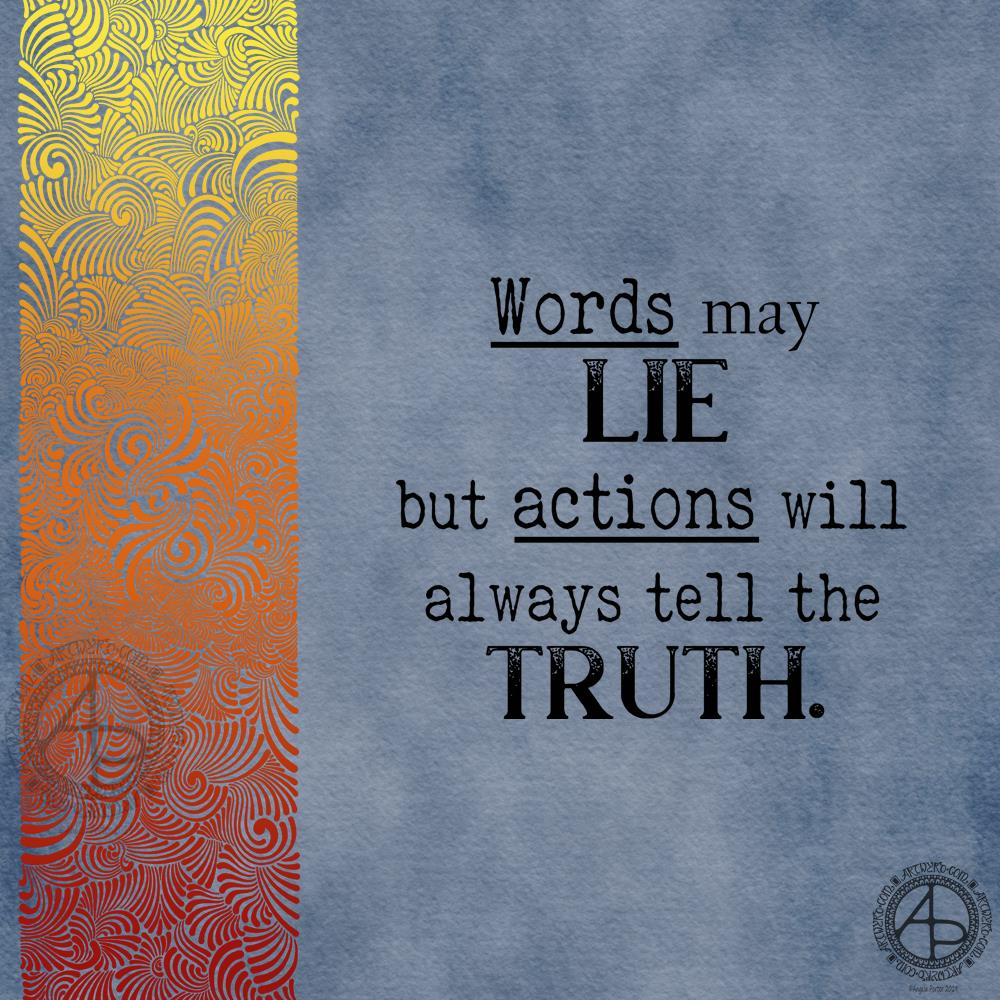
I had some arty fun creating a similar, but different background for a quote. This time I went for a blue-grey background with the patterned border in fiery shades of red, orange and yellow.
Rather than hand letter the quote, I chose to use fonts.
I’m not sure I’e developed this particular style of creating abstract patterns much, but I do like the results.